CO₂ and Greenhouse Gas Emissions
Human emissions of greenhouse gases are the primary driver of climate change today.1
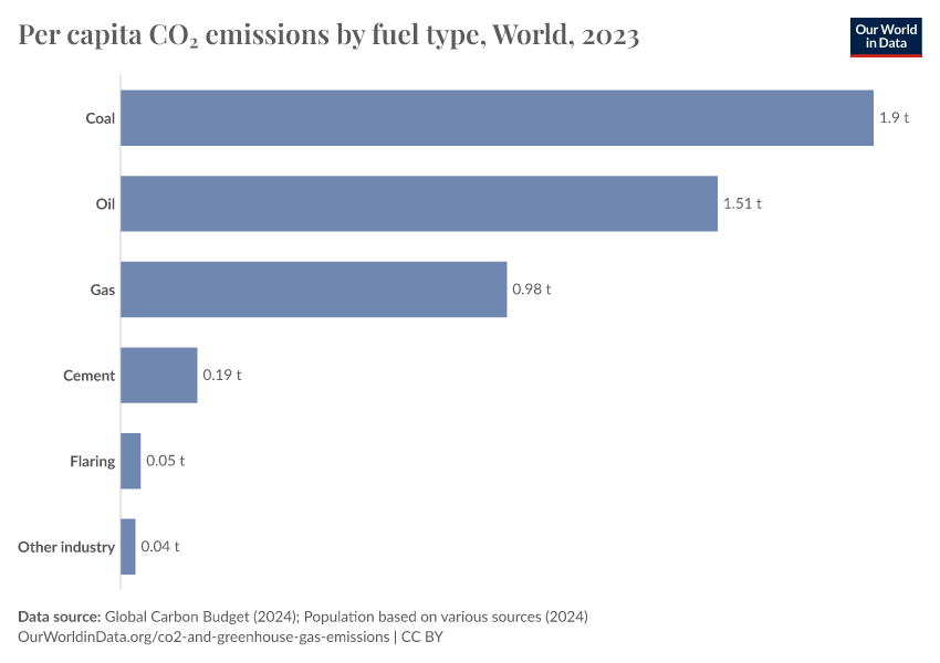
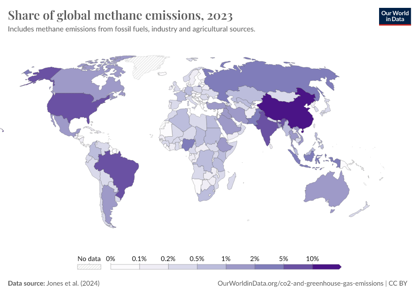
CO2 and other greenhouse gases like methane and nitrous oxide are emitted when we burn fossil fuels, produce materials such as steel, cement, and plastics, and grow the food we eat. If we want to reduce these emissions, we need to transform our energy systems, industries, and food systems.
At the same time, we need to tackle energy poverty, low standards of living, and poor nutrition, which all remain enormous problems for billions of people.
Technological advances could allow us to do both. The prices of solar, wind, and batteries have plummeted in recent decades, increasingly undercutting the cost of fossil fuel alternatives. Further progress could allow us to provide cheap, clean energy for everyone. Political change is essential to create a system that supports rapid decarbonization.
Emissions are still rising in many parts of the world. However, several countries have managed to cut their emissions in recent decades. With affordable low-carbon technologies, other countries can increase their living standards without the high-carbon pathway that rich countries followed in the past.
On this page, you can find our data, visualizations, and writing on CO2 and other greenhouse gas emissions.
Key Insights on CO₂ and Greenhouse Gas Emissions
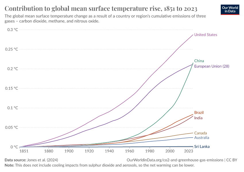
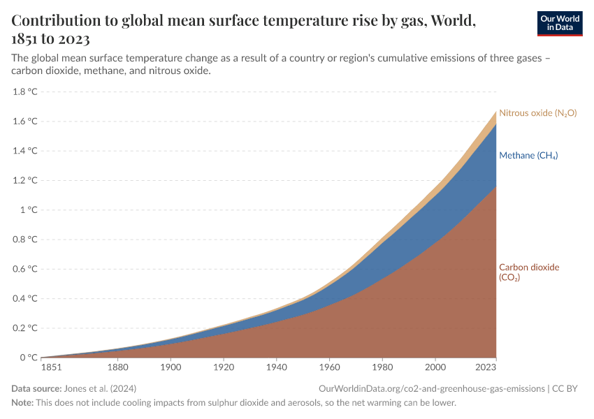
Human greenhouse gas emissions have increased global average temperatures
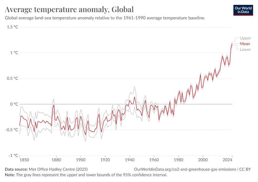
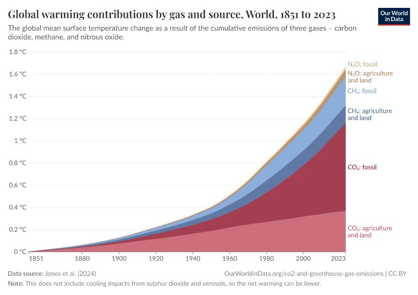
Human emissions of carbon dioxide and other greenhouse gases are the primary drivers of the global rise in temperatures.1 This link between global temperatures and greenhouse gas concentrations – especially CO2 – has been true throughout Earth’s history.2
In the chart, we see the global average temperature relative to a baseline, which is the average between 1861 and 1890. This gives us an estimate of the temperature increase compared to “pre-industrial” times. Average global temperatures have risen by approximately 1.3°C since then (with even higher anomalies in the last few years).
This warming has not been equally distributed across the world. The Northern Hemisphere has warmed more than the Southern Hemisphere. In some regions, temperatures have risen by more than 5°C. You can see this distribution in maps published by Berkeley Earth.
Human emissions have been the main driver of this change. Aerosols have played a slight cooling role in global climate, and natural variability has played a minor role. This article from Carbon Brief explains this very well, with interactive graphics showing the relative contributions of different factors to the climate.
What you should know about this data
- This data comes from the United Kingdom’s Met Office and combines air and sea surface temperatures in the Northern and Southern Hemispheres. It is called the “HadCRUT” (Hadley Centre/Climatic Research Unit Temperature) dataset.3
- It measures temperature anomalies across the world at high resolutions.
- There is very strong agreement in temperature trends across the large global datasets measured and produced by other leading institutions.

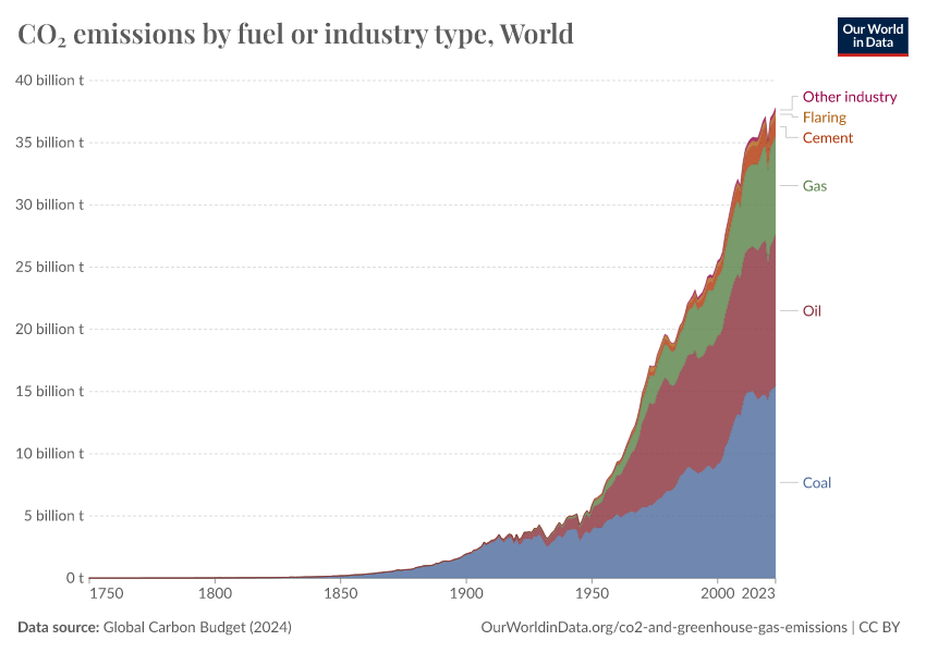
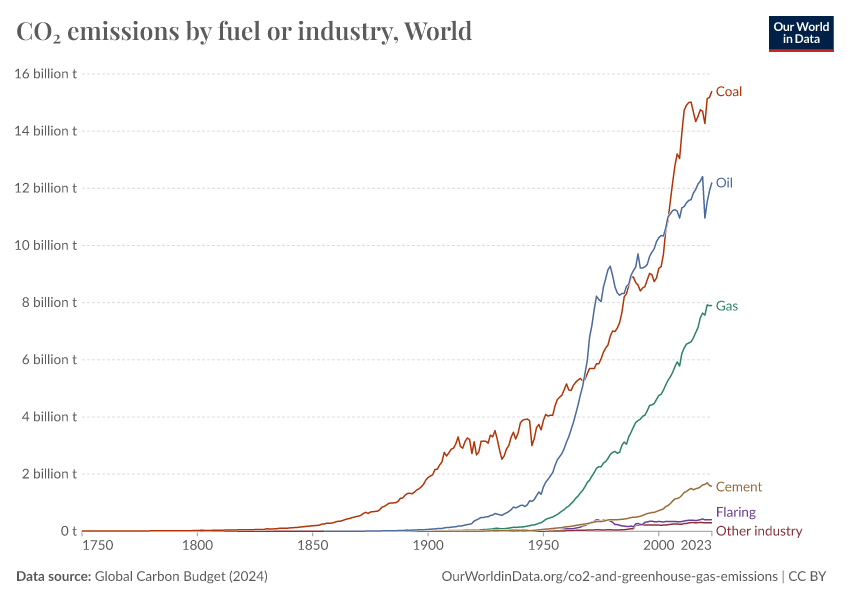
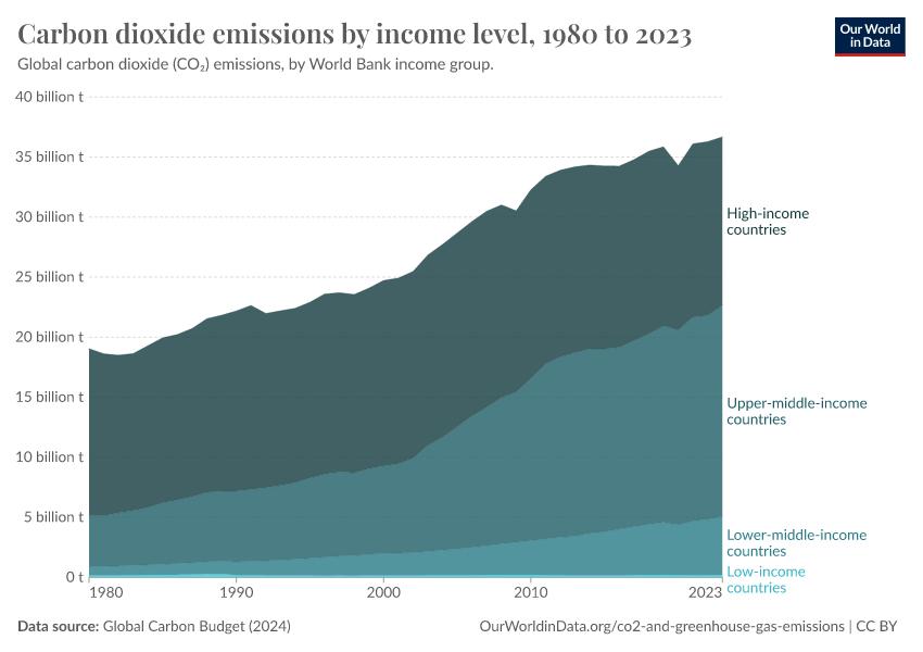
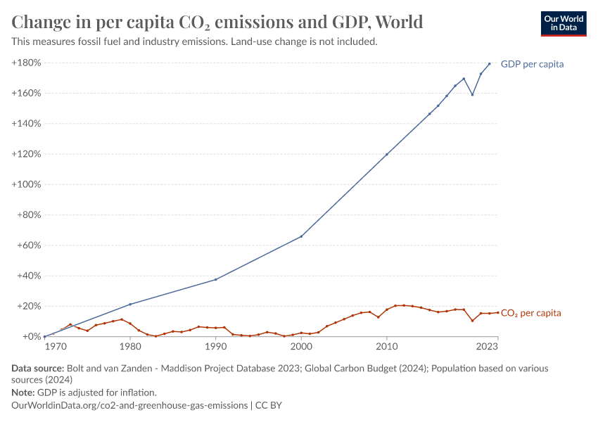
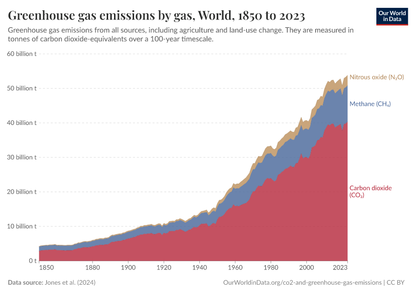
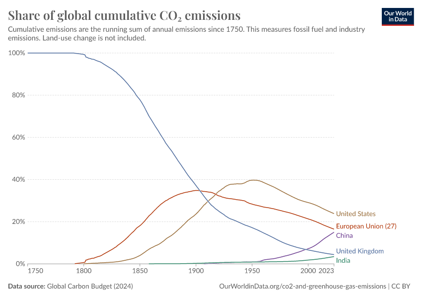
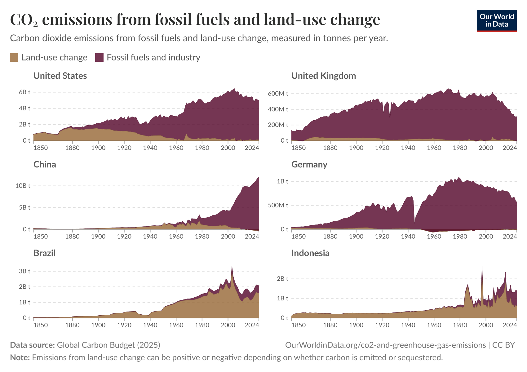
Global emissions have increased rapidly over the last 50 years and have not yet peaked
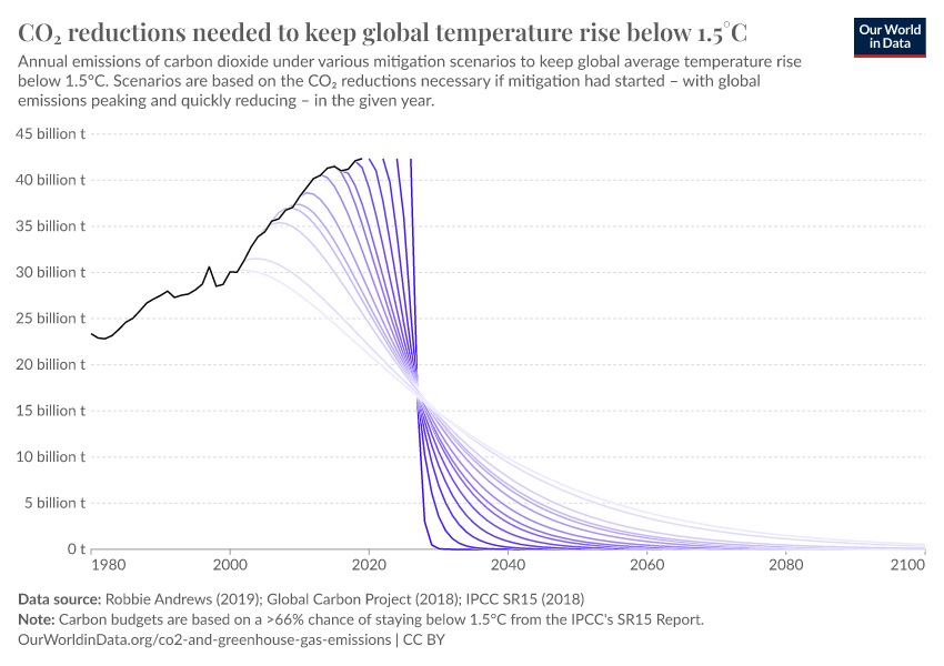
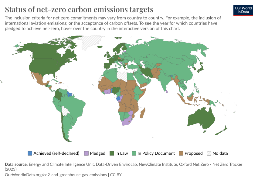
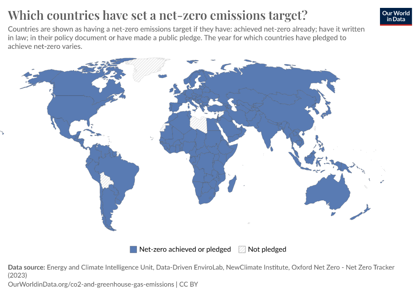
If we want to stabilize (or even reduce) concentrations of CO2 in the atmosphere, the world needs to reach net-zero emissions. This means our net carbon contributions to the atmosphere are zero: any remaining emissions are offset by carbon sinks. This requires significant reductions in emissions.
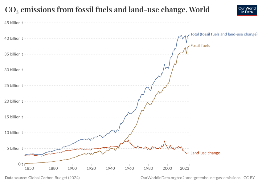
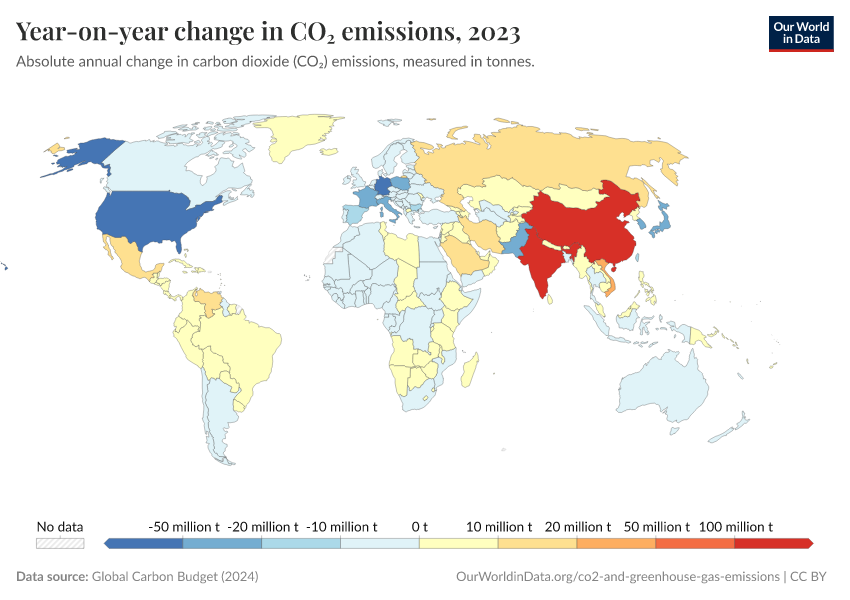
However, emissions from fossil fuels have not yet peaked.
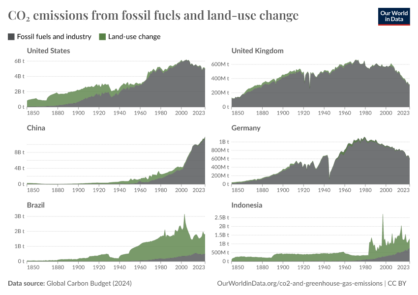
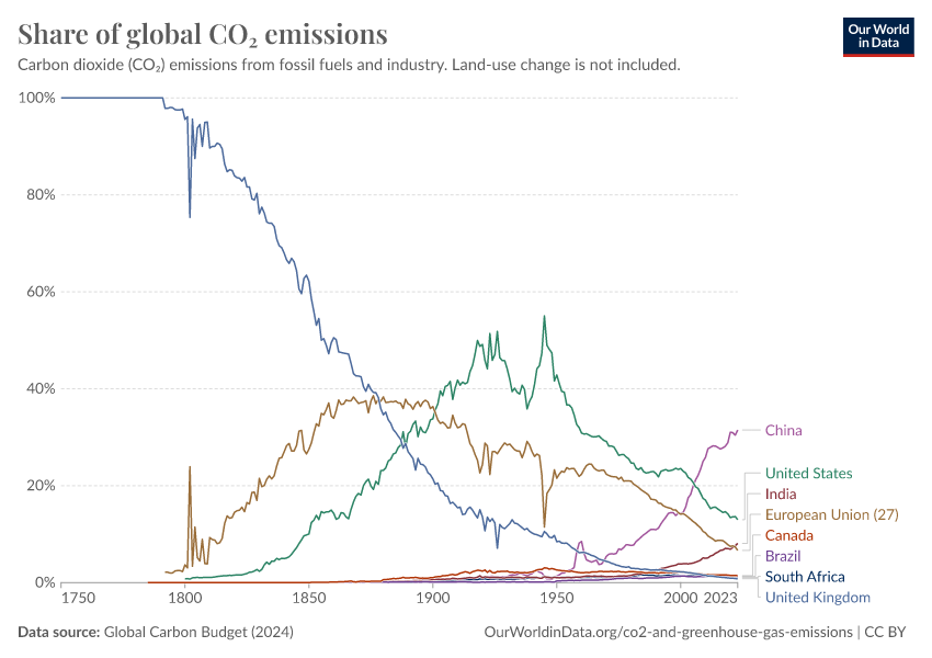
In the chart, you can see global CO2 emissions since 1750, broken down by world region. Emissions have increased rapidly over the last half-century.
While this growth rate has slowed recently, fossil emissions are still rising.
What you should know about this data
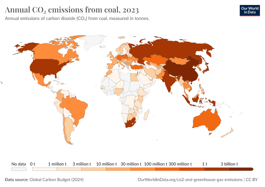
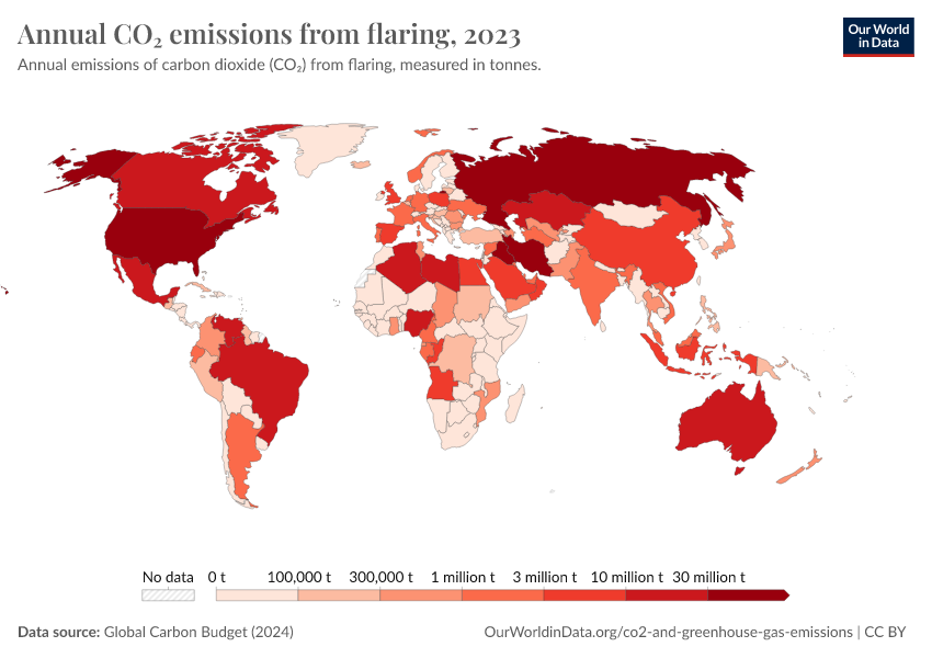
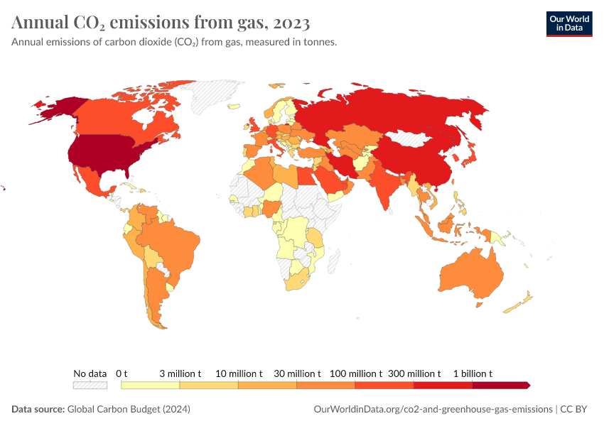
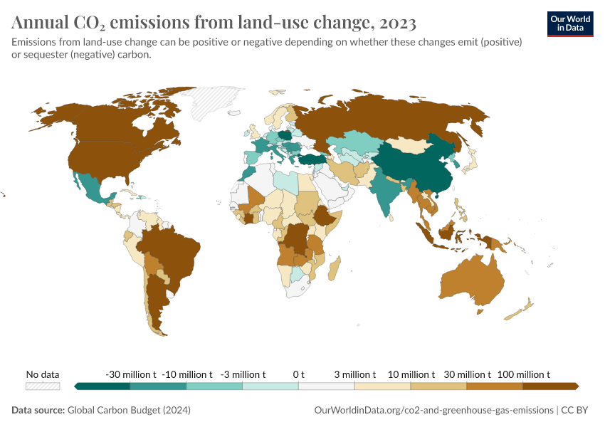
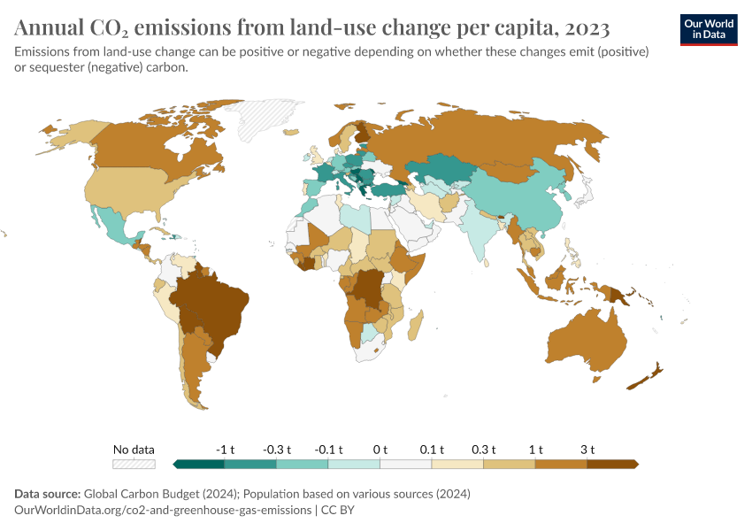
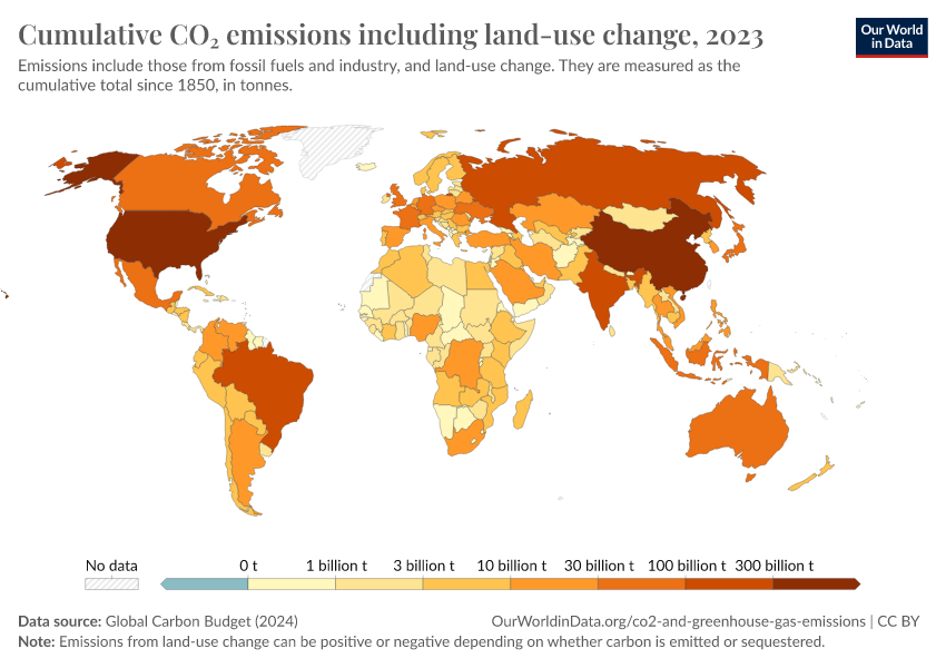
- CO2 emissions are for fossil fuel and industrial emissions only. Land use changes are not included but can be viewed in our data explorer.
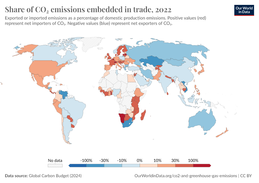
- Emissions are allocated to countries based on production – they do not adjust for trade. Trade-adjusted emissions can be found in our CO2 Data Explorer.

Current climate policies will reduce emissions, but not enough to keep temperature rise below 2°C
Current policies to reduce, or at least slow down, the growth of CO2 emissions have already averted some future warming compared to a world without these policies.
As we see in the chart, climate and energy policies – which include adopted and implemented policies (such as legislative decisions and executive orders) would reduce warming relative to a world with no climate policies.
This chart maps out future greenhouse gas emissions scenarios under a range of assumptions: if no climate policies were implemented; if current policies continued; if all countries achieved their current future pledges for emissions reductions; and the necessary pathways compatible with limiting warming to 1.5°C or 2°C of warming this century.4
Current policies have us on track for around 2.7°C by 2100.
And if countries achieved their current pledges, this could be reduced to 2.1°C.
But if we aim to limit warming to “well below 2°C” – as is laid out in the Paris Agreement – currently policies have us far off track. To achieve this goal, countries need to increase the ambition of these commitments and bring their policies in line with them.
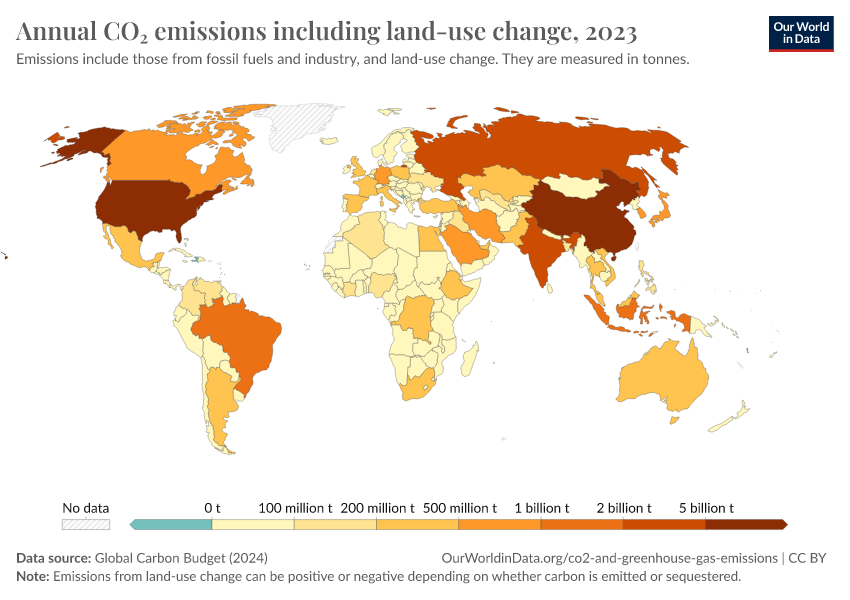
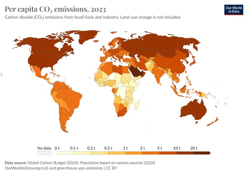
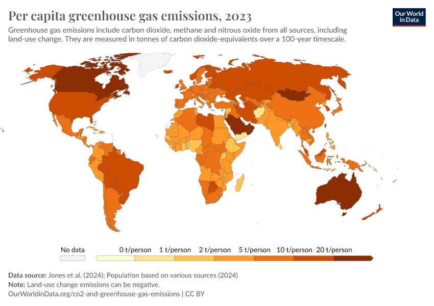
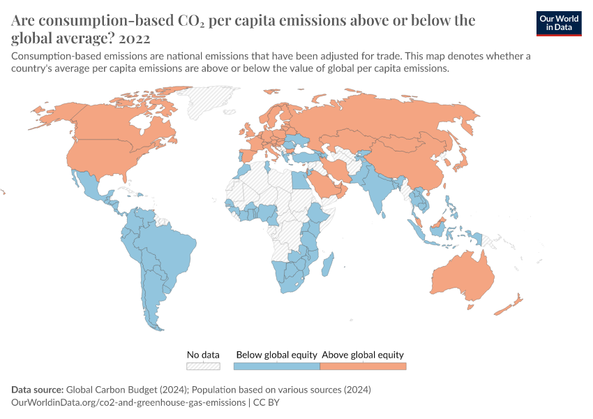
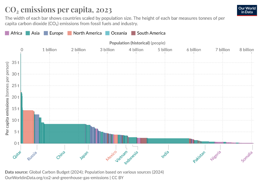
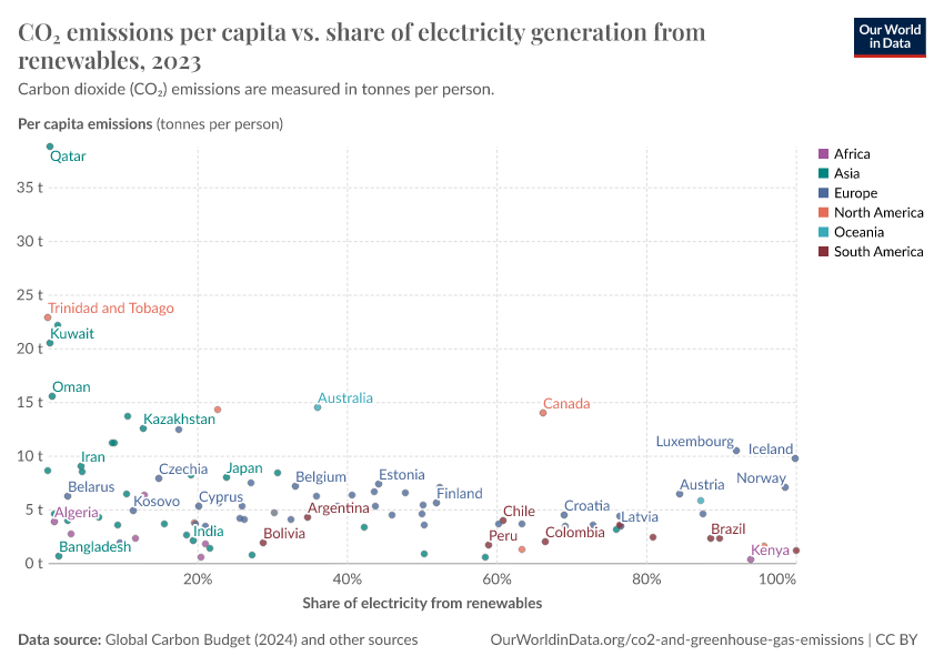
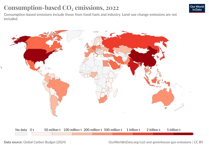
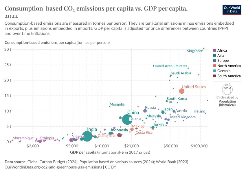
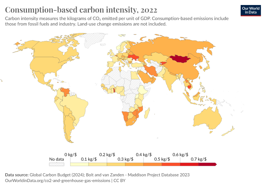
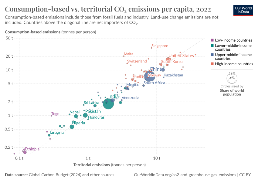
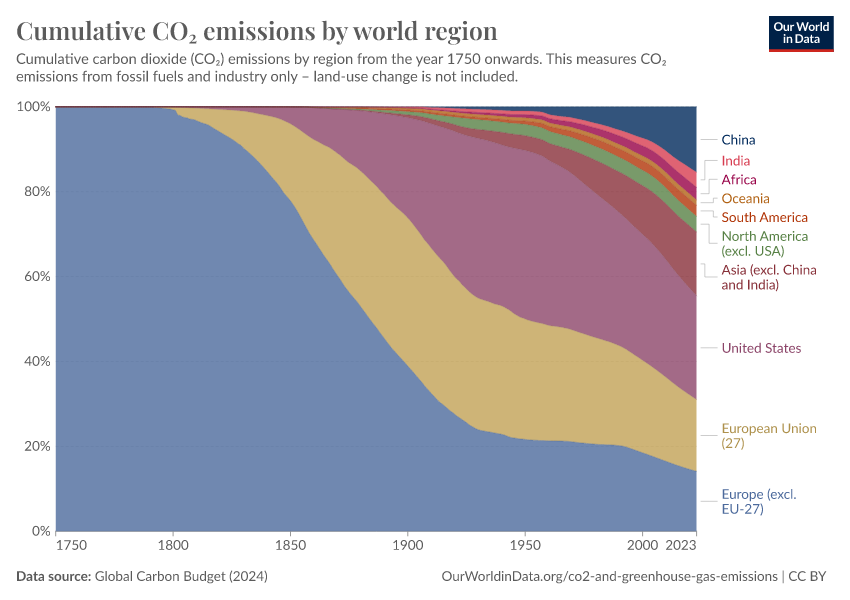
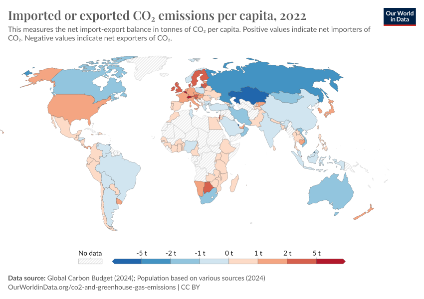
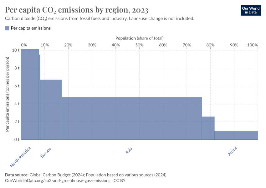
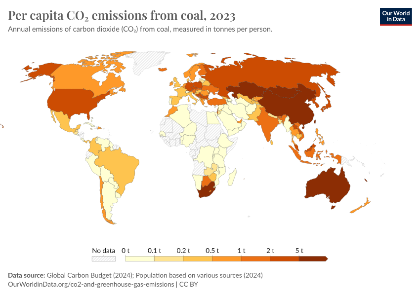
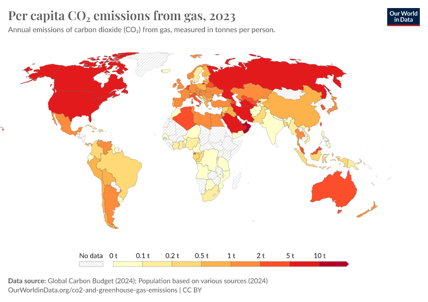
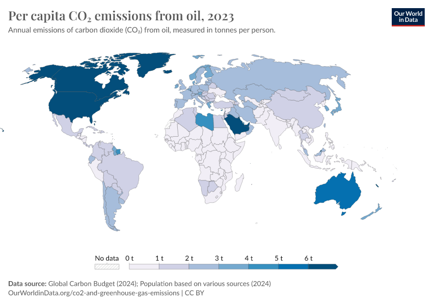
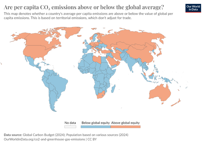
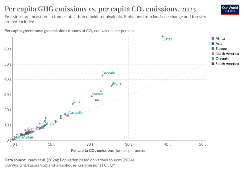
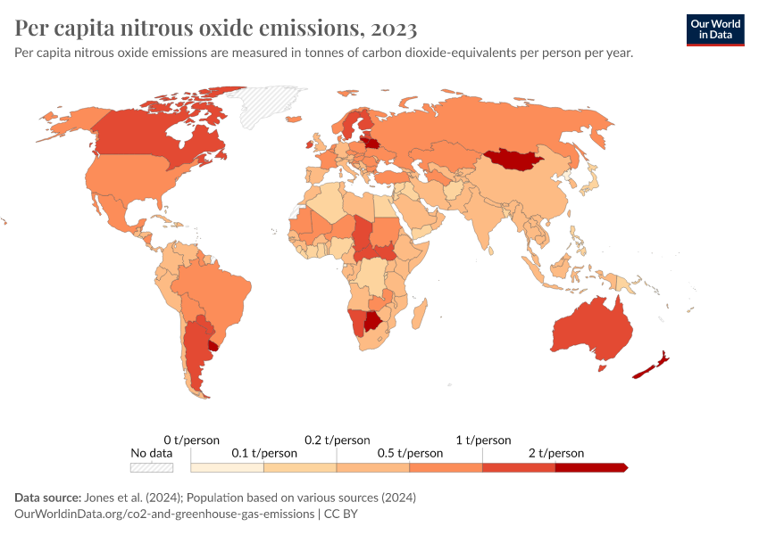
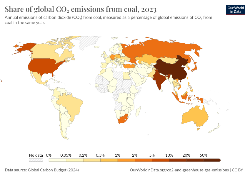
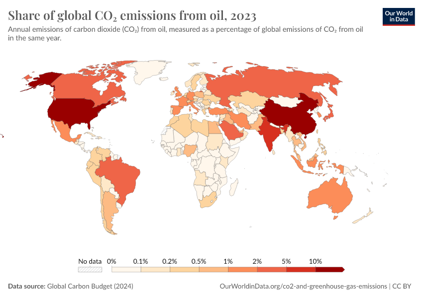
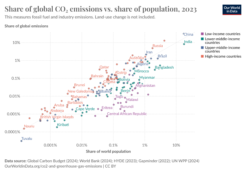
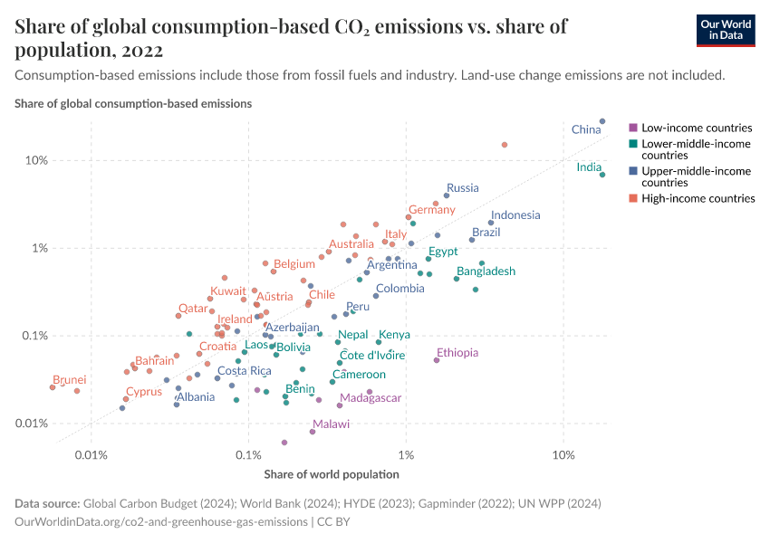
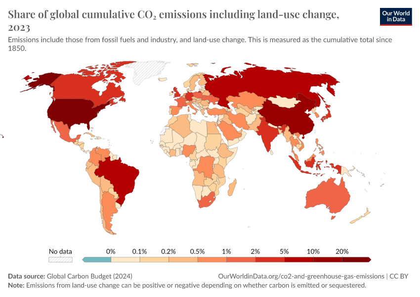
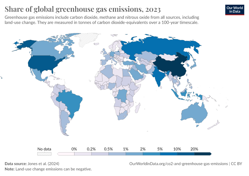
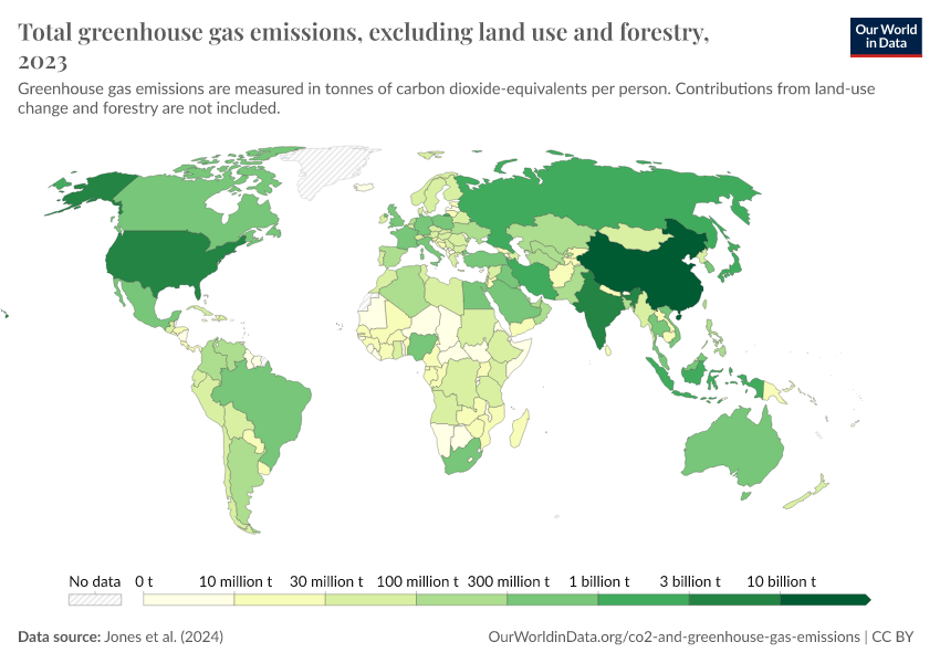
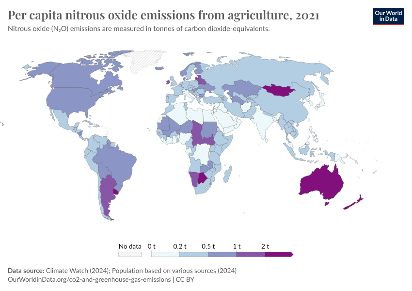
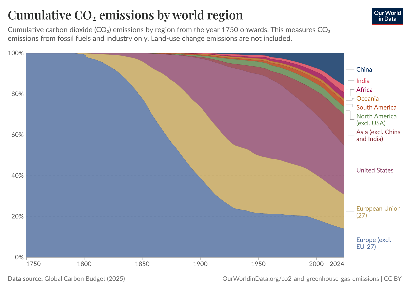
There are large differences in emissions across the world
There is no single metric that captures the distribution of CO2 emissions across the world, today or in the past.
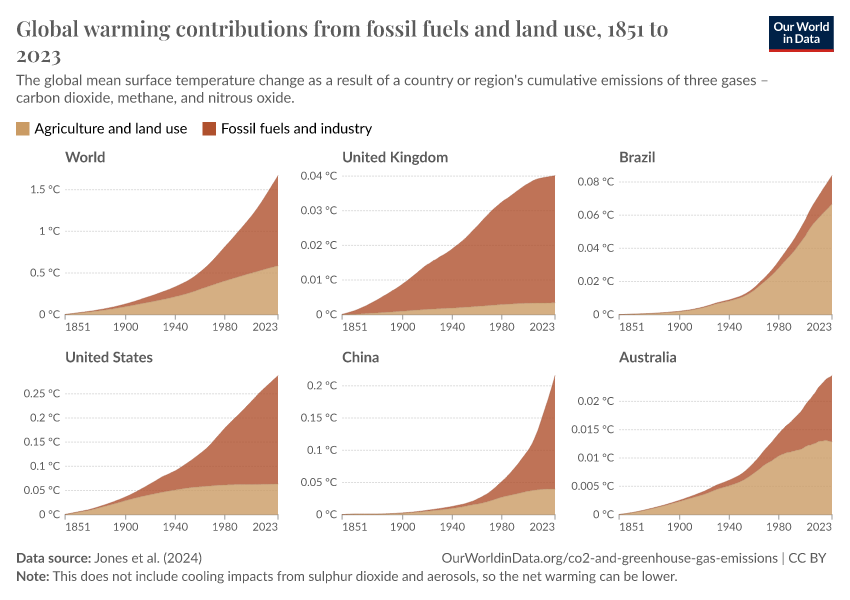
We can compare the total emissions of countries every year. But this fails to take population size into account; you’d expect a country with more people to have higher emissions. Even then, comparisons of total or per capita emissions today don’t capture historical contributions. Some countries that now have relatively low emissions have had high emissions for centuries.
These metrics tell us different things. We make all of them available by country in our data explorer.
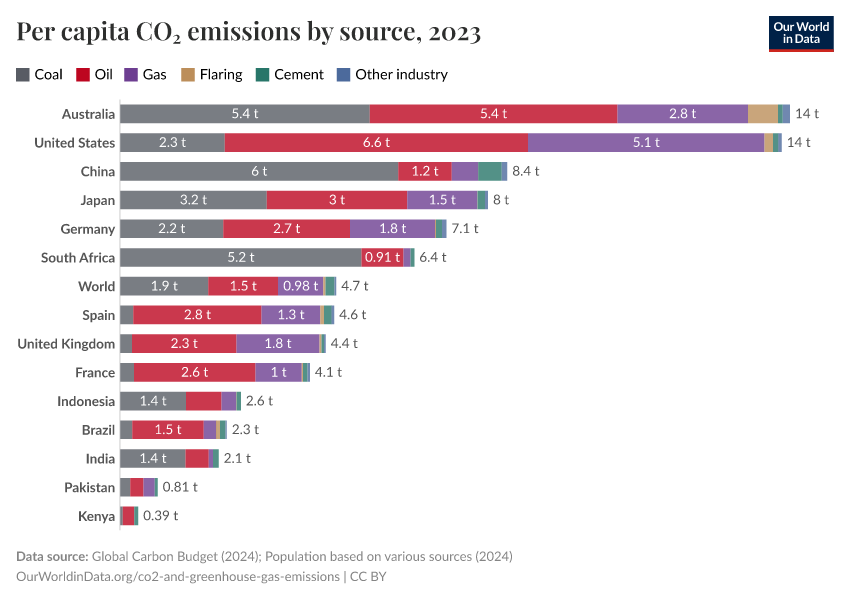
In the chart, we see one metric to compare across the world: emissions per person. There are massive differences in emissions across the globe. Some of the wealthiest countries emit 100 times more per person than the poorest.
Read more:

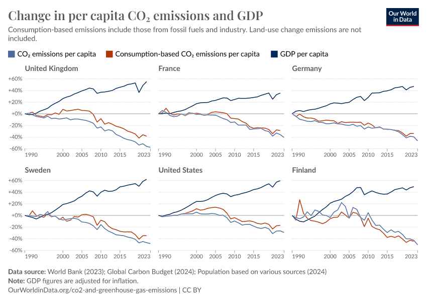
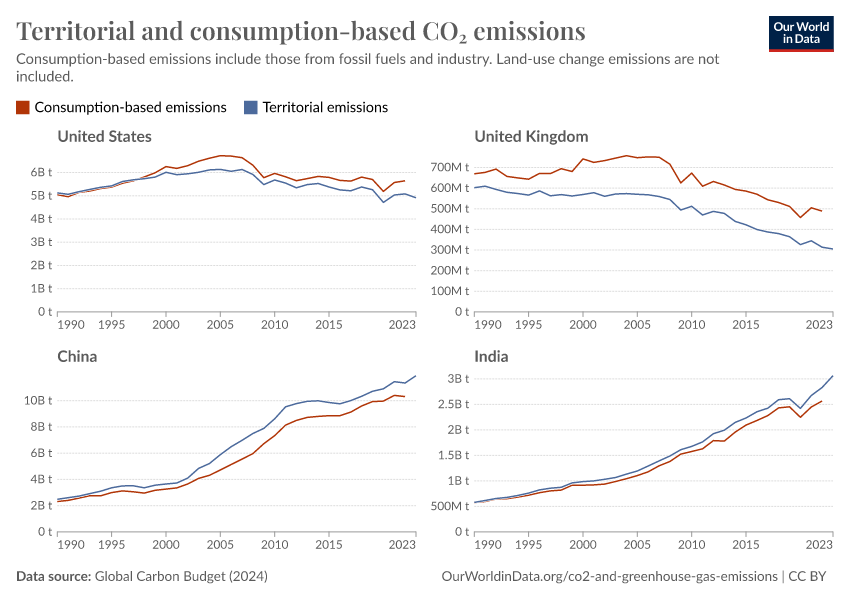
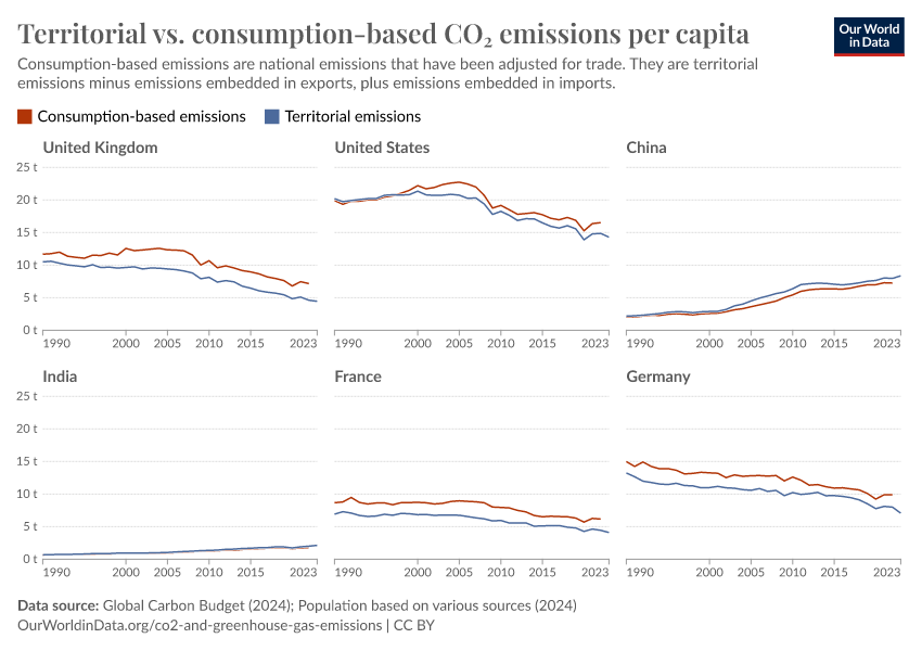
Many countries have reduced their CO₂ emissions
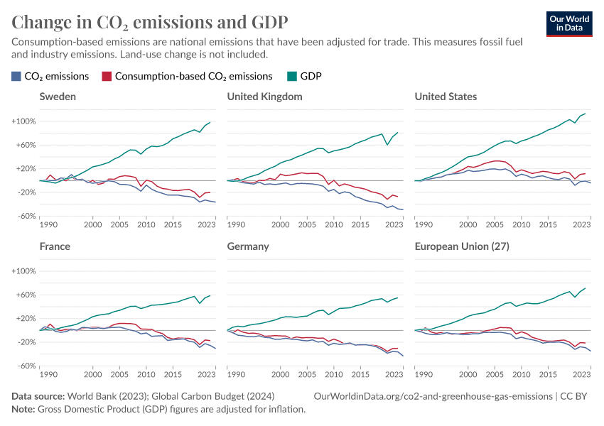
Global emissions are still rising, but many countries have managed to reduce their emissions in recent decades.
Domestic emissions in the UK have roughly halved since 1970. Emissions in the European Union have fallen by more than one-quarter.
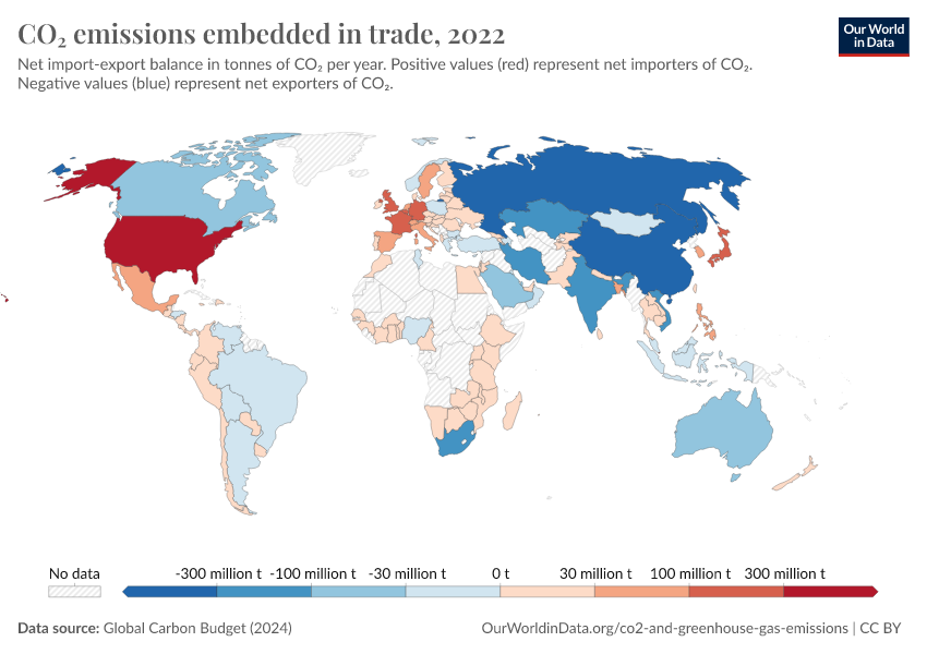
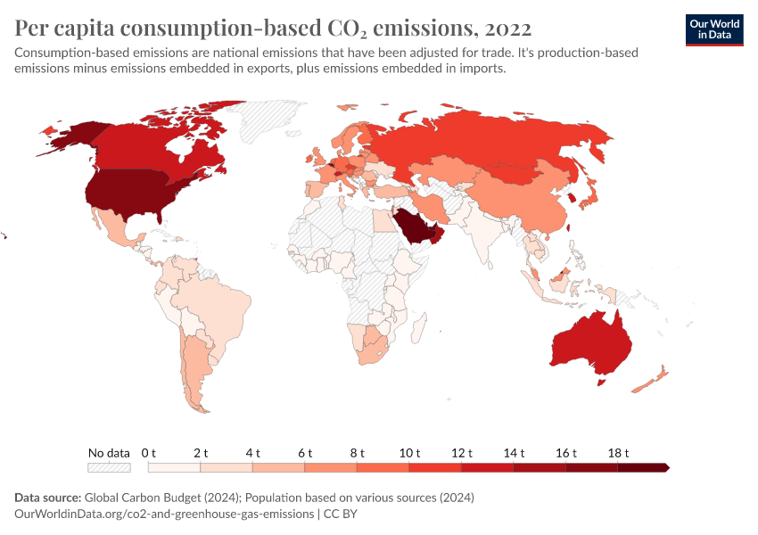
Part of this is because many rich countries have ‘offshored’ some of their emissions by importing CO2-intensive goods manufactured elsewhere – but we still see a significant decline in emissions after adjusting for trade. Consumption-based CO2 emissions have declined very substantially in many countries.
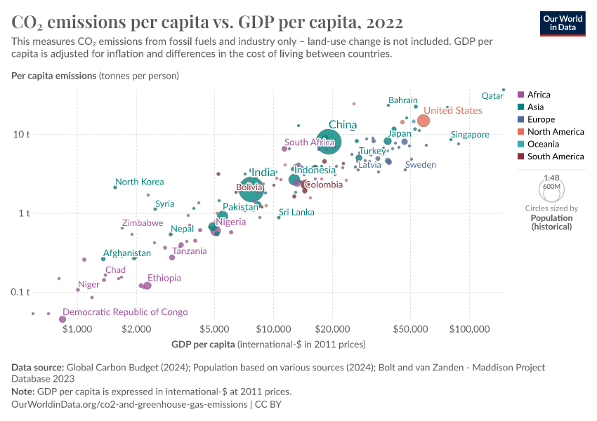
Many of these countries have grown their economies at the same time: GDP per capita has increased while consumption-based emissions have fallen. The chart shows the data for various countries that have achieved this decoupling.
Read more:
What you should know about this data
- Consumption-based emissions adjust for imported and exported emissions based on global trade flows. These emissions are domestic emissions plus imported emissions minus exported emissions.
- CO2 emissions are for fossil fuel and industrial emissions only. Land use changes are not included but can be viewed in our data explorer.
Research & Writing
September 27, 2023
Per capita, national, historical: how do countries compare on CO2 metrics?
There are many ways to measure countries’ contributions to climate change. What do they tell us?
December 1, 2021
Many countries have decoupled economic growth from CO₂ emissions, even if we take offshored production into account
It is possible to reduce emissions while growing the economy. But this decoupling needs to happen faster.
September 29, 2023
How much CO2 can the world emit while keeping warming below 1.5°C and 2°C?
The budget to keep temperatures below 1.5°C is less than a decade of current emissions. For 2°C, it’s less than three decades.
Overview Articles
Emissions from Energy
November 3, 2021
Fossil fuel subsidies: If we want to reduce greenhouse gas emissions we should not pay people to burn fossil fuels
December 10, 2020
The world’s energy problem
February 10, 2020
What are the safest and cleanest sources of energy?
December 1, 2020
Why did renewables become so cheap so fast?
Emissions from Transport
October 6, 2020
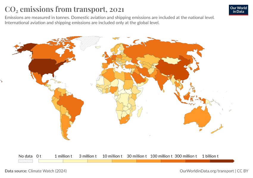
Cars, planes, trains: where do CO₂ emissions from transport come from?
August 30, 2023
Which form of transport has the smallest carbon footprint?
November 9, 2020
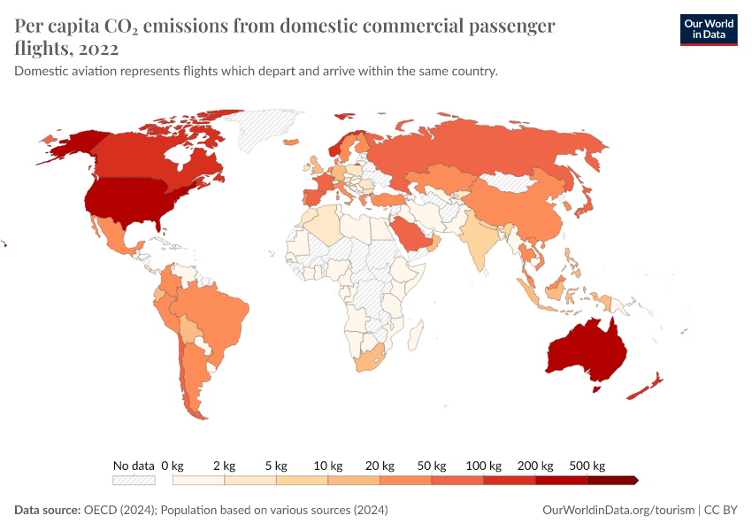
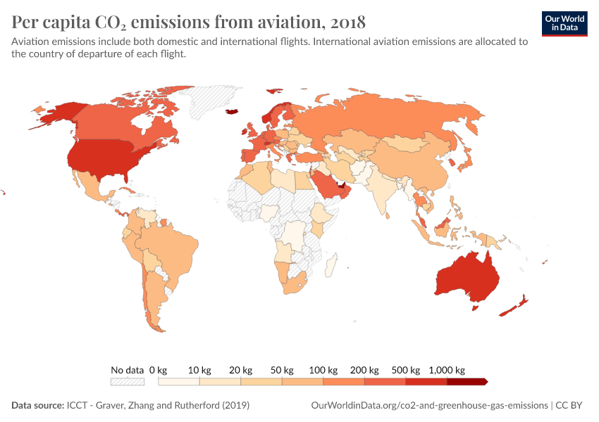
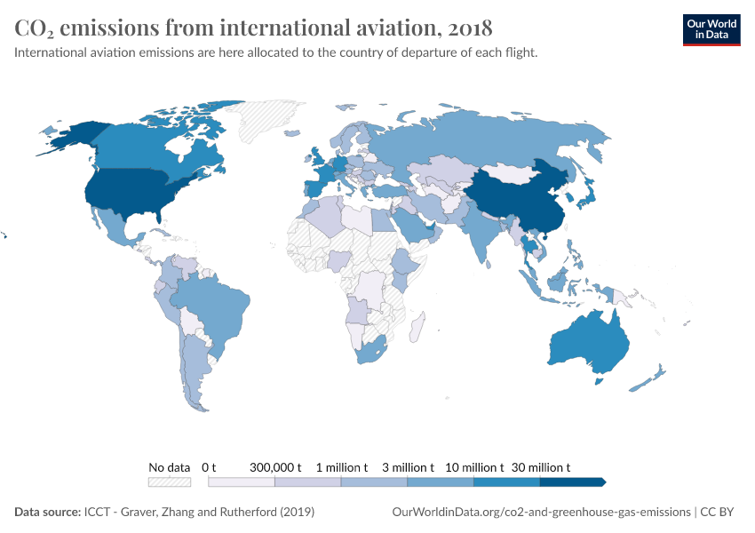
Where in the world do people have the highest CO2 emissions from flying?
April 8, 2024
What share of global CO₂ emissions come from aviation?
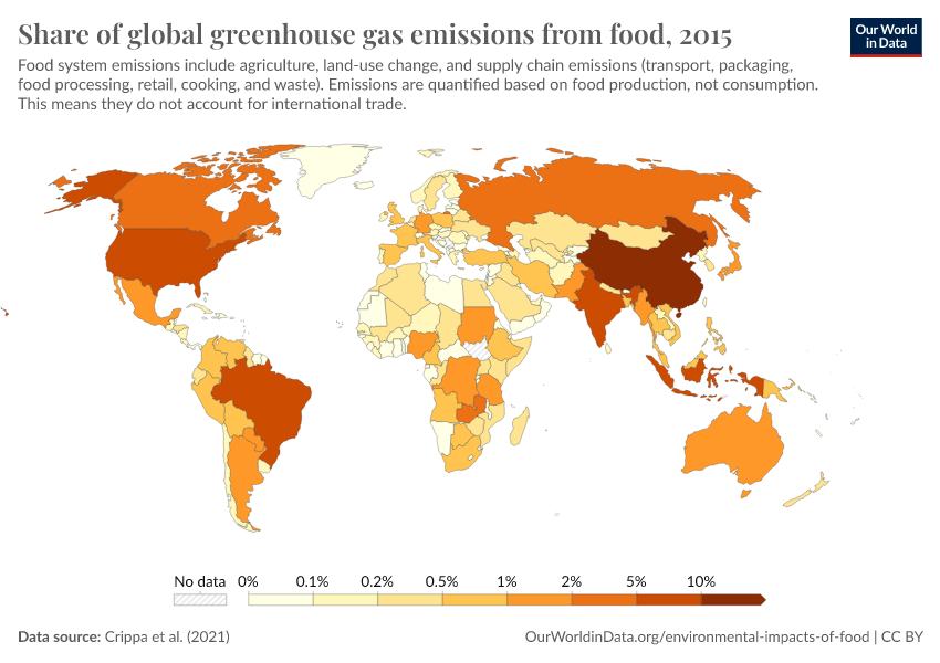
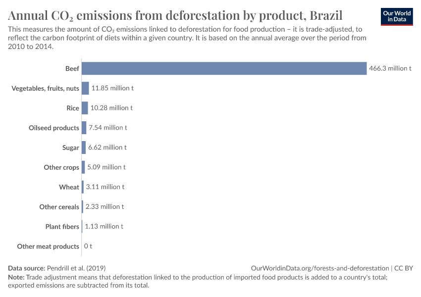
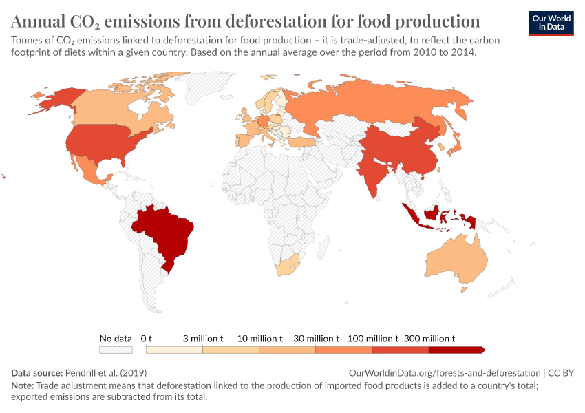
Emissions from Food
June 10, 2021
Emissions from food alone could use up all of our budget for 1.5°C or 2°C – but we have a range of opportunities to avoid this
November 6, 2019
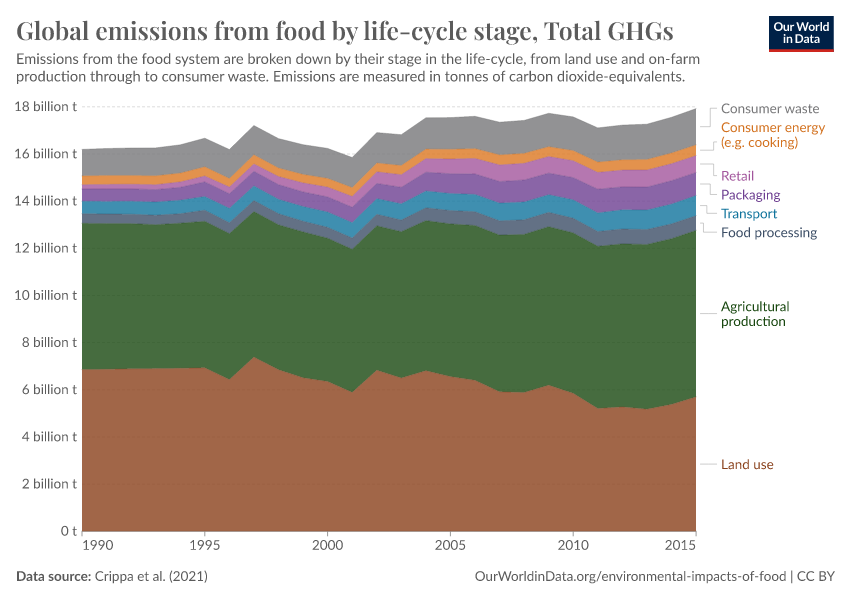
Food production is responsible for one-quarter of the world’s greenhouse gas emissions
March 18, 2020
Food waste is responsible for 6% of global greenhouse gas emissions
March 18, 2021
How much of global greenhouse gas emissions come from food?
February 4, 2020
Less meat is nearly always better than sustainable meat, to reduce your carbon footprint
January 24, 2020
You want to reduce the carbon footprint of your food? Focus on what you eat, not whether your food is local
More Key Articles on Greenhouse Gas Emissions
June 1, 2021
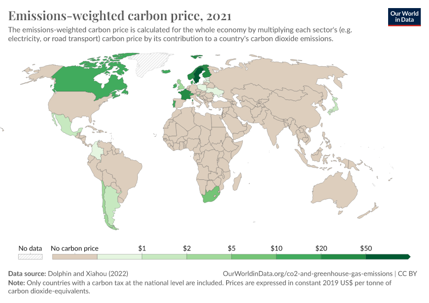
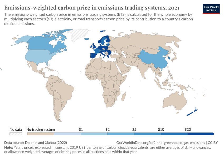
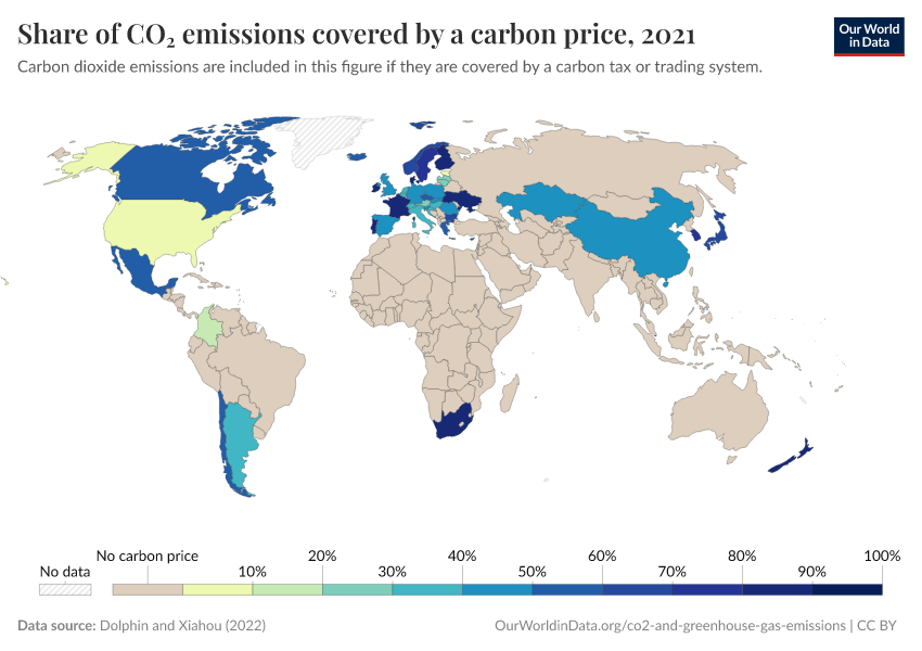
The argument for a carbon price
October 14, 2022
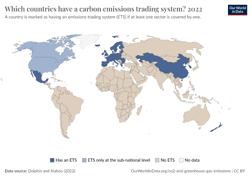
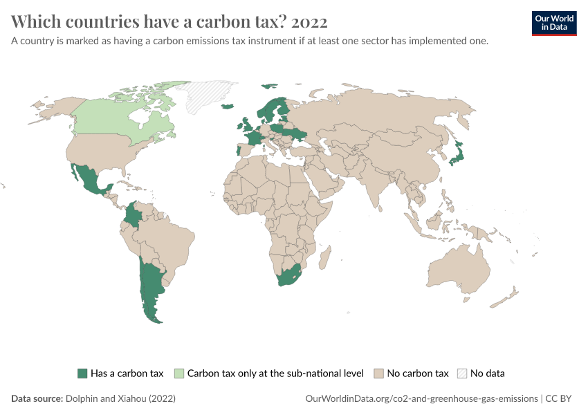
Which countries have put a price on carbon?
September 18, 2020
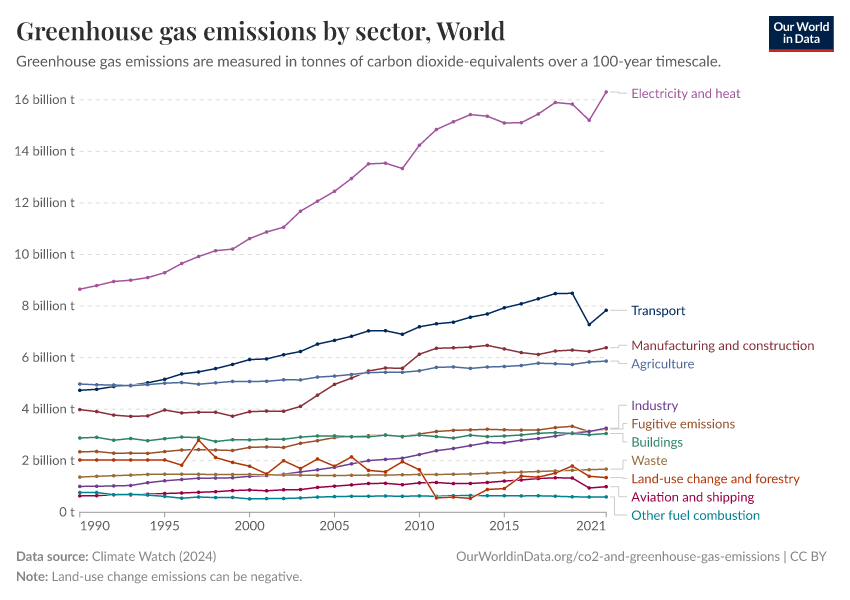
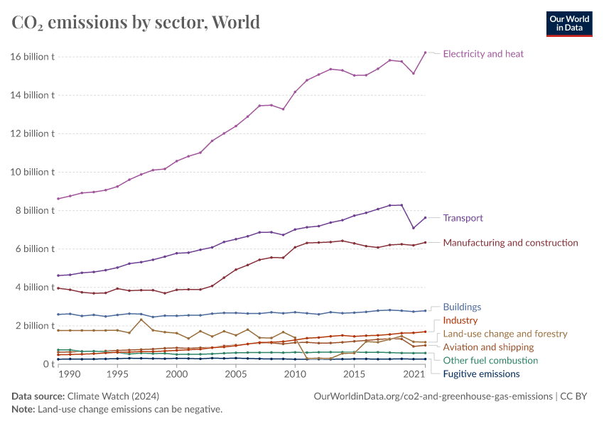
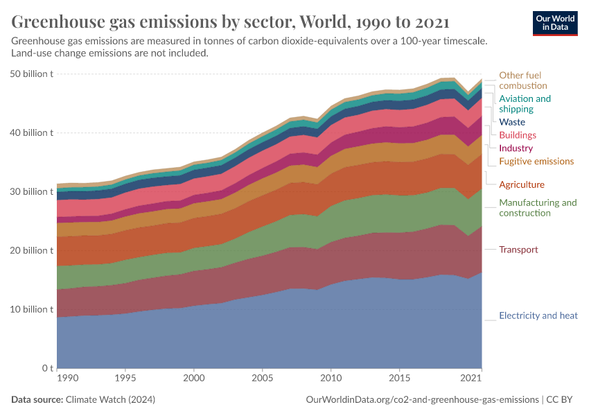
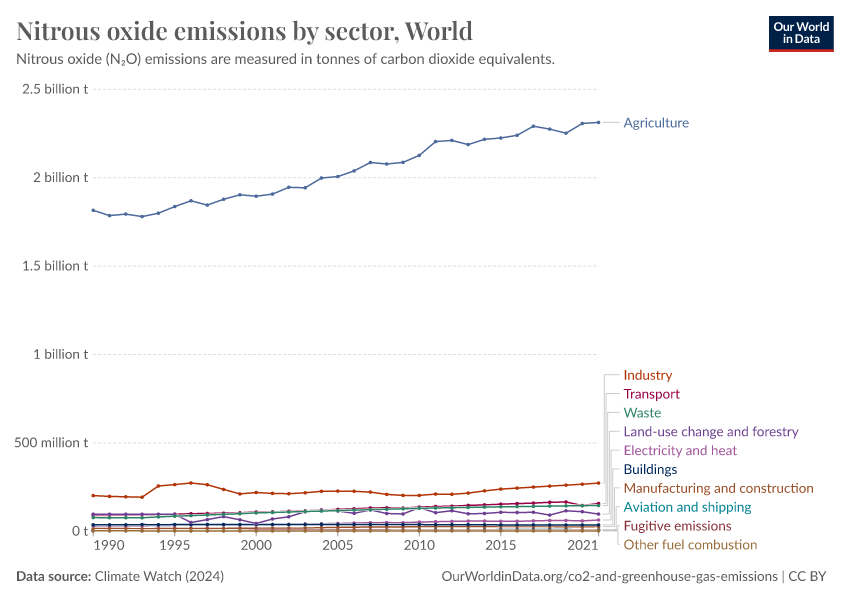
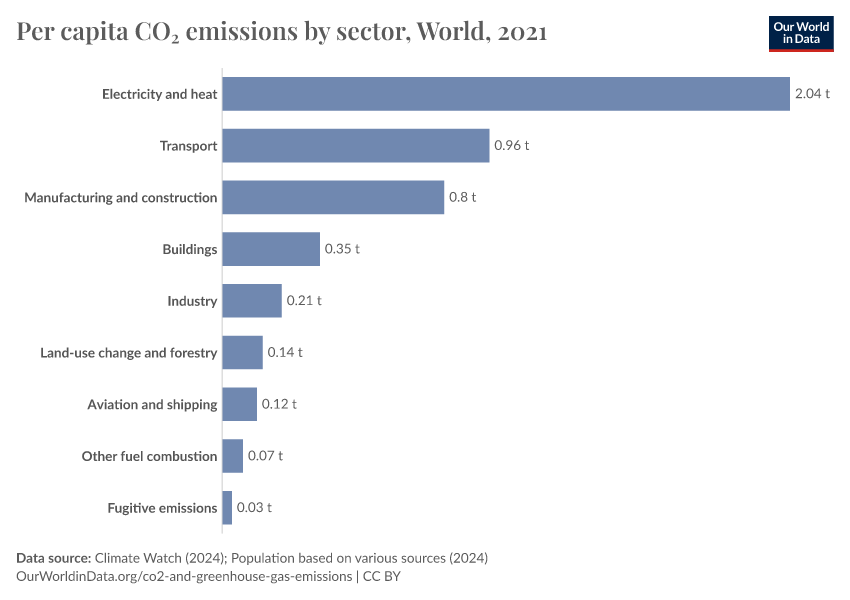
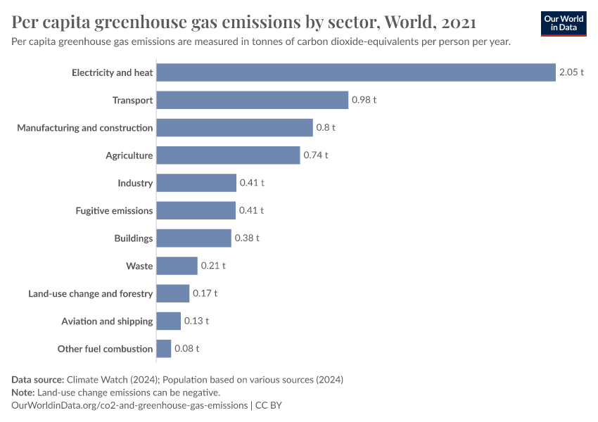
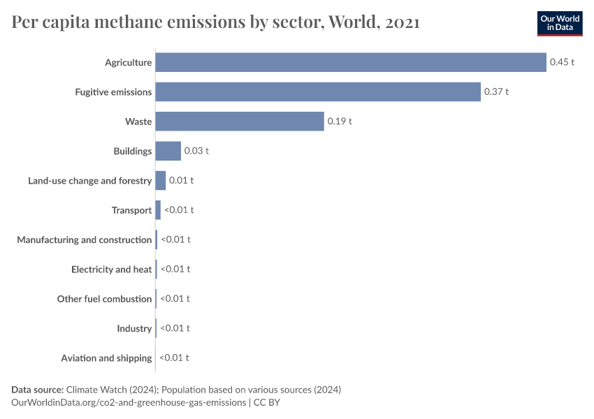
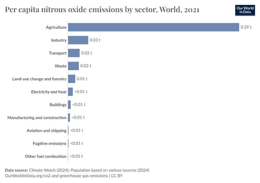
Sector by sector: where do global greenhouse gas emissions come from?
October 7, 2019
How do CO2 emissions compare when we adjust for trade?
August 31, 2023
Global inequalities in CO2 emissions
Country Profiles
Explore the key metrics on CO₂ and Greenhouse Gas Emissions for a country of your choice. How do its emissions compare with other countries, both now and in the past?


Key Charts on CO2 & Greenhouse Gas Emissions
See all charts on this topic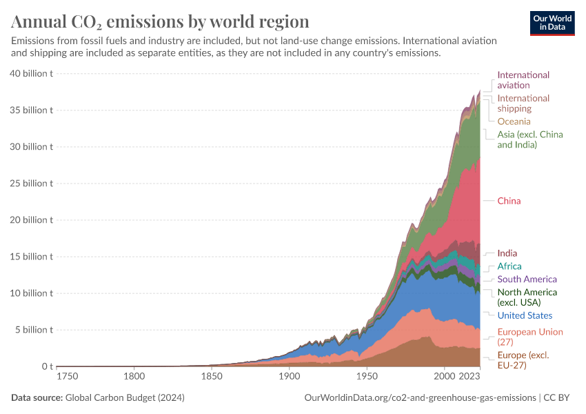


Featured Data on CO2 & Greenhouse Gas Emissions
Endnotes
IPCC, 2021: Climate Change 2021: The Physical Science Basis. Contribution of Working Group I to the Sixth Assessment Report of the Intergovernmental Panel on Climate Change [Masson-Delmotte, V., P. Zhai, A. Pirani, S.L. Connors, C. Péan, S. Berger, N. Caud, Y. Chen, L. Goldfarb, M.I. Gomis, M. Huang, K. Leitzell, E. Lonnoy, J.B.R. Matthews, T.K. Maycock, T. Waterfield, O. Yelekçi, R. Yu, and B. Zhou (eds.)]. Cambridge University Press, Cambridge, United Kingdom and New York, NY, USA, In press, doi:10.1017/9781009157896.
Lacis, A. A., Schmidt, G. A., Rind, D., & Ruedy, R. A. (2010). Atmospheric CO₂: Principal control knob governing Earth’s temperature. Science, 330(6002), 356-359.
Morice, C.P., J.J. Kennedy, N.A. Rayner, J.P. Winn, E. Hogan, R.E. Killick, R.J.H. Dunn, T.J. Osborn, P.D. Jones and I.R. Simpson (in press) An updated assessment of near-surface temperature change from 1850: the HadCRUT5 dataset. Journal of Geophysical Research (Atmospheres) doi:10.1029/2019JD032361 (supporting information).
The underlying data for this chart is sourced from the Climate Action Tracker – based on policies and pledges as of April 2022.
Cite this work
Our articles and data visualizations rely on work from many different people and organizations. When citing this topic page, please also cite the underlying data sources. This topic page can be cited as:
Hannah Ritchie, Pablo Rosado, and Max Roser (2023) - “CO₂ and Greenhouse Gas Emissions” Published online at OurWorldinData.org. Retrieved from: 'https://ourworldindata.org/co2-and-greenhouse-gas-emissions' [Online Resource]BibTeX citation
@article{owid-co2-and-greenhouse-gas-emissions,
    author = {Hannah Ritchie and Pablo Rosado and Max Roser},
    title = {CO₂ and Greenhouse Gas Emissions},
    journal = {Our World in Data},
    year = {2023},
    note = {https://ourworldindata.org/co2-and-greenhouse-gas-emissions}
}
Reuse this work freely
All visualizations, data, and articles produced by Our World in Data are completely open access under the Creative Commons BY license. You have the permission to use, distribute, and reproduce these in any medium, provided the source and authors are credited.
The data produced by third parties and made available by Our World in Data is subject to the license terms from the original third-party authors. We will always indicate the original source of the data in our documentation, so you should always check the license of any such third-party data before use and redistribution.
All of our charts can be embedded in any site.