Breakdown of carbon dioxide, methane, and nitrous oxide emissions by sector
How much do electricity, transport, and land use contribute to different greenhouse gas emissions?
Global greenhouse gas emissions continue to rise at a time when they need to be rapidly falling.
To effectively reduce emissions, we need to know where they come from – which sectors contribute the most? How can we use this understanding to develop effective solutions and mitigation strategies?
In this article, we look at the breakdown of total greenhouse gas emissions, and the individual gases – carbon dioxide, methane, and nitrous oxide individually – by sector and country.
You can find our article with a high-resolution breakdown of global greenhouse gas emissions by sub-sector here:
By country: greenhouse gas emissions by sector
Annual greenhouse gas emissions by sector
Where do our greenhouse gas emissions come from?
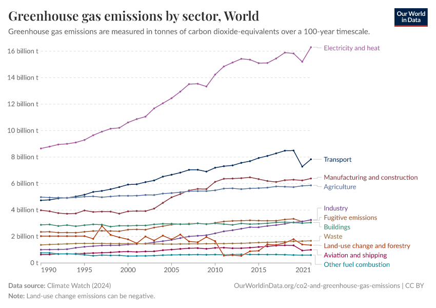
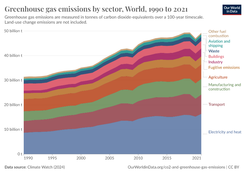
This chart shows the breakdown of total greenhouse gases (the sum of all greenhouse gases, measured in tonnes of carbon dioxide equivalents) by sector.
Electricity and heat production are the largest contributors to global emissions. This is followed by transport, manufacturing, construction (largely cement and similar materials), and agriculture.
But this is not the same everywhere. If we look at the United States, for example, transport is a much larger contributor than the global average. In Brazil, most emissions come from agriculture and land use change.
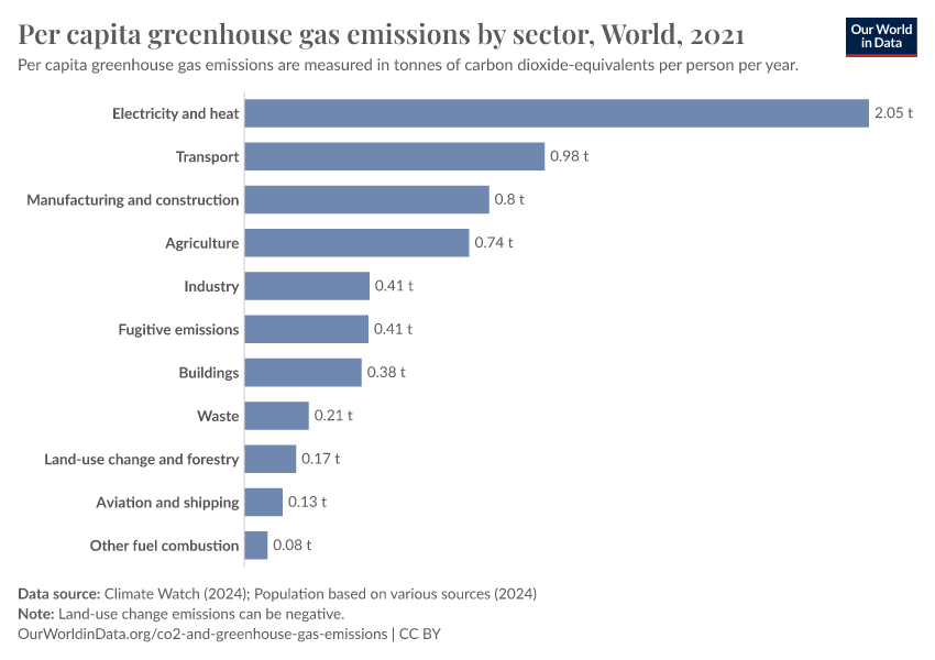
Per capita greenhouse gas emissions: where do our emissions come from?
Looking at the breakdown of greenhouse gases by sector on aggregate is essential for countries to understand where emissions reductions could have the largest impact. But it can often be unintuitive for individuals to see where their emissions are coming from.
In this chart, we show how the average person's emissions would be distributed across the different sectors. In effect, this shows the average footprint, measured in tonnes of carbon dioxide equivalents per year.
CO2 emissions by sector
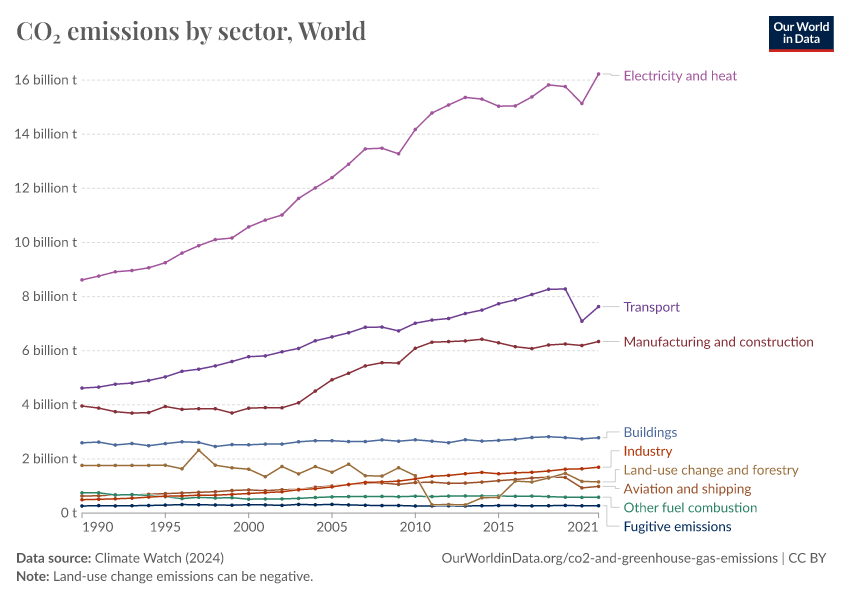
Annual CO2 emissions by sector
The above charts looked at total greenhouse gas emissions – this included other gases such as methane, nitrous oxide, and smaller trace gases.
How does this breakdown look if we focus only on carbon dioxide (CO2) emissions?
This chart shows the distribution of CO2 emissions across sectors.
The global breakdown for CO2 is similar to that of total greenhouse gases – electricity and heat production dominate, followed by transport, manufacturing, and construction. One key difference is that direct agricultural emissions (if we exclude land use change and forestry) are not shown; most direct emissions from agriculture result from methane (production from livestock) and nitrous oxide (released from the application of fertilizers).
Like total greenhouse gas emissions, this breakdown varies between countries.
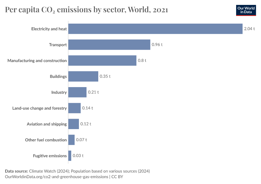
Per capita CO2: where do our emissions come from?
In this chart, we show the per capita breakdown of CO2 emissions by sector. This is measured in tonnes per person per year.
This allows us to better understand our domestic carbon footprint. However, it is not adjusted for the goods and services we buy from other countries.
Methane (CH4) emissions by sector
Annual CH4 emissions by sector
The breakdown of CO2 emissions mirrors total greenhouse gas emissions closely.
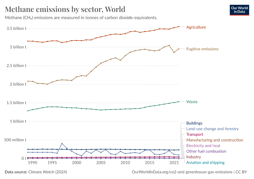
The distribution of methane emissions across sectors is notably different. This chart shows methane emissions by sector, measured in tonnes of carbon dioxide equivalents.
We see that, globally, agriculture is the largest contributor to methane emissions. Most of this methane comes from livestock (they produce methane through their digestive processes, known as “enteric fermentation”). Rice production is also a large contributor to methane emissions.
Aside from agriculture, fugitive emissions produce a significant amount of methane. “Fugitive emissions” represent the unintentional gas leaks from processes such as fracking and more traditional oil and gas extraction and transportation. This can happen when gas is transported through poorly maintained pipes, for example.
Waste is the third largest contributor. Methane is produced in landfills when organic materials decompose.
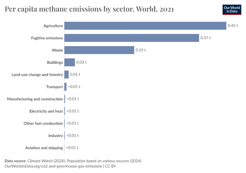
Per capita CH4: where do our emissions come from?
In this chart, we show the per capita breakdown of methane (CH4) emissions by sector. This is measured in tonnes per person per year.
Nitrous oxide (N2O) emissions by sector
Annual N2O emissions by sector
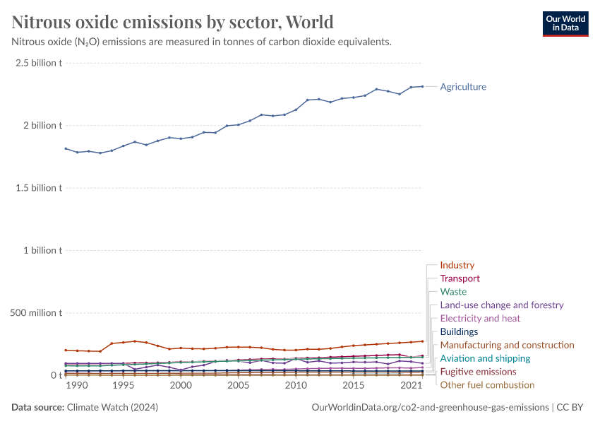
Nearly all of our nitrous oxide (N2O) emissions come from agriculture, as this chart shows.
Nitrous oxide is produced by microbes in nearly all soils. However, applying nitrogen fertilizers makes much more nitrogen readily available for microbes to convert to N2O – this is because not all of the applied nutrients are taken up by crops.
As the application of nitrogen fertilizers has rapidly increased over the past 50 years in particular, N2O emissions have also increased. But nitrous oxide is not only produced when synthetic nitrogen fertilizer is applied; the same processes occur when we use organic fertilizers such as animal manure.
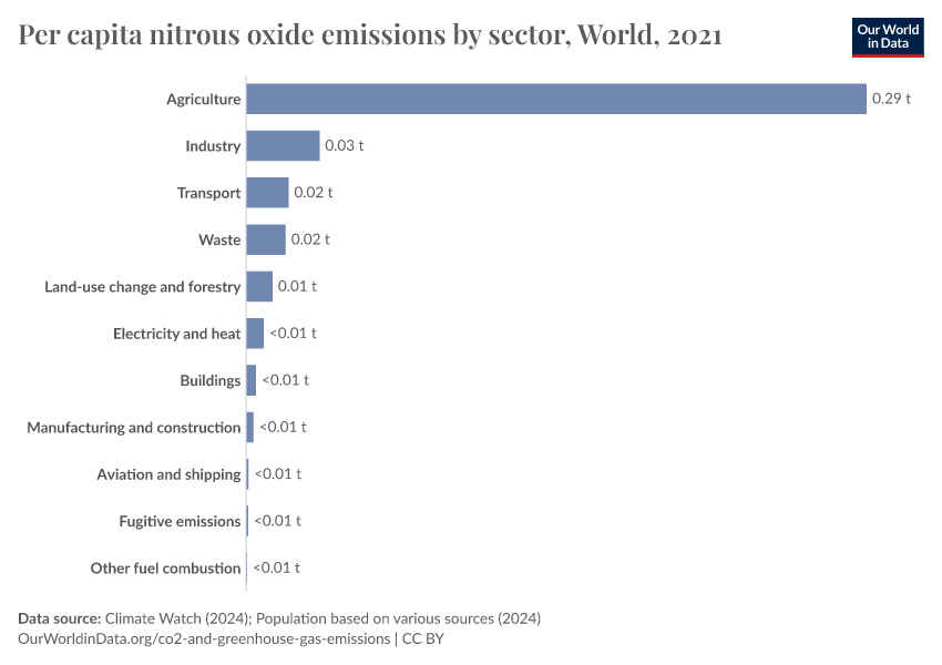
Per capita N2O: where do our emissions come from?
In this chart, we show the per capita breakdown of nitrous oxide (N2O) emissions by sector. This is measured in tonnes per person per year.
As expected, nearly all of our nitrous oxide emissions come from agriculture.
Cite this work
Our articles and data visualizations rely on work from many different people and organizations. When citing this article, please also cite the underlying data sources. This article can be cited as:
Hannah Ritchie, Pablo Rosado, and Max Roser (2020) - “Breakdown of carbon dioxide, methane, and nitrous oxide emissions by sector” Published online at OurWorldinData.org. Retrieved from: 'https://archive.ourworldindata.org/20260417-112857/emissions-by-sector.html' [Online Resource] (archived on April 17, 2026).BibTeX citation
@article{owid-emissions-by-sector,
    author = {Hannah Ritchie and Pablo Rosado and Max Roser},
    title = {Breakdown of carbon dioxide, methane, and nitrous oxide emissions by sector},
    journal = {Our World in Data},
    year = {2020},
    note = {https://archive.ourworldindata.org/20260417-112857/emissions-by-sector.html}
}
Reuse this work freely
All visualizations, data, and articles produced by Our World in Data are completely open access under the Creative Commons BY license. You have the permission to use, distribute, and reproduce these in any medium, provided the source and authors are credited.
The data produced by third parties and made available by Our World in Data is subject to the license terms from the original third-party authors. We will always indicate the original source of the data in our documentation, so you should always check the license of any such third-party data before use and redistribution.
All of our charts can be embedded in any site.
