CO₂ emissions by fuel
Coal, oil, gas or flaring: where do our CO₂ emissions come from? How are emissions from these fuels changing over time?
Carbon dioxide (CO2) emissions from energy and material production can arise from various sources and fuel types: coal, oil, gas, cement production, and gas flaring.
As global and national energy systems have transitioned over centuries and decades, the contribution of different fuel sources to CO2 emissions has changed both geographically and temporally.
In this article we look at the breakdown of CO2 emissions by fuel type, looking at the largest emitters of the past; the largest emitters today; and how these compare when we look at per capita adjustments.
CO2 emissions by fuel type
Coal, oil, gas, cement: where do CO2 emissions come from?
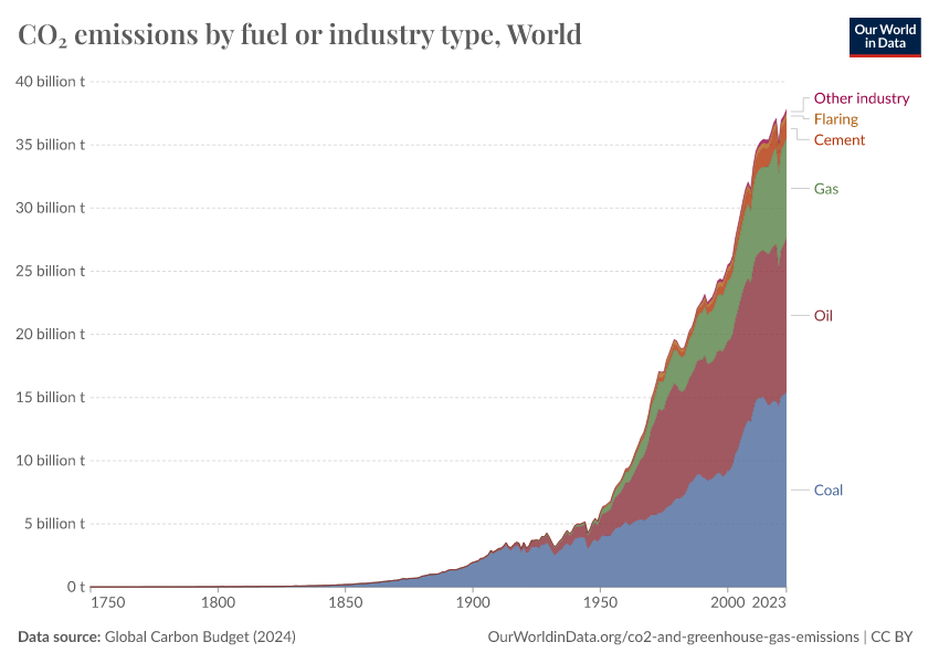
Carbon dioxide emissions associated with energy and industrial production can come from a range of fuel types. The contribution of each of these sources has changed significantly through time and still shows large differences by region. In the chart we see the absolute and relative contribution of CO2 emissions by source, differentiated between coal, gas, oil, flaring, and cement production.
At a global level, we see that early industrialization was dominated by the use of solid fuel.
Coal-fired power at an industrial scale was the first to emerge in Europe and North America during the 1700s. It wasn’t until the late 1800s that we began to see a growth in emissions from oil and gas production. Another century passed before emissions from flaring and cement production began.
Today, solid and liquid fuels dominate, although contributions from gas production are also notable. Cement and flaring at the global level remain comparably small.
The trends vary significantly by region. Overall patterns across Europe and North America are similar: early industrialization began through solid fuel consumption, however, through time this energy mix has diversified. Today, CO2 emissions are spread fairly equally between coal, oil, and gas. In contrast, Latin America and the Caribbean’s emissions have historically been and remain a product of liquid fuel—even in the early stages of development coal consumption was small.1
Asia’s energy remains dominant in solid fuel consumption and has notably higher cement contributions relative to other regions.2
Africa also has more notable emissions from cement and flaring; however, its key sources of emissions are a diverse mix of solid, liquid, and gas.
Per capita: How do coal, oil, gas, and cement emissions compare?
Total emissions from different sources – coal, oil, gas, and cement – largely reflect the population of a given country.
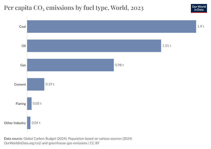
How do these figures compare when we look at them on a per capita basis? This chart shows per capita CO2 emissions from coal, oil, gas, flaring, and cement, measured in tonnes of CO2 per year.
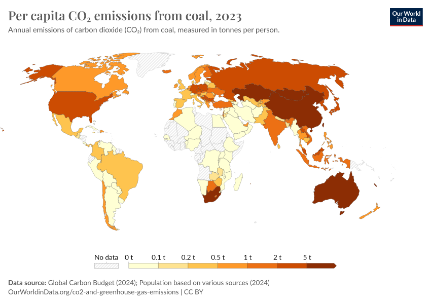
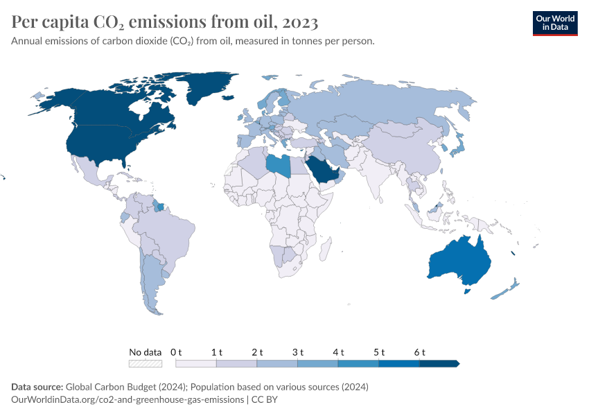
The distribution across different fuel sources is very dependent on energy production and mix in a given country. In the US or the UK, for example, oil followed by gas are the largest contributors. In China and India, coal is much more dominant. In Russia, it's gas.
Emissions from coal
Annual CO2 emissions from coal
Which countries are the largest CO2 emitters from coal production?
This interactive chart shows annual emissions from coal production by country, over time.
What becomes clear when we look across countries is how coal production has shifted over time. Throughout the 19th and 20th centuries, coal production was dominant across countries in Europe (predominantly the UK) and the United States. However, energy transitions in these countries have resulted in significant declines in recent decades.
Emissions from coal have since shifted elsewhere: in recent decades we have seen a rapid rise in emissions from industrializing economies such as China, India, and South Africa.
Per capita CO2 emissions from coal
How do emissions from coal compare when we adjust for population?
This interactive chart shows per capita CO2 emissions from coal, measured in tonnes per person per year.
Emissions from oil
Annual CO2 emissions from oil
Which countries are the largest CO2 emitters of oil?
This interactive chart shows annual emissions from oil by country, over time.
Per capita CO2 emissions from oil
How do emissions from oil compare when we adjust for population?
This interactive chart shows per capita CO2 emissions from oil, measured in tonnes per person per year.
Emissions from gas
Annual CO2 emissions from gas
Which countries are the largest CO2 emitters of gas?
This interactive chart shows annual emissions from gas by country, over time.
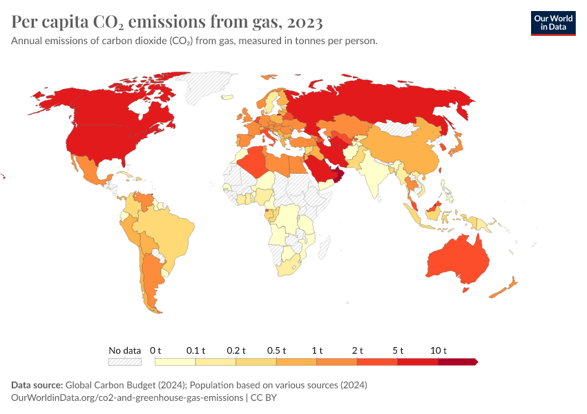
Per capita CO2 emissions from gas
How do emissions from gas compare when we adjust for population?
This interactive chart shows per capita CO2 emissions from gas, measured in tonnes per person per year.
Emissions from cement production
Annual CO2 emissions from cement
Which countries are the largest CO2 emitters from cement production?
This interactive chart shows annual emissions from cement production by country, over time.
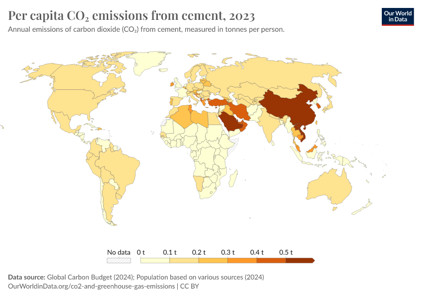
Per capita CO2 emissions from cement
How do emissions from cement production compare when we adjust for population?
This interactive chart shows per capita CO2 emissions from cement production, measured in tonnes per person per year.
Emissions from gas flaring
Annual CO2 emissions from gas flaring
Which countries are the largest CO2 emitters from gas flaring?
This interactive chart shows annual emissions from gas flaring by country, over time.
What is gas flaring?
Gas flaring is the burning of natural gas, often on oil or gas extraction sites.
Gas can be produced as a by-product during oil extraction and refining. If there are no on-site uses for the gas, refineries can either inject it back into the ground, let it vent to the atmosphere, or burn (i.e. flare) it. This flaring process produces greenhouse gas emissions.
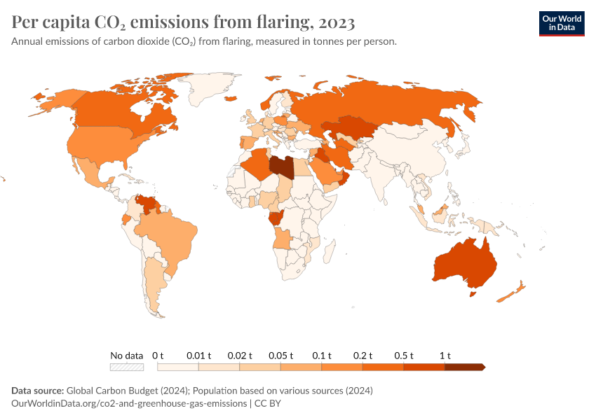
Per capita CO2 emissions from gas flaring
How do emissions from gas flaring compare when we adjust for population?
This interactive chart shows per capita CO2 emissions from gas flaring, measured in tonnes per person per year.
Endnotes
Zilio, M., & Recalde, M. (2011). GDP and environment pressure: the role of energy in Latin America and the Caribbean. Energy Policy, 39(12), 7941-7949. Available at: doi.org/10.1016/j.enpol.2011.09.049
Ali, M. B., Saidur, R., & Hossain, M. S. (2011). A review on emission analysis in cement industries. Renewable and Sustainable Energy Reviews, 15(5), 2252-2261. Available at: doi.org/10.1016/j.rser.2011.02.014
Cite this work
Our articles and data visualizations rely on work from many different people and organizations. When citing this article, please also cite the underlying data sources. This article can be cited as:
Hannah Ritchie, Pablo Rosado, and Max Roser (2020) - “CO₂ emissions by fuel” Published online at OurWorldinData.org. Retrieved from: 'https://archive.ourworldindata.org/20260417-112857/emissions-by-fuel.html' [Online Resource] (archived on April 17, 2026).BibTeX citation
@article{owid-emissions-by-fuel,
    author = {Hannah Ritchie and Pablo Rosado and Max Roser},
    title = {CO₂ emissions by fuel},
    journal = {Our World in Data},
    year = {2020},
    note = {https://archive.ourworldindata.org/20260417-112857/emissions-by-fuel.html}
}
Reuse this work freely
All visualizations, data, and articles produced by Our World in Data are completely open access under the Creative Commons BY license. You have the permission to use, distribute, and reproduce these in any medium, provided the source and authors are credited.
The data produced by third parties and made available by Our World in Data is subject to the license terms from the original third-party authors. We will always indicate the original source of the data in our documentation, so you should always check the license of any such third-party data before use and redistribution.
All of our charts can be embedded in any site.
