How much have temperatures risen in countries across the world?
Explore country-by-country data on monthly temperature anomalies.
In 2015, countries across the world adopted the Paris Agreement, agreeing on a goal to limit global warming “well below 2°C” above pre-industrial temperatures while “pursuing efforts” to limit warming to 1.5°C.
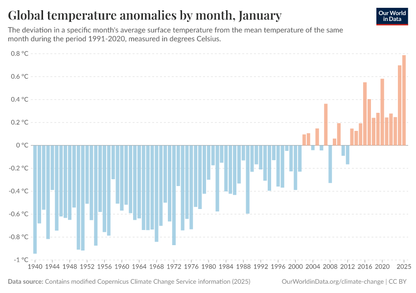
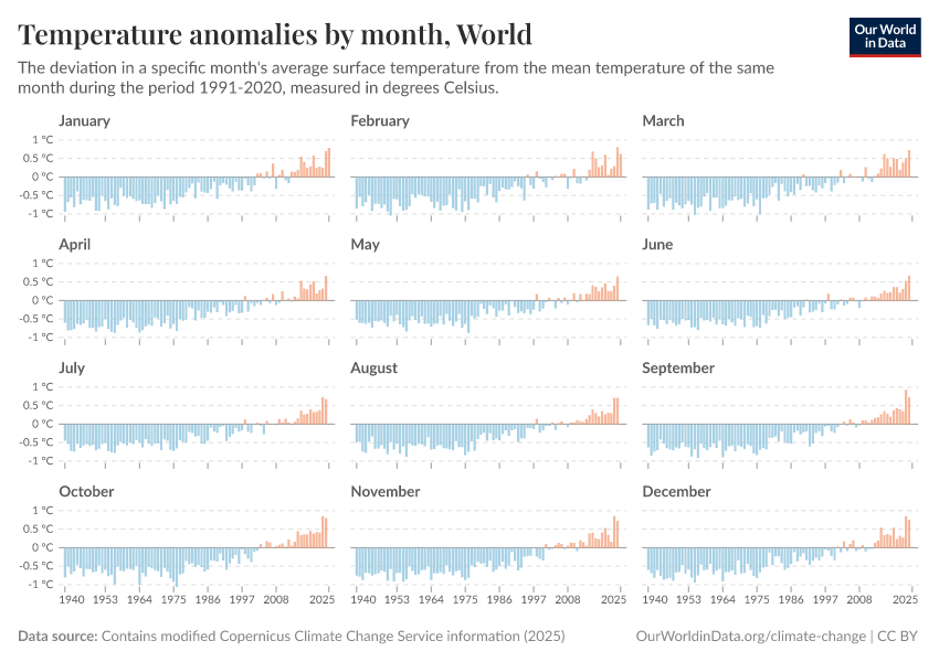
These targets are set based on the rise in the global average temperature. That’s the metric that most organizations use to track our global climate trajectory. You can track these global anomalies by month in the chart below, and see the longer-term time series on Our World in Data.
However, climate change does not affect all areas of the globe uniformly. Some regions are warming faster than others, which matters for local ecosystems, weather patterns, and human impacts.1
To allow people to track temperature changes across the globe, we've made this data explorable at the national level. We have relied on the excellent data from the European Centre for Medium-Range Weather Forecasts (ECMWF) ERA5 project to do this.2
This comprehensive dataset provides high-resolution (31-kilometer square) climate records that include a wide range of atmospheric, ocean-wave, and land-surface variables.3 We’ve used its 2-meter air surface temperature records, which include measurements across land, sea, and inland waters.4
The ERA5 data is structured in a gridded format. We’ve converted this into country-level data using the World Bank's country outlines, making adjustments for geographical disparities from Earth’s curvature. I’ve included some extra details on our methods in the footnotes.5
We will update this article monthly with new data.
Monthly temperature anomalies by country
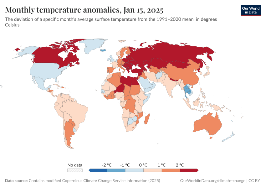
The main metric we use to track global warming is the temperature anomaly.6 This doesn’t tell us the absolute temperature in a given month, but how different it is compared to historical temperatures. In climate research, temperature anomalies are considered a key metric since they tell us about changes over time.7
This anomaly has to be measured relative to a temperature baseline. This baseline is usually established by averaging over several decades of temperature data. A positive anomaly indicates temperatures are warmer than the baseline, whereas a negative anomaly shows cooler conditions. For our analysis, we selected the 1991–2020 period as the reference, which is the ECMF’s default baseline period. So, when we talk about an anomaly in “March,” for example, it means how much the temperature in March of a particular year differs from the average March temperature between 1991 and 2020.
The interactive map below shows monthly temperature anomalies by country. This data can be explored from 1940 onwards using the time slider below the map. You can also explore the annual temperature anomalies data here.
The chart below lets you explore these temperature anomalies over time. Each bar represents the temperature anomaly in a given year. You can also explore this data as a line chart, by decade.
Monthly average temperatures by country
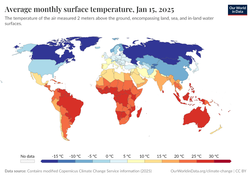
Another way to visualize this data is to look at absolute temperatures rather than anomalies.
On the map below, you can see the average monthly surface temperature by country. Again, this data can be explored from 1940 onwards.
The obvious takeaway from this chart is the large differences in temperature across the world.
The interactive chart below provides an easier way to see these temperature changes over time in a given country. Each line represents the average temperature by month in that year.
You can see that while there is often year-to-year variability, temperatures have been rising. You can also explore this data by decade.
Acknowledgments
I thank Hannah Ritchie, Edouard Mathieu and Pablo Rosado for their very helpful comments on this article and visualizations.
Endnotes
See Rantanen, M., Karpechko, A.Y., Lipponen, A. et al. The Arctic has warmed nearly four times faster than the globe since 1979. Commun Earth Environ 3, 168 (2022). https://doi.org/10.1038/s43247-022-00498-3.
Hersbach, H., Bell, B., Berrisford, P., Biavati, G., Horányi, A., Muñoz Sabater, J., Nicolas, J., Peubey, C., Radu, R., Rozum, I., Schepers, D., Simmons, A., Soci, C., Dee, D., Thépaut, J-N. (2023): ERA5 monthly averaged data on single levels from 1940 to present. Copernicus Climate Change Service (C3S) Climate Data Store (CDS), DOI: 10.24381/cds.f17050d7 (Accessed on 23-Feb-2024).
It synthesizes a vast collection of observational data sources, including satellites, weather stations, and balloons, with models grounded in the laws of physics. This integration has produced a unified, detailed global climate record, offering insights into climate trends worldwide since the 1940s.
The ECMWF calculates ground-level temperatures by using a method that fills in the gaps between the ground and the closest weather data point above it, while also considering the current weather conditions to make the estimates more accurate. These temperatures are initially presented in Kelvin (K), a standard unit of measurement in scientific research. For broader accessibility, temperatures can be converted from Kelvin to degrees Celsius (°C) by subtracting 273.15.
We computed the national average temperatures, acknowledging the need to adjust for the geographical disparities caused by the Earth's curvature. Grid cells closer to the poles cover a smaller physical area than those near the equator. To address this variation and accurately calculate the average temperatures for each country, we applied a mathematical correction using the cosine of the latitude. This adjustment acts as a proxy for the actual size differences among grid cells at various latitudes, ensuring a more accurate representation of temperature data across different parts of the world.
A temperature anomaly signifies the deviation from a baseline or average temperature, mitigating the influence of factors like station location or elevation on the data. This is crucial because while absolute temperatures can vary greatly between locations with different elevations or urbanization levels, anomalies provide a comparative measure highlighting whether a specific area is warmer or cooler than its historical average. For instance, a cooler-than-average summer month will register as such both at a mountaintop and in a valley despite the absolute temperatures at these locations being markedly different. Therefore, we next focused on analyzing these anomalies to gain further insights into climate trends and variations over time.
Smith, T. M., R. W. Reynolds, T. C. Peterson, and J. Lawrimore, 2008: Improvements to NOAA’s Historical Merged Land–Ocean Surface Temperature Analysis (1880–2006). J. Climate, 21, 2283–2296, https://doi.org/10.1175/2007JCLI2100.1.
Cite this work
Our articles and data visualizations rely on work from many different people and organizations. When citing this article, please also cite the underlying data sources. This article can be cited as:
Veronika Samborska (2024) - “How much have temperatures risen in countries across the world?” Published online at OurWorldinData.org. Retrieved from: 'https://archive.ourworldindata.org/20260511-195424/temperature-anomaly.html' [Online Resource] (archived on May 11, 2026).BibTeX citation
@article{owid-temperature-anomaly,
    author = {Veronika Samborska},
    title = {How much have temperatures risen in countries across the world?},
    journal = {Our World in Data},
    year = {2024},
    note = {https://archive.ourworldindata.org/20260511-195424/temperature-anomaly.html}
}
Reuse this work freely
All visualizations, data, and articles produced by Our World in Data are completely open access under the Creative Commons BY license. You have the permission to use, distribute, and reproduce these in any medium, provided the source and authors are credited.
The data produced by third parties and made available by Our World in Data is subject to the license terms from the original third-party authors. We will always indicate the original source of the data in our documentation, so you should always check the license of any such third-party data before use and redistribution.
All of our charts can be embedded in any site.


