COVID-19 Pandemic
The COVID-19 pandemic has had a profound impact on the world. Explore global data and research to understand its impact, spread, and global response.
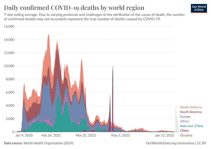
The COVID-19 pandemic has had a profound impact on the world, causing tens of millions of deaths, overwhelming healthcare systems, and disrupting societies and economies.
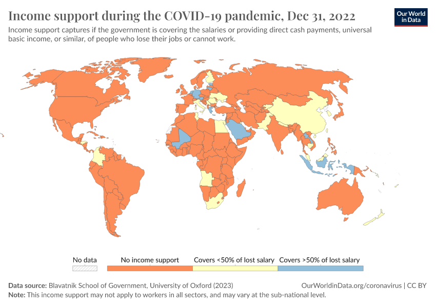
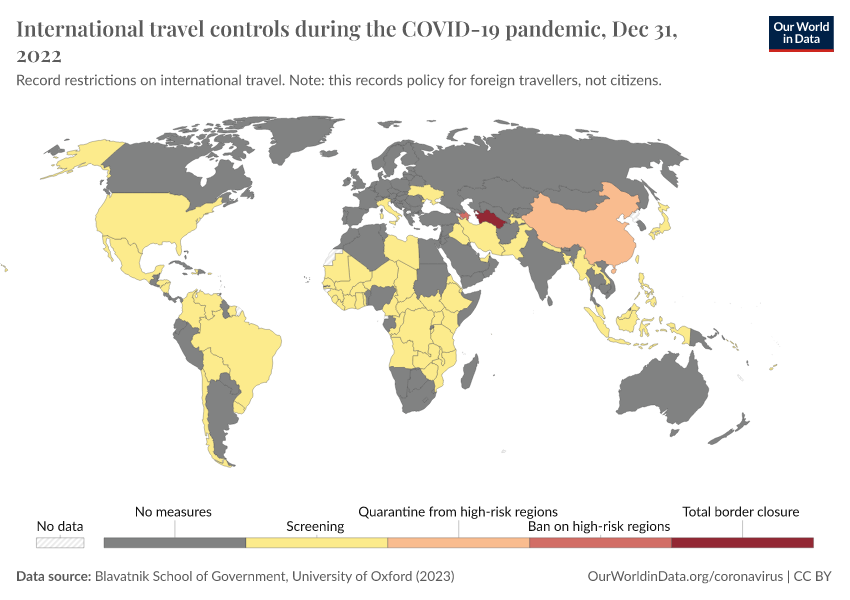
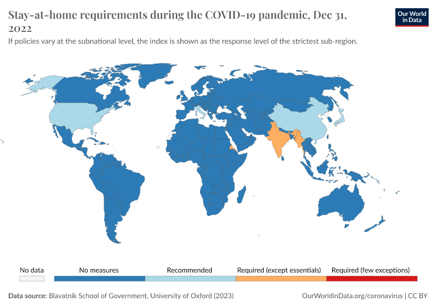
The rapid spread of the coronavirus led to many scientific developments and policies — from rapid testing and vaccines to social distancing and financial support — but an uneven global response, with significant disparities in healthcare access, economic responses, and outcomes.
Reliable data has been crucial to effectively track and respond to the pandemic and guide public health efforts, research, and policies.
For several years during the pandemic, our team at Our World in Data published daily updates on a range of crucial indicators and developed two global datasets on testing and vaccination. Our COVID-19 Data Explorer became a go-to source for people to understand the extent and spread of the disease.
On this page, you will find our wide-ranging catalog of data and research on the COVID-19 pandemic.
Research & Writing
November 18, 2024
17 key charts to understand the COVID-19 pandemic
The pandemic has resulted in over twenty million deaths. In this article, we review the key insights from global data on COVID-19.
November 18, 2024
How our team at Our World in Data became a global data source on COVID-19
Our small team made COVID-19 data clear, reliable, and accessible to a global audience. This is how it happened.
Key data on the COVID-19 pandemic
May 02, 2020
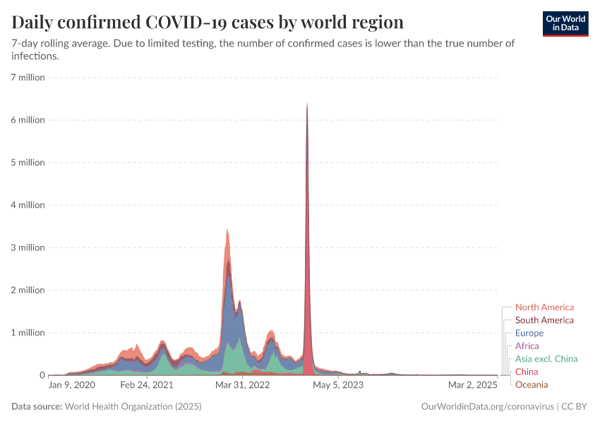
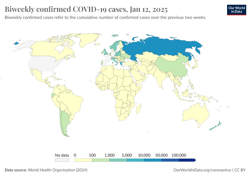
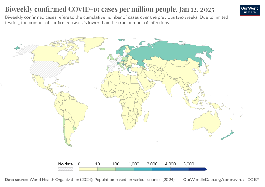
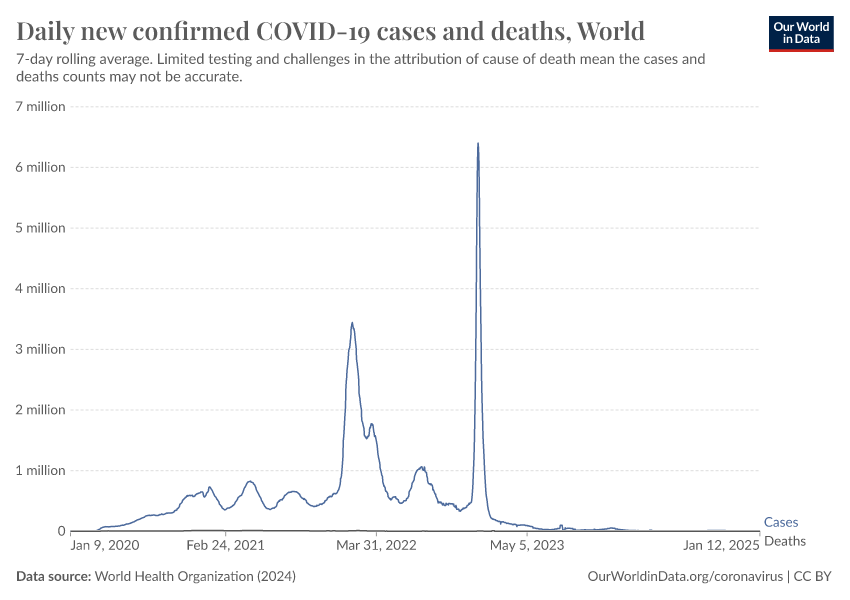
Coronavirus (COVID-19) Cases
November 01, 2020
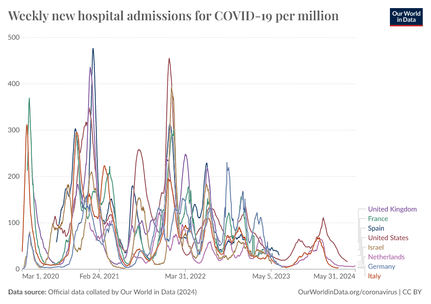
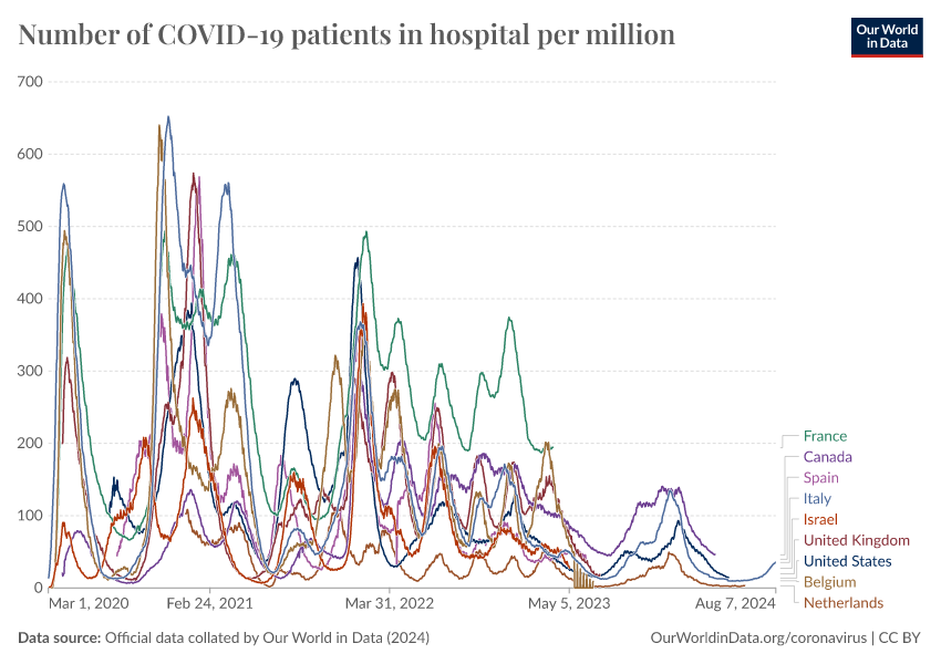
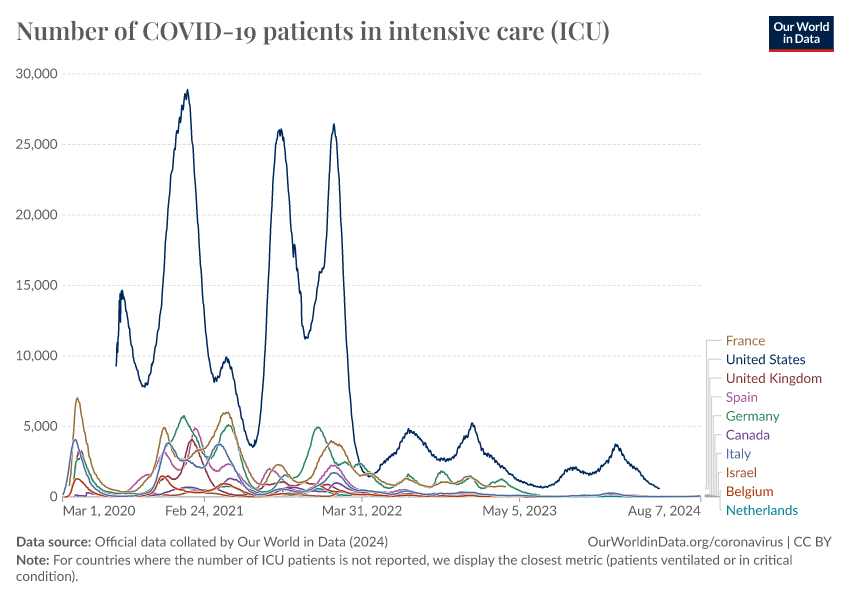
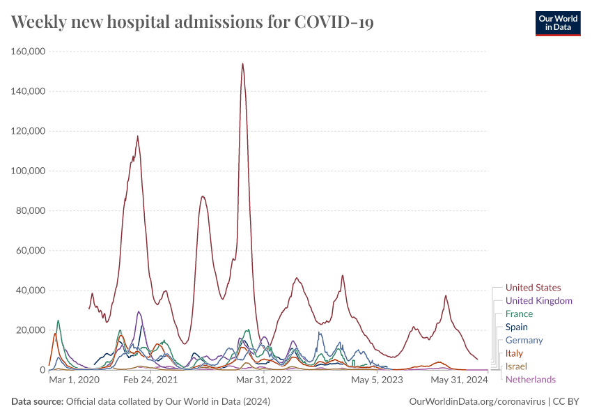
Coronavirus (COVID-19) Hospitalizations
May 01, 2020
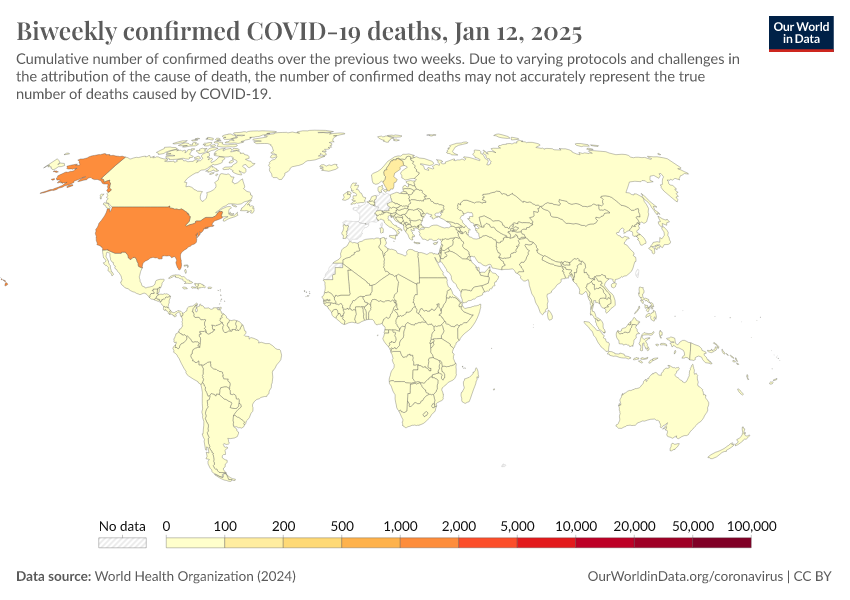
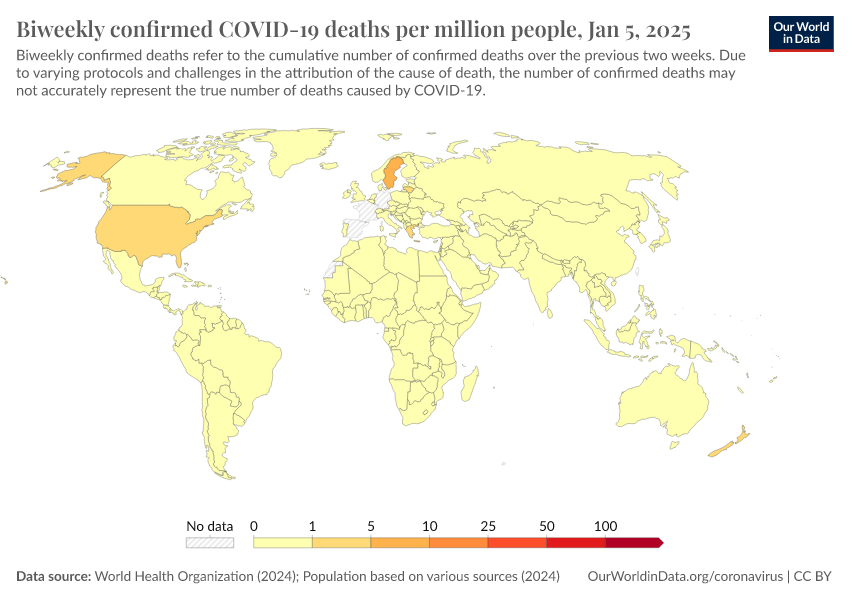
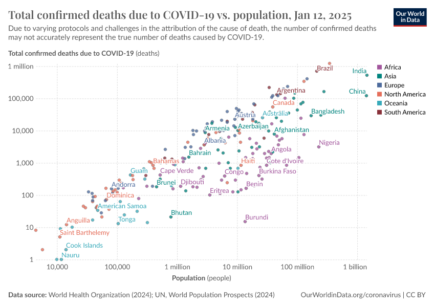
Coronavirus (COVID-19) Deaths
May 05, 2020
Mortality Risk of COVID-19
December 16, 2020
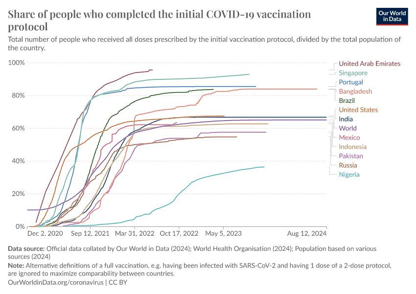
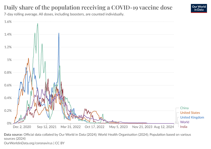
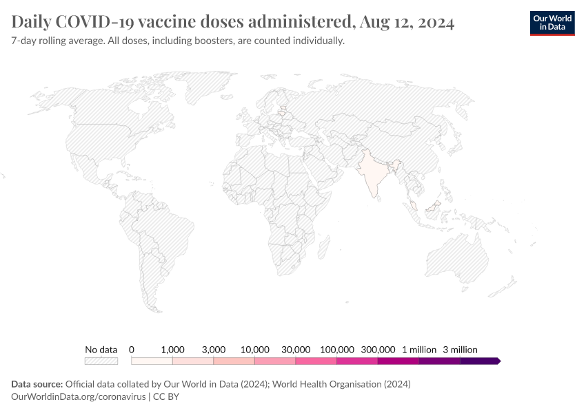
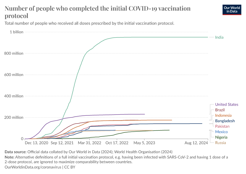
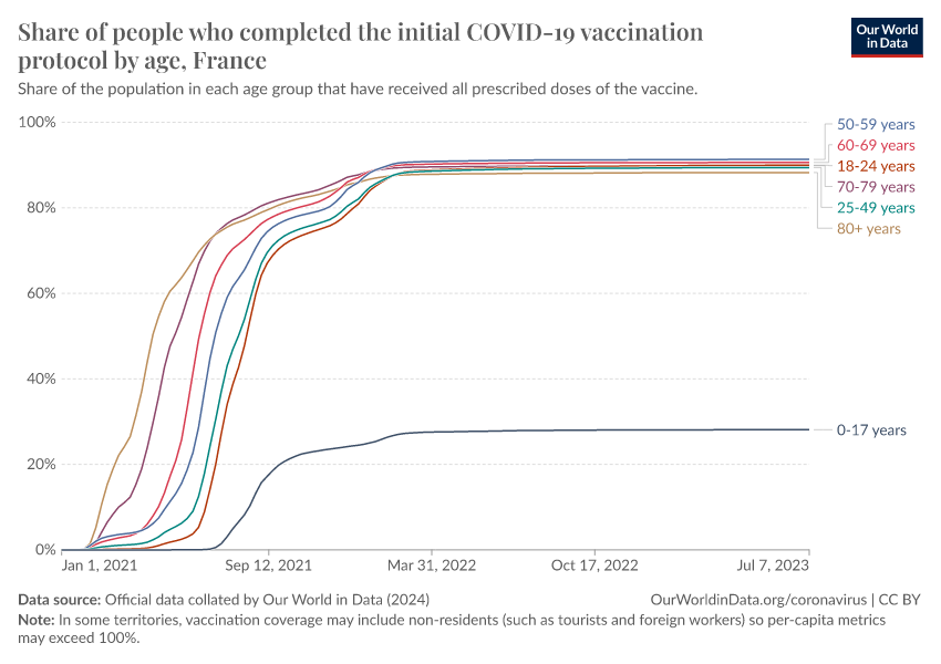
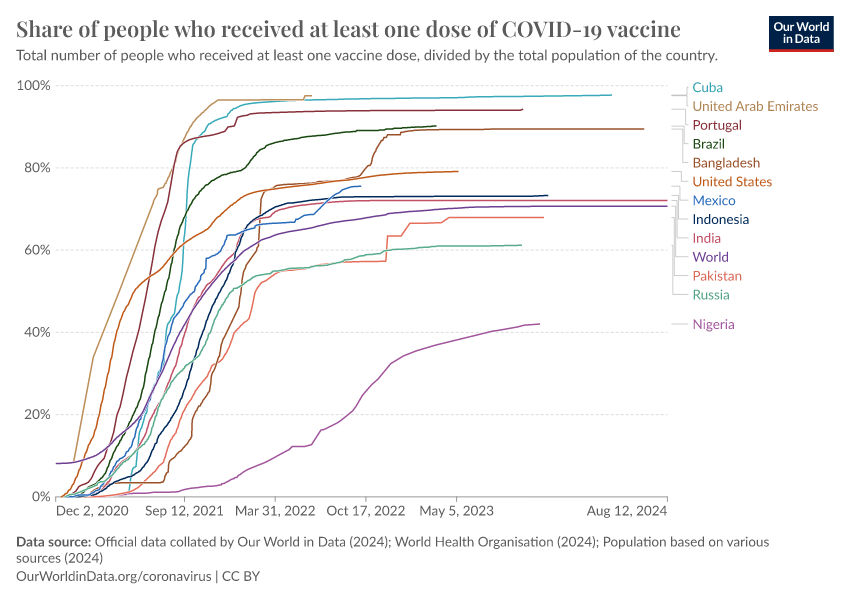
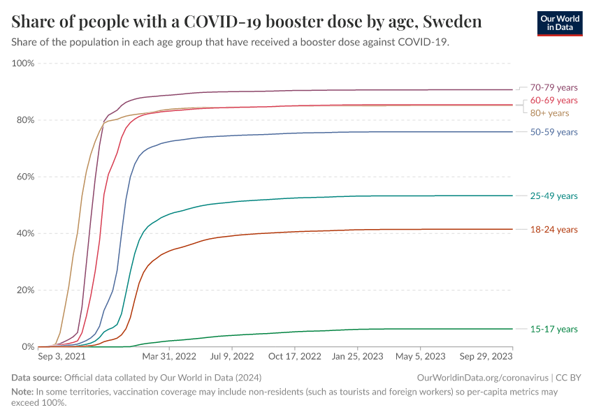
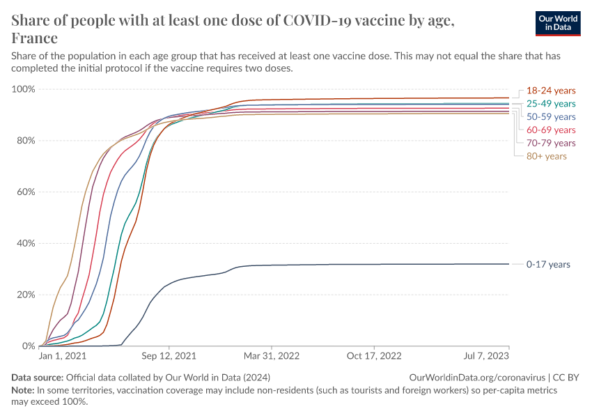
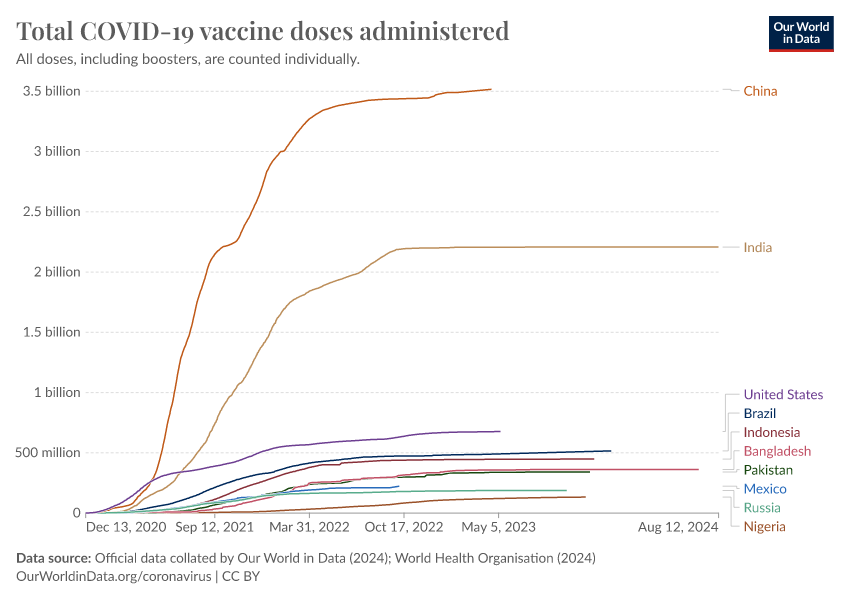
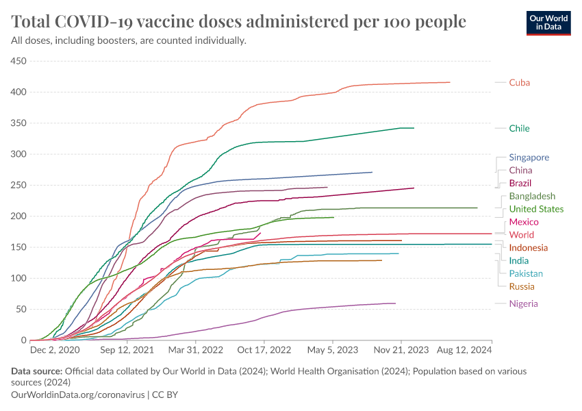
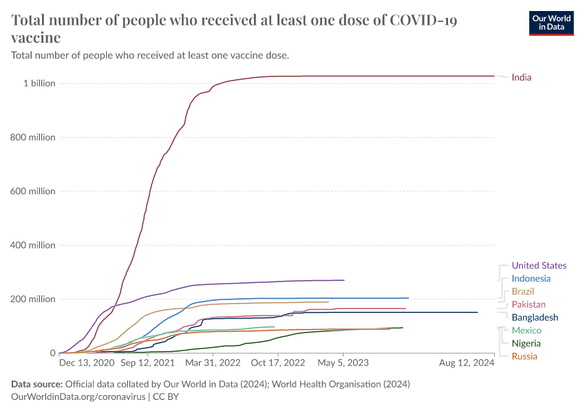
Coronavirus (COVID-19) Vaccinations
May 07, 2020
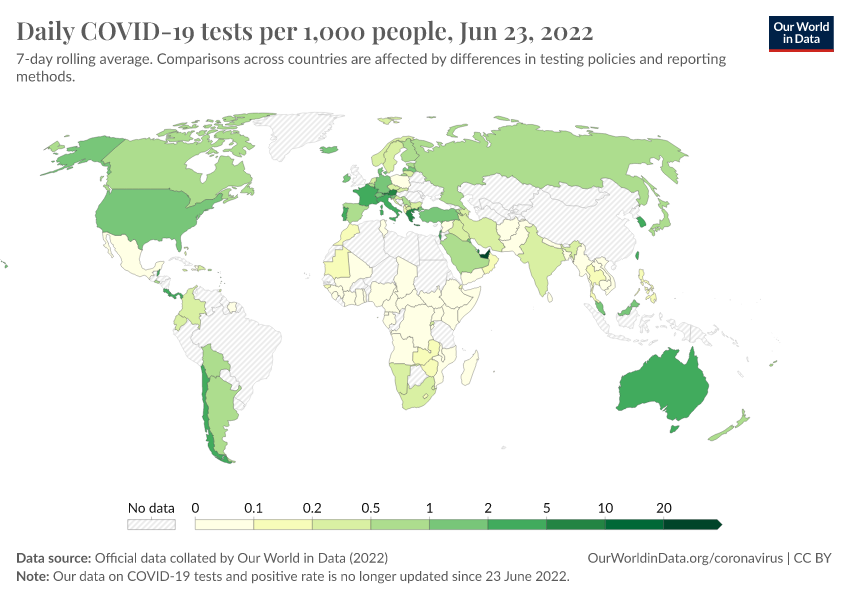
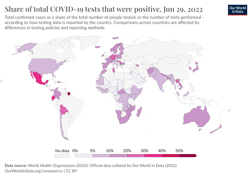
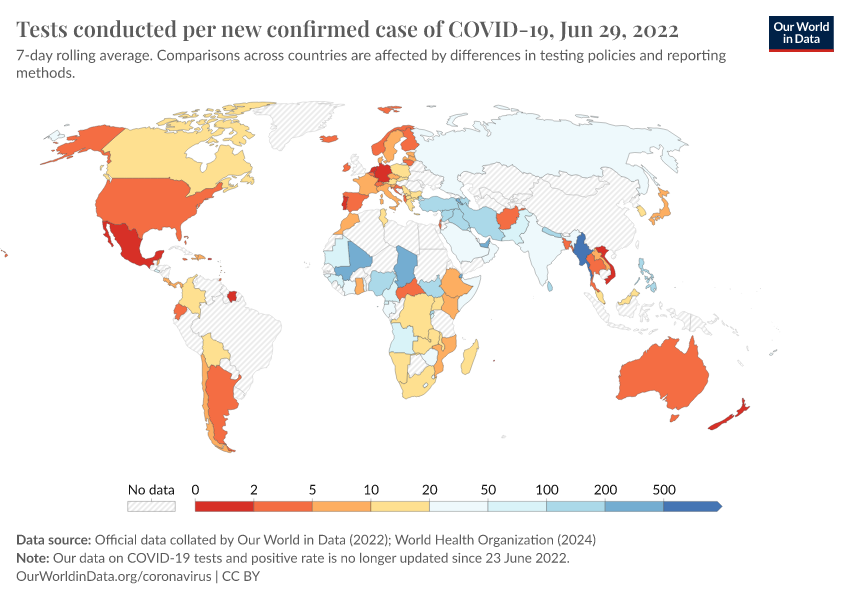
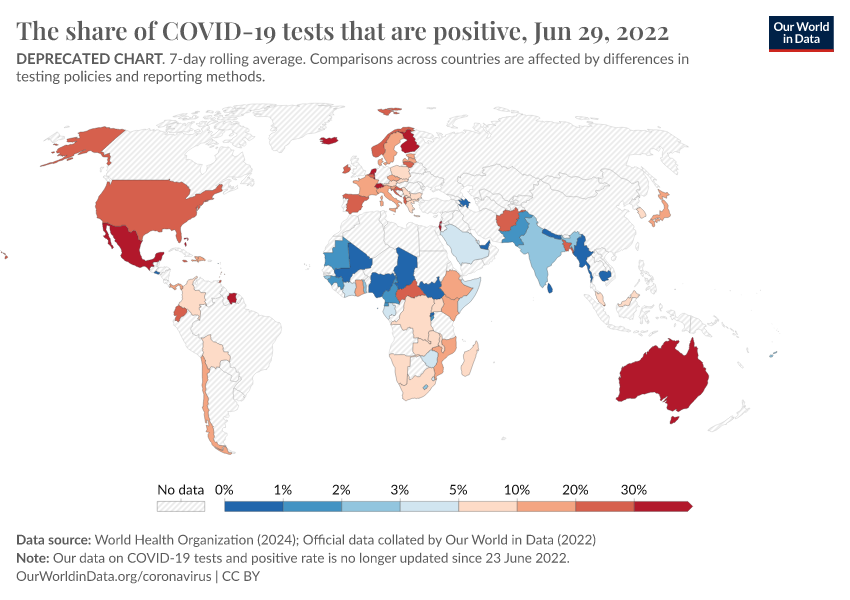
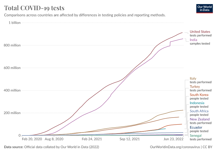
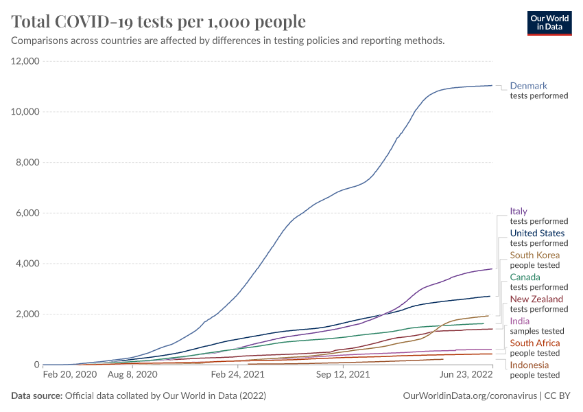
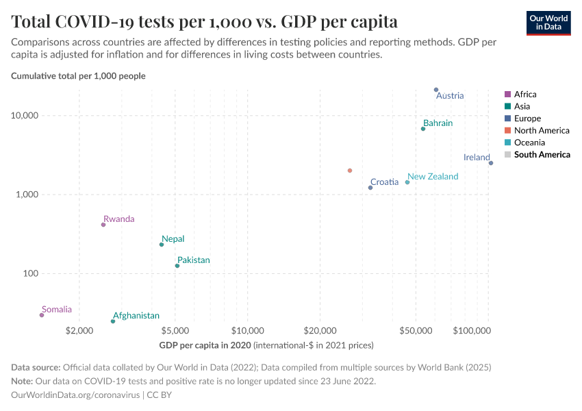
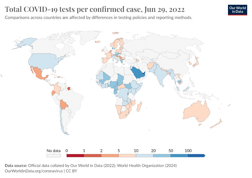
Coronavirus (COVID-19) Testing
May 22, 2020
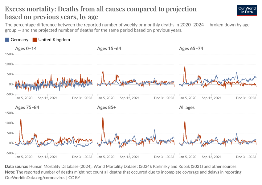
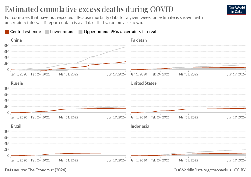
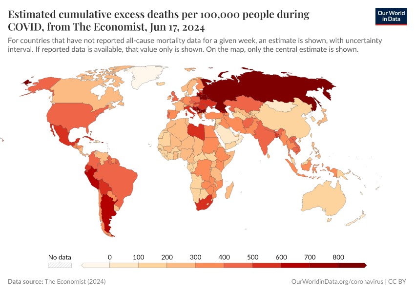
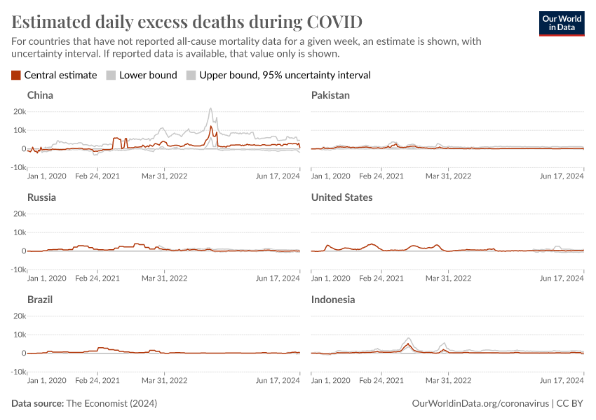
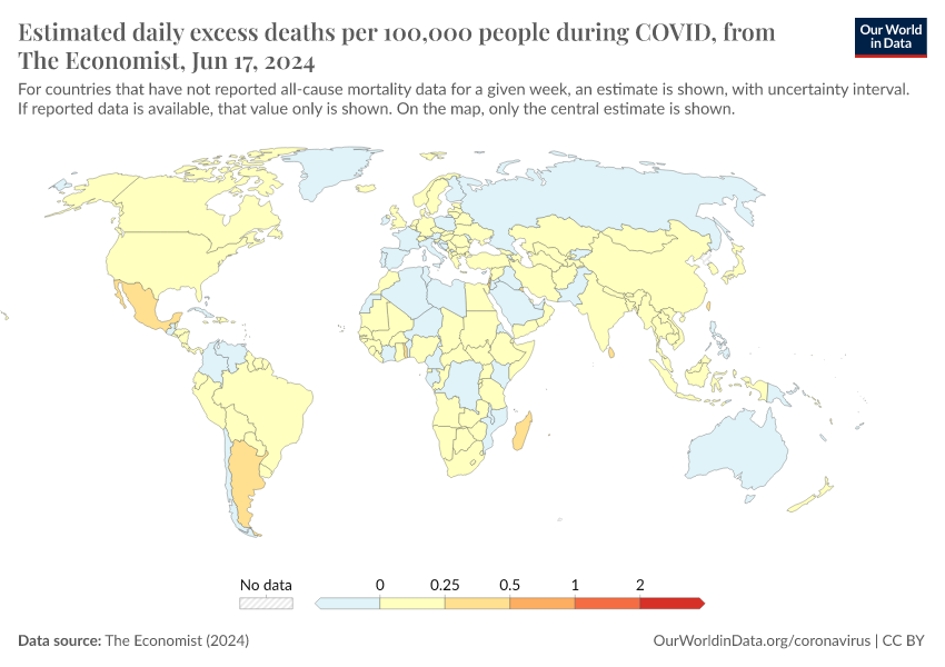
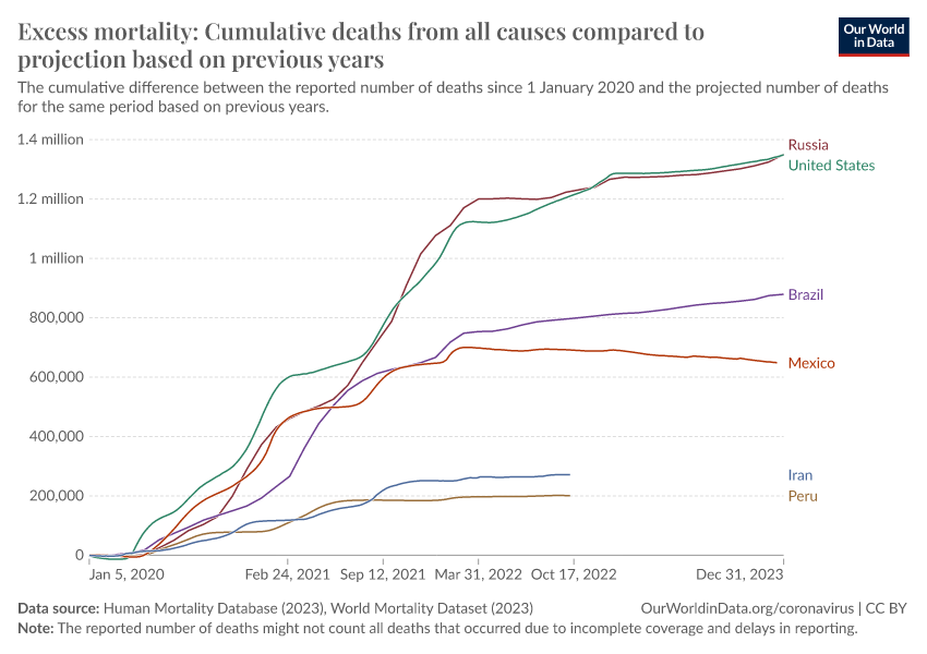
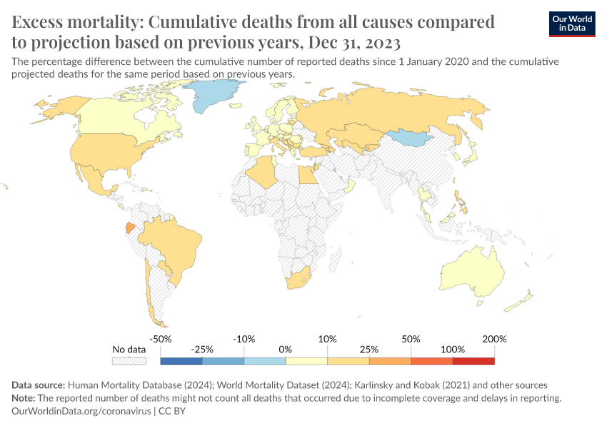
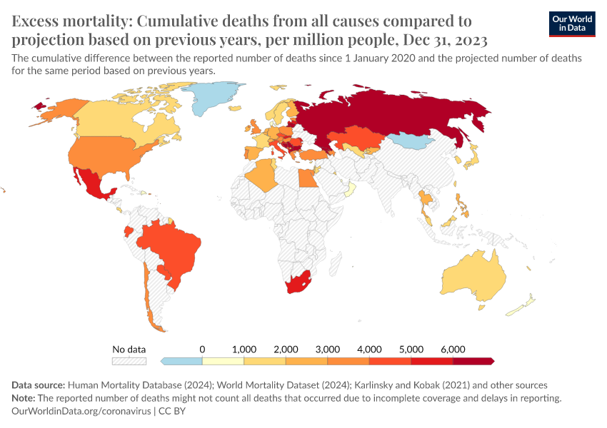
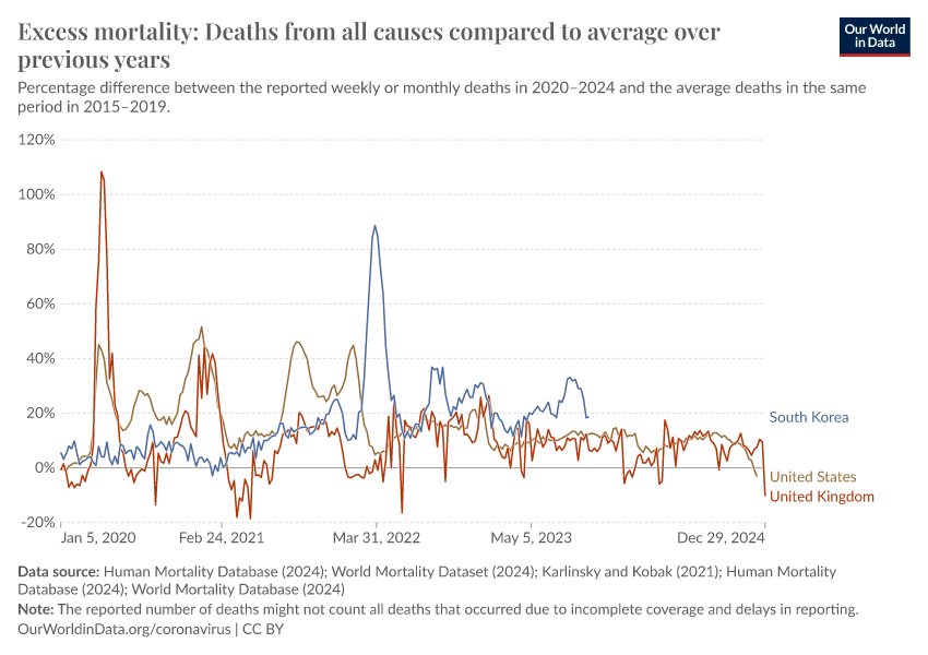
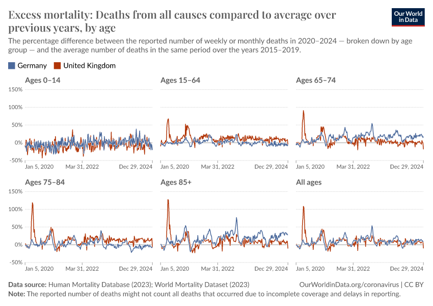
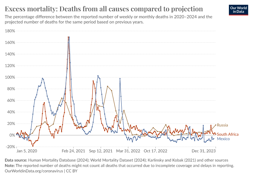
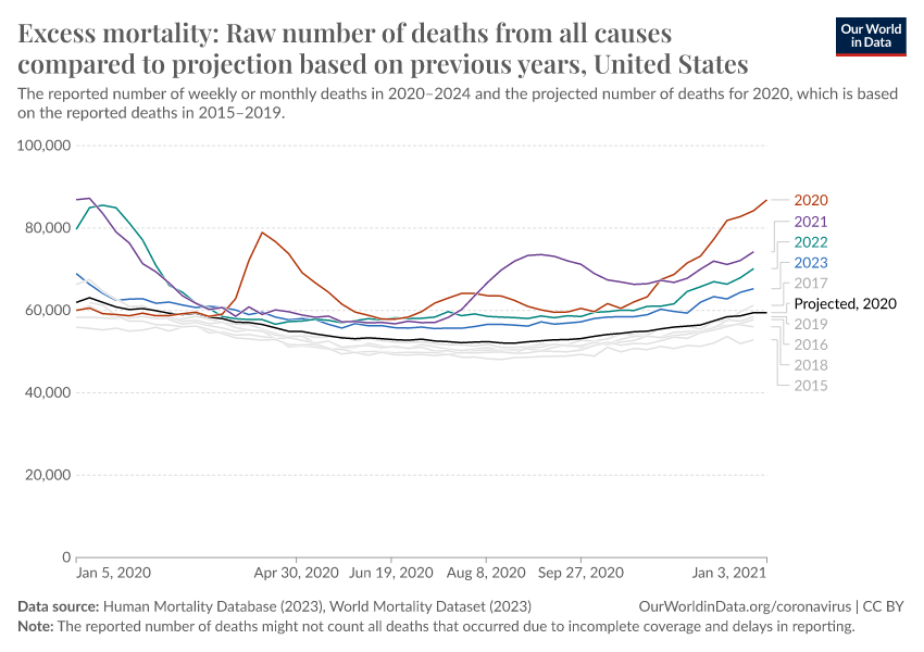
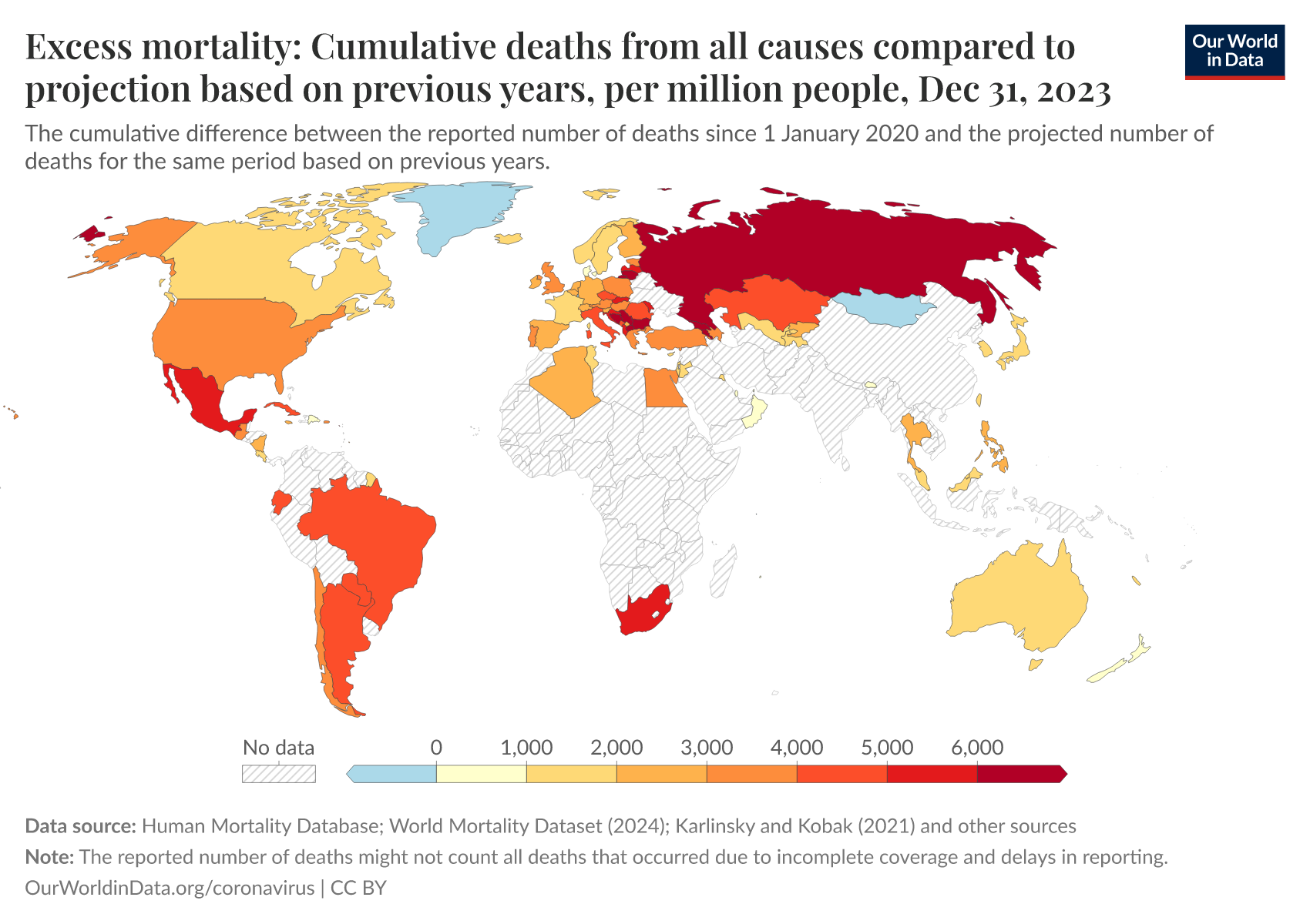
Excess mortality during the Coronavirus pandemic (COVID-19)
More articles on the COVID-19 pandemic
November 23, 2021
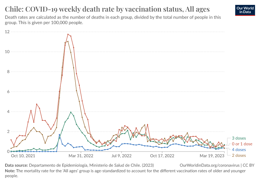
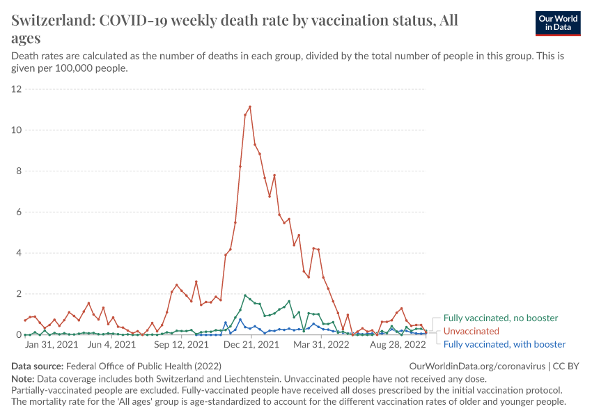
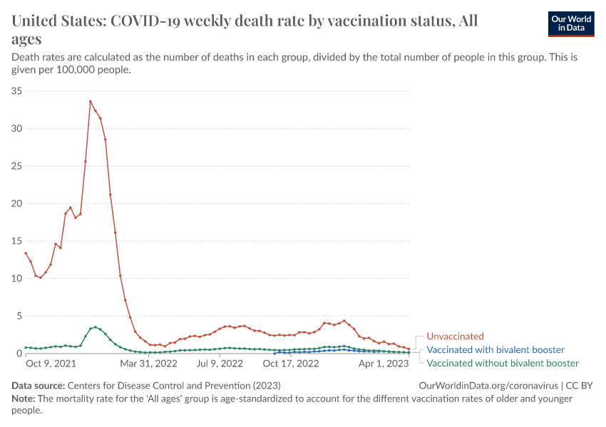
How do death rates from COVID-19 differ between people who are vaccinated and those who are not?
July 20, 2020
Our history is a battle against the microbes: we lost terribly before science, public health, and vaccines allowed us to protect ourselves
December 07, 2023
What were the death tolls from pandemics in history?
May 01, 2024
Key lessons from our work on the COVID-19 pandemic are now published in Lancet Public Health
September 01, 2020
Which countries have protected both health and the economy in the pandemic?
March 23, 2020
We teamed up with Kurzgesagt to make a video about the COVID-19 pandemic
Explainers on COVID-19 data
August 24, 2020
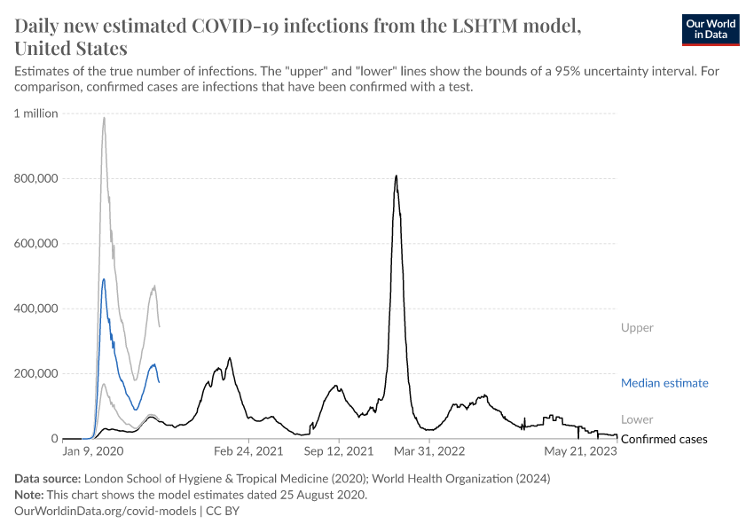
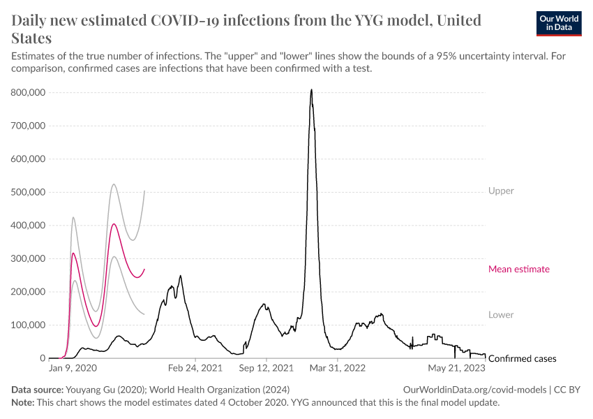
How epidemiological models of COVID-19 help us estimate the true number of infections
June 29, 2020
A pandemic primer on excess mortality statistics and their comparability across countries
June 03, 2020
Best practices for governments reporting COVID-19 testing data
November 13, 2020
Why do COVID-19 deaths in Sweden's official data always appear to decrease?
May 14, 2020
How to read the famous coronavirus trajectory chart — video explainer
Our World in Data’s COVID-19 data updates
November 15, 2024
Future updates of our data on COVID-19
February 28, 2023
Our World in Data will rely on data from the WHO to track confirmed COVID-19 cases and deaths
May 10, 2021
The Our World in Data COVID-19 vaccination dataset has been published in the academic journal, Nature Human Behaviour
October 09, 2020
The Our World in Data COVID-19 Testing dataset has been published in the academic journal, Nature Scientific Data
January 08, 2021
Our World in Data is now tracking Coronavirus (COVID-19) vaccinations across the world
May 31, 2022
Ending our COVID-19 testing data updates
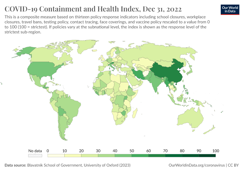
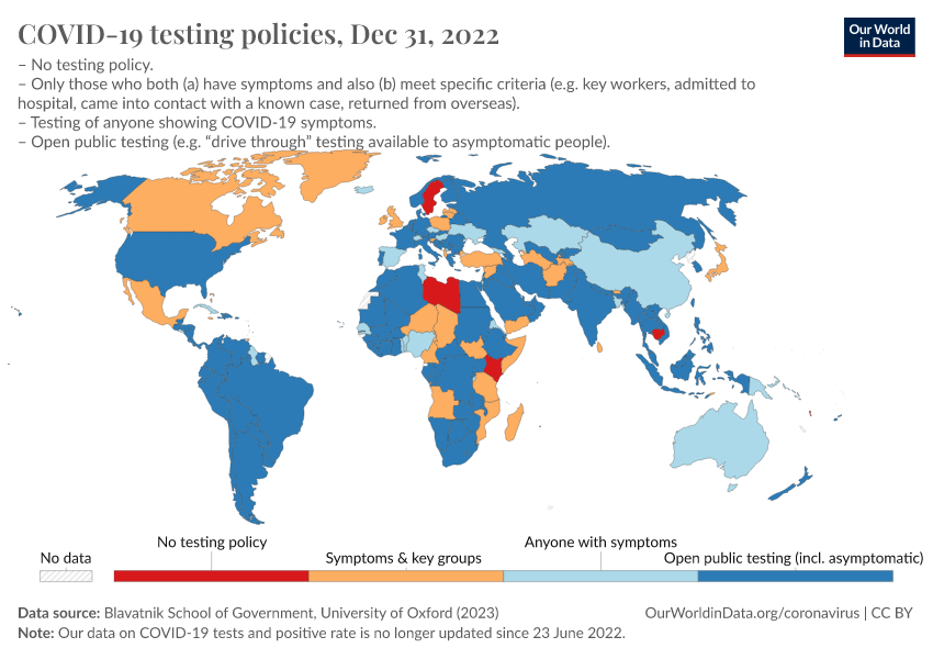
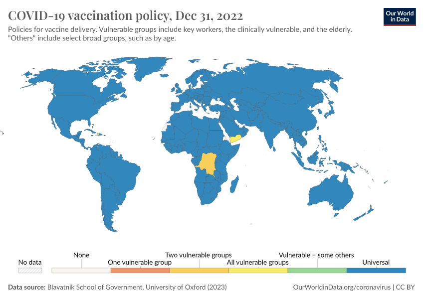
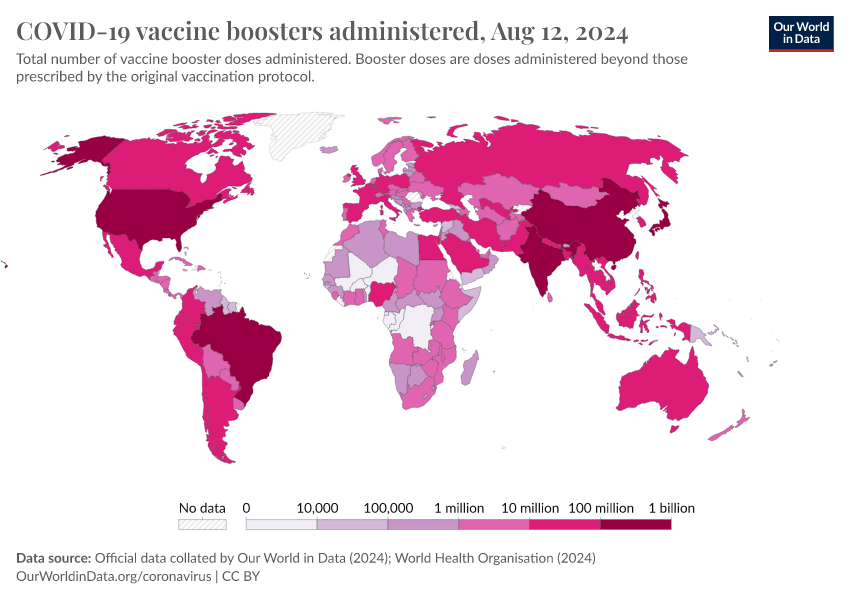
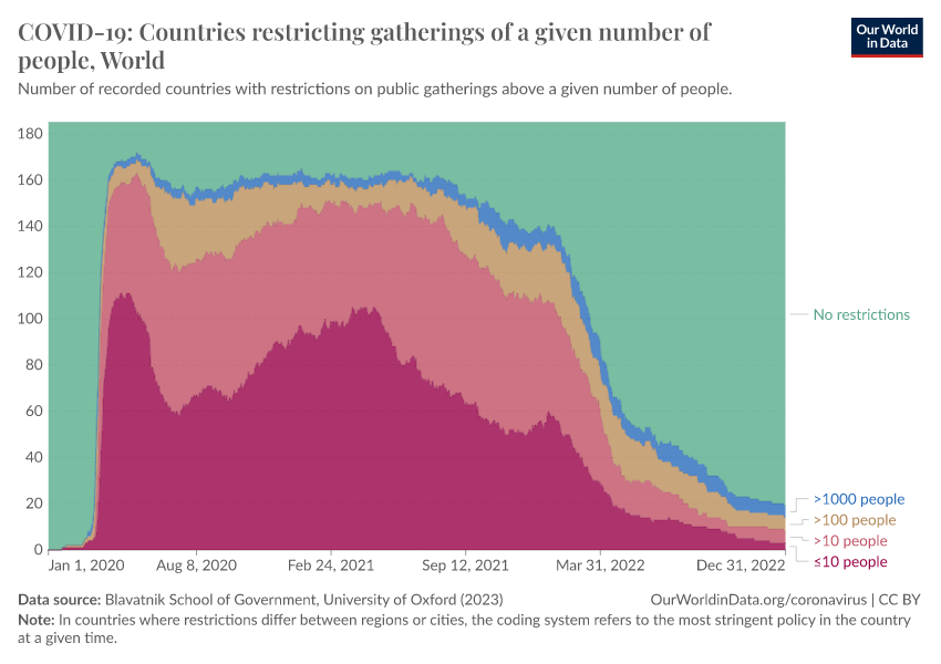
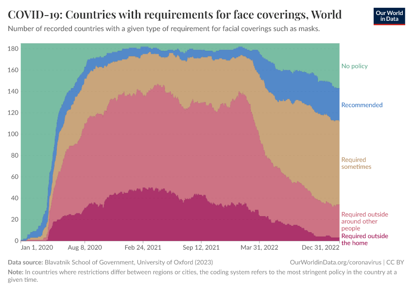
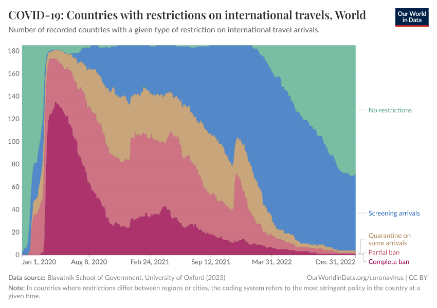
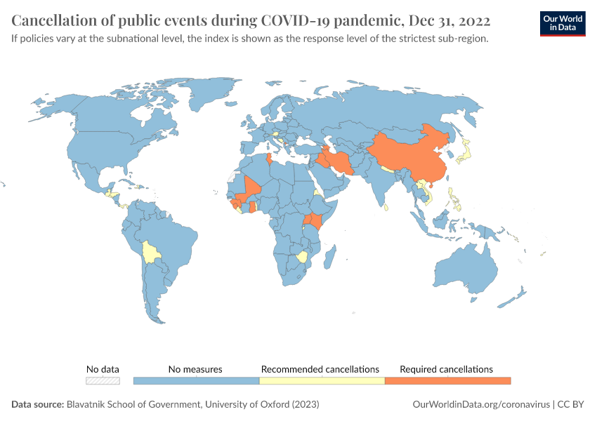
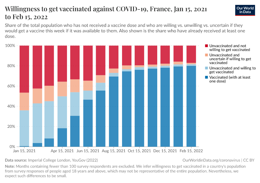
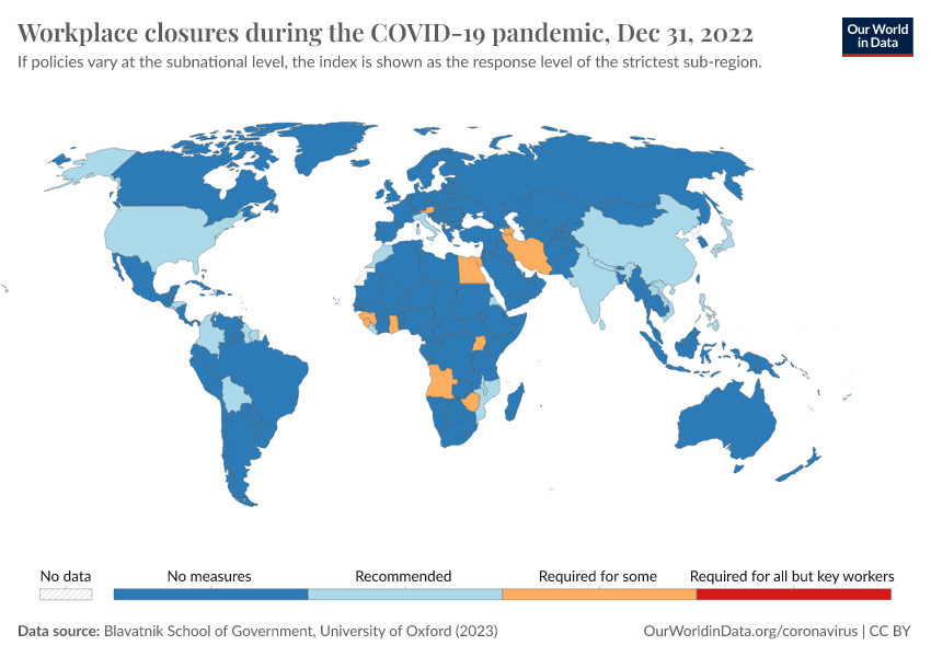
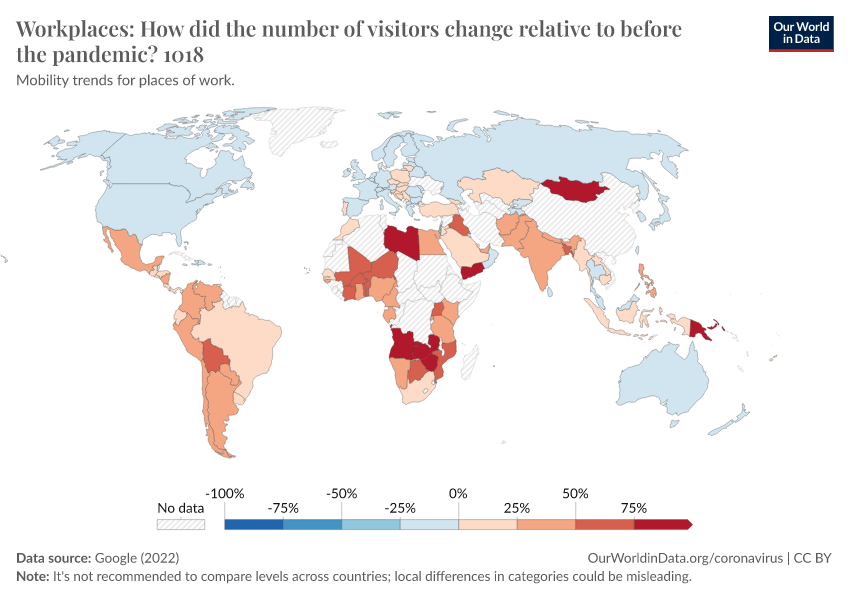
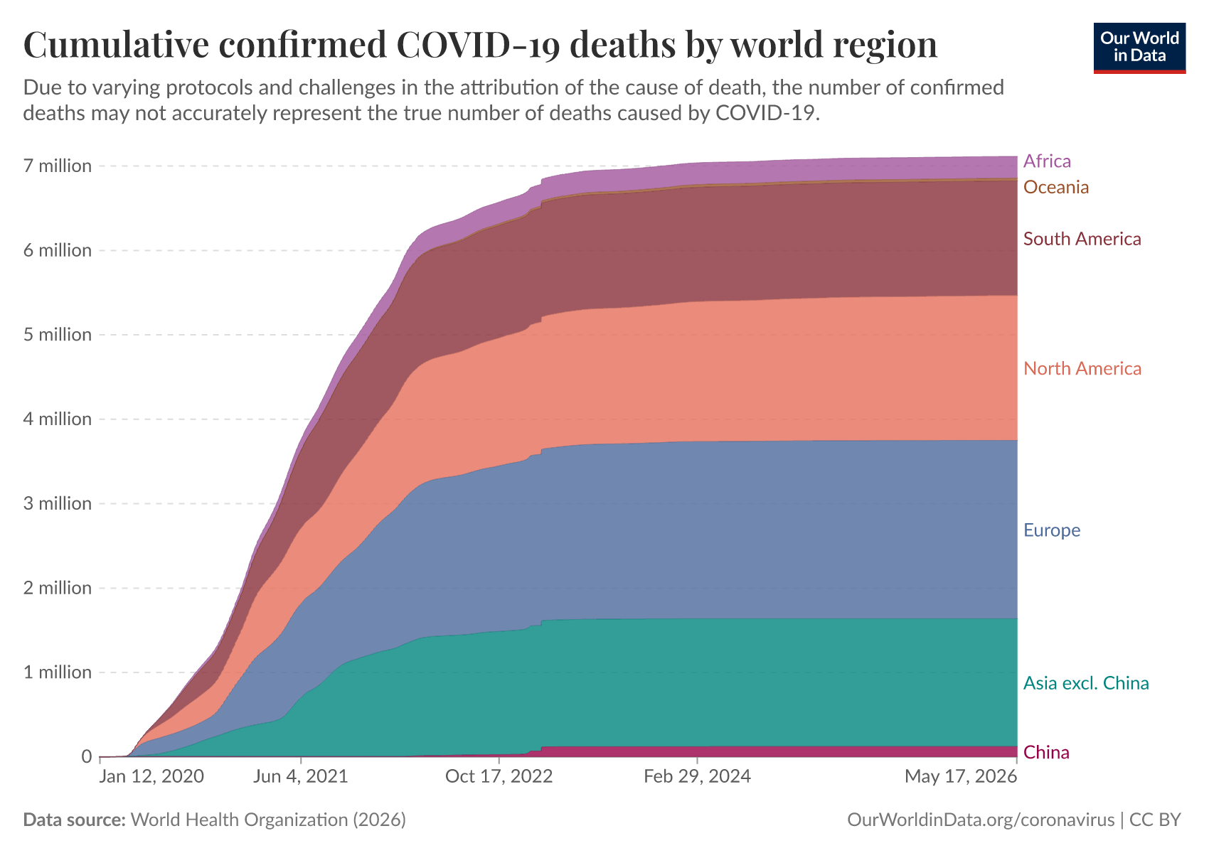
Key Charts on COVID-19
See all charts on this topic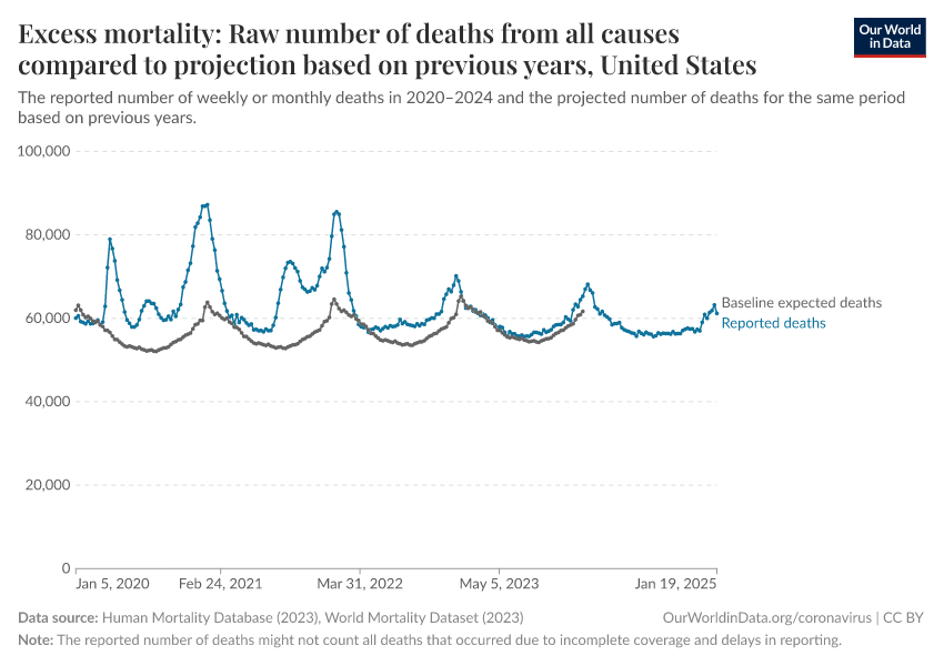


Cite this work
Our articles and data visualizations rely on work from many different people and organizations. When citing this topic page, please also cite the underlying data sources. This topic page can be cited as:
Edouard Mathieu, Hannah Ritchie, Lucas Rodés-Guirao, Cameron Appel, Daniel Gavrilov, Charlie Giattino, Joe Hasell, Bobbie Macdonald, Saloni Dattani, Diana Beltekian, Esteban Ortiz-Ospina, and Max Roser (2020) - “COVID-19 Pandemic” Published online at OurWorldinData.org. Retrieved from: 'https://ourworldindata.org/coronavirus' [Online Resource]BibTeX citation
@article{owid-coronavirus,
    author = {Edouard Mathieu and Hannah Ritchie and Lucas Rodés-Guirao and Cameron Appel and Daniel Gavrilov and Charlie Giattino and Joe Hasell and Bobbie Macdonald and Saloni Dattani and Diana Beltekian and Esteban Ortiz-Ospina and Max Roser},
    title = {COVID-19 Pandemic},
    journal = {Our World in Data},
    year = {2020},
    note = {https://ourworldindata.org/coronavirus}
}
Reuse this work freely
All visualizations, data, and code produced by Our World in Data are completely open access under the Creative Commons BY license. You have the permission to use, distribute, and reproduce these in any medium, provided the source and authors are credited.
The data produced by third parties and made available by Our World in Data is subject to the license terms from the original third-party authors. We will always indicate the original source of the data in our documentation, so you should always check the license of any such third-party data before use and redistribution.
All of our charts can be embedded in any site.