17 key charts to understand the COVID-19 pandemic
The pandemic has resulted in over twenty million deaths. In this article, we review the key insights from global data on COVID-19.
According to the best estimates, the COVID-19 pandemic, which began spreading across the world in 2020, had caused around 27 million deaths by August 2024. It has caused grief and suffering over lost lives, put immense pressure on doctors and nurses, and continues to disrupt societies, economies, and lives.
Countries implemented a range of policies to slow the spread of disease — from testing and contact tracing to social distancing and vaccination. The global response was slow and uneven, with significant disparities in healthcare and vaccination worldwide.
Since February 2020, we at Our World in Data worked with data providers to build and maintain a global dataset of the most critical data on COVID.
Our team made two major efforts: building the global dataset on vaccinations and the global dataset on testing. We allowed people worldwide to explore and download this data through our site.
Our goal was to enable everyone to study the data for themselves and help them make informed decisions on how to respond to the virus.
In this article, we will review some of the key insights on the COVID-19 pandemic.
The pandemic resulted in millions of deaths worldwide
Overall, data compiled from many countries shows that in 2020, on average, around 1 in 140 people infected died from COVID-19.1 That’s 0.7% of the population infected.
COVID-19 can cause death through complications like severe respiratory disease, heart disease, and multi-organ failure. Many others experienced serious short-term or long-term consequences of the disease, or were admitted to hospitals or intensive care units.
Data shows that the mortality risks from COVID-19 rise exponentially with age.2 The risks are also influenced by other factors such as pre-existing health conditions, immune system risk factors, access to supplementary oxygen, treatment, healthcare, and the particular coronavirus strain.3
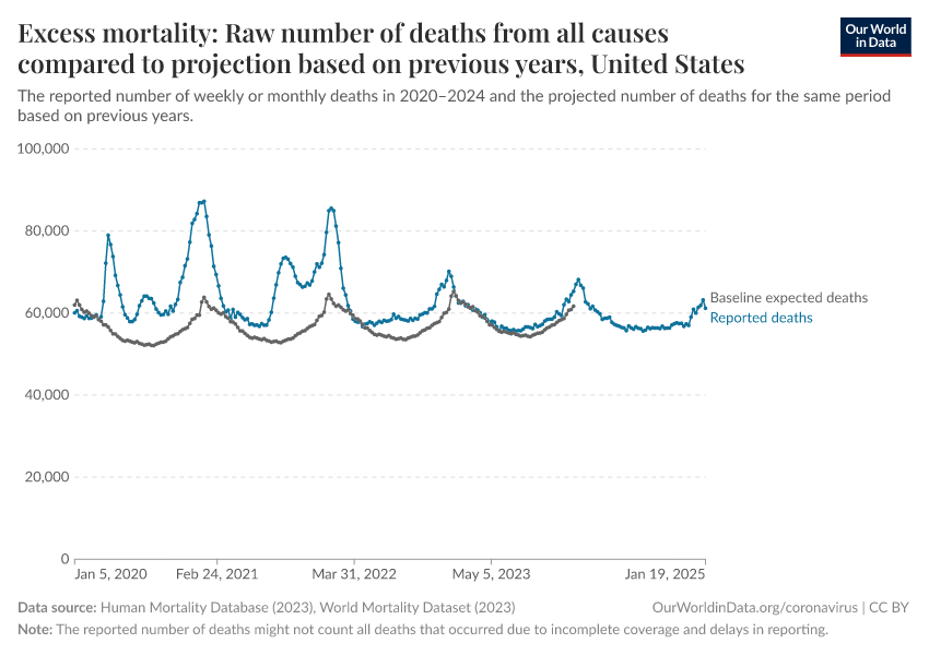
In the chart below, you can see how the total number of deaths in countries spiked during waves of the coronavirus compared to the trends in deaths in previous years.
The blue line shows the number of weekly deaths during the pandemic. Meanwhile, the gray line shows the estimated number of weekly deaths that would have been expected in a year without the pandemic. This estimated number of deaths is based on a projection of the average number of deaths in previous years.
The difference between reported and expected deaths is called “excess mortality” — in essence, it estimates the additional number of deaths compared to a scenario where the pandemic had not occurred.
The estimates of expected deaths in the absence of the pandemic are made by projecting previous trends and seasonal patterns, using data from vital registries, hospital records, and other sources.
Researchers can estimate the pandemic’s total mortality by summing the number of excess deaths since the beginning of the pandemic.
This is shown in the chart below. Here, we show the range of estimates made by researchers at The Economist, whose methods are transparently documented and regularly updated.4
The chart shows that 27 million people are estimated to have died from COVID-19 up to August 2024.
This includes around 5 million by the end of 2020 and another 10 million by the end of 2021.
Although there are significant uncertainties in the total number of deaths, you can see that even the lower bound estimate is much higher than the number of confirmed COVID-19 deaths.
It is still frequent to hear the number of confirmed deaths being cited as the death toll of the pandemic, but this is incorrect, especially in countries with limited testing. The number of confirmed deaths represents only a share of total deaths because of factors such as limited testing and death registration.
These estimates make COVID-19 one of the deadliest pandemics of the last century, along with the 1918 “Spanish flu” pandemic and the HIV/AIDS pandemic.
You can read more in our article:
Countries were slow to recognize the rise of COVID-19 because of limited testing
The large number of deaths from COVID-19 was partly due to countries' slow recognition and response to rising outbreaks. This delay began at the start of the pandemic but continued in new waves later on, including epidemics caused by new variants.
The first cases of COVID-19 were reported in Wuhan, China, at the end of December 2019. A sudden outbreak emerged where patients had a severe new respiratory disease, which resembled the SARS-1 epidemic in 2003. Researchers identified its cause as a novel coronavirus, which appeared between October and December of 2019.5
Cases were soon being reported in other countries, and the outbreak spread globally.
The rise in cases in early 2020 is shown in the chart below.
Since many of the cases identified weren’t known to be connected, it became clear that undiagnosed COVID-19 infections and asymptomatic infections also contributed to the spread of the disease.6
This reflects a major limitation of figures of confirmed cases — people who were infected but not tested were not counted. The figures only included cases confirmed by testing, such as PCR testing of the saliva for viral RNA.
However, many countries conducted limited testing, as shown in the map below. It shows which population groups could be tested for COVID-19.
By March 2020, many countries — shown in yellow — were only testing key groups (such as healthcare workers and recent travelers) who had symptoms but not the general public. Many other countries — shown in red — had no testing policy.
This meant the true number of infections was far higher than confirmed cases.
Without sufficient testing, countries were slow to recognize new outbreaks and respond to them, with delays in building up medical resources and hospital capacity, effectively tracing cases, and containing the spread of disease.
Because testing was limited, we at Our World in Data started building a testing database early on in the pandemic, to show the levels of testing over time and how they related to the number of cases detected. We published this database in the journal Nature Scientific Data.
The chart below compares the number of confirmed cases to different estimates of the true number of infections.
Different research teams estimated the number of infections using epidemiological modeling, data on the number of cases and deaths, testing levels, and other information.
As you can see, these estimates vary greatly; there is considerable uncertainty in the real number of infections.
But all models agree that the true number of cases was much higher than the number of confirmed cases — this was especially true at the beginning of the outbreak when testing was minimal.
The chart shows an example: while the United States reported around 25,000 daily cases by April 2020, researchers estimate that the actual number of infections was around ten times higher — between 130,000 and 490,000 daily infections that month.
In our article, we explain these epidemiological models in more detail:
Countries implemented a range of anti-epidemic measures to reduce the spread of disease
To slow the spread of disease, countries implemented a range of policies: restrictions on international travel and mass gatherings, school and workplace closures, stay-at-home orders, contact tracing and testing, and requirements for face coverings and vaccination.
Our charts here summarize these policies at a broad level — the data was compiled by our colleagues at the Blavatnik School of Government at the University of Oxford as part of the COVID-19 Government Response Tracker.
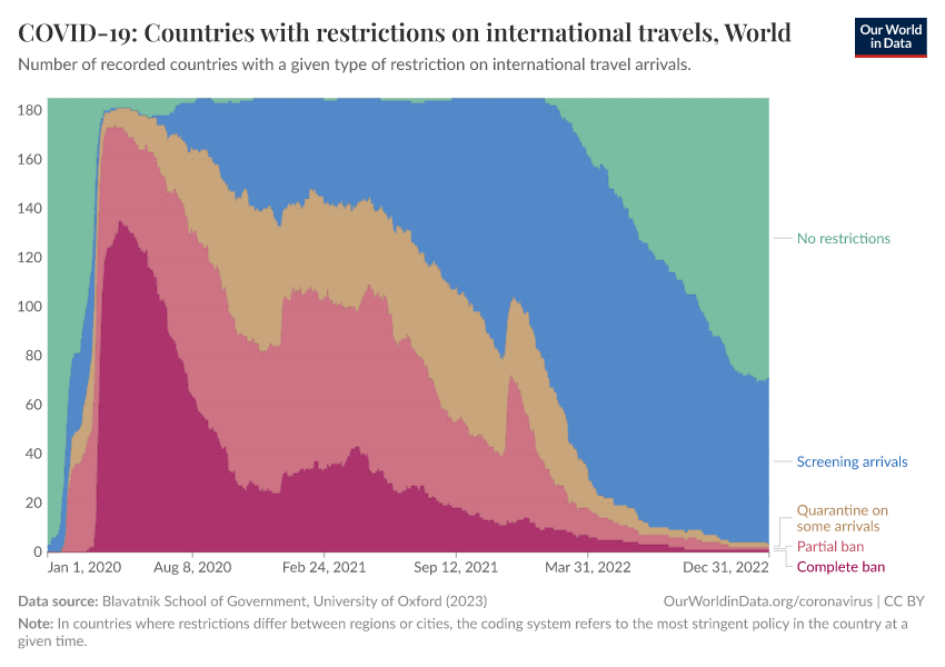
International travel restrictions were among the first policies implemented. As the chart shows, over half of countries had implemented a complete travel ban by April 2020.
Over the next few months, many countries reduced these restrictions to partial bans or quarantines. More countries began screening arrivals: travelers could avoid quarantines or travel restrictions if they had a negative COVID-19 test result.
By 2022, few countries still had restrictions on international travel.
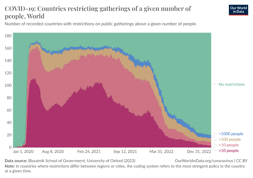
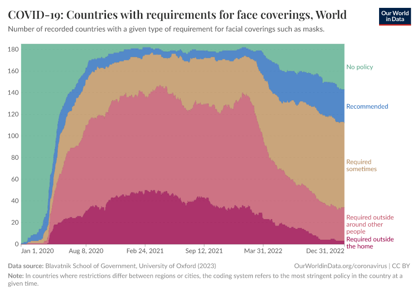
Restrictions on public gatherings and requirements for wearing facial coverings were also common. You can see these in the two charts below.
The first chart looks at the number of countries with restrictions on public gatherings. It shows that by the spring of 2020, most countries implemented strict restrictions on public gatherings — with around half restricting gatherings even among groups of fewer than 10 people.
These restrictions were reduced during the summer but rose again during the winter and continued in 2021. By the spring of 2022, restrictions on public gatherings were relaxed in most countries around the world.
The second chart shows the number of countries that required facial coverings such as masks. These policies were implemented slightly later than international travel restrictions and public gatherings.
But by the summer of 2020, around half of countries had requirements to wear face coverings near other people or to always wear them outside the home.
The impact of policies varied between countries and depended on how they were implemented.
However, since the coronavirus spreads between people through respiratory and airborne particles and human contact, policies led to a large reduction in contact between people and slowed down the spread of the virus.7
This impact is also visible in the spread of other respiratory infections, such as influenza, measles, pertussis, and common cold viruses, which are spread between people by similar mechanisms.8
The chart below shows this with data from the Seattle Flu study, which tested respiratory samples from the Seattle Area for many potential respiratory pathogens.9
As you can see, the share of positive tests for many respiratory pathogens declined during the pandemic. This decline was greatest from spring 2020 to 2021 when restrictions were strictest.10
SARS-CoV-2, the virus that causes COVID-19, was more contagious than other pathogens and continued to spread. It became one of the most common respiratory pathogens circulating at the time but was also the deadliest and became one of the leading causes of death in many countries.11
Effective vaccines were rolled out from the end of 2020, but there were large disparities between countries
Several COVID-19 vaccines became available within a year of the start of the pandemic after being developed and tested through all regular stages of large-scale clinical trials, which involved tens of thousands of study participants.
This rapid speed was possible for several reasons.
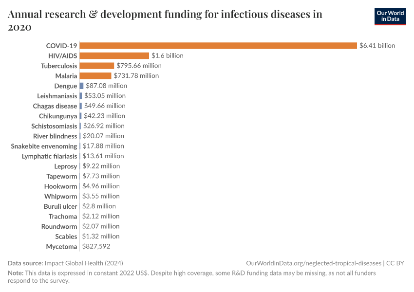
One is that there was a very high level of research and development funding compared to other diseases, as seen in the chart below. Many candidate vaccines were, therefore, developed and tested in clinical trials.
Another reason is that key research had already been conducted on coronaviruses and vaccines in the years before; this research suggested that people could clear the infection with immunity.12 There were also animal models to study the virus; coronavirus vaccines had already been developed for some animal coronavirus diseases.13
The clinical trial process also ran faster than usual. There was high interest in volunteering for clinical trials, and since outbreaks were widespread, it was faster to see the potential effect of vaccines.14
In addition, different stages of clinical trials ran in parallel — with phase 2 and 3 trials running simultaneously, for example — along with regulatory review, meaning that all stages could be completed in a shorter period.15
This fast development was followed by a rapid rollout of vaccines in many high-income countries, while it lagged in poorer countries.
We at Our World in Data built and maintained the global vaccination database as soon as the first people were vaccinated to show the vaccination levels over time across the world. We published this dataset in the journal Nature Human Behaviour.
Based on our data, the chart below shows the number of vaccine doses administered per 100 people in the population. Each dose is counted individually, meaning the figures include second doses and booster vaccinations.
As you can see, countries like the United States and the United Kingdom had administered more than 100 vaccine doses per 100 people by July 2021.16 But other countries, such as India, only reached this level by December 2021.
Even by the end of 2022, our data revealed a wide disparity in vaccination rates worldwide.
We can also see this by looking at the share of people who completed at least the initial vaccination protocol, which doesn’t count boosters.17
While more than 75% of people in many European countries and North America had received the initial vaccination protocol, that figure was less than 30% in most African countries.
Vaccination saved millions of lives but could have saved even more
COVID-19 vaccines have been highly effective in reducing the chances of severe disease, including hospitalizations and deaths.
This has been possible because the COVID-19 vaccines effectively present fragments of the coronavirus to our immune cells, which primes our immune system to recognize and respond to future infections by the virus. This is especially effective when the vaccine strains closely resemble those circulating in the population.
The impact of vaccines is also visible in data from the general population. We can see this by comparing overall death rates (from any cause) between vaccinated and unvaccinated people.
The chart below shows this with national data from the United States: death rates were much higher among unvaccinated people, especially during waves of the outbreak.
You can read more about this in our article:
Researchers have estimated that, in total, the COVID-19 vaccines saved around 20 million lives globally in just the first year of vaccine availability.18 These estimates are shown below, and come from statistical modeling using data on excess death rates, vaccine efficacy, and vaccination rates.
Recent research also demonstrates that the vaccines have continued to save many lives in the years since then.19
The coronavirus continues to evolve
The coronavirus evolves through random mutations, as well as through sudden recombination events, which can happen when a person is infected with two different strains of the coronavirus, and segments of the different virus genomes combine.20
Over time, this leads to new coronavirus strains, varying in how easily they spread or how deadly they are among those infected.
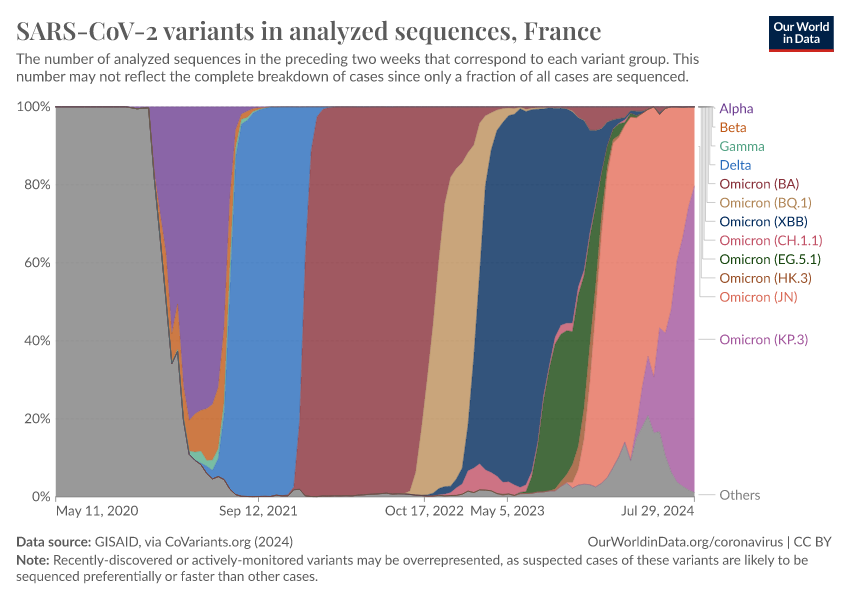
In the chart below, which shows data for France, you can see how coronavirus strains evolved. All coronavirus sequences were classified as the “Wuhan-Hu-1” strain at the pandemic's start.
In November 2020, a new strain called “Alpha” was identified, which was more lethal than the initial strain. The virus has continued to evolve to evade our immunity.21
Although genetically diverse strains can be better at evading the initial immune response, memory cells also persist and can respond to later stages of the disease.22
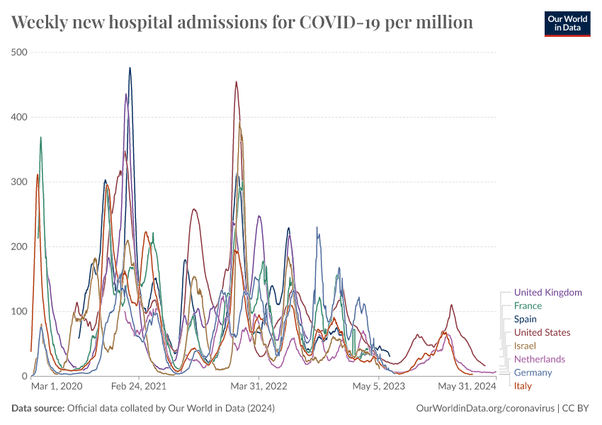
As a result, the virus’s impact, measured by hospitalizations and excess mortality, has generally declined as immunity from infections and vaccinations has grown.
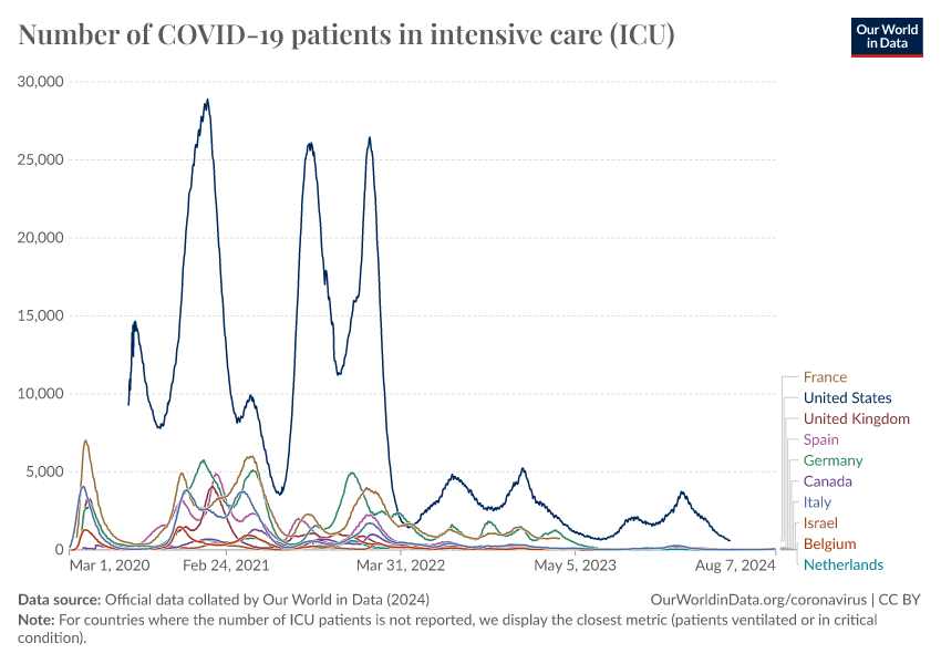
Despite this, COVID-19 continues to circulate in the population and causes waves of hospital admissions and severe disease. The chart below shows this for countries that have continued to report data.
This highlights the continued importance of booster vaccinations, especially among older people and vulnerable populations.
Conclusion
The COVID-19 pandemic has had a considerable global impact. It killed more than 25 million people, caused grief and suffering among their families and loved ones, impacted the health of people around the world, and disrupted work, economies, and lifestyles.
For our team at Our World in Data, it involved years of nonstop work through weekends under immense pressure since so many relied on our work. The same was true of many researchers, healthcare workers, and people worldwide who worked tirelessly to study the disease, create life-saving innovations, care for patients, and provide the crucial data that shaped public health responses.
COVID-19 continues to cause sickness and death, but the virus's impact on our lives has declined with a range of innovations, including rapid diagnostic testing, antiviral medicines, vaccinations, masks, social distancing, and public health efforts.
We should remember that pandemics happen repeatedly. To prevent suffering for years again, the world must respond more swiftly and effectively to pandemic risks. Our choices today determine whether we are prepared to face — and hopefully extinguish — the next pandemic.
Continue reading on Our World in Data
Endnotes
Meyerowitz-Katz, G., & Merone, L. (2020). A systematic review and meta-analysis of published research data on COVID-19 infection fatality rates. International Journal of Infectious Diseases, 101, 138-148. Available online.
Levin, A. T., Hanage, W. P., Owusu-Boaitey, N., Cochran, K. B., Walsh, S. P., & Meyerowitz-Katz, G. (2020). Assessing the age specificity of infection fatality rates for COVID-19: Systematic review, meta-analysis, and public policy implications. European Journal of Epidemiology, 35(12), 1123–1138. https://doi.org/10.1007/s10654-020-00698-1
Levin, A. T., Hanage, W. P., Owusu-Boaitey, N., Cochran, K. B., Walsh, S. P., & Meyerowitz-Katz, G. (2020). Assessing the age specificity of infection fatality rates for COVID-19: Systematic review, meta-analysis, and public policy implications. European Journal of Epidemiology, 35(12), 1123–1138. https://doi.org/10.1007/s10654-020-00698-1
Variation in the COVID-19 infection–fatality ratio by age, time, and geography during the pre-vaccine era: A systematic analysis. (2022). The Lancet, 399(10334), 1469–1488. https://doi.org/10.1016/S0140-6736(21)02867-1
Manry, J., Bastard, P., Gervais, A., Le Voyer, T., Rosain, J., Philippot, Q., Michailidis, E., Hoffmann, H.-H., Eto, S., Garcia-Prat, M., Bizien, L., Parra-Martínez, A., Yang, R., Haljasmägi, L., Migaud, M., Särekannu, K., Maslovskaja, J., De Prost, N., Tandjaoui-Lambiotte, Y., … Hamzeh-Cognasse, H. (2022). The risk of COVID-19 death is much greater and age dependent with type I IFN autoantibodies. Proceedings of the National Academy of Sciences, 119(21), e2200413119. https://doi.org/10.1073/pnas.2200413119
Estimates of excess mortality from other sources such as the World Health Organization (WHO) and Institute for Health Metrics and Evaluation (IHME) are only available for a limited part of the pandemic. However, their estimates for 2020 are similar to The Economist’s estimates.
Holmes, E. (2020). Novel 2019 Coronavirus genome. Virological.org. Available online.
Pekar, J. E., Magee, A., Parker, E., Moshiri, N., Izhikevich, K., Havens, J. L., Gangavarapu, K., Malpica Serrano, L. M., Crits-Christoph, A., Matteson, N. L., Zeller, M., Levy, J. I., Wang, J. C., Hughes, S., Lee, J., Park, H., Park, M.-S., Ching Zi Yan, K., Lin, R. T. P., … Wertheim, J. O. (2022). The molecular epidemiology of multiple zoonotic origins of SARS-CoV-2. Science, 377(6609), 960–966. https://doi.org/10.1126/science.abp8337
WIRED (2020). How ProMED Crowdsourced the Arrival of COVID-19 and SARS. Available online.
Kucharski, A. J., Russell, T. W., Diamond, C., Liu, Y., Edmunds, J., Funk, S., Eggo, R. M., Sun, F., Jit, M., Munday, J. D., Davies, N., Gimma, A., Van Zandvoort, K., Gibbs, H., Hellewell, J., Jarvis, C. I., Clifford, S., Quilty, B. J., Bosse, N. I., … Flasche, S. (2020). Early dynamics of transmission and control of COVID-19: A mathematical modelling study. The Lancet Infectious Diseases, 20(5), 553–558. https://doi.org/10.1016/S1473-3099(20)30144-4
Pung, Rachael, Josh A. Firth, Lewis G. Spurgin, Singapore CruiseSafe working group, Annie Chang, Jade Kong, Jazzy Wong, et al. “Using High-Resolution Contact Networks to Evaluate SARS-CoV-2 Transmission and Control in Large-Scale Multi-Day Events.” Nature Communications 13, no. 1 (April 12, 2022): 1956. https://doi.org/10.1038/s41467-022-29522-y
Pung, Rachael, Hannah E. Clapham, Timothy W. Russell, CMMID COVID-19 Working Group, Vernon J. Lee, and Adam J. Kucharski. “Relative Role of Border Restrictions, Case Finding and Contact Tracing in Controlling SARS-CoV-2 in the Presence of Undetected Transmission: A Mathematical Modelling Study.” BMC Medicine 21, no. 1 (March 16, 2023): 97. https://doi.org/10.1186/s12916-023-02802-0
Matczak, Soraya, Corinne Levy, Camille Fortas, Jérémie F Cohen, Stéphane Béchet, Fatima Aït El Belghiti, Sophie Guillot, et al. “Association between the COVID-19 Pandemic and Pertussis Derived from Multiple Nationwide Data Sources, France, 2013 to 2020.” Eurosurveillance 27, no. 25 (June 23, 2022). https://doi.org/10.2807/1560-7917.ES.2022.27.25.2100933
Tran, L. K., Huang, D. W., Li, N. K., Li, L. M., Palacios, J. A., & Chang, H. H. (2022). The impact of the COVID-19 preventive measures on influenza transmission: molecular and epidemiological evidence. International Journal of Infectious Diseases, 116, 11-13. https://doi.org/10.1016/j.ijid.2021.12.323
Chow, Eric J., Timothy M. Uyeki, and Helen Y. Chu. “The Effects of the COVID-19 Pandemic on Community Respiratory Virus Activity.” Nature Reviews Microbiology, October 17, 2022. https://doi.org/10.1038/s41579-022-00807-9
Huh, Kyungmin, Jaehun Jung, Jinwook Hong, MinYoung Kim, Jong Gyun Ahn, Jong-Hun Kim, and Ji-Man Kang. “Impact of Nonpharmaceutical Interventions on the Incidence of Respiratory Infections During the Coronavirus Disease 2019 (COVID-19) Outbreak in Korea: A Nationwide Surveillance Study.” Clinical Infectious Diseases 72, no. 7 (April 8, 2021): e184–91. https://doi.org/10.1093/cid/ciaa1682
Seattle Flu Alliance (2024). [Accessed 2nd September 2024] https://seattleflu.org
Chow, Eric J., Timothy M. Uyeki, and Helen Y. Chu. “The Effects of the COVID-19 Pandemic on Community Respiratory Virus Activity.” Nature Reviews Microbiology, October 17, 2022. https://doi.org/10.1038/s41579-022-00807-9
Boon, H., Meinders, A., Van Hannen, E. J., Tersmette, M., & Schaftenaar, E. (2024). Comparative analysis of mortality in patients admitted with an infection with influenza A/B virus, respiratory syncytial virus, rhinovirus, metapneumovirus or SARS‐CoV‐2. Influenza and Other Respiratory Viruses, 18(1), e13237. https://doi.org/10.1111/irv.13237
Hedberg, P., Karlsson Valik, J., Van Der Werff, S., Tanushi, H., Requena Mendez, A., Granath, F., Bell, M., Mårtensson, J., Dyrdak, R., Hertting, O., Färnert, A., Ternhag, A., & Naucler, P. (2022). Clinical phenotypes and outcomes of SARS-CoV-2, influenza, RSV and seven other respiratory viruses: A retrospective study using complete hospital data. Thorax, 77(2), 1–10. https://doi.org/10.1136/thoraxjnl-2021-216949
Kirchdoerfer, Robert N., Christopher A. Cottrell, Nianshuang Wang, Jesper Pallesen, Hadi M. Yassine, Hannah L. Turner, Kizzmekia S. Corbett, Barney S. Graham, Jason S. McLellan, and Andrew B. Ward. “Pre-Fusion Structure of a Human Coronavirus Spike Protein.” Nature 531, no. 7592 (March 3, 2016): 118–21. https://doi.org/10.1038/nature17200
Wrapp, Daniel, Nianshuang Wang, Kizzmekia S. Corbett, Jory A. Goldsmith, Ching-Lin Hsieh, Olubukola Abiona, Barney S. Graham, and Jason S. McLellan. “Cryo-EM Structure of the 2019-NCoV Spike in the Prefusion Conformation.” Science 367, no. 6483 (March 13, 2020): 1260–63. https://doi.org/10.1126/science.abb2507
Tseng, Chien-Te, Elena Sbrana, Naoko Iwata-Yoshikawa, Patrick C. Newman, Tania Garron, Robert L. Atmar, Clarence J. Peters, and Robert B. Couch. “Immunization with SARS Coronavirus Vaccines Leads to Pulmonary Immunopathology on Challenge with the SARS Virus.” Edited by Stefan Poehlmann. PLoS ONE 7, no. 4 (April 20, 2012): e35421. https://doi.org/10.1371/journal.pone.0035421
Tizard, Ian R. “Vaccination against Coronaviruses in Domestic Animals.” Vaccine 38, no. 33 (July 2020): 5123–30. https://doi.org/10.1016/j.vaccine.2020.06.026
Zhao, Juanjuan, Quan Yuan, Haiyan Wang, Wei Liu, Xuejiao Liao, Yingying Su, Xin Wang, et al. “Antibody Responses to SARS-CoV-2 in Patients With Novel Coronavirus Disease 2019.” Clinical Infectious Diseases 71, no. 16 (November 19, 2020): 2027–34. https://doi.org/10.1093/cid/ciaa344
Dean, Natalie E., Pierre-Stéphane Gsell, Ron Brookmeyer, Victor De Gruttola, Christl A. Donnelly, M. Elizabeth Halloran, Momodou Jasseh, et al. “Design of Vaccine Efficacy Trials during Public Health Emergencies.” Science Translational Medicine 11, no. 499 (July 3, 2019): eaat0360. https://doi.org/10.1126/scitranslmed.aat0360
Kalinke, Ulrich, Dan H. Barouch, Ruben Rizzi, Eleni Lagkadinou, Özlem Türeci, Shanti Pather, and Pieter Neels. “Clinical Development and Approval of COVID-19 Vaccines.” Expert Review of Vaccines 21, no. 5 (May 4, 2022): 609–19. https://doi.org/10.1080/14760584.2022.2042257
National Centre for Immunisation Research and Surveillance Australia. “Phases of Clinical Trials,” (April 2023). https://ncirs.org.au/phases-clinical-trials
European Medicines Agency. “Fast-track procedures for treatments and vaccines for COVID-19.” (2020). Available online.
Figures above 100 doses per 100 people are possible because each dose is counted individually, meaning they include second doses and booster vaccinations.
This refers to the doses specified for each type of vaccine: some vaccines, such as the Pfizer/BioNTech, Moderna, and AstraZeneca/Oxford vaccines, had a two-dose initial protocol; others, such as the Novavax and Johnson & Johnson vaccines, had a one-dose initial protocol; some vaccines such as Sinopharm had a three-dose protocol for some groups.
Watson, Oliver J, Gregory Barnsley, Jaspreet Toor, Alexandra B Hogan, Peter Winskill, and Azra C Ghani. “Global Impact of the First Year of COVID-19 Vaccination: A Mathematical Modelling Study.” The Lancet Infectious Diseases 22, no. 9 (September 2022): 1293–1302. https://doi.org/10.1016/S1473-3099(22)00320-6
Meslé, M. M. I., Brown, J., Mook, P., Katz, M. A., Hagan, J., Pastore, R., Benka, B., Redlberger-Fritz, M., Bossuyt, N., Stouten, V., Vernemmen, C., Constantinou, E., Maly, M., Kynčl, J., Sanca, O., Krause, T. G., Vestergaard, L. S., Leino, T., Poukka, E., … Pebody, R. (2024). Estimated number of lives directly saved by COVID-19 vaccination programmes in the WHO European Region from December, 2020, to March, 2023: A retrospective surveillance study. The Lancet Respiratory Medicine, 12(9), 714–727. https://doi.org/10.1016/S2213-2600(24)00179-6
Müller, Nicola F., Kathryn E. Kistler, and Trevor Bedford. “A Bayesian Approach to Infer Recombination Patterns in Coronaviruses.” Nature Communications 13, no. 1 (July 20, 2022): 4186. https://doi.org/10.1038/s41467-022-31749-8.
Telenti, A., Hodcroft, E. B., & Robertson, D. L. (2022). The Evolution and Biology of SARS-CoV-2 Variants. Cold Spring Harbor Perspectives in Medicine, 12(5), a041390. https://doi.org/10.1101/cshperspect.a041390
Markov, P. V., Ghafari, M., Beer, M., Lythgoe, K., Simmonds, P., Stilianakis, N. I., & Katzourakis, A. (2023). The evolution of SARS-CoV-2. Nature Reviews Microbiology, 21(6), 361–379. https://doi.org/10.1038/s41579-023-00878-2
Sakharkar, M., Rappazzo, C. G., Wieland-Alter, W. F., Hsieh, C.-L., Wrapp, D., Esterman, E. S., Kaku, C. I., Wec, A. Z., Geoghegan, J. C., McLellan, J. S., Connor, R. I., Wright, P. F., & Walker, L. M. (2021). Prolonged evolution of the human B cell response to SARS-CoV-2 infection. Science Immunology, 6(56), eabg6916. https://doi.org/10.1126/sciimmunol.abg6916
Cite this work
Our articles and data visualizations rely on work from many different people and organizations. When citing this article, please also cite the underlying data sources. This article can be cited as:
Saloni Dattani and Lucas Rodés-Guirao (2024) - “17 key charts to understand the COVID-19 pandemic” Published online at OurWorldinData.org. Retrieved from: 'https://archive.ourworldindata.org/20260425-064625/key-charts-understand-covid-pandemic.html' [Online Resource] (archived on April 25, 2026).BibTeX citation
@article{owid-key-charts-understand-covid-pandemic,
    author = {Saloni Dattani and Lucas Rodés-Guirao},
    title = {17 key charts to understand the COVID-19 pandemic},
    journal = {Our World in Data},
    year = {2024},
    note = {https://archive.ourworldindata.org/20260425-064625/key-charts-understand-covid-pandemic.html}
}
Reuse this work freely
All visualizations, data, and code produced by Our World in Data are completely open access under the Creative Commons BY license. You have the permission to use, distribute, and reproduce these in any medium, provided the source and authors are credited.
The data produced by third parties and made available by Our World in Data is subject to the license terms from the original third-party authors. We will always indicate the original source of the data in our documentation, so you should always check the license of any such third-party data before use and redistribution.
All of our charts can be embedded in any site.
