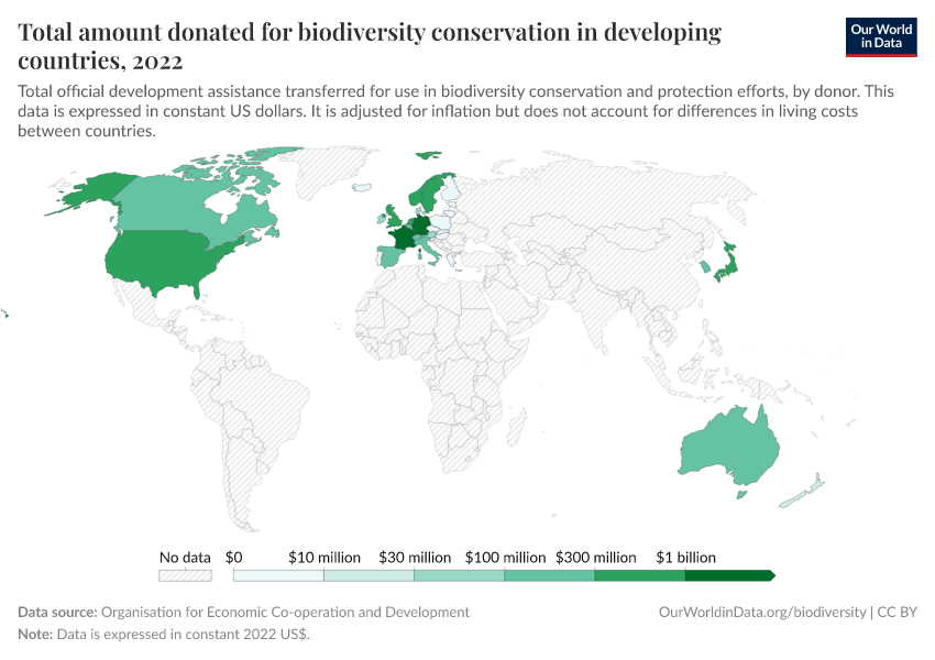
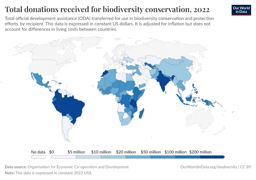
Biodiversity
Explore the diversity of wildlife across the planet. What are species threatened with? What can we do to prevent biodiversity loss?
Most of our work on Our World in Data focuses on data and research on human well-being and prosperity.
But we are just one of many species on Earth, and our demand for resources – land, water, food, and shelter – shapes the environment for other wildlife too.
For millennia, humans have been reshaping ecosystems, directly through competition and hunting of other animals, and indirectly through deforestation and land use changes for agriculture.
You can find all our data, visualizations, and writing related to biodiversity on this page. It aims to provide context on how biodiversity has changed in the past; the state of wildlife today; and how we can use this knowledge to build a future path where humans and other species can thrive on our shared planet.
Key insights on Biodiversity
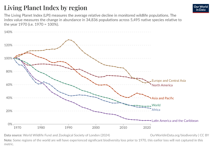
On average, there has been a large decline across tens of thousands of wildlife populations since 1970
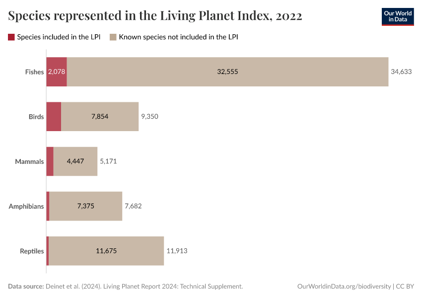
One of the most widely-quoted, but misunderstood, metrics on biodiversity is the Living Planet Index.
The Living Planet Index tries to summarize the average change in population size of tens of thousands of studied animal populations. It distills this change into a single number.
It's important to note that this data is not globally representative: some regions have much more data available than others. Biodiversity data is much more limited in the tropics, for example.
What it reports is the average decline in animal population sizes since 1970. This does not tell us the:
- Number of species lost;
- Number of populations or individuals that have been lost;
- Number or percentage of species or populations that are declining;
- Number of extinctions.
Since 1970, then, the size of animal populations for which data is available have declined by 73%, on average. The decline for some populations is much larger; for some, it’s much smaller. And, in fact, many populations have been increasing in size. We cover this in the next key insight.
What you should know about this data
- The Living Planet Project – which produces the Living Planet Index – is led by the Zoological Society of London (ZSL) and World Wildlife Fund (WWF).1
- Every two years, a new Living Planet Index report is published. This presents the latest high-quality data we have on animal populations, but also increases in global coverage with every new release.
- The underlying data included in the Living Planet Index comes from a combination of published scientific articles, online databases, and government reports.
- The Living Planet Index aggregates observations on changes in population size, and similar metrics, across tens of thousands of animal populations. Its 2024 report included figures across 34,000 wildlife populations. This captures everything from frogs to elephant species, rhinos to owls, from every continent on Earth. But even 34,000 populations are only a small fraction of the world’s wildlife.
- This data is not globally representative: some regions have much more data available than others. Biodiversity data is much more limited in the tropics, for example.
- The Living Planet Index only includes figures on vertebrate species – mammals, birds, fish, reptiles, and amphibians. It does not include insects, corals, fungi, or plants.
- Its final index is the average change in population size across all of the included animal populations. This figure is not representative of every population and is sensitive to outliers.2

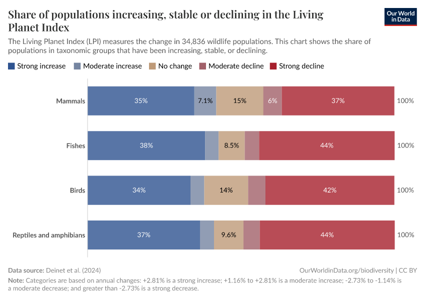
Not all animal populations are in decline; around half have increasing numbers
The Living Planet Index reports that there has been a large average decline across more than 34,000 animal populations.
But, reducing the state of global biodiversity into a single figure is a problem. It hides a huge diversity of changes in animal populations within the dataset.
The Living Planet Project also shows us what percentage of studied populations have increased, decreased, and remained stable since 1970.
Almost half of these animal populations have remained stable or increased. This is shown in the chart.
Understanding the broad range of changes in populations is crucial if we’re to stop biodiversity loss – we need to know that not all animal populations are declining. We need to also know which populations are doing well and why they’re doing well.
What you should know about this data
- The Living Planet Project – which produces the Living Planet Index – is led by the Zoological Society of London (ZSL) and World Wildlife Fund (WWF).1
- Every two years, a new Living Planet Index report is published. This presents the latest high-quality data we have on animal populations, but also increases in global coverage with every new release.
- The underlying data included in the Living Planet Index comes from a combination of published scientific articles, online databases, and government reports.
- The Living Planet Index aggregates observations on changes in population size, and similar metrics, across tens of thousands of animal populations. Its 2024 report included figures across 34,000 wildlife populations. This captures everything from frogs to elephant species, rhinos to owls, from every continent on Earth. But even 34,000 populations are only a small fraction of the world’s wildlife.
- This data is not globally representative: some regions have much more data available than others. Biodiversity data is much more limited in the tropics, for example.
- The Living Planet Index only includes figures on vertebrate species – mammals, birds, fish, reptiles, and amphibians. It does not include insects, corals, fungi, or plants.
- Its final index is the average change in population size across all of the included animal populations. This figure is not representative of every population and is sensitive to outliers.2
Wild mammals have declined by 85% since the rise of humans
A diverse range of mammals once roamed the planet. This changed quickly and dramatically with the rising number of humans over the course of the last 100,000 years.
Over this period, wild terrestrial mammal biomass has declined by an estimated 85%. This is shown in the chart.
This looks at the change in wild mammals on the basis of biomass. This means that each animal is measured in tonnes of carbon that it holds. This is a function of its body mass.
In an extended period between 50,000 to 10,000 years ago, hundreds of the world’s largest mammals were wiped out. This is called the Quaternary megafauna extinction event.
Humans were the main driver of this, killing off species through overhunting and changes to their habitats. What’s staggering is how few humans were alive at this time: fewer than 5 million people across the world.
Since then, wild mammals have continued to decline. A lot of this has been driven by the expansion of human agriculture into wild habitats.
What you should know about this data
- These estimates come from a combination of studies: pre-human and post-Quaternary extinction figures come from the work of Anthony Barnosky (2008); figures for the year 1900 figures from Vaclav Smil (2011); and 2015 figures from Yinon Bar-On, Rob Phillips and Ron Milo (2018).
- Only terrestrial mammals are included in these estimates. Marine mammals, such as whales and dolphins, are not included.
- These estimates compare mammals on the basis of biomass. This means that each animal is measured in tonnes of carbon that it holds. This is a function of its body mass.
- To calculate the biomass of a taxonomic group, the researchers multiply the carbon stock for a single organism by the estimated number of individuals in that group. In humans, for example, they would calculate the average carbon quantity of a person (about 15%) and multiply it by the human population.
- Estimating the population and biomass of mammals involves significant uncertainty, particularly for species that lived thousands of years ago. Older estimates tend to been more uncertain. These figures should be viewed as approximate, providing an order-of-magnitude estimate rather than precise values. This uncertainty arises from the need to make broad assumptions and generalizations about key factors such as body mass, population density, and range sizes of mammal species.
Wild mammals make up only a few percent of the world’s mammals
In the chart, we see the distribution of mammals on Earth.3 These estimates compare mammals on the basis of biomass. This means that each animal is measured in tonnes of carbon that it holds. This is a function of its body mass. Each rectangle represents one million tonnes of carbon.
Wild mammals make up just 4% of global mammal biomass. This includes marine and land-based mammals.
The other 96% is humans and our livestock.
The dominance of humans is clear. Alone, we account for around one-third of mammal biomass. Almost ten times greater than wild mammals.
Our livestock then accounts for almost two-thirds. Cattle weigh almost ten times as much as all wild mammals combined. The biomass of all of the world’s wild mammals is about the same as our sheep.
Poultry is not included here. But for birds, the distribution is similar: poultry biomass is more than twice that of wild birds.
What you should know about this data
- This data comes from the study of biomass distribution on Earth by researchers Yinon Bar-On, Rob Phillips, and Ron Milo, published in the Proceedings of the National Academy of Sciences.3
- These estimates compare mammals on the basis of biomass. This means that each animal is measured in tonnes of carbon that it holds. This is a function of its body mass.
- To calculate the biomass of a taxonomic group, the researchers multiplied the carbon stock for a single organism by the number of individuals in that group. In humans, for example, they calculate the average carbon quantity of a person and multiply by the human population. If you want to quickly estimate your carbon biomass: calculate 15% of your weight.
- These figures are approximate and come with significant uncertainty because the total number of wild mammals is highly uncertain.
Thanks to conservation efforts, some wild mammals are making a comeback
We have already seen that many animal populations have increased in the last decades.
Mammals in Europe are a prime example. Many of the region’s iconic mammal species – such as the Eurasian beaver, European bison, and brown bear – have been making a return.
In the chart, we see the average change in the population size of several mammal species in Europe. The studied time span differs from animal to animal, as the chart shows.
For example between 1960 and 2016, populations of brown bears increased by an average of 44%. Between 1977 and 2016, populations of Eurasian otters increased by an average of 300%.
Conservation efforts have played an important role in the return of these mammals, but it is not the only reason for this positive development. One important change is that the rise in agricultural productivity made it possible that agricultural land has declined across Europe, giving more habitat back to wildlife. Countries brought in hunting quotas or even complete bans on hunting. And some species – such as the European bison – were brought back through well-managed re-introduction programs.
What you should know about this data
- This data comes from the Wildlife Comeback Report 2022. This is published by a coalition of conservation organizations, including the Zoological Society of London; Birdlife International; and Rewilding Europe.4
- The dataset aggregates multiple studies of animal populations for each species. For example, 98 populations are included in the final figures for Eurasian beavers.
- Researchers calculate the averagerelative change in population size across all of the studied populations of a given species. The final figure does not tell us the total change in populations across Europe.
- Not every species in Europe is increasing in numbers. The underlying report focuses on a selection of mammal species that have made a comeback in recent decades. Many of those that are not shown might still be in decline, or only have stable population numbers.
Research & Writing
April 20, 2021
Wild mammals have declined by 85% since the rise of humans, but there is a possible future where they flourish
Wild mammal biomass has declined by 85% since the rise of humans. But we can turn things around by reducing the amount of land we use for agriculture.
September 27, 2022
Wild mammals are making a comeback in Europe thanks to conservation efforts
Hunting and habitat loss drove many large mammals in Europe close to extinction. New data shows us that many of the continent’s mammal populations are flourishing again.
Living Planet Index
October 10, 2024
The 2024 Living Planet Index reports a 73% average decline in wildlife populations — what’s changed since the last report?
October 13, 2022
Living Planet Index: what does it really mean?
May 17, 2021
How the Living Planet project helps us understand changes in the world’s wildlife
October 13, 2022
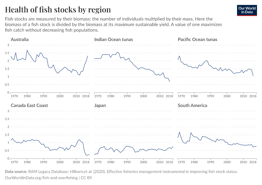
How does the Living Planet Index vary by region?
October 13, 2022
FAQs on the Living Planet Index
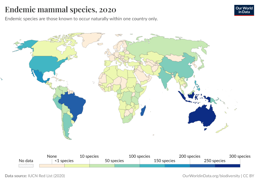
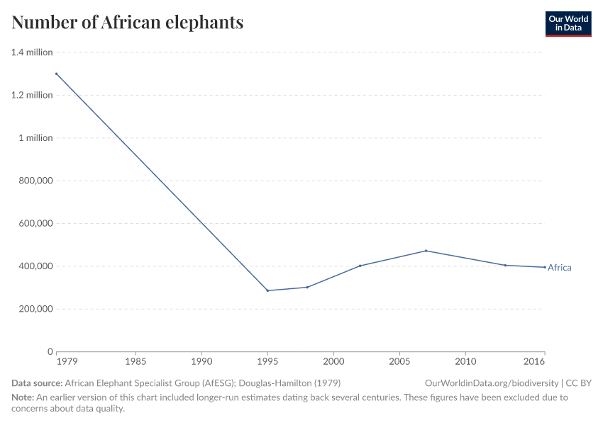
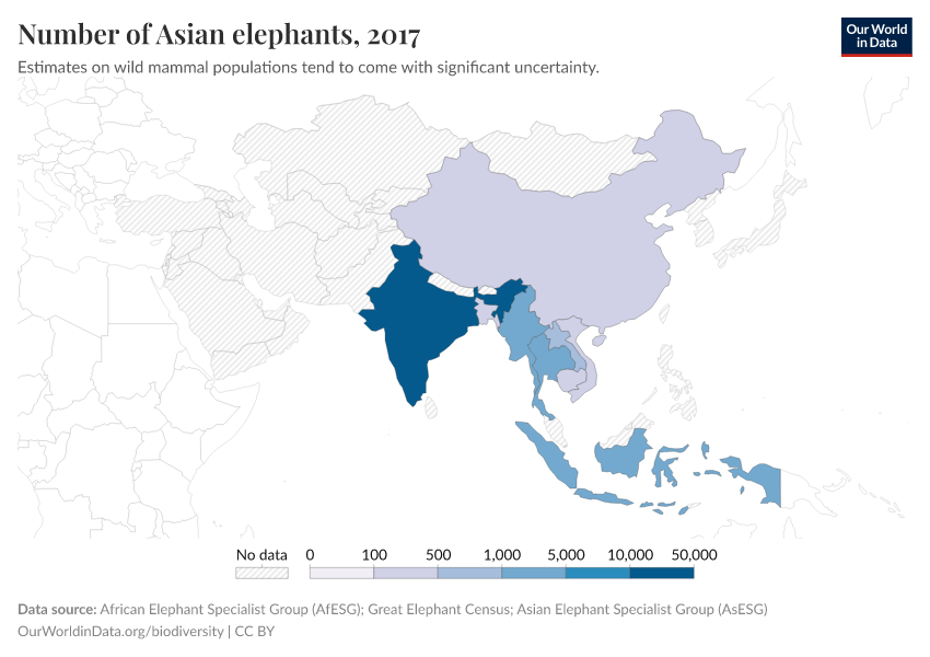
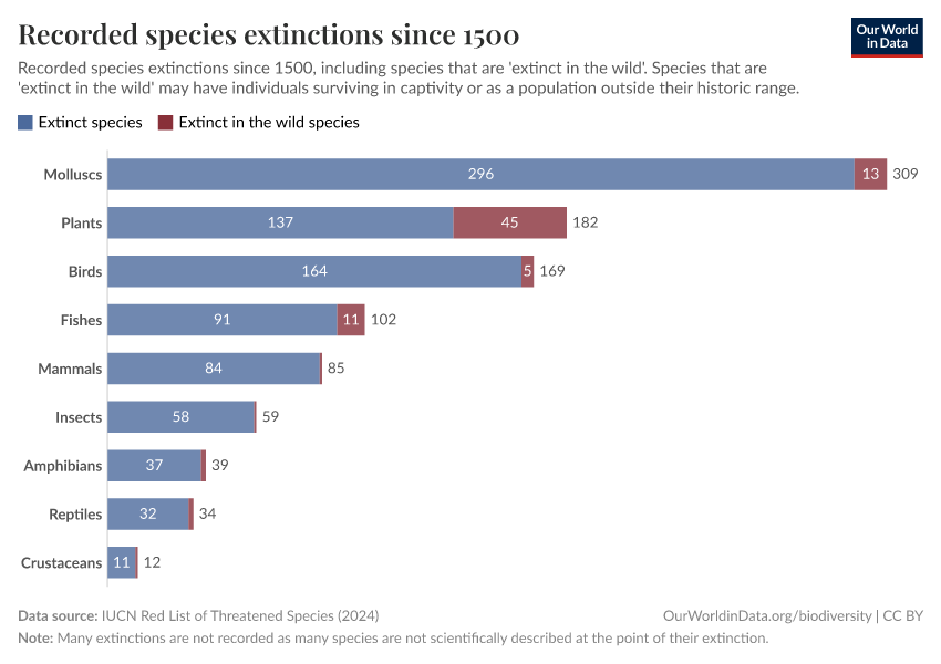
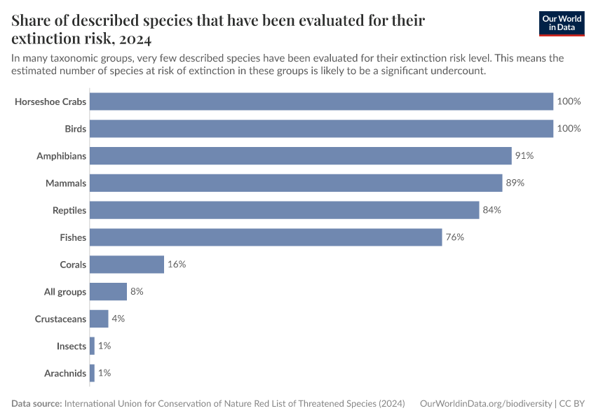
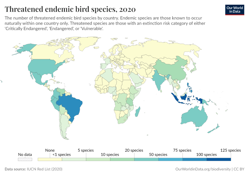
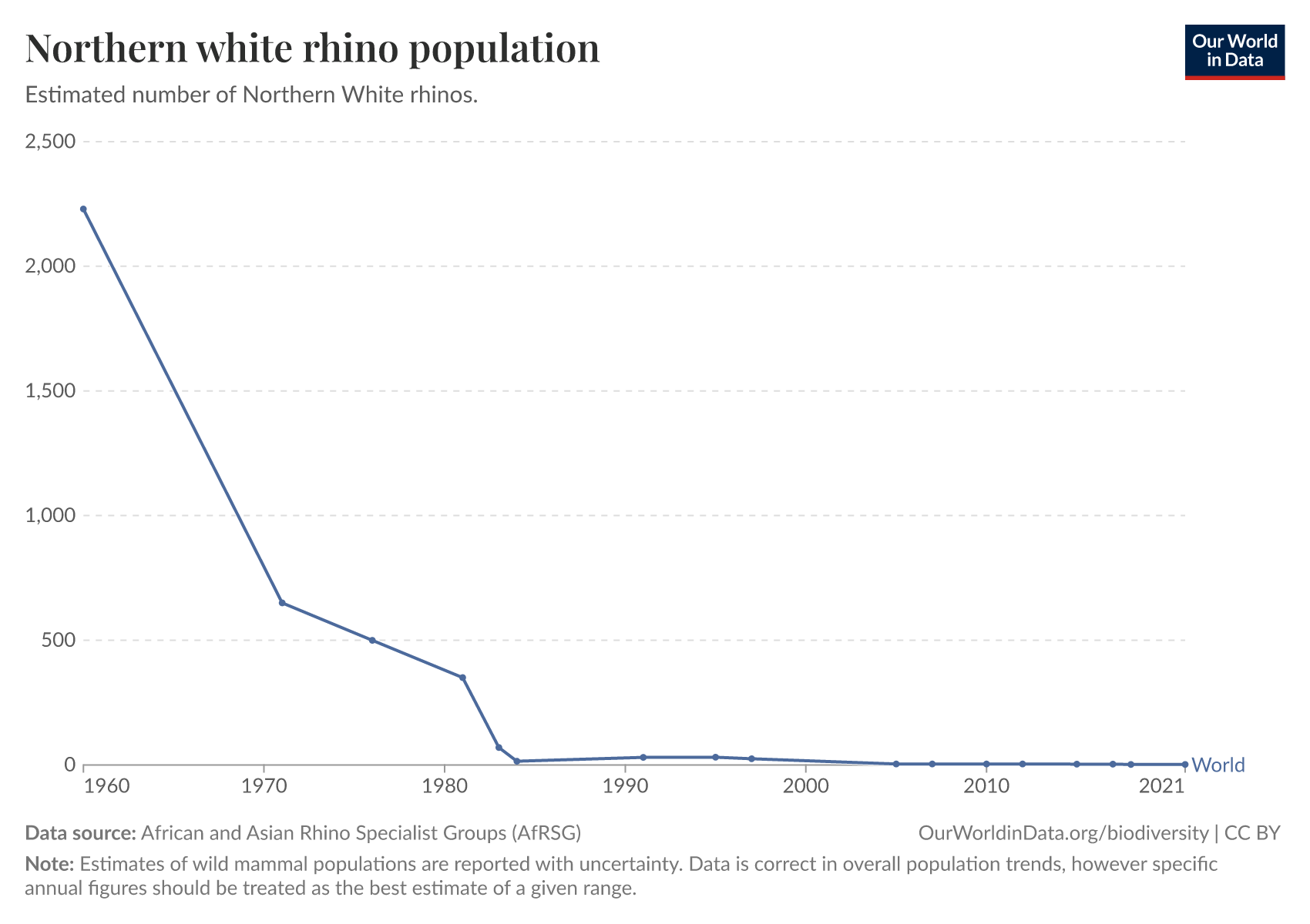
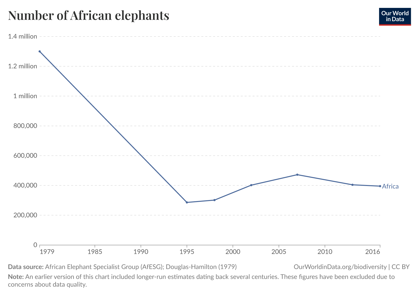
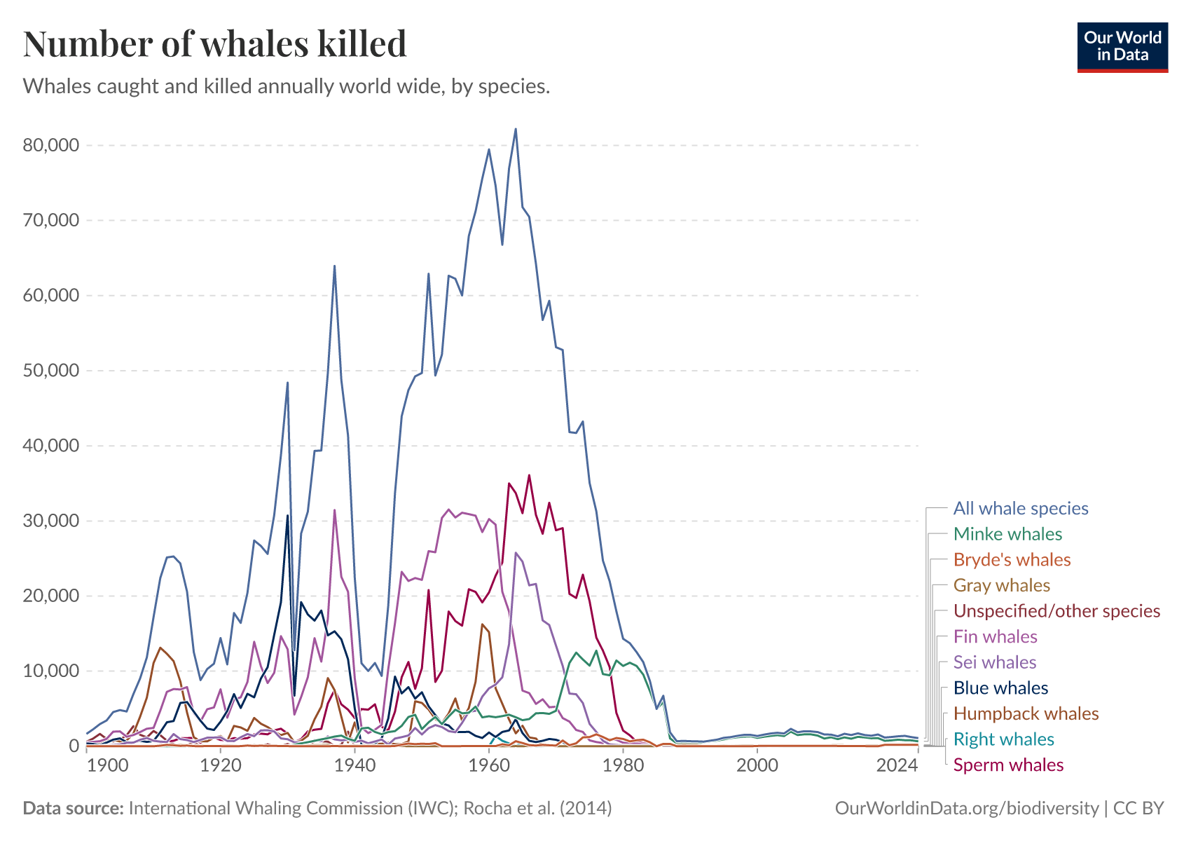
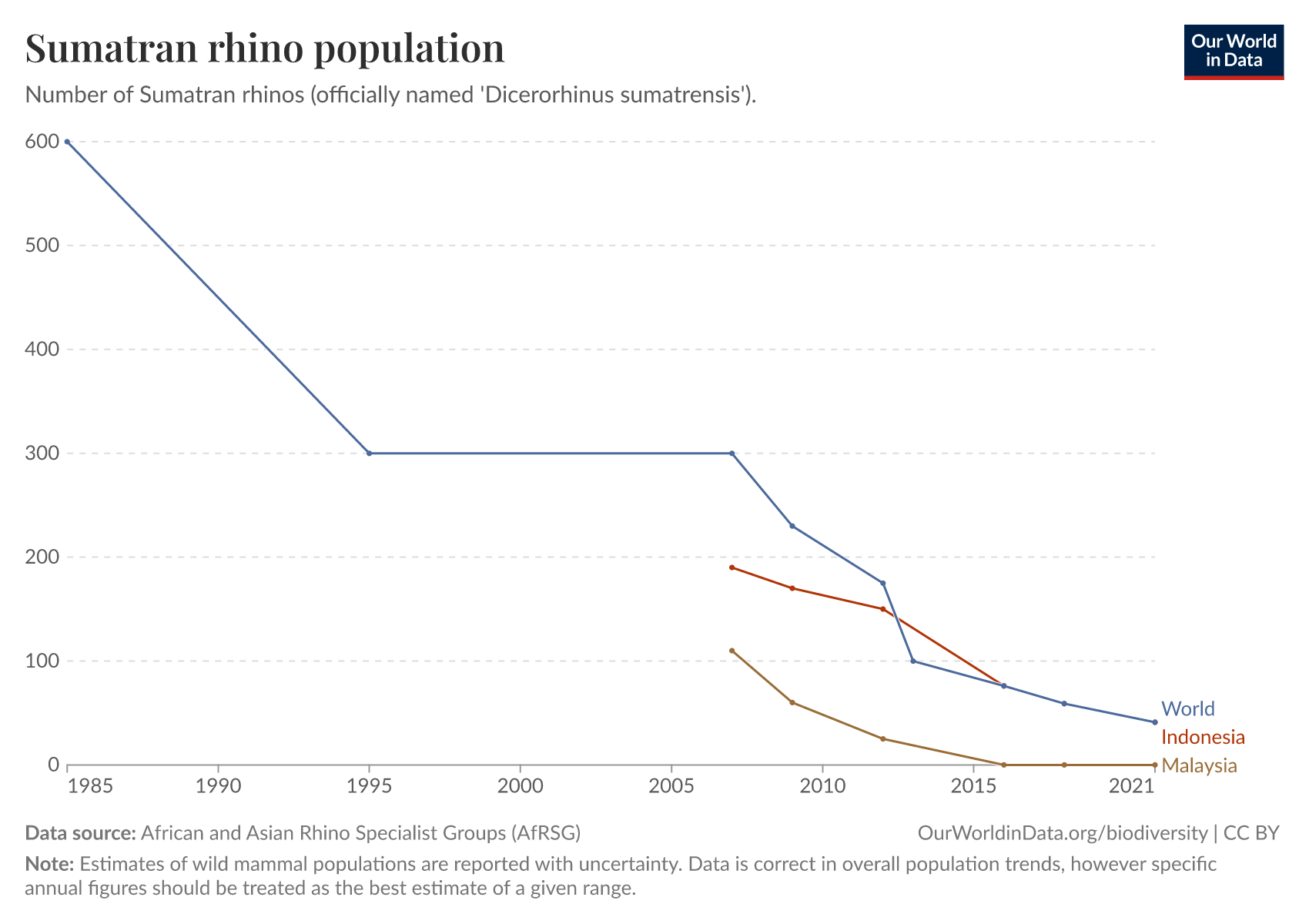
Mammals
Extinctions
Other articles on Biodiversity
August 2, 2021
How much of the world’s food production is dependent on pollinators?
September 2, 2021
To protect the world’s wildlife, we must improve crop yields — especially across Africa
April 24, 2019
Humans make up just 0.01% of Earth's life — what's the rest?
April 26, 2019
Oceans, land, and deep subsurface: how is life distributed across environments?
November 30, 2022
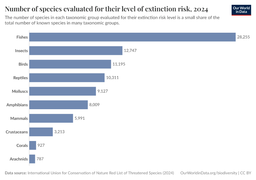
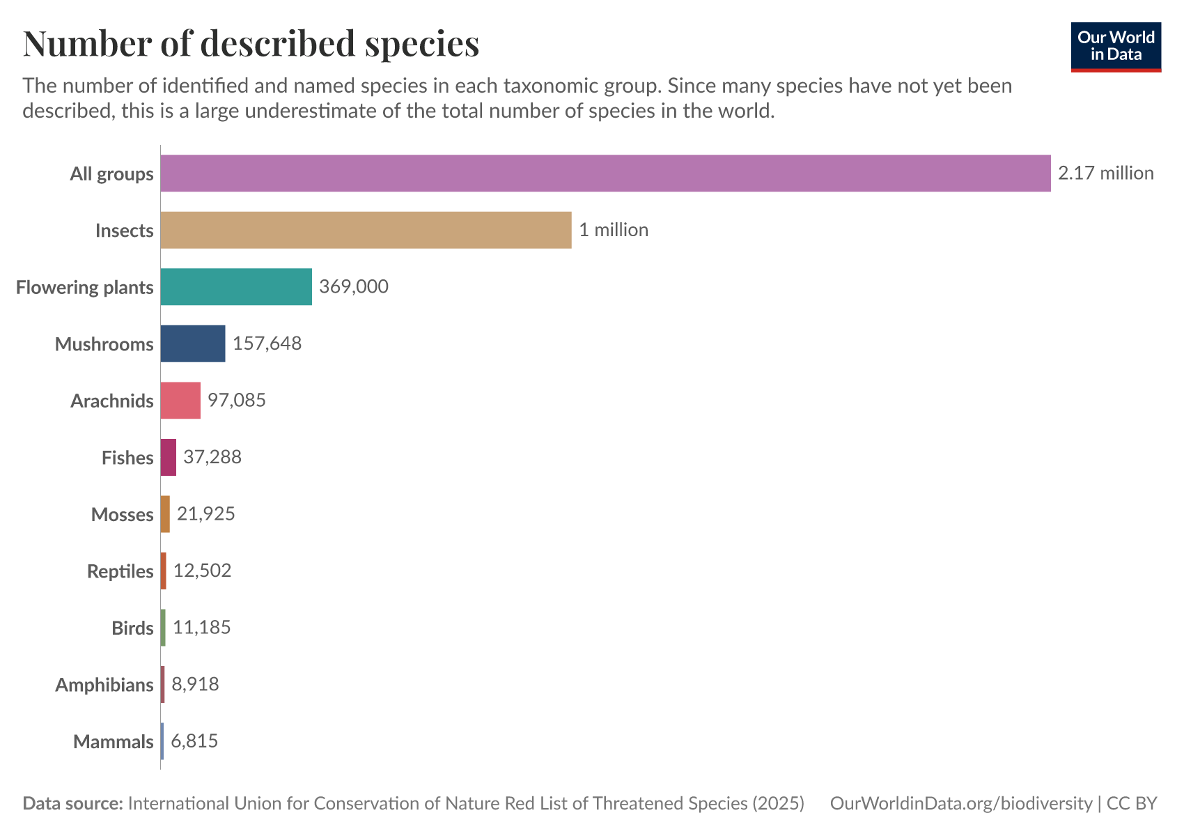
How many species are there?
Key Charts on Biodiversity
See all charts on this topic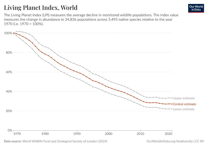


Featured Data on Biodiversity
Endnotes
WWF (2024) Living Planet Report 2024 – A System in Peril. WWF, Gland, Switzerland.
Leung, B., Hargreaves, A. L., Greenberg, D. A., McGill, B., Dornelas, M., & Freeman, R. (2020). Clustered versus catastrophic global vertebrate declines. Nature, 588(7837), 267-271.
Bar-On, Y. M., Phillips, R., & Milo, R. (2018). The biomass distribution on Earth. Proceedings of the National Academy of Sciences, 115(25), 6506-6511.
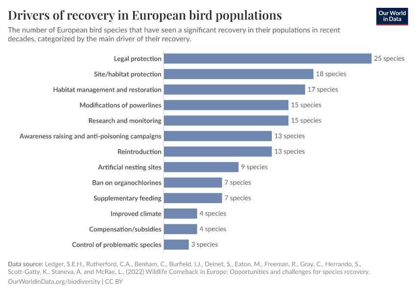
Ledger, S.E.H., Rutherford, C.A., Benham, C., Burfield, I.J., Deinet, S., Eaton, M., Freeman, R., Gray C., Herrando, S., Puleston, H., Scott-Gatty, K., Staneva, A. and McRae, L. (2022) Wildlife Comeback in Europe: Opportunities and challenges for species recovery. Final report to Rewilding Europe by the Zoological Society of London, BirdLife International and the European Bird Census Council.
Cite this work
Our articles and data visualizations rely on work from many different people and organizations. When citing this topic page, please also cite the underlying data sources. This topic page can be cited as:
Hannah Ritchie, Fiona Spooner, and Max Roser (2022) - “Biodiversity” Published online at OurWorldinData.org. Retrieved from: 'https://ourworldindata.org/biodiversity' [Online Resource]BibTeX citation
@article{owid-biodiversity,
    author = {Hannah Ritchie and Fiona Spooner and Max Roser},
    title = {Biodiversity},
    journal = {Our World in Data},
    year = {2022},
    note = {https://ourworldindata.org/biodiversity}
}
Reuse this work freely
All visualizations, data, and articles produced by Our World in Data are completely open access under the Creative Commons BY license. You have the permission to use, distribute, and reproduce these in any medium, provided the source and authors are credited.
The data produced by third parties and made available by Our World in Data is subject to the license terms from the original third-party authors. We will always indicate the original source of the data in our documentation, so you should always check the license of any such third-party data before use and redistribution.
All of our charts can be embedded in any site.