Top of the Charts: our most popular work in 2025
A look back at the most popular charts, articles, data insights, and more from Our World in Data in 2025.
As 2025 draws to a close, we want to look back on the year and share the pieces of our work that were most popular and engaging with you, our readers.
We continue to reach tens of millions of readers each year through our website. We also have a wide reach on other platforms. Across social media, our posts this year have been viewed nearly 60 million times. Our work also gets hundreds of millions of views on websites like Wikipedia, and many thousands of citations by media around the world each year.
From the charts with the most views, to the articles and data insights with the most reads, to our most-popular posts on social media, here we give you the “Top of the Charts” from Our World in Data in 2025. We hope you enjoy!
If you do, please share this list or your favorite parts with someone who you think would, too. Sharing with others is one of the best ways you can support our work.
Thanks, and have a great holiday season!
– The Our World in Data team
See our most popular work in 2025
You can navigate using the links below.
Charts
Here are our top five most-viewed interactive charts in 2025.1
We’ve made it easy for you to share these — just click the “Share” button in the bottom right of the chart. You can also embed them in any website.
You can reuse all of our charts for free under our permissive Creative Commons license.
1. CO2 emissions

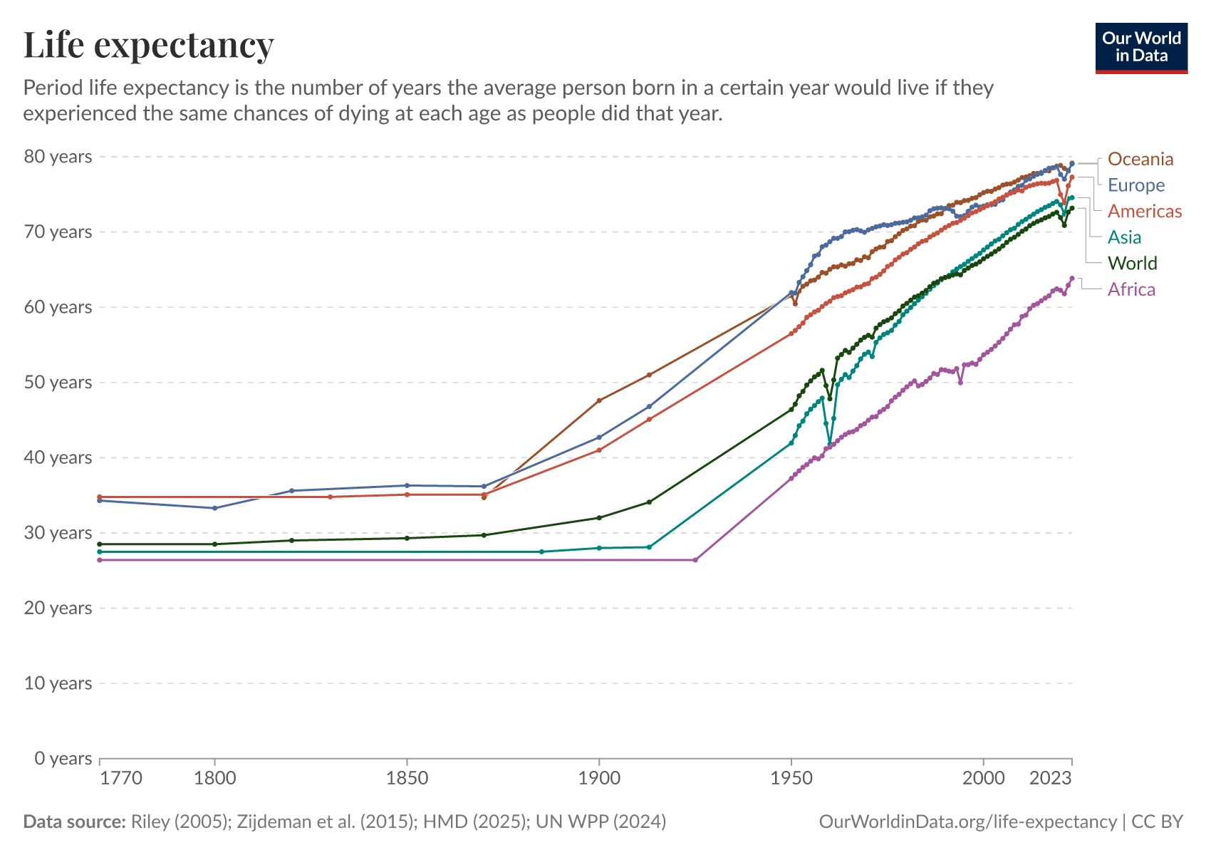
2. Life expectancy
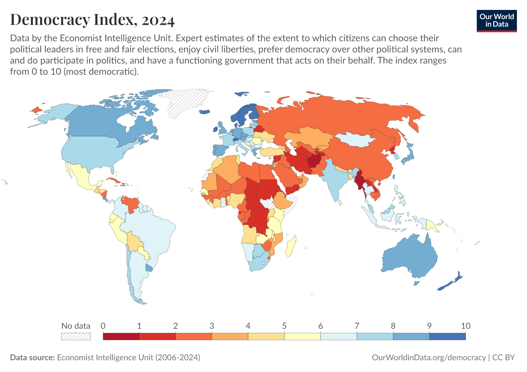
3. Democracy
4. Temperature anomalies

5. Economic growth

Articles
Here are the top five most-read articles that we published this year.2
- The baby boom in seven charts
- Does the news reflect what we die from?
- Air pollution kills millions every year — where does it come from?
- Death rates from cardiovascular disease have fallen dramatically — what were the breakthroughs behind this?
- Where in the world are babies at the lowest risk of dying?
1. The baby boom in seven charts
By Saloni Dattani and Lucas Rodés-Guirao
The baby boom reshaped family life and drove population growth in many countries.
One of the striking aspects of the baby boom is that it happened in many high-income countries at the same time — even in those not directly involved in World War II, such as Sweden. You can see this in the chart.
What caused the baby boom? This is still widely debated by demographers. Various theories have been put forward, including economic factors, such as rising wages and lower housing costs, as well as declining maternal mortality and societal changes.
It’s likely that multiple factors played a role and that no single explanation fully accounts for the surge in births.
In this article, Saloni Dattani and Lucas Rodés-Guirao explore the key patterns of the baby boom in seven charts.
2. Does the news reflect what we die from?
By Hannah Ritchie, Tuna Acisu, and Edouard Mathieu
More than 80% of people surveyed say they follow the news because they “want to know what is going on in the world around them.”
It’s not just that people expect the news to inform them about what’s going on in the world — most think that it does. And this is what media outlets themselves promise to do.
However, as we discuss in this article, the media focuses on just a fraction of our world.
We investigate this through the lens of health, looking at causes of death in the United States and reporting on these causes in the New York Times, Washington Post, and Fox News.
Our point is not that we should want or expect the media’s coverage to perfectly match the real distribution of deaths, although we’d argue that it would be better if it were less skewed.
We wrote this article so that you, the reader, are aware of a significant disconnect between what we often hear and what actually happens.
It’s easy to conflate what we see in the news with the reality of our world, and keeping this mismatch in mind can help you avoid falling into this trap.
3. Air pollution kills millions every year — where does it come from?
By Hannah Ritchie and Pablo Rosado
Millions of people die prematurely from air pollution every year, as you can see in the chart.
This problem has existed since humans started burning materials for fuel — first wood and biomass, then fossil fuels.
But it’s an environmental and public health problem that we can make progress on. We know this because the world has already been successful in reducing air pollutants, and many countries that used to be highly polluted now have much cleaner air than they used to.
To tackle air pollution effectively — to focus our efforts on the interventions that will have the biggest impact — we need to understand where it’s coming from.
In this article, Hannah Ritchie and Pablo Rosado overview the many sources of different pollutants — including sulfur dioxide, ammonia, nitrous oxide, and black carbon — and explain how we can reduce their harmful impacts.
4. Death rates from cardiovascular disease have fallen dramatically — what were the breakthroughs behind this?
By Saloni Dattani
In 1945 — at just 63 years old — President Franklin D. Roosevelt was sitting for a portrait when he raised a hand to his head and whispered, “I have a terrific pain in the back of my head.”
Minutes later, he lost consciousness and died from a massive brain hemorrhage — a consequence of uncontrolled high blood pressure and heart disease, which doctors at the time couldn’t treat.
Roosevelt wasn’t alone. Mid-twentieth-century medicine, even for some of the world's most powerful people, often lacked the tools to treat or sometimes even diagnose specific cardiovascular diseases.
Today, pills could have driven down Roosevelt’s blood pressure within weeks. The hypertension that struck him and many others without warning, often known as “the silent killer”, is routinely diagnosed and treated.
Cardiovascular diseases are still the leading cause of death worldwide. But the story reflects a remarkable and often overlooked fact: the risk of dying from cardiovascular diseases has fallen dramatically in recent decades.
This progress was built on decades of biomedical research, surgical advances, public health efforts, and lifestyle changes — many of these are highlighted in the chart.
In this article, Saloni Dattani looks at how and why deaths from cardiovascular disease have declined.
5. Where in the world are babies at the lowest risk of dying?
By Hannah Ritchie
Which country is the safest for a baby to be born in?
Answering this question might seem easy: divide the number of infants who die by the total number of infants born, make a map of these rates, and find the lowest number.
But while these comparisons are very helpful in identifying the huge differences across countries at different income levels, things get more complicated when it comes to the small differences between the countries with the lowest mortality rates.
This is because countries measure infant deaths slightly differently, specifically, the number of live births that are recorded.
In this article, Hannah Ritchie explains these differences in measurement and how they affect mortality rates. She also looks at what explains some of the differences in outcomes for babies in different countries.
Data insights
Here are the top five most-read data insights that we published this year.1
- Global sales of combustion engine cars have peaked
- The twin baby boom
- The world has probably passed “peak air pollution”
- Suicide rates are higher in men than women
- Life expectancy has increased at all ages
These are our bite-sized insights on the world and how it’s changing. We now have a catalog of nearly 400 insights. You can find them in our search, too.
1. Global sales of combustion engine cars have peaked
By Hannah Ritchie
To decarbonize road transport, the world must move away from petrol and diesel cars and towards electric vehicles and other forms of low-carbon transport.
This transition has already started. In fact, global sales of combustion engine cars are well past the peak and are now falling.
As you can see in the chart, global sales peaked in 2018. This is calculated based on data from the International Energy Agency. Bloomberg New Energy Finance estimates this peak occurred one year earlier, in 2017.
Sales of electric cars, on the other hand, are growing quickly.
2. The twin baby boom
By Saloni Dattani and Lucas Rodés-Guirao
The share of births that are twins has changed over time.
The chart shows data for France, Canada, the United States, and England & Wales in the Human Multiple Births Database.
As you can see, twin births have risen dramatically since the 1980s.
One reason is the use of reproductive technologies such as in vitro fertilization (IVF), which have made it possible for many more couples to conceive. During procedures like IVF, multiple eggs can be used at the same time to maximize the chances of a successful pregnancy, which can lead to twin births.
Another reason for the rise in twin births is that the average age of women at childbirth has risen. Older women are more likely to have twin births, even without using reproductive technologies.
Twin births are a chance event, but data shows they can also be influenced by societal changes and reproductive technologies.
3. The world has probably passed “peak air pollution”
By Hannah Ritchie
Global emissions of local air pollutants have probably passed their peak.
The chart shows estimates of global emissions of pollutants such as sulphur dioxide (which causes acid rain), nitrogen oxides, and black and organic carbon.
These pollutants are harmful to human health and can also damage ecosystems.
It looks like emissions have peaked for almost all of these pollutants. Global air pollution is now falling, and we can save many lives by accelerating this decline.
The exception is ammonia, which is mainly produced by agriculture. Its emissions are still rising.
These estimates come from the Community Emissions Data System (CEDS).
4. Suicide rates are higher in men than women
By Hannah Ritchie
Globally, more than 700,000 people die from suicide every year.
Understanding the factors that increase the risk of suicide can help us provide the most effective interventions and support systems.
One thing we do know is that more men die from suicide than women. In the chart, you can see male suicide rates (on the vertical axis) plotted against female rates. One dot is one country. Since all of the dots lie above the line, male suicide rates were higher in all countries included in this dataset.
The size of this gender gap varies by country. In the United States, rates among men are four times higher than among women. In South Korea and Japan, they’re around double. Some countries lie closer to the line, meaning the gap is smaller.
The exact reasons for this gender gap are still debated. Factors could include the lethality of different methods, stigma around seeking help, different social pressures, and alcohol and drug abuse.
Every suicide is a tragedy. However, suicide death rates have declined in many countries, and we know that they can be reduced further with greater understanding and support. If you are dealing with suicidal thoughts, you can receive immediate help by visiting resources such as findahelpline.com.
5. Life expectancy has increased at all ages
By Esteban Ortiz-Ospina
It’s a common misconception that life expectancy has increased only because fewer children die. Historical mortality records show that adults today also live much longer than adults in the past.
It’s true that child mortality rates were much higher in the past, and their decline has greatly improved overall life expectancy. But in recent decades, improvements in survival at older ages have been even more important.
The chart shows the period life expectancy in France for people of different ages. This measures how long someone at each of those ages would live, on average, if they experienced the death rates recorded in that year. For example, the last point on the top dark-red line shows that an 80-year-old in 2023 could expect to live to about 90, assuming mortality rates stayed as they were in 2023.
As you can see, life expectancy in France has risen at every age. In 1816, someone who had reached the age of 10 could expect to live to 57. By 2023, this had increased to 84. For those aged 65, it rose from 76 in 1816 to 87 in 2023.
The data for many other countries shows the same. This remarkable shift is the result of advances in medicine, public health, and living standards.
Topic pages
Here are our top five most-viewed topic pages in 2025.2
These are the “homepage” for a given topic, collecting all of our data, research, and writing in one place. They’re a great starting point for exploring a new topic.
1. CO₂ and Greenhouse Gas Emissions
Human emissions of greenhouse gases are the primary driver of climate change today.3
CO2 and other greenhouse gases like methane and nitrous oxide are emitted when we burn fossil fuels, produce materials such as steel, cement, and plastics, and grow the food we eat. If we want to reduce these emissions, we need to transform our energy systems, industries, and food systems.
At the same time, we need to tackle energy poverty, low standards of living, and poor nutrition, which all remain enormous problems for billions of people.
Technological advances could allow us to do both. The prices of solar, wind, and batteries have plummeted in recent decades, increasingly undercutting the cost of fossil fuel alternatives. Further progress could allow us to provide cheap, clean energy for everyone. Political change is essential to create a system that supports rapid decarbonization.
Emissions are still rising in many parts of the world. However, several countries have managed to cut their emissions in recent decades. With affordable low-carbon technologies, other countries can increase their living standards without the high-carbon pathway that rich countries followed in the past.
On this page, you can find our data, visualizations, and writing on CO2 and other greenhouse gas emissions.

2. Population Growth
Population growth is one of the most important topics we cover on Our World in Data.
For most of human history, the global population was a tiny fraction of what it is today. Over the last few centuries, the human population has gone through an extraordinary change. In 1800, there were one billion people. Today, there are more than 8 billion of us.
But after a period of very fast population growth, demographers expect the world population to peak by the end of this century.
On this page, you will find all of our data, charts, and writing on changes in population growth. This includes how populations are distributed worldwide, how this has changed, and what demographers expect for the future.

3. Life Expectancy
Across the world, people are living longer.
In 1900, the average life expectancy of a newborn was 32 years. By 2021, this had more than doubled to 71 years.
But where, when, how, and why has this dramatic change occurred?
To understand it, we can look at data on life expectancy worldwide.
The large reduction in child mortality has played an important role in increasing life expectancy. But life expectancy has increased at all ages. Infants, children, adults, and the elderly are all less likely to die than in the past, and death is being delayed.
This remarkable shift results from advances in medicine, public health, and living standards. Along with it, many predictions of the ‘limit’ of life expectancy have been broken.
On this page, you will find global data and research on life expectancy and related measures of longevity: the probability of death at a given age, the sex gap in life expectancy, lifespan inequality within countries, and more.

4. Plastic Pollution
Plastic production has sharply increased over the last 70 years. In 1950, the world produced just two million tonnes. It now produces over 450 million tonnes.
Plastic has added much value to our lives: it’s a cheap, versatile, and sterile material used in various applications, including construction, home appliances, medical instruments, and food packaging.
However, when plastic waste is mismanaged — not recycled, incinerated, or kept in sealed landfills — it becomes an environmental pollutant. One to two million tonnes of plastic enter our oceans yearly, affecting wildlife and ecosystems.
Improving the management of plastic waste across the world – especially in poorer countries, where most of the ocean plastics come from – is therefore critical to tackling this problem.
On this page, you can find all of our data, visualizations, and writing on plastic pollution.

5. Poverty
Global poverty is one of the most pressing problems that the world faces today. The poorest in the world are often undernourished and without access to basic services such as electricity and safe drinking water; they have less access to education and suffer from much poorer health.
In order to make progress against such poverty in the future, we need to understand poverty around the world today and how it has changed.
On this page, you can find all our data, visualizations, and writing relating to poverty. This work aims to help you understand the scale of the problem today; where progress has been achieved and where it has not; what can be done to make progress against poverty in the future; and the methods behind the data on which this knowledge is based.

Social media posts
Here are our top five most-popular social media posts in 2025, based on the number of “likes” they received.
- Does the news reflect what we die from? (Instagram)
- How do the rights of LGBT+ people vary across the world? (Instagram)
- Vaccines reduced measles cases across US states (Reddit)
- What do governments spend money on? (Instagram)
- Homophobic attitudes have fallen in Western Europe and the United States (Reddit)
We have a presence on most social media platforms to make it easy to follow our work: X/Twitter, Instagram, Facebook, LinkedIn, Threads, and Bluesky. Our combined audience across those is nearly 800,000, and our posts this year have been viewed nearly 60 million times.
We also often post our work on Reddit in subreddits like r/dataisbeautiful and r/Infographics.
1. Does the news reflect what we die from? (Instagram)
This post to share our article “Does the news reflect what we die from?” turned out to be our most-popular social media post of all time on any platform.
It has nearly 126,000 likes, 6 million views, and 67,000 shares, and helped substantially increase our follower count. Thanks to everyone who liked, commented on, and shared it!
2. How do the rights of LGBT+ people vary across the world? (Instagram)
This post shared data that our colleagues Pablo Arriagada and Bastian Herre had updated from Equaldex, a collaborative knowledge base crowdsourcing LGBT+ rights data by country and region.
Explore more of that data in this article.
3. Vaccines reduced measles cases across US states (Reddit)
Our colleague Fiona Spooner posted this as “OC” (original content) on the “Data is Beautiful” subreddit to share her article with Saloni Dattani, “Measles vaccines save millions of lives each year”.
4. What do governments spend money on? (Instagram)
This post shared updated data and writing on our Government Spending topic page, work led by Bertha Rohenkohl and Pablo Arriagada.
5. Homophobic attitudes have fallen in Western Europe and the United States (Reddit)
This post shared a data insight written by our colleague Simon van Teutem.
Datasets
Here are the top five most-downloaded datasets on Our World in Data this year.4
We’ve made it easy to download and reuse our data — with an API and enhanced download options (just click the “Download” button at the bottom of any chart).
Our work would not be possible without the researchers and data providers we rely on, so we ask you to always respect their license terms and cite them appropriately.
This is crucial to allow data providers to continue doing their work, enhancing, maintaining, and updating valuable data.
1. COVID-19
The COVID-19 pandemic has had a profound impact on the world, causing tens of millions of deaths, overwhelming healthcare systems, and disrupting societies and economies.
Reliable data has been crucial to effectively track and respond to the pandemic and guide public health efforts, research, and policies.
For several years during the pandemic, our team at Our World in Data published daily updates on a range of crucial indicators and developed two global datasets on testing and vaccination.
Our COVID-19 Data Explorer became a go-to source for people to understand the extent and spread of the disease, and it contains our most-downloaded dataset to this day.
Besides the data on testing and vaccination our team collected, this dataset relies on many sources, including The Economist, WHO, the Oxford Covid-19 Government Response Tracker, the Human Mortality Database, Karlinsky and Kobak (2021), and more.
2. CO₂ emissions
Data from the Global Carbon Budget

3. Economic growth
Data from the World Bank, IMF, OECD, and Eurostat

4. Life expectancy
Data from the UN, Human Mortality Database, Zijdeman et al. (2015), and Riley (2005)

5. Renewable electricity
Data from the Energy Institute’s Statistical Review of World Energy

Endnotes
Based on cumulative page views on Our World in Data.
Based on cumulative page views.
IPCC, 2021: Climate Change 2021: The Physical Science Basis. Contribution of Working Group I to the Sixth Assessment Report of the Intergovernmental Panel on Climate Change [Masson-Delmotte, V., P. Zhai, A. Pirani, S.L. Connors, C. Péan, S. Berger, N. Caud, Y. Chen, L. Goldfarb, M.I. Gomis, M. Huang, K. Leitzell, E. Lonnoy, J.B.R. Matthews, T.K. Maycock, T. Waterfield, O. Yelekçi, R. Yu, and B. Zhou (eds.)]. Cambridge University Press, Cambridge, United Kingdom and New York, NY, USA, In press, doi:10.1017/9781009157896.
Based on the cumulative number of clicks on "Download" buttons in charts and data explorers.
Cite this work
Our articles and data visualizations rely on work from many different people and organizations. When citing this article, please also cite the underlying data sources. This article can be cited as:
Our World in Data team (2025) - “Top of the Charts: our most popular work in 2025” Published online at OurWorldinData.org. Retrieved from: 'https://archive.ourworldindata.org/20260716-164845/top-of-the-charts-2025.html' [Online Resource] (archived on July 16, 2026).BibTeX citation
@article{owid-top-of-the-charts-2025,
    author = {Our World in Data team},
    title = {Top of the Charts: our most popular work in 2025},
    journal = {Our World in Data},
    year = {2025},
    note = {https://archive.ourworldindata.org/20260716-164845/top-of-the-charts-2025.html}
}
Reuse this work freely
All visualizations, data, and articles produced by Our World in Data are completely open access under the Creative Commons BY license. You have the permission to use, distribute, and reproduce these in any medium, provided the source and authors are credited.
The data produced by third parties and made available by Our World in Data is subject to the license terms from the original third-party authors. We will always indicate the original source of the data in our documentation, so you should always check the license of any such third-party data before use and redistribution.
All of our charts can be embedded in any site.