Famines
In many parts of the world famines have been common in the past. What causes famines? How can famines be averted?
This page was first published in 2013 and last revised in March 2025.
A famine is an episode of mass mortality due to mass starvation, which is the destruction, deprivation, or loss of objects and activities required for survival. 1
These crisis characteristics distinguish it from persistent malnutrition, which we discuss on another topic page. The term 'famine' can mean different things to different people and has evolved over time. It is only in recent years that more precise, measurable definitions — in terms of mortality rates, food consumption, and physical signs of malnutrition — have been developed.
But despite these ambiguities, it is nonetheless very clear that in recent decades the presence of major life-taking famines has diminished significantly compared to earlier eras. The parts of the world that continue to be at risk of famine represent a much more limited geographic area than in previous eras, and those famines that have occurred recently have typically been far less deadly – as we will go on to show in this topic page.
Famines have always occurred as the result of a complex mix of ‘technical’ and ‘political’ factors, but the developments of the modern industrial era have generally reduced the salience of natural constraints in causing famine.2 This includes many developments discussed in other pages of Our World in Data, such as the increasing food supply, made possible through increasing crop yields; improvements in healthcare and sanitation; increased trade; reduced food prices and food price volatility; as well as reductions in the number of people living in extreme poverty.
As a consequence famines have over time become increasingly “man-made”-phenomena, becoming more clearly attributable to political causes, including non-democratic government and conflict. Paradoxically, over the course of the 20th century famine was virtually eradicated from most of the world, whilst over the same period there occurred some of the worst famines in recorded history. This is because many of the major famines of the 20th century were the outcome of wars or totalitarian regimes. As such, the waning of the very high levels of warfare over the last decades and the spread of democratic institutions have also played a large part in the substantial reduction in famine mortality witnessed in recent decades.
Emergency food aid provided by relief agencies continues to play a crucial role in preventing loss of life, and the international relief community has recently developed monitoring systems that have allowed for greater preparation and more timely interventions. Where poor harvests are the main cause of famine, relief provision tends to prevent marked increases in mortality. It is the presence of conflict, or abuses of political power that can block food supplies from reaching populations which represents the most pertinent trigger of ‘death-dealing’ famines today.3
Thus, overall, we can see the rapid decline of famine mortality as one of the great accomplishments of our era, representing technological progress, economic development and the spread of stable democracies. Viewed in this light, however, it also serves to highlight the appalling continued presence of famines which are, in the modern world, entirely man-made.
Related topics and writing

See all interactive charts on famines ↓
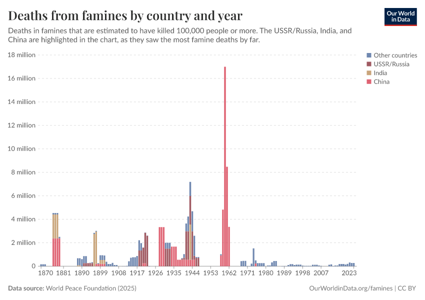
Famine across the world since 1870
Long-term trends in global famine mortality
Compared to earlier historical periods, fewer people have died in famines in recent decades. Here we show two bar charts using data from the World Peace Foundation’s famine dataset.4 The first chart shows the number of deaths from large famines. While the number of famine deaths has varied significantly from decade to decade depending on the occurrence of individual catastrophic famines, recent decades have seen low numbers of famine deaths by historical standards.
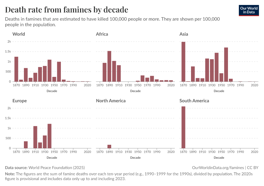
The next chart shows the death rate from large famines, expressed as the number of people dying each decade per 100,000 people of the world’s population. Viewed in this way, the trend is all the more notable: the famine mortality rate fell to very low levels over the second half of the 20th century.

The sharp reduction in famine mortality represents "one of the great unacknowledged triumphs of our lifetime", as famine researcher, Alex de Waal describes it.5
As de Waal explains, a continued decline is by no means assured: the future of famine will depend largely on the nature and prevalence of war.
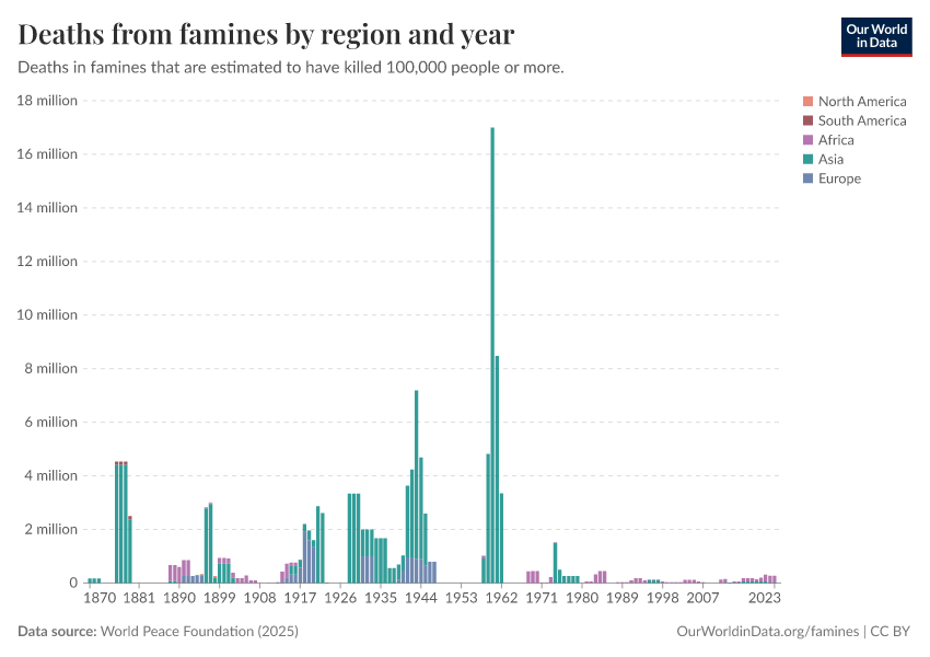
Famines by world region since 1870
Increasingly limited parts of the world are affected by famine
The geographic spread of famines has become smaller over time, as the following chart shows.
There hasn’t been a large famine in North or South America since the late 19th century, and no large famine in Europe since the 1940s.
Large famines in Asia have claimed many fewer lives in recent decades, even if they have not disappeared completely.
This has meant that large famines recently have mostly been confined to Africa.

Victims of individual famines
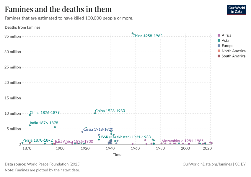
This chart shows the estimated number of people dying in individual famines since the 1870s.
We see that there are very large differences in how deadly different famines are: most death tolls are in the hundreds of thousands, a smaller number of famines claim several million lives, and one — China’s “Great Leap Forward” famine — was far deadlier than all others, claiming an estimated 36 millions lives between 1958 and 1962.
For all famines, the data on the death toll is associated with considerable uncertainty. The data that we rely on — produced by researchers at the World Peace Foundation — puts the most likely death toll for the famine during Mao Zedong's reign at 36 million, drawing on the work of several researchers.6 Other sources suggest that the death toll was even higher. For example, in his book 'Mao's Great Famine', Frank Dikötter suggests that the death toll was 45 million.7

The uncertainty of the data for historical famines is high because the estimates are frequently based on very scant demographic information, and even where such evidence is available there is still disagreement in its interpretation.
Where such differences are present, our source the World Peace Foundation has chosen either the most credible estimate of the number of deaths across sources, or — if there were several equally credible estimates — it used their median.
But while the number of deaths caused by individual famines is often subject to a good deal of uncertainty, the overall trend over time is very clear: compared to earlier historical periods, far fewer people have died in famines in recent decades.
Long-run view of famine in single countries
England
In today’s developed countries peacetime famines had largely ceased by the mid-19th century.8
In England, this was achieved at least a century earlier. This graph shows estimates of the crude population increase – the number of births minus the number of deaths divided by the population – taken from Campbell (2009).9
These figures are based on a national sample of parish register entries, which are available with good coverage from 1538 when the registration of baptisms, marriages, and burials became enforced. By comparing the price of grain (which was well documented in England from the twelfth century onwards) with estimates for real wages and grain yields, the author was able to make reasoned speculations about which of the documented sudden drops in population were likely to have resulted from famine, as opposed to disease epidemics unrelated to food shortages. The idea is that even if harvests were bad, if there was no simultaneous rise in grain prices it seems more likely that disease would have been the main driver of population losses, as opposed to famine (the lower population reducing the demand for food, thereby offsetting the reduced supply to keep prices roughly level).
In this visualization, population crises potentially consisting of famine conditions are indicated with an 'F'. The last was in 1741-2 which was “brought on by an extreme short-term weather anomaly of at least three-years’ duration” that affected much of northwest Europe, causing an even more severe famine in Ireland.
Japan
Saito (2010) has created a chronology of famines in Japan since the 6th century. Data before the 14th century is judged to be incomplete (although the records for the 8th and 9th are surprisingly complete—there were more than 35 famines in each of the two centuries).
In Saito's visualization shown here, the number and intensity of famines are shown as 'points': 1 point is given to widespread famines, and 0.5 points are given to more localized events.
Overall, Saito's chronology comprises information on 281 famines. None of these 281 famines happened in the twentieth century, and the graph here shows that the end of starvation in Japan arrived gradually. Before 1550, there were more than 10 famines per 50-year interval, and since then, famines have become less and less common in Japan.
How frequent were famines in the distant past?
It is very difficult to know how common famines were in the distant past given the absence of historical records.
As noted by the World Peace Foundation, “generally speaking, better demographic calculations lead to lower estimations of excess deaths than those provided by journalists and other contemporary observers. We might therefore reasonably expect an upward bias in the figures for earlier famines on the record.” On the other hand, there is an obvious risk that existing historical records underreport long-past famines and the number of their victims due to the lack of documentation being made at the time or their being lost subsequently. Loveday, an early researcher of Indian famines, noted in 1914 that, “The frequency of the mention of famine in the later history […] increases in exact proportion with the precision and accuracy in detail of her historians.”11
At least in proportionate terms, it seems safe to conclude that the nineteenth century suffered far more intensely from famine than did the twentieth century, with Ó Gráda (2007) considering one hundred million deaths a ‘conservative estimate’ for the nineteenth century as a whole: similar to the combined figure for the twentieth century, and in the context of a much lower population back then.12
On the other hand, it seems unlikely that famines dominated to the degree assumed by some early famine scholars such as Robert Malthus, not least because ‘normal’ mortality rates would have been very high anyhow. “Given that life expectancy was low even in noncrisis years, frequent famines would have made it impossible to sustain population”, concludes Ó Gráda (2007).
Based on consideration of a patchwork of burial records and other historical accounts, Menken and Watkins (1985) conclude that famines in which death rates doubled for two years or more were 'rare', and that famines of even greater intensity were 'highly unusual', if they occurred at all.13
From what evidence there is, it seems unlikely that famine served as a primary check to population growth in the past, with non-crisis malnutrition and disease generating high enough death rates to act as "more potent positive checks on population growth in the long run than the Third Horseman.”14
Why do famines happen?
Food supply
We might naturally tend to associate famine with drought or other natural phenomena, and indeed most documented famines have occurred in the context of harvest failures, often due to droughts or flooding. However, in recent times, aggregate food availability per person has increased dramatically, and given the comparable ease of transportation and communication, localized shortfalls can – in theory at least – be met by importing food from surplus areas far quicker and at a much lower cost nowadays. As such, lack of overall food availability per se plays a less prominent role in causing famine today than it did historically.
Better integrated food markets have on the whole helped to ease acute localized food price volatility due to bad harvests. Food shortages that lead to higher prices create an incentive for traders to increase the supply of food, thereby preventing shortages from developing into outright food crises.
Thus the absence of markets, or the presence of badly functioning markets, can be a key part of why people are not able to obtain enough food. Where means of transport are lacking, trade between surplus and deficit regions can be hampered, as well as making the distribution of food aid much harder during crises. The more limited development of transport infrastructure in parts of Africa has played a contributory role in a number of recent famines on the continent.15
Where markets function badly, supply may be restricted 'artificially'. For example, Amartya Sen argues that 'speculative withdrawal and panic purchase of rice stocks' was one of the primary causes of the Bengali famine of 1943, which turned a 'moderate short-fall in production... into an exceptional short-fall in market release’.16
Where traders have some monopoly power over local markets, hoarding can be a way of increasing profits by making prices rise. Even without monopoly power, where traders collectively expect prices to increase, for whatever reason, it can make sense for them not to sell storable food to final consumers immediately, but rather wait for the higher prices, thereby restricting the current overall supply to consumers. Again, this is part of the normal functioning of a market which encourages food to be transferred from periods of relative plenty to those of relative scarcity. But where such trading leads to excessive speculation on price increases, 'price bubbles' can emerge such that prices no longer bear any relation to the actual relative scarcity. In this sense badly functioning markets can produce 'artificial' scarcities, where food is prevented from reaching final consumers not because of actual falls in production, but only due to the anticipation of higher future prices.
Such self-fulfilling expectations of price increases can occur simply where people have mutually reinforcing, but nonetheless mistaken beliefs about future supply. According to Ravaillion (1987), such a dynamic was indeed at play during the Bangladesh famine, in which food prices soared despite there being no significant drop in food production or in overall food availability per person.17 He suggests that the severe flooding that occurred during the famine created the expectation of a shortfall and related price increases, but that the resulting panic buying and price speculation themselves brought about the scarcity, rather than any realized drop in production. It is argued by others that food price speculation at the time was directed toward a perceived weakness in the government's ability to continue with a policy of buying food at below-market prices in order to keep prices from rising too much.18
For instance, if a weather event (such as the severe flooding that occurred during the Bangladesh famine of 1974) makes people think there will be shortages, panic buying and price speculation can artificially produce scarcity.
The chart shown, taken from Ó Gráda (2006), shows the very dramatic peak in food prices during the Bangladesh famine that happened despite there being no decline in overall food availability. It also shows a sharp increase in the differences in food prices between different regions in Bangladesh (as measured by the standard deviation). This is evidence that, during the famine, markets became more spatially segregated – i.e. food was not able to move to those regions where it was in highest demand, and thereby lower local price differences. The absence of properly functioning markets thus contributed to the localized scarcities.
International aid continues to play a large role in addressing food security, both in emergency situations and to help relieve more persistent periods of food insufficiency (the World Food Program collects data on the quantity and value of international food aid and is available here). The development of better monitoring systems, such as the Famine Early Warning System, has given the international relief community more advanced notice of developing food crises, although such early warnings by no means guarantee a sufficient aid response or the granting of secure access to affected areas.
Thus, whilst drought or flood-caused crop failure might naturally seem to be high up on a list of causes of famine, this was far truer for famines in the past. Nowadays, crop failure is better understood as an important contributing factor rather than a sufficient cause of famine: food crises due simply to localized drops in production do not tend to develop into full-blown famines with high excess mortality unless exacerbated through more overtly human influences.
Demographics
The world is approaching what the late Hans Rosling called “the age of peak child”: the number of births globally has flattened out and we recently passed – or are at – the largest cohort of children that there will likely ever be.
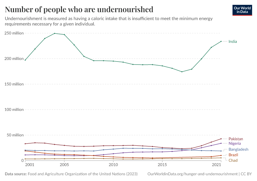
This is relevant to famine trends because children under the age of five are particularly vulnerable, usually accounting for between one half and two thirds of all excess deaths in famines.20 Whilst the absolute number of children has increased, the fraction of the world population that this vulnerable age group makes up has decreased, and will continue to do so. The Demographic transition makes the occurrence of famines with very high mortality rates increasing less likely, both at a global level and as it unfolds in individual countries.
Poverty
As Amartya Sen argued, the fact that there may be enough food available in aggregate within a given area does not necessarily mean that everyone will be able to afford it.21
Food crises are often precipitated by spikes in the price of food relative to wages, or the collapse in the price of assets owned. The latter commonly accompanies famines due to many people all at once trying to sell their assets (for instance their livestock) in order to be able to buy more food. Such shocks can mean that those already living close to the level of subsistence may find their 'exchange entitlement' — that which they can obtain on the market in exchange for their labor or other assets — fails to provide them with enough food, even if the aggregate local supply is sufficient.
Wealthy countries have very few people living in such extreme poverty, both because of higher incomes before tax and benefits, but also due to higher government expenditures and transfers.
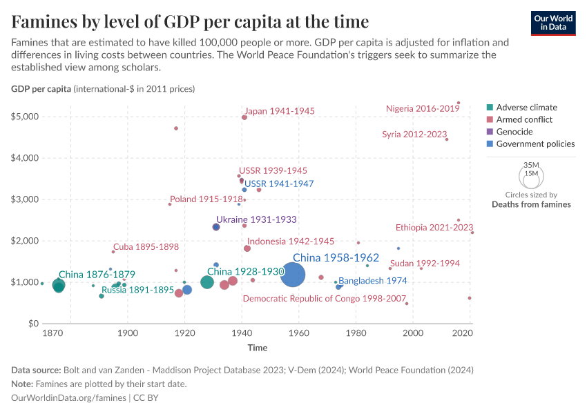
The countries in which famines occur tend to be very poor, as the following chart shows. Here we show the average income of each country at the time it experienced a famine. As we can see, many countries had average incomes of below $2,000 when the famine occurred.
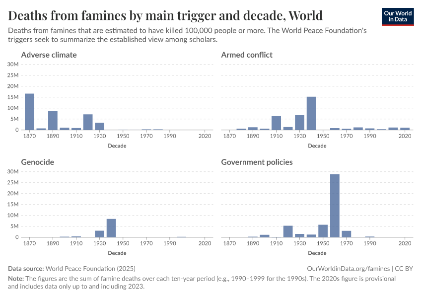
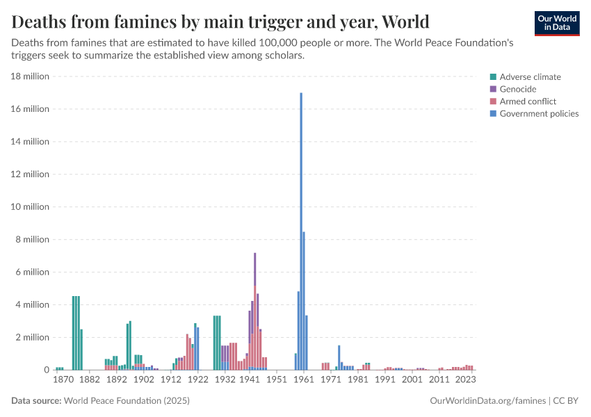
Our source, the World Peace Foundation, also identifies a main trigger for each famine. This data suggests that all famines in the slightly richer countries were not triggered by adverse climates, but human action in the form of bad government policies or armed conflict.

Democracy and oppression
Amartya Sen famously noted in his 1999 book Development as Freedom that “there has never been a famine in a functioning multiparty democracy”. He suggested that democratic authorities are incentivized through elections to be more responsive to food crises and that the presence of a free press can quickly draw attention to the event and hold governments to account.
Whilst exceptions to this rule can be found — depending on the definition of ‘democracy’ and ‘famine’ being employed — the visualization here corroborates the idea that famines tend not to happen in democracies. Here we use the World Peace Foundation’s data on famines and group it by data on political regimes (discussed more in our article on democracy data).
Based on these data sources, there was only one large famine in a democracy between 1870 and 2023: in Northeast Nigeria between 2016 and 2019. During that time, fighting between the rebel group Boko Haram and the government displaced millions of people, and both parties were accused of restricting the delivery of humanitarian aid.
It is important to note, however, that the question of how often famines have occurred within democracies crucially depends upon the definition of famine being used. In particular, what, if any, excess mortality lower-bound is being used yields different answers. As Thomas Plümper and Eric Neumayer (2007) point out, a number of smaller-scale events in which drought-related mortality did occur have happened in functioning democracies.22The authors argue that even within democracies it can still be politically advantageous for governments to allow small minorities to starve if in doing so they are able to win more votes by distributing benefits to others.
Regardless of the threshold though, the main point remains that the large, catastrophic life-taking famines documented in history have occurred in autocratic regimes and not in the context of functioning democratic institutions.
War and famines
Many major famines resulted from international or civil war. For some of these, famine was used as an intentional part of political or military strategy. The ‘Hunger Plan’ pursued by Nazi Germany as part of its attempted invasion of the Soviet Union is an example of the latter. Despite the plan only being partially executed, millions of famine deaths are attributable to the offensive, significantly more than have occurred globally since the turn of the 21st Century.23
In terms of more recent events, from the second half of the 20th century onwards, famines in Africa have become increasingly associated with civil war. In addition to the direct casualties, conflict can also generate disruption to production and trade and can encourage the spread of disease epidemics, particularly through forced migration.24
Crucially, it can also block the arrival of humanitarian relief to those in need.
It is mainly in the context of conflict that major death-dealing famines can be expected today.
Poor health and infectious diseases
It is important to note that, as opposed to dying from literal starvation, the vast majority of people who die during famines actually succumb to infectious diseases or other illnesses, with some diseases being more directly linked to diet than others. Famines brought on by drought often go hand-in-hand with a scarcity of clean drinking water that increases the threat of cholera and other diseases. Increased migration and the disruption of personal hygiene and sanitation routines and healthcare systems also increase the risk of outbreaks of infectious diseases, all in the context of a population already weakened through malnourishment.
This is particularly true in places where such diseases are already endemic. Thus, in sub-Saharan Africa where vaccination rates for measles have been relatively low, the disease has been a big killer during modern famines in the region alongside other infectious and parasitic diseases common in non-crisis times.25
The table here is taken from Ó Gráda and Mokyr (2002) and shows the percentages of excess deaths during a selection of famines attributable to different proximate causes, including the most typical famine diseases. In each case, it can be seen that communicable diseases were the ultimate cause of death in the majority of cases. (Note that, for India and Moscow, the excess mortality attributable to starvation is not available separately).
This is in contrast to some famines that occurred in industrialized countries during WWII, in the context of overall healthier populations and systems of sanitation that were maintained to some degree despite the crisis. In these instances, disease played far less of a role, with deaths from starvation correspondingly higher. Ó Gráda (2009) gives the example of the siege of Leningrad in which “few of Leningrad’s 0.8 million or so victims perished of contagious diseases,” noting that the number of people dying from the main infectious diseases were actually lower in 1941 – amidst an overall vast increase in excess mortality – than they had been in 1940 before the blockade began.25
Key Charts on Famines
See all charts on this topic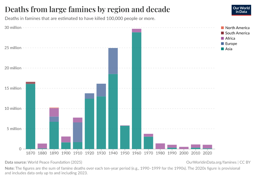


Featured Data on Famines
Acknowledgments
We thank Alex de Waal for his helpful suggestions and ideas for this topic page.
Endnotes
This definition comes from the World Peace Foundation’s Historic Famines dataset, our main data source.
See Famine in the Twentieth Century by Stephen Devereux for a good overview.
See Ó Gráda, Making Famine History.
Until spring 2025 we relied on a dataset that we had assembled ourselves. We have switched to the World Peace Foundation’s data because it provides improved and more recent estimates.
de Waal, A., The end of famine? Prospects for the elimination of mass starvation by political action, Political Geography (2017)
Jisheng, Yang. 2013. Tombstone: The Untold Story of Mao’s Great Famine.
Graziosi, Andrea, and Frank Sysyn. 2016. Communism and Hunger: The Ukrainian, Chinese, Kazakh, and Soviet Famines in Comparative Perspective.
Weigelin-Schwiedrzik, Susanne. 2003. Trauma and Memory: The case of the Great Famine in the People’s Republic of China (1959-1961). Historiography East and West (1)1: 29-67.
See, for example: Dikötter, Frank. 2017. Mao's Great Famine: The History of China's Most Devastating Catastrophe, 1958–1962.
Ó Gráda, Famine: A Short History, Princeton University Press, 2009; p.9.
Campbell, B. (2009). Four famines and a pestilence: harvest, price, and wage variations in England, 13th to 19th centuries. In B. Liljewall, I. A. Flygare, U. Lange, L. Ljunggren, & J. Söderberg (Eds.), Agrarhistoria på många sätt; 28 studier om manniskan och jorden. Festskrift till Janken Myrdal på hans 60-årsdag, Stockholm, Sweden: KSLAB, Stockholm, Sweden.
This is taken from Osamu Saito (2010) – Climate and Famine in Historic Japan: A Very Long-Term Perspective. In Satomi Kurosu, Tommy Bengtsson, and Cameron Campbell Eds. – Demographic Responses to Economic and Environmental Crises. Reitaku University.
The authors's sources for the famine chronology table are:
Ogashima, M. 1894. Nihon saii-shi. Nihon Kōgyōkai, Tokyo.
Nishimura, M., and I.Yoshikawa eds. 1936. Nihon kyōkō-shi kō. Maruzen, Tokyo.
and Fujiki, H. ed. 2007. Nihon Chūsei Kishō-saigaishi Nenpyō Kō. Kōshi Shoin, Tokyo.
Loveday (1914) – Loveday, Alexander. 1914. The History and Economics of Indian Famines. Repr., New Delhi: Usha Publications, 1985.
As quoted in Ó Gráda – (2007) 'Famine: A Short History.' Princeton: Princeton University Press.
Ó Gráda – (2007) 'Famine: A Short History.' Princeton: Princeton University Press. p. 36. This contrasts somewhat with Devereux's (2000) assessment of the 20th-century famine mortality: "Not only is it the highest total for any century in history, it occurred at the precise historical moment that the capacity to abolish famine… was first achieved.
Cotts Watkins, Susan & Menken, Jane. (1985). Famines in Historical Perspective. Population and Development Review. 11. 647. 10.2307/1973458.
Ó Gráda – (2007) 'Famine: A Short History.' Princeton: Princeton University Press. p. 122
See Stephen Devereux, Famine in the Twentieth Century, IDS Working Paper, 2000.
Sen, A, Poverty and Famines.
Ravallion, M, Markets and Famines, OUP, 1987.
Munir Quddus and Charles Becker. 'Speculative Price Bubbles in the Rice Market and the 1974 Bangladesh Famine' in Journal of Economic Development, Volume 25, Number 2, December 2000.
Taken from Ó Gráda, Making Famine History, UCD Centre for Economic Research Working Paper, 2006.
de Waal (2017)
Sen, A, Poverty and Famines.
Plümper, Thomas and Neumayer, Eric (2009) Famine mortality, rational political inactivity, and international food aid. World Development 37(1): 50–61.
According to the World Peace Foundation.
See Máire A Connolly, David L Heymann (2002), Deadly comrades: war and infectious diseases.
Cormac Ó Gráda, Famine: A Short History (2009), Princeton University Press, p.109-121.
Mokyr, J., & Ó Gráda, C. (2002). What do people die of during famines: The Great Irish Famine in comparative perspective. European Review of Economic History, 6, 339-363.
Cite this work
Our articles and data visualizations rely on work from many different people and organizations. When citing this topic page, please also cite the underlying data sources. This topic page can be cited as:
Bastian Herre, Veronika Samborska, Joe Hasell, and Max Roser (2017) - “Famines” Published online at OurWorldinData.org. Retrieved from: 'https://ourworldindata.org/famines' [Online Resource]BibTeX citation
@article{owid-famines,
    author = {Bastian Herre and Veronika Samborska and Joe Hasell and Max Roser},
    title = {Famines},
    journal = {Our World in Data},
    year = {2017},
    note = {https://ourworldindata.org/famines}
}
Reuse this work freely
All visualizations, data, and articles produced by Our World in Data are completely open access under the Creative Commons BY license. You have the permission to use, distribute, and reproduce these in any medium, provided the source and authors are credited.
The data produced by third parties and made available by Our World in Data is subject to the license terms from the original third-party authors. We will always indicate the original source of the data in our documentation, so you should always check the license of any such third-party data before use and redistribution.
All of our charts can be embedded in any site.