Food Supply
How has the availability of food changed over time? How does food supply vary across the world today?
This page was first published in March 2013. We made changes to the text in December 2023.
See all interactive charts on food supply ↓
Caloric supply
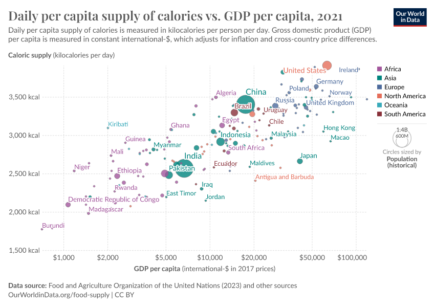
A primary metric in evaluating food supply and security is the average caloric availability for each individual. This metric, while not encompassing the full spectrum of nutritional needs – as a wholesome diet demands more than mere energy – serves as a critical benchmark in assessing food security.
Regional variations in daily caloric energy supply
The most widely used and comprehensive data on food supply and consumption is published by the UN Food and Agriculture Organization (FAO). This data is annually available and is updated by the FAO, extending back to 1961.
Over the decades since 1961, there has been a consistent global uptrend in the per capita calorie supply, reflecting changes and advancements in food production, distribution, and consumption patterns worldwide. Yet, as we can see from the chart below this overall increase in average daily supply of calories (measured in kilocalories per person per day) varied across the world's regions.
There has been a substantial increase in caloric supply in Asia and Africa in recent decades. The steeper rise across poorer regions of the world meant that over the last few decades, global trends in caloric supply have been converging. In terms of food supply, we live in a more equal world today than in the previous century.
Note that supply figures do not include consumption-level waste (i.e. food that is wasted at retail, restaurant, and household levels), and therefore represent food available for consumption at the retail level, rather than actual food intake.
Improving food supply in early modernized countries
As productivity increased, famines and the exclusion of the poor due to hunger and too little energy became a thing of the past in both France and England. The improving supply of food in both countries is shown in the visualization below. In terms of calories, the average food supply in France more than doubled over the last 300 years.1.
We provide a detailed account of how these long-term data series are constructed, and related definitions here.

World map of caloric supply
In this interactive map, we see the differences in how many calories each person gets every day in different countries.
You can view the annual trends of any country over time by clicking on it on the map.

Minimum dietary energy requirement (MDER)
While average caloric supply is a vital indicator for assessing food security, understanding its impact on hunger and malnutrition requires a comparison with actual dietary energy needs. The following visualization explores a key aspect of these needs: the minimum dietary energy requirement (MDER). MDER represents the minimum caloric intake necessary for an individual to maintain an acceptable weight for their height. This measure is pivotal in determining the prevalence of undernourishment within a population. An individual is considered 'undernourished' if their caloric intake consistently falls below their specific MDER.
The MDER of an individual is defined as the cut-off threshold caloric intake an individual would have to consume to attain a minimum acceptable weight for height. This metric is used to define the prevalence of undernourishment in a population; an individual whose caloric intake falls below their specific MDER for an extended period is defined as 'undernourished'. In the map, it is presented as the average MDER for a country's population which is calculated based on its demographic weighting.
In our explainer on hunger measurement, we detail how these metrics are used to estimate levels of undernourishment across a population.
MDER values vary globally because dietary energy needs differ based on gender, age, and physical activity levels. As a result, each country's average MDER, calculated based on demographic profiles and weighted for gender and age distribution, differs and changes annually.
Countries with predominantly young populations tend to have lower average MDER values, as children's energy needs are generally lower than adults'. Conversely, countries with populations engaged in physically demanding activities, such as labor-intensive or agricultural work, often have higher MDER values due to increased energy requirements.

Inequalities in caloric supply within countries
While there are differences in calorie supply between countries worldwide, it's worth noting that within countries, the variation in calorie intake can also be significant. To gauge this variation within a population, the FAO uses a parameter called the 'coefficient of variation of habitual caloric consumption distribution'. This annual measurement, critical for assessing food security, provides insights into dietary equality.
The coefficient of variation quantifies the inequality in calorie intake within a population. It's a statistical measure that tells us how spread out the data is around the average calorie intake. It's measured on a scale from zero to one, with higher values indicating greater dietary inequality. For instance, a value of 0.1 suggests that calorie consumption within a country is relatively equal, with most people having a daily intake close to the national average. On the other hand, a value of 0.5 is considered high, signifying significant dietary disparities, where calorie intake levels in a country vary widely around the national average.
In the map, you can see a diverse range of values representing dietary inequality, with Sub-Saharan Africa standing out as a region where it tends to be most pronounced. The values have shown a consistent pattern over the past few decades, characterized by minor year-to-year fluctuations.

Macronutrients supply
The measurement of energy/calories is typically the most standard measure of food supply over time. However, also essential for proper nutrition are our other macronutrients2.
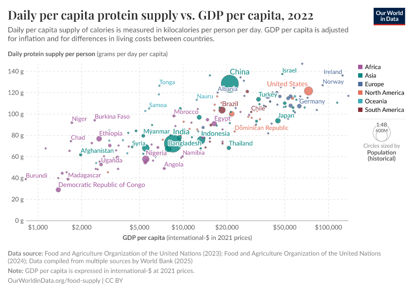
Regional variations in protein supply
Proteins form the building blocks of human tissues, and so protein intake is essential for growth and maintenance.
In the chart below we can see FAO estimates of per capita protein supply by region dating back to 1961. Overall, the global per capita protein supply has increased by approximately one-third over this period. The majority of this growth has occurred in Africa, Asia, and South America, where per capita protein supplies have been on the rise. Conversely, in Europe, Oceania, and North America, protein supply has more or less plateaued in recent decades.
It's worth noting that there is a significant disparity in protein supplies among these regions, and this difference is more pronounced in protein supply than in caloric supply. Notably, the per capita supply of protein in North America and Europe remains notably higher than that in Africa. Nevertheless, there has been a global trend toward narrowing the distribution of protein supply.
World map of protein supply
In this interactive map, we see the differences in how much protein each person gets every day in different countries.
You can view the annual trends of any country over time by clicking on it on the map.

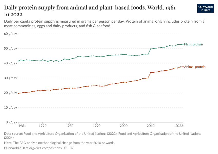
Protein supply from animal-based and plant-based foods
Not only has the quantity of protein supply evolved over time, but so has its composition, originating from various sources. As elaborated in more detail in our Diet Compositions topic page, our dietary intake has witnessed changes in the consumption of animal and plant-based foods.
Protein supply can be derived from both animal and plant sources, but the quality of this protein is not always equal. Animal-based proteins are typically considered 'complete proteins,' as they contain all the essential amino acids required for proper nutrition. In contrast, plant-based proteins, with some exceptions like pulses, certain nuts, and seeds, often have lower quality and may lack some essential amino acids.3
In the following chart, we can see the differentiation of protein supply between animal-based and plant-based sources over time. For most countries, there is a general upward trend in both animal-based and plant-based protein supplies over time. However, by toggling to the 'relative' view on this chart, it becomes apparent that the proportion of total protein sourced from animal-based products has been on the rise in most countries. Today, we obtain a more significant share of our protein from sources such as meat, dairy, and seafood products compared to five decades ago

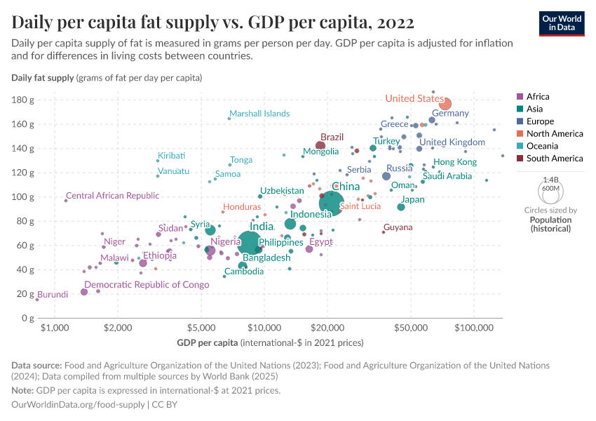
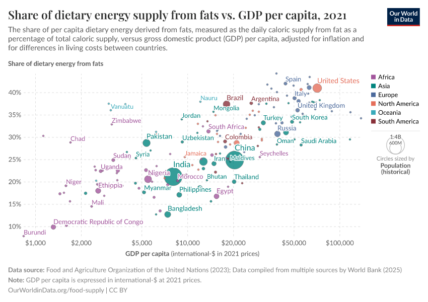
Regional variations in fat supply
Fat is one of the three key macronutrients in human diets, alongside carbohydrates and protein. Fats are sources of essential fatty acids, which are important for dietary requirements in several ways, including the absorption of vital vitamins, promoting healthy cell function, and providing a buffer against a host of diseases.4
In this chart below we can see FAO estimates of per capita fat supply by region dating back to 1961. Overall, the global per capita protein supply has more than doubled since. Unlike calories and protein, fat supply has been increasing across all regions over this period, although this increase has been slowing in North America, Europe, and Oceania over the last decade.
Of the three macronutrients, the regional differences in supply are largest for fat.
World map of fat supply
In this interactive map, we see the differences in how much fat each person gets every day in different countries.
You can view the annual trends of any country over time by clicking on it on the map.

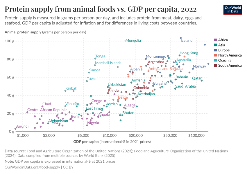
The link between food supply and prosperity
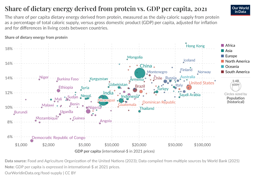
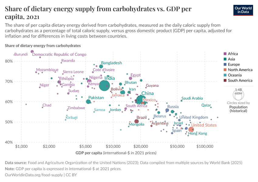
There is a strong correlation between per capita food supply and prosperity. This relationship is evident not only internationally, where higher-income regions typically enjoy greater food supply levels compared to their less affluent counterparts, but also within individual countries over time. As a nation's economy grows, there's a corresponding increase in the availability of key nutritional components: calories, protein, and fat.
In the sub-sections below we have plotted the relationship between daily per capita food supply (in the form of calories, protein, and then fat) versus gross domestic product (GDP) per capita in 2011 international-$. Several countries selected across a range of income levels and global regions have been highlighted for comparison. For all three measures of food supply, we see a close correlation between per capita supply and prosperity. As we get richer, per capita supply tends to increase.
This trend is especially pronounced in countries transitioning from low to upper-middle-income status. However, in recent years we have seen an overall plateauing (or in some cases a decline) in per capita supply across several high-income countries. For example, if we look at recent trends for the United States, France, the United Kingdom, and Japan in the charts below on calories and protein, we see a typical stabilization or decline in per capita intakes. In some high-income countries, this is also true for per capita fat supply, although this plateauing effect is less marked.
Per capita food supply therefore tends to increase with economic growth. However, this trend tends to taper off or even reverse in high-income countries.
Caloric supply and prosperity

Protein supply and prosperity

Fat supply and prosperity

Impact of food supply on undernourishment
The link between increasing per capita food supply and the prevalence of undernourishment is an intuitive yet critical aspect of global nutrition dynamics. Undernourishment, as we cover in detail in our topic page Hunger and Undernourishment, is defined as a caloric intake insufficient to meet minimum energy requirements for adequate weight and nutrition.
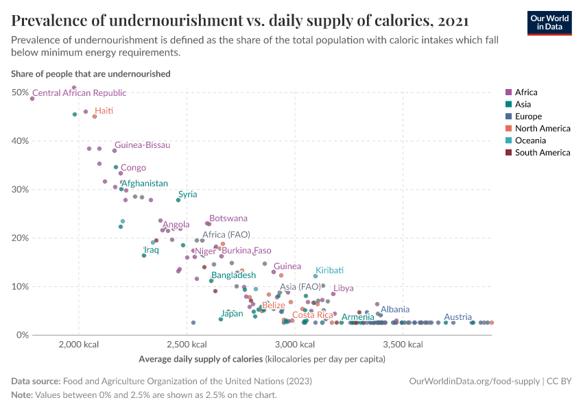
In the following chart, we show the prevalence of undernourishment, measured as the percentage of the total population undernourished against the daily supply of calories, in kilocalories per person per day. Overall, there is a distinct trend where nations with lower per capita calorie availability typically exhibit higher rates of undernourishment. Additionally, as a nation's per capita calorie supply rises over time, there is a corresponding decline in the occurrence of undernourishment. This trend is visually represented by a general shift towards the bottom-right section of the chart, indicating improved nutritional status correlated with increased calorie availability.
Note that the FAO does not record levels of undernourishment prevalence below 5 percent; this explains the illusion of a plateauing of prevalence at 5 percent. It notes that: "Data showing as 5 may signify a prevalence of undernourishment below 5%."

Key Charts on Food Supply
See all charts on this topic


Featured Data on Food Supply
Endnotes
Fogel (2004) - The Escape from Hunger and Premature Death, 1700-2100: Europe, America, and the Third World.
Macronutrients are defined as the chemical compounds humans consume in the largest quantities within the diet, and which provide the bulk of our energy. There are three key macronutrients: protein, fat, and carbohydrates.
WHO (2007). Protein and amino acid requirements in human nutrition. Report of a joint FAO/WHO/UNU expert consultation (WHO Technical Report Series 935). Available online.
Simopoulos, A. P. (1999). Essential fatty acids in health and chronic disease. The American Journal of Clinical Nutrition, 70(3), 560s-569s. Available online.
Cite this work
Our articles and data visualizations rely on work from many different people and organizations. When citing this topic page, please also cite the underlying data sources. This topic page can be cited as:
Max Roser, Hannah Ritchie, and Pablo Rosado (2013) - “Food Supply” Published online at OurWorldinData.org. Retrieved from: 'https://ourworldindata.org/food-supply' [Online Resource]BibTeX citation
@article{owid-food-supply,
    author = {Max Roser and Hannah Ritchie and Pablo Rosado},
    title = {Food Supply},
    journal = {Our World in Data},
    year = {2013},
    note = {https://ourworldindata.org/food-supply}
}
Reuse this work freely
All visualizations, data, and articles produced by Our World in Data are completely open access under the Creative Commons BY license. You have the permission to use, distribute, and reproduce these in any medium, provided the source and authors are credited.
The data produced by third parties and made available by Our World in Data is subject to the license terms from the original third-party authors. We will always indicate the original source of the data in our documentation, so you should always check the license of any such third-party data before use and redistribution.
All of our charts can be embedded in any site.