War and Peace
Since 1800, more than 37 million people worldwide have died while actively fighting in wars.
The number would be much higher still if it also considered the civilians who died due to the fighting, the increased number of deaths from hunger and disease resulting from these conflicts, and the deaths in smaller conflicts that are not considered wars.1
Wars are also terrible in many other ways: they make people’s lives insecure, lower their living standards, destroy the environment, and, if fought between countries armed with nuclear weapons, can be an existential threat to humanity.
Looking at the news alone, it can be difficult to understand whether more or less people are dying as a result of war than in the past. One has to rely on statistics that are carefully collected so that they can be compared over time.
While every war is a tragedy, the data suggests that fewer people died in conflicts in recent decades than in most of the 20th century. Countries have also built more peaceful relations between and within them.
How many wars are avoided, and whether the trend of fewer deaths in them continues, is up to our own actions. Conflict deaths recently increased in the Middle East, Africa, and Europe, stressing that the future of these trends is uncertain.
On this page, you can find data, visualizations, and writing on how common war and peace are between and within countries, and how this has changed over time.
Key Insights on War and Peace
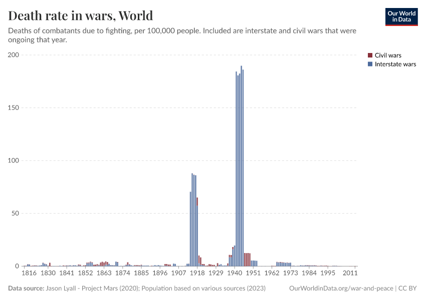
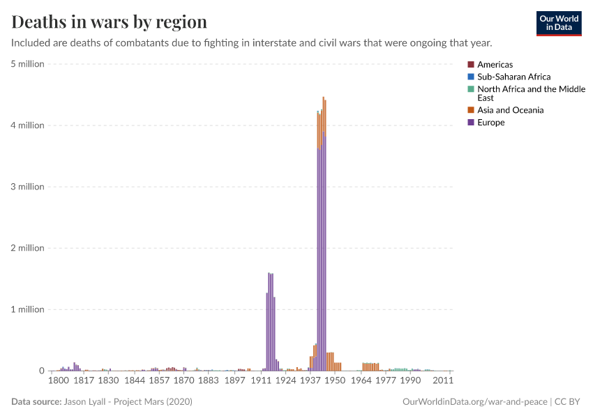
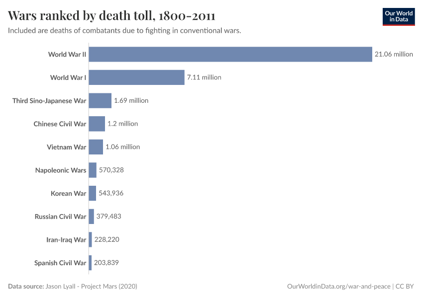
Some conflicts are much, much deadlier than most
There are very large differences in how deadly different wars are: most death tolls are relatively small, a few are large, and very few are extremely large.
The chart shows this for all conventional wars between 1800 and 2011, relying on data from Project Mars.2
Even though most wars killed several thousand people, we can barely make them out in the chart.3
This is because the big wars were much more deadly: wars like the Russian Civil War and the Korean War killed several hundred thousand people. And wars such as the Chinese Civil War and the Vietnam War killed between 1 and 2 million combatants.
But the deaths in the World Wars loom even over them: in World War I, more than 7 million soldiers died.
And in World War II alone, more than 21 million combatants died.
Three-quarters of all war deaths since 1800 happened in just these two wars, and 90% in the biggest ten wars; this is one of the reasons why we have to treat any trends over time with caution.
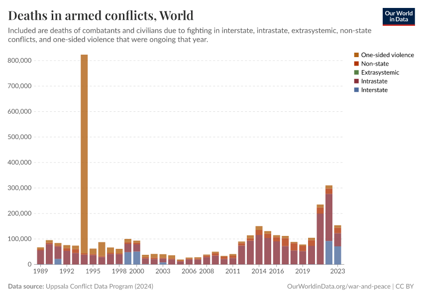
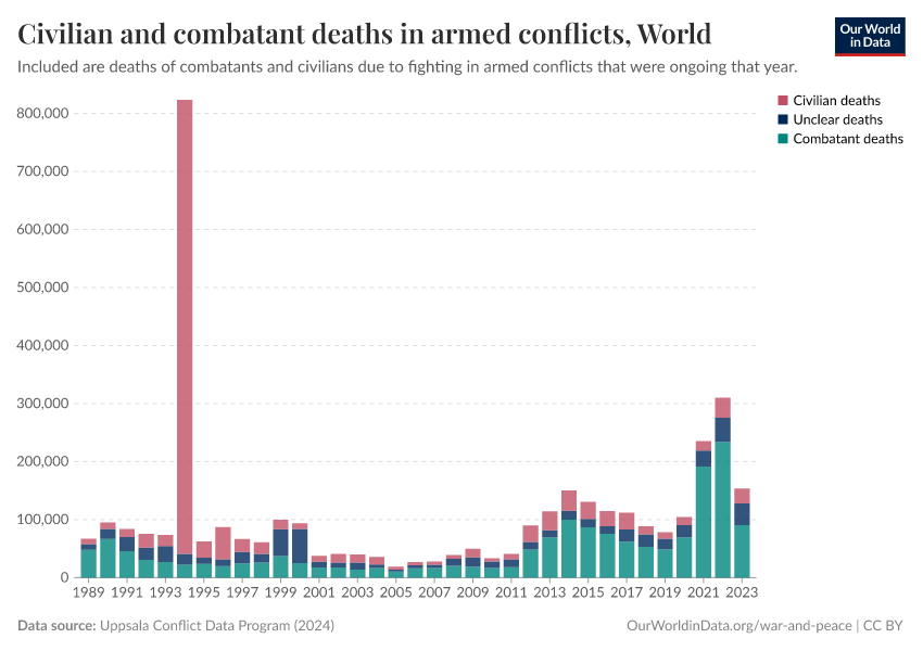
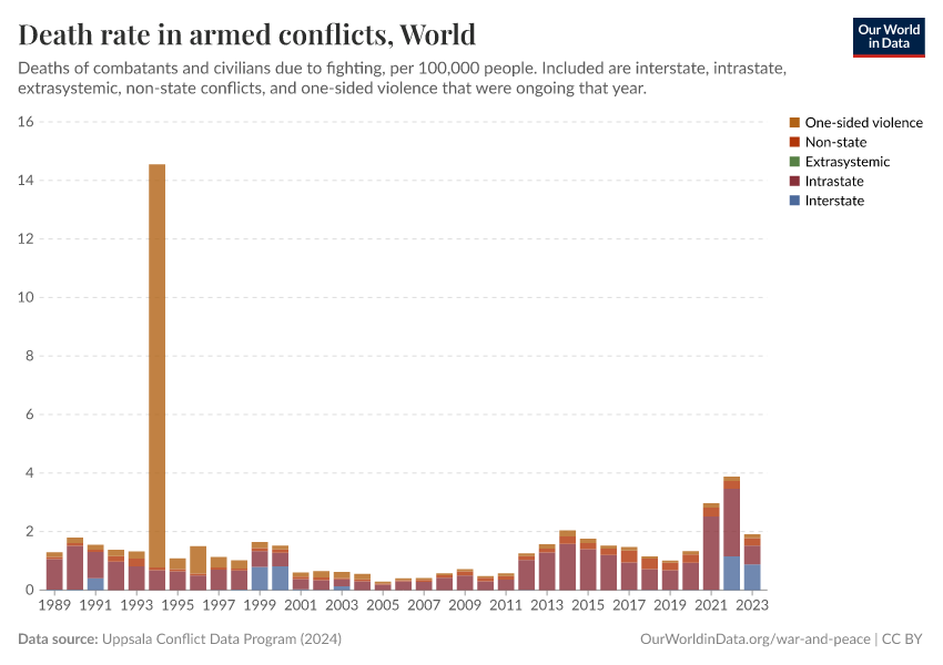
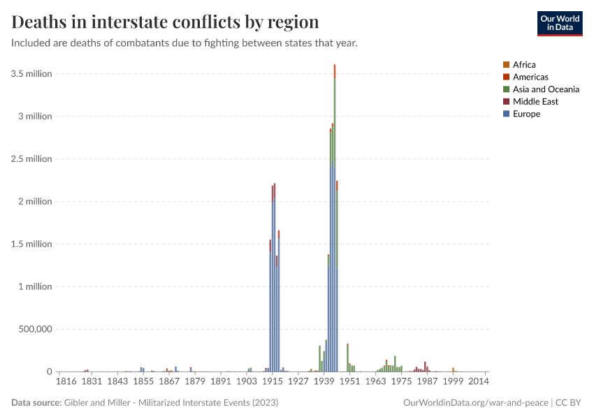
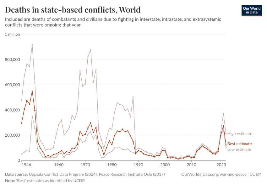
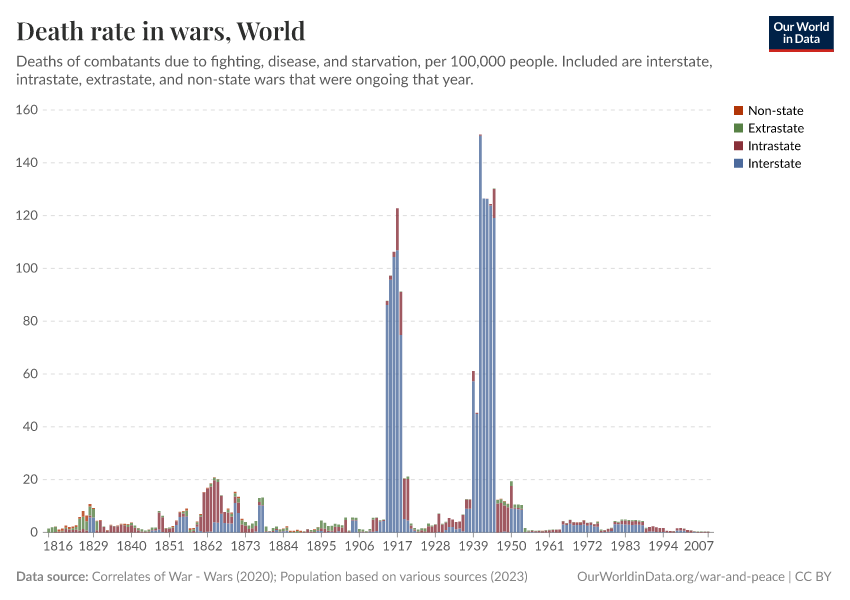
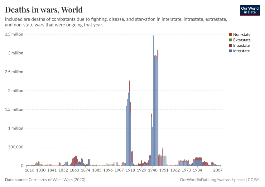
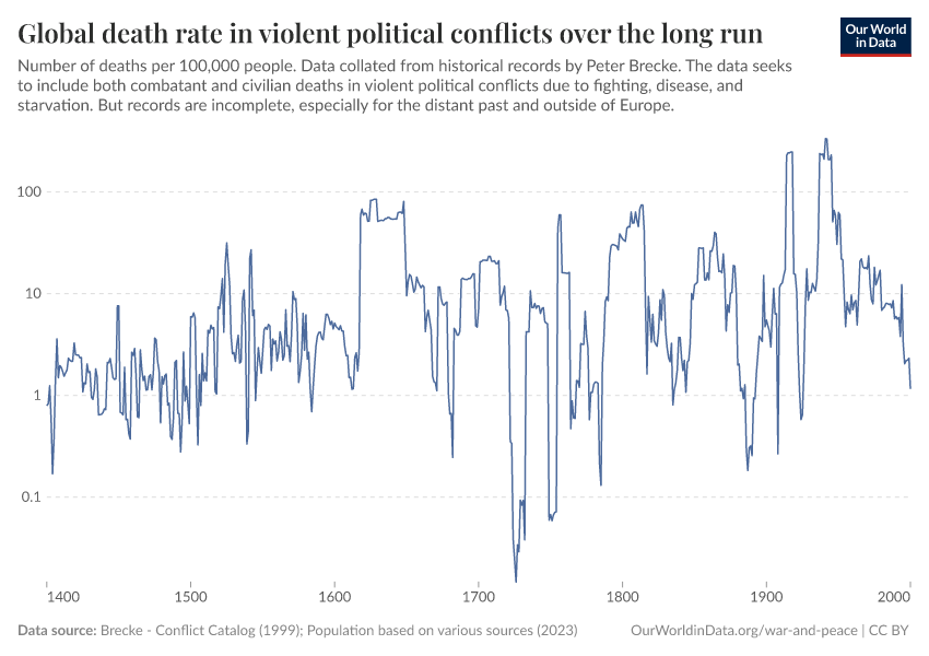
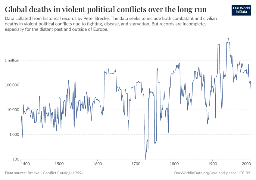
Conflict deaths have declined; it is on us that this trend continues
Fewer people died in conflicts in recent decades than in most of the 20th century.
The chart shows that several million people died in conflicts in the years after World War II.
After falling to much lower levels in the 1950s, conflict deaths surged again in the 1970s and 1980s. But this time, they peaked at 300,000 deaths annually.
They fell to much lower levels in the 1990s and have stayed below previous peaks in the decades since.
We see these lower numbers of deaths also in other data sources.
But there are several reasons we cannot be confident that this decline in conflict deaths will continue.
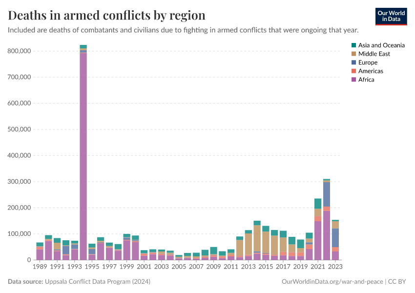
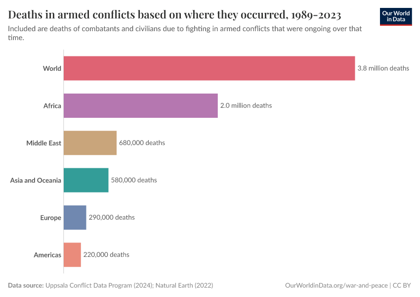
First, the chart shows more deaths in the last decade and, most recently, a spike in deaths due to wars in Ethiopia and Ukraine. The trends also differ by world region: deaths have plummeted and stayed low for Asia and Oceania, but they have recently increased in the Middle East and soared in Africa and Europe.
One more reason we cannot be confident is that the deadliness of conflicts shows a lot of variation from year to year. Some wars are much deadlier than others, so a single deadly conflict could change this trend completely. Researchers have used statistical tests to tell actual trends from random fluctuations but have come to different conclusions.4
But the absence of a clear trend should not cause despair: countries have built more peaceful relations between and within them. It is up to us that these historical trends continue over the next decades and centuries.
What you should know about this data
- There are several other leading approaches to measuring conflicts. You can explore them in our Conflict Data Explorer.

Armed conflict is a rare cause of death in most years and countries
Globally, close to 80,000 people died due to fighting in armed conflicts in 2019.
This means conflicts caused around 1 in 700 deaths.
This is shown in the chart, which presents what people died from during that year. You can find conflict deaths in the bottom-right corner.
Armed conflict is a much rarer cause of death than non-communicable (in blue) or infectious diseases (in red). It is also less common than other causes of violent death: more than five times as many people died from homicides in 2019, and almost ten times as many from suicide.
Yet, the number of conflict deaths can change a lot from year to year — in 2005, fewer than 20,000 people died in armed conflicts, while in 1994, in the wake of the genocide in Rwanda, it was more than 800,000. During the two World Wars, armed conflict was a leading cause of death, with several million deaths per year.
And while armed conflict is a rare cause of death globally in most years, it is much more common in some countries.
What you should know about this data
- For its data on conflict and terrorism deaths, the data source — the Global Burden of Disease study by the Institute for Health Metrics and Evaluation (IHME) — relies on several major sources, including UCDP5 and the Peace Research Institute Oslo (PRIO).6
- We separated terrorism deaths from conflict deaths by using data from the Global Terrorism Database.7
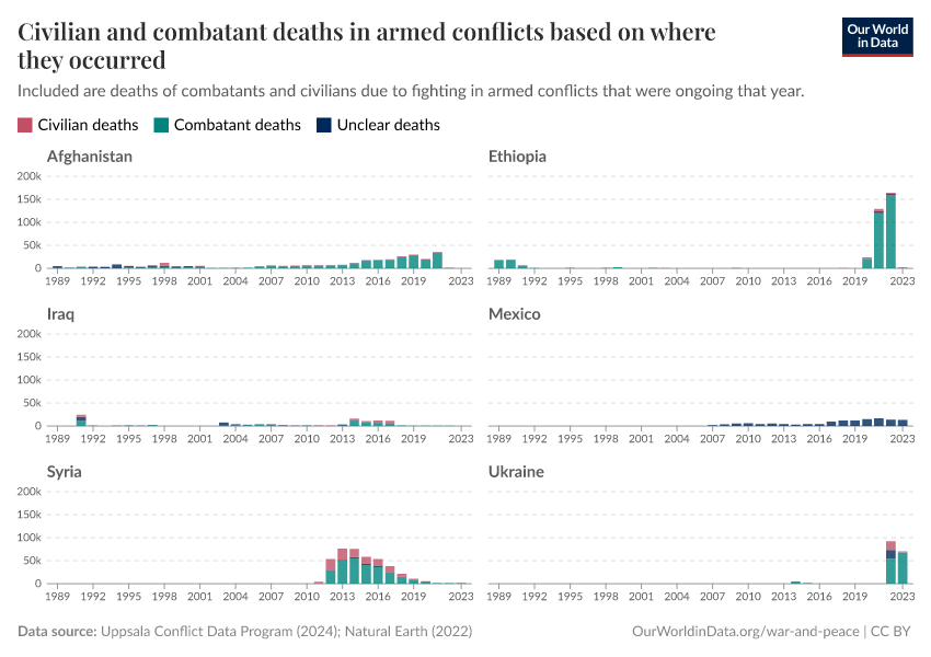
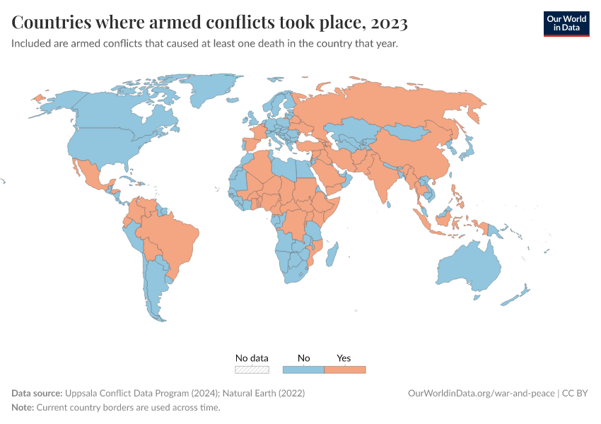
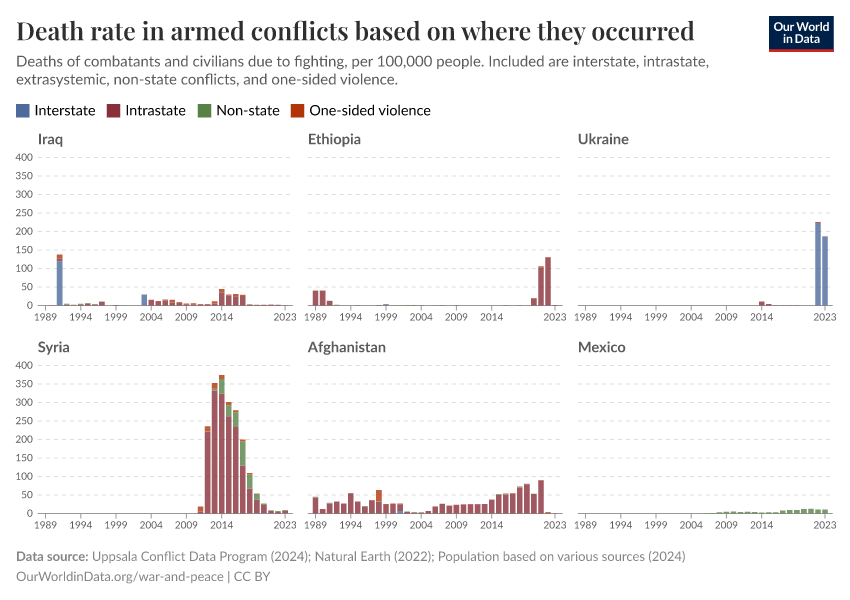
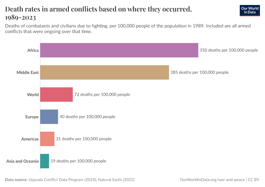
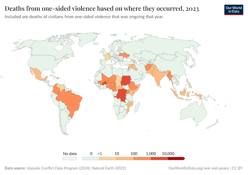
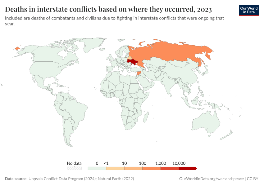
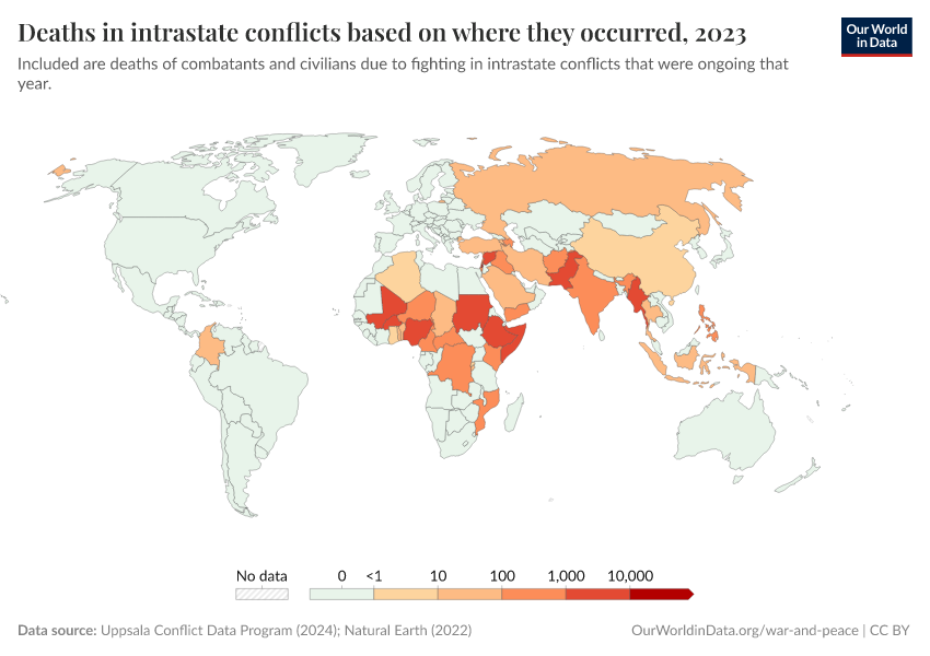
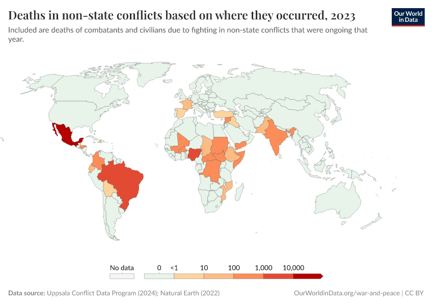
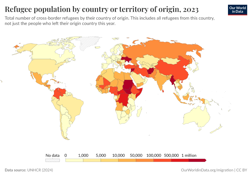
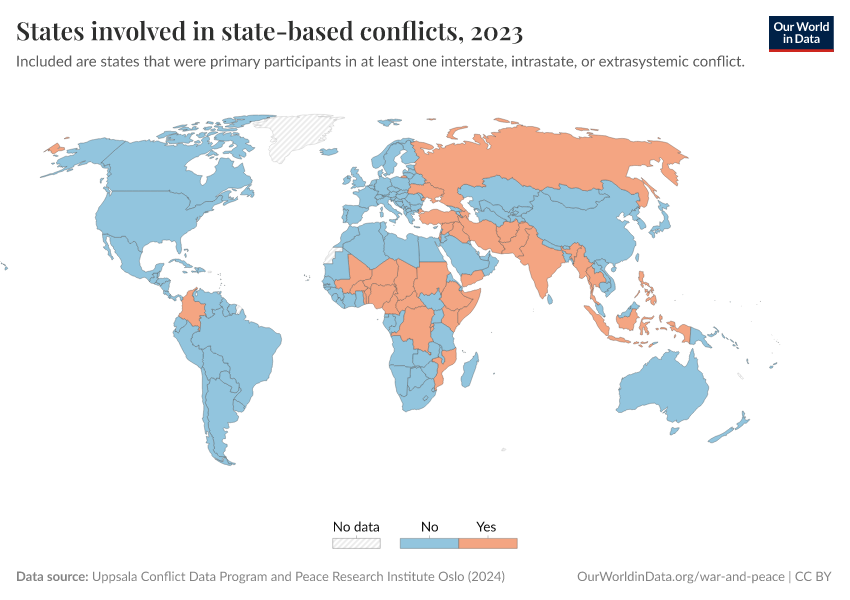
Some countries are much more affected by conflict than others
There are very large differences in the number of deaths from conflict across the world.
The map shows annual deaths from armed conflicts in each country.
We see that a large number of countries around the world are relatively peaceful. In them, few to no people die due to conflicts. Many of them are in Europe, but there are countries where few die in conflicts in all world regions.
In other countries, however, deaths from conflict are common. They see dozens, hundreds, or even thousands of deaths per year. In a few, conflict deaths account for several percent of all deaths in a year.
These global differences look similar when we consider that countries differ in the size of their populations.
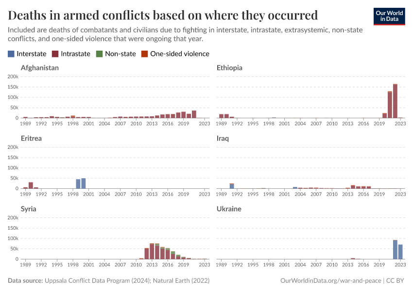
The countries with the most conflict deaths can change frequently. In 2022, more than 40% of the people who died from conflict worldwide were in Ethiopia. In 2021, it was Afghanistan, with almost a third of all global conflict deaths occurring there.
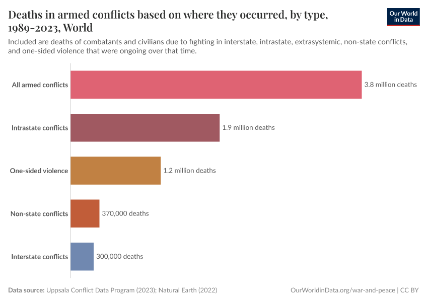
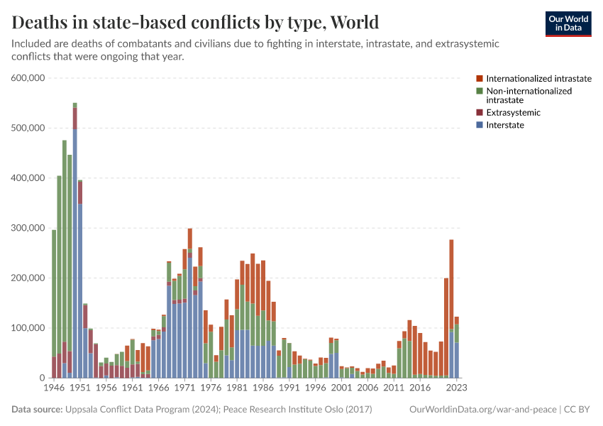
The countries with the most conflict deaths also differ depending on whether we look at interstate, intrastate, non-state conflicts, or one-sided violence.

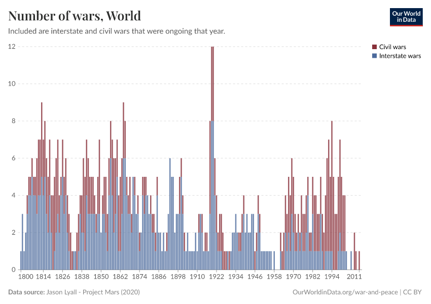
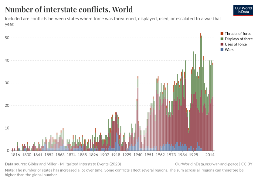
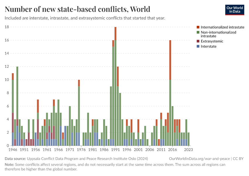
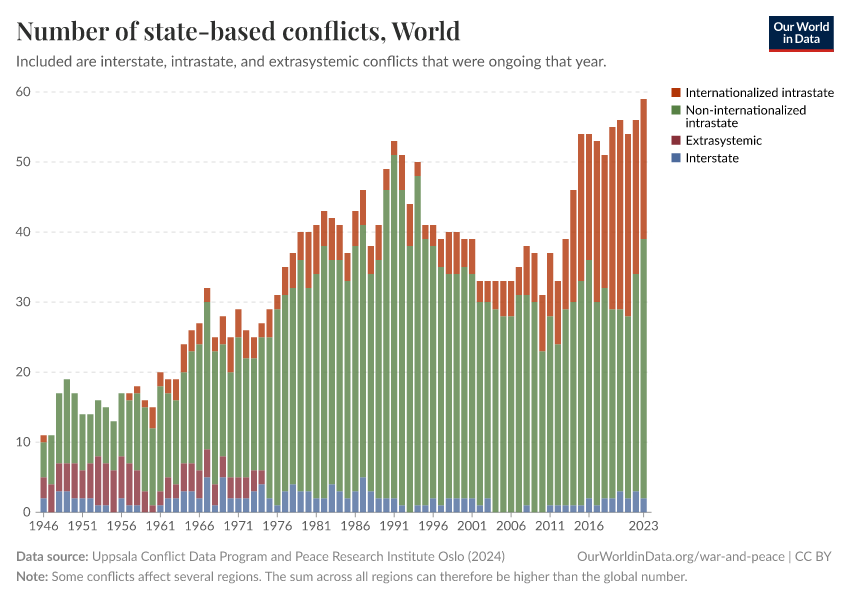
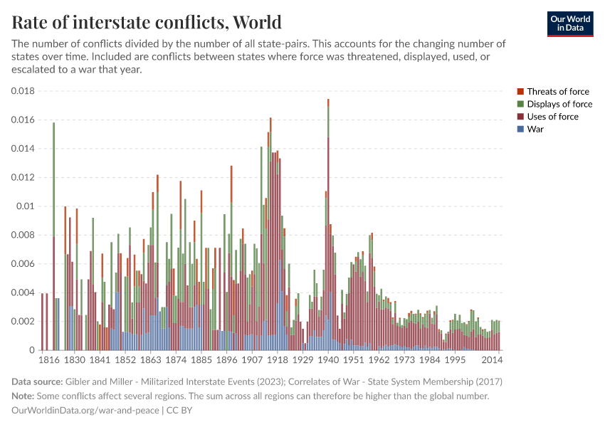
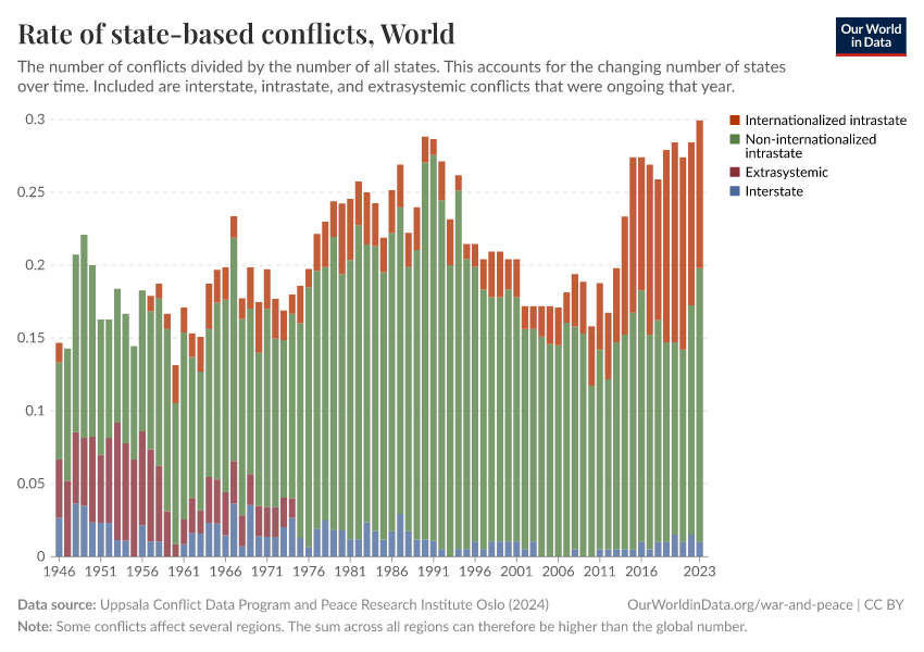
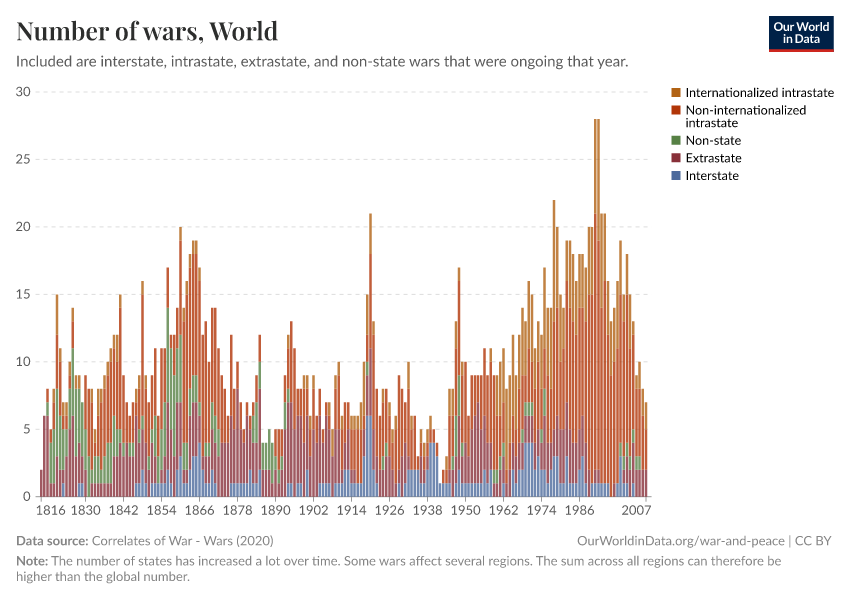
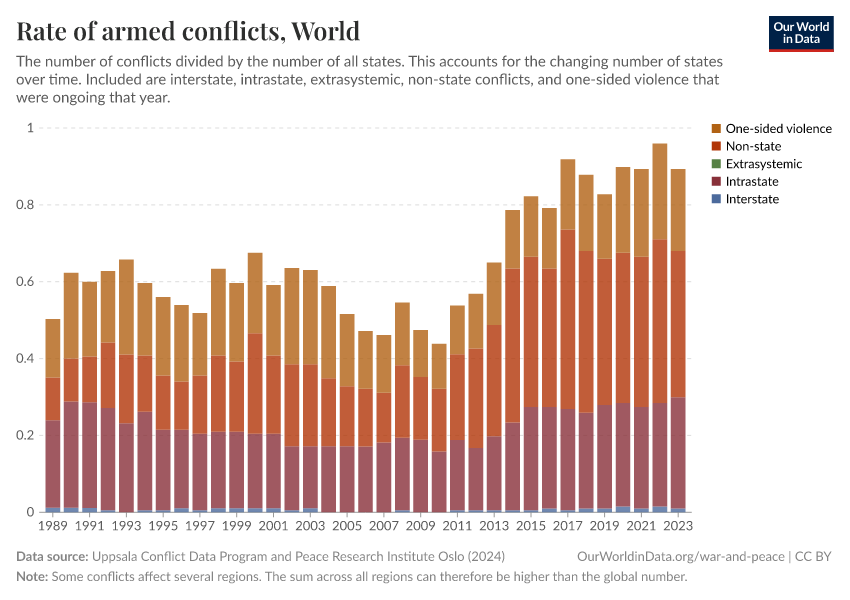
Armed conflict is common and takes different forms
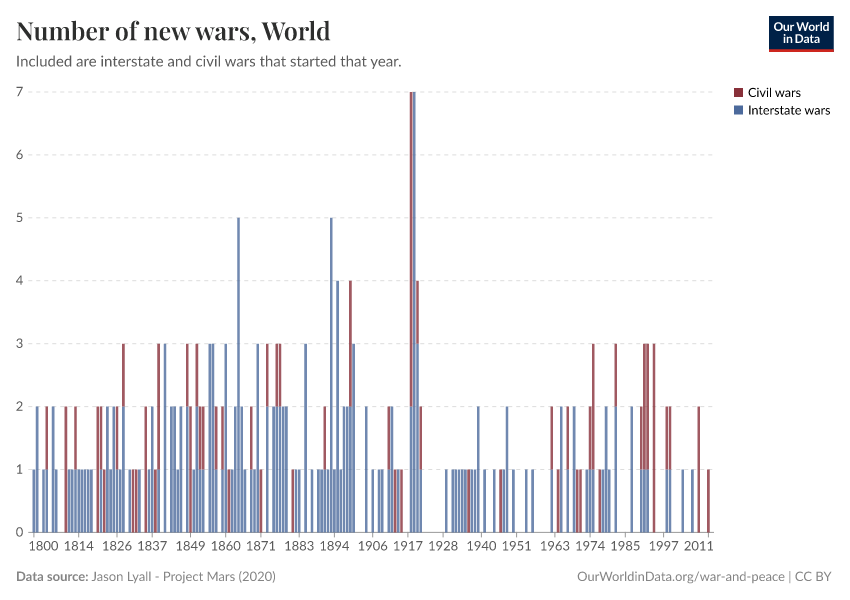
As the chart shows, at least 150 ongoing armed conflicts have been recorded each year recently. This number is up from previous decades, but even then, it rarely fell below 100, and there has been no year without armed conflict for centuries.
Wars — usually defined as armed conflicts that are especially deadly — have been rarer, with between 0 and 12 active wars per year. Still, there have been very few years without any.
The frequency of armed conflicts also differs depending on who fights them.
Armed conflict can occur between states (interstate), between a state and a non-state armed group within its territory (intrastate) or outside of it (extrasystemic), between non-state armed groups (non-state), or between an armed group and civilians (one-sided violence).
Looking at these conflict types more closely, we see that there have been no extrasystemic conflicts in recent decades. They disappeared after decolonization in the middle of the 20th century.
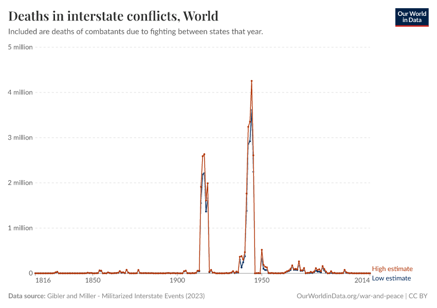
Interstate conflicts are rare: there have been, at most, three ongoing conflicts of this type in any given year in the last three decades. And several years in that period saw no such conflict at all.
Intrastate conflicts and one-sided violence are more frequent. In recent decades, there have been several dozen conflicts of these types ongoing each year.
And non-state conflicts have become the most common type; they have been the primary driver of the recent increase in conflicts.
What you should know about this data
- There are several other leading approaches to measuring conflicts. You can explore them in our Conflict Data Explorer.

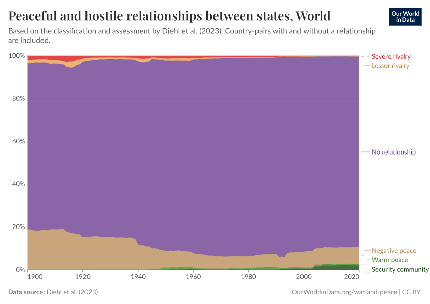
Relationships between countries have become more peaceful
Researchers have argued that we should think of peace as more than just the absence of violence (called negative peace), but envision it as sustained cooperation or even mutual protection between groups (positive peace).8
The chart shows global data that uses this distinction to classify the bilateral relationships between countries into different levels of peacefulness or hostility, expressed here as the share of each type of relationship.
Most relationships between countries are characterized as negative and positive peace — which is further split into warm peace and security communities.
Only a small percentage of relationships are classified as rivalries. These rivalries are separated into lesser or severe rivalries by the researchers who produced this data.
We also see that relationships between countries have changed over time: more than a century ago, in 1900, most countries did not use violence against each other, but none had highly cooperative relationships. And almost 20% of relationships were rivals that occasionally or frequently used violence against each other.
Conflict surged during the two World Wars and the early years of the Cold War. But then, rivalries steadily declined, and bilateral cooperation spread. Importantly, this happened while many more countries became independent, and many more pairs of countries started having a relationship.9
Many countries deepened their ties in the 1990s and 2000s, predominantly in the European Union. This turned almost a fifth of relationships into security communities.
Recent years have seen slight increases in rivalries and declines in peaceful relationships. But bilateral relations remain much more peaceful than over the entire 20th century.
Even if we are more ambitious in our vision of peace, we see that the world has made progress.

Research & Writing
July 15, 2024
Millions have died in conflicts since the Cold War; most of them in Africa and intrastate conflicts
Deaths in the Middle East and deaths from violence targeting civilians have also been common.
October 13, 2023
How major sources collect data on conflicts and conflict deaths, and when to use which one
There are many ways to measure armed conflicts and conflict deaths. What approaches do different researchers take? And when is which approach best?
October 20, 2023
How different measures capture how common and deadly conflicts are, and when to use which one
There are several ways to capture how common and deadly armed conflicts are. What are they? And when is which measure best?
Explore Data on Armed Conflict and War
Our team has created two additional Data Explorers to make even more data on armed conflicts and war easier to access and understand. They provide and explain data from six leading datasets: on how deadly and common they are, which countries are involved, and where they take place. You can learn more about which measure and data source can best answer your questions in our articles explaining the metrics and datasets.
Key Charts on War & Peace
See all charts on this topic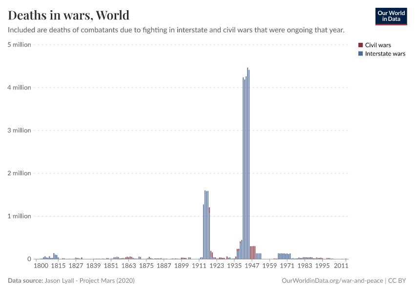


Featured Data on War & Peace
Acknowledgements
We thank Saloni Dattani, Charlie Giattino, Joe Hasell, Edouard Mathieu, Esteban Ortiz-Ospina, Valerie Rogers Muigai, and Veronika Samborska for their helpful suggestions and ideas.
Endnotes
These additions bring the estimated death toll for the 20th century alone to around 110 million people.
Wimmer, Andreas. 2014. War. Annual Review of Sociology 40: 173-197, citing:
Eckhart, William. 1992. Civilizations, Empires and Wars: A Quantitative History. McFarland.
Lyall, Jason. 2020. Divided Armies: Inequality and Battlefield Performance in Modern War. Princeton University Press.
You can take a closer look at them in our bar chart on wars ranked by their death toll, which allows you to select the wars you are interested in.
Braumoeller, Bear. 2019. Only the Dead: The Persistence of War in the Modern Age.
Spagat, Michael, and Stijn van Weezel. 2020. The Decline of War since 1950: New Evidence. In: Nils Petter Gleditsch. Lewis Fry Richardson: His Intellectual Legacy and Influence in the Social Science.
Davies, Shawn, Garoun Engström, Therese Pettersson, and Magnus Öberg. 2024. Organized violence 1989-2023, and the prevalence of organized crime groups. Journal of Peace Research 61(4): 673-693.
Lacina, Bethany, and Nils Petter Gleditsch. 2005. Monitoring Trends in Global Combat: A New Dataset of Battle Deaths. European Journal of Population 21: 145-166.
START (National Consortium for the Study of Terrorism and Responses to Terrorism). 2021. Global Terrorism Database (GTD) [Data set]. University of Maryland.
Galtung, Johan. 1969. Violence, Peace, and Peace Research. Journal of Peace Research 6(3): 167-191.
The share of peaceful relationships also increases when country-pairs without a relationship are included.
Cite this work
Our articles and data visualizations rely on work from many different people and organizations. When citing this topic page, please also cite the underlying data sources. This topic page can be cited as:
Bastian Herre, Lucas Rodés-Guirao, and Max Roser (2024) - “War and Peace” Published online at OurWorldinData.org. Retrieved from: 'https://ourworldindata.org/war-and-peace' [Online Resource]BibTeX citation
@article{owid-war-and-peace,
    author = {Bastian Herre and Lucas Rodés-Guirao and Max Roser},
    title = {War and Peace},
    journal = {Our World in Data},
    year = {2024},
    note = {https://ourworldindata.org/war-and-peace}
}
Reuse this work freely
All visualizations, data, and articles produced by Our World in Data are completely open access under the Creative Commons BY license. You have the permission to use, distribute, and reproduce these in any medium, provided the source and authors are credited.
The data produced by third parties and made available by Our World in Data is subject to the license terms from the original third-party authors. We will always indicate the original source of the data in our documentation, so you should always check the license of any such third-party data before use and redistribution.
All of our charts can be embedded in any site.