Famines
In many parts of the world famines have been common in the past. What causes famines? How can famines be averted?
This page was first published in 2013 and last revised in April 2024.
This topic page focuses on the history of famines and the deaths in them. Our data include information only up to 2016. Information on current crises can be found at FEWS.net.
A famine is an acute episode of extreme hunger that results in excess mortality due to starvation or hunger-induced diseases.1
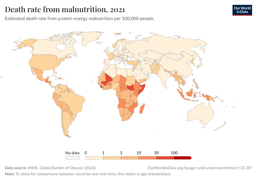
It is this crisis characteristic that distinguishes it from persistent malnutrition, which we discuss on another topic page. As we discuss in the section on our famines dataset below, the term 'famine' can mean different things to different people and has evolved over time. It is only in recent years that more precise, measurable definitions – in terms of mortality rates, food consumption, and physical signs of malnutrition – have been developed.
But despite these ambiguities, it is nonetheless very clear that in recent decades the presence of major life-taking famines has diminished significantly and abruptly compared to earlier eras. This is not in any way to underplay the very real risk facing the roughly 80 million people currently living in a state of crisis-level food insecurity and therefore requiring urgent action.2 Nevertheless, the parts of the world that continue to be at risk of famine represent a much more limited geographic area than in previous eras, and those famines that have occurred recently have typically been far less deadly – as we will go on to show in this topic page.
For this topic page, we have assembled a new global dataset on famines from the 1860s until 2016. We estimate that in total 128 Million people died in famines over this period.3
Famines have always occurred as the result of a complex mix of ‘technical’ and ‘political’ factors, but the developments of the modern industrial era have generally reduced the salience of natural constraints in causing famine.4 This includes many developments discussed in other pages of Our World in Data, such as the increasing availability of food per person, made possible through increasing crop yields; improvements in healthcare and sanitation; increased trade; reduced food prices and food price volatility; as well as reductions in the number of people living in extreme poverty. Over time, famines have become increasingly “man-made”-phenomena, becoming more clearly attributable to political causes, including non-democratic government and conflict. Paradoxically, over the course of the 20th century famine was virtually eradicated from most of the world, whilst over the same period there occurred some of the worst famines in recorded history. This is because many of the major famines of the 20th century were the outcome of wars or totalitarian regimes. As such, the waning of the very high levels of warfare over the last decades and the spread of democratic institutions have also played a large part in the substantial reduction in famine mortality witnessed in recent decades.
Emergency food aid provided by relief agencies continues to play a crucial role in preventing loss of life, and the international relief community has recently developed much better monitoring systems, such as the Famine Early Warning System, that have allowed for greater preparation and more timely interventions. Where poor harvests are the main cause of famine, as in Niger in 2005, relief provision tends to prevent marked increases in mortality. It is the presence of conflict, or abuses of political power that can block food supplies from reaching populations which represents the most pertinent trigger of ‘death-dealing’ famines today.5
Thus, overall, we can see the rapid decline of famine mortality as one of the great accomplishments of our era, representing technological progress, economic development and the spread of stable democracies. Viewed in this light, however, it also serves to highlight the appalling continued presence of famines which are, in the modern world, entirely man-made.
The topic page is based on a global dataset of famines since the mid-19th century produced by us. This 'Our World in Data-Dataset of Famines' can be found at the very end of this document and is preceded by a discussion of how this dataset was constructed and on which sources it is based.
Related topics
Hunger and Undernourishment
Explore the global data, visualizations, and writing on how many people are undernourished, where they are, and other metrics on food security.
Micronutrient Deficiency
Food is not only a source of energy and protein, but also micronutrients — vitamins and minerals — which are essential to good health. Who is most affected by the "hidden hunger" of micronutrient deficiency?
Food Prices
Food needs to be affordable for people, and at the same it is a key source of income for one-quarter of the world’s labor force.
See all interactive charts on famines ↓
Famine across the world since 1860
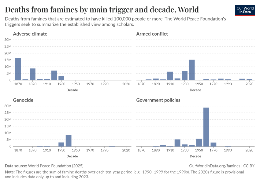
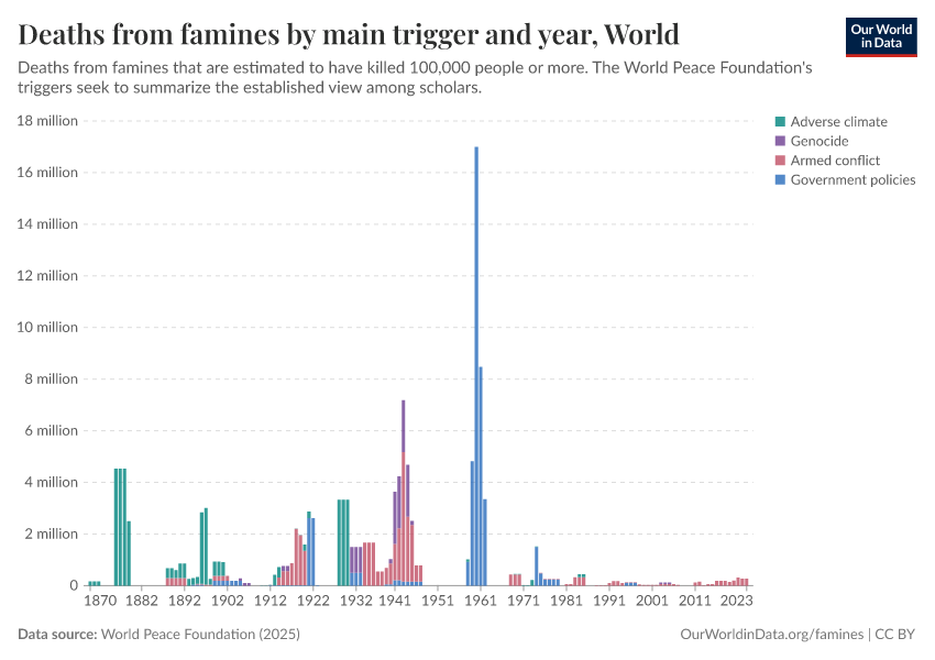
Long-term trends in global famine mortality
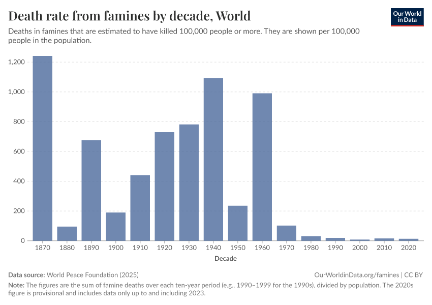
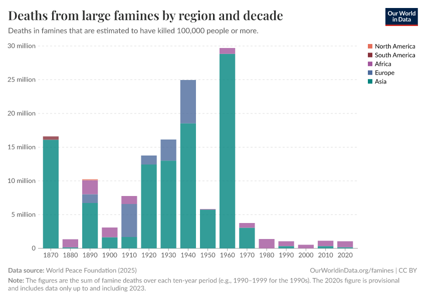
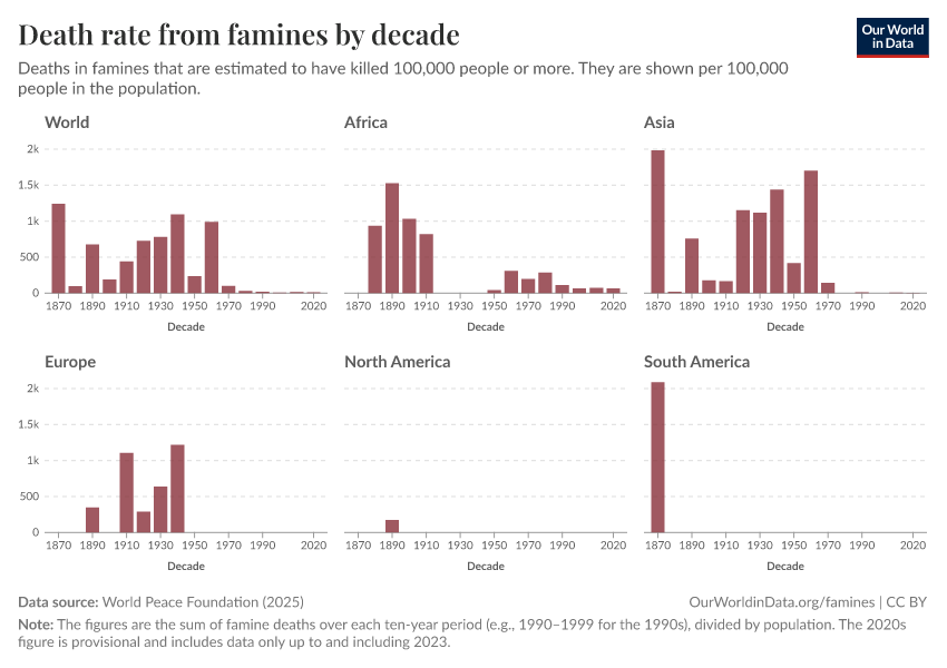
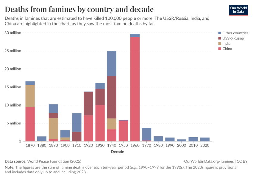
Compared to earlier historical periods, very few people have died in famines in recent decades. Here we show two bar charts based on our dataset of famines discussed in detail below. The blue bars show the number of famine deaths in each decade since 1860. The number of famine deaths varies hugely from decade to decade depending on the occurrence of individual catastrophic famines. Nevertheless, the last four decades have seen low numbers of famine deaths by historical standards.
The red bars show famine mortality relative to the growing world population over this time. Viewed in this way, the trend is all the more notable. The chart shows the rate of famine deaths globally, expressed as the number of people dying each year per 100,000 people of the world’s population. The chart presents this rate averaged across each decade since 1860. You can see that the famine mortality rate fell to very low levels over the second half of the 20th century.
The sharp reduction in famine mortality represents "one of the great unacknowledged triumphs of our lifetime", as famine researcher, Alex de Waal describes it.6
As de Waal explains, a continued decline is by no means assured: the future of famine will depend largely on the nature and prevalence of war. However, as we discuss below, the long-run developments that have contributed to the sharp decline in famine mortality do suggest that the type of catastrophic famine seen in the nineteenth and twentieth centuries is unlikely to return.
Famines by world region since 1860
Increasingly limited parts of the world are affected by famine
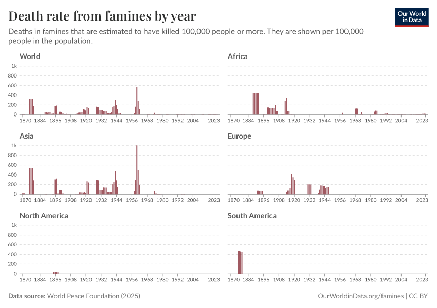
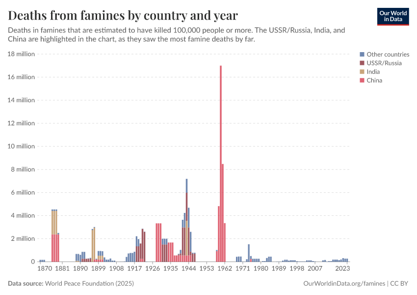
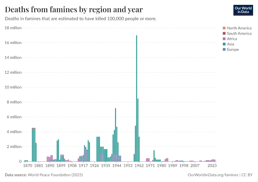
The geographic spread of famines has become smaller over time, as the following two charts show. They provide two ways of visualizing famine deaths by continent.
While in earlier periods Asia suffered heavily from major famines, this came to a halt over the mid-20th century. Since then, famines have almost exclusively been restricted to Africa, with the famine in North Korea being a stark exception.
Victims of individual famines
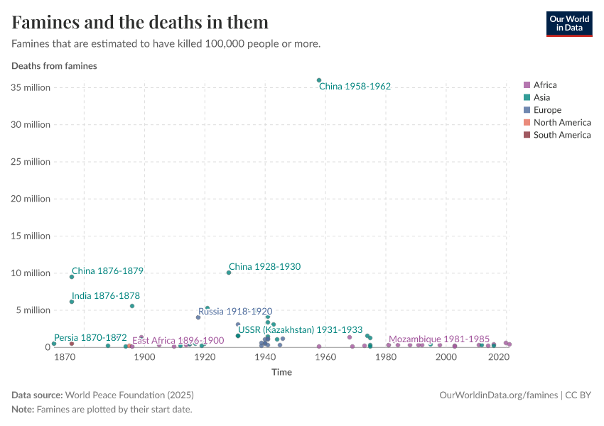
This chart shows the estimated number of people dying in individual famines since the 1860s, based on our dataset of famines. The length of each line shows the duration of the famine and the color shows the continent in which the famine occurred.
What this chart doesn't show however is the significant uncertainty that surrounds many of these estimates. As we discuss in the section on our famines dataset below, historical famine estimates are frequently based on very scant demographic information, and even where such evidence is available there is still disagreement in its interpretation.
As such, many of the famines included in our dataset are associated with a wide range of plausible mortality estimates. In our data, these are represented by upper- and lower-bound estimates, with the mid-point being shown in the visualization above. Two apt examples are the famines in the Democratic Republic of Congo, which took place amidst the Second Congo War beginning in 1998, and that of North Korea from 1995 to 1999. These famines stand out in recent decades for their particularly high mortality. But in both cases, the range of mortality estimates available in the literature is large, with high and low estimates varying by several millions of deaths.9
Where such differences are present, our midpoint estimates are clearly very sensitive to our choice of upper and lower bounds. We have not simply taken the highest and lowest figures published in the public domain, given that more accurate estimates often emerge with time. As noted by the World Peace Foundation, “generally speaking, better demographic calculations lead to lower estimations of excess deaths than those provided by journalists and other contemporary observers." Rather, we have sought to select upper and lower estimates based on the balance of opinion in commonly cited sources, all of which are given (for each individual event) in our dataset of famines. Inevitably though, this meant us taking a position in some controversial cases, discussed in detail below.
But while the number of deaths caused by individual famines is often subject to a good deal of uncertainty, the overall trend over time is very clear: compared to earlier historical periods, far fewer people have died in famines in recent decades. Whether we consider high or low estimates or something in between, does not affect this conclusion.
Long-run view of famine in single countries
England
In today’s developed countries peacetime famines had largely ceased by the mid-19th century.10
In England, this was achieved at least a century earlier. This graph shows estimates of the crude population increase – the number of births minus the number of deaths divided by the population – taken from Campbell (2009).11
These figures are based on a national sample of parish register entries, which are available with good coverage from 1538 when the registration of baptisms, marriages, and burials became enforced. By comparing the price of grain (which was well documented in England from the twelfth century onwards) with estimates for real wages and grain yields, the author was able to make reasoned speculations about which of the documented sudden drops in population were likely to have resulted from famine, as opposed to disease epidemics unrelated to food shortages. The idea is that even if harvests were bad, if there was no simultaneous rise in grain prices it seems more likely that disease would have been the main driver of population losses, as opposed to famine (the lower population reducing the demand for food, thereby offsetting the reduced supply to keep prices roughly level).
In this visualization, population crises potentially consisting of famine conditions are indicated with an 'F'. The last was in 1741-2 which was “brought on by an extreme short-term weather anomaly of at least three-years’ duration” that affected much of northwest Europe, causing an even more severe famine in Ireland.
Japan
Saito (2010) has created a chronology of famines in Japan since the 6th century. Data before the 14th century is judged to be incomplete (although the records for the 8th and 9th are surprisingly complete—there were more than 35 famines in each of the two centuries).
In Saito's visualization shown here, the number and intensity of famines are shown as 'points': 1 point is given to widespread famines, and 0.5 points are given to more localized events.
Overall, Saito's chronology comprises information on 281 famines. None of these 281 famines happened in the twentieth century, and the graph here shows that the end of starvation in Japan arrived gradually. Before 1550, there were more than 10 famines per 50-year interval, and since then, famines have become less and less common in Japan.
How frequent were famines in the distant past?
It is very difficult to know how common famines were in the distant past given the absence of historical records.
As noted by the World Peace Foundation, “generally speaking, better demographic calculations lead to lower estimations of excess deaths than those provided by journalists and other contemporary observers. We might therefore reasonably expect an upward bias in the figures for earlier famines on the record.” On the other hand, there is an obvious risk that existing historical records underreport long-past famines and the number of their victims due to the lack of documentation being made at the time or their being lost subsequently. Loveday, an early researcher of Indian famines, noted in 1914 that, “The frequency of the mention of famine in the later history […] increases in exact proportion with the precision and accuracy in detail of her historians.”13
At least in proportionate terms, it seems safe to conclude that the nineteenth century suffered far more intensely from famine than did the twentieth century, with Ó Gráda (2007) considering one hundred million deaths a ‘conservative estimate’ for the nineteenth century as a whole: higher than the combined figure for the twentieth century, and in the context of a much lower population back then.14
On the other hand, it seems unlikely that famines dominated to the degree assumed by some early famine scholars such as Robert Malthus, not least because ‘normal’ mortality rates would have been very high anyhow. “Given that life expectancy was low even in noncrisis years, frequent famines would have made it impossible to sustain population”, concludes Ó Gráda (2007).
Based on consideration of a patchwork of burial records and other historical accounts, Menken and Watkins (1985) conclude that famines in which death rates doubled for two years or more were 'rare', and that famines of even greater intensity were 'highly unusual', if they occurred at all.15
From what evidence there is, it seems unlikely that famine served as a primary check to population growth in the past, with non-crisis malnutrition and disease generating high enough death rates to act as "more potent positive checks on population growth in the long run than the Third Horseman.”16
Why do famines happen?
Food supply
We might naturally tend to associate famine with drought or other natural phenomena, and indeed most documented famines have occurred in the context of harvest failures, often due to droughts or flooding. However, in recent times, aggregate food availability per person has increased dramatically, and given the comparable ease of transportation and communication, localized shortfalls can – in theory at least – be met by importing food from surplus areas far quicker and at a much lower cost nowadays. As such, lack of overall food availability per se plays a less prominent role in causing famine today than it did historically.
Better integrated food markets have on the whole helped to ease acute localized food price volatility due to bad harvests. Food shortages that lead to higher prices create an incentive for traders to increase the supply of food, thereby preventing shortages from developing into outright food crises.
Thus the absence of markets, or the presence of badly functioning markets, can be a key part of why people are not able to obtain enough food. Where means of transport are lacking, trade between surplus and deficit regions can be hampered, as well as making the distribution of food aid much harder during crises. Comparable climatic conditions that sparked two famines in northern China, in the 1870s and 1920s respectively, brought about 9-13 million deaths in the first case and half a million in the latter. One important difference that can explain this moderated impact is the availability of greatly improved transport infrastructure that was constructed in the interim which allowed for prompt relief efforts to take place. The more limited development of transport infrastructure in parts of Africa has played a contributory role in a number of recent famines on the continent.17
Where markets function badly, supply may be restricted 'artificially'. For example, Amartya Sen argues that 'speculative withdrawal and panic purchase of rice stocks' was one of the primary causes of the Bengali famine of 1943, which turned a 'moderate short-fall in production... into an exceptional short-fall in market release’.18
Where traders have some monopoly power over local markets, hoarding can be a way of increasing profits by making prices rise. Even without monopoly power, where traders collectively expect prices to increase, for whatever reason, it can make sense for them not to sell storable food to final consumers immediately, but rather wait for the higher prices, thereby restricting the current overall supply to consumers. Again, this is part of the normal functioning of a market which encourages food to be transferred from periods of relative plenty to those of relative scarcity. But where such trading leads to excessive speculation on price increases, 'price bubbles' can emerge such that prices no longer bear any relation to the actual relative scarcity. In this sense badly functioning markets can produce 'artificial' scarcities, where food is prevented from reaching final consumers not because of actual falls in production, but only due to the anticipation of higher future prices.
Such self-fulfilling expectations of price increases can occur simply where people have mutually reinforcing, but nonetheless mistaken beliefs about future supply. According to Ravaillion (1987), such a dynamic was indeed at play during the Bangladesh famine, in which food prices soared despite there being no significant drop in food production or in overall food availability per person.19 He suggests that the severe flooding that occurred during the famine created the expectation of a shortfall and related price increases, but that the resulting panic buying and price speculation themselves brought about the scarcity, rather than any realized drop in production. It is argued by others that food price speculation at the time was directed toward a perceived weakness in the government's ability to continue with a policy of buying food at below-market prices in order to keep prices from rising too much.20
For instance, if a weather event (such as the severe flooding that occurred during the Bangladesh famine of 1974) makes people think there will be shortages, panic buying and price speculation can artificially produce scarcity.
The chart shown, taken from Ó Gráda (2006), shows the very dramatic peak in food prices during the Bangladesh famine that happened despite there being no decline in overall food availability. It also shows a sharp increase in the differences in food prices between different regions in Bangladesh (as measured by the standard deviation). This is evidence that, during the famine, markets became more spatially segregated – i.e. food was not able to move to those regions where it was in highest demand, and thereby lower local price differences. The absence of properly functioning markets thus contributed to the localized scarcities.
International aid continues to play a large role in addressing food security, both in emergency situations and to help relieve more persistent periods of food insufficiency (the World Food Program collects data on the quantity and value of international food aid and is available here). The development of better monitoring systems, such as the Famine Early Warning System, has given the international relief community more advanced notice of developing food crises, although such early warnings by no means guarantee a sufficient aid response or the granting of secure access to affected areas.
Thus, whilst drought or flood-caused crop failure might naturally seem to be high up on a list of causes of famine, this was far truer for famines in the past. Nowadays, crop failure is better understood as an important contributing factor rather than a sufficient cause of famine: food crises due simply to localized drops in production do not tend to develop into full-blown famines with high excess mortality unless exacerbated through more overtly human influences.
Demographics
The world is approaching what the late Hans Rosling called “the age of peak child”: the number of births globally has flattened out and we recently passed – or are at – the largest cohort of children that there will likely ever be.
This is relevant to famine trends because children under the age of five are particularly vulnerable, usually accounting for between one half and two thirds of all excess deaths in famines.22 Whilst the absolute number of children has increased, the fraction of the world population that this vulnerable age group makes up has decreased, and will continue to do so. The Demographic transition makes the occurrence of famines with very high mortality rates increasing less likely, both at a global level and as it unfolds in individual countries.
Poverty
As Amartya Sen argued, the fact that there may be enough food available in aggregate within a given area does not necessarily mean that everyone will be able to afford it.23
Food crises are often precipitated by spikes in the price of food relative to wages, or the collapse in the price of assets owned. The latter commonly accompanies famines due to many people all at once trying to sell their assets (for instance their livestock) in order to be able to buy more food. Such shocks can mean that those already living close to the level of subsistence may find their 'exchange entitlement' – that which they can obtain on the market in exchange for their labor or other assets – fails to provide them with enough food, even if the aggregate local supply is sufficient.
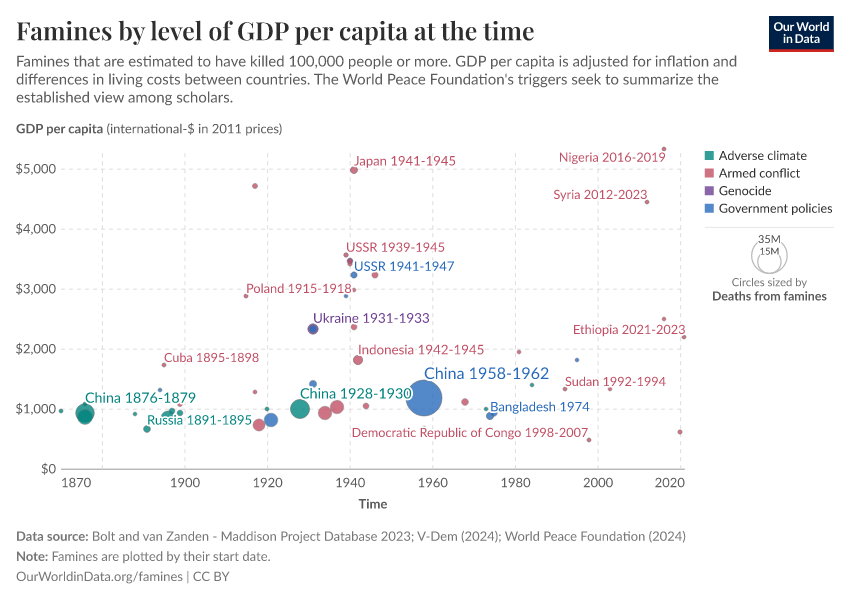
Wealthy countries have very few people living in such extreme absolute poverty, both because of higher incomes before tax and benefits, but also due to higher government expenditures and transfers. It is therefore unsurprising that those countries in which famines occur tend to be very poor. Here we show the inflation-adjusted income per capita of each country at the time they experienced a famine, with some reference points on the vertical axis. As you can see, most countries in which a famine took place had, at the time, average incomes less than half of that of the UK at the outset of its industrial revolution. You can see that average incomes in India – a country that historically suffered very heavily from famine – have grown rapidly in recent decades, while the country has been famine-free at the same time. African countries, conversely, have on the whole remained very poor and make up the majority of recent famines.
This relationship proxies for the presence of extreme poverty and also reflects the fact that poorer countries tend to have less adequate facilities like transport infrastructure, sanitation, and healthcare systems that play a key role in preventing or moderating the impacts of food shortages.
Whilst poverty certainly increases the vulnerability of a country, we should be careful not to think of it as the single, or even the most important, cause of famine, given the typically political nature of most outbreaks of famine.
Democracy and oppression
Amartya Sen famously noted in his 1999 book Development as Freedom that “there has never been a famine in a functioning multiparty democracy”. He suggested that democratic authorities are incentivized through elections to be more responsive to food crises and that the presence of a free press can quickly draw attention to the event and hold governments to account.
Whilst exceptions to this rule can be found – depending on the definition of ‘democracy’ and ‘famine’ being employed – the visualization here corroborates the idea that famines tend not to happen in democracies, by grouping them according to the political regime under which they took place. Here we use our list of famines since 1860 which can be found at the bottom of this page, and we define the political regime type according to the Polity IV score (discussed more in our topic page on democracy), collecting the various scores into three clusters: democracy (>5), autocracy or anocracy (-10 to 5), and colony.
According to the definitions we have adopted, three famines since 1850 took place in democracies. However, in two of them, the ‘democratic’ classification is rather ill-fitting. The St. Lawrence Island famine of 1878-80 is listed as occurring in the USA. However, it took place on a very remote Alaskan island populated by the indigenous Yupik people, that had relatively little interaction with mainland USA. In the case of Sudan, according to its Polity IV score, there was a brief spell of democracy, following elections held in 1986. However, it is somewhat misleading to consider the famine occurring in southern Sudan in 1988 as happening under conditions of a functioning democracy. It took place during the Second Sudanese Civil War, which was organized primarily along a North/South division and marked by many human rights violations. According to Wikipedia, in the majority of seats in the southern regions voting was in fact suspended for the 1986 election.
In the third case, that of Maharashtra in India in 1972-3, whilst there is no ambiguity as to the political regime type, there has been some disagreement as to whether excess mortality in fact occurred. This is discussed further in the section on our famines dataset below. In any case, whilst in absolute terms it is certain that the drought caused enormous suffering, whatever excess mortality that did occur in Maharashtra was much lower than the major famines occurring under totalitarian regimes in roughly the same period.
It is important to note, however, that the question of how often famines have occurred within democracies crucially depends upon the definition of famine being used. In particular, what, if any, excess mortality lower-bound is being used yields different answers. As Thomas Plümper and Eric Neumayer (2007) point out, a number of smaller-scale events in which drought-related mortality did occur have happened in functioning democracies.26 As the authors argue, even within democracies it can still be politically advantageous for governments to allow small minorities to starve if in doing so they are able to win more votes by distributing benefits to others. As discussed in the section on our famines dataset below, in compiling our table we have omitted events where the excess mortality is estimated to be lower than one thousand deaths, to reflect that the term "famine" has in its common usage typically been reserved for larger-scale events with crisis characteristics. This leaves only the three democracy famine events discussed above. Regardless of the threshold though, the main point remains the same: famines tend not to occur in democracies, and none of the catastrophic life-taking famines documented in history have occurred in the context of functioning democratic institutions.
War and famines
Many of the major famine events in our table resulted from international or civil war. For some of these, famine was used as an intentional part of political or military strategy. The ‘Hunger Plan’ pursued by Nazi Germany as part of its attempted invasion of the Soviet Union is an example of the latter. Despite the plan only being partially executed, over 4.5 million famine deaths are attributable to the offensive, significantly more than have occurred globally since the turn of the 21st Century.27
In terms of more recent events, from the second half of the 20th century onwards, famines in Africa have become increasingly associated with civil war, and include a number of crises in places that were not previously prone to famines at all, such as Mozambique and Biafra in Nigeria. In addition to the direct casualties, conflict can also generate disruption to production and trade and can encourage the spread of disease epidemics, particularly through forced migration.28
Crucially, it can also block the arrival of humanitarian relief to those in need.
It is mainly in the context of conflict that major death-dealing famines can be expected today. The majority of 'areas of concern' currently noted by the Famine Early Warning System are listed with armed conflict mentioned in the 'reasons for concern'.29
Poor health and infectious diseases
It is important to note that, as opposed to dying from literal starvation, the vast majority of people who die during famines actually succumb to infectious diseases or other illnesses, with some diseases being more directly linked to diet than others. Famines brought on by drought often go hand-in-hand with a scarcity of clean drinking water that increases the threat of cholera and other diseases. Increased migration and the disruption of personal hygiene and sanitation routines and healthcare systems also increase the risk of outbreaks of infectious diseases, all in the context of a population already weakened through malnourishment.
This is particularly true in places where such diseases are already endemic. Thus, in sub-Saharan Africa where vaccination rates for measles have been relatively low, the disease has been a big killer during modern famines in the region alongside other infectious and parasitic diseases common in non-crisis times.30
The table here is taken from Ó Gráda and Mokyr (2002) and shows the percentages of excess deaths during a selection of famines attributable to different proximate causes, including the most typical famine diseases. In each case, it can be seen that communicable diseases were the ultimate cause of death in the majority of cases. (Note that, for India and Moscow, the excess mortality attributable to starvation is not available separately).
This is in contrast to some famines that occurred in industrialized countries during WWII, in the context of overall healthier populations and systems of sanitation that were maintained to some degree despite the crisis. In these instances, disease played far less of a role, with deaths from starvation correspondingly higher. Ó Gráda (2009) gives the example of the siege of Leningrad in which “few of Leningrad’s 0.8 million or so victims perished of contagious diseases,” noting that the number of people dying from the main infectious diseases were actually lower in 1941 – amidst an overall vast increase in excess mortality – than they had been in 1940 before the blockade began.30
What does a famine declaration declare?
In recent years, the international humanitarian community has agreed upon specific criteria for determining if a food crisis should be considered a famine. But given the range and complexity of food emergencies, the way in which famines, or potential famines, are discussed can still be quite unclear.
For example, in February 2017, parts of South Sudan were officially declared by the UN as being in famine – the first such declaration since 2011. By May the famine had apparently receded, thanks to an effective aid response that averted large-scale loss of life. And yet, the crisis was far from over. Indeed the overall food security situation in the country had, in fact, 'further deteriorated' over the same period, according to official reports32 – even as the 'famine' status was being withdrawn.
Here, we look in more detail at the famine declaration in South Sudan to better understand how famine is defined today and how this fits in with our understanding of famines in the past.
Intensity vs. magnitude
The UN follows the Integrated Food Security Phase Classification (IPC) when declaring famines. The IPC famine factsheet and the more general IPC Manual provide details.
The IPC lays out thresholds across three dimensions of outcomes, all of which must be evidenced in order for a famine to be declared in a certain area:
- Food consumption and livelihood change: At least one in five households faces an extreme lack of food, as evidenced by insufficient food consumption (in terms of quantity and/or quality) and by the coping strategies employed by or available to households (e.g. the extent to which assets like livestock or seed may have been sold off)
- Nutritional status: More than 30% of the population is suffering from 'wasting' (being below 2 standard deviations below the median weight for a given height in the reference population)
- Mortality (due to inadequate food consumption): At least two people out of every 10,000 and at least four children under five out of every 10,000 are dying per day.33The key criterion is for the overall death rate to be above the 2/10,000 threshold. Where this is below the threshold level but the under five death rate is above its threshold, famine should only be declared following consultation with an 'Emergency Review Committee'. See IPC famine factsheet and the more general IPC Manual version 2.0, accessed 26 Jan 2018.{/ref}
A few things are worth noting about this definition. First, these thresholds represent only the most severe rank of the IPC food insecurity classification. The system ranges from Phase 1 to Phase 5, with 5 corresponding to a famine situation. Lower phases of food insecurity are categorized by lower thresholds in each of the three dimensions above.
Second, it is important to see that such thresholds are a measure of intensity rather than magnitude.34 That is to say, rather than trying to capture the absolute number of people in a certain situation of food insecurity, it looks at proportions within given geographic areas. Thus different assessments of food security trends will often be made depending on the geographic level of analysis. An amelioration at a very local level is perfectly compatible with an overall deterioration of the food security status of a country as a whole. And this is exactly what happened in South Sudan over the course of 2017.
Here, we show two maps of South Sudan showing the IPC classification of each county in South Sudan in January and May 2017. It was the intensity of the food security situation in Unity State in January (shown in dark red colors), which brought about the famine declaration later in February, with IPC Phase 5 thresholds being confirmed in some parts.
By May the situation in Unity State had somewhat abated due to humanitarian relief efforts, but the food security situation of most other parts of the country had deteriorated significantly. Thus while the 'famine' was over – in the very particular sense of there being no area where intensity thresholds met Phase 5 criteria – the food emergency had in fact become worse for most people.
Areas as a whole vs. individual households within an area
Just as different parts of a country can have different food security statuses, different households can and typically do experience different levels of food insecurity within any given geographic area. Rather than looking at geographical subdivisions, one way of getting a sense of how different people are faring in a food emergency is to look at the numbers of individual households experiencing different levels of food insecurity.
The IPC sets out such a 'Household Group Classification' alongside the 'Area Classification' outlined above. It mirrors the area classification in providing a Phase classification from 1 to 5, with 5 consisting of a 'Catastrophe' situation for the household. Since nutritional status and mortality data are typically collected for whole populations in a given area, only the food consumption and livelihood change dimension is used to categorize food security at the household level – though signs of malnutrition or excess mortality within the household are used to confirm the presence of extreme food gaps at the higher insecurity rankings.37
So whilst the household-level classification considers fewer outcomes (only food deficits, as opposed to nutritional or mortality outcomes), it does allow for an assessment of the magnitude of a food emergency in terms of the absolute number of people being affected at different levels of severity. Looking at the household data for South Sudan over 2017 offers another angle on the evolution of the crisis. The two tables shown give the number of people estimated to be at a given level of insecurity across the different States in January (first table) and May (second table).
With such a disaggregation we can see that the humanitarian provision, targeted to the most in need in Unity State, did indeed bring down the number of people experiencing the very worst food insecurity. It was on this basis that that country was no longer officially 'in famine'. However, if we look at the number of individuals in Phase 3 (Crisis) or worse food insecurity, we see not only a deterioration in the country as a whole (45.2 % of the population in May compared to 32.3% in January), but even in Unity State itself (with 58.7% and 54.7% respectively).
Thus whilst a binary 'famine/no-famine' categorization is very useful in terms of being able to draw international attention and relief efforts to the most dire situations, there are other dimensions that we should be aware of in trying to get a sense of the gravity of a food crisis, particularly in terms of its magnitude.
The global need for emergency food assistance
The Household Group IPC classification can be used to get a sense of the scale of the food emergencies currently underway. The Famine Early Warning Systems Network (FEWS), for instance, publishes estimates for the number of people in need of emergency food assistance, defined as those experiencing, or imminently likely to experience Phase 3 ('Crisis') food insecurity or worse. This corresponds to households experiencing "food consumption gaps with high or above usual acute malnutrition" or those "marginally able to meet minimum food needs only with accelerated depletion of livelihood assets that will lead to food consumption gaps."
And along this dimension, the numbers were, according to FEWS, 'unprecedented in recent decades'.38
The numbers estimated to be in need of emergency assistance in 2017, as defined by FEWS, did represent a peak in recent times.39
Prospective vs. retrospective classification
The IPC system is fundamentally geared towards preventing famines, rather than assessing their severity after the event. As stated in the IPC Manual,
"The purpose of the IPC... is not to classify various degrees of famine, nor is it to categorize the “worst famine”. Rather, in order to inform real-time decision-making, the IPC thresholds for famine... are set to signify the beginning of famine stages."41
It is important to bear this in mind when trying to compare such assessments with famine trends over time. Our famines dataset provides estimates of the 'excess mortality' associated with individual famines.42
In reference to the discussion above, this can be thought of as a measure of magnitude only along one dimension: mortality.
Official famine declarations based on the IPC Area classification, like that made for South Sudan in 2017, do not straightforwardly map onto such an analysis. For instance, given the larger population being affected, it is quite possible that more people died due to food consumption deficits in Yemen than in South Sudan in early 2017, despite the intensity of the former crisis not having brought about a famine declaration in any part of the country so far.
In terms of classification based on excess mortality alone, there are no officially agreed criteria about which food emergencies should be counted as famines and which not. In collating our dataset of famines, we excluded events with an estimated mortality of less than one thousand.43 Currently our data do not include any mortality estimates for the crises in South Sudan, Yemen, and elsewhere since 2017.
Does population growth lead to hunger and famine?
Modern Malthusians
It’s no good blaming climate change or food shortages or political corruption. Sorry to be neo-Malthusian about it, but continuing population growth in this region makes periodic famine unavoidable... Many of the children saved by the money raised over the next few weeks will inevitably be back again in similar feeding centres with their own children in a few years time.44
It is not uncommon to see arguments along the lines of this quote from Sir Jonathan Porritt, claiming that famines are ultimately caused by overpopulation. Porritt – former director of 'Friends of the Earth' and also a former chairman of the UK Government’s Sustainable Development Commission – was talking about the 2011 famine in Somalia that went on to kill roughly 250,000 people.45 He seems certain that the rapid population growth witnessed in East Africa had made famine there ‘unavoidable’.
There is something compelling about this logic: a finite land area, with a limited ‘carrying capacity’, cannot continue to feed a growing population indefinitely. From such a perspective, the provision of humanitarian aid to famine-afflicted countries, however well intended, represents only a temporary fix. In this view it fails to address the fundamental issue: there simply being too many mouths to feed.
As mentioned in the quote, this suggestion is commonly associated with the name of Thomas Robert Malthus, the English political economist writing at the turn of the nineteenth century. Malthus is famous for the assertion that in the absence of ‘preventative checks’ to reduce birth rates, the natural tendency for populations to increase – being ‘so superior to the power of the earth to produce subsistence for man’ – ultimately results in ‘positive checks’ that increase the death rate. If all else fails to curb population, ‘gigantic inevitable famine stalks in the rear, and with one mighty blow levels the population with the food of the world'.46
But does the evidence support this idea? Here, we examine the relationship between population growth and famine, and between population growth and hunger more generally.
Does population growth cause famine?
This chart compares the number of famine deaths per decade – based on our famines dataset – with the world population over the same period.
Looking at the world as a whole, it is very difficult to square Malthus' hypothesis with the simple but stark fact that, despite the world's population increasing from less than one billion in 1800 to more than seven billion today, the number of people dying due to famine in recent decades is only a tiny fraction of that in previous eras.
We might naturally think that increasing agricultural production explains this trend. Indeed, food supply per person has consistently increased in recent decades, as we can see in the interactive line chart shown. The large increase in global population being met with an even greater increase in food supply (largely due to increases in yields per hectare).
However, looking at the issue in this way is too simple. As we discuss above, insufficient aggregate food supply per person is just one factor that can bring about famine mortality. Contemporary famine scholarship tends to suggest that insufficient aggregate food supply is less important than one might think, and instead emphasizes the role of public policy and violence: in most famines of the 20th and 21st centuries, conflict, political oppression, corruption, or gross economic mismanagement on the part of dictatorships or colonial regimes played a key role.47
It is also true of the 2011 famine in Somalia referred to above, in which food aid was greatly restricted, and in some cases diverted, by militant Islamist group al Shabaab and other armed opposition groups in the country.48
Famine scholar Stephen Devereux of the Institute of Development Studies, University of Sussex, summarizes the trajectory of famines over the 20th century as follows: "The achievement of a global capacity to guarantee food security was accompanied by a simultaneous expansion of the capacity of governments to inflict lethal policies, including genocidal policies often involving the extraction of food from the poor and denial of food to the starving."49
Thus, all in all, the recent history of famine mortality does not fit the Malthusian narrative particularly well. Firstly, contrary to what Malthus predicted for rapidly increasing populations, the food supply per person has – in all regions – increased as populations have grown. Secondly, famines have not become more, but less frequent. Thirdly, in the modern era the occurrence of major famine mortality, and its prevention, is something for which politics and policy seem the more salient triggers.
Does population growth increase hunger?
Global picture
Famines tend to be thought of as acute periods of crisis and are in that sense to be distinguished from more chronic manifestations of hunger that may in some places represent 'normal' circumstances, despite being responsible for large numbers of deaths.50
Given the typically political nature of outbreaks of such famine crises, it may make more sense to examine the effect of population growth on the longer-term trends of hunger and malnutrition.
But again, at the global level, we know that population growth has been accompanied by a downward trend in hunger. As we discuss in our topic page on hunger and undernourishment, in recent decades the proportion of undernourished people in the world has fallen, and, although more muted, this fall is also seen in the absolute number. The number of people dying globally due to insufficient calorie or protein intake has also fallen, from almost half a million in the 1990s to less than half in more recent data, as shown in the visualization.
Within countries
We can also look at the experiences of individual countries, rather than just at the global level. Do those countries with particularly high population growth rates find it harder to adequately feed its population?
In order to get some idea about this, we can compare countries' Global Hunger Index (GHI) scores with their population growth rates. GHI is a composite measure, out of 100, that combines four indicators: undernourishment, child wasting, child stunting, and child mortality.51
The score is based on data collected in the years leading up to the scoring year, and as such reflects the hunger levels in this period rather than solely capturing conditions in the year itself. All the countries for which there was GHI data available are shown in the three charts.52 Crucially, this excludes a number of very food-insecure countries including the Democratic Republic of Congo, South Sudan, and Somalia, which have also seen high levels of population growth.53 This should be borne in mind when interpreting the following results.
Of the countries for which we do have GHI data, it is clear that those with higher levels of hunger have also tended to have had higher population growth over the last 25 years, as the first chart shows.
It is important to see though that among the countries for which we have GHI scores in both years, the level of hunger went down in all but one – Iraq, as the second chart demonstrates. Over the same period, population went up in almost every case. Moreover, those countries that experienced higher levels of population growth in fact saw a bigger drop in their GHI score over this period.
The countries that saw high population growth over this period started with higher levels of hunger. So what we are seeing here is that countries are converging towards lower levels of hunger: it fell quickest in countries with the highest levels of hunger, as the third chart shows.
So whilst countries that experience hunger do tend to have high levels of population growth, the idea that population growth necessarily leads to increased hunger is clearly mistaken: many countries with high population growth have recently managed to decrease levels of hunger substantially.
Population growth does not make famine inevitable
Environmental degradation, including climate change, does pose a threat to food security, and the growth of human populations has undoubtedly exacerbated many environmental pressures. However, this represents only one aspect of the complex explanation of why so many people suffer and die from undernourishment today, despite there being adequate food available for consumption globally.54
'Malthusian' explanations of famine and hunger thus fall short for the following reasons, the evidence for which we reviewed above:
- Per capita food supply has increased as populations have grown, largely due to increasing yields.
- Famine deaths have decreased, not increased, with population growth.
- Food scarcity has played a smaller role in famines than suggested by the Malthusian narrative. It ignores other factors like conflict, poverty, access to markets, healthcare systems, and political institutions.
- Population growth is high where hunger is high, but that does not mean that population growth makes hunger inevitable. On the contrary, we see that hunger has fallen fastest in countries with high population growth.
If we want to put an end to hunger, we need to understand the diverse causes that bring it about. Oversimplifications that mistakenly see hunger and famine as an inevitable consequence of population growth do not contribute to this end.
Do famines curb population growth?
Is famine the ultimate 'check'?
English political economist, Thomas Robert Malthus, writing at the turn of the 19th century, is famous for describing famine as "the last, the most dreadful resource of nature" which acts to "level the population with the food of the world" should other forces fail to lower birth rates or increase death rates.46
We can think of this ‘Malthusian’ proposition as containing two separate hypotheses: first, that unabated population growth ultimately leads to famine; and second, that famine acts as a ‘check’ to population in this eventuality.
As we discuss above, recent trends in famine mortality, and hunger more generally, largely contradict the first hypothesis. Here we investigate the second, by considering the contribution of famines to long-run population trends. What role has famine played in shaping birth and mortality rates throughout history?
We begin by considering two examples of famines that differ enormously from a demographic point of view: the Chinese famine of 1959-61 and that in Ireland in the late 1840s.
China's 'Great Leap Forward' famine
The 'Great Leap Forward'-famine in China from 1959-61 was the single largest famine in history in terms of absolute numbers of deaths. Excess mortality estimates vary hugely, but based on our midpoint estimates, it cost more than double the number of lives than any other famine.
The chart shows the estimated changes to birth and death rates during and after this famine period, in addition to the effect of these changes on overall population size. Alongside a significant jump in death rates, there was also a large fall in births — a trend very typical of famines.55
However, this was immediately followed by a spike in birth rates in the years immediately following the famine, offsetting to a large degree its demographic effect. This was followed by a steady decline in birth rates throughout the 1960s and 70s, concurrent with domestic birth control policies, but also in line with many other rapidly developing countries.
The trend in mortality rates is similar: the peak generated by the crisis was followed by a continued decline that forms part of the common experience of countries as they develop. The key thing to note is that these secular shifts in births and deaths far outweigh the short-lived impact of the famine in determining the long-run trajectory of population growth in China. Despite causing excess mortality of 2-5% of the total population, and a similar number of 'lost births', we can see from the lower panel in the chart below the famine had next to no discernible impact on the population in the long run.
The Great Irish Famine
This picture contrasts somewhat with the developments following the Great Irish Famine of the late 1840s, as shown in the chart below. After a period of rapid growth that brought the population to over 8 million, a famine struck that was, in relation to the country's population, far more severe than the 'Great Leap Forward'-famine. It is thought to have reduced the population by about one quarter in its immediate effects: one million perishing and a further million emigrating. But one striking feature of Irish demographics is how the population then continued to shrink following the famine. By 1911 there were in Ireland about half as many people as in 1841. The population only began to grow again in the late 20th century. Is this then an example of a country that learned from its 'Malthusian lesson'?
This continued depopulation was partly due to low birth rates (which were considerably lower than in England and Scotland in the second half of the 19th century) and partly due to very high levels of outward migration, particularly to the US and Great Britain. Between 1851 and 1900, there were almost as many outward migrants as there were deaths in Ireland (4.18 million and 4.56 million, respectively).58 According to Cormac Ó Gráda, "during the decades between the Great Famine and World War One the probability of a young Irishman or Irishwoman not emigrating was less than one in two."59
As Ó Gráda argues, the only way a famine can have any real lasting demographic impact is if it "teaches" the population to alter marriage and family planning practices to reduce fertility rates.
There is some evidence of changing behavior in Ireland following the famine, including more people choosing to marry later or not all. However, it is difficult to know if this is directly attributable to the famine, or if it instead reflects people's responses to other changes taking place at the time, such as increasing life expectancy or increasing incomes. Furthermore, whilst total birth rates were low in the post-famine period, the number of children being born to married couples remained high, and the rate of natural increase was highest in those parts of the country worst hit by the famine, complicating any simple explanation along these lines. Similarly, whilst the famine itself clearly provided the impetus for mass emigration, high levels of outward migration began some decades before the famine and continued long afterward in the context of a much-ameliorated standard of living. Thus, it seems likely that it was the promise of improved economic opportunities, rather than fear of famine that drove emigration between 1851 and 1900.60
Overall then, even in this seemingly paradigmatic ‘Malthusian’ example, whilst Ireland undoubtedly did suffer some lasting demographic impacts from the famine, subsequent economic and social developments unrelated to the famine explain the majority of the depopulation the country experienced in the decades following it.
The role of 'crises' in long-run population trends
But what can we say about the impact of famines on long-term population trends more generally? To help answer this question, we look instead at the role of 'population crises' of all kinds – that is, severe spikes in mortality in general, not just those due to famine. What impact have such crises played in shaping population trends, relative to other global developments?
Here are two charts showing the historic evolution of death rates in England and Wales, and in Norway. Data points mark the annual 'Crude Death Rate' (total deaths per 1,000 people) in each country, and a line plotting the 20-year moving average is shown in each case. You can see that the decline in average mortality rates in both countries was preceded by a reduction in the spread around the average i.e., the number and extent of 'crises' of high mortality.61
However, when such spikes were common, they in fact played a relatively small part in keeping average mortality rates as high as they were. Economic Historian, Robert Fogel, in considering the data for England concludes that "crisis mortality [including famine] accounted for less than 5 percent of total mortality in England prior to 1800 and the elimination of crisis mortality accounted for just 15 percent of the decline in total mortality between the eighteenth and nineteenth centuries."62
You can imagine this by imagining what would happen if you took the highest points in the charts above – representing the crises in mortality – and moved them downwards towards the average for that time. The line showing the 20-year moving average would indeed fall, but only by a small amount compared to the overall decline.
The impact of demographic transition outweighs mortality crises
Falling death rates, and increasing life expectancy, are trends that took place first in early industrializing countries but have been a common experience in all parts of the world as poverty has declined, and healthcare and nutrition have improved. But since the 1960s this has been outpaced by a fall in birth rates, such that overall the global population growth rate has been steadily falling, and is likely to approach zero towards the end of this century. The rapid growth in population witnessed since the early 20th century was due to the fall in death rates happening ahead of the fall in birth rates, generating a period of natural increase in between.
This is known as the 'demographic transition': a shift from stable populations with high birth and death rates to stable populations with low birth and death rates, with a period of rapid increase in between due to the fall in mortality preceding the fall in fertility. This chart shows this transition as it occurred in five very different countries. Here also we can see that the secular decline in death rates follows a reduction in its volatility. But again, the height of the peaks in earlier decades is generally small relative to the overall decline. Even larger crises, such as the "Great Leap Forward", or the spike in mortality in Mauritius in the late 1920s,63 translate into very small changes in overall population trends, if at all. It is the persistent long-term decline in 'normal' birth and death rates that represents the more significant development for population trends, not the absence of temporary mortality spikes.
Famines are no 'solution' to population growth
As with any living organism, humans cannot sustain a given population without sufficient energy resources. Given this, at first glance, it does seem intuitive to assume population growth and famines to be closely linked via food availability. The evidence discussed here (and also above) contradicts any simplified view of this relationship that fails to acknowledge the diverse causes of famines and population dynamics.
The analogy to other living organisms can obscure what is different about the human species. We organize ourselves into complex social and political structures capable of incredible joint accomplishments – such as the eradication of diseases. But we are also capable of inflicting, or consciously allowing, unimaginable suffering – including the majority of famine deaths to date. The capacity of the planet to feed us is not a fixed constant, imposed by nature, but rather it depends on us: on our agricultural practices, the development and transmission of knowledge and technology, and also crucially upon our choice of diet – an inherently cultural act.
The population growth rate is now declining, not, thankfully, due to more frequent crises of mortality but because people, through their own volition, are choosing to have fewer children. This change is very much associated with rising incomes and other social developments in health and education and has tended to happen more quickly in countries that have developed more recently. If we need any generalization here, it is plenty – in terms of improved access to adequate food, clean water, sanitation, healthcare, education, and so on – rather than scarcity, that is slowing down our species' multiplication.
This isn't to say that increased populations and affluence haven't brought about environmental damage, nor that environmental degradation poses no risks to our future well-being. But the idea we are helpless to stop famines in the face of high population growth in some parts of the world, or that famines represent any kind of 'solution' to the environmental problems humans are causing, are two hypotheses that do little to help either humanity or the planet.
The Our World in Data Dataset of Famines
This topic page is based on our 'Our World in Data Dataset of Famines', which covers the period since the mid-19th century and we show in full below. In the following we discuss how famines are defined and how we constructed the dataset.
Intensity vs. magnitude of famines
Today the Integrated Food Security Phase Classification (IPC) provides a definition of 5 levels of food insecurity of increasing severity, with level 5 constituting famine. According to the IPC, in order for a food insecurity situation to be declared a famine it must meet three specific criteria:
- At least one in five households faces an extreme lack of food
- More than 30 percent of the population is suffering from acute malnutrition (wasting)
- At least two people out of every 10,000 are dying each day
Whilst providing a more objective, and hence de-politicized, benchmark for declaring a famine – vital for eliciting a timely humanitarian response – a key aspect of the IPC classification is to provide a graduated system that fits the reality of food crises better than a binary ‘famine or no-famine’ approach. Notice that it focuses on the intensity of the crisis. As discussed by Howe and Devereux (2004), this is distinct from the magnitude of the event, typically understood in terms of the total (excess) mortality that occurred.65 In compiling our table of famine deaths over time, we have naturally used estimates of the latter. It is important to note that there is no institutionally-agreed classification of famines in terms of magnitude. Indeed, for some people, a crisis that resulted in no excess mortality might still be properly considered a famine under some circumstances – there are many terrible outcomes that a severe food crisis can produce other than mortality, such as losses of livelihoods or long-term health impacts. Nevertheless, in producing our table we decided to implement a lower threshold of mortality for a crisis to be included (see “Famines with low mortality” below).
It is worth seeing that these two dimensions – intensity and magnitude – whilst clearly related are nevertheless independent of each other. A very high-intensity famine, resulting in high mortality rates, may only affect a very small group of people and thus represent a relatively low-magnitude event. Or a low-intensity crisis may extend across a wide area and over a long period, resulting in a high-magnitude famine. A threshold in terms of intensity (i.e. IPC level 5) does not, therefore, straightforwardly map onto any given magnitude threshold.
Is mortality from current ongoing food crises included?
No, our visualizations only show data up to and including 2016.
Incomplete or inaccurate historical records
In constructing our table of famine mortality over time, we have relied on a variety of secondary sources (listed below), themselves generated from historical accounts that did not make use of such precise definitions, nor would they have been able to do so given the absence of demographic records. Even if we may imagine a relative degree of conformity through time to the notion that famine consists of ‘a widespread lack of food leading directly to excess mortality from starvation or hunger-induced illnesses’, it is important to note that most of the mortality estimates listed in our table are typically very rough and are often the subject of a good deal of controversy (some examples are discussed in more detail below).66
It should be borne in mind that there may be many motives for different observers, record keepers or historians to (intentionally or otherwise) over- or underestimate mortality levels according to their sympathies with the affected population or suspected perpetrators.67
As noted by the World Peace Foundation, “generally speaking, better demographic calculations lead to lower estimations of excess deaths than those provided by journalists and other contemporary observers. We might therefore reasonably expect an upward bias in the figures for earlier famines on the record [i.e. from 1870s].”
The earlier back one goes though, the more one might suspect that the written historical record is incomplete. We start our table from the 1860s. Whilst records for this period are no doubt more complete than earlier times, it is likely that some smaller events that would count as famines by today's standards may not have been recognized or recorded as such and are therefore missing from our table.
How is excess mortality estimated?
The aim of the table below is to show estimates of ‘excess mortality’ – that is to say, the extra number of deaths that occurred during the famine as compared to the number there would have been had the famine not occurred. As noted above, it should be borne in mind that those dying of infectious diseases during famines are normally also included in this. As such, mortality estimates typically try to subtract the ‘normal’ death rate – that is expected in the famine’s absence – from the actual total death rate during the famine. Estimating the latter is far from straightforward given the paucity of reliable demographic statistics typical of even recent famines. This also requires making assumptions about what the ‘normal’ death rate is, leaving even more room for disagreement (see discussion of the Democratic Republic of Congo famine below for an example).
Given this focus on excess mortality, some severe food insecurity situations involving high levels of mortality can nonetheless result in next to no excess mortality where the ‘normal’ death rate for the area in question is already very high. Niger in 2005, which many observers at the time considered to be a famine, is an example of this.68
It is worth noting as well that what is ‘normal’ changes through time. Modern definitions of famine include criteria for nutrition and mortality that would correspond to conditions typical or near-typical of non-crisis conditions in earlier periods for much of the world.69
How should war famines be taken into account?
It should be noted that, based on the work of Alex de Waal at the World Peace Foundation, included in our famine list is a number of events that are described as ‘episodes of mass intentional starvation’. Some of these events are not included in other lists of major famine events of the 20th century (notably some of them are missing from Stephen Devereux’s much-cited 2000 paper, Famine in the Twentieth Century). This suggests that some authors might consider these deaths to be attributable more to conflict and not reliably attributable to famine. Nonetheless, we decided to include these events in our table. Our reasoning here is that the excess mortality associated with many of the famines listed in Devereux (2000) would not have occurred in the absence of conflict, and many of them are not without similar controversy (see below for some more discussion). Thus any distinction between 'famine' and ‘episodes of mass intentional starvation’ seems to be a matter of degree, and as such there appeared no clear reason not to include the latter in our table.
Some controversial mortality estimates
Famines with very low mortality
In our table, we have excluded crises where reported excess mortality was lower than 1,000. Our reasons for doing so were twofold. First, in the context of very large margins of error for many of the famines in our table (with upper and lower estimates of excess mortality sometimes several million apart), we felt that including events in which very few people are recorded as dying might give a misleading impression of the accuracy of the rest of the estimates in the table. Second, for many people, substantial excess mortality (due to starvation or hunger-induced diseases) would normally be seen as an integral part of what it means for a crisis to constitute a famine.70
It should be noted that there might be good reasons to make use of a definition of famine that allows for zero or very low excess mortality.71 Nevertheless we felt some lower threshold would be appropriate, though the exact cut-off was a somewhat arbitrary choice.
One of our main data sources is EM-DAT’s International Disaster Database, which lists mortality estimates for a range of disasters. In particular, it provides data on a number of smaller-scale events often not given in the main lists of major famines we have used. We considered those events listed as 'Droughts' as being famines, though we excluded any such disasters with a mortality estimate lower than 1,000 as per our threshold.
In addition, we also chose to omit two recent drought events listed in the database for China of 1,400 and 2,000 excess deaths in 1988 and 1991 respectively, having failed to find any corroborating cross-references to famine having occurred in these years.
Relatedly, some events often described as famines are not included in the table below where the reported excess mortality is considered to be in some sense 'negligible'. As with shifting understandings of what the 'normal', non-crisis death rate consists of, no doubt this is a threshold that has changed considerably over time as demographic analysis of famines has become more precise and excess mortality a relatively rare event. Examples of potentially controversial omissions we have made along these lines include the Highland Potato Famine in Scotland (1846-56), the Bihar famine in India 1966-7 (discussed in more detail below) and Niger in 2005.
Various secondary sources that we have used to compile our table (listed below) themselves use some excess mortality cut-off, but one typically higher than our threshold of 1,000. This means that there may exist records of famines of a magnitude larger than 1,000 excess deaths that are not included in our table (if they did not appear in the International Disaster Database).72 However given the large-magnitude events in our table, this can only have had a very small effect on the overall trend outlined in our charts.
Famines in independent India: Bihar 1966-67 and Maharashtra 1972-3
The International Disaster Database lists a drought in India in 1965 as killing 1.5 million people. The only food crisis around this time that we could find cross-references for was that in Bihar, more commonly cited as occurring in 1966-67. Official statistics, however, suggest very low excess mortality. Indeed, the famine was sometimes invoked as evidence that independent India had turned a corner in its development, such that it could now cope with a serious drought without sustaining major loss of life.
Dyson and Maharatna (1992), however, regarded the official mortality data to be highly deficient. They concluded that ‘while the available data show little sign of excess mortality in Bihar, we probably cannot exclude this possibility’.73 Drèze (1990) similarly came to the conclusion that ‘there is precious little evidence to support the self-congratulatory statements that have commonly been made about the Bihar famine, e.g. “no exceptional mortality was recorded” or “no one died of starvation”.’74
Given such uncertainty, we decided to exclude this famine from our dataset. Notably, we chose to exclude the EM-DAT figure for 1965: such a high mortality seems questionable given the absence of other corroborating references.
Similar issues surrounded the determination of an excess mortality figure for the Maharashtra crisis in 1972-3. For Drèze (1990) it is clear that, whilst "the crisis was of extreme severity, famine was uncontroversially averted." This was largely due to an enormous public employment program that at its peak employed as many as 5 million people in Maharashtra state alone.
Whilst Drèze considers the available demographic statistics to imply that "mortality rose only marginally, if at all,", and notes that there were no confirmed instances of 'starvation deaths', Dyson and Maharatna (1992) insist that the mortality rates do imply a significant excess mortality of 130,000 people. They arrive at this conclusion based on adjusting the figures to account for systematic under-registration of deaths, the pre-crisis trend in mortality rates, inter-census population growth, and the possibility of excess mortality also occurring in 1972.
In keeping with many other of our listed famine mortality estimates, we decided to provide that figure cited by Devereux (2000), itself quoting the 130,000 figure from Dyson's work.75
It is worth seeing though that our choice to attribute a mortality figure to the Maharashtra drought, but not that of Bihar, stands in contrast to the conclusion of Drèze (1990) – based on consideration of nutrition surveys, asset disposals, and land sales (signs of acute distress), and the extent of migration – that the Bihar famine struck considerably harder. Nevertheless, in the absence of a specific mortality estimate for the Bihar famine, it has been excluded from our list of famines. In any case, the level of uncertainty surrounding both of these famines should be borne in mind.
Great Leap Forward Famine, China 1959-61
By far the largest single event in our dataset is that of China at the turn of the 1960s associated with the economic and social campaign led by Mao Zedong known as the Great Leap Forward. During and immediately after the Chinese famine, however, it remained 'shrouded in mystery’, with the Chinese authorities and some Western observers insisting that, despite successive poor harvests, famine had been averted. In the post-Mao era of the early 1980s, some official demographic data was newly released allowing for the first systematic investigations of the death toll.
Initial results from this suggested an excess mortality of around 30 million, and this figure gained some currency. Subsequent estimates have tended to be lower.
One of the key issues is how these official data compare with UN estimates of infant mortality and life expectancy for the period 1950-5, which imply significant under-registration in official data. Exactly what assumptions are made about such under-registration have consequences for the ultimate mortality estimate produced. There is necessarily a degree of arbitrariness to such assumptions, with different hypotheses often standing in contradiction to alternative sources of evidence such as historical documentation, and conflicting with the demographic patterns typically observed in famines.
Whilst there is much uncertainty about the exact number of deaths attributable to the Great Leap Forward famine, it seems certain that it represents the single biggest famine event in history in absolute terms. Relative to the size of the population however, the death rate was “modest” compared to that of Ireland in the 1840s or Finland in 1867-8, and was comparable to that of the 1876-9 famine in China.
For our table we use the midpoint between the lowest and highest estimates given in our main sources, 15 million being the lower bound given by Ó Gráda (2009) and 33 million being the upper bound given by Devereux (2000).
A good summary of these issues is given by Ó Gráda (2008).
Democratic Republic of Congo, 1998-2007
The most commonly cited excess mortality estimate for the conflict in the Democratic Republic of Congo (DRC) is the 5.4 million given in a 2007 report by the International Rescue Committee (IRC). The estimates were based on ‘retrospective mortality surveys’ in which interviewers asked a sample of respondents to report the number of deaths that had occurred within their household over a given period. These were then used to make inferences about the number of deaths across the country and, in conjunction with an assumed baseline mortality rate capturing the number of people that would have died anyway in the absence of the conflict, were used to generate the overall excess mortality figure.
Some controversy was generated in 2009 with the publication of the 2009/10 Human Security Report which presented a number of criticisms of the IRC methodology and argued that it had significantly overestimated the death toll. The key debate concerned the baseline mortality rate used, which the Human Security Report considered to be too low, thereby inflating in its view the number of deaths that could be associated with the conflict. In addition, the Report argued that the samples of respondents used in the earliest IRC surveys were unrepresentative and also too small to provide reliable estimates. In particular, it suggested that the areas visited were atypical in that many of them were selected because of there being existing or planned humanitarian operations already in the vicinity, so they were therefore likely to have higher mortality rates than the average location.
The IRC authors meanwhile point to the fact that access to some of the most insecure zones was impossible during the surveys, suggesting a sample bias in the opposite direction.
The overall argument of the Human Security Report is that the available data is not sufficient to form the basis for a credible excess mortality estimate, and any attempt to make one is very sensitive to the choice between a range of plausible alternatives and subject to a very wide margin of error. It does produce an estimate, but only for the period between 2001-7 for which the surveys conducted were more representative and numerous. The report’s ‘best estimate’ for excess mortality over this period is 863,000, compared to the 2,830,600 of the IRC for the same period. However, it points out that this is very sensitive to assumptions about whether the counterfactual baseline mortality rate should be considered to have a trend. For short-lived events a point estimate for the baseline mortality rate is sufficient. To estimate the excess mortality of a long-lived event, the report argues, one should allow for the possibility that the baseline mortality rate would have changed over this period in the absence of the event being studied. In the case of DRC, it might be reasonable to assume that a negative trend in mortality rates observed prior to the outbreak of war would have continued, in which case the Report’s ‘best estimate’ for the 2001-7 period would increase to 1.5 million.
As such, the 863,000 figure that we include as a lower bound in our table should be treated with extreme caution. It completely excludes the period prior to 2001 and also ignores the downward pre-trend in mortality rates (as does the IRC estimate).
On the other hand, all these estimates of excess mortality include ‘violent deaths’ i.e. those directly attributable to conflict and not to the ensuing famine conditions. The IPC report cited does not provide an exact number of violent deaths, but it does claim that “less than 10 percent of all deaths were due to violence, with most attributed to easily preventable and treatable conditions such as malaria, diarrhea, pneumonia, and malnutrition”. As such we do not attempt to subtract violent deaths from the total.
North Korea, 1995-1999
The number of people who died in the North Korean famine remains highly uncertain, largely due to the closed nature of the country which has precluded access to official data and other channels of inquiry, such as surveys. Estimates range from the North Korean Government's 'quasi-official' estimate of 220,000 to the 3.5 million arrived at by South Korean NGO, Good Friends Centre for Peace, Human Rights and Refugees by extrapolation from interviews conducted with refugees fleeing the country. Whilst one might naturally be suspicious of the Government's own estimate, the approximate figure has been lent some credence by a recent study by Spoorenberg and Schwekendiek (2012). Via a reconstruction of demographic trends between 1993 and 2008 census data, the authors deduce an estimated mortality between 240,000 and 420,000. A rough consensus seems to have emerged that the 3.5 million is not reliable: the sample of interviewees – people from areas so badly affected that they sought to emigrate – was almost certainly unrepresentative of the country as a whole.76
Over time, estimates made via a variety of methods have tended to suggest increasingly lower excess mortality. For instance, Goodkind and West (2001) put forward 600,000-1 million, with a subsequent study by Goodkind, West, and Johnson (2011) suggesting a mortality towards the lower end of that range. Ho Il Moon in an article for VoxEU argues for a figure of 336,000, again based on the reconstruction of intercensal demographics. We take as our lower bound the 240,000 from Spoorenberg and Schwekendiek (2012) and Goodkind, West, and Johnson's (2011) higher figure of 600,000 as our upper bound.77
Indonesia 1962-68
Pierre van der Eng collates local and international newspaper reports of a series of localized famines that may have affected specific parts of Indonesia intermittently during this period, against a backdrop of more generalized and persistent malnutrition in much of the country (his paper is partly available here). As news reports, these figures are clearly not necessarily all that reliable and naturally focus on total numbers of deaths rather than excess mortality. Nevertheless, taken together they probably do point towards some excess famine mortality. Moreover, this was a period of significant repression of press freedoms in which the government appears to have sought to actively restrict reporting on food crises, such that the reports collated may only represent a subset of famine events that occurred.
In our table we include a zero lower bound and use van der Eng’s total figure of 135,400 deaths as the upper bound, taking the midpoint of these two for inclusion in the graphs presented in this topic page.
Sources
Major sources
- Devereux, Stephen. 2000. Famine in the Twentieth Century. Institute of Development Studies Working Paper 105.
- EM-DAT. 2017. The International Disaster Database. (has been updated since)
- Ó Gráda, Cormac. 2010. Famine: A Short History.
- World Peace Foundation. 2017. The Famine Trends dataset. (does not seem to have been updated since)
Minor sources
- Coghlan, Benjamin, Pascal Ngoy, Flavien Mulumba, Colleen Hardy, Valerie Nkamgang Bemo, Tony Stewart, Jennifer Lewis, and Richard Brennan. 2007. Mortality in the Democratic Republic of Congo: An Ongoing Crisis.
- Crowell, Aron, and Estelle Oozevaseuk. 2006. The St. Lawrence Island Famine and Epidemic, 1878-80: A Yupik Narrative in Cultural and Historical Context. Arctic Anthropology 43(1): 1-19.
- Davis, Mike. 2001. Late Victorian Holocausts. El Niño Famines and the Making of the Third World.
- Drèze, Jean. 1991. Famine Prevention in India. In: Jean Drèze and Amartya Sen. The Political Economy of Hunger. Volume II: 13-122.
- Goodkind, Daniel, Loraine West, and Peter Johnson. 2011. A Reassessment of Mortality in North Korea 1993-2008. Paper to be presented at the annual meeting of the Population Association of America March 31 - April 2, 2011, Washington. D.C.
- Human Security Report Project. 2011. Human Security Report 2009/2010. The Causes of Peace and the Shrinking Costs of War.
- Iliffe, John. 1987. The African Poor. A History.
- Kumar, Dharma, and Tapan Raychaudhuri. 1983. The Cambridge Economic History of India. Volume 2: c. 1757—c. 1970.
- Maharatna, Arup. 1992. The Demography of Indian Famines: A Historical Perspective.
- Maharatna, Arup, and Tim Dyson. 1992. Bihar Famine 1966-67 and Maharashtra drought, 1970-73 - The Demographic Consequences. Economic and Political Weekly 27(26): 1, 325-332.
- Ó Gráda, Cormac. 2007. Making Famine History. Journal of Economic Literature 45(1): 5-38.
- Ó Gráda, Cormac. 2008. The ripple that drowns? Twentieth-century famines in China and India as economic history. Economic History Review 61(s1): 5-37.
- Ó Gráda, Cormac. 2010. Famine: A Short History.
- Okazaki, Shoko. 1986. The great Persian famine of 1870-71. Bulletin of the School of Oriental and African Studies 49(1): 183-192.
- Spoorenberg, Thomas, and Daniel Schwekendiek. 2021. Demographic Changes in North Korea: 1993-2008. Population and Development Review 38(1): 133-158.
- The Imperial Gazetteer of India. 1907. The Indian Empire. Vol. III. Economic: 475-502.
- van der Eng, Pierre. All Lies? Famines in Sukarno’s Indonesia, 1950-1960s.
The OWID Dataset of Famines
🗂️ This table is also available as a downloadable spreadsheet.
Year | Country | Excess Mortality midpoint | Excess Mortality lower | Excess Mortality upper | Source |
---|---|---|---|---|---|
1846–52 | Ireland | 1,000,000 | 1,000,000 | 1,000,000 | Ó Gráda (2007) |
1860-1 | India | 2,000,000 | 2,000,000 | 2,000,000 | Kumar and Raychaudhuri (1983) |
1863-67 | Cape Verde | 30,000 | 30,000 | 30,000 | Ó Gráda (2010): 22 |
1866-7 | India | 961,043 | 961,043 | 961,043 | Kumar and Raychaudhuri (1983) |
1868 | Finland | 100,000 | 100,000 | 100,000 | Ó Gráda (2010): Table 1.1 |
1868-70 | India | 1,500,000 | 1,500,000 | 1,500,000 | The Imperial Gazetteer of India (1907) |
1870–1871 | Persia (now Iran) | 1,000,000 | 500,000 | 1,500,000 | Okazaki (1986) |
1876–79 | Brazil | 750,000 | 500,000 | 1,000,000 | World Peace Foundation (2017); Davis (2001) |
1876–79 | India | 7,176,346 | 6,135,000 | 8,217,692 | Maharatna (1992): Ó Gráda (2010): Table 1.1 |
1877–79 | China | 11,000,000 | 9,000,000 | 13,000,000 | World Peace Foundation (2017); Ó Gráda (2010): Table 1.1 |
1878-1880 | USA (St. Lawreence Island Alaska) | 1,000 | 1,000 | 1,000 | Crowell and Oozevaseuk (2006) |
1885-99 | Congo | 3,000,000 | 3,000,000 | 3,000,000 | World Peace Foundation (2017) |
1888-92 | Sudan | 2,000,000 | 2,000,000 | 2,000,000 | World Peace Foundation (2017) |
1888-9 | India | 150,000 | 150,000 | 150,000 | Kumar and Raychaudhuri (1983) |
1888–1892 | Ethiopia | 1,000,000 | 1,000,000 | 1,000,000 | World Peace Foundation (2017) |
1891–1892 | Russia | 275,000 | 275,000 | 275,000 | World Peace Foundation (2017) |
1896-7 | India | 3,887,287 | 2,624,574 | 5,150,000 | Kumar and Raychaudhuri (1983); Maharatna (1992) |
1896-1900 | Brazil | 1,000,000 | 1,000,000 | 1,000,000 | World Peace Foundation (2017) |
1897-1901 | China | 1,000,000 | 1,000,000 | 1,000,000 | World Peace Foundation (2017) |
1899-1901 | India | 2,699,790 | 1,000,000 | 4,399,579 | World Peace Foundation (2017); Maharatna (1992) |
1899-1902 | S Africa | 42,000 | 42,000 | 42,000 | World Peace Foundation (2017) |
1900-03 | Cape Verde | 15,500 | 11,000 | 20,000 | EM-DAT (2017); Ó Gráda (2010): 22 |
1903-06 | Nigeria (Hausaland) | 5,000 | 5,000 | 5,000 | Devereux (2000) |
1904-07 | Namibia | 55,017 | 34 | 110,000 | World Peace Foundation (2017) |
1906-07 | Tanzania (south) | 118,750 | 37,500 | 200,000 | World Peace Foundation (2017); Devereux (2000) |
1907-08 | India | 2,683,782 | 2,148,788 | 3,218,776 | Maharatna (1992) |
1910 | Niger | 85,000 | 85,000 | 85,000 | EM-DAT (2017) |
1913-14 | West Africa (Sahel) | 125,000 | 125,000 | 125,000 | World Peace Foundation (2017); Devereux (2000) |
1915-18 | Greater Syria (including Lebanon) | 350,000 | 350,000 | 350,000 | World Peace Foundation (2017) |
1915-16 | Turkey (Armenians) | 400,000 | 400,000 | 400,000 | World Peace Foundation (2017) |
1917-18 | Germany | 763,000 | 763,000 | 763,000 | World Peace Foundation (2017) |
1917-19 | Persia (now Iran) | 455,200 | 455,200 | 455,200 | World Peace Foundation (2017) |
1917-19 | East Africa | 300,000 | 300,000 | 300,000 | World Peace Foundation (2017); Devereux (2000) |
1919 | Armenia | 200,000 | 200,000 | 200,000 | World Peace Foundation (2017) |
1920-22 | Cape Verde | 24,500 | 24,000 | 25,000 | EM-DAT; Ó Gráda 2010: 22 |
1920-21 | China (Gansu, Shaanxi) | 500,000 | 500,000 | 500,000 | Devereux (2000) |
1921-22 | USSR | 9,000,000 | 9,000,000 | 9,000,000 | Devereux (2000); Ó Gráda 2010: Table 1.1 |
1927 | China (northwest) | 4,500,000 | 3,000,000 | 6,000,000 | Devereux (2000); Ó Gráda 2010: Table 1.1 |
1929 | China (Hunan) | 2,000,000 | 2,000,000 | 2,000,000 | Devereux (2000); Ó Gráda (2008) |
1930-31 | Libya | 50,000 | 50,000 | 50,000 | World Peace Foundation (2017) |
1932-34 | USSR (Ukraine) | 5,650,000 | 3,300,000 | 8,000,000 | World Peace Foundation (2017); Devereux (2000) |
1932-34 | USSR (Russia, Kazakhstan) | 1,500,000 | 1,500,000 | 1,500,000 | World Peace Foundation (2017) |
1934, 1936-7 | China (Sichuan) | 5,000,000 | 5,000,000 | 5,000,000 | World Peace Foundation (2017); Ó Gráda (2008) |
1940-43 | Cape Verde | 20,000 | 20,000 | 20,000 | EM-DAT; Ó Gráda (2010): 22 |
1941-50 | Europe/USSR (collection of WWII-related events) | 6,333,000 | 6,333,000 | 6,333,000 | World Peace Foundation (2017) |
1941-45 | East/Southeast Asia (collection of WWII-related events) | 5,444,000 | 5,444,000 | 5,444,000 | World Peace Foundation (2017) |
1943 | China (Henan) | 3,250,000 | 1,500,000 | 5,000,000 | World Peace Foundation (2017); Devereux (2000); Ó Gráda (2008) |
1943 | India (Bengal) | 2,550,000 | 2,100,000 | 3,000,000 | World Peace Foundation (2017); Devereux (2000) |
1943-44 | Rwanda | 300,000 | 300,000 | 300,000 | Devereux (2000) |
1944 | Netherlands | 10,000 | 10,000 | 10,000 | Devereux (2000) |
1946-48 | Cape Verde | 30,000 | 30,000 | 30,000 | EM-DAT (2017); Ó Gráda (2010): 22 |
1946-47 | USSR (Ukraine and Belorussia) | 1,300,000 | 600,000 | 2,000,000 | World Peace Foundation (2017); Devereux (2000) |
1957-58 | Ethiopia (Tigray) | 248,500 | 100,000 | 397,000 | World Peace Foundation (2017); Devereux (2000) |
1959-61 | China | 24,000,000 | 15,000,000 | 33,000,000 | World Peace Foundation (2017); Devereux (2000); Ó Gráda (2010): 1.1 |
1966 | Ethiopia (Wallo) | 52,500 | 45,000 | 60,000 | Devereux (2000) |
1962-68 | Indonesia | 67,700 | - | 135,400 | van der Eng (2012) |
1968-70 | Nigeria (Biafra) | 750,000 | 500,000 | 1,000,000 | World Peace Foundation (2017); Devereux (2000); Ó Gráda (2010): 98 |
1969-74 | West Africa (Sahel) | 50,500 | - | 101,000 | World Peace Foundation (2017); Devereux (2000) |
1972-73 | India (Maharashtra) | 130,000 | 130,000 | 130,000 | Devereux (2000) |
1972-75 | Ethiopia (Wallo & Tigray) | 350,000 | 200,000 | 500,000 | World Peace Foundation (2017); Devereux (2000) |
1974-75 | Somalia | 20,000 | 20,000 | 20,000 | Devereux (2000) |
1974 | Bangladesh | 1,000,000 | 500,000 | 1,500,000 | Devereux (2000); Ó Gráda (2010): 98 |
1979 | Cambodia | 1,605,000 | 1,210,000 | 2,000,000 | World Peace Foundation (2017); Devereux (2000); Ó Gráda (2010): 98 |
1980 | Chad | 3,000 | 3,000 | 3,000 | EM-DAT (2017); Iliffe (1987): 253 |
1980-81 | Uganda | 30,000 | 30,000 | 30,000 | Devereux (2000) |
1982-85 | Mozambique | 100,000 | 100,000 | 100,000 | Devereux (2000) |
1983-85 | Ethiopia | 795,000 | 590,000 | 1,000,000 | World Peace Foundation (2017); Devereux (2000); Ó Gráda (2010): 98 |
1984-85 | Sudan (Darfur, Kordofan) | 245,000 | 240,000 | 250,000 | World Peace Foundation (2017); Devereux (2000) |
1988 | Sudan (south) | 175,000 | 100,000 | 250,000 | World Peace Foundation (2017); Devereux (2000) |
1991-93 | Somalia | 360,000 | 220,000 | 500,000 | World Peace Foundation (2017); Devereux (2000) |
1995-99 | North Korea | 420,000 | 240,000 | 600,000 | World Peace Foundation (2017); Spoorenberg and Schwekendiek (2012); Goodkind et al. (2004) |
1998 | Sudan (Baht el Ghazal) | 85,000 | 70,000 | 100,000 | World Peace Foundation (2017); Devereux (2000) |
1998-2007 | Democratic Republic of Congo | 3,131,500 | 863,000 | 5,400,000 | Coghlan et al (2007); Human Security Report Project (2011) |
2002 | Malawi | 1,650 | 300 | 3,000 | Devereux (2002) |
2003-05 | Sudan (Darfur) | 200,000 | 200,000 | 200,000 | World Peace Foundation (2017) |
2003-06 | Uganda | 100,000 | 100,000 | 100,000 | World Peace Foundation (2017) |
2011 | Somalia | 255,000 | 255,000 | 255,000 | World Peace Foundation (2017) |
Endnotes
This definition is adapted from Ó Gráda’s Making Famine History. As we discuss in the section on our famines dataset below, other definitions are possible, including those that would not see excess mortality as a necessary condition.
That is, people ranked at level 3 or above within the Integrated Food Security Phase Classification (IPC) system. See The Global Report on Food Crises 2017. Retrieved 20th June, 2017.
The sum of the midpoint excess mortality estimates in the table below is approximately 128 million. The sum of the upper bound mortality estimates is about 155 million deaths and the sum of the lower bound estimates is around 100 million deaths.
See Famine in the Twentieth Century by Stephen Devereux for a good overview.
See Ó Gráda, Making Famine History.
de Waal, A., The end of famine? Prospects for the elimination of mass starvation by political action, Political Geography (2017)
The data used for this visualization can be found in the table at the bottom of this topic page. If a range of famine victims is shown in the table then the average is used here. For famines that straddle two decades, the number of victims is assigned to decades proportionately to the number of years falling in each decade.
Famines for which no estimate for the number of victims has been found or those below 1000 deaths are excluded.
The data used for this visualization can be found in the table at the bottom of this topic page. If an upper and lower figure for famine victims is shown in the table then the average is used here. For famines that straddle two decades, the number of victims is assigned to decades proportionately to the number of years falling in each decade.
Famines for which no estimate for the number of victims has been found or those below 1000 deaths are excluded.
Democratic Republic of Congo, 1998-2007
– Upper-bound mortality estimate: 5.4 million (International Rescue Committee 2007 report)
– Lower-bound mortality estimate: 863,000 – 2009/10 (Human Security Report)
The great disparity between these two estimates largely lies within the assumptions made about the number of people that would have died anyway in the absence of the Second Congo War, with the Human Security Report arguing that the IRC estimate adopts an overly optimistic counterfactual. So-called 'excess mortality' estimates are always highly sensitive to the choice of baseline mortality rate, but this is particularly true for crises that extend across several years such that the counterfactual trend in mortality has to be considered also. They also argue that the survey data on which the IRC estimate is based is, for some periods at least, unrepresentative of the country as a whole – a perennial issue in famine demography, given the typically patchy availability of data.
North Korea, 1995-1999
– Upper-bound mortality estimate: 240,000 (Spoorenberg and Schwekendiek, 2012))
– Lower-bound mortality estimate: 600,000 (Goodkind, West and Johnson, 2011))
The number of people who died in the North Korean famine remains highly uncertain, largely due to the closed nature of the country. This has precluded access to official data and other channels of inquiry, such as surveys. Estimates range from the North Korean Government's 'quasi-official' estimate of 220,000 to the 3.5 million arrived at by South Korean NGO, Good Friends Centre for Peace, Human Rights and Refugees by extrapolating from interviews conducted with refugees fleeing the country.
More recent analyses have produced increasingly lower estimates, with a rough consensus that the sample of refugees upon which the 3.5 million figure was based – people from areas so badly affected that they sought to emigrate – was almost certainly unrepresentative of the country as a whole. See, for instance, Ó Gráda Famine: A Short History (2009), p.94 and Haggard and Noland (2005). Both our upper and lower estimates are, instead, based on the authors' attempts to reconstruct demographic trends between censuses conducted in 1993 and 2008, again contrasted to an assumed counterfactual mortality rate. Ho Il Moon's estimate of 336,000 published in an article for VoxEU, also falls in this interval. Again it is based on the reconstruction of intercensal demography.
Ó Gráda, Famine: A Short History, Princeton University Press, 2009; p.9.
Campbell, B. (2009). Four famines and a pestilence: harvest, price, and wage variations in England, 13th to 19th centuries. In B. Liljewall, I. A. Flygare, U. Lange, L. Ljunggren, & J. Söderberg (Eds.), Agrarhistoria på många sätt; 28 studier om manniskan och jorden. Festskrift till Janken Myrdal på hans 60-årsdag, Stockholm, Sweden: KSLAB, Stockholm, Sweden.
This is taken from Osamu Saito (2010) – Climate and Famine in Historic Japan: A Very Long-Term Perspective. In Satomi Kurosu, Tommy Bengtsson, and Cameron Campbell Eds. – Demographic Responses to Economic and Environmental Crises. Reitaku University.
The authors's sources for the famine chronology table are:
Ogashima, M. 1894. Nihon saii-shi. Nihon Kōgyōkai, Tokyo.
Nishimura, M., and I.Yoshikawa eds. 1936. Nihon kyōkō-shi kō. Maruzen, Tokyo.
and Fujiki, H. ed. 2007. Nihon Chūsei Kishō-saigaishi Nenpyō Kō. Kōshi Shoin, Tokyo.
Loveday (1914) – Loveday, Alexander. 1914. The History and Economics of Indian Famines. Repr., New Delhi: Usha Publications, 1985.
As quoted in Ó Gráda – (2007) 'Famine: A Short History.' Princeton: Princeton University Press.
Ó Gráda – (2007) 'Famine: A Short History.' Princeton: Princeton University Press. p. 36. This contrasts somewhat with Devereux's (2000) assessment of the 20th-century famine mortality: "Not only is it the highest total for any century in history, it occurred at the precise historical moment that the capacity to abolish famine… was first achieved.
Cotts Watkins, Susan & Menken, Jane. (1985). Famines in Historical Perspective. Population and Development Review. 11. 647. 10.2307/1973458.
Ó Gráda – (2007) 'Famine: A Short History.' Princeton: Princeton University Press. p. 122
See Stephen Devereux, Famine in the Twentieth Century, IDS Working Paper, 2000.
Sen, A, Poverty and Famines.
Ravallion, M, Markets and Famines, OUP, 1987.
Munir Quddus and Charles Becker. 'Speculative Price Bubbles in the Rice Market and the 1974 Bangladesh Famine' in Journal of Economic Development, Volume 25, Number 2, December 2000.
Taken from Ó Gráda, Making Famine History, UCD Centre for Economic Research Working Paper, 2006.
de Waal (2017)
Sen, A, Poverty and Famines.
The famine data used for this visualization can be found in the table at the bottom of this topic page. If an upper and lower figure for famine victims is shown in the table then the average is used here. For famines that straddle two decades, the number of victims is assigned to decades proportionately to the number of years falling in each decade.
Famines for which no estimate for the number of victims has been found or those below 1000 deaths are excluded.
Real GDP per capita is taken from the Madison Project Database (2018)
The regime is defined according to its Polity IV score, downloadable here. Where a famine continued over several years, the political regime at the start of the period is listed. Where a famine is attributed to a country not listed in the Political Regime data or to an area that spans multiple countries that have different classifications, the regime is recorded as 'not categorized'. On the other hand, where a famine affected clusters of countries of the same classification this is recorded as such. Within the USSR, some regions (e.g. Ukraine) are classified as a colony, and for those famines that are attributed to these specific regions, it is recorded as such. Note that, for two famines – Somalia in 2011 and Cambodia in 1979 – listed as having an ‘interruption’ in their regime status in the affected years we have listed the country as their prior regime type.
The data on famine mortality can be found in the table at the bottom of this topic page. If an upper and lower figure for famine victims is shown in the table then the average is used here. Importantly, famines for which no estimate for the number of victims has been found, or those below 1000 deaths are excluded.
Plümper, Thomas and Neumayer, Eric (2007) Famine mortality, rational political inactivity, and international food aid. PSPE working papers, 02-2007. Department of Government, London School of Economics and Political Science, London, UK.
According to the World Peace Foundation.
See Máire A Connolly, David L Heymann (2002), Deadly comrades: war and infectious diseases.
As of 5/12/2017.
Cormac Ó Gráda, Famine: A Short History (2009), Princeton University Press, p.109-121.
Mokyr, J., & Ó Gráda, C. (2002). What do people die of during famines: The Great Irish Famine in comparative perspective. European Review of Economic History, 6, 339-363.
IPC May 2017 communication, available here. Access 22 Jan 2018
The IPC Manual version 2.0 states that "for both nutrition and mortality area outcomes, household food consumption deficits must be an explanatory factor in order for that evidence to be used in support of a Phase classification". Where, for instance, illness or conflict, unrelated to food consumption deficits, was the cause of mortality this should not be included in the Phase assessment. However, it is common for poor health or conflict to exacerbate the extent or impact of food consumption deficits. Mortality generated in such circumstances is counted.
This distinction in famine classification was made in an influential paper by Paul Howe and Steven Devereux in 2004, see Howe, P. & Devereux, S. 2004. Famine intensity and magnitude scales: A proposal for an instrumental definition of famine. Disasters 28(4), 353–372.
IPC Full Analysis Report, Jan 2017. Accessed 31 Jan 2018.
South Sudan: Current (May 2017) and Projected (June-July 2017) Acute Food Insecurity and Acute Malnutrition Situation. IPC. Accessed 31 Jan 2018.
The two classifications are linked by the fact that the categorization of households along this dimension forms the basis of the first threshold criterion of the area classification of food insecurity: "A key criterion for the Area classification is that 20 percent of the population must be in that Phase or worse based on the Household Group classification".
See article here, accessed 27 Jan 2018. FEWS in fact later went on to increase its estimates for 2017 to 83 million, as shown in the bar chart.
This is based on FEWS' statement just cited. I was not able to find figures prior to 2015. It is important to note that the coverage of the FEWS analysis is not global, and the geographical coverage can change from year to year. The system looks at only those countries considered to be at risk of facing food crises. As such it may not capture some households experiencing similar levels of food insecurity in countries that are not within this scope.
See article here, accessed 27 Jan 2018
That is to say, the number of deaths in addition to that which would have been expected in the famine's absence. It should be borne in mind that many of the estimates in our table, particularly those from earlier periods, are not based on detailed demographic data but rather represent a certain degree of guesswork on the part of either contemporary observers or historians. For more discussion, see the section on our famines dataset below.
Note that we have made use of a number of different sources and have thereby implicitly accepted the underlying definitions of famine held by observers and historians over time. It is likely that some events that today would be considered famines may not have been seen as such in the past and will therefore be missing from our table.
Who would have thought it? Population growth and famine would appear to be linked! Blog entry from www.jonathanporritt.com, dated 11/07/2011. Accessed 19 Jan 2018. Emphasis added.
The excess mortality estimate is taken from the World Peace Foundation list of famines.
Malthus T.R. 1798. An Essay on the Principle of Population. Chapter VII, p 44.
See, for instance, de Waal, A. The end of famine? Prospects for the elimination of mass starvation by political action, Political Geography, 62:2008
Seal, A., & Bailey, R. (2013). The 2011 Famine in Somalia: lessons learnt from a failed response? Conflict and Health, 7, 22. As the authors note, this was in part due to concern on the part of humanitarian organizations that they would be contravening US government sanctions. Furthermore, both the US and the EU had significantly reduced humanitarian spending in the country in the run up to the famine.
Devereux, S. Famine in the Twentieth Century. IDS working paper 105, 2000.
de Waal, 2018 defines famine as 'a crisis of mass hunger that causes elevated mortality over a specific period of time'. Note that the official IPC classification system used by the UN for famine declarations just looks at total (undernourishment-related) death rates in absolute terms, rather than relative to any non-crisis reference level. This contrasts somewhat with the typical ex-ante famine assessment in which excess mortality is estimated by factoring out the counterfactual death rate – however high.
More information on these individual indicators, including their definitions, can be found on our topic page on hunger and undernourishment.
Population data was taken from the World Bank. Note that GHI is typically not collected for wealthy countries. Below a score of 5, GHI gets bottom coded as '<5'. Of the 95 countries for which we have data in both years, none of them began bottom-coded but five moved into this range by 2017. In the analysis that follows we replaced these bottom-coded observations with a GHI of 2.5. However the key results are robust to omitting these countries altogether. As a robustness check, we also conducted the analysis on the prevalence of undernourishment separately (one of the four components of GHI). The key results remained unchanged.
These three countries would be situated in the top quarter of our sample in terms of population growth, with DRC and South Sudan roughly in the top decile.
World food supply per person is higher than the Average Dietary Energy Requirements of all countries. See our topic page on food supply for more details.
See for instance the summary of famine demography in Ó Gráda (2009) Famine: A Short History. Princeton.
Data up to 1982 are taken from Luo, S. (1988) 'Reconstruction of life tables and age distributions for the population of China, by year, from 1953 to 1982'. Data from 1983 are taken from the World Bank.
Population figures are from Clio-Infra (2016), except for Ireland from 1920 onwards which in the original data refer to the Republic of Ireland only. We add to this population figures for Northern Ireland, based on census data.
According to John Fitzgerald, President of the Statistical and Social Inquiry Society of Ireland in his May 2016 Presidential Address.
Ó Gráda, Famine: A Short History, 2009.
See Ó Gráda, The population of Ireland 1700-1900: a survey. Annales de Démographie Historique, 1979
Note that the distribution is skewed: there are no major 'crises' of survival, with mortality rates far below the average. For earlier periods, death rates are extrapolated from parish records, and imprecision in the estimation possibly contributes to the variance.
Fogel, R. Second Thoughts on the European Escape from Hunger: Famines, Price Elasticities, Entitlements, Chronic Malnutrition, and Mortality Rates. NBER Historical Working Paper No. 1. 1989
The Wikipedia page on the history of Mauritius says that "conflicts arose between the Indian community (mostly sugarcane labourers) and the Franco-Mauritians in the 1920s, leading to several – mainly Indian – deaths."
The data on birth rates, death rates, and the total population is taken from the International Historical Statistics (IHS), edited by Palgrave Macmillan Ltd. (April 2013).
P. Howe, S. Devereux, Famine intensity and magnitude scales: A proposal for an instrumental definition of famine. Disasters, 28(1) (2004), pp.353-372
The definition comes from: Ó Gráda (2007). Making Famine History. Journal of Economic Literature. Vol. 45, No. 1 (Mar., 2007), pp. 5-38.
Some examples of particularly contentious mortality estimates are discussed below.
See Niger 2005: not a famine, but something much worse, by Gary Eilerts, USAID April 2006. Accessed 25 Aug 2017.
See Ó Gráda (2015) Eating People Is Wrong, and Other Essays on Famine, Its Past, and Its Future, Princeton University Press, 2015, p. 174-5.
As, for instance, in the definition adopted in Ó Gráda, Making Famine History.
Related to the distinction between intensity and magnitude. Discussed further in P. Howe, S. Devereux, Famine intensity and magnitude scales: A proposal for an instrumental definition of famine. Disasters, 28 (1) (2004), pp. 353-372
And of course it is more likely that such relatively small famines would have gone unrecorded in history in the first place.
Bihar famine, 1966-67 and Maharashtra drought, 1970-73: the demographic consequences. Economic and Political Weekly, 1992 Jun 27; 27(26):1,325-32.
Drèze, Jean. 1990. Famine Prevention in India. In The Political Economy of Hunger. Volume II,
eds. Jean Drèze and Amartya Sen. Oxford: Clarendon Press. Pp. 13-122.
Stephen Devereux (2000), Famine in the Twentieth Century.
See, for instance, Ó Gráda (2009) p.94 and Haggard and Noland (2005).
As does the World Peace Foundation's Famine Trends dataset. This constitutes quite a considerable downward revision to the figure we published prior to 2 March 2018, in which we made use of the 3.5 million figure as our upper bound.
Cite this work
Our articles and data visualizations rely on work from many different people and organizations. When citing this topic page, please also cite the underlying data sources. This topic page can be cited as:
Joe Hasell and Max Roser (2017) - “Famines” Published online at OurWorldinData.org. Retrieved from: 'https://ourworldindata.org/famines' [Online Resource]
BibTeX citation
@article{owid-famines,
author = {Joe Hasell and Max Roser},
title = {Famines},
journal = {Our World in Data},
year = {2017},
note = {https://ourworldindata.org/famines}
}
Reuse this work freely
All visualizations, data, and code produced by Our World in Data are completely open access under the Creative Commons BY license. You have the permission to use, distribute, and reproduce these in any medium, provided the source and authors are credited.
The data produced by third parties and made available by Our World in Data is subject to the license terms from the original third-party authors. We will always indicate the original source of the data in our documentation, so you should always check the license of any such third-party data before use and redistribution.
All of our charts can be embedded in any site.