Gdoc/Admin

Poverty

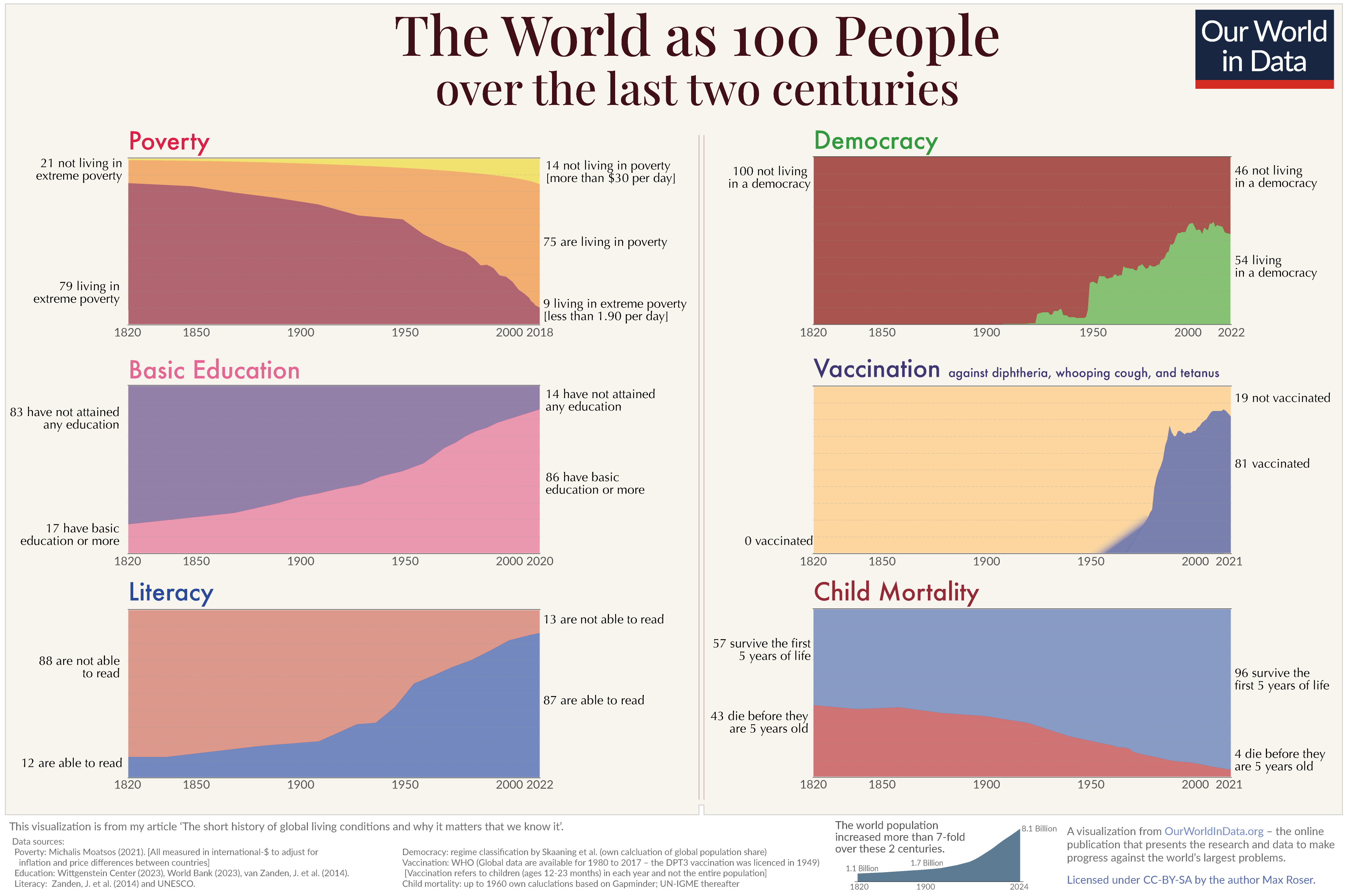
Global poverty is one of the most pressing problems that the world faces today. The poorest in the world are often undernourished, without access to basic services such as electricity and safe drinking water; they have less access to education, and suffer from much poorer health.

In order to make progress against such poverty in the future, we need to understand poverty around the world today and how it has changed.

On this page you can find all our data, visualizations and writing relating to poverty. This work aims to help you understand the scale of the problem today; where progress has been achieved and where it has not; what can be done to make progress against poverty in the future; and the methods behind the data on which this knowledge is based.

Key Insights on Poverty

Measuring global poverty in an unequal world

There is no single definition of poverty. Our understanding of the extent of poverty and how it is changing depends on which definition we have in mind.

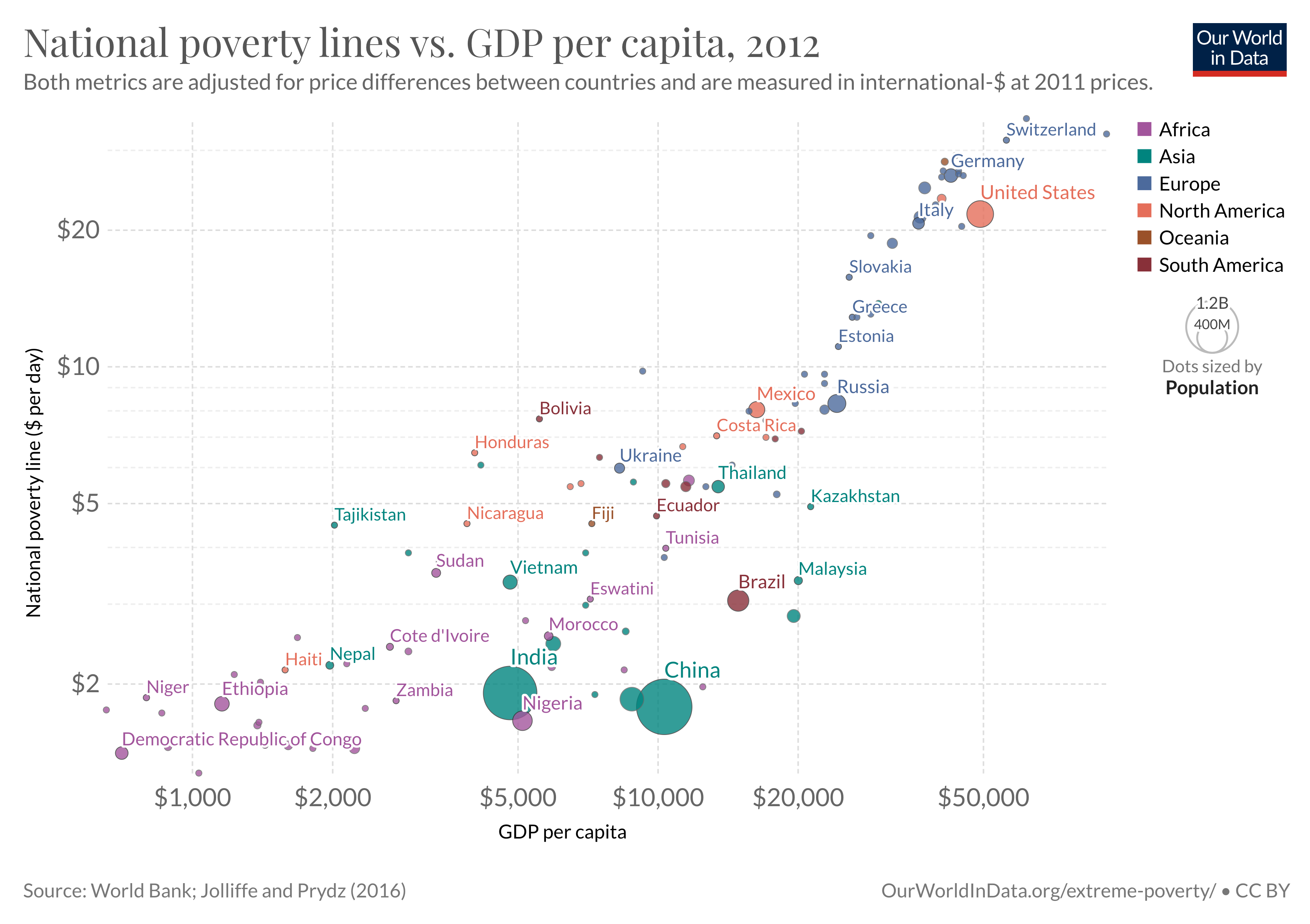
In particular, richer and poorer countries set very different poverty lines in order to measure poverty in a way that is informative and relevant to the level of incomes of their citizens.

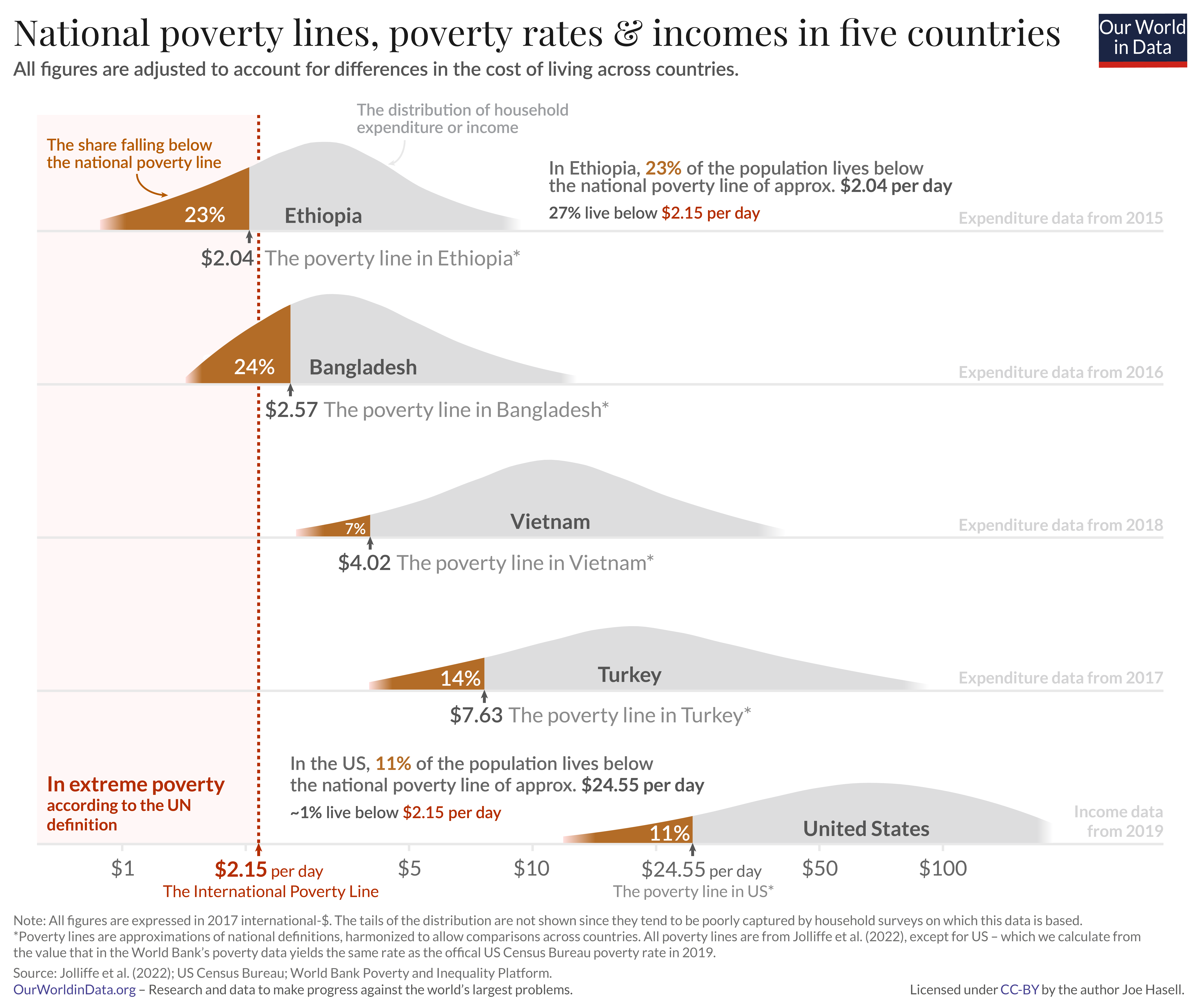
For instance, while in the United States a person is counted as being in poverty if they live on less than roughly $24.55 per day, in Ethiopia the poverty line is set more than 10 times lower – at $2.04 per day. You can read more about how these comparable national poverty lines are calculated in this footnote.1

To measure poverty globally, however, we need to apply a poverty line that is consistent across countries.

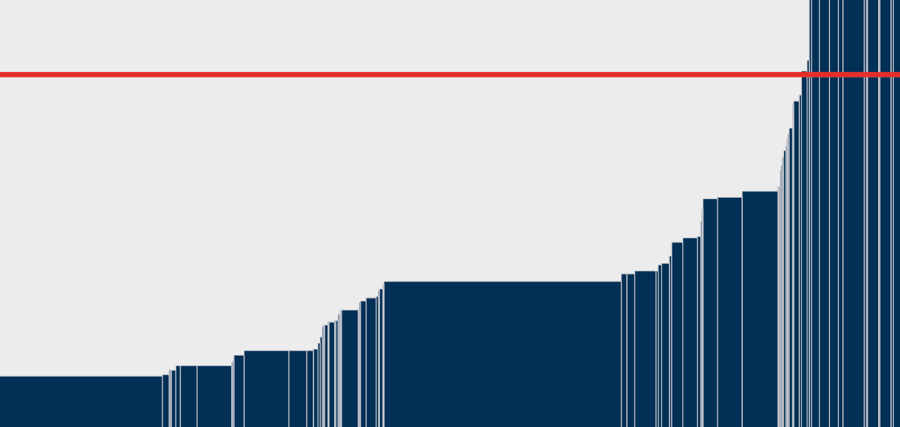
This is the goal of the International Poverty Line of $2.15 per day – shown in red in the chart – which is set by the World Bank and used by the UN to monitor extreme poverty around the world.

We see that, in global terms, this is an extremely low threshold indeed – set to reflect the poverty lines adopted nationally in the world’s poorest countries. It marks an incredibly low standard of living – a level of income much lower than just the cost of a healthy diet.

From $1.90 to $2.15 a day: the updated International Poverty Line

Read more

What you should know about this data
  • Global poverty data relies on national household surveys that have differences affecting their comparability across countries or over time. Here the data for the US relates to incomes and the data for other countries relates to consumption expenditure.2
  • The poverty lines here are an approximation of national definitions of poverty, made in order to allow comparisons across the countries.1
  • Non-market sources of income, including food grown by subsistence farmers for their own consumption, are taken into account.3
  • Data is measured in 2017 international-$, which means that inflation and differences in the cost of living across countries are taken into account.4
legacy-wordpress-upload

Global extreme poverty declined substantially over the last generation

Over the past generation extreme poverty declined hugely. This is one of the most important ways our world has changed over this time.

There are more than a billion fewer people living below the International Poverty Line of $2.15 per day today than in 1990. On average, the number declined by 47 million every year, or 130,000 people each day.5

The scale of global poverty today, however, remains vast. The latest global estimates of extreme poverty are for 2019. In that year the World Bank estimates that around 650 million people – roughly one in twelve – were living on less than $2.15 a day.

Extreme poverty: how far have we come, how far do we still have to go?

What you should know about this data
  • Extreme poverty here is defined according to the UN’s definition of living on less than $2.15 a day – an extremely low threshold needed to monitor and draw attention to the living conditions of the poorest around the world. Read more in our article, From $1.90 to $2.15 a day: the updated International Poverty Line.
  • Global poverty data relies on national household surveys that have differences affecting their comparability across countries or over time.2
  • Surveys are less frequently available in poorer countries and for earlier decades. To produce regional and global poverty estimates, the World Bank collates the closest survey for each country and projects the data forward or backwards to the year being estimated.6
  • Non-market sources of income, including food grown by subsistence farmers for their own consumption, are taken into account.3
  • Data is measured in 2017 international-$, which means that inflation and differences in the cost of living across countries are taken into account.4

The pandemic pushed millions into extreme poverty

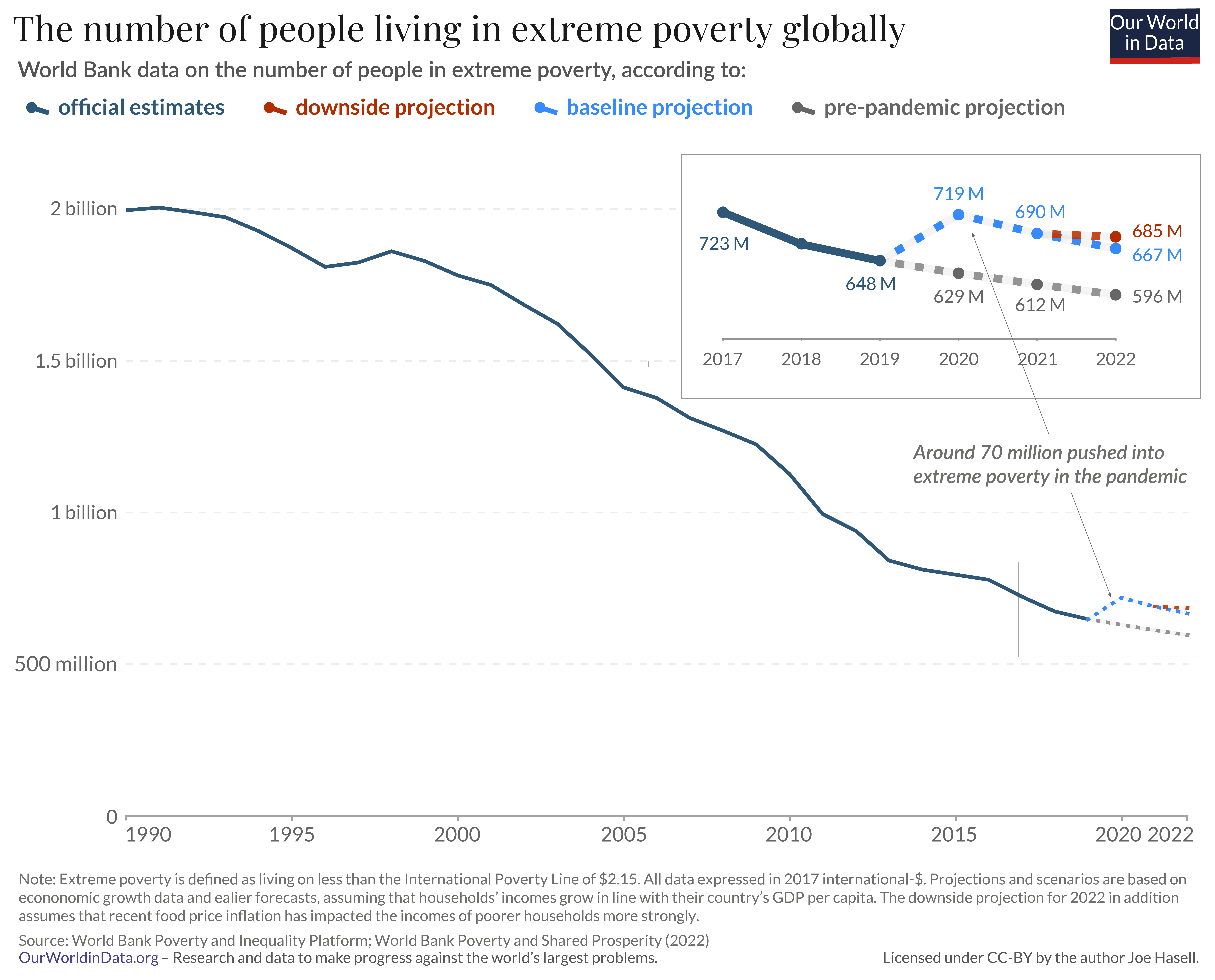
Official estimates for global poverty over the course of the Coronavirus pandemic are not yet available.

But it is clear that the global recession it brought about has had a terrible impact on the world’s poorest.

Preliminary estimates produced by researchers at the World Bank suggest that the number of people in extreme poverty rose by around 70 million in 2020 – the first substantial rise in a generation – and remains around 70-90 million higher than would have been expected in the pandemic’s absence. On these preliminary estimates, the global extreme poverty rate rose to around 9% in 2020.7

What you should know about this data
  • Extreme poverty here is defined according to the UN’s definition of living on less than $2.15 a day – an extremely low threshold needed to monitor and draw attention to the living conditions of the poorest around the world. Read more in our article, From $1.90 to $2.15 a day: the updated International Poverty Line.
  • Figures for 2020-2022 are preliminary estimates and projections by World Bank researchers, based on economic growth forecasts. The pre-pandemic projection is based on growth forecasts prior to the pandemic. You can read more about this data and the methods behind it in the World Bank’s Poverty and Shared Prosperity 2022 report.8
  • Global poverty data relies on national household surveys that have differences affecting their comparability across countries or over time.2
  • Surveys are less frequently available in poorer countries and for earlier decades. To produce regional and global poverty estimates, the World Bank collates the closest survey for each country and projects the data forward or backwards to the year being estimated.6
  • Non-market sources of income, including food grown by subsistence farmers for their own consumption, are taken into account.3
  • Data is measured in 2017 international-$, which means that inflation and differences in the cost of living across countries are taken into account.4
legacy-wordpress-upload

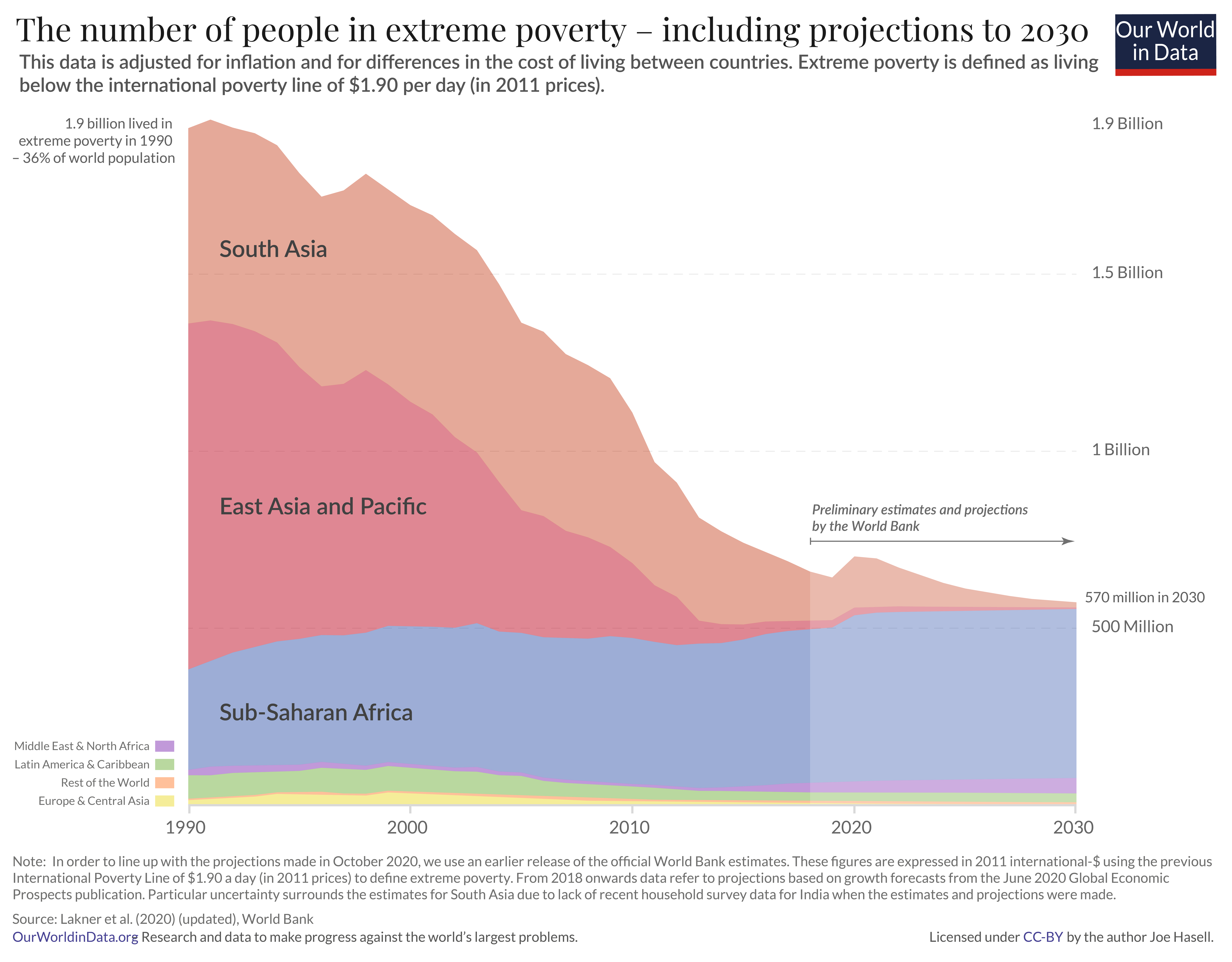
Extreme poverty declined during the last generation because the majority of the poorest people on the planet lived in countries with strong economic growth – primarily in Asia.

The majority of the poorest now live in Sub-Saharan Africa, where weaker economic growth and high population growth in many countries has led to a rising number of people living in extreme poverty.

The chart here shows projections of global extreme poverty produced by World Bank researchers based on economic growth forecasts.9

A very bleak future is ahead of us should such weak economic growth in the world’s poorest countries continue – a future in which extreme poverty is the reality for hundreds of millions for many years to come.

Extreme poverty: how far have we come, how far do we still have to go?

What you should know about this data
  • The extreme poverty estimates and projections shown here relate to a previous release of the World Bank’s poverty and inequality data in which incomes are expressed in 2011 international-$. The World Bank has since updated its methods, and now measures incomes in 2017 international-$. As part of this change, the International Poverty Line used to measure extreme poverty has also been updated: from $1.90 (in 2011 prices) to $2.15 (in 2017 prices). This has had little effect on our overall understanding of poverty and inequality around the world. You can read more about this change and how it affected the World Bank estimates of poverty in our article From $1.90 to $2.15 a day: the updated International Poverty Line.
  • Figures for 2018 and beyond are preliminary estimates and projections by Lakner et al. (2022), based on economic growth forecasts. You can read more about this data and the methods behind it in the related blog post.10
  • Global poverty data relies on national household surveys that have differences affecting their comparability across countries or over time.2
  • Surveys are less frequently available in poorer countries and for earlier decades. To produce regional and global poverty estimates, the World Bank collates the closest survey for each country and projects the data forward or backwards to the year being estimated.6
  • Non-market sources of income, including food grown by subsistence farmers for their own consumption, are taken into account.3
  • Data is measured in 2011 international-$, which means that inflation and differences in the cost of living across countries are taken into account.4
legacy-wordpress-upload

The rapid progress seen in many countries shows an end to poverty is possible

Each of the countries shown in the chart achieved large declines in extreme poverty over the last generation.11

The fact that rapid progress against poverty has been achieved in many places is one of the most important lessons we can learn from the available data on extreme poverty.

For those who are not aware of such progress – which is the majority of people – it would be easy to make the mistake of believing that poverty is inevitable and that action to tackle poverty is hence doomed to fail.

The huge progress seen in so many places shows that this view is incorrect.

What you should know about this data
  • Extreme poverty here is defined according to the UN’s definition of living on less than $2.15 a day – an extremely low threshold needed to monitor and draw attention to the living conditions of the poorest around the world. Read more in our article, From $1.90 to $2.15 a day: the updated International Poverty Line.
  • Global poverty data relies on national household surveys that have differences affecting their comparability across countries or over time.2
  • Non-market sources of income, including food grown by subsistence farmers for their own consumption, are taken into account.3
  • Data is measured in 2017 international-$, which means that inflation and differences in the cost of living across countries are taken into account.4

After 200 years of progress the fight against global poverty is just beginning

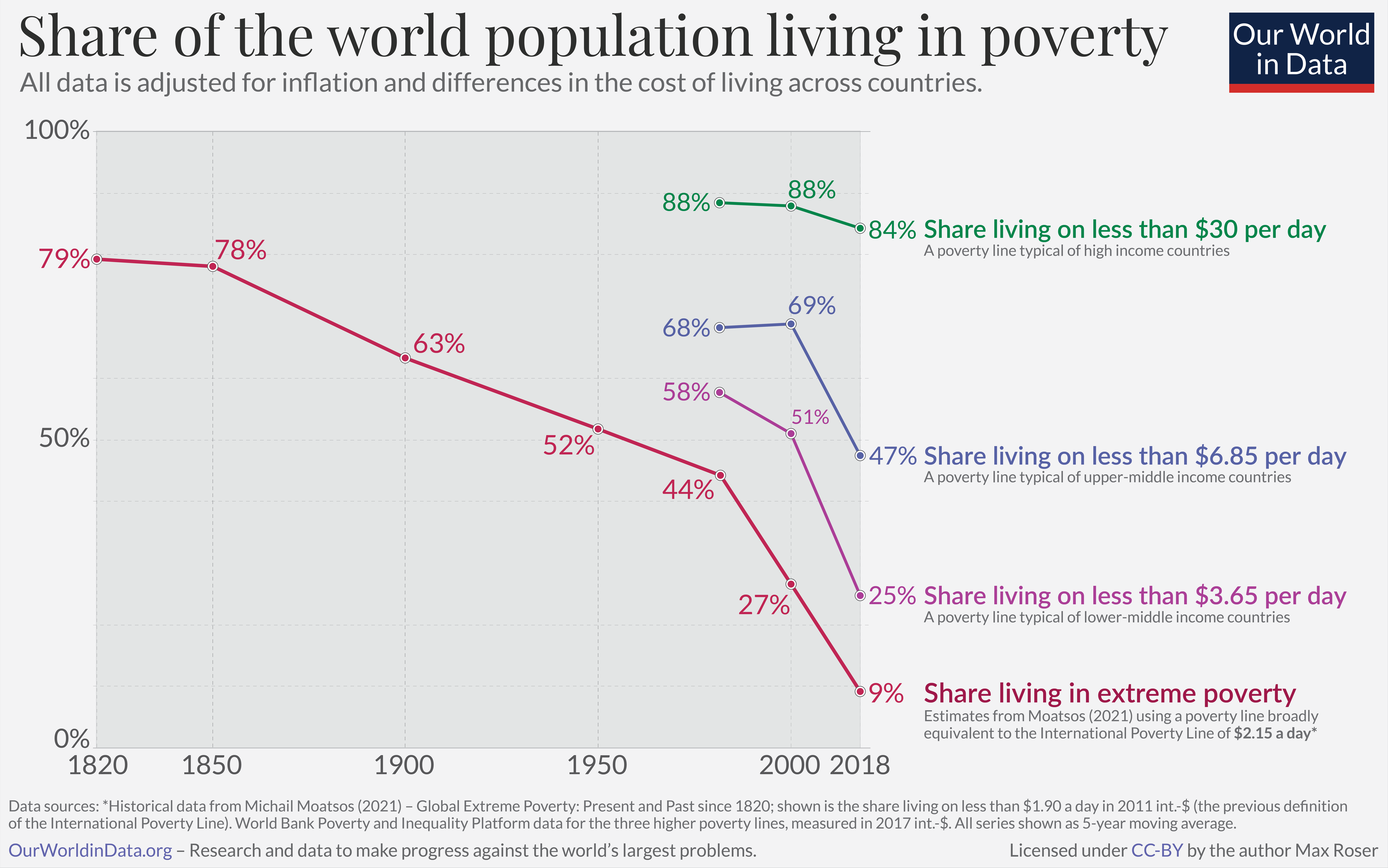
Over the past two centuries the world made good progress against extreme poverty. But only very recently has poverty fallen at higher poverty lines.

Global poverty rates at these higher lines remain very high:

  • 25% of the world lives on less than $3.65 per day – a poverty line broadly reflective of the lines adopted in lower-middle income countries.
  • 47% of the world lives on less than $6.85 per day – a poverty line broadly reflective of the lines adopted in upper-middle income countries.
  • 84% live on less than $30 per day – a poverty line broadly reflective of the lines adopted in high income countries.12

Economic growth over the past two centuries has allowed the majority of the world to leave extreme poverty behind. But by the standards of today’s rich countries, the world remains very poor. If this should change, the world needs to achieve very substantial economic growth further still.

The history of the end of poverty has just begun

How much economic growth is necessary to reduce global poverty substantially?
What you should know about this data
  • The data from 1981 onwards is based on household surveys collated by the World Bank. Earlier figures are from Moatsos (2021), who extends the series backwards based on historical reconstructions of GDP per capita and inequality data.13
  • All data is measured in international-$ which means that inflation and differences in purchasing power across countries are taken into account.4
  • The World Bank data for the higher poverty lines is measured in 2017 international-$. Recently, the World Bank updated its methodology having previously used 2011 international-$ to measure incomes and set poverty lines. The Moatsos (2021) historical series is based on the previously-used World Bank definition of extreme poverty – living on less than $1.90 a day when measured in 2011 international-$. This is broadly equivalent to the current World Bank definition of extreme poverty – living on less than $2.15 a day when measured in 2017 international-$. You can read more about this update to the World Bank’s methodology and how it has affected its estimates of poverty in our article From $1.90 to $2.15 a day: the updated International Poverty Line.
  • The global poverty data shown from 1981 onwards relies on national household surveys that have differences affecting their comparability across countries or over time.2
  • Such surveys are less frequently available in poorer countries and for earlier decades. To produce regional and global poverty estimates, the World Bank collates the closest survey for each country and projects the data forward or backwards to the year being estimated.6
  • Non-market sources of income, including food grown by subsistence farmers for their own consumption, are taken into account. This is also true of the historical data – in producing historical estimates of GDP per capita on which these long-run estimates are based, economic historians take into account such non-market sources of income, as we discuss further in our article How do we know the history of extreme poverty?
legacy-wordpress-upload

Explore Data on Poverty

About this data

All the data included in this explorer is available to download in GitHub, alongside a range of other poverty and inequality metrics.

Where is this data sourced from?

This data explorer is collated and adapted from the World Bank’s Poverty and Inequality Platform (PIP).

The World Bank’s PIP data is a large collection of household surveys where steps have been taken by the World Bank to harmonize definitions and methods across countries and over time.

About the comparability of household surveys

There is no global survey of incomes. To understand how incomes across the world compare, researchers need to rely on available national surveys.

Such surveys are partly designed with cross-country comparability in mind, but because the surveys reflect the circumstances and priorities of individual countries at the time of the survey, there are some important differences.

Income vs expenditure surveys

One important issue is that the survey data included within the PIP database tends to measure people’s income in high-income countries, and people’s consumption expenditure in poorer countries.

The two concepts are closely related: the income of a household equals their consumption plus any saving, or minus any borrowing or spending out of savings.

One important difference is that, while zero consumption is not a feasible value – people with zero consumption would starve – a zero income is a feasible value. This means that, at the bottom end of the distribution, income and consumption can give quite different pictures about a person’s welfare. For instance, a person dissaving in retirement may have a very low, or even zero, income, but have a high level of consumption nevertheless.

The gap between income and consumption is higher at the top of this distribution too, richer households tend to save more, meaning that the gap between income and consumption is higher at the top of this distribution too. Taken together, one implication is that inequality measured in terms of consumption is generally somewhat lower than the inequality measured in terms of income.

In our Data Explorer of this data there is the option to view only income survey data or only consumption survey data, or instead to pool the data available from both types of survey – which yields greater coverage.

Other comparability issues

There are a number of other ways in which comparability across surveys can be limited. The PIP Methodology Handbook provides a good summary of the comparability and data quality issues affecting this data and how it tries to address them.

In collating this survey data the World Bank takes a range of steps to harmonize it where possible, but comparability issues remain. These affect comparisons both across countries and within individual countries over time.

To help communicate the latter, the World Bank produces a variable that groups surveys within each individual country into more comparable ‘spells’. Our Data Explorer provides the option of viewing the data with these breaks in comparability indicated, and these spells are also indicated in our data download.

Global and regional poverty estimates

Along with data for individual countries, the World Bank also provides global and regional poverty estimates which aggregate over the available country data.

Surveys are not conducted annually in every country however – coverage is generally poorer the further back in time you look, and remains particularly patchy within Sub-Saharan Africa. You can see that visualized in our chart of the number of surveys included in the World Bank data by decade.

In order to produce global and regional aggregate estimates for a given year, the World Bank takes the surveys falling closest to that year for each country and ‘lines-up’ the data to the year being estimated by projecting it forwards or backwards.

This lining-up is generally done on the assumption that household incomes or expenditure grow in line with the growth rates observed in national accounts data. You can read more about the interpolation methods used by the World Bank in Chapter 5 of the Poverty and Inequality Platform Methodology Handbook.

How does the data account for inflation and for differences in the cost of living across countries?

To account for inflation and price differences across countries, the World Bank’s data is measured in international dollars. This is a hypothetical currency that results from price adjustments across time and place. It is defined as having the same purchasing power as one US-$ would in the United States in a given base year. One int.-$ buys the same quantity of goods and services no matter where or when it is spent.

There are many challenges to making such adjustments and they are far from perfect. Angus Deaton (Deaton, 2010) provides a good discussion of the difficulties involved in price adjustments and how this relates to global poverty measurement.

But in a world where price differences across countries and over time are large it is important to attempt to account for these differences as well as possible, and this is what these adjustments do.

In September 2022, the World Bank updated its methodology, and now uses international-$ expressed in 2017 prices – updated from 2011 prices. This has had little effect on our overall understanding of poverty and inequality around the world. But poverty estimates for particular countries vary somewhat between the old and updated methodology. You can read more about this update in our article From $1.90 to $2.15 a day: the updated International Poverty Line.

To allow for comparisons with the official data now expressed in 2017 international-$ data, the World Bank continues to release its poverty and inequality data expressed in 2011 international-$ as well. We have built a Data Explorer to allow you to compare these, and we make all figures available in terms of both sets of prices in our data download.

Absolute vs relative poverty lines

This dataset provides poverty estimates for a range of absolute and relative poverty lines.

An absolute poverty line represents a fixed standard of living; a threshold that is held constant across time. Within the World Bank’s poverty data, absolute poverty lines also aim to represent a standard of living that is fixed across countries (by converting local currencies to international-$). The International Poverty Line of $2.15 per day (in 2017 international-$) is the best known absolute poverty line and is used by the World Bank and the UN to measure extreme poverty around the world.

The value of relative poverty lines instead rises and falls as average incomes change within a given country. In most cases they are set at a certain fraction of the median income. Because of this, relative poverty can be considered a metric of inequality – it measures how spread out the bottom half of the income distribution is.

The idea behind measuring poverty in relative terms is that a person’s well-being depends not on their own absolute standard of living but on how that standard compares with some reference group, or whether it enables them to participate in the norms and customs of their society. For instance, joining a friend’s birthday celebration without shame might require more resources in a rich society if the norm is to go for an expensive meal out, or give costly presents.

Our dataset includes three commonly-used relative poverty lines: 40%, 50%, and 60% of the median.

Such lines are most commonly used in rich countries, and are the main way poverty is measured by the OECD and the European Union. More recently, relative poverty measures have come to be applied in a global context. The share of people living below 50 per cent of median income is, for instance, one of the UN’s Sustainable Development Goal indicators. And the World Bank now produces estimates of global poverty using a Societal Poverty Line that combines absolute and relative components.

When comparing relative poverty rates around the world, however, it is important to keep in mind that – since average incomes are so far apart – such relative poverty lines relate to very different standards of living in rich and poor countries.

Does the data account for non-market income, such as food grown by subsistence farmers?

Many poor people today, as in the past, rely on subsistence farming rather than a monetary income gained from selling goods or their labor on the market. To take this into account and make a fair comparison of their living standards, the statisticians that produce these figures estimate the monetary value of their home production and add it to their income/expenditure.

Research & Writing

Interactive Charts on Poverty

Endnotes

  1. Official definitions of poverty in different countries are often not directly comparable due to the different ways poverty is measured. For example, countries account for the size of households in different ways in their poverty measures.

    The poverty lines shown here are an approximation of national definitions, harmonized to allow for comparisons across countries. For all countries apart from the US, we take the harmonized poverty line calculated by Jolliffe et al. (2022). These lines are calculated as the international dollar figure which, in the World Bank’s Poverty and Inequality Platform (PIP) data, yields the same poverty rate as the officially reported rate using national definitions in a particular year (around 2017).

    For the US, Jolliffe et al. (2022) use the OECD’s published poverty rate – which is measured against a relative poverty line of 50% of the median income. This yields a poverty line of $34.79 (measured using 2017 survey data). This however is not the official definition of poverty adopted in the US. We calculated an alternative harmonized figure for the US national poverty using the same method as Jolliffe et al. (2022), but based instead on the official 2019 poverty rate – as reported by the U.S. Census Bureau.

    You can see in detail how we calculated this poverty line in this Google Colabs notebook.

    Jolliffe, Dean Mitchell, Daniel Gerszon Mahler, Christoph Lakner, Aziz Atamanov, and Samuel Kofi Tetteh Baah. 2022. Assessing the Impact of the 2017 PPPs on the International Poverty Line and Global Poverty. The World Bank. Available to read at the World Bank here.

  2. Because there is no global survey of incomes, researchers need to rely on available national surveys. Such surveys are designed with cross-country comparability in mind, but because the surveys reflect the circumstances and priorities of individual countries at the time of the survey, there are some important differences. In collating this survey data the World Bank takes steps to harmonize it where possible, but comparability issues remain.

    One important issue is that, whilst in most high-income countries the surveys capture people’s incomes, in poorer countries these surveys tend to capture people’s consumption. The two concepts are closely related: the income of a household equals their consumption plus any saving, or minus any borrowing or spending out of savings.

    One important difference is that, while zero consumption is not a feasible value – people with zero consumption would starve – a zero income is a feasible value. This means that, at the bottom end of the distribution, income and consumption can give quite different pictures about a person’s welfare. For instance, a person dissaving in retirement may have a very low, or even zero, income, but have a high level of consumption nevertheless.

    The gap between income and consumption is higher at the top of this distribution too, richer households tend to save more, meaning that the gap between income and consumption is higher at the top of this distribution too. Taken together, one implication is that inequality measured in terms of consumption is generally somewhat lower than the inequality measured in terms of income.

    In our Data Explorer of this data there is the option to view only income survey data or only consumption survey data, or instead to pool the data available from both types of survey – which yields greater coverage.

    There are a number of other ways in which comparability across surveys can be limited. The PIP Methodology Handbook provides a good summary of the comparability and data quality issues affecting this data and how it tries to address them.

    In collating this survey data the World Bank takes a range of steps to harmonize it where possible, but comparability issues remain. These affect comparisons both across countries and within individual countries over time.

    To help communicate the latter, the World Bank produces a variable that groups surveys within each individual country into more comparable ‘spells’ (which we include in our data download). Our Data Explorer provides the option of viewing the data with these breaks in comparability indicated.

  3. Many poor people today, as in the past, rely on subsistence farming rather than a monetary income gained from selling goods or their labor on the market. To take this into account and make a fair comparison of their living standards, the statisticians that produce these figures estimate the monetary value of their home production and add it to their income/expenditure.

  4. The international-$ is a hypothetical currency that results from price adjustments across time and place. It is defined as having the same purchasing power as one US-$ in a given base year – in this case 2017. One int.-$ buys the same quantity of goods and services no matter where or when it is spent. There are many challenges to making such adjustments and they are far from perfect. But in a world where price differences across countries and over time are large it is important to attempt to account for these differences as well as possible, and this is what these adjustments do. Read more in our article From $1.90 to $2.15 a day: the updated International Poverty Line.

  5. ​​According to World Bank data, in 1990 there were 2.00 billion people living in poverty, and in 2019 that had fallen to 0.648 billion. The average fall over the 29 years in between is: (2.00 billion – 0.648 billion)/29 = 46.6 million. Dividing by the number of days (29 x 365) gives the average daily fall: (2.00 billion – 0.648 billion)/(29 x 365) = 128,000. (All figures rounded to 3 significant figures).

  6. The projections are generally made on the assumption that incomes or expenditure grow in line with the growth rates observed in national accounts data. You can read more about the interpolation methods used by the World Bank in Chapter 5 of the Poverty and Inequality Platform Methodology Handbook.

  7. We use the figures presented in the World Bank’s Poverty and Shared Prosperity 2022 report. Earlier estimates were also published in Lakner, C., Mahler, D.G., Negre, M. et al. How much does reducing inequality matter for global poverty?. J Econ Inequal (2022). https://doi.org/10.1007/s10888-021-09510-w. Available online here.

  8. Earlier estimates were also published in Lakner, C., Mahler, D.G., Negre, M. et al. How much does reducing inequality matter for global poverty?. J Econ Inequal (2022). https://doi.org/10.1007/s10888-021-09510-w. Available online here.

  9. The figures are taken from a World Bank blog post by Nishant Yonzan, Christoph Lakner and Daniel Gerszon Mahler. The post builds on and updates the estimates published by Lakner et al. (2022). In September 2022, the World Bank changed from using 2011 international-$ to 2017 international-$ in the measurement of global poverty. The International Poverty Line used by the World Bank and the UN to define extreme poverty was accordingly updated from $1.90 a day (in 2011 prices) to $2.15 (in 2017 prices). In order to match up to the projected figures, the extreme poverty estimates shown here relate to a previous release of the World Bank’s data using data expressed in 2011 prices, which vary slightly from the latest data in 2017 prices. You can read more about this change and how it affected the World Bank estimates of poverty in our article From $1.90 to $2.15 a day: the updated International Poverty Line. Lakner, C., Mahler, D.G., Negre, M. et al. How much does reducing inequality matter for global poverty?. J Econ Inequal (2022). https://doi.org/10.1007/s10888-021-09510-w. Available online here.

  10. We use the figures provided in the blog post, which extend the methods presented in Lakner et al. (2022). Lakner, C., Mahler, D.G., Negre, M. et al. How much does reducing inequality matter for global poverty?. J Econ Inequal (2022). https://doi.org/10.1007/s10888-021-09510-w. Available online here.

  11. Shown are those countries with a decline of more than 30 percentage points over a period of 15 years or more. There are a number of ways in which comparability across the different household surveys on which this data is based can be limited. These affect comparisons both across countries and within individual countries over time. The World Bank’s Poverty and Inequality Platform Methodology Handbook provides a good summary of the comparability and data quality issues affecting this data and how it tries to address them. In collating this survey data the World Bank takes a range of steps to harmonize it where possible, but comparability issues remain. To help communicate the latter, the World Bank produces a variable that groups surveys within each individual country into more comparable ‘spells’. Our Data Explorer provides the option of viewing the data with these breaks in comparability indicated.

  12. You can read more about how the World Bank sets these higher poverty lines, as well as the International Poverty Line against which it measures extreme poverty, in our article From $1.90 to $2.15 a day: the updated International Poverty Line. To the three poverty lines adopted officially by the World Bank – $2.15, $3.65 and $6.85 – we add a higher line broadly consistent with definitions of poverty in high income countries. See our article Global poverty in an unequal world: Who is considered poor in a rich country? And what does this mean for our understanding of global poverty?
  13. For details of the methods used to produce the long-run poverty data see, Moatsos, M. (2021). Global extreme poverty: Present and past since 1820. In van Zanden, Rijpma, Malinowski and Mira d’Ercole (eds.) How Was Life? Volume II: New Perspectives on Well-Being and Global Inequality since 1820. Available from the OECD here.

Cite this work

Our articles and data visualizations rely on work from many different people and organizations. When citing this topic page, please also cite the underlying data sources. This topic page can be cited as:

Joe Hasell, Max Roser, Esteban Ortiz-Ospina and Pablo Arriagada (2022) - “Poverty” Published online at OurWorldinData.org. Retrieved from: 'https://ourworldindata.org/poverty' [Online Resource]

BibTeX citation

@article{owid-poverty,
    author = {Joe Hasell and Max Roser and Esteban Ortiz-Ospina and Pablo Arriagada},
    title = {Poverty},
    journal = {Our World in Data},
    year = {2022},
    note = {https://ourworldindata.org/poverty}
}
Our World in Data logo

Reuse this work freely

All visualizations, data, and code produced by Our World in Data are completely open access under the Creative Commons BY license. You have the permission to use, distribute, and reproduce these in any medium, provided the source and authors are credited.

The data produced by third parties and made available by Our World in Data is subject to the license terms from the original third-party authors. We will always indicate the original source of the data in our documentation, so you should always check the license of any such third-party data before use and redistribution.

All of our charts can be embedded in any site.