From $1.90 to $2.15 a day: the updated International Poverty Line
The World Bank has updated the methods it uses to measure incomes and poverty around the world. What does this mean for our understanding of global poverty?
Note: Since the publication of this article, the World Bank has updated its poverty data. See the note at the end for more information.
To track progress towards its goal of eradicating extreme poverty by 2030, the UN relies on World Bank estimates of the share of the world population that falls below the International Poverty Line.
In September 2022, the figure at which this poverty line is set shifted from $1.90 to $2.15. This reflects a change in the units in which the World Bank expresses its poverty and inequality data — from international dollars given in 2011 prices to international dollars given in 2017 prices.
In this article we consider what the World Bank’s revised methodology means for our understanding of global poverty. We then also explain the updated methodology: what international dollars are, what the change to 2017 prices mean, and how this change affects the International Poverty Line and the World Bank’s poverty estimates.
How does the updated International Poverty Line affect our understanding of global poverty?
The crucial fact to know about the World Bank’s updated International Poverty Line is that, whilst the number has risen — from $1.90 to $2.15 per day — in terms of the goods and services that it affords, the value is broadly the same.
This is because the units in which the old and new figures are counted have changed: the $1.90 figure was expressed in 2011 international-$, and the new figure of $2.15 is expressed in 2017 international-$.
Below, we explain in much more detail what international dollars are and what the change in base year means. But broadly speaking, the difference in the two units reflects inflation over time: Because prices have gone up, one 2017 international-$ buys a smaller quantity of goods and services than one 2011 international-$. This leaves the real value of the revised International Poverty Line broadly equal to what it was before.
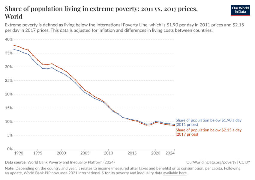
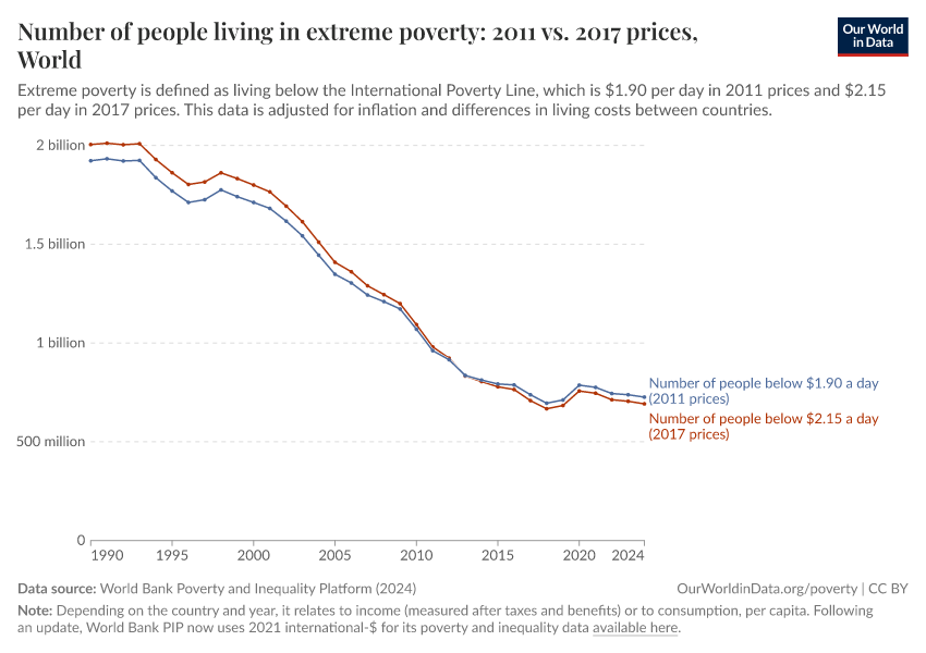
This continuity is reflected in the data: Overall, the update only very modestly changes our understanding of the extent of extreme poverty globally. We see this in the two charts below, which show the share and number of people in extreme poverty using the old and updated methodologies.
Estimates of the share of people living in extreme poverty globally for 2019 are slightly lower using the updated methodology: 8.4% as compared to 8.7%. That translates to 20 million fewer people living in extreme poverty.
We also see a slightly faster decline in poverty over recent decades using the updated methodology. Looking back to the 1990s, estimates of the share in extreme poverty using the updated methodology are around 1.5% points higher — or around 80 million people.
Differences within individual countries
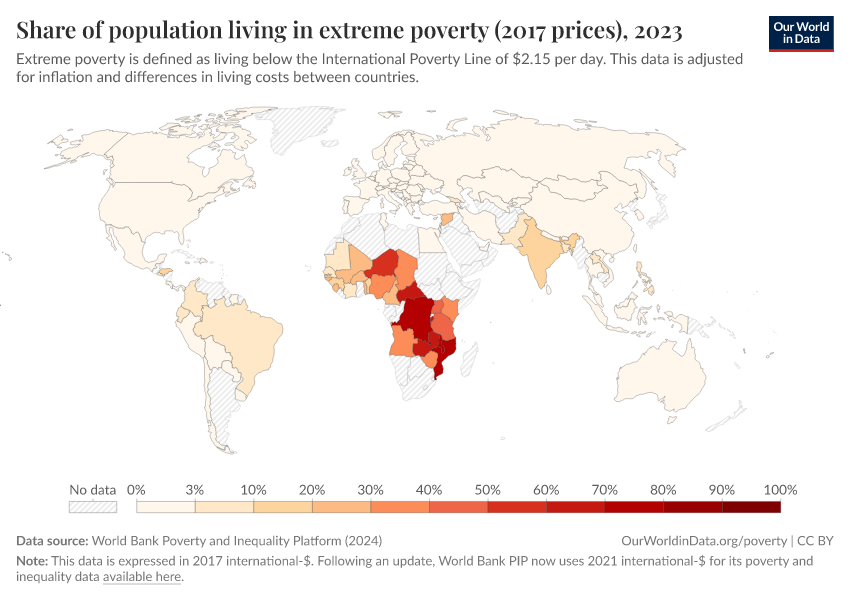
There are only small changes to the World Bank’s extreme poverty estimates at the global level. But the updated methodology has resulted in more substantial revisions to poverty estimates for some countries. These changes reflect a revision to the adjustments made to account for differences in the cost of living across countries, as explained in more detail below.
These revisions go in both directions: some countries see higher poverty estimates and others see lower estimates. These opposing differences are cancelling each other out when we look at the global figures.
Nigeria is one country that has seen a significant downward revision, with 16 million fewer people estimated to be living in extreme poverty in 2018. You can read more about this particular change in this World Bank blogpost.
In Indonesia, the revision has gone in the other direction — the latest available estimates for 2021 show an additional 4 million people living in extreme poverty when calculated with the new methodology.
Despite significant differences in some individual countries, our overall understanding of the global distribution of extreme poverty has changed very little though. This can be seen from a comparison of the two map charts below which show the share of population in extreme poverty according to the old and updated World Bank methodologies.
Changes in poverty estimates at higher poverty lines
The International Poverty Line is set by the World Bank to be representative of national definitions of poverty adopted in the world’s poorest countries.
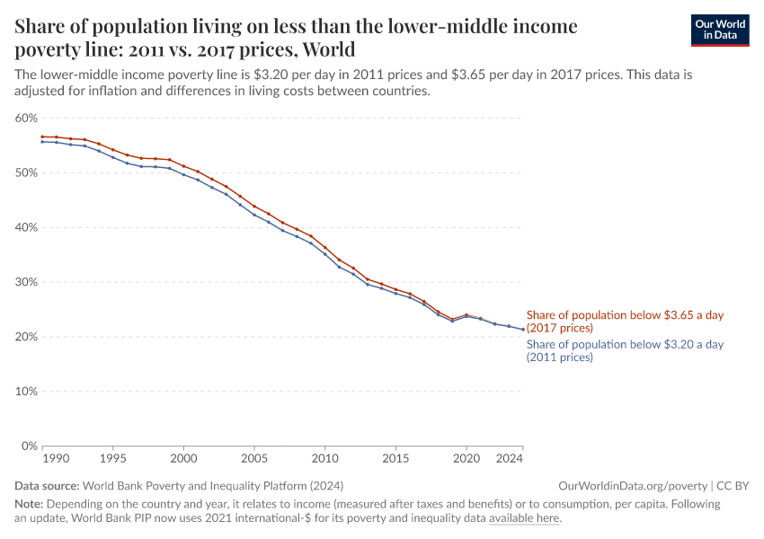
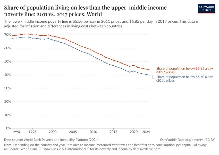
In addition to this very low poverty line the World Bank also sets two higher global poverty lines for measuring poverty: one that reflects the definitions of poverty adopted in lower-middle income countries, and one that reflects the definitions adopted in upper-middle income countries. Within the updated methodology, these lines are set at $3.65 and $6.85 in 2017 international-$, replacing the previous $3.20 and $5.50 lines expressed in 2011 international-$.
How have poverty estimates around the world changed with the revision of these higher lines?
As with the International Poverty Line, the real value of the lower-middle income poverty line is roughly the same across the two methodologies. Accordingly, global poverty estimates are again very similar across the old and updated methodologies — as we see in the first chart below.
In contrast, the update of the upper-middle income poverty line represents a real increase in the value of the line: This revised higher line buys more goods and services than the previously used figure. This real-terms increase is due to a rise in the national poverty lines to which the World Bank anchors this line, as discussed in more detail below.
Since the real value of the poverty line is significantly higher, unsurprisingly the prevalence of poverty when measured with the updated methodology is higher — as shown in the second chart.
Understanding the World Bank’s updated poverty estimates: what does the shift from 2011 to 2017 international-$ mean?
At the heart of the update is a change in the units that the World Bank uses to count and compare the incomes of households in different countries at different times.
These units are called international dollars – a hypothetical currency that adjusts for inflation and differences in the cost of living between countries.
To understand the update to the World Bank’s methodology we need a good understanding of what these units mean and how they are calculated. In the box below we give a summary.
How do incomes measured in 2011 and 2017 international dollars compare?
The World Bank’s shift from measuring household incomes in 2011 to 2017 international-$ has affected the data in two ways, relating to the two different adjustments made in the calculation of international-$.
Firstly, it reflects the impact of inflation between 2011 and 2017. Secondly, it reflects a revised assessment of how the cost of living compares in different countries, as presented in the 2017 Purchasing Power Parity rates published by the International Comparison Program.
The impact of inflation: a general rise in income figures
As explained in more detail in the box above:
- One 2017 int.-$ is defined as the value of goods and services that one US dollar would buy in the US in 2017.
- One 2011 int.-$ is defined as the value of goods and services that one US dollar would buy in the US in 2011.
The amount of goods and services that one US dollar bought in the US changed over these years. There was inflation of around 9%, meaning that one US dollar bought 9% less in the US in 2017 than it did in 2011.1
This also means that one 2017 int.-$ buys around 9% less than one 2011 int.-$, and this is one key way in which the two units differ. Expressing incomes in 2017 international-$ generally results in higher numbers than when expressed in 2011 international-$.
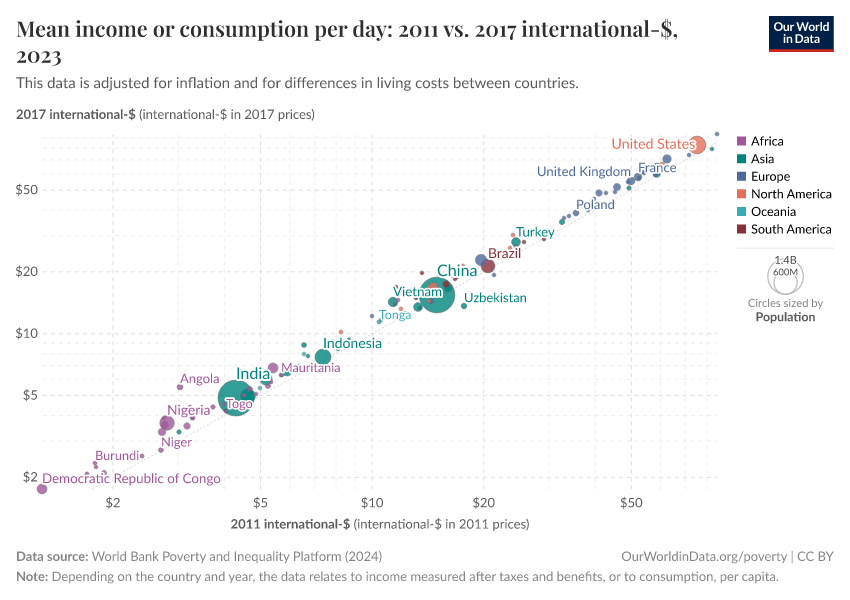
You can see this general increase in the chart here which compares the average income or consumption per person, as expressed in 2011 international-$ (shown on the x-axis) and in 2017 international dollars (on the y-axis).
The 45 degree line indicates the point where the two numbers would be equal. You see that in almost all countries, average incomes are “higher” when expressed in 2017 international-$ than in 2011 international-$.
The impact of the new 2017 PPPs: a change in countries’ relative income levels
But we also see in the chart above that the increase is not uniform across countries. In fact, some countries fall below the 45 degree line: their incomes count as fewer 2017 international-$ than they do 2011 international-$.
You can see these differences in more detail in this chart, which plots the average income or consumption expenditure of countries over time – as measured in both 2011 and 2017 international-$.
The incomes are plotted on a log scale to show proportional differences more clearly. Again we see that the switch to 2017 international-$ generally shifts the incomes data up by a certain proportion — but the proportion varies for each country. In the chart we have selected particular countries to demonstrate the range of differences we see in the data, but you can change which countries or regions are shown using the 'Add country' button.
At one end of the spectrum are countries such as Angola whose figures shift up by a large amount. The figure for the average level of consumption in Angola is 80% higher when expressed in 2017 international-$ than in 2011 international-$. At the opposite end of the spectrum is Ghana, whose figures fall by around 25%.
In the US — the “numeraire” country for the purposes of the PPP adjustment – the rise is 9%, in-line with US inflation as discussed above.
The different shifts we see across countries means that, with the new 2017 international-$, we have an updated understanding of how incomes compare across countries. Those countries that see a bigger jump in their income figures when measured in the new units now appear relatively richer than countries with a smaller, or even negative jump.
But what explains these such very different jumps, and how are we to interpret them? Is it that our previous understanding, based on the old 2011 PPPs, was wrong?
Part of the complication of interpreting the switch to 2017 international-$ is that two factors are operating at the same time.
Firstly, the change in PPPs reflects changes in the methods and underlying price data used by the ICP. Producing these estimates, in as comparable a way as possible, is a huge and very complex task and not surprisingly the ICP adapts and refines the methods they use in different rounds. Moreover, the quality and coverage of the country price data that go into these calculations is also generally improving over time. It is not necessarily the case that the quality of the estimates improve in every aspect or for every country, but in general the new PPPs do indeed give us a better, truer picture of how incomes compare around the world.2
Secondly, the change in PPPs reflects actual changes in relative price levels across countries. Inflation happens at different rates in different countries. In part, such changes are accounted for by the inflation adjustment made when converting data to international-$, as discussed above. But the way that PPP rates are calculated means that the change in PPPs need not exactly track these various national inflation rates. When a new cross-country assessment of price levels is made, there can be a gap with what would have been expected based on the previous set of PPPs extended forward with national inflation data.3
Because the change in PPPs in part picks up “real” changes in the relative price levels between countries, some data providers expressing income data in international dollars, such as the Penn World Tables, use PPPs from multiple ICP rounds and adopt techniques to interpolate, or smooth out the jumps between the rounds. An important downside of this approach, however, is that the trends in income calculated with this approach do not then necessarily match up with the trends observed in the original national data, prior to conversion to international-$.
This “multiple benchmarks” approach is not the route that the World Bank takes. It uses just one set of PPPs — from the latest available ICP round — applied back over the whole time span of its data. This makes the trends over time consistent with the original data, but it means that the adoption of a new set of PPPs can generate significant revisions to our understanding of income levels in different countries, both now and in the past.
The World Bank’s updated poverty lines
A key aspect of the World Bank’s updated methodology is that, along with the change in the units by which it measures household incomes, it has also updated the International Poverty Line against which it measures extreme poverty.
To help explain this change, in the box below, we describe what the International Poverty Line is and how it is calculated, along with the higher poverty lines set by the World Bank.
Has the value of the World Bank’s poverty lines changed?
A key question to ask of the World Bank’s updated poverty lines is the extent to which their real value — in terms of the goods and services they can buy — have been maintained, or if instead they represent a shifting of the goalposts.
One way to answer this question, building on the explanation of change from 2011 to 2017 international-$ given above, is to compare the increase in the numbers to the rate of inflation in the US between these two years. An increase in-line with US inflation would indicate that the poverty lines have the same purchasing power. A rise greater than US inflation would indicate that the real value had increased. This is just a direct consequence of the definition of international-$ for a given base year — where one international-$ is defined as the value of goods and services that one US dollar could buy in that base year.
Prices in the US rose by 9% between 2011 and 2017. In the case of both the International Poverty Line and the lower-middle income poverty line, the increase across the update was roughly similar — from $1.90 to $2.15 (13%) and from $3.20 to $3.65 (14%) respectively. That the rise was close to the US inflation rate implies that the purchasing power of the lines was similar before and after the update. And, as demonstrated above, this is reflected in the data: global poverty estimates according to these two poverty lines are very similar across the old and updated methodologies.
The upper-middle poverty line, however, rose by considerably more than US inflation — from $5.50 to $6.85, a 25% increase. Again, this is reflected in the data — with notably higher global poverty estimates resulting from the updated methodology.
Why would the World Bank “shift the goal posts” by using a higher poverty line? This answer lies in the method the World Bank uses to set the line, just explained in the box above. The upper-middle income country poverty line was set at $5.50 in 2011 international-$ because this was the median poverty line observed among this group of countries at the time of the last update to the World Bank methodology.6
Since that time, the national poverty lines of some countries in this group have been revised upwards as incomes generally increased. This dynamic was not present for the lower income groupings of countries: in these cases those countries with a rising poverty line were also graduating into a higher income group, thereby maintaining the median poverty line within their former income group roughly constant.7
Further reading
For a fuller understanding of international-$ and PPPs in the context of global poverty measurement you may find some of the following articles helpful.
On the 2017 PPPs:
- Jolliffe, Dean Mitchell, Daniel Gerszon Mahler, Christoph Lakner, Aziz Atamanov, and Samuel Kofi Tetteh Baah. 2022. Assessing the Impact of the 2017 PPPs on the International Poverty Line and Global Poverty. The World Bank. Available online here.
- A World Bank blog post considering the implication of the 2017 PPPs for global and regional poverty estimates.
- A World Bank factsheet concerning the updating of its global poverty lines
And some more general discussions, in the context of past PPP rounds:
- Deaton, Angus, and Bettina Aten. 2017. “Trying to Understand the PPPs in ICP 2011: Why Are the Results So Different?” American Economic Journal: Macroeconomics 9 (1): 243–64. Working paper version available online here.
- Bolt, Jutta, and Jan Luiten van Zanden. 2020. “Maddison Style Estimates of the Evolution of the World Economy. A New 2020 Update.” University of Groningen, Groningen Growth and Development Centre, Maddison Project Working Paper, no. 15. http://reparti.free.fr/maddi2020.pdf.
The World Bank has updated its poverty and inequality data since the publication of this article
This article uses a previous release of the World Bank's poverty and inequality data, in which incomes were expressed in 2011 and 2017 international dollars.
The World Bank has since updated its methods, and now measures incomes in 2021 international-$. As part of these changes, the International Poverty Line used to measure extreme poverty has also been updated: from $1.90 a day (in 2011 prices) to $2.15 a day (in 2017 prices) to $3 a day (in 2021 prices).
Because of the change of units, many of the figures mentioned in this article will differ from the latest World Bank figures.
Explore the latest data and read more about the World Bank's methodology:
Endnotes
According to World Bank data on the Consumer Price Index, the price level (relative to 2010) in 2011 was 103.2% and the price level in 2017 was 112.4%. The increase in prices was therefore 112.4/103.2 = 1.089, or approximately 9%. These are the same figures that the World Bank uses to adjust its data on household incomes for inflation within each country.
You can read about these changes and a summary of the ICP’s current methods in its 2017 report. Dean Joliffe and others (2022) provide a helpful comparison of the ICPs methods in the 2011 and 2017 rounds in the context of global poverty measurement.
A helpful — although quite detailed and technical — explanation of why this gap can exist can be found in this methodological note from the team behind the Maddison Project Database — another cross-country dataset of incomes that uses international-$ adjustments.
At the heart of the problem is that, when comparing the overall price level in two places or two years you need to account not just for the prices of each product but also the quantity of that product bought or produced in each country — the weights attached to each product when calculating the average price level. Both the prices and the weights differ between countries. This means that straightforward comparisons of the price level between different pairs of countries needn’t be consistent with each other – the difference in prices between country A and C, need not be the same as the combined differences between country A and country B and country B and country C (in technical terms, they are not transitive). For the purposes of making international comparisons, this is clearly an unhelpful property. In calculating PPPs, the IPC use a method for comparing price levels that yields transitive rates. A consequence of this is that there can be inconsistency between the change in price levels found across various rounds of PPPs and the inflation rates recorded in individual countries.
Official definitions of poverty in different countries are often not directly comparable due to the different ways poverty is measured. For example, countries account for the size of households in different ways in their poverty measures.
The poverty lines shown here are an approximation of national definitions, harmonized to allow for comparisons across countries. For all countries apart from the US, we take the harmonized poverty line calculated by Jolliffe et al. (2022). These lines are calculated as the international dollar figure which, in the World Bank’s Poverty and Inequality Platform (PIP) data, yields the same poverty rate as the officially reported rate using national definitions in a particular year (around 2017).
For the US, Jolliffe et al. (2022) use the OECD’s published poverty rate – which is measured against a relative poverty line of 50% of the median income. This yields a poverty line of $34.79 (measured using 2017 survey data). This however is not the official definition of poverty adopted in the US. We calculated an alternative harmonized figure for the US national poverty using the same method as Jolliffe et al. (2022), but based instead on the official 2019 poverty rate – as reported by the U.S. Census Bureau.
You can see in detail how we calculated this poverty line in this Google Colabs notebook.
Jolliffe, Dean Mitchell, Daniel Gerszon Mahler, Christoph Lakner, Aziz Atamanov, and Samuel Kofi Tetteh Baah. 2022. Assessing the Impact of the 2017 PPPs on the International Poverty Line and Global Poverty. The World Bank. Available to read at the World Bank here.
As described by Dean Jolliffe and others (2022).
Jolliffe, Dean Mitchell, Daniel Gerszon Mahler, Christoph Lakner, Aziz Atamanov, and Samuel Kofi Tetteh Baah. 2022. Assessing the Impact of the 2017 PPPs on the International Poverty Line and Global Poverty. The World Bank. Available online here.
As documented by Dean Jolliffe and Espen Beer Prydz (2016), in which they introduced the method now applied by the World Bank.
Jolliffe, Dean, and Espen Beer Prydz. 2016. Estimating International Poverty Lines from Comparable National Thresholds. Washington, DC. Available online here.
See the paper by Dean Jolliffe and others (2022) that introduces the updated World Bank poverty lines and provides a breakdown of the different factors contributing to the change in the poverty lines.
Jolliffe, Dean Mitchell, Daniel Gerszon Mahler, Christoph Lakner, Aziz Atamanov, and Samuel Kofi Tetteh Baah. 2022. Assessing the Impact of the 2017 PPPs on the International Poverty Line and Global Poverty. The World Bank. Available online here.
Cite this work
Our articles and data visualizations rely on work from many different people and organizations. When citing this article, please also cite the underlying data sources. This article can be cited as:
Joe Hasell and Pablo Arriagada (2022) - “From $1.90 to $2.15 a day: the updated International Poverty Line” Published online at OurWorldinData.org. Retrieved from: 'https://archive.ourworldindata.org/20260417-111409/from-1-90-to-2-15-a-day-the-updated-international-poverty-line.html' [Online Resource] (archived on April 17, 2026).BibTeX citation
@article{owid-from-1-90-to-2-15-a-day-the-updated-international-poverty-line,
    author = {Joe Hasell and Pablo Arriagada},
    title = {From $1.90 to $2.15 a day: the updated International Poverty Line},
    journal = {Our World in Data},
    year = {2022},
    note = {https://archive.ourworldindata.org/20260417-111409/from-1-90-to-2-15-a-day-the-updated-international-poverty-line.html}
}
Reuse this work freely
All visualizations, data, and code produced by Our World in Data are completely open access under the Creative Commons BY license. You have the permission to use, distribute, and reproduce these in any medium, provided the source and authors are credited.
The data produced by third parties and made available by Our World in Data is subject to the license terms from the original third-party authors. We will always indicate the original source of the data in our documentation, so you should always check the license of any such third-party data before use and redistribution.
All of our charts can be embedded in any site.
