Extreme poverty: How far have we come, and how far do we still have to go?
The world has made immense progress against extreme poverty, but it is still the reality for almost one in ten people worldwide.
Note: Since the publication of this article, the World Bank has updated its poverty data. See the note at the end for more information.
Two centuries ago, the majority of the world population was extremely poor. Back then, it was widely believed that widespread poverty was inevitable. But this turned out to be wrong. Economic growth is possible, and poverty can decline. The world has made immense progress against extreme poverty.
But even after two centuries of progress, extreme poverty is still the reality for every tenth person in the world. This is what the ‘international poverty line’ highlights – this metric plays an important (and successful) role in focusing the world’s attention on the very poorest people in the world.
The poorest people today live in countries that have achieved no economic growth. This stagnation of the world’s poorest economies is one of the largest problems of our time. Unless this changes, hundreds of millions of people will continue to live in extreme poverty.
The state of poverty today
There are poor people in every country, people who live in poor housing and who struggle to afford basic goods and services like heating, transport, and healthy food for themselves and their families.
The definition of poverty differs from country to country, but in high-income countries, the poverty line is around $30 per day.1
Even in the world’s richest countries, a substantial share of people – between every 10th and every 5th person – lives below this poverty line.
In the map below, and in all international poverty statistics on Our World in Data, the data is adjusted for inflation and cross-country differences in the price level. The expandable section below the map provides a more detailed explanation of how.

We can apply this $30-a-day-poverty-line to the global income distribution to see the share in poverty as judged by the definition of poverty in high-income countries.5
The latest global data tells us that the huge majority – 84% of the world population – live on less than $30 per day. That means 6.7 billion people.
Why is an extremely low poverty line necessary?
Extreme poverty is defined by the UN as living on less than $3 a day. Why do we need a poverty line that is so extremely low?
It is not enough to measure global poverty solely by a higher poverty line because a large number of people are living in extreme poverty. Without an extremely low poverty line, we would not be able to see that a large share of the world lives in such deep poverty.
If we’d only rely on the poverty line from high-income countries, we would hide the differences between people with very different living standards. Whether someone was living on almost $30 a day or on thirty times less would not matter – they would all be considered ‘poor’.
It is however a good idea to add additional poverty lines. As the following chart shows, this can draw attention to the large income differences between people and highlights how many live on extremely low incomes.6
The $3 poverty line, set by the UN, shows that globally close to one in ten people live in extreme poverty. In all these statistics, the researchers are not only taking people’s monetary income into account, but also their non-monetary income and home production. One reason why this is important is because many poor people are small-scale farmers who produce their own food.7
The UN’s global poverty line is valuable because it has been successful in drawing attention to the terrible depths of extreme poverty of the poorest people in the world.8
In a related essay, I focus on global poverty as defined by a higher poverty line.
The big lesson of the last 200 years: Economic growth is possible, poverty is not inevitable
What needs explanation is not poverty, but prosperity. Deep poverty was the condition that the majority of humanity has always lived in. In the pre-modern days, hunger was widespread, and every second child died no matter where in the world it was born.
Historian Michail Moatsos has recently produced a new global dataset that goes back two centuries. The chart shows his data. According to his research three-quarters of the world lived in extreme poverty in 1820. This means they "could not afford a tiny space to live, some minimum heating capacity, and food that would not induce malnutrition.”9
The chart looks simple, but it would be a mistake to think that it was simple to produce this data. Underlying it is a wealth of careful historical research that Moatsos made use of. Historians gathered data for people around the world over two centuries to reconstruct how many of them were able to afford a set of very basic goods and services and aggregated this detailed information into this final picture. You find more information on the methodology in the footnote.10

Economic growth made it possible to leave poverty behind
Economic growth made it possible to leave the widespread extreme poverty of the past behind. It made the difference between a society in which the majority were lacking even the most basic goods and services – food, decent housing and clothes, healthcare, public infrastructure and transport – and a society in which these products are widely available.
Growth means that a society produces an increasing quantity and quality of economic goods and services. The key to economic growth is the development of technology that makes it possible to increase productivity by which these goods and services are produced.
Because the total production in an economy equals the total income in that country – as everyone’s spending is someone else’s income – incomes grow at the same rate as production increases.
The 9 charts show the data for different regions in the world. On the horizontal axis of each chart, you find the average income (GDP per capita) and on the vertical axis you see the share living in extreme poverty. The starting point of each trajectory shows the data for 1820 and it tells us that two centuries ago the majority of people lived in extreme poverty, no matter where in the world they were at home.11 Since then, all world regions achieved growth – the production of goods and services increased – and the share living in poverty declined.
[See also my related article: 'What is Economic Growth?]
Most extremely poor people today are living in Africa
How far do we still have to go?
The previous chart showed that Sub-Saharan Africa is the poorest region. Almost 40% of the population lives in extreme poverty.
Not all African countries are struggling. In fact, most African countries have achieved good growth after the end of the oppressive colonial regimes that hindered the growth of African economies. But in a number of countries, the situation is bad. These countries remain as poor as they were in the past. Since the economy is stagnant, poverty is too.
In the chart below, you see that mean incomes have actually fallen in some of the world’s poorest countries.12
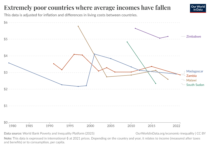
To see the consequences of this, let’s first focus on one country that achieved large growth and then contrast it with a country that did not.
A country that achieved large growth is the UK: the orange distribution on the left shows incomes in the UK two centuries ago; the majority lived in extreme poverty. The green distribution shows how the distribution of incomes has changed since then. Two centuries of economic growth lifted the majority of people out of the deep poverty of the past.13
The next chart shows the income distribution of the UK in 2019 in green – just as in the previous chart – and in red the income distribution of Madagascar, a country that did not achieve growth.
The majority of people in Madagascar still live in extreme poverty. Very similar to the global situation two centuries ago, three-quarters of Madagascar’s population are living in extreme poverty.
Not just economic growth, but also the distribution of that growth matters. If the inequality of income increases, the poorest can be left behind.
But without economic growth, there is no chance at all to leave poverty behind. The data from Madagascar makes clear that a reduction of inequality cannot end extreme poverty in a poor country. If inequality in Madagascar would be entirely eradicated, then everyone would live on the average income. In Madagascar, this is $1.60 a day. For poor countries, the only way to end poverty is an increase in incomes – economic growth.
The majority of the world is making good progress against poverty, but not all: some of the very poorest economies are stagnating
The history of extreme poverty is, at the same time, one of humanity’s greatest achievements and failures.
The majority of the world left extreme poverty behind. To me, this ranks among the most impressive and most important achievements in humanity’s history.
But, as we’ve seen, the fight against extreme poverty is far from over. Almost one in ten people still live in extreme poverty right now.
The worry with extreme poverty today is that some of the world’s poorest countries are not growing. Unless this changes, hundreds of millions of people will continue to live in extreme poverty.
Crucially this was true before the pandemic hit – even before COVID, researchers expected that half a billion people would remain in extreme poverty by 2030. The global recession that followed the pandemic exacerbated this further.
When it comes to the consequences of climate change, this is what I am most worried about. Richer people will be able to adapt in many ways. It is the extremely poor population that will be hardest hit.
The economic stagnation of some of the world's poorest countries is not as widely known as it should be. I think it deserves more attention. If the stagnation of the very poorest economies persists, we will see a growing divide at the lowest end of the global income distribution. While the living standards of the majority of the world are rising, some of the world’s very poorest people remain in extreme poverty.
Whether or not the poorest countries achieve growth is among the most important questions for the coming years. It will decide whether humanity wins its long fight against extreme poverty or not.
Last updated in 2023
This article was first published on November 22, 2021. It was last updated in August 2023.
The World Bank has updated its poverty and inequality data since the publication of this article
This article uses a previous release of the World Bank's poverty and inequality data, in which incomes were expressed in 2011 international dollars.
The World Bank has since updated its methods, and now measures incomes in 2021 international-$. As part of these changes, the International Poverty Line used to measure extreme poverty has also been updated: from $1.90 a day (in 2011 prices) to $2.15 a day (in 2017 prices) to $3 a day (in 2021 prices).
Because of the change of units, many of the figures mentioned in this article will differ from the latest World Bank figures.
Explore the latest data and read more about the World Bank's methodology:
Endnotes
For the moment, it is important to note that this $30 per day poverty line is defined in international-$ and therefore comparable with the ‘International Poverty Line’ discussed in the following section. More details about how to compare incomes across countries, the income concept here, and the definition of this poverty line follow further below in this text.
This is possible by relying on the work of the International Comparison Program, which monitors the prices of goods and services around the world.
Angus Deaton and Alan Heston (2010) discuss the methods behind such price adjustments and many of the difficulties and limitations involved.
Deaton, A., and Heston, A. 2010. “Understanding PPPs and PPP-Based National Accounts.” American Economic Journal: Macroeconomics 2 (4): 1–35. A working paper version is available online here.
Keep in mind that in the special case of the US, the US-$ equals the international-$.
Remember that these statistics take the cost of living into account – a person who lives on less than int-$30 is a person who cannot afford the goods and services that cost US-$30 in the US.
If you want to explore this data for any world region or any individual country, you can do so here.
See also the previous box on poverty measurement. This is, of course, also true of the historical research.
Indeed, there is an argument for using an even lower poverty line. To understand what is happening to the very poorest in the world, we need to look even lower than $3. This is because one of the biggest failures of development is that over the last decades, the incomes of the very poorest people have not risen. A big part of the reason for why this issue doesn’t get discussed enough is that the International Poverty Line we rely on is too high to see this fact.
Michail Moatsos (2021) – Global extreme poverty: Present and past since 1820. Published in OECD (2021), How Was Life? Volume II: New Perspectives on Well-being and Global Inequality since 1820, OECD Publishing, Paris, https://doi.org/10.1787/3d96efc5-en.
The sources for the measures shown in this chart and the following chart are:
Michail Moatsos (2021) – Global extreme poverty: Present and past since 1820. Published in OECD (2021), How Was Life? Volume II: New Perspectives on Well-being and Global Inequality since 1820, OECD Publishing, Paris, https://doi.org/10.1787/3d96efc5-en.
Jutta Bolt and Jan Luiten van Zanden (2021) – The GDP data in the chart is taken from The long view on economic growth: New estimates of GDP, How Was Life? Volume II: New Perspectives on Well-being and Global Inequality since 1820, OECD Publishing, Paris, https://doi.org/10.1787/3d96efc5-en.
The latest datapoint for the poverty data refers to 2018, while the latest datapoint for GDP per capita in the chart below refers to 2016. In that chart, I have chosen the middle year (2017) as the reference year.
The historical poverty research was done by economic historian Michail Moatsos and is based on the ‘cost of basic needs’-approach as suggested by Robert Allen (2017) and recommended by the late Tony Atkinson.
The ‘cost of basic needs’-approach was recommended by the ‘World Bank Commission on Global Poverty’, headed by Tony Atkinson, as a complementary method in measuring poverty. The report for the ‘World Bank Commission on Global Poverty’ can be found here.
Tony Atkinson – and after his death, his colleagues – turned this report into a book that was published as Anthony B. Atkinson (2019) – Measuring Poverty around the World. You find more information on Atkinson’s website.
The CBN-approach Moatsos’ work is based on was suggested by Allen in Robert Allen (2017) – Absolute poverty: When necessity displaces desire. In American Economic Review, Vol. 107/12, pp. 3690-3721, https://doi.org/10.1257/aer.20161080
Moatsos describes the methodology as follows: “In this approach, poverty lines are calculated for every year and country separately, rather than using a single global line. The second step is to gather the necessary data to operationalize this approach, alongside imputation methods in cases where not all the necessary data are available. The third step is to devise a method for aggregating countries’ poverty estimates on a global scale to account for countries that lack some of the relevant data.” In his publication – linked above – you find much more detail on all of the shown poverty data.
The speed at which extreme poverty declined increased over time, as the chart shows. Moatsos writes, “It took 136 years from 1820 for our global poverty rate to fall under 50%, then another 45 years to cut this rate in half again by 2001. In the early 21st century, global poverty reduction accelerated, and in 13 years, our global measure of extreme poverty was halved again by 2014.”
Parts of Western Europe and the US had already achieved some growth in the decades before this chart begins so that the share in poverty had already fallen, but even in 1820 the majority was still living in extreme poverty there
In the centuries and millennia before, no region in the world had achieved sustained economic growth (see, for example, my post on the Malthusian Trap and links therein). The chart here focuses on the very exceptional two last centuries when economic growth reduced widespread poverty.
You can explore related data in detail in this chart for growth measured as GDP per capita and in our Poverty Data Explorer.
The data shown in the small plots of the income distribution in the UK and Madagascar is again taken from PovcalNet – the predecessor to the World Bank's Poverty and Inequality Platform – Gapminder, and Michail Moatsos 2021.
Cite this work
Our articles and data visualizations rely on work from many different people and organizations. When citing this article, please also cite the underlying data sources. This article can be cited as:
Max Roser (2023) - “Extreme poverty: How far have we come, and how far do we still have to go?” Published online at OurWorldinData.org. Retrieved from: 'https://archive.ourworldindata.org/20260703-175051/extreme-poverty-in-brief.html' [Online Resource] (archived on July 3, 2026).BibTeX citation
@article{owid-extreme-poverty-in-brief,
    author = {Max Roser},
    title = {Extreme poverty: How far have we come, and how far do we still have to go?},
    journal = {Our World in Data},
    year = {2023},
    note = {https://archive.ourworldindata.org/20260703-175051/extreme-poverty-in-brief.html}
}
Reuse this work freely
All visualizations, data, and articles produced by Our World in Data are completely open access under the Creative Commons BY license. You have the permission to use, distribute, and reproduce these in any medium, provided the source and authors are credited.
The data produced by third parties and made available by Our World in Data is subject to the license terms from the original third-party authors. We will always indicate the original source of the data in our documentation, so you should always check the license of any such third-party data before use and redistribution.
All of our charts can be embedded in any site.