How do we know the history of extreme poverty?
Note: Since the publication of this article, the World Bank has updated its poverty data. See the note at the end for more information.
The poverty researcher Martin Ravallion spent decades researching how poverty can be measured and which policies can help us in our fight against poverty. The summary of his work is his monumental book ‘The Economics of Poverty: History, Measurement, and Policy’.
The first chapters of this book present a detailed history of global poverty and how the research of poverty has developed. The very big-picture of the long-run decline of extreme poverty he summarizes in the following figure. The chart shows that the share of the world population living in extreme poverty declined continuously over the last two centuries.
What is this chart based on? How do we know that just two centuries ago, the majority of the world population lived in conditions that are similar to the living conditions of the very poorest in the world today, as this chart indicates? And how do we know that this account of falling global extreme poverty is, in fact, true?
It is the research of hundreds of historians who have carefully assembled thousands of quantitative estimates that inform us about people's living conditions that give us this global perspective on the history of poverty.
In public discussions of the history of poverty, the extent of this careful work is often overlooked. Such a deceptively simple chart on the global decline of poverty may then be easily dismissed as being based on little evidence. While there are substantial questions that introduce uncertainty which need to be taken seriously, it would be a mistake to believe that historians do not have produced very substantial knowledge that informs us about the improvements of living conditions and the decline of global poverty.
In the following, we want to explain the methods used by researchers to estimate poverty over time. We cannot provide a complete overview over a large field of research in a short text, so we have put together a list of books and research papers below this text to give you a starting point into this important academic literature. You can find more detail across the rest of our work on Poverty.
How do we estimate global poverty over time?
In recent decades, it has become routine for countries to conduct household surveys that record the level of income or consumption of a representative sample of households. From these samples, poverty rates can be estimated for the whole country. A team of development researchers at the World Bank brings these national surveys together in order to make an estimate of the global poverty rate. These global estimates go back to 1981 – the year in which World Bank researchers judge the coverage of the survey data to be complete enough to produce reliable global estimates. In the first chart shown above, you can see such estimates made some years ago by Shaohua Chen and Martin Ravallion.1 The latest estimates are published on the World Bank's Poverty and Inequality Platform, and you can explore that data in our chart.
To study earlier periods, before the broad adoption of household surveys, a different approach is needed. Here, researchers rely on the ‘national accounts’ method, in which poverty estimates are derived from economic historians’ reconstructions of prosperity and inequality at the time.2
If that sounds like a rather heroic task, that’s because it is. It is only thanks to decades of cumulative, systematic, and painstaking historical research that we are now able to have a detailed understanding of the economic history of the world over the last centuries.
Below we will look in some detail at how researchers go about estimating income levels in earlier periods. In doing so we will get an idea of the many sources of uncertainty present in this endeavor. But what should also become clear is the solidity of the overall conclusions. Over the last two hundred years, incomes rose and the share of people in extreme poverty fell.
Historical reconstructions of national accounts
How do economic historians go about estimating incomes in the distant past?
In broad terms, the strategy is to extend back to earlier periods the system of national income accounting that countries use today to estimate the total output of the economy. The main objective is to apply a methodology that reconstructs this metric consistently over time and across countries. In the absence of data collected at the time, researchers have to bring together what evidence they can from historical sources, but the basic principles are the same.
Because Great Britain's economy was the first to achieve persistent economic growth, it is the economy that historians have studied in most depth.
The reconstruction of Britain's economic history
The visualization shows the output of the English economy per person since the Middle Ages. As explained below, it is not only capturing the production of workers paid in the labor market, but also the production of subsistence farmers and other producers who were not paid a monetary salary. As such, it gives us a perspective on the history of material living conditions of the English population over the last 746 years.
The data in the chart is taken from the seminal book on the history of material living conditions in Britain – British Economic Growth 1270-1870, by Broadberry, Campbell, Klein, Overton, and van Leeuwen. It presents a fantastic overview of this work and is very much recommended for anyone who wants to study the origins of economic growth in detail.3
When interpreting these reconstructions it is important to bear in mind the fundamental identity in this historical accounting: "Within the methodological framework provided by national income accounting, the estimation of GDP can be approached in three different ways, via income, expenditure and output, all of which ought to yield broadly similar results."4 For the important case of the subsistence farmer for example, the value of the food they produce represents both the economic output of the activity and the income received by the farmer. Consumption of that produce then represents a form of expenditure, as it is using up part of the farmer’s income.
Because of this identity the measurement of GDP can be approached from any one of these three angles: output, income, or expenditure. For historical estimates, the output approach is often considered the more reliable in practice given the available evidence, though information on incomes and expenditure still provide benchmarks to cross-check the plausibility of estimates.

It would be wrong to believe that historians do not take non-monetary incomes into account
Firstly, it’s important to get clear from the outset that historical reconstructions of poverty and prosperity do not just concern the amount of money people had in the past. This is a common misunderstanding that is often at the heart of misinformed critiques of historical research. For instance, in a discussion of our global extreme poverty chart on Reddit, one user suggested that it was "indicative of the fact that quite a lot of the world […] did not use fiat currency."
This interpretation is incorrect. Yes, over the last two hundred years, there has been a major shift from people farming for their own consumption towards people working for a wage and purchasing goods in the market. But historians know about history. Where non-market sources of income make up a substantial part of total income, it is very obvious that money would represent a rather silly indicator of welfare.
Just as we need to adjust for price inflation, accounting for non-market sources of income is an essential part of making meaningful welfare comparisons over time. Estimates of poverty and prosperity account for both market and non-market sources of income, including the value of food grown for own consumption or other goods and services that enriched the lives of households without being sold in a market.
This issue is not just of importance for historical estimates, but it is also of central relevance for poverty measurement today, given the importance that food produced at home, or otherwise received in-kind, continues to play in the incomes of the rural poor, especially in low-income countries. Accordingly, these flows are accounted for in household surveys of both consumption and income, and in the historical estimates.
Adjusting for price changes and new products
It is straightforward to compare material prosperity over time relative to all those goods that remained relatively unchanged over the course of history – economic historians can track the affordability of products like bread, shirts, beer, nails, meat, books or candles over time.
This, however, is not easily possible when entirely new products were introduced or when the quality of products and services changed very substantially.
The fact that some of the most important goods and services very much changed in quality or did not exist at all in the past represents the biggest problem of any long-term comparisons of poverty and prosperity because it makes price adjustments difficult.
Many of the most valuable goods today were not available at all: no king or queen had access to antibiotics, they had no vaccines, no comfortable transport in trains or planes, and no electronic devices — no computer and no light at night.
Historians, of course, attempt to take this into account as much as possible5 but this caveat should be kept in mind: no matter how high someone’s income might have been, some of the goods you might value the most – or would value, when you get sick – were not available at all.6
The detail of the historical reconstructions
The simple structure of how this economic history is presented – as a single line that is flat for most of the time and very steep for the recent period – should not fool us into believing that it is only a loose and approximate historical analysis. The amount of work that went into the reconstruction of this history is extraordinary: it is the culmination of decades of tedious and extremely careful academic work by large teams of dedicated researchers.
The level of detail that goes into such estimates is extreme, although this is hard to present in a short overview like this one. Whilst there are indeed many sources of uncertainty in such a process, it would be very wrong to think that historical GDP estimates are based on flimsy evidence. It is recommended to read this work in full length, but a passage on agricultural output gives some insight into how carefully this work is done:
“[The output method] has entailed, first, estimating the amounts of land under different agricultural land uses... and, then, deriving valid national trends from spatially weighted farm-specific output information on cropped areas and crop yields and livestock numbers and livestock yields... The latter task is further complicated by the need to correct for data biases towards particular regions, periods and classes of producer.”
Below is one of the many tables from this book, showing the authors’ estimates of the output of just one part of the agricultural sector of England. This is one of hundreds of datasets that are required to construct the time series in the chart above. And this table – and all others – in turn, build upon a substantial body of historical research.
There are two key takeaways: First, that historical reconstructions of GDP are the outcome of very serious academic work. And second, these represent estimates of total output, not just that part of production sold on markets.
It would be wrong to believe that these GDP series do not account for the value of non-market production, including domestic production for households’ own use.
A table from Broadberry et al. (2015) showing estimates of historical arable output in England
Global economic history over the long run
The extreme poverty estimates prior to 1981 shown in the first chart are taken from the famous research paper of Bourguignon and Morrison. Their estimates are based on a reconstruction of the global income distribution using the Maddison Project’s database of historical GDP per capita series for different countries.
This database has subsequently been updated and now provides a much richer overview of this field of research. It draws together the research efforts of a huge range of country specialists, including the work on England just discussed. In different countries researchers employ different methods, depending on what historical evidence is available and is most reliable. But in each case the series are the outcome of serious scholarly research and are debated extensively within a large peer-reviewed literature. (See the list of references at the end.)
The chart here shows global GDP per capita as constructed from the Maddison database. What is clear is that economic growth is a reality – average income has increased by roughly a factor of ten over this period.
It is also worth keeping in mind that this change has happened while the world population increased 5-fold. Had total global production not increased, the GDP per capita would have declined 5-fold.

Global poverty and poverty in Asia and Africa
Bourguignon and Morrison (2002), whose work is presented in the chart by Martin Ravallion, were able to rely on data of some Asian and African economies in the 19th century from earlier vintages of the Maddison Project Database, but for many countries in these regions, data was not available then. Coverage for these regions has subsequently improved.
How much can these gaps in the research on prosperity matter for estimates of global poverty?
It is important to remember that data coverage in terms of countries is not the same as data coverage in terms of people. Global poverty estimates are proportionately driven by those countries with a large population. The population of India and China in 1800 was half a billion. This is half of the world population at the time, which was 1 billion. And it is two-thirds of the total Asian population. For both countries, we have good data. What that data shows is that people in both of these countries – and in other Asian countries – were much poorer than the very poor people in Europe. You can see that in the first chart here: GDP per capita in India and China was less than one-third of the GDP per capita in the UK.
For Africa, we have fewer historical estimates. As shown in the second chart, within the Maddison Project Database, estimates prior to 1950 are only available for a small number of countries.
What we know does not suggest that people in Africa were richer than Europeans at the time, however. The available research on living conditions more broadly – for example, estimates of life expectancy – suggests that Africans were worse off in important ways.
Moreover, we can also ask how much the uncertainty surrounding historical data for Africa can possibly matter for our estimates of global poverty. The population of Africa accounted for 8% of the world population. Even if all people in African at the time were much, much richer, this would mean that the global poverty rate would be at most 8% lower (in fact less, because Bourguignon and Morrison estimate that some Africans were not in extreme poverty).
And we don't only have to rely on reconstructions of population size and poverty, we have also a broader understanding of the economics in pre-industrial societies. How this is known is another fascinating piece of research that we discuss in some detail in this article. Based on this historians do not expect that the levels of income in these past societies was significantly higher or poverty significantly lower. They expect the majority to be living in extreme poverty.


Economic growth and declining poverty
Knowing how the income of the ‘average’ person has changed is of course not enough to infer what has happened to poverty. To do this, research on the distribution of income over time is needed – not just growth, but also inequality matters for how poverty changes.
Just as the increase in average incomes over this period is very clear from the historians work, so too is the increase in global inequality. Whilst many Western European countries, the US, Australia, and Canada saw rapid economic growth throughout the 19th and 20th century, other regions lagged behind. It was only in the second half of the 20th century that low-income countries began to see growth rates comparable to, and eventually even higher than, those seen in rich countries. Many countries, particularly, but not only, in Africa, are still being left behind in terms of economic prosperity as the chart shows. Exploitative colonialism is one of the institutions that is to blame that poverty in these regions did not decline earlier as we know from the studies of economic historians that rely on the work that is the topic of this text.7 The progress against the worst poverty that people in Asia, Latin America, and Africa have made in recent decades became possible thanks to the end of colonialism.
As well as reconstructing GDP estimates, economic historians also use historical sources to infer the extent of inequality within countries from historical sources. Putting these two components together allows us to construct the evolution of the entire global distribution of income.
The resulting picture of combining both aspects – average income and inequality – is shown in the visualization below. In this chart we can learn three things. Firstly, the overall volume of the distribution increases, representing the growth in world population, from around 1 billion to over 7 billion. Secondly, we see that between 1800 and 1975 the distribution of incomes in Europe shifted to the right and out of extreme poverty, whereas Asia and Pacific’s growing population remained mostly below the extreme poverty line. In recent decades, rising incomes in Asia bridged the divide between the two peaks of the global distribution visible in 1975. In doing so, hundreds of millions left extreme poverty behind and the share of the population living on less than the extreme poverty line declined.
The chart is plotted on a logarithmic inequality and this needs to be kept in mind when thinking about global inequality: economic inequality in the world today is vast, higher than in many of the most unequal countries in the world.
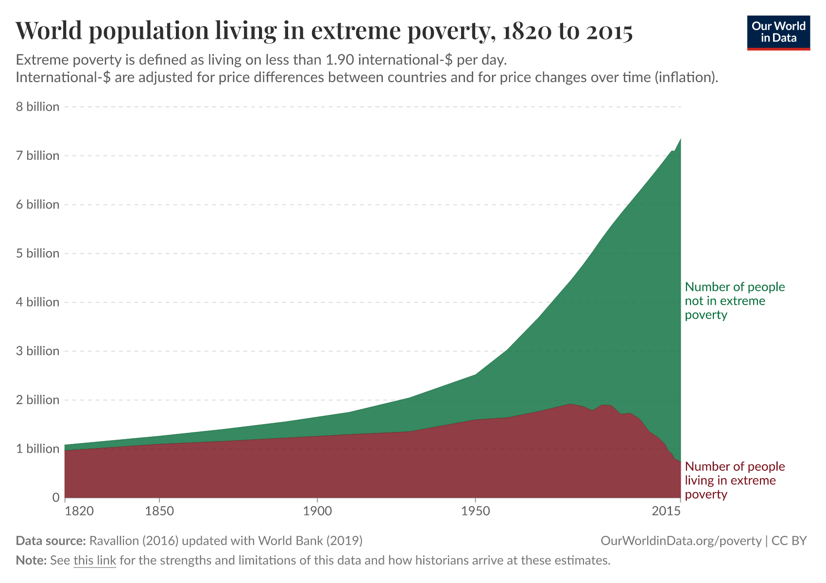
The number of people in extreme poverty
Around 700 million people remain in extreme poverty today, as represented by the volume to the left of the extreme poverty line in the chart above. Indeed, we see that a broadly comparable number of people are in extreme poverty today as they were in 1800. The difference is that in 1800, almost all the world’s 0.9 billion inhabitants were living in extreme poverty, whereas today, this represents less than 10% of the world’s population. The number of people who are not in extreme poverty has increased more than 50-fold.
You can see this more clearly in the chart here. Via the settings, you can switch from absolute numbers to percentages. Whilst the proportion of the world’s population living in extreme poverty has been falling consistently since 1820, it is only in recent decades that this has translated into a decline in the number of people living in extreme poverty.
Uncertainty
It’s important to recognize the sources of uncertainty in these historical reconstructions. By reading the work we list in the references below, you will get a sense of just how many steps are involved in the production of historical GDP estimates.
These uncertainties, however, should not be blown out of proportion. Whilst there are many debates in the economic history literature about which methods are most reliable or which assumptions are most plausible, there is no contention about the fact that average incomes have risen substantially across most parts of the world over the last two hundred years, and that the proportion of people living in extreme poverty has fallen.
Rising global inequality and population growth meant that, despite rising average incomes, the number of people living in extreme poverty was rising until relatively recently. But it is wrong to think of the last two centuries as being one where the rich got richer and the poor got poorer. The poor also got richer. The absolute difference between the incomes of the world’s rich and the world’s poor have never been larger in the whole of human history. But neither have the absolute incomes of the majority of the world population.
How and why poverty lines are defined
Poverty metrics have several purposes. One is to provide an interpretable summary of what is happening to the material living conditions of the poorest. Setting the poverty line is a decision about how far down the distribution we want to focus our attention on – do we want to know something about the poor, the very poor, or the extremely poor? Another is to express a view or a social standard concerning the level of income needed to lead a decent life. Yet another is to specify a target for progress, such as the Sustainable Development Goal to end extreme poverty by 2030 – this is a goal we are not on track to reach, as we have shown here.
The ‘international poverty line’ is an extremely low poverty line. It is a definition of extreme poverty, and when we write about it here, we are careful to always refer to this poverty line with this name. You can read more about where this poverty line comes from our article on the World Bank's methods. It was chosen by the World Bank to broadly reflect the national poverty standards set in the poorest countries for which national poverty lines are available.
Given the multiple purposes of setting a poverty line, it’s wrong to dismiss the relevance of a given threshold just because this does not in accord with our sense of what standard of living is needed for a decent life, or what our ultimate goal is for the world’s poorest people. Two points are worth considering here:
An even lower poverty line is used in important research and would be helpful in the public debate
Indeed, there is a very good argument for using an even lower poverty line. To understand how the very worst off on the planet are fairing, we need to look even lower than $1.90. This is because one of the biggest failures of development is that over the last decades, the incomes of the very poorest on the planet have not risen. A big part of the reason why this issue doesn’t get discussed enough is that the international poverty line we rely on is too high to see this fact.
Higher poverty lines make sense too
Of course, someone living on marginally more than $1.90 is not suddenly free of poverty. As such, it’s very important to consider higher poverty thresholds as well. The chart here shows the number of people falling below different poverty lines. (Again, you can switch between absolute numbers and percentages via the chart’s settings. You can also view the data for individual countries.)
Given that one purpose of poverty lines is to reflect minimum social standards, as well as aspirations and targets for improving the welfare of the poor, richer countries tend to set themselves higher poverty lines. The headline poverty figures for the rich country of Norway for example relate to a poverty line of roughly int.-$35 a day.
Whether someone lives in poverty should not depend on where in the world this person lives and this is one of the many good arguments for much higher poverty lines. Almost the entire world population is living on less than int.-$35 and while using such a higher threshold to measure poverty is certainly justified and relevant it has the big disadvantage that we miss the very meaningful differences in living standards between the middle-class in mid-income countries and the world’s very poorest that are more than 20-times poorer.
Yes, we should take much higher poverty lines for the world seriously, but to focus our attention on what is happening to the world’s poorest they are not helpful at all. The proposal of Lant Pritchett to rely on at least two poverty lines is a very good one.
The chart here shows the number of people living below 4 different poverty lines. Via the settings you can switch the chart to see the proportion living below these poverty lines.
We see that the proportion of people living on more than $10 was broadly flat throughout the 1980s and 90s, this century this rate has started to increase again. The rise in incomes in many Asian countries occurred largely beneath this threshold until very recently. But the fact that $10 a day represents an informative poverty threshold at all is testament to the fact that incomes across the distribution have risen. Looking back to the global distribution in 1800 we see that this was a level of income enjoyed by only a tiny proportion of the world’s population: the very richest people two centuries ago.
Again, different poverty lines are helpful for different questions. One of us published a research paper in which we suggest a poverty line of int.-$10.89. And recently, the world did, in fact make rapid progress against poverty relative to higher poverty lines. Every day in the last decade, newspapers could have had the headline, “The number of people living on more than 10 dollars per day increased by 245,000 since yesterday.”

The history of global living conditions can serve as a reality check
There is a long tradition in economics of focussing on income or consumption as a key metric. But everyone – economists included – would agree that other things matter too, and indeed often matter much more: good health, education, human rights, leisure time, mental health, life satisfaction, and many other aspects – the list is long.
It is because the list is so long that we are working on a very broad number of global problems here on Our World in Data. Across our website we have more than 100 entries and show more than 3,000 other charts presenting the evidence on global living standards and the environment over time, across many, many dimensions that matter to people.
And this too is the reason why our ‘Short history of global living conditions’-chart shows six charts, each capturing a different aspect of global development over the last two hundred years. Extreme poverty is an important one, but it is shown next to other important metrics.
Whilst conceptually distinct from the economist’s notion of income, we see that many – but by no means all – of these dimensions are in fact correlated with it and, as such, have also shown dramatic improvements over the last two hundred years.
What has happened in nutrition, health and education can also be viewed as a reality-check on the extreme poverty chart. These substantial improvements in several dimensions have made each other possible and the substantial fall in extreme poverty was a key development in this aspect of global change.

What we learn from this
In considering long-run global poverty trends, people are at times too quick to present arguments on what has brought about progress, and what has undermined it. Some champion the increased role of the state, through social spending or the broader management of the economy. Others emphasize globalized trade and free markets. These debates on why this has happened are important, but they are not the same as the historical work that establishes what has happened.
In order for this discussion to be sound and helpful, we first need to know how income and consumption around the world have in fact changed over time. Thanks to the sustained academic research of hundreds of historians, we can. This research clearly shows that the share of people extreme poverty rate has declined over the last two hundred years. The fact that such a large share of the world population is living in poverty is unacceptable. The fact that we can make progress against poverty means that we do have to accept it.
This research matters. For many – including us – ending extreme poverty is one of the most important tasks for our time and our generation. But just as with climate change, global health, or demographic challenges, any meaningful debate concerning how we should pursue this goal requires all the participants to understand the best evidence on how poverty has changed over time, and what these numbers represent. Otherwise, we cannot hope to be helpful.
The World Bank has updated its poverty and inequality data since the publication of this article
This article uses a previous release of the World Bank's poverty and inequality data, in which incomes were expressed in 2011 international dollars.
The World Bank has since updated its methods, and now measures incomes in 2021 international-$. As part of these changes, the International Poverty Line used to measure extreme poverty has also been updated: from $1.90 a day (in 2011 prices) to $2.15 a day (in 2017 prices) to $3 a day (in 2021 prices).
Because of the change of units, many of the figures mentioned in this article will differ from the latest World Bank figures.
Explore the latest data and read more about the World Bank's methodology:
Endnotes
Chen, Shaohua, and Martin Ravallion. 2010. “The Developing World Is Poorer than We Thought, but No Less Successful in the Fight against Poverty.” The Quarterly Journal of Economics. https://academic.oup.com/qje/article-abstract/125/4/1577/1916270.
It should be noted, of course, that not only national accounts can inform us about poverty and living standards in the past. A very substantial literature studies the history of wages for example.
See Broadberry, Stephen, Bruce Campbell, Alexander Klein, Mark Overton, and Bas van Leeuwen (2015) – British Economic Growth 1270-1870. Cambridge: Cambridge University Press. https://doi.org/10.1017/CBO9781107707603. And of course, their work in turn relies on hundreds of other people's work.
Stephen Broadberry, Bruce M. S. Campbell, Alexander Klein, Mark Overton, and Bas van Leeuwen – ‘British Economic Growth 1270–1870’; book page.
Again, see Broadberry et al or read about the various methods that attempt to take innovation of new products and changing quality of products into account. One important method is 'hedonic pricing'.
To some extent, the opposite problem also exists, and some goods that were available in the past – like slaves – are not available today. But this is a much rarer problem.
If you are interested in this aspect of global history in particular we recommend Branko Milanovic’s book ‘Global Inequality’.
The data are produced by Ola Rosling and published at the website of Gapminder. You can explore the Gapminder visualization of the income distributions of all countries in their interactive tool here. Regarding the construction of the data, Hans and Ola Rosling note the following here: "This graph is constructed by combining data from multiple sources. In summary, we take the best available country estimates for the three indicators: GDP per capita, Population and Gini (which is a measure of income inequality). With these numbers we can approximate the number of people on different income levels in every country. We then combine all these approximations into a global pile using the method described below under The Adjusted Global Income Scale."
Cite this work
Our articles and data visualizations rely on work from many different people and organizations. When citing this article, please also cite the underlying data sources. This article can be cited as:
Joe Hasell and Max Roser (2019) - “How do we know the history of extreme poverty?” Published online at OurWorldinData.org. Retrieved from: 'https://archive.ourworldindata.org/20260619-103117/extreme-history-methods.html' [Online Resource] (archived on June 19, 2026).BibTeX citation
@article{owid-extreme-history-methods,
    author = {Joe Hasell and Max Roser},
    title = {How do we know the history of extreme poverty?},
    journal = {Our World in Data},
    year = {2019},
    note = {https://archive.ourworldindata.org/20260619-103117/extreme-history-methods.html}
}
Reuse this work freely
All visualizations, data, and articles produced by Our World in Data are completely open access under the Creative Commons BY license. You have the permission to use, distribute, and reproduce these in any medium, provided the source and authors are credited.
The data produced by third parties and made available by Our World in Data is subject to the license terms from the original third-party authors. We will always indicate the original source of the data in our documentation, so you should always check the license of any such third-party data before use and redistribution.
All of our charts can be embedded in any site.