Working Hours
Work is a central part of our lives. It is something we do almost every day, for much of the day, for decades on end. Because it is so central, looking closely at how much time we spend working can tell us a lot about our lives and the societies we live in.
How much do people around the world work? In many countries today, people work much less than in the past 150 years. Working less means being able to spend time becoming more educated or simply enjoying leisure time.
This is substantial progress, but there are still huge inequalities across and within countries, and progress still to make.
Here we present the data on working hours. We explore how it differs across countries and over time and how these differences matter for people’s lives.
Research & Writing
December 16, 2020
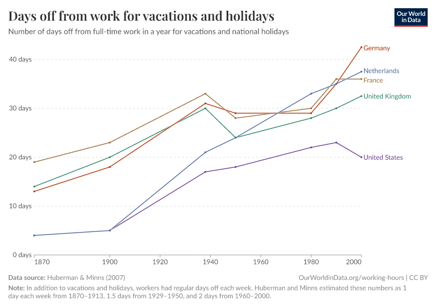
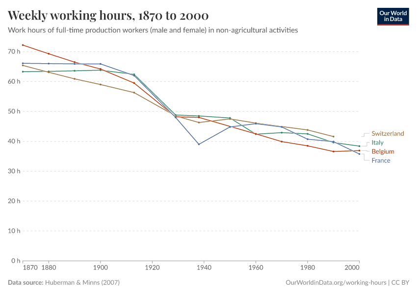
Are we working more than ever?
Working hours for the average worker have decreased dramatically over the last 150 years.
December 21, 2020
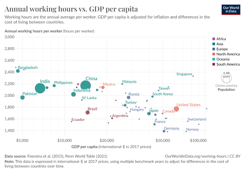
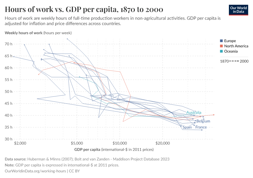
Do workers in richer countries work longer hours?
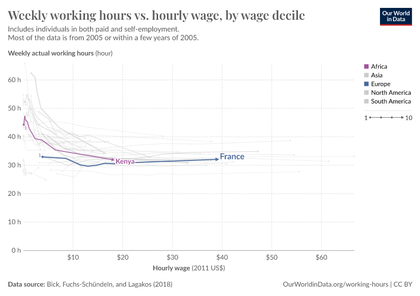
Workers in richer countries tend to work fewer hours than those in poorer countries.
January 6, 2021
How are working hours measured and what can we learn from the data?
The primary way to measure working hours is with surveys, but the data can have limitations that are important to understand.
Key Charts on Working Hours
See all charts on this topic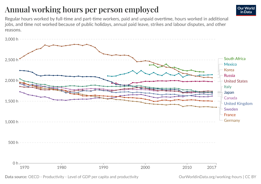


Featured Data on Working Hours
Cite this work
Our articles and data visualizations rely on work from many different people and organizations. When citing this topic page, please also cite the underlying data sources. This topic page can be cited as:
Charlie Giattino, Esteban Ortiz-Ospina, and Max Roser (2020) - “Working Hours” Published online at OurWorldinData.org. Retrieved from: 'https://ourworldindata.org/working-hours' [Online Resource]BibTeX citation
@article{owid-working-hours,
    author = {Charlie Giattino and Esteban Ortiz-Ospina and Max Roser},
    title = {Working Hours},
    journal = {Our World in Data},
    year = {2020},
    note = {https://ourworldindata.org/working-hours}
}
Reuse this work freely
All visualizations, data, and articles produced by Our World in Data are completely open access under the Creative Commons BY license. You have the permission to use, distribute, and reproduce these in any medium, provided the source and authors are credited.
The data produced by third parties and made available by Our World in Data is subject to the license terms from the original third-party authors. We will always indicate the original source of the data in our documentation, so you should always check the license of any such third-party data before use and redistribution.
All of our charts can be embedded in any site.