Time Use
How do people across the world spend their time? How do daily activities differ across countries, and how do these differences matter for people’s lives? Explore data and research on time use.
This page was first published in November 2020, and we updated the text in February 2024.
Time is the ultimate limited resource. Every one of us has the same “time budget” — 24 hours per day, 365 days per year, giving a total of 8,760 hours — each year of our lives.
How do we spend our time? There are many commonalities across the world: we all sleep, work, eat, and enjoy leisure time. But there are also important differences in the freedom people have to spend time on the things they value most.
Studying how people across the world spend their time provides an important perspective for understanding living conditions, economic opportunities, and general well-being.
Here we present the data on time use. We explore how it differs across countries and over time and how these differences matter for people’s lives.
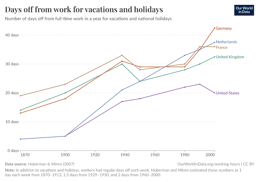
On our related topic page on Working Hours, you can read more about people’s time spent working and how this varies around the world.
See all interactive charts on time use ↓
Related topics
Time use from the perspective of an average day
How do people across the world spend their time and what does this tell us about living conditions?
Sleep, work, eat, leisure — at a high level most of us spend time on similar activities. But just how similar are the daily activities of people across the world?
This is something worth considering, not just to serve our curiosity but because differences in the way we spend time give us meaningful perspectives on living conditions, economic opportunities, and general well-being.
Here we take a look at the data on time use. We explore some of the key patterns that emerge from cross-country time use surveys, and then dig deeper to understand how these differences matter for people’s well-being.
Daily activities: similarities and differences across countries
In the chart below we compare the average time spent across several common activities.
The data comes from the OECD and brings together estimates from time diaries where respondents are asked to record the sequence of what they did over a specific day, as well as from general questionnaires where respondents are asked to recall the amount of time spent on different activities on a specific day in the previous week.1
The first thing that jumps out from this chart is that there are indeed many similarities across countries.
This is not surprising — most of us try to split our days into “work, rest, and fun”, and so there are some predictable patterns. We spend the most time working and sleeping. Together, paid work, housework, leisure, eating, and sleeping take 80–90% of all the 1440 minutes in a day.
Work is an important activity where we see large differences. Countries are sorted by paid work hours in the chart — from highest to lowest. On an average day, people in China and Mexico spend almost twice as much time on paid work as people in Italy and France do. This is a general pattern: people in richer countries can afford to work less. Keep in mind that this chart shows the average for all people in the working age bracket, from 15 to 64 years, whether or not they are employed.3
Read more on our page on working hours:
Differences in demographics, education, and economic prosperity all contribute to these inequalities in work and time use.
But what’s clear in the chart here is that some differences in time use are not well explained by economic or demographic differences. In the UK, for example, people spend more time working than in France, but in both countries, people report spending a similar amount of time on leisure activities.
Cultural differences are likely to play a role here. The French seem to spend much more time eating than the British — and in this respect, the data goes in line with stereotypes about food culture. People in France, Greece, Italy, and Spain report spending more time eating than people in most other European countries. The country where people spend the least time eating and drinking is the USA.
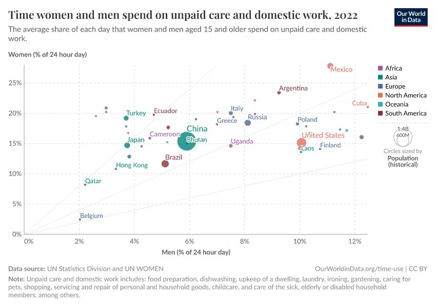
Going beyond averages: The gender gap in leisure time
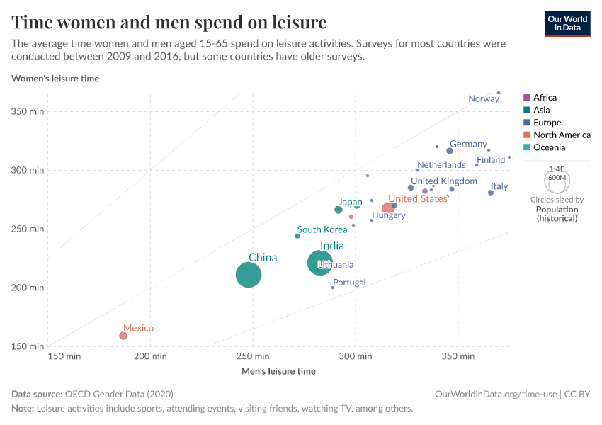
Going beyond national averages reveals important inequalities within countries. The gender gap in leisure time, for example, is a key dimension along which large inequalities exist.
The chart here relies on the same time-use data described above but it shows total leisure time for men and women separately.
Time for men is shown on the horizontal axis, while time for women appears on the vertical axis. The dotted diagonal line denotes "gender parity", so the further away a country is from the diagonal line, the larger the difference between men and women.

As we can see, in all countries the average leisure time for men is higher than for women — all bubbles are below the diagonal line — but in some countries, the gaps are much larger. In Norway, the difference is very small, while in Portugal men report much more leisure time than women.
A key factor driving these differences in leisure time is the gender gap in unpaid work. As we explain in detail on our page on women’s employment, women are responsible for a disproportionate amount of unpaid work and have less leisure as a result.4
Why should we care about differences in time use?
Every single one of us has the same “time budget”: 24 hours per day and 365 days per year. But of course, not all of us can choose to spend time on the activities that we enjoy most. Differences in our freedom to allocate time to the things we enjoy are the main reasons why time-use data is important for studying living conditions.
In the UK, researchers from the Centre for Time Use Research linked time-use diaries with the respondents’ assessments of enjoyment, on a scale from 1 to 7, to better understand the connection between time use and well-being.
The chart here, which we’ve adapted from the book "What We Really Do All Day’, by professors Jonathan Gershuny and Oriel Sullivan, shows the results. The estimates correspond to average reported levels of enjoyment for each activity, with confidence intervals.5
We see that the most-enjoyed activities involve rest or leisure activities — such as eating out, sleeping, going to sports events, playing computer games, or attending cultural performances. The activities receiving the lowest ratings include doing school homework, looking for a job, or doing housework.
The activity where people show the greatest variation in enjoyment is working a “Second Job”. This likely reflects the difference between people who work a second job because they want to, and those who work a second job because they have to.
So what do we learn from this?
First, we learn that the enjoyment of activities is, at least to some degree, predictable and stable. This means we can take activity groups and make meaningful comparisons across groups of people. Economists, for example, often classify any activity with an enjoyment level below work as a “non-leisure activity”, to measure trends in leisure across people and time.7
But beyond this, and more importantly, this confirms that time-use is informative about well-being.
The fact that there is a very clear and predictable pattern in the enjoyment of activities suggests that differences in time use do, indeed, give us meaningful perspectives on living conditions and economic opportunities. In countries where people do more paid and unpaid work, and have less time for leisure, their enjoyment — and happiness and life satisfaction — levels are likely to be lower.
Time use from the perspective of the life cycle
Who do we spend time with across our lifetime?
As we go through life we build personal relationships with different people — family, friends, coworkers, partners.
These relationships, which are deeply important to all of us, evolve with time. As we grow older we build new relationships while others transform or fade, and towards the end of life, many of us spend a lot of time alone.
Taking the big picture over the entire life course: Who do we actually spend our time with?
From adolescence to old age: who do we spend our time with?
To understand how social connections evolve throughout our lives we can look at survey data on how much time people spend with others, and who that time is spent with.
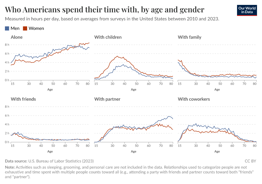
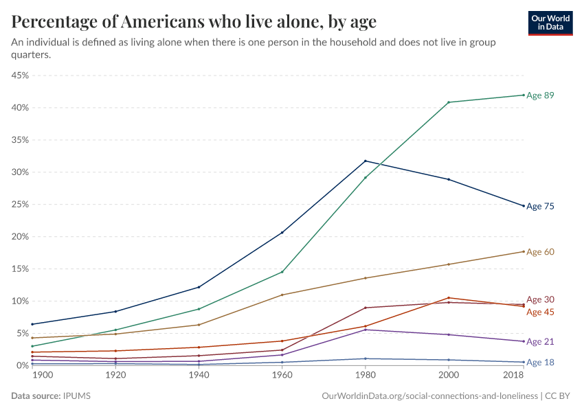
The chart here shows the amount of time that people in the US report spending in the company of others, based on their age.
The data comes from time-use surveys, where people are asked to list all the activities that they perform over a full day, and the people who were there during each activity. We currently only have data with this granularity for the US — time-use surveys are common across many countries, but what is special about the US is that respondents of the American Time Use Survey are asked to list everyone who was present during each activity.

The numbers in this chart are based on averages for a cross-section of American society — people are only interviewed once, but we have brought together a decade of surveys, tabulating the average amount of time that survey respondents of different ages report spending with other people.8
Who we spend our time with changes a lot over the course of life
When we’re young — particularly in our teens — we spend a lot of our time with friends, parents, siblings, and extended family.
As we enter our 20s, time with friends, siblings, and parents starts to drop off quickly. Instead, we start spending an increasing amount of time with partners and children. The chart shows an average across Americans, so for those that have children the time spent with children is even higher, since the average is pulled down by those without children.
As the chart shows, this continues throughout our 30s, 40s, and 50s — over this period of their life, Americans spend much of their time with partners, children, and, unsurprisingly, co-workers.
For those 60 and older, we see a significant drop-off in time spent with co-workers. This makes sense, considering many people in the US enter retirement in their mid-60s. We see that this time is partly displaced by more time with partners.
How about the number of people we interact with? This chart suggests that the number of people with whom we interact is highest around 40, but then things change substantially after that. And this is perhaps the most conspicuous trend in the chart: above 40, people spend an increasing amount of time alone.
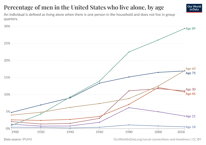
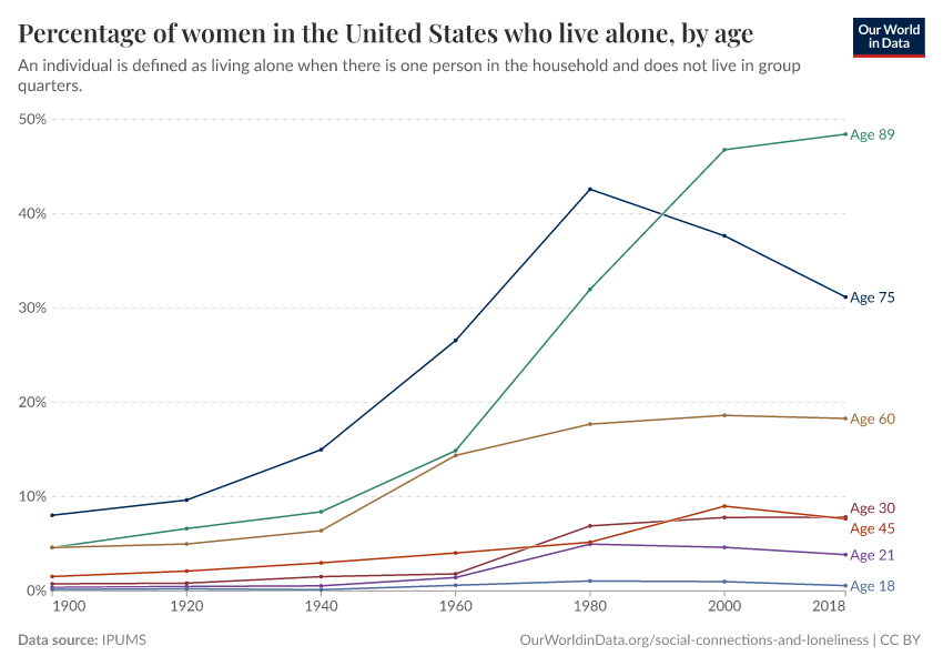
Older people spend a lot of time alone
Older people spend a large amount of time alone and it is understandable why — time spent alone increases with age because this is when health typically deteriorates and people lose relatives and friends.
Indeed, many people who are older than 60 live alone as this chart shows clearly: living alone is particularly common for older adults.
Another interesting point here is that the share of people across all age groups who live alone has been rising over time.
This is part of a more general global trend — if you want to read more about the global "rise of living alone", we provide a detailed account of this trend across countries on our topic page on Loneliness and Social Connection.

Older people spend more time alone, but this doesn’t necessarily mean they’re lonely
The data shows that as we become older we tend to spend more and more time alone. What’s more, the data also shows that older people today spend more time alone than older people did in the past.
We might think older people are therefore more lonely — but this is not necessarily the case.
Spending time alone is not the same as feeling lonely. This is a point that is well recognized by researchers, and one which has been confirmed empirically across countries. Surveys that ask people about living arrangements, time use, and feelings of loneliness find that solitude, by itself, is not a good predictor of loneliness.
You can read our overview of the evidence in our article:
So, what about loneliness? If we focus on self-reported loneliness, there is little evidence of an upward trend over time in the US, and importantly, it’s not the case that loneliness keeps going up as we become older.
In fact, a recent study based on surveys that track the same individuals over time found that after age 50 — which is the earliest age of participants in the analysis — loneliness tended to decrease, until about 75, after which it began to increase again.9
Taking the evidence together, the message is not that we should be sad about the prospect of aging, but rather that we should recognize the fact that social connections are complex.
We often look at the amount of time spent with others as a marker of social well-being — but the quality of time spent with others, and our expectations, matter even more for our feelings of connection and loneliness.
Key Charts on Time Use
See all charts on this topic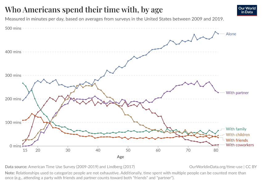


Featured Data on Time Use
Endnotes
The "time-diary method" is generally more reliable and allows a richer analysis of routines, because it measures not only aggregate times but also sequences and clock-times. Time-diary data is less common, but it is available for some countries from the Multinational Time Use Study. We explore time-use "tempograms" from the MTUS in a forthcoming companion post.
OECD (2020) Time Use Database.
Because these estimates include people who are not employed, they are much lower than the estimates of working hours per worker present elsewhere. The estimates also differ because of differences in the sources: time-use surveys compared to labor force surveys and national accounts data.
If you want to dig deeper you can explore gender differences across all other activities directly from our source, via the OECD Data Portal. You can read more about within-country inequalities in time use along other dimensions, such as income and education, in this Brookings Paper, where the authors focus on the "middle-class time squeeze" in the US.
Sawhill, I. V., & Guyot, K. (2020). The Middle Class Time Squeeze. Economic Studies at Brookings. Brookings Institution.
The underlying data comes from time-use diaries where respondents are asked to record the sequence of what they do over a specific day, and how much they enjoy each "episode" (i.e. what they do) on a scale from 1 to 7. All episodes reported are then coded and grouped into similar activities. To arrive at the mean enjoyment scores, the authors multiply the duration of each episode where the activity category concerned is the primary activity recorded, by the enjoyment level to arrive at the total enjoyment score for that episode. Then they sum these total enjoyment scores for each category of activity across the day, and finally divide these daily enjoyment total scores for each activity by the amount of time devoted to the activity. In this way, they arrive at an appropriately weighted mean enjoyment level for each activity across all those who engage in it. For more details see Gershuny, J., & Sullivan, O. (2019). What We Really Do All Day: Insights from the Centre for Time Use Research. Penguin UK.
Gershuny, J., & Sullivan, O. (2019). What We Really Do All Day: Insights from the Centre for Time Use Research. Penguin UK.
You can find a very clear and complete explanation of this in Ramey, V. A., & Francis, N. (2009). A century of work and leisure. American Economic Journal: Macroeconomics, 1(2), 189-224.
When interpreting this chart it’s important to bear in mind that the relationships used to categorize people are not exhaustive (i.e., survey respondents could also list being with people who didn’t fit any of the listed categories, or for whom a relationship was unclear or unknown — we do not count these instances in the estimates). Additionally, time spent with multiple people can be counted more than once; so attending a party with friends and your spouse, for example, would show up for both “friends” and “partner” in our estimates. The implication is that companion categories cannot be stacked to add up the total time spent in the company of others.
Hawkley, L. C., Wroblewski, K., Kaiser, T., Luhmann, M., & Schumm, L. P. (2019). Are US older adults getting lonelier? Age, period, and cohort differences. Psychology and Aging, 34(8), 1144.
Cite this work
Our articles and data visualizations rely on work from many different people and organizations. When citing this topic page, please also cite the underlying data sources. This topic page can be cited as:
Esteban Ortiz-Ospina, Bastian Herre, Tuna Acisu, Charlie Giattino, and Max Roser (2020) - “Time Use” Published online at OurWorldinData.org. Retrieved from: 'https://ourworldindata.org/time-use' [Online Resource]BibTeX citation
@article{owid-time-use,
    author = {Esteban Ortiz-Ospina and Bastian Herre and Tuna Acisu and Charlie Giattino and Max Roser},
    title = {Time Use},
    journal = {Our World in Data},
    year = {2020},
    note = {https://ourworldindata.org/time-use}
}
Reuse this work freely
All visualizations, data, and articles produced by Our World in Data are completely open access under the Creative Commons BY license. You have the permission to use, distribute, and reproduce these in any medium, provided the source and authors are credited.
The data produced by third parties and made available by Our World in Data is subject to the license terms from the original third-party authors. We will always indicate the original source of the data in our documentation, so you should always check the license of any such third-party data before use and redistribution.
All of our charts can be embedded in any site.