Women's Employment
How does women’s labor force participation differ across countries? How has it changed over time? What is behind these differences and changes?
This page was first published in March 2018. We made changes to the text in February 2026.
Rising female labor force participation has been one of the most remarkable economic developments of the last century. In this topic page, we present the key facts and drivers behind this important change.
How does women’s labor force participation differ across countries?
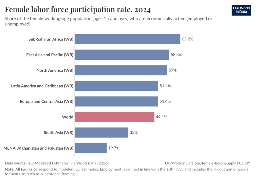
Women’s participation in labor markets differs across regions and countries
The chart shows that around half of all women worldwide are participating in the labor force. That is, they are of working age and “economically active”, either because they are working or actively looking for a job.
But this global average hides how this differs across world regions: while most regions are slightly or clearly above the world average, the Middle East and North Africa, and South Asia have much lower participation rates.
Switching to the map view shows that female labor force participation also differs a lot within world regions.
Men tend to participate in labor markets more frequently than women
Around the world, men tend to participate in labor markets more frequently than women. However, it only takes a glimpse of the data to see that there are huge differences across societies.
The map shows how men and women compare today in terms of labor market participation, country by country. Shown is the female-to-male ratio in labor force participation rates (expressed in percent).
The data comes from the International Labor Organization (ILO). These are “modeled estimates” in the sense that the ILO produces them after harmonizing various data sources to improve comparability across countries. (You can read more about the modeled estimates on this other page).
The ratio in most countries is well below 100%, which means that the participation of women tends to be lower than that of men. Yet differences are outstanding: in some countries, the ratio is below 25%. In others, the ratio is close to, or even slightly above 100% (i.e., there is gender parity in labor force participation or even a higher share of women participating in the labor market than men).

Female labor force participation is highest in the poorest and richest countries
Female labor force participation is highest in some of the poorest and richest countries in the world. And it is often lowest in countries with middle incomes, measured by GDP per capita. In other words: when we compare countries at one point in time, the relationship between female participation rates and GDP per capita follows a U-shape. This is shown in the scatter plot here.

You can highlight continents by clicking on the labels in the right panel. If you do this, you will see that some interesting patterns emerge. Within Africa, there is a negative correlation — the poorest countries have the highest participation rates. In Europe, this is reversed: richer countries tend to have higher participation rates — a positive correlation. Indeed, these correlations across high and low-income countries seem to explain a big part of the U-shape that appears in this chart.
Female labor force participation varies with age
The next chart shows women’s labor force participation rates by age groups.
Participation varies with age. In most countries, it is highest among women in their prime working ages (25–54), and lower among younger and older women. However, the balance between younger and older women differs across countries. In some, younger women participate more; in others, older women do.

How has women’s labor force participation changed over time?
Female participation in labor markets grew remarkably in the 20th century
The 20th century saw a radical increase in the number of women participating in labor markets across early-industrialized countries.
The chart here shows long-run female participation rates, combining data from the International Labour Organization (ILO) with historical estimates for a selection of countries.

Participation rose across all of these countries. Notably, growth in participation began at different points in time, and proceeded at different rates — but the long-run trend is clear. The large and sustained increases in the labor force participation of women in rich countries remain a striking feature of economic and social change in the 20th century.1
However, this chart also shows that in many rich countries — such as, for example, the US — participation growth slowed down considerably or even stopped at the turn of the 21st century.2
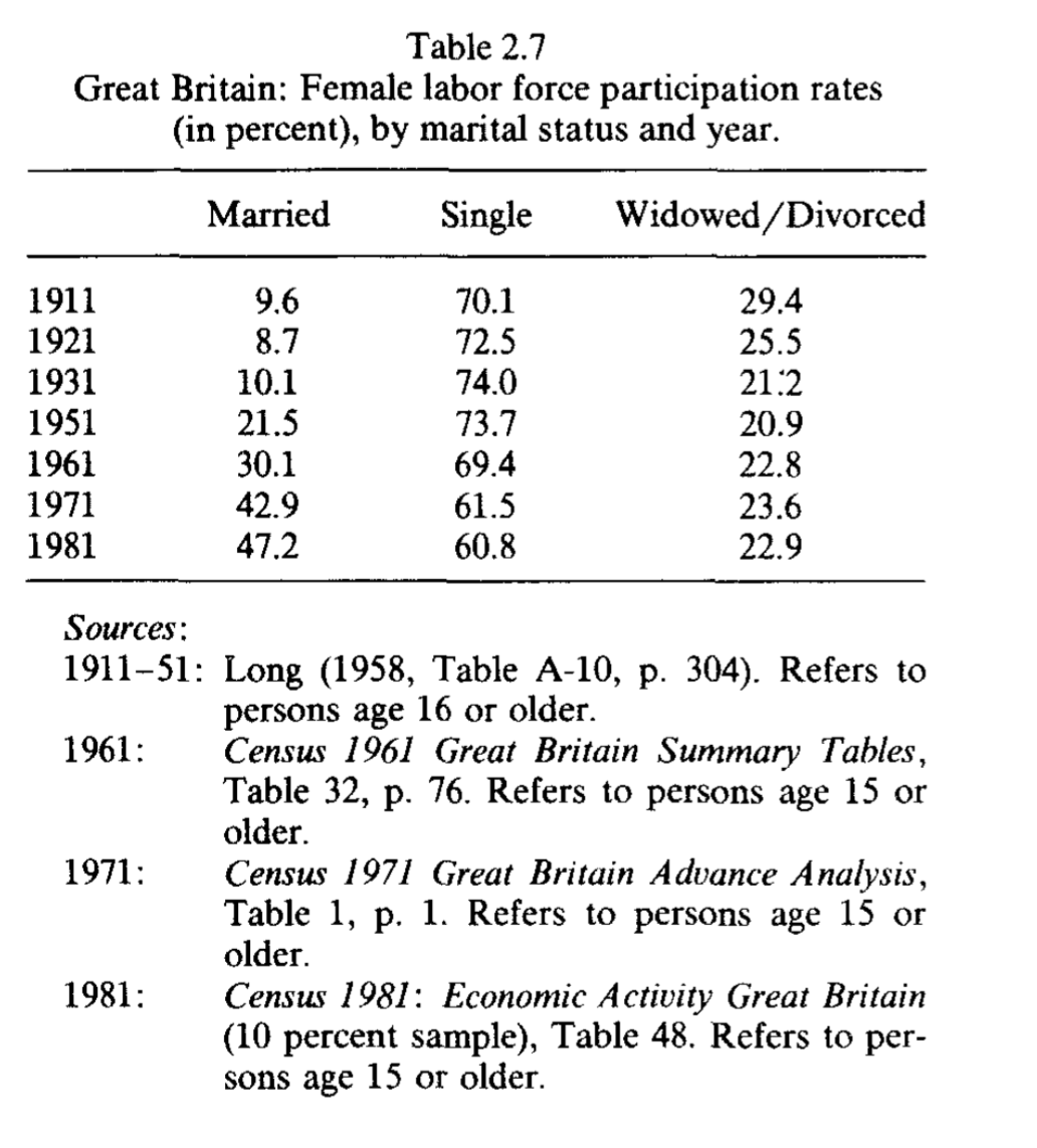
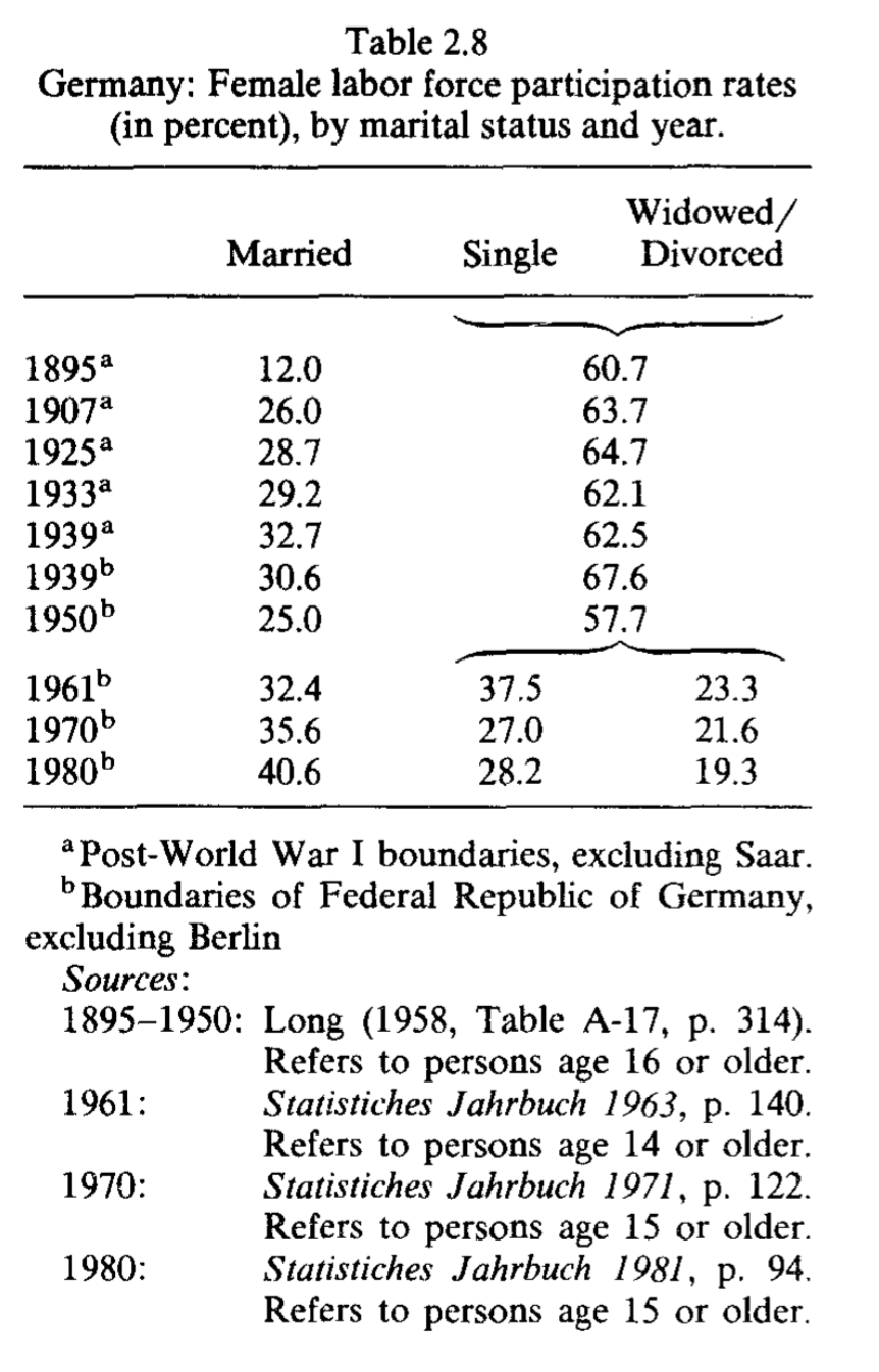
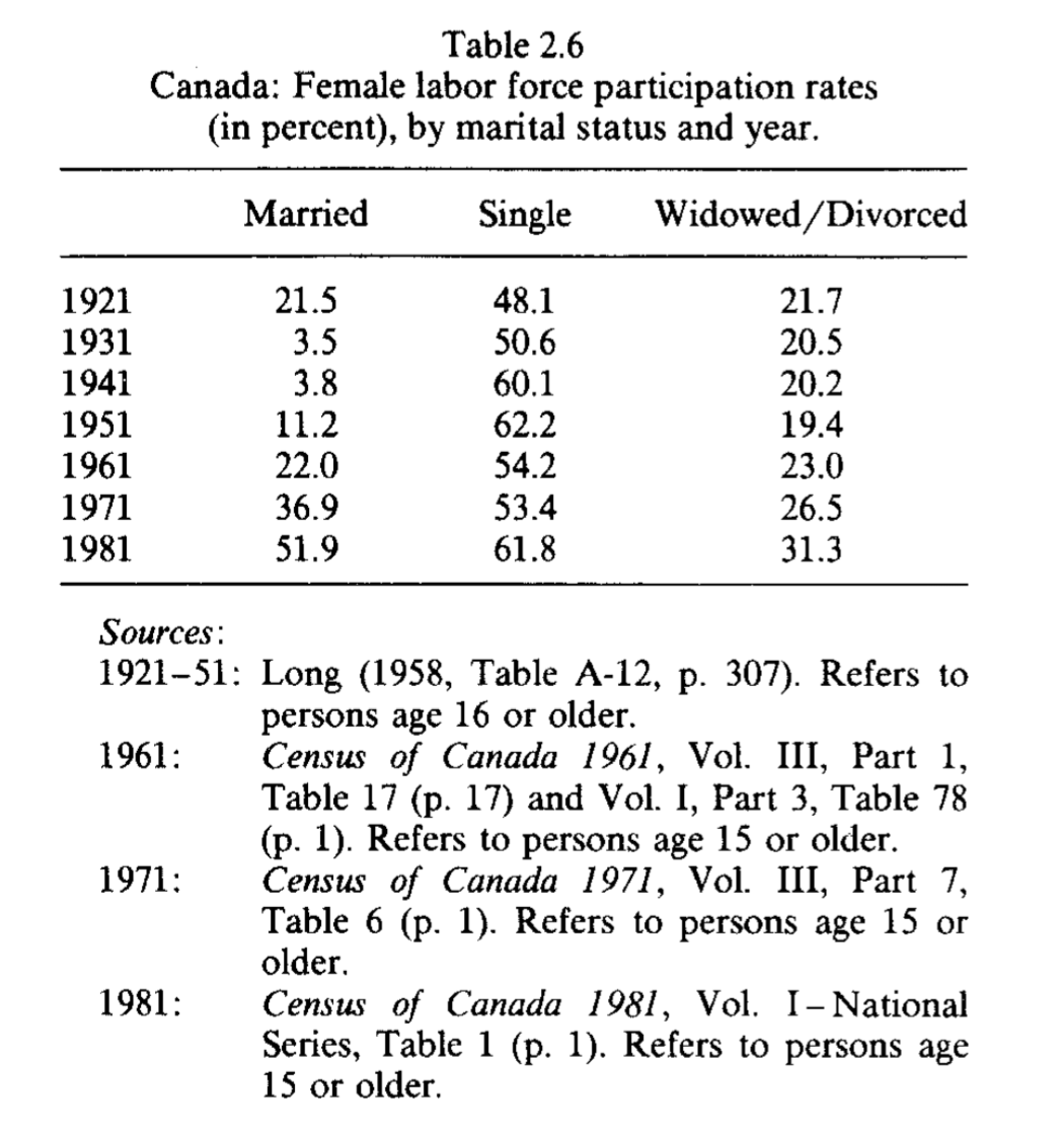
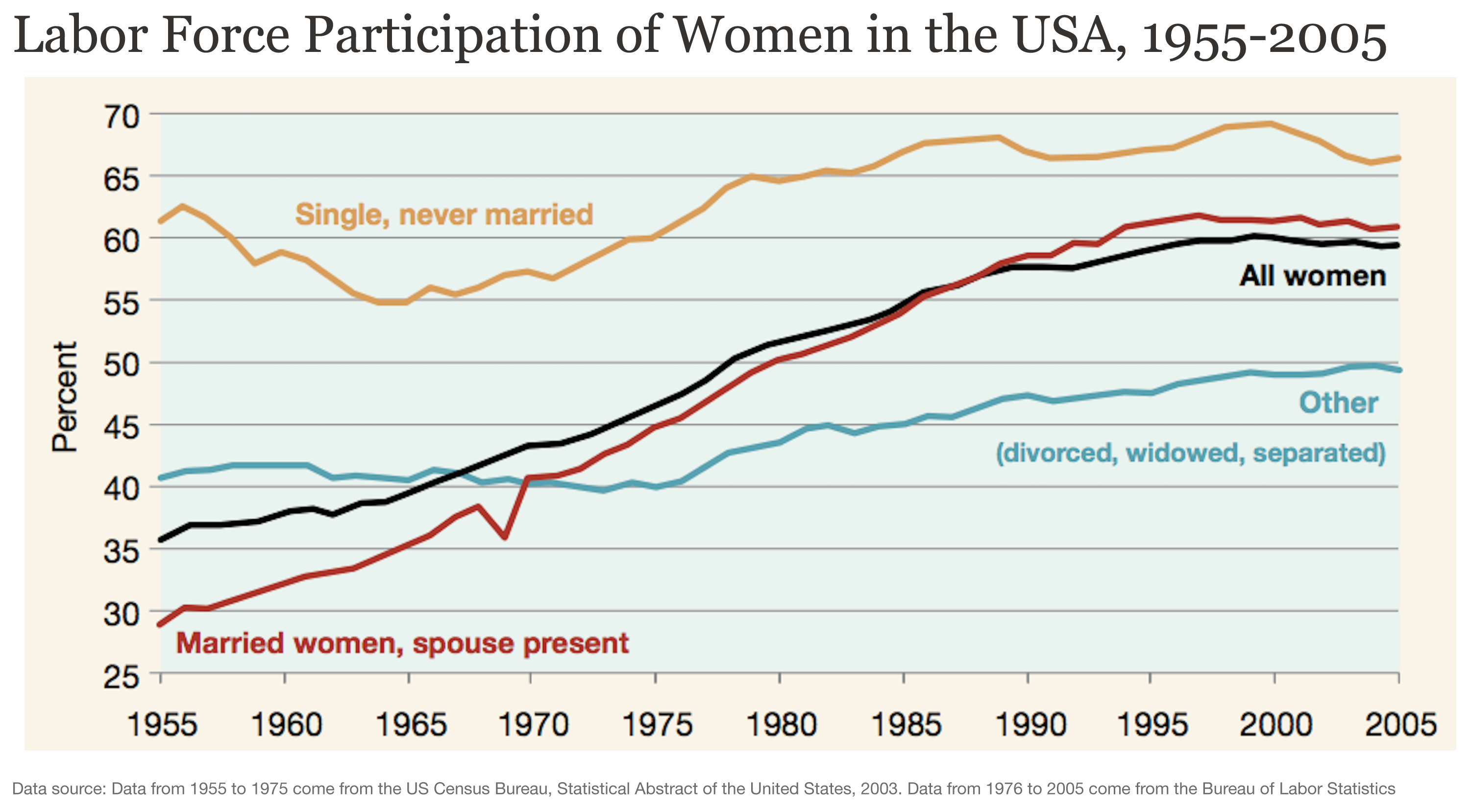
Married women drove the increase in female labor force participation in rich countries
What do we know about the characteristics of the women who drove this remarkable historical expansion of female labor force participation in rich countries? As it turns out, the evidence shows that most of the long-run rise in the participation of women in labor markets throughout the last century is attributable specifically to an increase in the participation of married women.
As an example, the chart here shows female labor force participation rates in the US, by marital status.3 As we can see, the marked upward trend observed for the general female population is mainly driven by the trend among married women. Heckman and Killingsworth (1986) provide evidence of similar historical trends for the UK, Germany, and Canada.4
Higher female labor force participation often went together with fewer worked hours
The charts above show that the rise in female labor force participation increased the supply of women’s labor. But participation is only one part of the labor supply. Another is the number of hours worked. Did this also change?
This is a relevant question since working hours for the general population decreased substantially in rich countries as they increased their productivity throughout the 20th century.
The chart here provides some clues. It shows average weekly hours worked by women in a selection of OECD countries over several decades. In most countries, average weekly hours fell over time, which is consistent with the trends for the population as a whole.
However, some of these trends are still remarkable if we take into account the substantial increase in female participation taking place at the same time.
This is an important pattern: as more women in rich countries entered the labor force, there was often a reduction in the average number of hours that women spent at work.

The available evidence shows that overall, the increase in participation was much larger than the reduction in the hours worked per woman. As a result, in these countries, there was an increase in the sum of female worker hours — that is, the total yearly hours worked by women increased.5
Female labor force participation worldwide is higher today than several decades ago
Looking at the more recent past and countries around the world, we see that the female labor force participation rate is higher today than it was several decades ago. This is true in the majority of countries, across income levels.
The chart below shows this, comparing national estimates of female participation rates in 1980 and 2024.6
Most countries have seen increases in female labor force participation rates in this period. In some cases, such as in the United Arab Emirates, participation more than tripled over the period.

What does this imply at the global level? The answer is not immediately obvious, since some countries have missing data, and global trends can be particularly sensitive to changes in large countries, such as India.
Using the International Labour Organization’s modeled estimates, which are harmonized and use statistical assumptions to impute data when it is missing, we can see that since the early 1990s, women’s labor force participation has stayed around 50%. Over the same period, men’s participation has been falling gradually, from 80% in 1990 to around 73% in more recent years. So the gender gap in participation has narrowed over the past generation.
An important point to note is that the global figures are for people aged 15 and over. This means that these aggregate trends can mask differences across population sub-groups (e.g., young women, married women, older women above retirement age, etc.). We discuss this in more detail below.
The global expansion of female labor supply has come with an increase in the average age of women in the labor force
The next chart shows the age distribution of women who are economically active — that is, employed and unemployed — worldwide.
As we can see, today the number of women in the global labor force who are younger than 25 is slightly lower than it was in 2000. However, the total global female labor force grew by almost 40% over the same period.
This shows that the global expansion of the female labor supply has come with an increase in the average age of women in the labor force.

In many rich countries, there has been a steeper increase in the age of women in the labor force, partly because participation among younger women has actually gone down.
What does women’s labor force participation look like?
Types of labor force participation
We have said that labor force participation is defined as being “economically active”. But what does that actually mean? Being able to answer this question is crucial to understanding changes in female participation, since women typically invest time in productive activities that do not count as “market labor supply”.
From a conceptual point of view, people who are economically active are either employed or unemployed. The employed include anyone who works, even part-time, or for at least 1 hour during the survey reference period (usually a week). The unemployed include anyone who doesn’t have a job but is actively looking for one, even if it is the first time. People who don’t have a job and are not looking for one — for example, students — are not economically active; they are outside the labor force.
In the guidelines stipulated by the ILO, employment also includes self-employment. In principle, the labor force therefore includes anyone who supplies labor for the production of economic goods and services, independently of whether they do so for pay, profit, or family gain.7 The ILO shows an overview of what counts and what doesn’t towards producing “economic goods and services”.8
Not all productive activities are counted. Loosely speaking, the guidelines stipulate that unpaid activities should be excluded if they relate to services produced and consumed within the household.9 This means excluding unpaid domestic work on tasks such as "Preparation and serving of meals"; "Care, training and instruction of children"; or "Cleaning, decorating and maintenance of the dwelling". As a result, even if the guidelines are closely followed to include all possible forms of economic activities, many forms of unpaid domestic and care work, disproportionately performed by women, are not counted as labor force participation.10
These exclusions are even more salient when we consider that, in practice, actual measurements often deviate from the guidelines. In many countries with limited capacity to produce national statistics, labor force participation is measured from population censuses, rather than from labor force surveys that are especially designed for that purpose.11 As a result, some individuals who meet the conceptual definition of employment may not be fully captured in official statistics.
Given all of this, it is natural to wonder if the “key facts” would look different if we used alternative definitions of labor supply. Let's try to break down the figures to understand any relevant differences between “labor supply” and other notions of “work”.
Formal employment
The first and most obvious line splitting the economically active population in a country is employment.
The chart here plots female employment rates across the world (national estimates before ILO corrections). These figures show the number of employed women as a share of the total female working-age population (in both cases, for women ages 15 or older).

To emphasize, here we are leaving aside unemployment, and we are focusing on trends for employed women engaged in work, who are, by definition, a subset of the whole economically active population.
As we can see, the trends are consistent with those for labor force participation: In the period 1980-2024, the majority of countries saw an increase in the share of women who are employed. This is what we would expect — it means that by and large, the participation of women in the labor market was driven by a rise in employment, rather than unemployment.

Informal work
Let us turn now to informal employment. The ILO guidelines stipulate that in official statistics, total employment includes both formal and informal jobs. Informality, therefore, cuts across the employed population, rather than being a separate category outside the labor force.12
Informality refers to the job, not the worker. In general, informal jobs lack formal arrangements, either in law or in practice.13
In practice, however, informal employment is not always reflected in labor statistics because it is difficult to measure. As a result, studying economically active women in informal work remains a challenge. Nevertheless, some progress has been made on this front, and today many countries report figures for some forms of informal employment, mainly those relating to paid work in non-agricultural economic activities.14
The chart below shows that a large share of women’s employment takes place in informal jobs. In many low- and middle-income countries, more than half of employed women are informally employed — and in some cases, the share exceeds 90%.

In another chart, you can see how the figures for women compare to those for men. The data shows that in the majority of countries, women are more likely than men to work in informal jobs. This gender gap may be even larger if we focus on agriculture, where informality is often more common. This is important because national sources of protection and support — as well as legal and policy frameworks — tend to favor formal workers.15
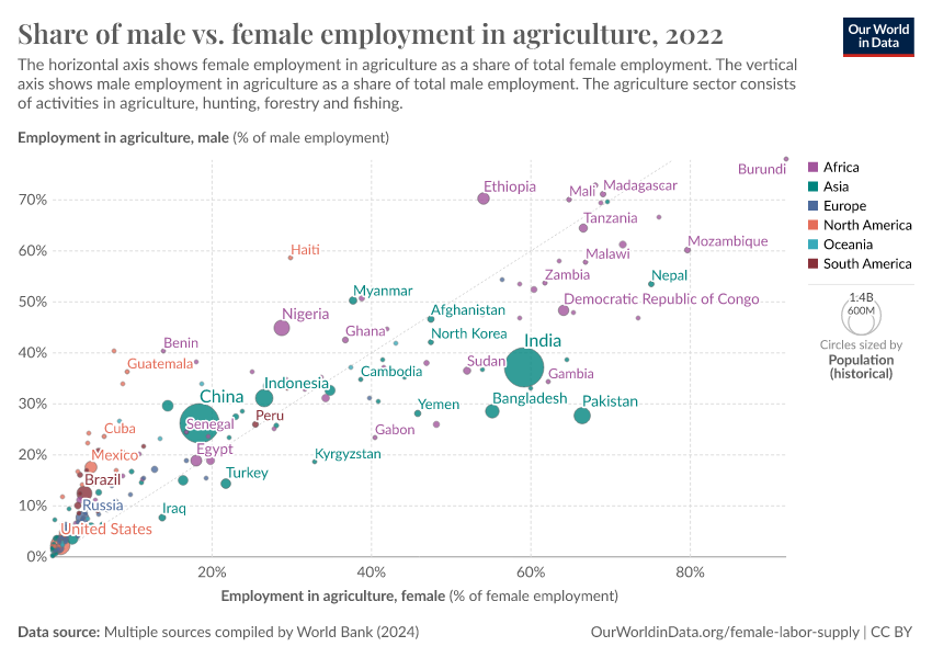
Employment by economic sector
The following chart plots the share of women in different economic sectors, country by country. That is, the share of employed women working in agriculture, industry, and services.

This shows how women’s employment is distributed across sectors. In many countries, most women work in services, while smaller shares work in industry or agriculture. You can add and remove countries to see how this varies around the world.
To look at “occupational segregation” more directly — that is, to see that women tend to be disproportionately concentrated in certain types of jobs — we can look at this other chart below.
In most countries, men are more likely to work in industry than women (most countries lie above the diagonal line). And women tend to work more often than men in services, and the picture is more mixed in agriculture. This also has important consequences for pay differences between men and women.
The pattern for services is also interesting because it shows important regional differences: In many low-income countries where the service sector is small in relative terms (i.e. countries in the bottom left, where both male and female employment in services is low), the pattern is reversed, and men tend to work more often in services than women. India is an important case in point.

Unemployment
The next scatter plot looks at unemployment and compares rates for men with those for women. As we can see, in most countries, unemployment rates are higher for women than for men.
But the difference in unemployment rates depends on the country's overall unemployment rate: on the left-hand side of the chart, we can see that most countries lie close to the diagonal line marking gender parity. This means that in countries with generally low unemployment rates, the gender differences in unemployment are not very large.
On the right-hand side of the chart, most countries lie significantly above the diagonal line — so in countries where unemployment is more common, women tend to be disproportionately affected.

The map shows unemployment rates for women across the world. As we can see, the highest female unemployment rates are concentrated in North Africa and the Middle East, and correspond to the countries where female labor force participation is also low.

Closely related to this, surveys show that in many countries with low female labor force participation, people think that when jobs are scarce, men should have more rights to a job than women.
Unpaid work
Let us now have a look at unpaid work. Unpaid domestic and care work is an important activity on which women tend to spend a significant amount of time — and, as noted above, it is an activity that is typically not counted in labor force statistics.
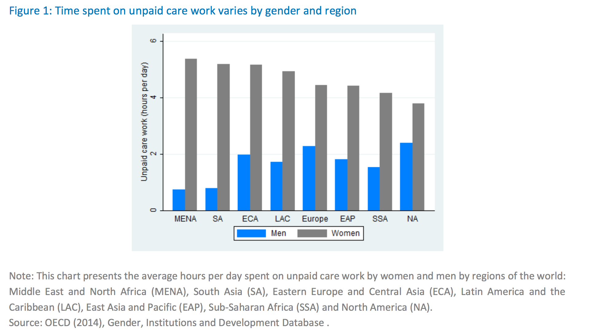
The chart below shows just how skewed the gender distribution of unpaid care work in the household is. It shows how much time men and women spend on unpaid services provided within the household, including care of persons, housework, and voluntary community work.
As we can see, gender differences in unpaid care work cut across societies: all over the world, women spend more time than men on these activities.
But the size of the gap varies considerably. In some countries, women spend more than six times as much time as men on unpaid work at home. In others, women spend twice as much time as men on these activities.

This other chart breaks the data down by rural and urban areas in each country. In Brazil, for example, in 2022, women in both rural and urban areas spent about three hours of the day on unpaid care and domestic work. Meanwhile, men spent roughly one and a half hours.
Another chart provides a sense of perspective on the levels by regions. In the MENA region, where the gap tends to be largest, women spend on average over 5 hours on unpaid care work per day, while men spend less than one hour.16
What affects women’s labor force participation?
In order to understand changing female labor force participation, it is important to first conceptualize the overarching context within which various factors operate. For women to be able to participate in the labor market, they have to have the time and opportunity to do so. This means that we can only fully analyze labor force participation if we understand time allocation more generally.
In the case of female labor supply in particular, time allocation is crucially affected by the fact that women all over the world tend to spend a substantial amount of time on activities such as unpaid care work, which fall outside of the traditional economic production boundary. In other words, women may spend many hours working without being counted as “economically active” in labor force statistics.

Around the world, women spend more time on unpaid care work than men. In countries with available data, women spend between three and six hours on unpaid care work per day, while men spend between half an hour and three hours. If we consider the sum of paid and unpaid work, women tend to work more than men in total.
It is therefore not surprising that the factors driving change in female labor supply — whether they are improvements in maternal health, reductions in the number of children, childcare provision, or gains in household technology — all affect unpaid care work. Because time allocation is gendered in this way, female participation in labor markets tends to increase when the time cost of unpaid care work is reduced, shared equally with men, and/or made more compatible with market work.
Crucially, this analysis is not intended to diminish the importance of unpaid care work. On the contrary, such work is fundamental to — rather than separate from — economic activity and wellbeing, and the fact that it is omitted from national accounts is a point of debate.17
With this said, an obvious question remains: why do women perform a disproportionate amount of unpaid care work in the first place? As we discuss below, although time use should be a choice, evidence shows that social norms play a large part in determining gender roles and, consequently, gendered time use.
Keeping this context in mind, let's have a look at the evidence behind the “drivers” of rising female labor force participation.
Maternal health
The various aspects related to maternity — pregnancy, childbirth, and the period shortly after childbirth — impose a substantial burden on women's health and time. This, in turn, can have a significant impact on women's ability to participate in the labor force.
Before 1930, maternal mortality was the second biggest cause of death for American women in their childbearing years, claiming 850 deaths for every 100,000 live births in 1900. And for each such death, 20 times as many mothers experienced pregnancy-related health conditions, which often included long-lasting or chronic disability.18 While maternal mortality has dropped to around 10 deaths per 100,000 births across most rich countries, it is still comparatively high in poorer countries. In Africa, for example, there were 464 maternal deaths per 100,000 live births in 2020. To read more about maternal health, see our topic page on Maternal Mortality.
Researchers Albanesi and Olivetti (2016) consider how improvements in maternal health between 1930 and 1960 contributed to rising female labor force participation in the US during that time period.18 Their approach is based on a calibrated macroeconomic model of household behavior. In other words, the authors incorporate numerical measures of medical progress into a quantitative model to assess the role of improving maternal health in accounting for the rise in labor force participation of married women in the US.
To measure “medical progress”, Albanesi and Olivetti draw on historical data and use it to estimate the burden of maternal conditions using the concept of “disability-adjusted life years”, or DALYs (you can find more details about this concept in our topic page on Burden of Disease). Their estimates suggest that the time lost to disabilities associated with maternal conditions declined from 2.31 years per pregnancy in 1920 to 0.17 in 1960. According to their model, the historical decline in the burden of maternal conditions and the introduction of infant formula can account for approximately 50 percent of the increase in married women’s labor force participation between 1930 and 1960 in the US.
The chart here plots US maternal mortality and female labor force participation as an index to their respective values in 1900 (thus 1900 = 100). As we can see, the correlation is stark: maternal mortality declined steeply between 1930 and 1960, while female labor force participation rose rapidly. Alternatively, you can see the data in a connected scatterplot.
The number of children per woman
On average, mothers around the world continue to spend more time on childcare than fathers. Because of this, fewer children per woman — lower fertility rates — can theoretically free up women's time and contribute to an increase in female labor force participation.
The chart here shows women’s fertility rate and female labor force participation across the world. Most countries are in the upper-left quadrant — that is, in most countries female labor force participation is high while fertility is low.

However, correlation is not the same as causation: a woman's choice to have fewer children might be influenced by the rising female labor force participation itself or other factors driving it. Instead, causal evidence can be found in studies that have identified exogenous — in other words, externally caused — changes in family size and measured their impact on labor market outcomes.
Some such studies provide evidence from twins, as conceiving twins can be seen as an unexpected increase in fertility.19 Other studies have considered women who sought medical help in achieving pregnancy. In those cases, fertility treatments create a “control group” of women who were unable to become pregnant and a “treatment group” of those who were able to get pregnant.20 And yet other studies have used country-level policies, such as abortion legislation, as an exogenous source of variation in fertility. When available, abortion can be seen as a way to avoid unwanted childbirth, and researchers argue that the timing of policy shifts making abortion legal and available is exogenous.21
In these studies, researchers find strong evidence of a causal link between higher fertility rates and lower labor market participation. In the most recent of the studies, Lundborg, Plug and Rasmussen (2017)22 find that women who are successfully treated by in vitro fertilization (IVF) in Denmark earn persistently less because of having children. This decline in annual earnings is explained by the fact that women tend to work less when their children are young and, in turn, get paid less when their children are older.
But of course, while “exogenous variation” in the number of children per woman is an important way to establish causality, what actually matters is how women's control over their reproductive choices affects labor market outcomes. In their widely cited 2002 paper, "The Power of the Pill: Oral Contraceptives and Women's Career and Marriage Decisions", Goldin and Katz (2002) examine the behavioral effect of increasing women's control over their fertility.23 Their research shows how the diffusion of the birth control pill in the US during the late 1960s contributed to changing women's career and marriage choices by eliminating the risk of pregnancy, encouraging career investment, and "enabling young men and women to put off marriage while not having to put off sex."
Childcare and other family-oriented policies
The fact that falling fertility rates lead to higher labor force participation for women is certainly important from an empirical point of view. But it is obviously contradictory to promote female agency while suggesting women should have fewer children.
So it is helpful to consider other factors that make employment compatible with childbearing and thus broaden the choices available to women. Let's begin with childcare, parental leave, and other family-oriented policies.
While the years after World War II saw a rise in women’s labor force participation across many countries, growth in participation began at different points in time and proceeded at different rates in each country. In 2024, for example, Sweden’s female labor force participation rate was 62%, while it was 56% in Germany and only 41% in Italy. Researchers comparing broad policy configurations argue that the different types of welfare states that emerged in rich countries after World War II have contributed to these differences.24
Social democratic policies, such as those seen in Sweden, for example, are characterized by subsidized childcare, paid parental leave that is designed to encourage both mothers and fathers to participate in childcare, and support for full employment. Liberal welfare states, on the other hand, take a more hands-off approach to social policy — one prominent example is the US’s maternity leave.
In the chart here, we show that female employment, measured as the employment rates for women 15+, tends to be higher in countries with higher levels of public spending on family benefits (i.e. child-related cash transfers to families with children, public spending on services for families with children, and financial support for families provided through the tax system, including tax exemptions).

While the pattern seen in this chart is only a correlation, evidence suggests that this relationship is, in fact, causal. There is evidence that improving childcare availability increases women’s labor supply.25 A natural experiment from Canada, for example, provides compelling proof that childcare support can have a positive effect on the labor force participation rate of mothers with young children. In 1997, the provincial government of Quebec introduced a generous subsidy for childcare services, effectively imposing an exogenous reduction in childcare prices. Researchers Lefebvre and Merrigan (2008) found that this policy had substantial labor supply effects on the mothers of preschool children, both among well-educated and less well-educated mothers.26 In 2002, the policy increased the participation rate of mothers (with at least one child aged 1-5 years) by 8 percentage points, and their hours worked increased by 231 per year.
Labor-saving consumer durables
In 1890, only 24% of US households had running water. In 1900, 98% of households in the US washed their clothes using a scrubboard and water heated on a wood or coal-burning stove. It is not hard to see then why in 1900, the average American household spent 58 hours per week on housework. By 1975, that figure had declined to 18. Progress in labor-saving consumer durables in the household has thus been another factor contributing to the rise in female labor force participation, especially in early-industrialized countries. Of course, this is feasible especially because women — both in 1900 and now — take on a disproportionate amount of unpaid domestic work.
Greenwood et al. (2005) present evidence for this by calibrating a quantitative economic model to show that the consumer goods revolution — which, as we can see in the chart here, introduced washing machines, vacuum cleaners, and other time-saving products — can help explain the rise in married female labor force participation in the US.27
It is important to know, however, that these improvements have not yet reached all households around the world. Hundreds of millions of people are still without access to improved water sources. A recent study by Graham, Hirai, and Kim (2016) looked at water collection in Sub-Saharan Africa — where it is estimated that more than two-thirds of the population must leave their home to collect water — and found that this time-consuming and physically grueling chore falls primarily to women.28
Social and cultural factors
Some argue that there is a "natural" distribution of gender roles, with women being better suited to domestic and child-rearing responsibilities and men to working outside of the home. Such assertions lack compelling evidence and, more importantly, perpetuate a status quo that limits the choices available to both men and women.29 Instead, it is known that social norms and culture influence the way we see the world and our role in it. To this end, there is little doubt that the gender roles assigned to men and women are in no small part socially constructed.30
To determine when and how existing gender norms first gained a foothold, researchers have attempted to connect historical evidence to modern norms and opinions.31 For example, Alesina, Giuliano and Nunn (2013) contribute to the explanation of existing cross-cultural beliefs and values about the appropriate role of women in society by looking at the division of labor in the distant past.32 They test the hypothesis that historically, societies that adopted plow-based agriculture, which required "significant upper body strength", gave men an advantage relative to women in a crucial aspect of production. They contrast such societies to those that employed 'shifting cultivation', which uses hand-held tools like the hoe, and in which women participated actively.
Their findings suggest that the division of labor that arose around plow use generated persistent cultural norms about the appropriate role of women in society, which norms have continued to exist at an individual level beyond agrarian economies and under different institutional structures. By comparing pre-industrial ethnographic data with contemporary measures of individuals’ views on gender roles across countries, ethnic groups, and individuals, they show that historical plow use has a positive statistical relationship with unequal gender roles today.
Another study published in the journal Science by Dyble et al. (2015), goes even further back in time, arguing that hyper cooperation among hunter-gatherers — an important characteristic that may serve to evolutionarily differentiate modern humans from our ancestors — was enabled by sex egalitarianism.33 The study uses agent-based modeling to suggest that wealth and sex inequalities began to emerge when "heritable resources, such as land and livestock, became important determinants of reproductive success."
And while it is possible that socially-assigned gender roles emerged in the distant past, our recent and even current practices show that these roles persist with the help of institutional enforcement. Goldin (1988), for instance, examines past prohibitions against the training and employment of married women in the US.34 She touches on some well-known restrictions, such as those against the training and employment of women as doctors and lawyers, before focusing on the lesser known but even more impactful "marriage bars" that arose in the late 1800s and early 1900s. These work prohibitions are important because they applied to teaching and clerical jobs — occupations that would become the most commonly held among married women after 1950. Around the time the US entered World War II, it is estimated that 87% of all school boards would not hire a married woman and 70% would not retain an unmarried woman who married.
Where are there restrictions on the jobs women are allowed to have?
The map here shows that to this day, legal barriers to female labor force participation exist in parts of the world. The data in this map provides a measure of whether there are any specific jobs that women are not allowed to perform. So, for example, a country might be coded as "No" if women are only allowed to work in certain jobs within the mining industry, such as health care professionals within mines, but not as miners.

But even after explicit barriers are lifted and legal protections put in their place, discrimination and bias can persist in less overt ways. Goldin and Rouse (1997), for example, look at the adoption of "blind" auditions by orchestras, and show that by using a screen to conceal the identity of a candidate, impartial hiring practices increased the number of women in orchestras by 25% between 1970 and 1996.35
Public opinion about working women
In fact, discrimination and biases operate in many other ways, permeating all spheres of life. As the chart here shows, at the end of World War II, only 18% of people in the US thought that a wife should work if her husband was able to support her. Indeed, it is not surprising that around this time, female labor supply in market activities was low, and demand-side barriers were high. As this chart shows, female labor supply started increasing in the US alongside changing social norms: people's approval of married women working went up during a period of remarkable growth in female labor force participation and then flattened at around the same time that participation stalled. For more details on this, see Fortin (2015) and Goldin and Katz (2016).36

Social norms and culture are clearly important determinants of female labor force participation. So how can social norms be changed? Research in this area shows that social norms and culture can be influenced in a number of non-institutional ways, including through intergenerational learning processes, exposure to alternative norms, and activism such as that which propelled the women's movement.37
Structural changes in the economy
Having now discussed the various determinants affecting women's labor force participation in the context of socially assigned gender roles, we turn to the larger picture. How do these pieces factor into a global landscape of varied income levels and changing economic conditions?
In low-income countries, where the agricultural sector is particularly important for the national economy, we see that women are heavily involved in production, primarily as family workers. Under such circumstances, productive and reproductive work is not strictly delineated and can be more easily reconciled. With technological change and market expansion, however, work becomes more capital-intensive and is often physically separated from the home. In middle-income countries, there is an observed social stigma attached to married women working and "women’s work is often implicitly bought by the family, and women retreat into the home, although their hours of work may not materially change."38
With sustained development, women make educational gains and the value of their time in the market increases alongside the demand-side pull from growing service industries. This means that in high-income countries, the rise in female labor force participation is characterized by women gaining the option of moving into paid, often white-collar work, while the opportunity cost of exiting the workforce for childcare rises.39
The chart here shows some evidence of this pattern. As we can see, female labor force participation is highest in some of the poorest and richest countries in the world, while it is lowest in countries with incomes somewhere in between. In other words: in a cross-section, the relationship between female participation rates and GDP per capita follows a U-shape.
Given that informal employment is harder to capture in labor statistics, the chart here offers only partial evidence of the mechanisms described above. However, multiple studies have found support for a U-shaped female labor supply function, both within and across countries over the course of development.40
Featured Data on Women's Employment
Economic Inequality by Gender
How big are the inequalities in pay, jobs, and wealth between men and women? What causes these differences?
Women’s Rights
How has the protection of women’s rights changed over time? How does it differ across countries? Explore global data and research on women’s rights.
Work and Employment
See all our data, visualizations, and writing on work and employment.
Endnotes
Comparable historical estimates showing a breakdown of participation rates by age groups show that this increase took place across almost all individual age groups (see, for example, Heckman J. and Killingsworth M. (1986) Female Labor Supply: A Survey. in Handbook of Labor Economics, Volume I, Edited by O. Ashenfelter and R. Layard)
The recent decline in female labor force participation in the US has received attention in a number of recent academic studies. Importantly, Goldin & Katz (2016) show that the overall trend of decreasing female participation in the US masks important cohort trends. In particular, they show that a large share of American women are working much longer today than previous generations — well into their 60s and 70s — and working full-time.
Engemann, K. M., & Owyang, M. T. (2006). Social changes lead married women into labor force. The Regional Economist, (Apr), 10-11.
Heckman J. and Killingsworth M. (1986) Female Labor Supply: A Survey. in Handbook of Labor Economics, Volume I, Edited by O. Ashenfelter and R. Layard)
Another way of saying this is that the reduction in hours worked per female worker did not offset the strong effect of the increase in the number of female workers. But a technical note regarding “cohort” vs “period” effects is relevant here. The issue is that the decline in weekly hours worked may be at least partly a consequence of the addition of "low-hours" women within each cohort, rather than a reduction of hours worked across cohorts. This may well be the case, since a large part of the increase in participation was driven by new part-time employment opportunities (e.g., because of greater availability of jobs with flexible hours). Heckman and Killingsworth (1986) provide evidence suggesting that successive cohorts of women in rich countries generally did supply steadily increasing amounts of labor throughout most of the 20th century — and this is true for various definitions of "labor supply", including participation in the labor force, employment and “total work per capita” (i.e. the product of the employment rate and weekly hours worked by working women).
Shown are the ILO's national, or “non-modeled” estimates, which have a higher margin of error but are available for a longer period. Whenever a country has missing data for 1980 or the most recent year, the closest year with available data is shown (within a 5-year window). For reference, this other chart plots the same dataset, but only for countries with observations in 1980 and the most recent year.
Employment is defined according to international standards, which we explain in “How do international standards make labor data more comparable?”.
The classification follows the standards set in the 2008 System of National Accounts. The linked chart is from Castillo M. (2011). Labour Force Framework: Concepts Definitions, Issues and Classifications. ILO Department of Statistics – Geneva.
Interestingly, note that activities are not excluded on the grounds that they are illegal or registered with public authorities.
It is important to note that unpaid work is not the same as informal work. The ILO standards do recommend including informal workers (both paid and unpaid) under the economically active population. In practice, however, data collection typically focuses on paid informal employment, mainly outside agriculture. This means that labor force statistics often do include self-employed workers in their own informal enterprises (e.g., street food vendors), as well as persons in informal employment relationships in formal enterprises (e.g., workers hired by formal enterprises without a formal contract). But they often fail to include unpaid work on activities such as subsistence farming.
The ILO “modeled estimates" aim to improve comparability by harmonizing the national estimates across countries and over time and accounting for differences in data source, scope of coverage, methodology, and other country-specific factors. The modeled estimates are based mainly on nationally representative labor force surveys, with other sources (population censuses and nationally reported estimates) used only when no survey data are available. You can read more on the Work and Employment page.
You can read more about the definitions of informal work in our Work and Employment page.
These jobs are often not covered by labor laws, social security, or worker protections such as sick pay and annual leave, and may lack written contracts.
You can read more about measurement and definitions of informal employment in the ILO report "Women and Men in the Informal Economy: A Statistical Picture".
Formal workers are favored through, for example: sectoral policies, infrastructure services, social protection, childcare, occupational safety systems, and institutions for collective bargaining. See WIEGO (Women in Informal Employment: Globalizing and Organizing).
OECD (2014) Unpaid Care Work: The missing link in the analysis of gender gaps in labour outcomes.
The 2009 Stiglitz-Sen-Fitoussi Commission on the Measurement of Economic Performance And Social Progress puts it this way: "There have been large changes in the functioning of households and the society. For example, many of the services that people received from their family in the past are now purchased on the market. This shift translates into a rise of income, as measured in the national account, and this may give a false impression of a change in living standards, while it only reflects a shift from non-market to market provision of services. A shift from private to public provision of a particular product should not affect measured output. By the same token, a shift of production from market to household production or vice versa, should not affect measured output. In practice, this invariance principle is not assured by current conventions on the measurement of household services." (Pg. 125, available here).
Albanesi, S., & Olivetti, C. (2016). Gender roles and medical progress. Journal of Political Economy, 124(3), 650-695.
See Rosenzweig, M. R., & Wolpin, K. I. (1980). Testing the quantity-quality fertility model: The use of twins as a natural experiment. Econometrica: journal of the Econometric Society, 227-240
Lundborg, P., Plug, E., & Rasmussen, A. W. (2017). Can Women Have Children and a Career? IV Evidence from IVF Treatments. American Economic Review, 107(6), 1611-1637. And Cristia, J. P. (2008). The effect of a first child on female labor supply evidence from women seeking fertility services. Journal of Human Resources, 43(3), 487-510.
Bloom, D. E., Canning, D., Fink, G., & Finlay, J. E. (2009). Fertility, female labor force participation, and the demographic dividend. Journal of Economic Growth, 14(2), 79-101.
Lundborg, P., Plug, E., & Rasmussen, A. W. (2017). Can Women Have Children and a Career? IV Evidence from IVF Treatments. American Economic Review, 107(6), 1611-1637.
Goldin, C., & Katz, L. F. (2002). The power of the pill: Oral contraceptives and women’s career and marriage decisions. Journal of political Economy, 110(4), 730-770.
Pettit, B., & Hook, J. (2005). The structure of women's employment in comparative perspective. Social Forces, 84(2), 779-801., and
Kenjoh, E. (2005). New mothers’ employment and public policy in the UK, Germany, the Netherlands, Sweden, and Japan. Labour, 19(s1), 5-49.
Heath, R, A Bernhardt, G Borker, A Fitzpatrick, A Keats, M McKelway, A Menzel, T Molina, G Sharma, “Female Labour Force Participation” VoxDevLit, 11(2), October 2025.
Lefebvre, P., & Merrigan, P. (2008). Child-care policy and the labor supply of mothers with young children: A natural experiment from Canada. Journal of Labor Economics, 26(3), 519-548.
Greenwood, J., Seshadri, A., & Yorukoglu, M. (2005). Engines of liberation. The Review of Economic Studies, 72(1), 109-133.
Graham, J. P., Hirai, M., & Kim, S. S. (2016). An Analysis of water collection labor among women and children in 24 Sub-Saharan African countries. PloS one, 11(6), e0155981.
According to the authors, "among households spending more than 30 minutes collecting water, adult females were the primary collectors of water across all 24 countries, ranging from 46% in Liberia (17,412 households) to 90% in Cote d’Ivoire (224,808 households). Across all countries, female children were more likely to be responsible for water collection than male children (62% vs. 38%, respectively)."
That women are better suited to domestic and child-rearing responsibilities is an assumption often implicitly suggested even in recent academic work. For example, the 2014 book 'Economics of the Family' states in its introduction, "in discussing sex roles, economists often rely on the principle of comparative advantage. Thus a mother will spend more time with a child than with her husband if the ratio of her productivity at home relative to her market wage exceeds that of the father."
For an explanation of "gender" (rather than "sex"), see the World Health Organization. For an example of socially constructed gender, see Stobbe (2005), who provides a study of "machismo" in the Argentine auto components industry.
Giuliano (2017) provides a literature review of recent empirical research on such historical determinants of contemporary differences in gender roles across societies: Giuliano, P. (2017) Gender: An Historical Perspective. NBER.
Alesina, A., Giuliano, P., & Nunn, N. (2013). On the origins of gender roles: Women and the plough. The Quarterly Journal of Economics, 128(2), 469-530.
Dyble, M., et al. (2015). Sex equality can explain the unique social structure of hunter-gatherer bands. Science, 348(6236), 796-798.
Goldin, C. (1988). Marriage bars: Discrimination against married women workers, 1920's to 1950's.
Goldin, C., & Rouse, C. (1997). Orchestrating impartiality: The impact of" blind" auditions on female musicians. NBER.
Fortin, N. M. (2015). Gender role attitudes and women's labor market participation: opting-out, AIDS, and the persistent appeal of housewifery. Annals of Economics and Statistics/Annales d'Économie et de Statistique, (117/118), 379-401.
Goldin, C., & Katz, L. F. (2016). Women Working Longer: Facts and Some Explanations. NBER.
Regarding intergenerational transmission of gender roles, see Fernández, R. (2013). Cultural change as learning: The evolution of female labor force participation over a century. The American Economic Review, 103(1), 472-500.
Regarding “exposure to alternative norms”, see for example the work of Jensen and Oster (2009), which considers the introduction of cable TV to an Indian village and the resulting significant changes in gender attitudes.
For a discussion regarding social activism and its link to the other determinants mentioned above, see for example, Heer and Grossbard-Shechtman (1981).
Goldin, C. (1994). The U-shaped female labor force function in economic development and economic history. NBER.
It is important to note, however, that even in rich countries such as the US (where female labor force participation rose dramatically in the second half of the 20th century and women's college attendance exceeds men's), women continue to be overrepresented in low-wage jobs. It is under such circumstances that female childcare workers are paradoxically unable to afford childcare for their own children. For more details see Entmacher, J., et al. (2014). Underpaid and overloaded: Women in low-wage jobs. Washington, DC: National Women’s Law Center.
Ester Boserup's seminal book, Woman's Role in Economic Development (1970), was among the first to document that the process of economic development often affects women differently from men. (Boserup, E. 1970. Woman's Role In Economic Development. New York, NY: St. Martin's Press.
For a recent paper presenting the evidence, see Olivetti, C., & Ngai, R. (2015). Structural Transformation and the U-Shaped Female Labor Supply. In 2015 Meeting Papers (No. 1501). Society for Economic Dynamics.
Cite this work
Our articles and data visualizations rely on work from many different people and organizations. When citing this topic page, please also cite the underlying data sources. This topic page can be cited as:
Esteban Ortiz-Ospina, Bertha Rohenkohl, Pablo Arriagada, Sandra Tzvetkova, and Max Roser (2018) - “Women's Employment” Published online at OurWorldinData.org. Retrieved from: 'https://ourworldindata.org/female-labor-supply' [Online Resource]BibTeX citation
@article{owid-female-labor-supply,
    author = {Esteban Ortiz-Ospina and Bertha Rohenkohl and Pablo Arriagada and Sandra Tzvetkova and Max Roser},
    title = {Women's Employment},
    journal = {Our World in Data},
    year = {2018},
    note = {https://ourworldindata.org/female-labor-supply}
}
Reuse this work freely
All visualizations, data, and articles produced by Our World in Data are completely open access under the Creative Commons BY license. You have the permission to use, distribute, and reproduce these in any medium, provided the source and authors are credited.
The data produced by third parties and made available by Our World in Data is subject to the license terms from the original third-party authors. We will always indicate the original source of the data in our documentation, so you should always check the license of any such third-party data before use and redistribution.
All of our charts can be embedded in any site.