Cancer
Cancers are one of the leading causes of death globally. Are we making progress against them?
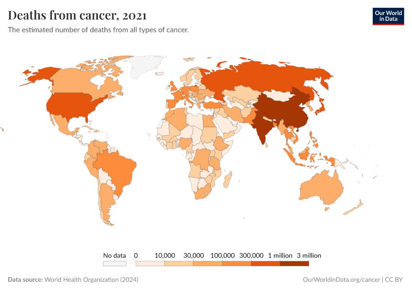
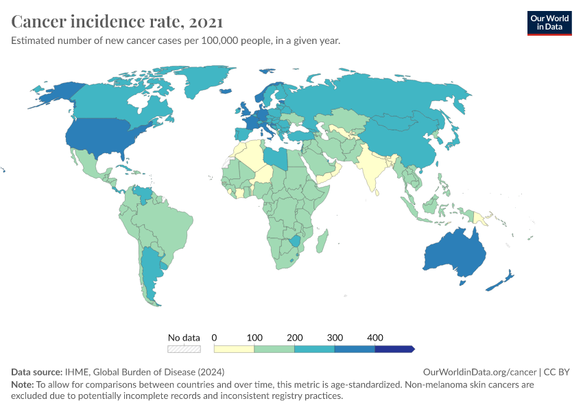
Cancer is one of the biggest health challenges worldwide. As of 2021, around 15% of all deaths were cancer deaths, making it one of the most common causes of death globally.
Cancers are a group of diseases in which abnormal cells multiply rapidly and can grow into tumors. They can develop in different parts of the body and, in some cases, spread to other organs through the blood and lymph systems.
As the global population grows larger and older, the number of cancer cases has also increased. However, the age-standardized death rate from cancer has declined over time in many countries — due to improvements in diagnosis, research, medical advances, and public health efforts, as well as reductions in risk factors such as smoking and some cancer-causing pathogens.
On this page, we explore global data and research on different types of cancer. This can help us better understand the risk factors for cancer, how cancer risks vary across the lifespan, how they differ worldwide, and how they have changed over time.
Research & Writing
Related topics
See all interactive charts on cancer ↓
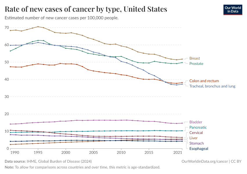
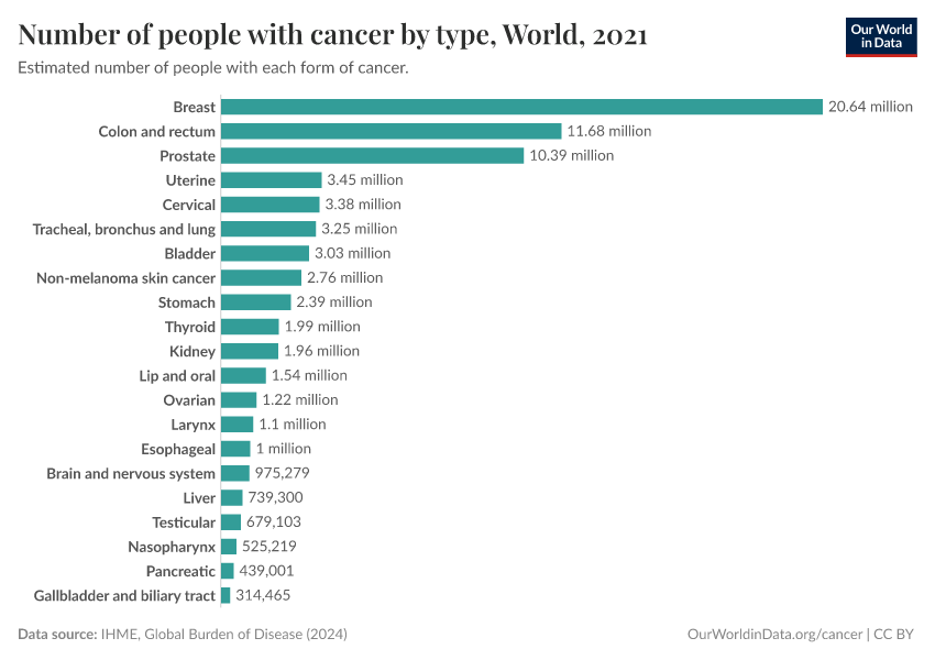
Lung, colorectal, stomach, and breast cancers are the leading cancer causes of death worldwide
The chart below shows the cancers with the highest death rates globally.
These estimates come from the Institute for Health Metrics and Evaluation (IHME), which uses data from vital registries, cancer registries, hospital records, and verbal autopsies and applies statistical modeling to make global estimates, including for countries where data is lacking.
As you can see, lung cancer has the highest death rate, followed by colorectal, stomach, and breast cancers.
The high death rate from lung cancer is primarily due to the impact of smoking.

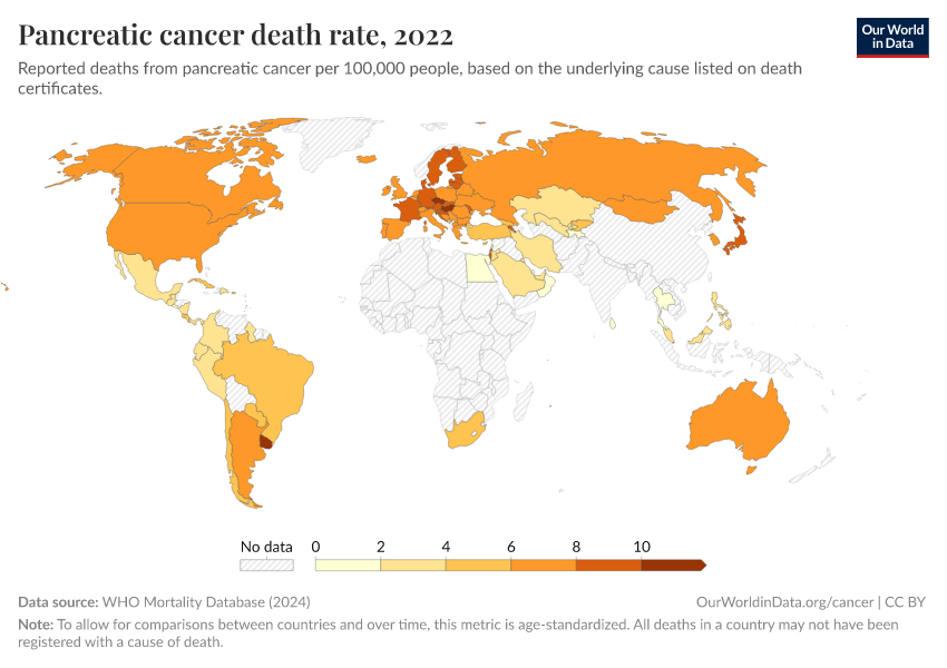
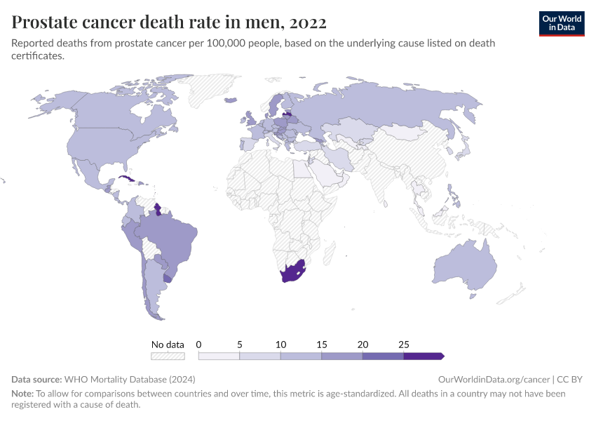
The two maps below show the leading cause of cancer deaths in men and women.
The data comes from the WHO Mortality Database, which presents reported data from the “underlying cause of death” listed on death certificates. These are filled in by health and legal professionals and collected by national vital registries. The dataset only includes countries that have sufficient death registration.
In men, you can see that lung cancer kills the most in many countries. Other cancers — such as prostate, liver, and stomach cancer — are the most common in others.
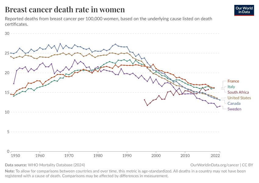
In women, the picture is different. Breast cancer is the most common cause of cancer death in women in many countries, but in others, lung, liver, and stomach cancer dominate.


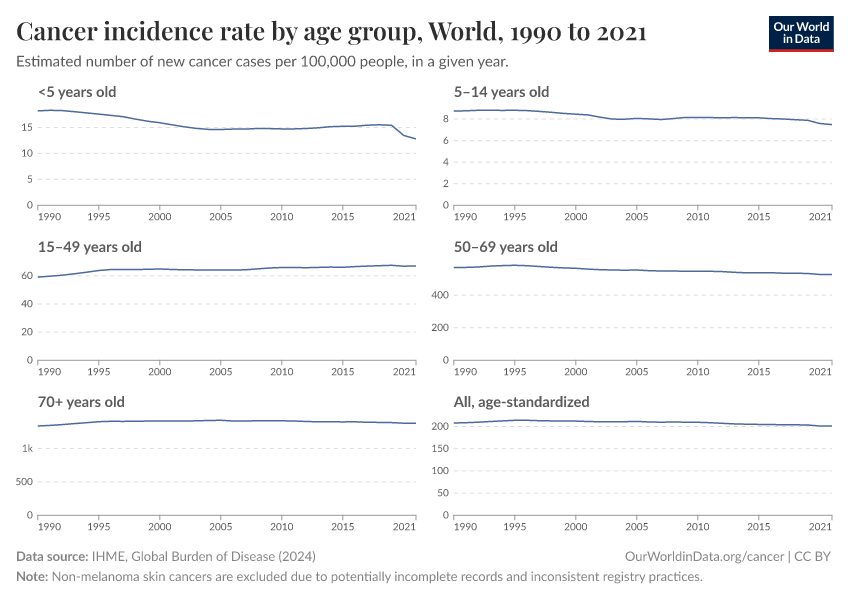
Cancer risks rise steeply with age
Cancer risks rise with age, so most cancer cases and deaths occur in older people.
The chart below presents death rates from cancers across ages in the United States. It is based on national data from the Centers for Disease Control and Prevention (CDC), using the “underlying cause of death” on death certificates between 2018 and 2022.
As you can see, cancer death rates are much higher at older ages.
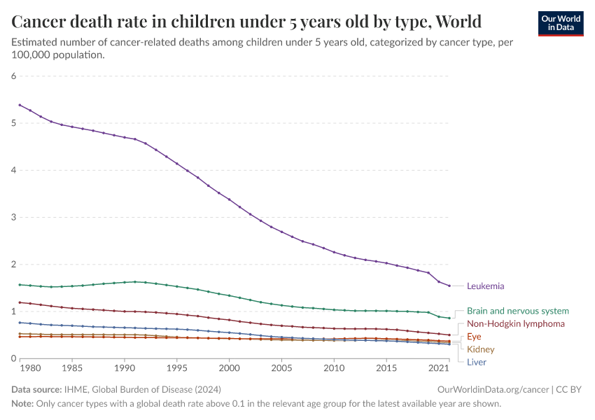
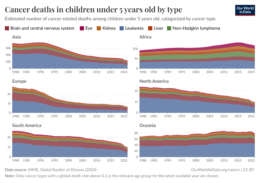
Some cancers — such as brain and central nervous system cancers, leukemias, lymphoid and blood cancers — are also seen in children. Some cancers begin to rise much earlier than others.
Why does cancer risk increase with age?
Several factors make cancer more likely at older ages.
One reason is that as we get older, our cells accumulate more DNA damage, which increases the chances of mutations that can lead to cancer. At the same time, our cells’ ability to repair this damage becomes less effective, which allows harmful mutations to build up.1
Our immune system also weakens with age, which makes it harder to identify and eliminate abnormal cells before they can multiply and spread.
In addition, we accumulate more exposure to risk factors, such as smoking and radiation, which can damage our cells.
In some organs, it is rare for cancers to develop without the effect of risk factors, and the risk factors may only affect people in some age groups, such as the human papillomavirus, which is spread through sexual contact.
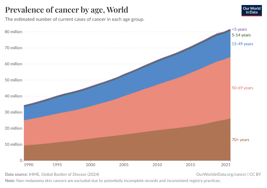
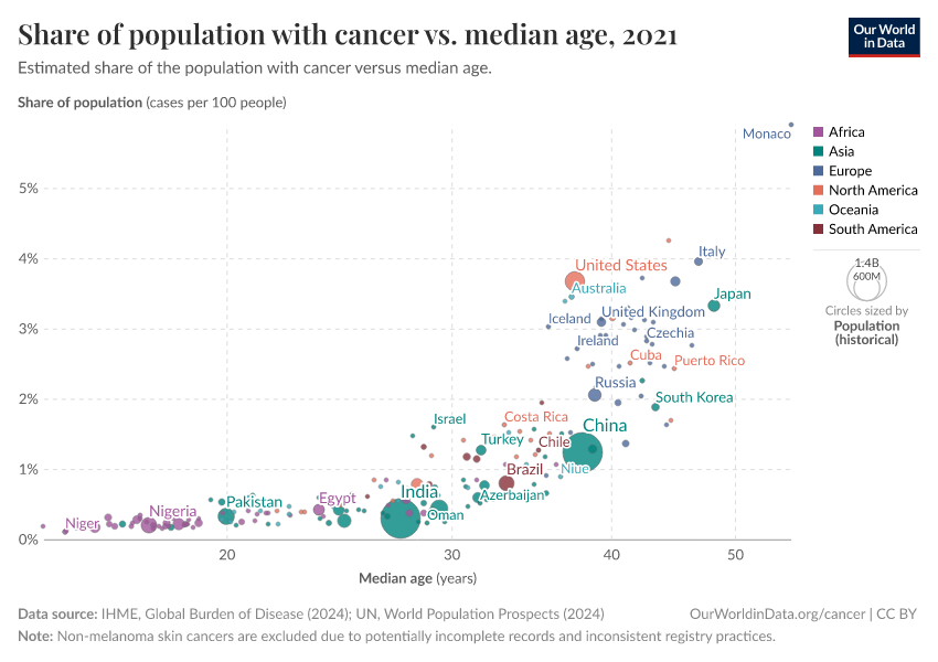
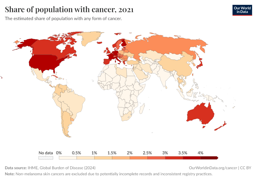
These factors mean that countries with older populations tend to have a higher prevalence of cancer. This is shown in the chart below.

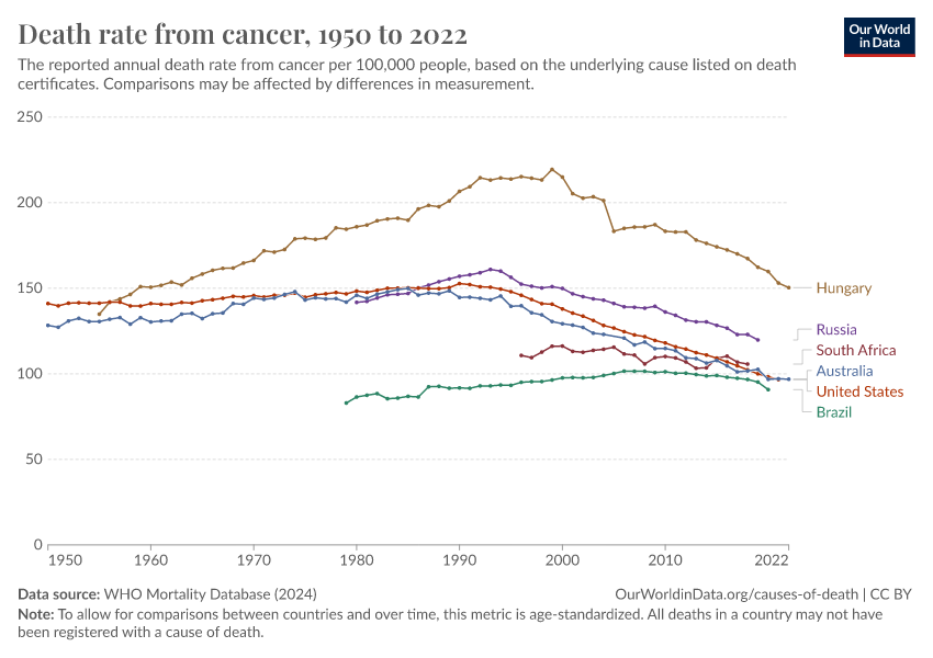
In many countries, cancer death rates have fallen for people of a given age
The world has seen a rise in cancer deaths over time, as the chart below shows. This comes largely from more deaths in the oldest age groups as populations have been growing and aging.

As we saw earlier, death rates from cancer rise steeply with age. This means that, without any other changes, we would expect more people to die from cancer as populations become larger and older.
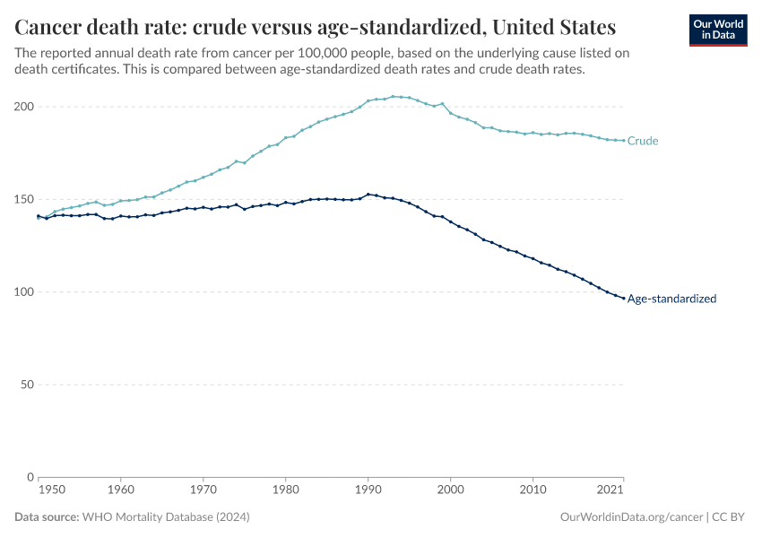
If we account for the population size alone — by looking at the “crude death rate” — we may see an increase or a slight decrease over time.
But if we also account for the population growing older — by looking at the “age-standardized death rate” — we see a more significant decline.
The chart below compares the crude to the age-standardized rate in the United States. You can click to change the country.
The chart shows that the age-standardized cancer death rate has fallen by one-third from 1990 to 2021. This means that, among people of the same ages, those in 2021 had a cancer mortality rate one-third lower than those in 1990.

The decline in cancer mortality is due to many factors, including:
- Better screening and earlier diagnosis of cancers;
- Research into the biological mechanisms of cancer, and medical advances such as chemotherapy, radiation therapy, immunotherapy, and surgery;
- Public health efforts in reducing risk factors — including behavioral risk factors like declining smoking, environmental toxins and carcinogens, and infectious causes of cancers.
One notable example is stomach cancer, which used to be one of the top causes of cancer death in countries like the United States. But age-standardized death rates from stomach cancer have declined a lot over time, as the chart below shows.
For example, in the United States, the death rate of stomach cancer was around 9 times lower in 2021 than it was in 1950.

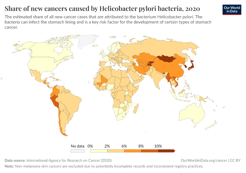
Most stomach cancer cases are caused by the bacteria Helicobacter pylori, which can cause chronic inflammation and gradually result in stomach cancer in a fraction of people. It spreads between people through close contact, contaminated food and water, and poor hygiene.2
It’s likely that stomach cancer declined without specific interventions but rather over time due to general improvements in clean water and sanitation, food safety practices, antibiotics, and hygiene.3
Since the 1990s, when the bacterium was identified as its cause, doctors have used screening, testing, and antibiotic treatment to prevent their progression into stomach cancer in individuals.4 Some countries have also piloted screening and antibiotic programs to eliminate the bacteria nationwide after randomized controlled trials.5 These have shown large declines in the prevalence of bacteria, stomach infections, and cancers; research is ongoing.6
Cancers in childhood are often different from cancers at older ages
Although cancer rates rise with age, some cancers can develop much earlier.
The chart below shows the relative share of deaths from each cancer by age. This is based on national data from the United States Centers for Disease Control and Prevention (CDC) between 2018 and 2022, using the “underlying cause of death” on death certificates.
In the United States, the leading causes of cancer death in children are brain and central nervous system cancers and leukemias. These organs rapidly grow and develop during childhood, which makes them more vulnerable to cancerous changes.
These tend to be linked to risk factors early in development or genetic mutations. Some cancer-causing genetic mutations are inherited, but others are “de novo mutations” — meaning they arise by chance around the time of conception or early in development.7
In contrast, cancers often develop in adults due to long-term exposure to risk factors, typically in organs such as the lungs, colon, pancreas, breasts, or prostate.
The relative share of deaths from each cancer type in this chart is affected by the rise of other cancer types: some cancers may grow rapidly and outrank other cancers on the chart. This is why some cancer types, like colorectal and breast cancer, appear to shrink at the oldest ages, even though their risks actually continue to rise with age.
The share of cancer deaths from each type varies between countries. You can explore an interactive chart for different countries showing the relative share of all cancer deaths from each cancer type here:
The world has made much progress in treating childhood cancers
Thanks to scientific research, medical advances, and public health efforts, the world has made significant progress in treating childhood cancers.
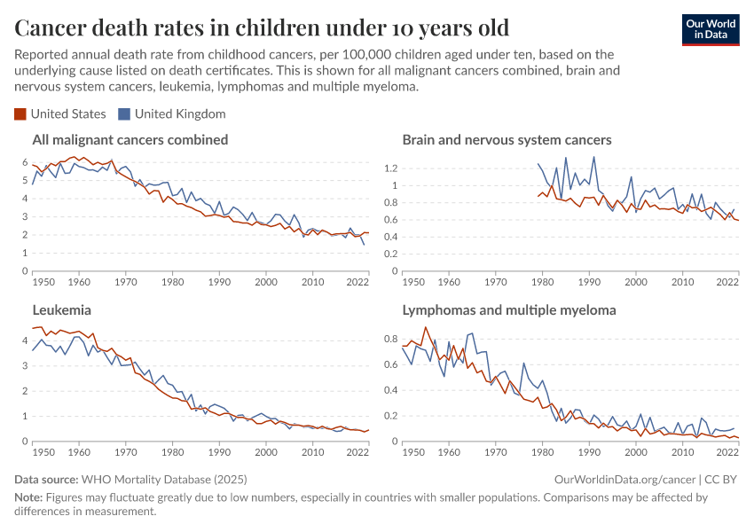
The chart below shows this. There have been declines in cancer death rates across age groups, but especially among children.

One reason for this progress is that scientists have learned more about the genetic causes of childhood cancers. This has helped identify children at risk earlier and develop targeted treatments with fewer side effects.8
There have also been advances in immunotherapy, stem cell transplants, radiation, and surgeries used to treat different types of childhood cancers.9
A prominent example is acute lymphoblastic leukemia (ALL), a common form of leukemia in children. Survival rates for ALL in children have increased greatly, thanks to improved treatments and bone marrow transplants. Genetic research helped identify specific mutations responsible for ALL, which led to the development of highly effective targeted chemotherapy drugs.10
The chart below shows the decline in death rates for some common childhood cancers. You can see that childhood cancer death rates have declined greatly in the United States, especially for leukemias and lymphomas.

There has also been progress in protecting children with cancer from other complications while they are undergoing chemotherapy.
For example, as chemotherapy weakens the immune system, it’s harder for children with cancer to fight off infections. This means vaccination across the population — against diseases like the flu, measles, whooping cough, and pneumonia — can help protect these children from catching infections that can be much more serious for them.11
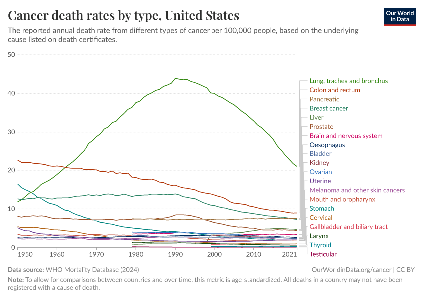
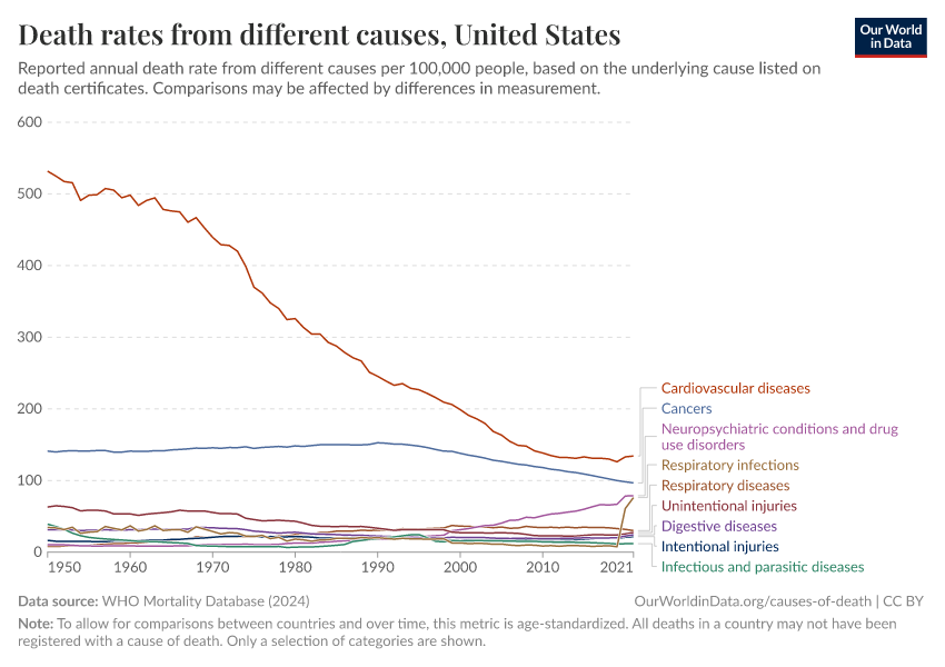
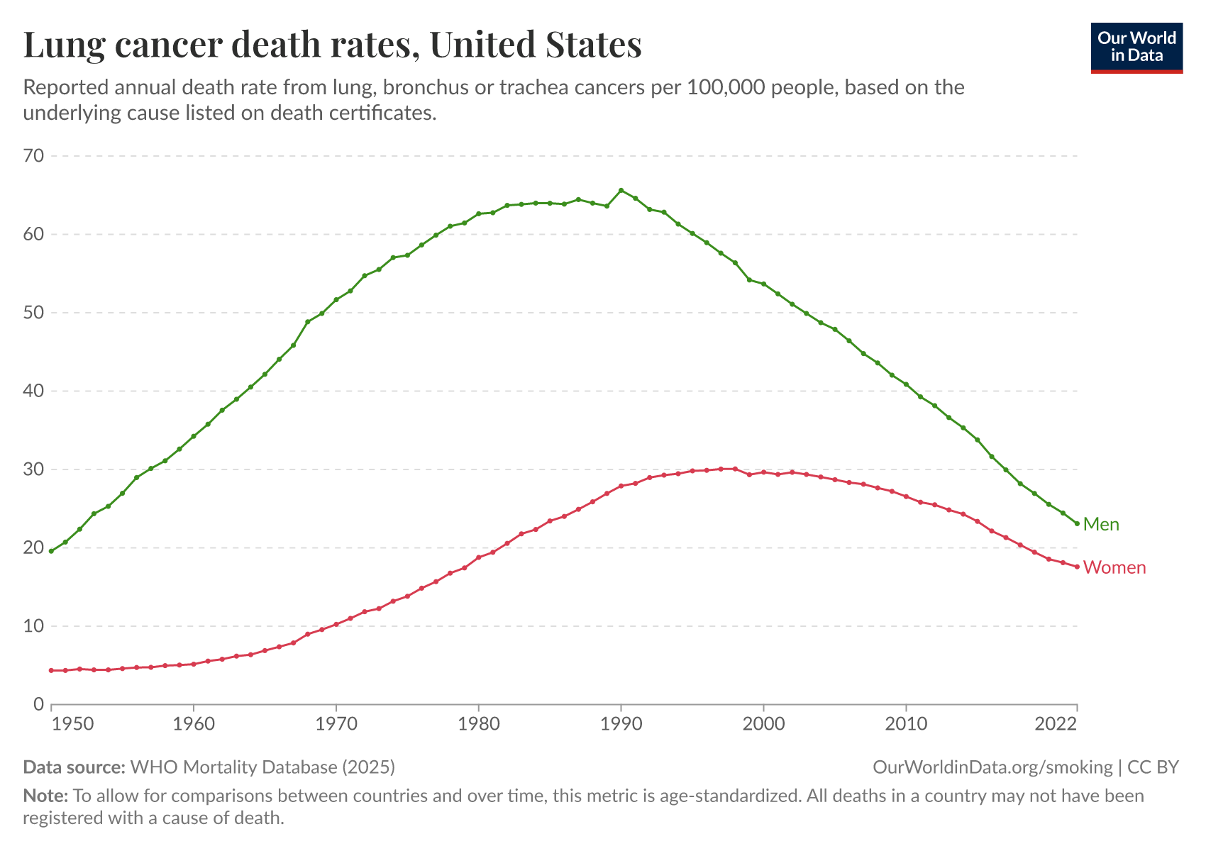
Smoking was a major driver of cancer in the 20th century
Tobacco smoking became much more common over the 20th century in many countries. This led to a rise in lung cancer death rates, as the chart below shows.
Smoking causes lung cancer because some of the chemicals in cigarette smoke damage the cells in our lungs and their DNA.
Over time, constant exposure overwhelms the body’s ability to repair the damage, which allows mutated cells to multiply and form tumors. Smoking also causes chronic inflammation and weakens the immune system, making it harder to stop cancer from developing.12
Read more in our article:
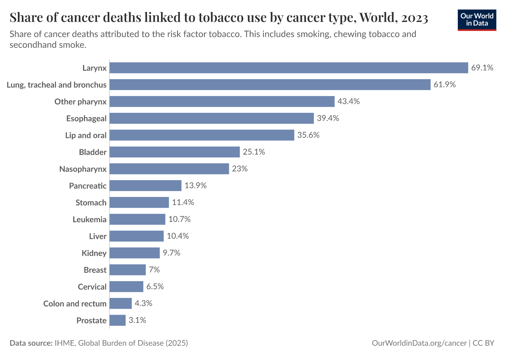
Lung cancer isn’t the only risk from smoking.
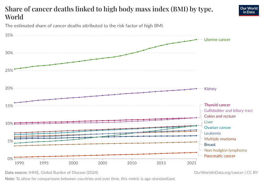
Smoking raises the risks of various other cancers as well, because the chemicals in cigarette smoke can affect multiple parts of the respiratory system, and can travel via the bloodstream to other organs.
As the chart below shows, smoking increases the risk of death from cancers in various organs like the bladder, kidneys, pancreas, stomach, cervix, lungs, mouth, and throat.13
Smoking also increases the risks of death from cardiovascular diseases, tuberculosis, and chronic obstructive pulmonary disease.
Smoking has an impact on many cancers, and its rise and fall over time was a major driver of cancer in the 20th century.
The chart below shows a historical view of reported cancer death rates since 1950 in the United States. You can see several major changes: colorectal and stomach cancer were previously the two most common cancer causes of death, but both have declined greatly over time.
Although both colorectal and stomach cancer are also affected by smoking, other factors reduced their rates during this time — such as colorectal cancer screening, improved hygiene, and the use of antibiotics against the bacteria H. pylori, which can cause stomach cancer.
In contrast, lung cancer rose greatly over the 20th century and became the leading cause of cancer death by far, and pushed up the overall death rate from cancer.

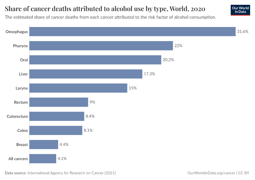
Some cancers are caused by infections, which can be effectively prevented or treated
Some infections can increase the risk of cancer, by mechanisms such as causing inflammation, harming key proteins, or directly damaging our cells’ DNA.
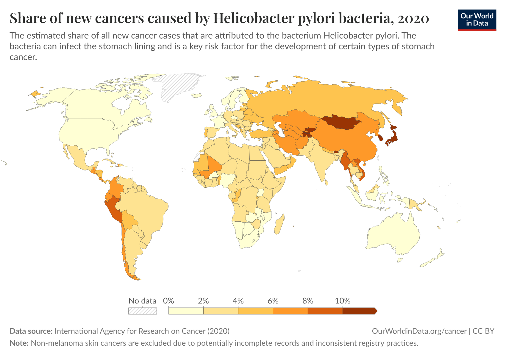
This includes the human papillomavirus (HPV), which can cause various cancers, including cervical cancer and penile cancer; the hepatitis B and C viruses, which can cause liver cancer; and the bacteria Helicobacter pylori, which can cause stomach cancer.14
The different pathogens spread through various routes. HPV is typically spread through sexual contact, while hepatitis B and C viruses spread via blood, including needle sharing or unprotected sex. In contrast, H. pylori typically spreads through contaminated food and water or close human contact, often in places with poor sanitation.
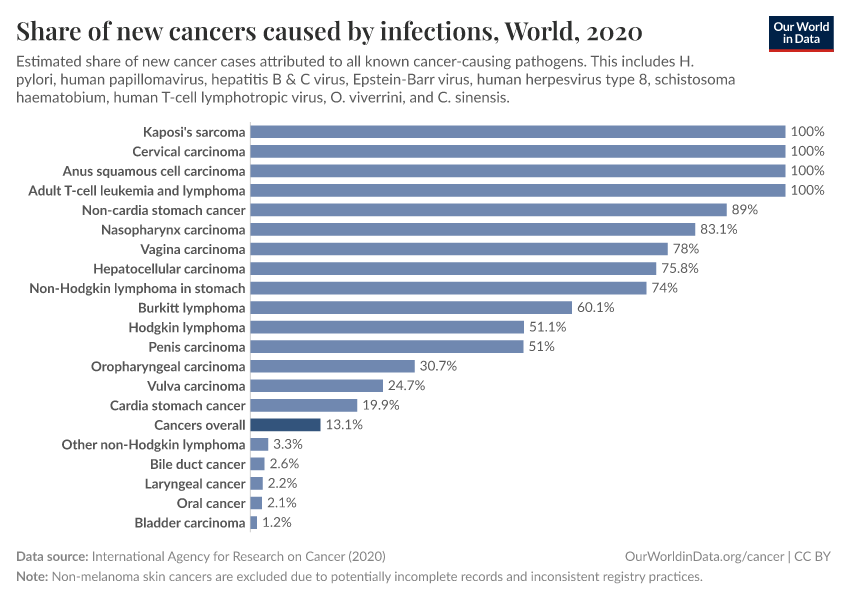
The chart below shows the estimated share of cancers caused by infectious diseases. This comes from the International Agency for Research on Cancer.15
You can see that, for some cancers — such as Kaposi’s sarcoma, cervical cancer, T-cell leukemia and lymphoma, and non-cardia stomach cancer — it’s estimated that all, or almost all, cases are caused by pathogens.
Without these pathogens, these organs tend to remain stable and rarely form cancers.
For many others, such as lung cancer, pathogens are not established as a causal risk factor and are not shown in the chart.
In total, it’s estimated that around 13% of all cancers worldwide were caused by infections in 2020.

These infection-caused cancers can be prevented or treated in different ways.
This includes vaccination (for HPV and hepatitis B), antibiotic treatment and improved hygiene (for H. pylori), antiviral treatments (for hepatitis C), and various types of chemotherapies, radiation therapies, immunotherapies, and surgeries.
By controlling these infections, their cancers can be reduced or prevented effectively.
Read more in our article about human papillomavirus:
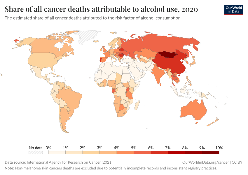
The map below shows that the share of cancers caused by infections varies widely worldwide — with around a quarter of cancer cases caused by infections in many African countries versus less than 10% in many European countries and North America.
These disparities are due to many factors, including the risks of infection and public health efforts, such as vaccination, sanitation, and antibiotics.

Much more progress can be made against cancers
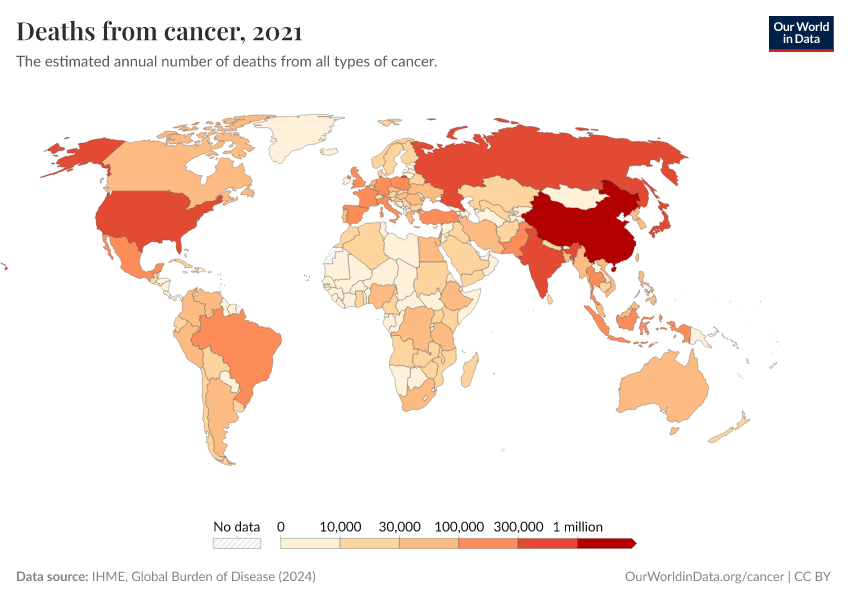
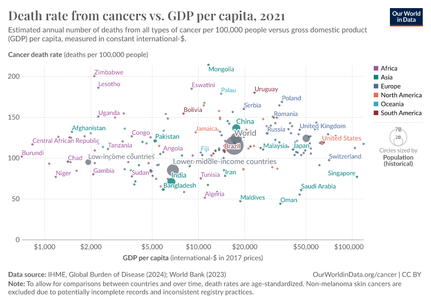
Although the world has made progress against several cancers, it remains one of the largest health problems, and it is the most common cause of death in many countries.
It’s estimated that around 10 million people died from cancer in 2021. This number is expected to rise over time, with a growing and aging population.

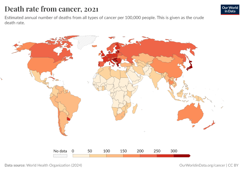
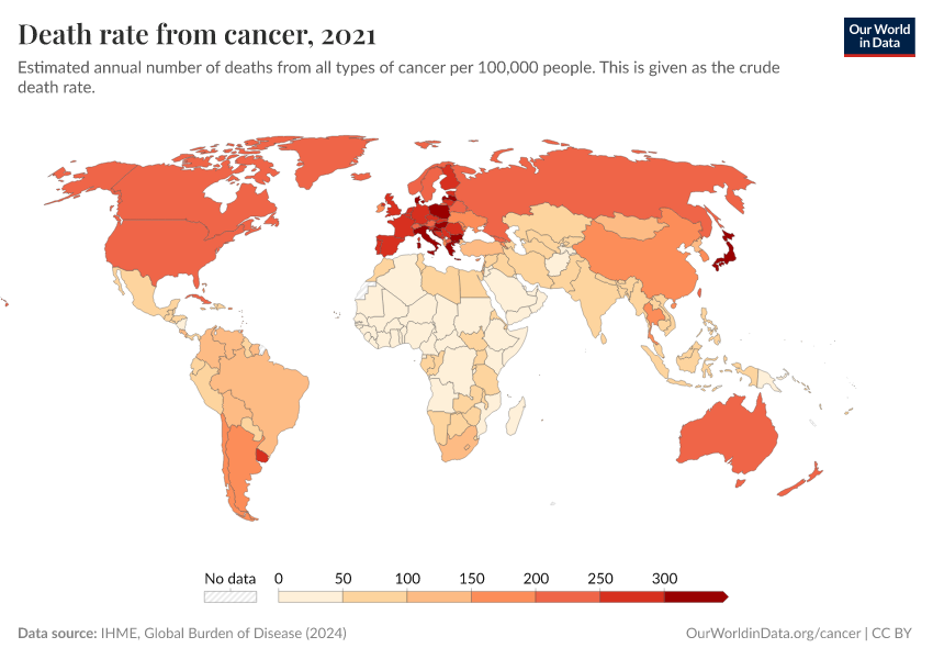
Much more progress is possible. As the chart below shows, death rates from cancers remain high.
Our ability to treat them can improve with a better understanding of the risk factors and causes and research into potential new treatments and public health policies.
We can also make more use of existing tools — including vaccines, antibiotics, and antivirals for cancers caused by infections.
We can also save lives by expanding access to screening and early treatment, especially in places where healthcare is limited.
On a broader scale, we can use public health efforts that reduce smoking, improve sanitation, and lower exposure to carcinogens to drive further progress.

Definitions and measurement
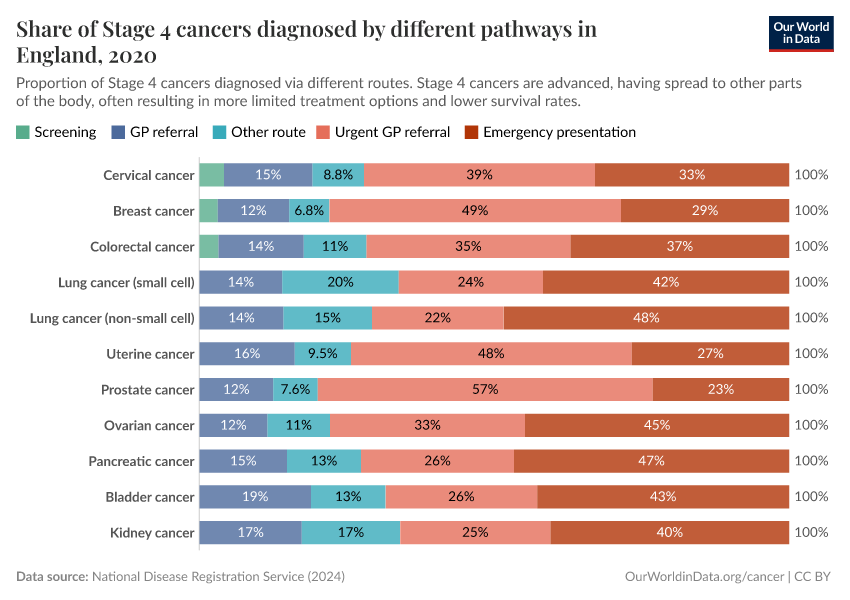
Differences in screening and diagnosis can affect the number of cancer cases detected
In the past, many cancers went undetected, especially at the early stages of cancer. Improvements in screening and diagnosis methods have helped detect cancers earlier before they might progress and lead to noticeable symptoms or disease.
These can include mammography for breast cancer, Pap smears or HPV testing for cervical cancer, and colonoscopies for colorectal cancer.
Some countries have screening programs to test populations at risk of specific cancers. For example, all women of certain ages may be invited for Pap smear tests to screen for cervical cancer, or long-term smokers may be invited for lung cancer screening.
Other cases may be detected during routine check-ups, other healthcare visits, or emergency admissions.
The chart below shows these pathways to diagnosis in England. As you can see, a significant share of stage 1 cases of cervical, breast, and colorectal cancer, are detected during screening in England. For others, most stage 1 cases are diagnosed during general practitioner (GP) referrals or other routes.

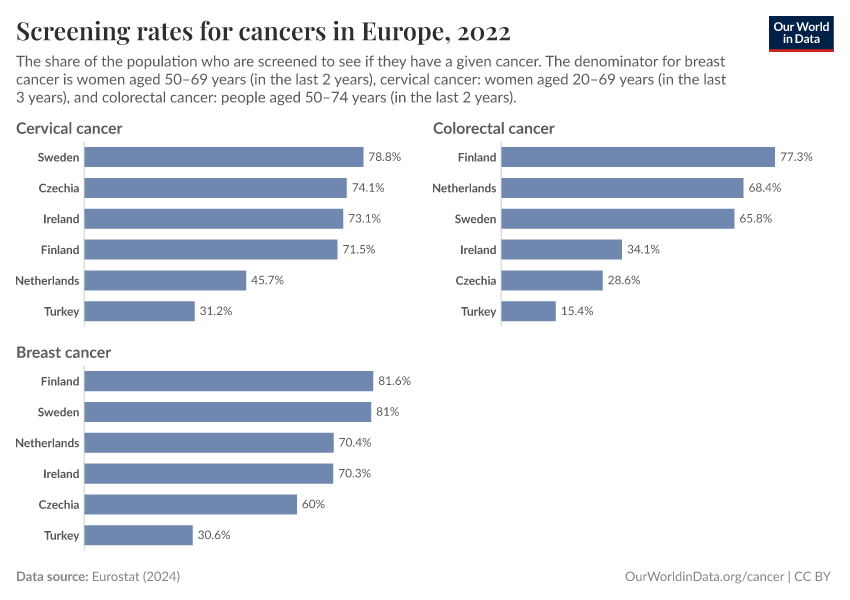
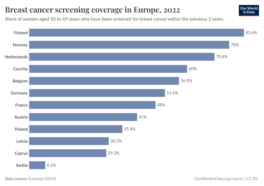
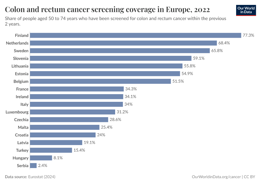
Screening rates and policies can vary greatly between countries. They have also changed over time.16
The chart below shows data from Europe on screening rates for different cancers. Screening rates vary between countries and dropped in several countries during the COVID-19 pandemic.
These differences can result in differences in the reported number of cancer cases between countries and over time, even without underlying changes in cancer rates.

In many countries, a national cancer registry collects data on the number of cancer cases. This only includes cancers that are detected and reported, which means that new and expanded screening programs can increase the number of cancer cases reported.16
International statistical organizations aim to adjust for underdiagnosis of cancer in countries without cancer registries, by using other hospital or death records. However, this can be challenging without sufficient data.
Even in countries with high-quality data from cancer registries, it can be difficult to account for new screening policies and improvements in survival rates over time.
Non-melanoma skin cancers are typically excluded from cancer statistics
Non-melanoma skin cancer (NMSC) refers to skin cancers aside from melanoma. This group of cancers is often not included in international cancer statistics.
This is because NMSC cases are usually benign and easily treatable, and awareness and diagnosis of them have increased greatly over time.17
In addition, different countriesʼ reporting standards vary. Some countries don’t include NMSC in their cancer registries, while others do.18
Many international statistical organizations exclude them from overall cancer statistics, as we do on this page, to make comparisons more valid.
Key Charts on Cancer
See all charts on this topic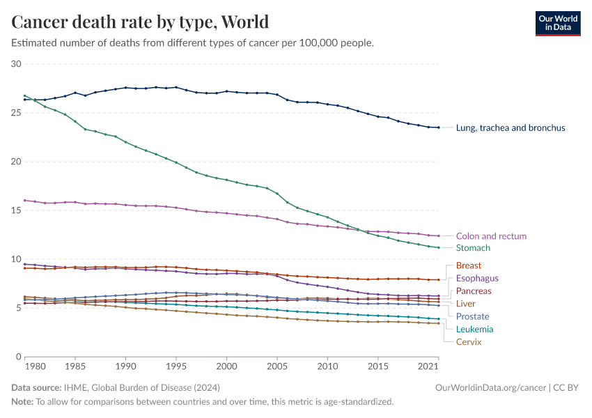


Featured Data on Cancer
Endnotes
Sas, A. A., Snieder, H., & Korf, J. (2012). Gompertz’ survivorship law as an intrinsic principle of aging. Medical Hypotheses, 78(5), 659–663. https://doi.org/10.1016/j.mehy.2012.02.004
Moss, Steven F. “The Clinical Evidence Linking Helicobacter Pylori to Gastric Cancer.” Cellular and Molecular Gastroenterology and Hepatology 3, no. 2 (March 2017): 183–91. https://doi.org/10.1016/j.jcmgh.2016.12.001
Balakrishnan, Maya, Rollin George, Ashish Sharma, and David Y. Graham. “Changing Trends in Stomach Cancer Throughout the World.” Current Gastroenterology Reports 19, no. 8 (August 2017): 36. https://doi.org/10.1007/s11894-017-0575-8
Lee, Y.-C., Dore, M. P., & Graham, D. Y. (2022). Diagnosis and Treatment of Helicobacter pylori Infection. Annual Review of Medicine, 73(1), 183–195. https://doi.org/10.1146/annurev-med-042220-020814
Chiang, T.-H., Cheng, H.-C., Chuang, S.-L., Chen, Y.-R., Hsu, Y.-H., Hsu, T.-H., Lin, L.-J., Lin, Y.-W., Chu, C.-H., Wu, M.-S., & Lee, Y.-C. (2022). Mass screening and eradication of Helicobacter pylori as the policy recommendations for gastric cancer prevention. Journal of the Formosan Medical Association, 121(12), 2378–2392. https://doi.org/10.1016/j.jfma.2022.08.012
Kowada, A., & Asaka, M. (2021). Economic and health impacts of introducing Helicobacter pylori eradication strategy into national gastric cancer policy in Japan: A cost‐effectiveness analysis. Helicobacter, 26(5), e12837. https://doi.org/10.1111/hel.12837
Chen, M., Bair, M., Chen, P., Lee, J., Yang, T., Fang, Y., Chen, C., Chang, A., Hsiao, W., Yu, J., Kuo, C., Chiu, M., Lin, K., Tsai, M., Hsu, Y., Chou, C., Chen, C., Lin, J., Lee, Y., … for the Taiwan Gastrointestinal Disease and Helicobacter Consortium. (2022). Declining trends of prevalence of Helicobacter pylori infection and incidence of gastric cancer in Taiwan: An updated cross‐sectional survey and meta‐analysis. Helicobacter, 27(5), e12914. https://doi.org/10.1111/hel.12914
Chiang, T.-H., Chang, W.-J., Chen, S. L.-S., Yen, A. M.-F., Fann, J. C.-Y., Chiu, S. Y.-H., Chen, Y.-R., Chuang, S.-L., Shieh, C.-F., Liu, C.-Y., Chiu, H.-M., Chiang, H., Shun, C.-T., Lin, M.-W., Wu, M.-S., Lin, J.-T., Chan, C.-C., Graham, D. Y., Chen, H.-H., & Lee, Y.-C. (2020). Mass eradication of Helicobacter pylori to reduce gastric cancer incidence and mortality: A long-term cohort study on Matsu Islands. Gut, gutjnl-2020-322200. https://doi.org/10.1136/gutjnl-2020-322200
Kuhlen, M., Taeubner, J., Brozou, T., Wieczorek, D., Siebert, R., & Borkhardt, A. (2019). Family-based germline sequencing in children with cancer. Oncogene, 38(9), 1367–1380. https://doi.org/10.1038/s41388-018-0520-9
Plon, S. E., & Lupo, P. J. (2019). Genetic Predisposition to Childhood Cancer in the Genomic Era. Annual Review of Genomics and Human Genetics, 20, 241–263. https://doi.org/10.1146/annurev-genom-083118-015415
Rashed, W. M., Marcotte, E. L., & Spector, L. G. (2022). Germline De Novo Mutations as a Cause of Childhood Cancer. JCO Precision Oncology, 6, e2100505. https://doi.org/10.1200/PO.21.00505
Skalet, A. H., Gombos, D. S., Gallie, B. L., Kim, J. W., Shields, C. L., Marr, B. P., Plon, S. E., & Chévez-Barrios, P. (2018). Screening Children at Risk for Retinoblastoma. Ophthalmology, 125(3), 453–458. https://doi.org/10.1016/j.ophtha.2017.09.001
Smith, M. A., Altekruse, S. F., Adamson, P. C., Reaman, G. H., & Seibel, N. L. (2014). Declining childhood and adolescent cancer mortality. Cancer, 120(16), 2497–2506. https://doi.org/10.1002/cncr.28748
Erdmann, F., Frederiksen, L. E., Bonaventure, A., Mader, L., Hasle, H., Robison, L. L., & Winther, J. F. (2021). Childhood cancer: Survival, treatment modalities, late effects and improvements over time. Cancer Epidemiology, 71, 101733. https://doi.org/10.1016/j.canep.2020.101733
Tran, T. H., & Hunger, S. P. (2022). The genomic landscape of pediatric acute lymphoblastic leukemia and precision medicine opportunities. Seminars in Cancer Biology, 84, 144–152. https://doi.org/10.1016/j.semcancer.2020.10.013
Starý, J., & Hrušák, O. (2016). Recent advances in the management of pediatric acute lymphoblastic leukemia. F1000Research, 5, 2635. https://doi.org/10.12688/f1000research.9548.1
Plon, S. E., & Lupo, P. J. (2019). Genetic Predisposition to Childhood Cancer in the Genomic Era. Annual Review of Genomics and Human Genetics, 20, 241–263. https://doi.org/10.1146/annurev-genom-083118-015415
Ward, Elizabeth M., Christopher R. Flowers, Ted Gansler, Saad B. Omer, and Robert A. Bednarczyk. “The Importance of Immunization in Cancer Prevention, Treatment, and Survivorship.” CA: A Cancer Journal for Clinicians 67, no. 5 (September 2017): 398–410. https://doi.org/10.3322/caac.21407
Lee, J., V. Taneja, and R. Vassallo. “Cigarette Smoking and Inflammation: Cellular and Molecular Mechanisms.” Journal of Dental Research 91, no. 2 (February 2012): 142–49. https://doi.org/10.1177/0022034511421200
Oza, S., Thun, M. J., Henley, S. J., Lopez, A. D., & Ezzati, M. (2011). How many deaths are attributable to smoking in the United States? Comparison of methods for estimating smoking-attributable mortality when smoking prevalence changes. Preventive Medicine, 52(6), 428–433. https://doi.org/10.1016/j.ypmed.2011.04.007
Schiffman, M., Doorbar, J., Wentzensen, N., De Sanjosé, S., Fakhry, C., Monk, B. J., Stanley, M. A., & Franceschi, S. (2016). Carcinogenic human papillomavirus infection. Nature Reviews Disease Primers, 2(1), 16086. https://doi.org/10.1038/nrdp.2016.86
Moss, S. F. (2017). The Clinical Evidence Linking Helicobacter pylori to Gastric Cancer. Cellular and Molecular Gastroenterology and Hepatology, 3(2), 183–191. https://doi.org/10.1016/j.jcmgh.2016.12.001
Llovet, J. M., Kelley, R. K., Villanueva, A., Singal, A. G., Pikarsky, E., Roayaie, S., Lencioni, R., Koike, K., Zucman-Rossi, J., & Finn, R. S. (2021). Hepatocellular carcinoma. Nature Reviews Disease Primers, 7(1), 6. https://doi.org/10.1038/s41572-020-00240-3
De Martel, Catherine, Damien Georges, Freddie Bray, Jacques Ferlay, and Gary M Clifford. “Global Burden of Cancer Attributable to Infections in 2018: A Worldwide Incidence Analysis.” The Lancet Global Health 8, no. 2 (February 2020): e180–90. https://doi.org/10.1016/S2214-109X(19)30488-7
Cardoso, R., Guo, F., Heisser, T., Hackl, M., Ihle, P., De Schutter, H., Van Damme, N., Valerianova, Z., Atanasov, T., Májek, O., Mužík, J., Nilbert, M. C., Tybjerg, A. J., Innos, K., Mägi, M., Malila, N., Bouvier, A.-M., Bouvier, V., Launoy, G., … Brenner, H. (2021). Colorectal cancer incidence, mortality, and stage distribution in European countries in the colorectal cancer screening era: An international population-based study. The Lancet Oncology, 22(7), 1002–1013. https://doi.org/10.1016/S1470-2045(21)00199-6
Some forms of NMSC are not mild; for example, squamous cell carcinomas can sometimes spread to other parts of the body if not treated. Non-melanoma skin cancers can also cause damage to the skin and surrounding tissues if they are left untreated for too long.
Ciążyńska, M., Kamińska-Winciorek, G., Lange, D., Lewandowski, B., Reich, A., Sławińska, M., Pabianek, M., Szczepaniak, K., Hankiewicz, A., Ułańska, M., Morawiec, J., Błasińska-Morawiec, M., Morawiec, Z., Piekarski, J., Nejc, D., Brodowski, R., Zaryczańska, A., Sobjanek, M., Nowicki, R. J., … Lesiak, A. (2021). The incidence and clinical analysis of non-melanoma skin cancer. Scientific Reports, 11(1), 4337. https://doi.org/10.1038/s41598-021-83502-8
Eisemann, N., Waldmann, A., Geller, A. C., Weinstock, M. A., Volkmer, B., Greinert, R., Breitbart, E. W., & Katalinic, A. (2014). Non-Melanoma Skin Cancer Incidence and Impact of Skin Cancer Screening on Incidence. Journal of Investigative Dermatology, 134(1), 43–50. https://doi.org/10.1038/jid.2013.304
The National Cancer Registry of Ireland provides an example. They write:
”Registrations for non-melanoma skin cancer (ICD-10 C44) are likely to be less complete and less accurate than for other cancer sites. Such cancers are relatively common and usually non-fatal. There is a propensity for multiple tumours to occur in one individual and cancer registries adopt different practices in recording these. The tumours are most common in the elderly population and the completeness of registration in the very elderly is likely to be less than for younger patients. Furthermore, increasing numbers of these cancers are diagnosed and treated within GP surgeries and the registration scheme is not confident that all such cases are notified. Because cancer registries across the world have different practices for recording non-melanoma skin cancer (some do not record them at all), the category "all cancers combined" often omits these tumours in the interests of making international comparisons of cancer incidence more valid.”
National Cancer Registry of Ireland (2024). Why are data for non-melanoma skin cancer sometimes excluded? Available online.
Cite this work
Our articles and data visualizations rely on work from many different people and organizations. When citing this topic page, please also cite the underlying data sources. This topic page can be cited as:
Saloni Dattani, Veronika Samborska, Hannah Ritchie, and Max Roser (2024) - “Cancer” Published online at OurWorldinData.org. Retrieved from: 'https://ourworldindata.org/cancer' [Online Resource]BibTeX citation
@article{owid-cancer,
    author = {Saloni Dattani and Veronika Samborska and Hannah Ritchie and Max Roser},
    title = {Cancer},
    journal = {Our World in Data},
    year = {2024},
    note = {https://ourworldindata.org/cancer}
}
Reuse this work freely
All visualizations, data, and articles produced by Our World in Data are completely open access under the Creative Commons BY license. You have the permission to use, distribute, and reproduce these in any medium, provided the source and authors are credited.
The data produced by third parties and made available by Our World in Data is subject to the license terms from the original third-party authors. We will always indicate the original source of the data in our documentation, so you should always check the license of any such third-party data before use and redistribution.
All of our charts can be embedded in any site.