Transport
Transport allows people to move across cities, countries, and continents. It allows us to trade goods and products across the world by road, rail, sea or air.
It has become an essential part of our lives, whether it’s getting to work or school; delivering essential services or necessities to different communities; or connecting people and industries across the world. It’s now a key driver of economic development.
But transport also negatively affects our health and the environment through road injuries and fatalities, air pollution, and CO₂ emissions which drive climate change.
On this page, you can find data, visualizations, and writing on transport patterns across the world, how this is changing, and its environmental impacts.
Research & Writing
February 26, 2024
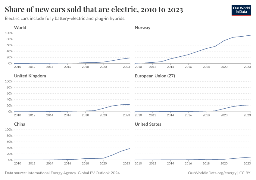
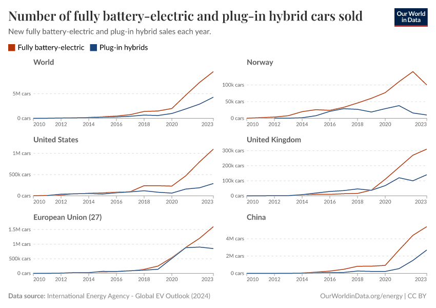
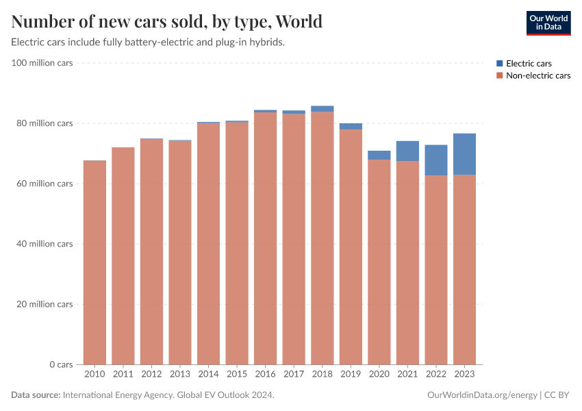
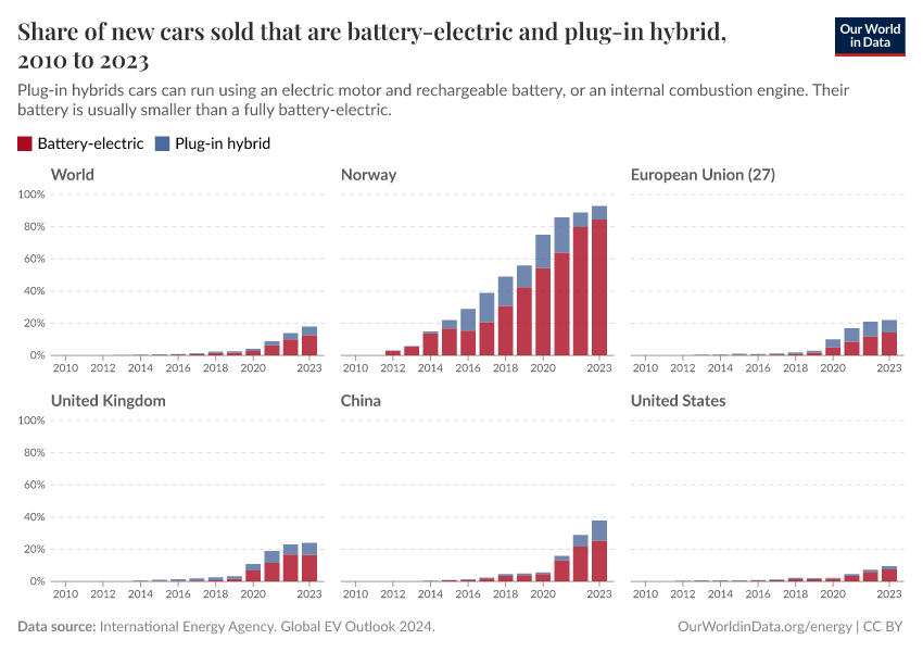
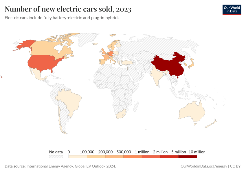
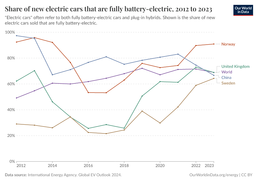
Tracking global data on electric vehicles
Explore data on electric car sales and stocks worldwide.
April 8, 2024
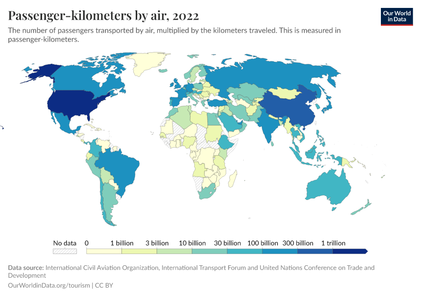
What share of global CO₂ emissions come from aviation?
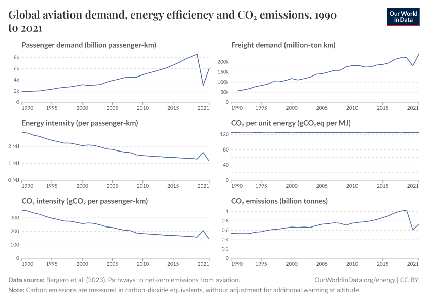
Aviation accounts for 2.5% of global CO₂ emissions. But it has contributed around 4% to global warming to date.
August 30, 2023
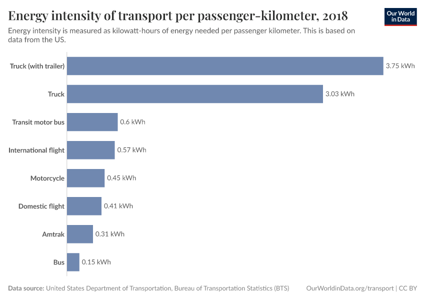
Which form of transport has the smallest carbon footprint?
How can individuals reduce their emissions from transport?
Transport and CO₂ emissions
October 6, 2020
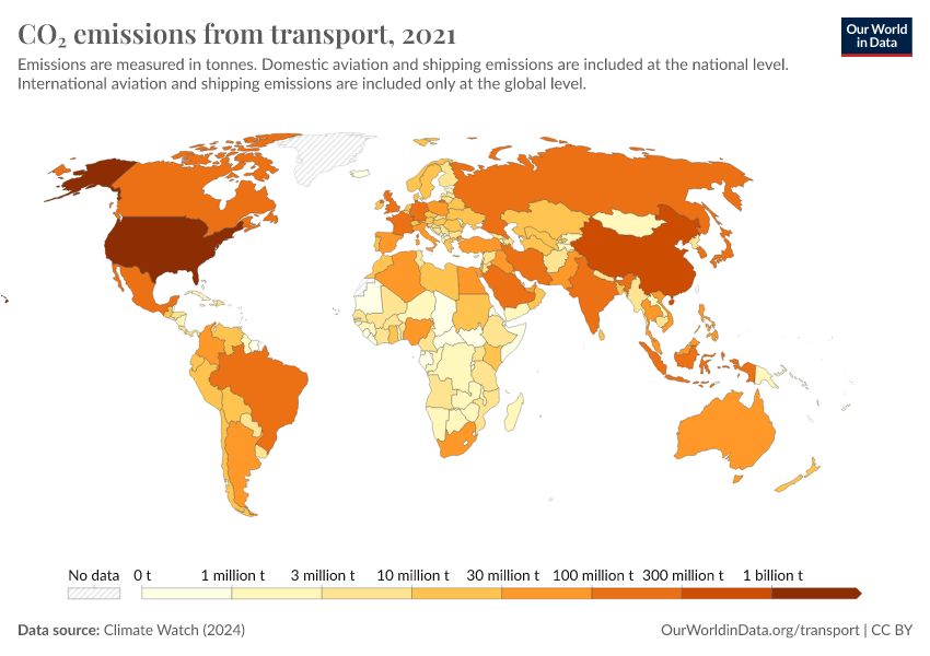
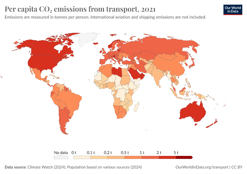
Cars, planes, trains: where do CO₂ emissions from transport come from?
October 23, 2020
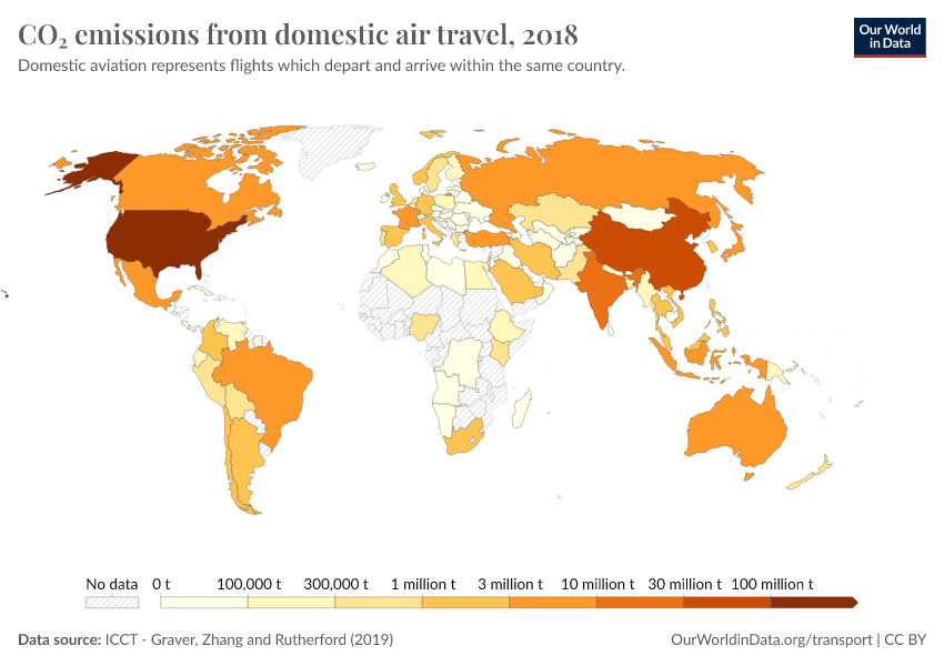
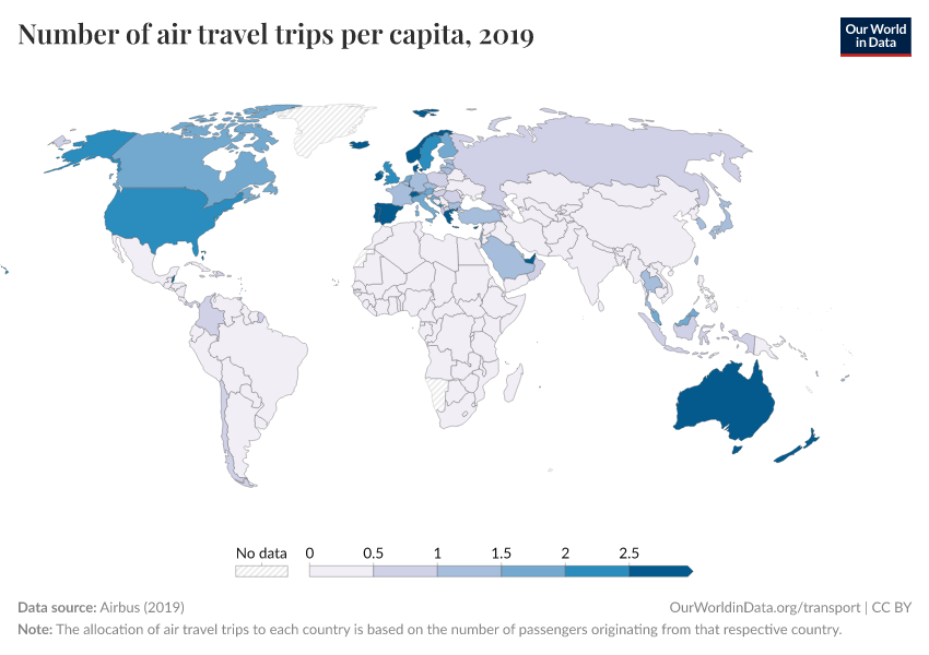
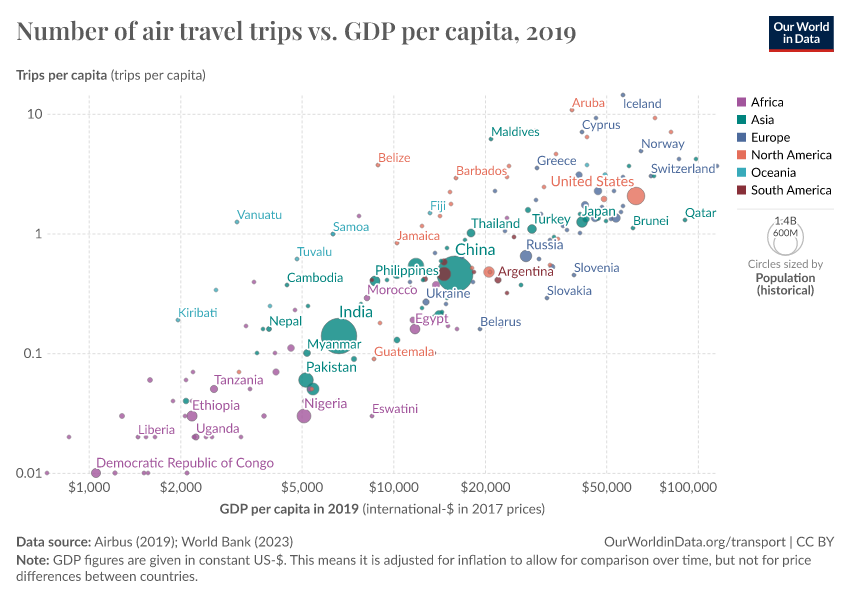
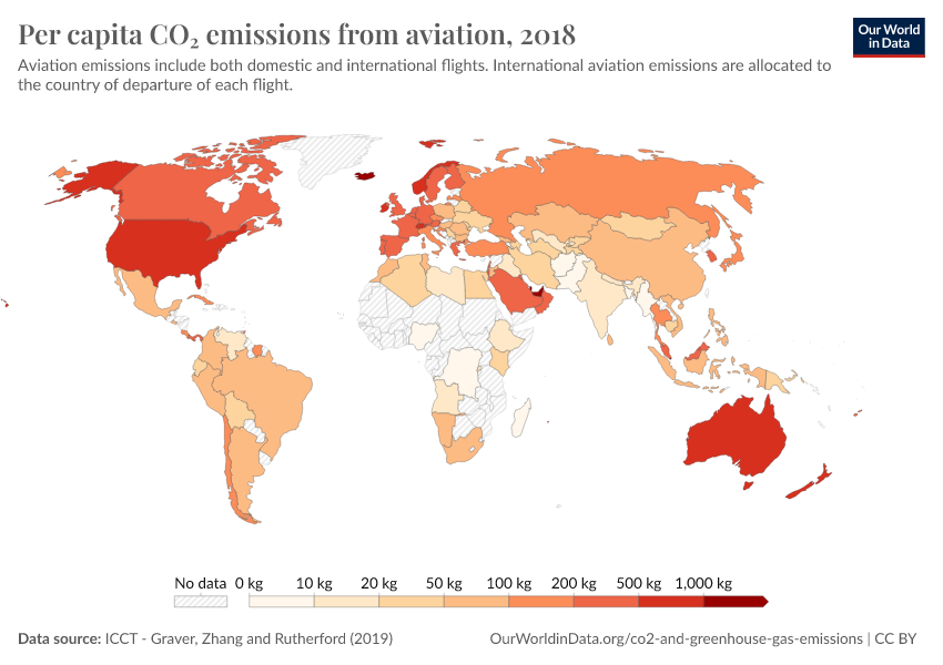
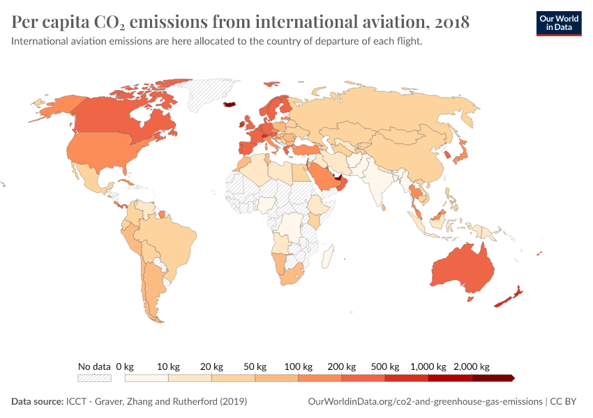
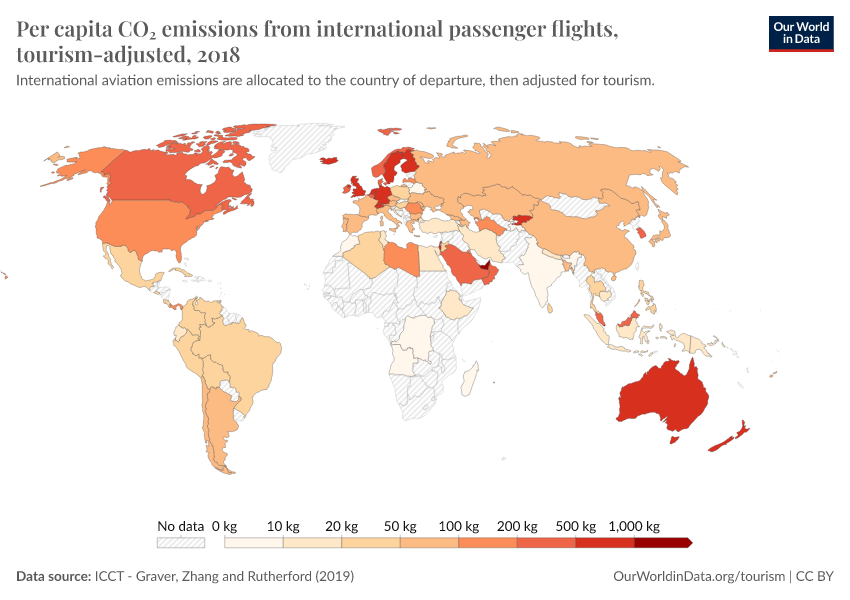
Global inequalities in CO₂ emissions from aviation
November 9, 2020
Where in the world do people have the highest CO2 emissions from flying?
September 18, 2020
Sector by sector: where do global greenhouse gas emissions come from?
January 24, 2020
You want to reduce the carbon footprint of your food? Focus on what you eat, not whether your food is local
January 28, 2020
Very little of global food is transported by air; this greatly reduces the climate benefits of eating local
More articles on transport
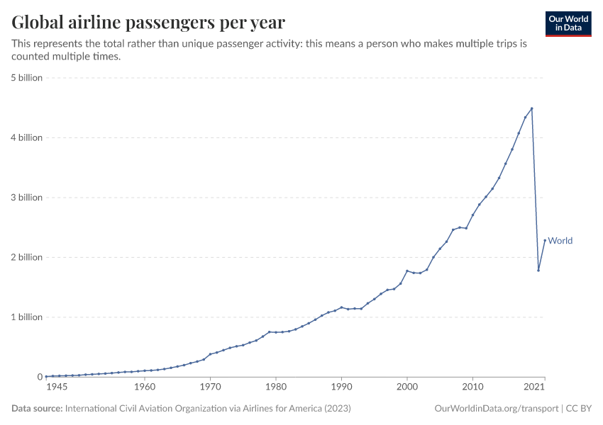
Key Charts on Transport
See all charts on this topic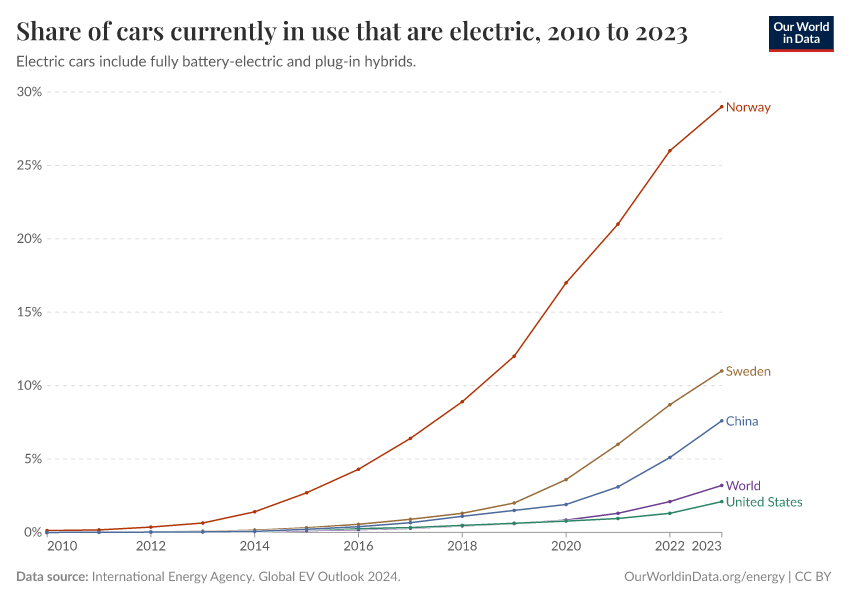


Featured Data on Transport
Cite this work
Our articles and data visualizations rely on work from many different people and organizations. When citing this topic page, please also cite the underlying data sources. This topic page can be cited as:
Hannah Ritchie and Max Roser (2021) - “Transport” Published online at OurWorldinData.org. Retrieved from: 'https://ourworldindata.org/transport' [Online Resource]BibTeX citation
@article{owid-transport,
    author = {Hannah Ritchie and Max Roser},
    title = {Transport},
    journal = {Our World in Data},
    year = {2021},
    note = {https://ourworldindata.org/transport}
}
Reuse this work freely
All visualizations, data, and articles produced by Our World in Data are completely open access under the Creative Commons BY license. You have the permission to use, distribute, and reproduce these in any medium, provided the source and authors are credited.
The data produced by third parties and made available by Our World in Data is subject to the license terms from the original third-party authors. We will always indicate the original source of the data in our documentation, so you should always check the license of any such third-party data before use and redistribution.
All of our charts can be embedded in any site.