Age Structure
What is the age profile of populations around the world? How did it change and what will the age structure of populations look like in the future?
This page was first published in September 2019, and we updated the text in February 2024.
The global median age has risen over time, as older people make up an increasingly large percentage of the population.
What is the age distribution in countries around the world? How has it changed over time, and what can we expect for the future? These are the questions that this topic page focuses on.
See all interactive charts on age structure ↓
Related topics
Other research and writing on age structure on Our World in Data:
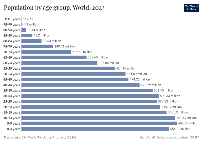
The global population pyramid
The global population pyramid: How global demography has changed and what we can expect for the 21st century
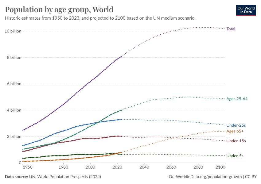
In 1950, there were 2.5 billion people on the planet. In 2021, there were around 8 billion. By the end of the century, the UN expects a global population of around 10 billion.

But how has the age structure of the world’s population changed over time?
The following chart — the population pyramid — makes it possible to understand this enormous global transformation.
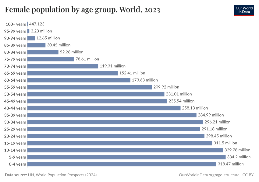
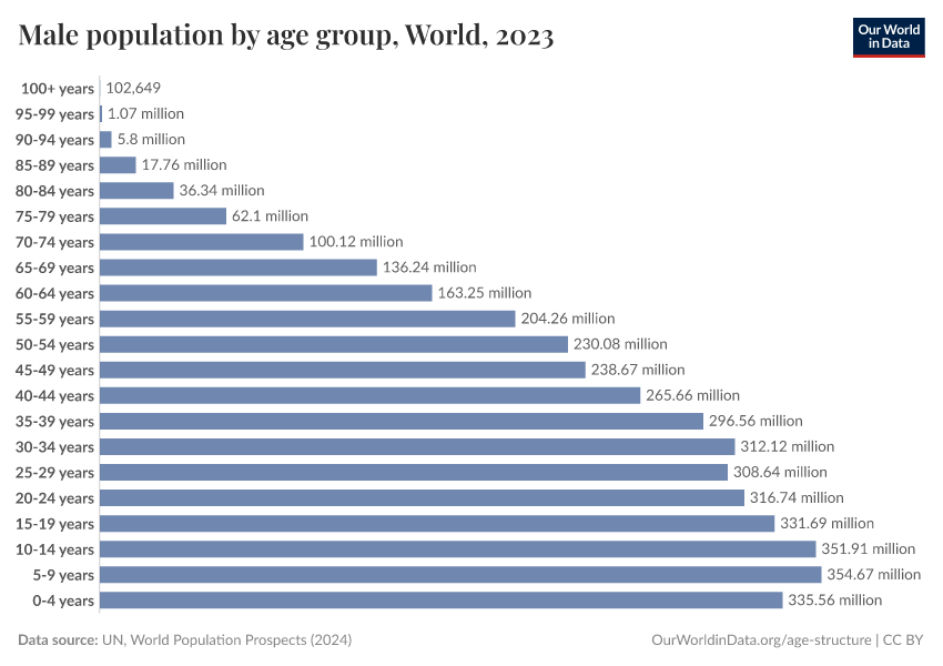
Population pyramids visualize the demographic structure of a population. The width represents the size of the population of a given age, with women on the right and men on the left. The bottom layer represents the number of newborns and above it, each layer shows the number of people at each age in older cohorts.
In countries with high mortality rates, the population structure of societies resembled a pyramid — this is how this famous type of visualization got its name.
In the darkest blue, you can see the pyramid that represents the structure of the world population in 1950.
Two factors were responsible for the pyramid’s shape in 1950: an increasing number of births broadened the base layer of the population pyramid, and a high risk of death throughout life led to a narrowing towards the top. This means there were many newborns relative to the number of people at older ages.
The narrowing of the pyramid just above the base is testimony to the fact that child mortality used to be much higher in the past, with more than 1 in 5 children dying before the age of five in many low-income countries.
Through shades of blue and green the same visualization shows the population structure over the last decades up to 2018. You see that in each subsequent decade, the population pyramid was larger than before — in each decade more people of all ages were added to the world population.
If you look at the green pyramid for 2018 you see that the narrowing above the base is much less strong than back in 1950, as child mortality has fallen.
If you now compare the base of the pyramid in 2018 with the projection for 2100 you see that the coming decades will not resemble the past: According to the projections, there will be fewer children born at the end of this century than today. The base of the future population structure is narrower.
We are at a turning point in global population history. Between 1950 and today, it was a widening of the entire pyramid — an increase in the number of children — that was responsible for the increase in the world population.
From now on is not a widening of the base, but a ‘fill up’ of the population above the base: the number of children will barely increase and then start to decline, but the number of people of working age and old age will increase very substantially. As global health is improving and mortality is falling, the people alive today are expected to live longer than any generation before us.
Read more in our article:
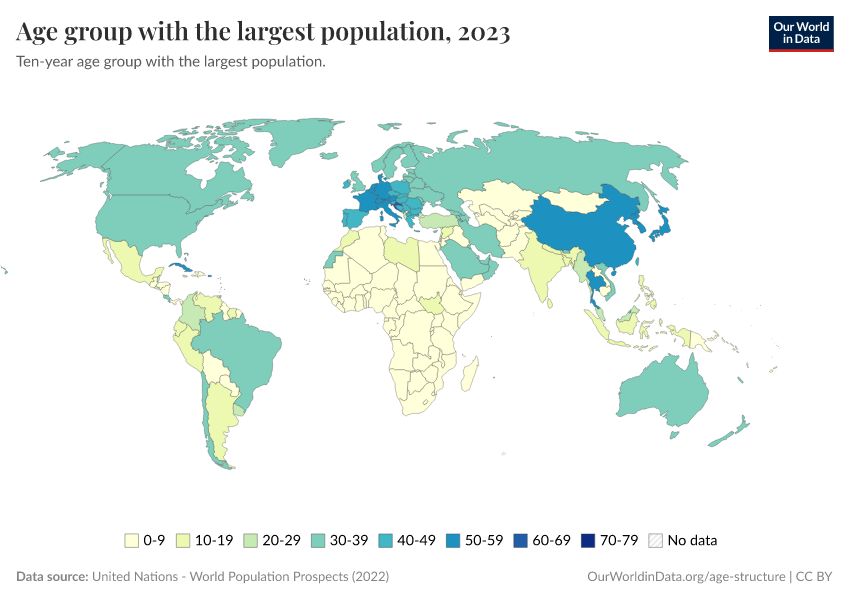
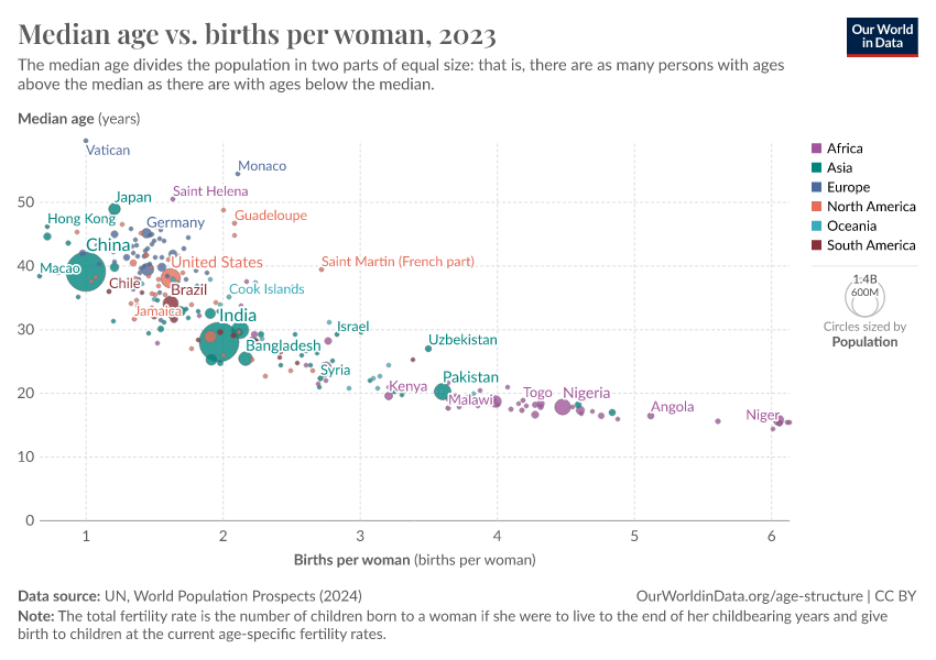
How does median age vary across the world?
The median age provides an important single indicator of the age distribution of a population. It provides the age 'midpoint' of a population — where there are the same number of people who are older than the median age as there are younger than it.
On the map, we see the median age in all countries in the world.
Overall we see that higher-income countries across North America, Europe, and East Asia tend to have a higher median age.

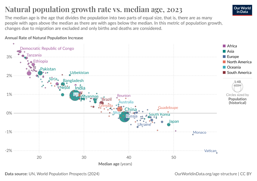
Countries with lower median age tend to have higher population growth rates
Lower-income countries tend to have a lower median age. This is because they have a younger and faster growing population overall.
Higher fertility rates across these countries mean they have larger populations of young children and adolescents.


How did the age structure of populations change?
The age structure of a population has important impacts for various aspects of society: economic growth rates, labour force participation, educational and healthcare services, housing markets amongst others.23
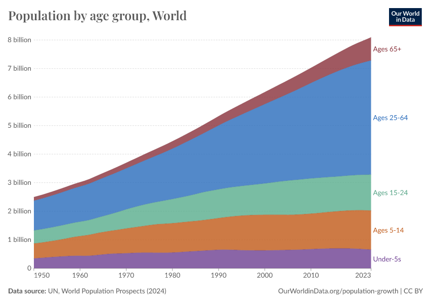
Over the past century, the age structure of populations has been changing dramatically.
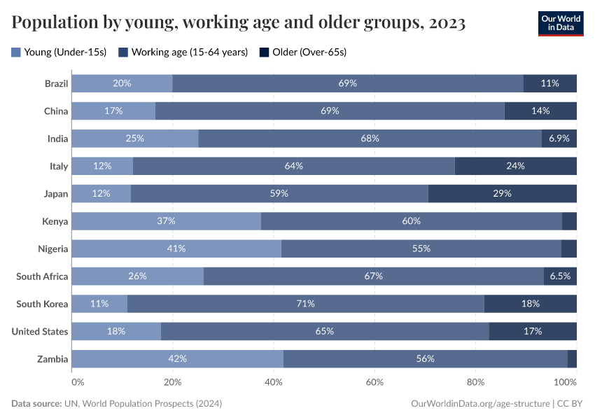
In these two charts you can compare the population structure by broad age groups for two example countries: Japan and Nigeria. This is shown from 1950 onwards. Here there are two key points to notice.
- There are large differences in the age composition of the two countries. Nigeria has a much younger population than Japan.
- We also see a major aging transition in Japan over the past half-century. In 1950, more than half of its population were younger than 25 years old. By 2021, this had declined substantially. Instead, the share of those over 65 years old has increased significantly, and makes up a sizeable share of the total population.


What does the age structure of future populations look like?
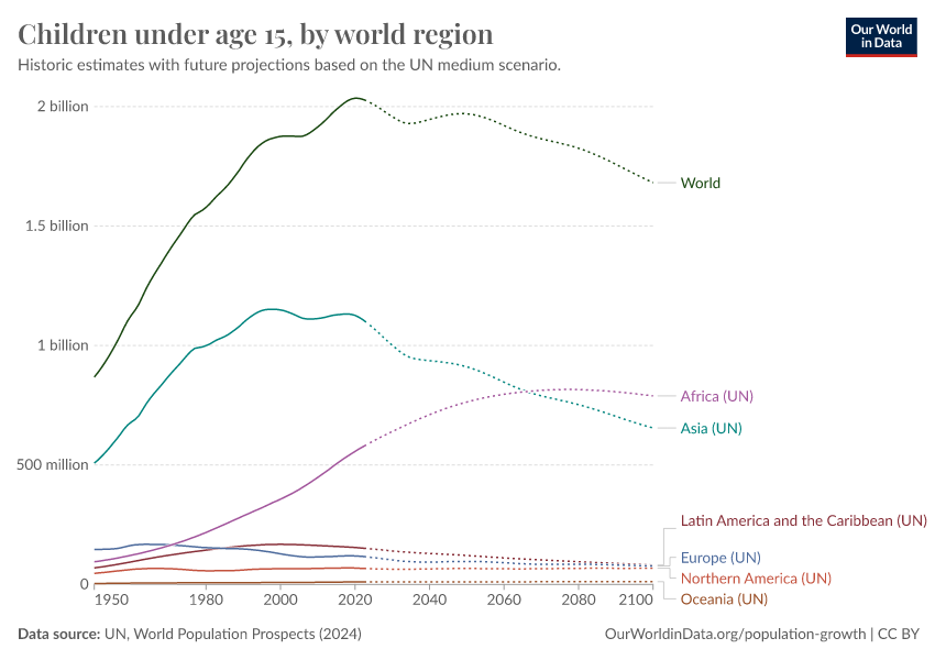
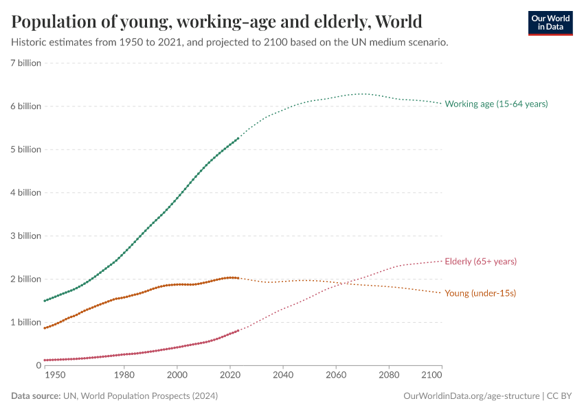
The world population is changing: For the first time there are more people over 64 than children younger than 5
Countries across the world have been going through an important demographic transition: from young to increasingly aging populations.
In 2018, the number of people worldwide older than 64 years old surpassed the number of children under 5 years old. This was the first time in history this was the case.4
We can see this transition clearly when we look at the population by age bracket in the chart — this is shown from 1950 onwards, with UN projections to 2100.
In this chart, you can explore the projected age structure of future populations for any country or world region, by clicking on the “Change country” button.

As we discuss in our exploration of dependency ratios, this distribution between working age versus young and old (dependent) populations is important for the economic and social functioning of societies.
This breakdown is shown in the visualization. You can explore this data for any country using the "change country" button on the interactive chart.
Going beyond the global perspective, when did this crossover point occur in countries around the world?
The timing varied significantly between countries — in higher-income countries with low fertility rates and longer life expectancies, it has been shifting for decades. In the United States, under-5s were already outnumbered by those older than 64 in the 1960s. In Spain it was around 1970, while in South Korea, it was around the year 2000.
For many countries, this crossover point is still to come. In South Africa, it's expected to happen in around 2035. In low-income countries with high fertility rates and lower life expectancy, this point is still many decades away: it's projected that in Nigeria, under-5s will outnumber those older than 64 until around 2080.
The number of children under 5 years old has peaked and is projected to plateau then fall for most of the 21st century. As the global population of people older than 64 years will continue to grow, it's clear that we're moving towards an aging world.
How do dependency ratios vary across the world?
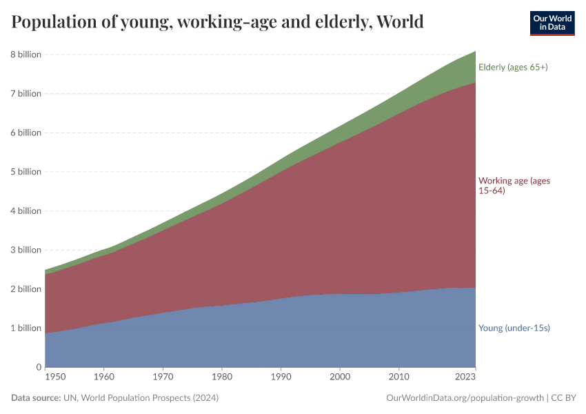
It is common in demography to split the population into three broad age groups:
- children and young adolescents (under 15 years old)
- the working-age population (15–64 years) and
- the elderly population (65 years and older)
A large share of the population in the working-age bracket is seen as essential to maintain economic and social stability and progress. And since a smaller share of the younger and older population is typically working, these two groups are seen as “dependents” in demographic descriptions.
A large fraction of economically dependents relative to those in the working-age bracket can have negative impacts for labour productivity, capital formation, and savings rates.5
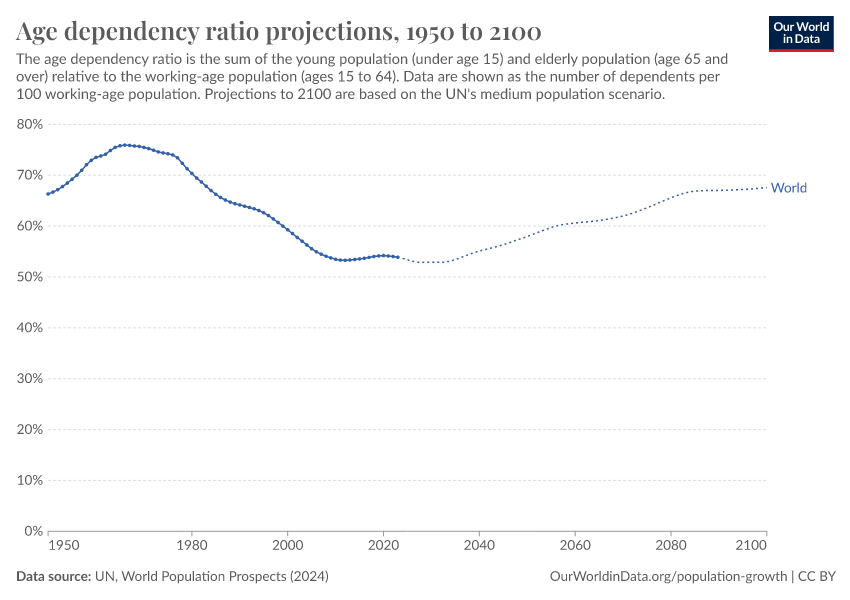
Demographers express the share of the dependent age-groups using a metric called the “age dependency ratio”. This measures the ratio between dependents (the sum of young and old) to the working-age population (aged 15 to 64 years old).
The age dependency ratio across the world is shown in this map.
It's given as the number of dependents per 100 people of working-age. A value of 100% means that the number of dependents was exactly the same as the number of people in the working-age bracket. A higher number means there are more dependents relative to the working-age population; a lower number means fewer.
Most countries have a dependent population that is at least half the size of its working-age population.
But we see big differences across the world. The ratio is much higher across many countries in Sub-Saharan Africa: several countries have a dependent population around the same size or larger than their working-age populations.
As we’ll see in the next section, this is the result of having very young populations.

How do dependents vary across the world?
In the map above we considered the 'dependent' population — both young and old — as a single group. But the split between young and old populations varies also significantly across the world.
In these two charts we see the breakdown of age dependency by young and old populations for two contrasting countries: Japan and Nigeria.
As we see, Japan has a much older population: in 2021, there were more than twice as many above 64 as there were children younger than 15. This has not always been the case, as the chart shows. Japan has aged significantly in recent decades: in 1950, there were over 7 children younger than 15 for every person above 64.
The opposite is true in Nigeria, where almost 94% of dependents there were young in 2021.
You can explore this data for any country using the "change country" button in these charts.
You'll notice fairly consistent patterns: higher-income countries with low fertility rates and longer life expectancies are dominated by an older population. The opposite is true for lower-income countries with high fertility rates.


Youth- and old-age dependencies across the world
We can also see this distribution of young and old populations across the world clearly in the two maps below. These again show the age dependency ratio, but are now split between young (under 15 years) and old (65+ years) dependency ratios.
Whilst the total age dependency ratio is a useful indicator, understanding the breakdown of this dependency between young and old is key. The needs, behavior, and future pathways for young and old populations are very different. This has important implications for national planning, spanning everything from education and healthcare services, to labour supply, savings rates, and pensions.
Youth dependency ratio
The young dependency ratio is high across Sub-Saharan Africa in particular. Some countries in this region have close to the same number of young people as they have working-age population. The youth dependency ratio is much lower across higher-income countries since fertility rates tend to be much lower there.

Old-age dependency ratio
The old-age dependency ratio is almost a mirror image. Higher-income countries — particularly across Europe, North America, and East Asia — have the highest dependency ratios.

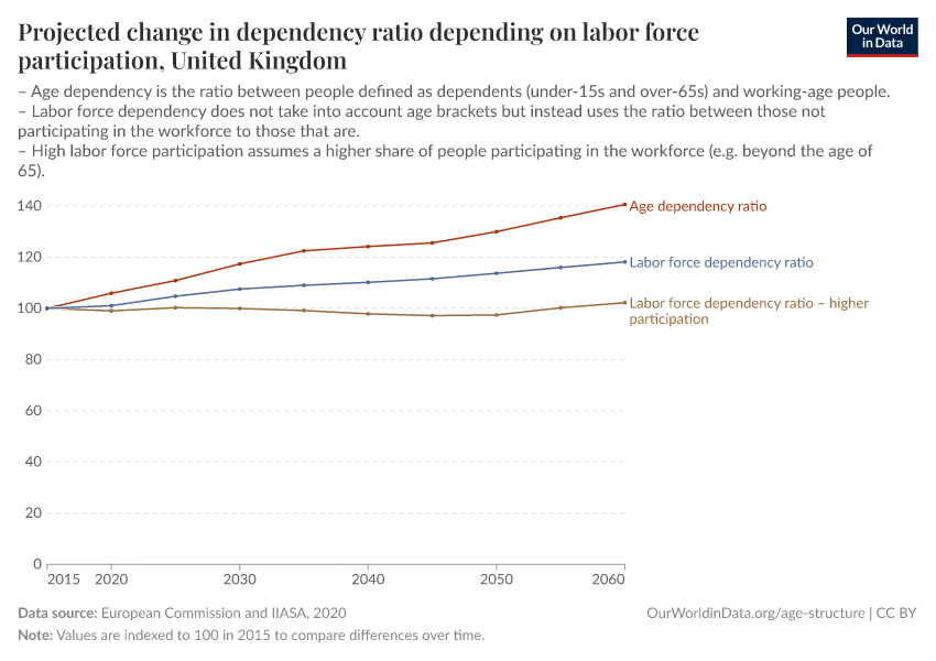
What matters more for dependency: age or labor participation?
Many thanks to Nicholas Gailey, of the World Population Program at the International Institute for Applied Systems Analysis (IIASA), for providing the content for this section on age or labor participation.
Age is one of several factors needed to tell the full story of dependency.
Conventionally, age is assumed to have a direct relationship to productivity. It’s used to estimate who is a worker and a dependent — with a productive life said to begin at 15 and end at 65. However, measures of dependency based on chronological age alone can be misleading.6
Cultural questions such as an acceptable age of retirement, delaying work for education, and the role of women in the labor force vary greatly by country and across time.
Average teenagers in rural regions of the poorest countries, who end their education early to work on the family farm, contribute much earlier and differently over the life course than average urban teenagers in the richest countries, who may spend time in education for another decade into their mid-twenties.
The reality of aging itself is not even constant. Thanks to medical advances, improved nutrition, and less demanding lifestyles, 65-year-olds in most countries can expect longer lives, and more years in good health, than their parents or grandparents.
These factors all make it difficult to use age-dependency to draw comparisons or assess economic troubles — specifically, a breakdown in the balance between workers and non-workers.
Alternative types of “dependency ratio” can capture at least some of the nuances. The Labor Force Dependency Ratio (LFDR) is useful for this purpose – it shows the number of people participating in the labor force relative to those not in the labor force. “Participation” in this context is defined as people working or actively searching for work.
Projections for the EU and UK show that regardless of possible developments in fertility or migration, there is a clear momentum towards population aging.7This prospect is common to nearly all industrialized societies. Whereas aging is inevitable, labor participation can change and play a decisive role in determining the future of dependency.
The interactive chart here shows projected changes in “dependency” between 2015 and 2060. The change in these dependency ratios is shown relative to their 2015 values (which were each set at '100' for the start of the projection).8 You can explore this data for all EU-27 countries and the United Kingdom using the ‘Change country’ toggle on the interactive chart.

The scenarios illustrate a range of pessimistic and optimistic outlooks, depending on which indicator you look at.
The Age Dependency Ratio, for example, does not account for labor force participation past the age of 65. Meanwhile, the Labor Force Dependency Ratio covers everyone participating in the labor force. The LFDR scenario assumes gradual improvements in labor participation (e.g. to the levels seen in 2015 Sweden by the year 2060).9
Even though the LFDR is still expected to climb, it suggests there is more flexibility. If Europe were to move closer to higher participation rates among its adult population (both under- and over-65) — as in Sweden, Czechia, Germany, or the Baltic countries — then much of the feared rise in dependency would fail to materialize.
For that to be achievable, education systems must be more responsive to in-demand skills and relevant to the broader economy.
Demographic opportunities and challenges: dividends and aging populations
Different countries face different challenges related to demographic aging.
Lower-income countries with high fertility rates typically have a very young population, with a large share of the population being children who aren't (or shouldn't be) in the productive working population. High-income countries with a large elderly population face the same challenge for working-age populations.
But how is this expected to change in the future? In the two charts, we see the breakdown of two example populations — Japan and Nigeria — by age, between young (under 15 years old), working-age (15-64 years old), and elderly (65+ years old). This is shown until the year 2100, based on the UN's population projections.


In Japan and other high-income countries, it's expected that the older demographic over 65 years old will continue to increase in the coming decades. Since the youth share is not expected to change significantly, this means the share of the population who is working age is expected to fall further.
Nigeria currently has a much younger population. However these children and adolescents will move into the working-age bracket soon, and the share of the productive working-age population will increase significantly in the coming decades.
As fertility rates continue to decline, it's expected that the working population as a share of the total population will continue to increase throughout this century.
Projections of the age-dependency ratios
From an economic perspective, a changing age structure generates very different opportunities and challenges across the spectrum of countries.
For Nigeria, the share of the working-age population will increase relative to the 'dependent' population as the chart shows.
The dependency ratio is expected to decline throughout this century, and because its working population has fewer people to support, this provides a window of opportunity for more rapid economic growth — the so-called “demographic dividend”.10
But as research shows: taking advantage of this opportunity is not a given.
India, one of the most populous countries, which has seen a rapid decline in fertility rates in recent decades, has had a large potential demographic dividend. The age dependency ratio in India in 1970 was almost 80%, because of a very young demographic. Since then it has fallen to below 50%, and is expected to fall until the mid-2030s.


Studies, however, suggest that despite impressive rates of economic growth, India has failed to take full advantage of this possible demographic dividend.
To reap the benefits of this demographic transition, a few conditions are required: there need to be jobs and a favorable labor market for young adults to move into, and youth have to be suitably employable for these jobs.
Research suggests that the absorption of India's youth into the workforce has been lower than expected, because of youth unemployment and educational and health challenges.11 This limits India's ability to achieve higher economic growth despite a large working-age population, and fully take advantage of its low dependency ratio.12
The demographic dividend from rapid reductions in fertility rates can provide a major opportunity for accelerated economic growth. But maximizing this potential needs a strong policy environment for education, health, and job creation. If lower-income countries can achieve this, they could see major economic gains throughout the 21st century.
Key Charts on Age Structure
See all charts on this topic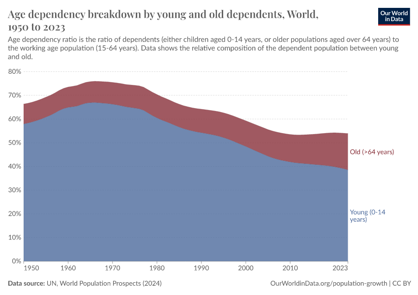


Featured Data on Age Structure
Endnotes
Data source: United Nations — World Population Prospects 2017
David E. Bloom, David Canning, Günther Fink, Implications of population ageing for economic growth, Oxford Review of Economic Policy, Volume 26, Issue 4, Winter 2010, Pages 583–612
Harper, S. (2014). Economic and social implications of aging societies. Science, 346(6209), 587-591.
The data below only extends back to 1950: why do we think that the under-5 population has been larger than those over 65 years old throughout our history? High fertility rates have been a constant in our history, with the average number of births per woman at 5, 6, or higher. Average life expectancy has also been relatively low throughout much of our history: a low share of the population lived to the age of 65. This equilibrium of high fertility and high mortality represents the first stage of the demographic transition; the population pyramid at stage one is characterized by a wide base (lots of children) and a very narrow top (few people living to older age). This equilibrium was a constant for most of our history until very recently.
Choudhry, M. T., Marelli, E., & Signorelli, M. (2016). Age dependency and labour productivity divergence. Applied Economics, 48(50), 4823-4845.
Sanderson, W. C., & Scherbov, S. (2010). Remeasuring aging. Science, 329(5997), 1287-1288.
https://ec.europa.eu/jrc/en/facts4eufuture/eu-demographic-scenarios.
These population projections come from a joint project between the European Commission and the International Institute for Applied Systems Analysis (IIASA). The results, first published as the "Demographic Scenarios for the EU" flagship report, were since updated and published by the Proceedings of the National Academy of Sciences of the United States of America (PNAS). Information on the detailed methodology and updated microsimulation results can be found at the underlying paper.
Marois, G., Bélanger, A., & Lutz, W. (2020). Population aging, migration, and productivity in Europe. Proceedings of the National Academy of Sciences, 117(14), 7690-7695.
Background on the labor force assumptions for the 'LFDR - Constant Participation' and 'LFDR - High Participation' scenarios:
Future labor force participation rates are calculated from statistical modelling based on the 2014 and 2015 Labor Force Survey, assuming constant entry and exit rates in the labor force by age, sex, education, and country. The 'high participation (Swedish) scenario' assumes a convergence in labor participation rates by 2050 to what was observed in Sweden during 2014-2015.
Mason, A. (2005). Demographic transition and demographic dividends in developed and developing countries. In: United Nations expert group meeting on social and economic implications of changing population age structures (Vol. 31).
Chandrasekhar, C. P., Ghosh, J., & Roychowdhury, A. (2006). The 'demographic dividend' and young India's economic future. Economic and Political Weekly, 5055-5064.
James, K. S. (2011). India’s demographic change: opportunities and challenges. Science, 333(6042), 576-580.
James, K. S. (2008). Glorifying Malthus: Current debate on 'demographic dividend' in India. Economic and Political Weekly, 63-69.
Cite this work
Our articles and data visualizations rely on work from many different people and organizations. When citing this topic page, please also cite the underlying data sources. This topic page can be cited as:
Hannah Ritchie and Max Roser (2019) - “Age Structure” Published online at OurWorldinData.org. Retrieved from: 'https://ourworldindata.org/age-structure' [Online Resource]BibTeX citation
@article{owid-age-structure,
    author = {Hannah Ritchie and Max Roser},
    title = {Age Structure},
    journal = {Our World in Data},
    year = {2019},
    note = {https://ourworldindata.org/age-structure}
}
Reuse this work freely
All visualizations, data, and articles produced by Our World in Data are completely open access under the Creative Commons BY license. You have the permission to use, distribute, and reproduce these in any medium, provided the source and authors are credited.
The data produced by third parties and made available by Our World in Data is subject to the license terms from the original third-party authors. We will always indicate the original source of the data in our documentation, so you should always check the license of any such third-party data before use and redistribution.
All of our charts can be embedded in any site.