Outdoor Air Pollution
Outdoor air pollution is one of the world’s largest health and environmental problems.
This article was first published in November 2019. We made minor changes to the text in March 2024.
Outdoor air pollution is one of the world's largest health and environmental problems – one that tends to worsen for countries as they industrialize and transition from low to middle incomes.
The Global Burden of Disease study estimates that millions of deaths are attributed to outdoor air pollution.1
There is also growing evidence that long-term exposure to air pollution can have important impacts on other aspects of health and well-being – such as cognitive function.
See all interactive charts on outdoor air pollution ↓
Related topics
Other research and writing on outdoor air pollution on Our World in Data:
- Air pollution: does it get worse before it gets better?
- Data review: how many people die from air pollution?
- What the history of London’s air pollution can tell us about the future of today’s growing megacities
Outdoor air pollution is a leading risk factor for premature death
Outdoor air pollution is attributed to millions of deaths each year
Outdoor air pollution is one of the world's largest health and environmental problems.
The Global Burden of Disease is a major global study on the causes and risk factors for death.1 These estimates of the annual number of deaths attributed to a wide range of risk factors are shown here. This chart is shown for the global total but can be explored for any country or region using the "change country or region" toggle.
Outdoor air pollution is a risk factor for several of the world's leading causes of death, including stroke, heart disease, lung cancer, and respiratory diseases, such as asthma.2 In the chart, we see that it is one of the leading risk factors for death globally.

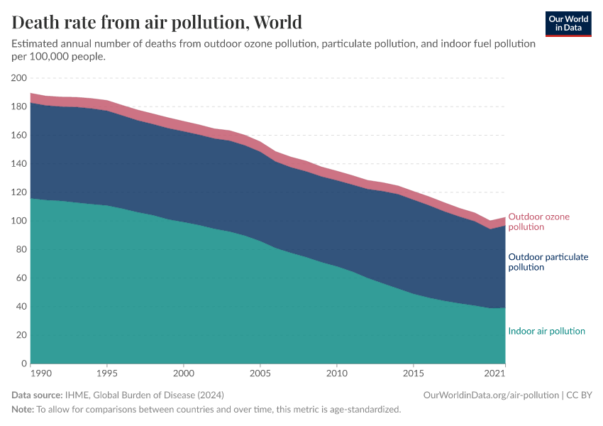
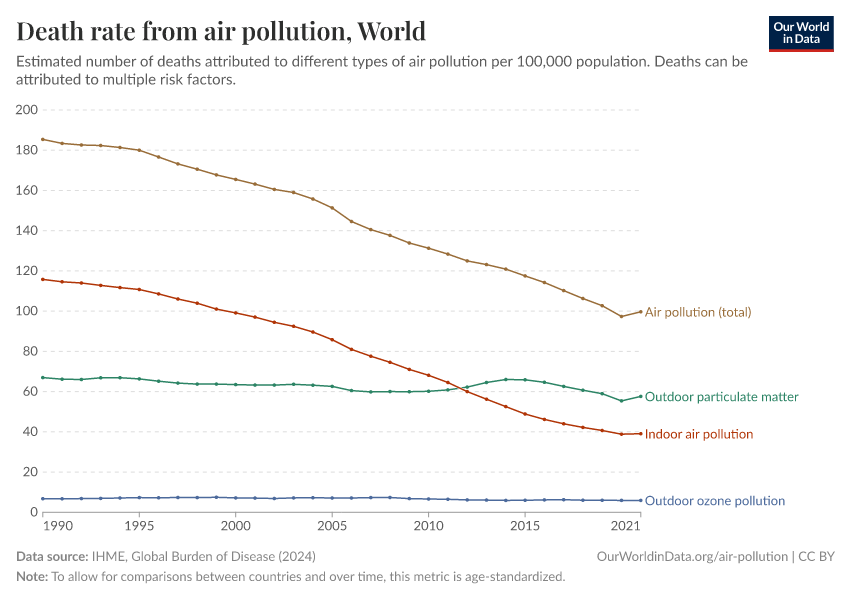
Death rates from ozone and particulate matter pollution
There are two key local air pollutants that can have adverse health impacts: ozone and particulate matter. Death rates from particulate matter pollution tend to be higher than that of ozone.
Here, when we discuss ozone, we mean 'tropospheric ozone' – that is, ozone that exists in the lower atmosphere, close to the surface. This is not to be confused with ozone in the stratosphere – the ozone layer – which is essential in protecting us from UV radiation. Local ozone close to the surface is often termed 'bad ozone' and is contrasted with the 'good ozone' in the ozone layer.
Throughout our work on outdoor air pollution, we often combine the death rates from ozone and particulate matter pollution. But in the visualization here, we show the breakdown of death rates for each. Also shown in this chart is the death rate from indoor air pollution. The global figures are shown here as the default, but this can be viewed for any country or region using the "change country or region" toggle on the chart.
We see that global death rates from total air pollution have fallen in recent decades. Most of the total decline is due to reductions in indoor air pollution.

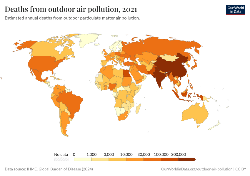
The global distribution of deaths from outdoor air pollution
What share of global deaths are attributed to outdoor air pollution?
In the map here, we see the share of annual deaths attributed to outdoor air pollution across the world.
This is based on the share of deaths that are attributable to outdoor air pollution based on the impact of air pollution on the risk of diseases like cardiovascular disease, lung disease, lung cancer, and others. In other words, it is an estimate of the share of all deaths that would be prevented if outdoor air pollution was absent.

Death rates tend to be highest across middle-income countries
In this map, we see death rates from outdoor air pollution across the world. Death rates measure the number of deaths per 100,000 people in a given country or region.
The global distribution is reflected in the patterns we see when we look at death rates versus income. Death rates tend to rise as countries shift from low to middle-income through industrialization before falling again at higher incomes as both air pollution and overall health improve.

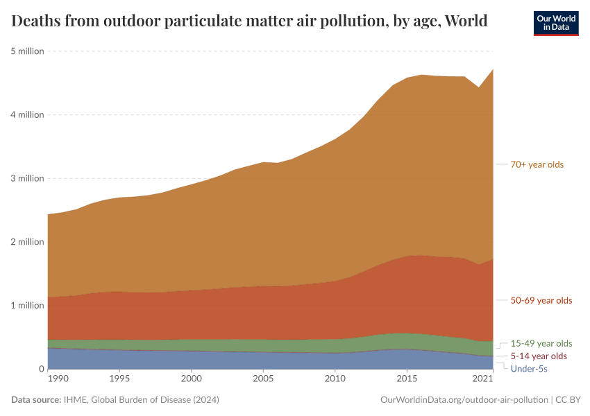
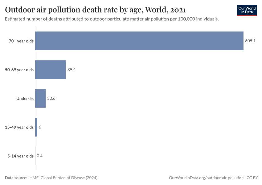
Outdoor air pollution deaths by age
Death rates from outdoor air pollution are highest in older populations
Outdoor air pollution is a risk factor for many of the world's leading causes of death: stroke, heart disease, lung cancer, and respiratory diseases.2 Most are defined as non-communicable diseases (NCDs) – a group of illnesses that are most common in older populations. Outdoor air pollution often exacerbates or accelerates the extent of NCDs, which can result in premature death.
This means the burden of air pollution is also most prevalent for older individuals. In the chart here, we see death rates from outdoor air pollution by age group. Populations aged 70 years and older are clearly at much higher risk of premature mortality from outdoor air pollution. This does not result from acute exposure but from long-term exposure over their lifetimes.
The differences in death rates by age can be explored for any country and region using the "change country or region" toggle on the interactive chart. Across countries, we find a very consistent pattern of much higher death rates in the older sections of the population.

How are deaths from outdoor air pollution changing?
Globally, the number of deaths from outdoor air pollution has increased significantly in recent decades.
The two main drivers for the rising number of deaths were the overall increase in population and the aging of the population.
When we look at the global death rate from outdoor air pollution – which is age-standardized and thereby corrects for the aging of the population – we see that the rate has stayed fairly constant.
Population growth and population aging resulted in a rising number of deaths in most countries
The global number of deaths from outdoor air pollution has increased. But by how much? And have some countries seen a decline?
In the scatterplot, we see the comparison between the number of deaths from outdoor air pollution in 1990 (shown on the y-axis) and the number in the latest year (on the x-axis).
The grey line here represents parity: a country which lies along this line had the same number of deaths in both years. Countries that lie above the grey line had a higher number of deaths in 1990 (meaning they've since declined), and countries below had a higher number in the latest year (meaning they've increased over recent decades).
The number of deaths has increased in most countries in the world. The main exceptions are countries in Europe – if you hover over this region in the legend, you see these countries highlighted – where the number of deaths has decreased. For most other countries, the number of deaths has increased. As we see in the next section, this is not always the result of increased death rates from air pollution but is instead the result of growing and aging populations.

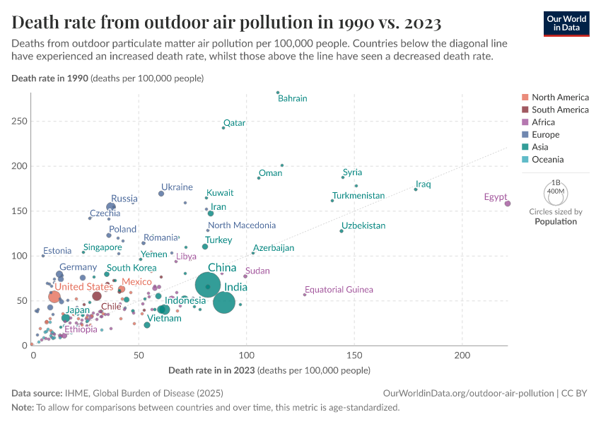
Death rates from outdoor air pollution have fallen in around half of countries
The total number of deaths from outdoor air pollution has increased in most countries in recent decades. In some cases, this has occurred because outdoor air pollution has increased. However, in many cases, the largest driver of this change has been population growth and aging populations.
Where in the world have death rates increased, and where have rates decreased?
In the scatterplot, we see the comparison between the death rate from outdoor air pollution in 1990 (shown on the y-axis) and the rate in the latest year (on the x-axis).
The grey line here represents parity: a country that lies along this line had the same death rate in both years. Countries that lie above the grey line had a higher death rate in 1990 (meaning they've since declined), and countries below had a higher rate in the latest year (meaning they've increased in recent decades).
Here, we see that death rates have increased in around half of all countries and declined in the other half. Regardless of region, rates have typically fallen across high-income countries: almost everywhere in Europe, but also in Canada, the United States, Australia, New Zealand, Japan, Israel, South Korea, and other countries. In low and lower-middle-income countries, rates have typically increased over this period.

Exposure to air pollution across the world
Concentrations of air pollution
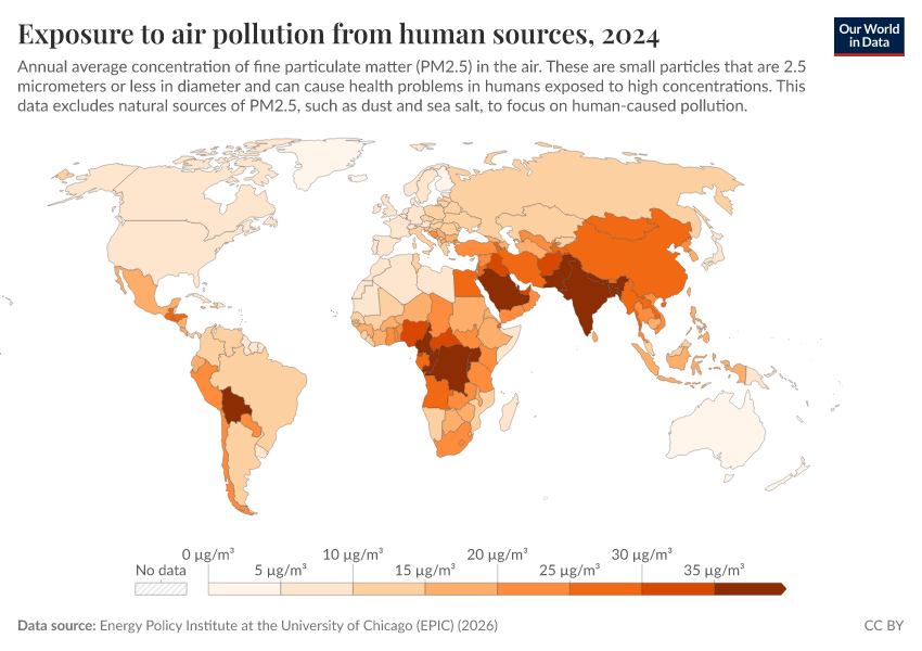
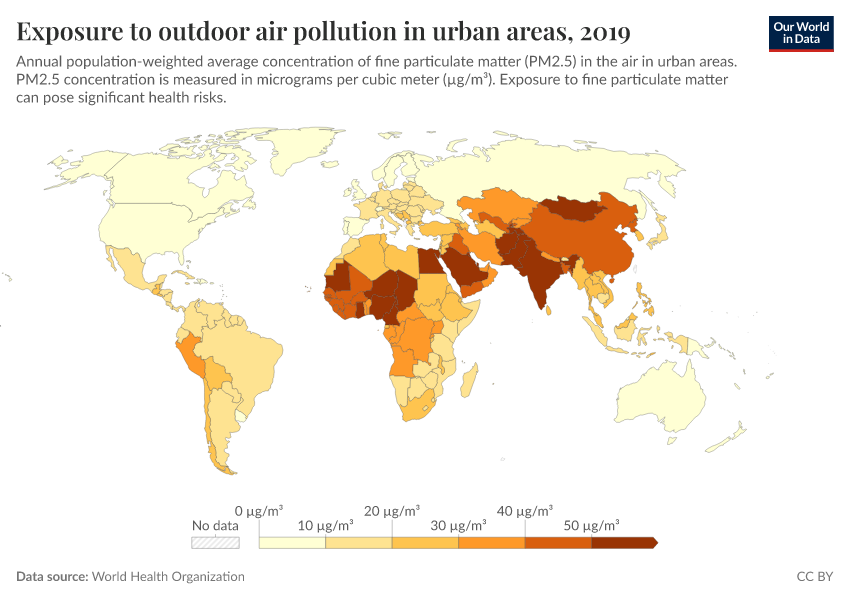
The main contributor to poor health from air pollution is particulate matter. Very small particles of matter – termed 'PM2.5', are particles with a size (diameter) of less than 2.5 micrometers (µm). Smaller particles tend to have more adverse health effects because they can enter airways and affect the respiratory system.
How does exposure to PM2.5 vary across the world? In the map, we see the distribution of the population-weighted mean exposure to PM2.5 each year. We see a greater than ten-fold difference in exposure between countries.
Pollution exposure is high in many low-to-middle-income countries across Africa and Asia. There, exposure can go above 50µg per cubic meter. Compare this with Sweden, where exposure levels are around 5µg/m3 – around 10 times lower.

In order to limit the adverse health impacts of air pollution, the World Health Organization (WHO) lays out clear recommendations for exposure to air pollution – these are its so-called Air Quality Guidelines (AQG).3 The WHO defines these AQGs for various air pollutants based on an epidemiological assessment of the link between pollution exposure and health consequences.
The negative health consequences of air pollution increase with exposure. There is little evidence that there is a threshold below which no health impacts occur from exposure to PM2.5. In other words, there might not be a "safe limit" where we can expect the health impacts to be zero. The WHO makes clear in its guidelines that limiting exposure to their guideline value cannot guarantee zero health consequences; it will, however, greatly minimize these impacts.
The WHO has set an AQG annual average concentration for PM2.5 of 5 micrograms per cubic meter (5 µg/m3).3 This threshold presents the lower end of the range over which long-term exposure to PM2.5 is associated with all non-accidental causes of death.4
Exposure to air pollution over time
Concentrations of air pollution are high across many countries in the world today. Has this been getting better or worse?
In the scatterplot, we see the comparison of exposure to PM2.5 in 1990 (shown on the y-axis) and exposure in the latest year available (on the x-axis). The grey line here represents parity: a country which lies along this line had the same pollution concentration in both years. Countries that lie above the grey line had higher pollution in 1990 (meaning levels have improved since), and countries below had higher pollution in recent years (meaning it's increased in recent decades).
Here, we see a very strong regional split: pollution levels have fallen across most of Europe and North and South America, whilst pollution has increased in recent decades across most countries in Asia and Africa.

The long-term decline of air pollution in rich countries
A common narrative we see in public discussions is that levels of air pollution are at their highest levels in history.
With continued urbanization, densely-populated cities, and city driving, this narrative can be easy to believe. But for rich countries today, this is far from true. Air pollution levels today are at some of their lowest levels in decades.
Here, we take a look at air pollution trends in two countries for which we have good data from the last decades: the UK and the US.
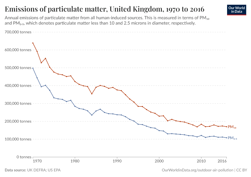
Decline of air pollution in the UK
In the visualization, we see the relative change in air pollution emissions in the UK since 1970. Levels of emissions in 1970 (1980 for ammonia) are assigned a value of 100 – this means a value of 40 would mean emissions in the given year were 40% of what they were in 1970 (a 60% decline).
We see a dramatic decline in emissions for all pollutants except ammonia (which is a gas typically produced in agriculture and is difficult to tackle).
We see that emissions of sulfur dioxide – the gas that contributes to acid rain, an important environmental problem – have fallen drastically. Emissions of particulate matter (PM2.5), which is the biggest threat to human health, fell by almost 80%; nitrous oxides fell by more than 70%.
What becomes clear is that far from being the most polluted in recent history, the air in many rich countries today is cleaner than it has been for decades. This does not mean we can't do more to generate cleaner cities and towns to live in – there are large health and other benefits to doing so – but it does show us that a combination of technological and political progress can be effective in reducing air pollution.

Decline of air pollution in the United States
The decline of air pollution in the UK is also mirrored across the Atlantic in the US.
In the visualization, we see the same again – the relative change in emissions of air pollutants since 1970 (where emissions in the first year of available data are given a value of 100).
The US achieved significant reductions in air pollution with sulfur dioxide, particulate matter (PM10), nitrous oxides, and volatile organic compounds. Data for PM2.5 did not begin until 1990, but by 2016, emissions had declined by around 25%.

How can we make progress against outdoor air pollution?
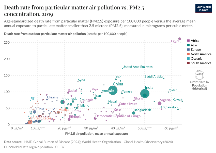
Link between exposure to pollution and death rates
A key question for making progress against air pollution is to understand in which way pollution affects human health. What determines the likelihood that a given individual will die prematurely from pollution-related illness?
It seems intuitive that the health impacts of air pollution would be strongly linked to the concentration of local pollutants (i.e., the exposure). But are there other factors at play?
In the visualization, we see the death rate from outdoor particulate matter pollution (on the y-axis) plotted against the population-weighted exposure to particulate matter (PM2.5) concentrations (on the x-axis).
Indeed, we see an overall correlation: the death rate from air pollution is higher in countries that have a higher level of pollution. There is also an important regional divide: most European, North American, and Latin American countries cluster near the origin at low pollution levels and low death rates. Nearly all countries with either a high death rate or high pollution concentration (or both) are in Africa or Asia.

But what about some of the outliers? How do some countries with a high level of PM2.5 pollution manage to maintain significantly lower death rates than we'd expect? Countries such as Qatar, Saudi Arabia, Oman, Kuwait, and the UAE have a comparably lower risk of premature death despite high levels of pollution. They do, however, have a significantly higher GDP per capita than their neighbors. Overall health, well-being, and healthcare/medical standards in these nations significantly reduce the risk of mortality from respiratory illness.
The importance of good living standards is also likely to explain the other extreme, where countries such as Afghanistan and the Central African Republic have a very high death rate despite having mid-range pollution levels. With low GDP levels, overall health and healthcare quality are likely to increase the burden of pollution-related diseases.
Furthermore, many of the outliers on the right of the graphic (with high levels of particulate pollution and lower death rates) lie in the Middle East and North Africa. Drier conditions here mean the source of pollutants may be notably different from elsewhere: much of the local air pollution could be derived from dust and sand particles as opposed to anthropogenic sources of industry and agriculture. If proximal sand and dust sources have less severe impacts on health, this may explain the strong outliers from this world region.
If we want to reduce death rates from air pollution, there are two important elements to tackle: a decline in exposure to pollution and improving overall health conditions and healthcare across the world.
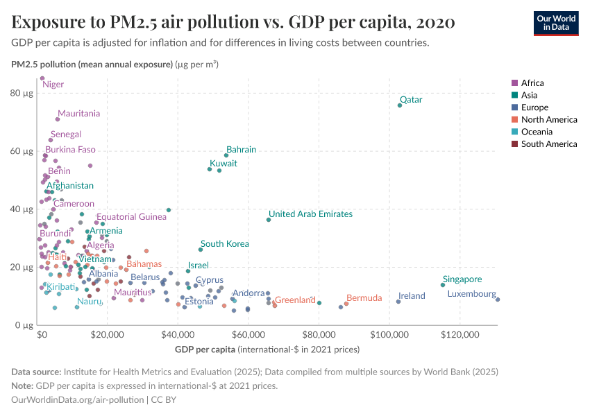
Outdoor air pollution tends to rise with industrialization before falling
The visualization shows that it is in middle-income countries where the death rates from air pollution are highest. The evolution over time also shows an increase-peak-reduction shape.
This trend is characteristic of what is called the ‘Environmental Kuznets Curve’ (EKC). The concept of the EKC was first discussed in the 1990s within the 1992 World Development Report, but builds upon the stylized relationship between income inequality and economic development as described by Simon Kuznets in 1955 – he hypothesized that income inequality is low at low levels of prosperity and then rises with increasing prosperity, but eventually falls again at higher levels of average incomes.5
The EKC provides a hypothesis of the link between environmental degradation and economic development: environmental quality initially worsens with the onset of industrial growth but then peaks at a certain stage of economic development, and from then on, environmental quality begins to improve with increased development. Evidence of the EKC is mixed: across various measures, it has been widely contested, but for a number of environmental markers, there is strong evidence for the existence of an EKC relationship. For example, a recent study published in Science suggests the EKC relationship also appears in links between deforestation, afforestation, and economic growth.6
In regard to air pollution, we see this in trends of sulfur dioxide (SO2) emissions – they tend to follow an inverted U shape, first rising with industrialization before peaking and falling rapidly with development.7
This also appears to be reflected in the data when we look at death rates from outdoor air pollution versus income by country, as shown in the scatterplot here. What we see is that death rates tend to be highest around middle incomes – lower for low-income countries and low also in high-income countries. Countries with very high death rates – such as India, Egypt, Pakistan, and Nepal, are at low to middle-income levels.

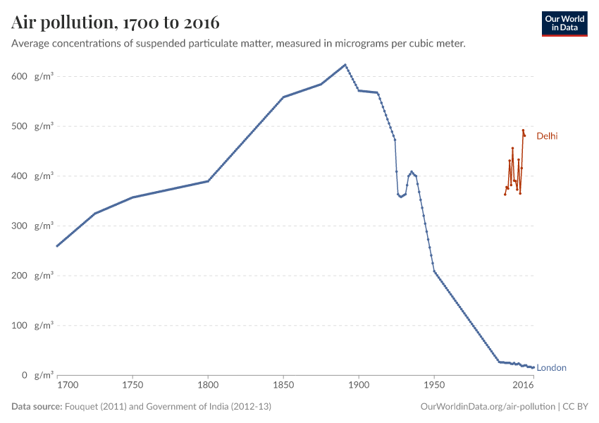
The rise and fall of air pollution in London
Many of today's megacities face a huge challenge in managing development with air pollution. Dense cities not only have the problem that air pollution levels tend to be higher but also that they can expose large populations to its impacts.
What we see from historical data is that this rise in pollution is a typical pathway of developing cities. It's one where emissions levels peak and can then fall dramatically.
If we take a historical look at pollution levels in London, we can see Kuznet's Curve. In the visualization, we plotted the average levels of suspended particulate matter (SPM) in London’s air from 1700 to 2016. Suspended particulate matter (SPM) refers to fine solid or liquid particles that are suspended in Earth’s atmosphere (such as soot, smoke, dust, and pollen). The data presented below has been provided by Roger Fouquet, who studied the topic of environmental quality, energy costs, and economic development in great detail.8
As we see, from 1700 on, London experienced a worsening of air pollution decade after decade. Over the course of two centuries, the suspended particulate matter in London’s air doubled. But at the very end of the 19th century, concentration reached a peak and then began a steep decline, so today’s levels are almost 40 times lower than at that peak more than a century ago.
To provide context of pollution in today's growing megacities, we have also shown levels in Delhi in India. Pollution in Delhi is much worse than in London today but not dissimilar from levels during London's period of rapid industrialization. In our post here, we look in more detail at what today's megacities can learn from London's pollution of the past. The key takeaway is that city pollution is not unprecedented from a historical perspective – and we know that with development, levels peak and eventually decline. However, to successfully address the large health burdens of air pollution today, we must find solutions that accelerate this process for low-to-middle-income countries.

Key Charts on Outdoor Air Pollution
See all charts on this topic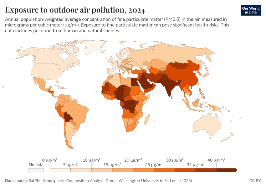


Featured Data on Outdoor Air Pollution
Endnotes
Murray, C. J., Aravkin, A. Y., Zheng, P., Abbafati, C., Abbas, K. M., Abbasi-Kangevari, M., ... & Borzouei, S. (2020). Global burden of 87 risk factors in 204 countries and territories, 1990–2019: a systematic analysis for the Global Burden of Disease Study 2019. The Lancet, 396(10258), 1223-1249.
WHO (2018) – Fact sheet – Ambient air quality and health. Updated May 2018. Online here.
WHO global air quality guidelines. Particulate matter (PM2.5 and PM10), ozone, nitrogen dioxide, sulfur dioxide and carbon monoxide. Geneva: World Health Organization; 2021.
Chen J, Hoek G (2020). Long-term exposure to PM and all-cause and cause-specific mortality: a systematic review and meta-analysis. Environ Int. 143:105974. Doi: 10.1016/j.envint.2020.105974
Kuznets, S. Economic Growth and Income Inequality. American Economic Review. 45, 1–28 (1955). Available at: JSTOR
Crespo Cuaresma, J. et al. Economic Development and Forest Cover: Evidence from Satellite Data. Scientific Reports. 7, 40678 (2017). Available at: doi:10.1038/srep40678
This transition across Europe and North America was achieved through a number of economic, technological, and policy measures. National regulation and regional policy agreements played a crucial role in this clean-up, the first being the 1979 Convention on Long-Range Transboundary Air Pollution (CLRTAP), signed by 35 countries across North America, Western Europe, and the Eastern Bloc. Since then, a number of progressive Sulphur Protocols and European directives have set regulatory limits on SO2 emissions from large power stations and industrial processes. This has forced the adoption of emissions reduction technologies such as ‘scrubbers’, which strip the gases of sulfur before being emitted, as well as migration away from cheaper coal and oil sources, which typically have higher sulfur contents.
Kunnas, J. & Myllyntaus, T. The Environmental Kuznets Curve Hypothesis and Air Pollution in Finland. Scandinavian Economic History Review. 55, 101–127 (2007). Available at: doi:10.1080/03585520701435970.
Fouquet, R. (2011). Long-run trends in energy-related external costs. Ecological Economics, 70(12), 2380–2389.
Cite this work
Our articles and data visualizations rely on work from many different people and organizations. When citing this topic page, please also cite the underlying data sources. This topic page can be cited as:
Hannah Ritchie and Max Roser (2022) - “Outdoor Air Pollution” Published online at OurWorldinData.org. Retrieved from: 'https://ourworldindata.org/outdoor-air-pollution' [Online Resource]BibTeX citation
@article{owid-outdoor-air-pollution,
    author = {Hannah Ritchie and Max Roser},
    title = {Outdoor Air Pollution},
    journal = {Our World in Data},
    year = {2022},
    note = {https://ourworldindata.org/outdoor-air-pollution}
}
Reuse this work freely
All visualizations, data, and articles produced by Our World in Data are completely open access under the Creative Commons BY license. You have the permission to use, distribute, and reproduce these in any medium, provided the source and authors are credited.
The data produced by third parties and made available by Our World in Data is subject to the license terms from the original third-party authors. We will always indicate the original source of the data in our documentation, so you should always check the license of any such third-party data before use and redistribution.
All of our charts can be embedded in any site.