Global Health
An overview of our research on global health.
This page was first published in August 2016, and we updated the text in February 2024.
Good health is fundamental for a high quality of life, as it influences our ability to enjoy life and participate in daily activities.
On this page, we provide an overview of global health, emphasizing data on health outcomes — such as disease and death — and the effects of healthcare investments.
We begin by examining life expectancy, a primary indicator of population health. Historical trends show us there have been significant increases in global life expectancy over the last two centuries, reflecting improvements around the world.
Notably, poorer countries have made considerable progress, which has helped reduce the global disparity in life expectancy. But substantial gaps remain, with life expectancies in some sub-Saharan African countries below 60 years, in contrast to over 80 years in several European countries and Japan.
Large reductions in child and maternal mortality have been central to the improvement in life expectancy worldwide. But life expectancy has risen across all age groups.
Despite these advancements, disparities persist — child mortality rates in low-income countries are substantially higher than those in high-income countries. This pattern extends to other health measures, including disease burden estimates, indicating ongoing global health challenges.
A growing body of research highlights the effectiveness of healthcare investments in improving health outcomes. Evidence shows that health outcomes respond positively to increased healthcare spending, particularly at lower levels of expenditure.
This suggests that appropriately targeted and managed international health aid can significantly reduce global health inequalities and improve living standards worldwide.
Explore the data on global health
In this data explorer, you can explore many of the key metrics on global health. In the sections below, we describe these areas in more detail.
See all interactive charts on global health ↓
Health Outcomes
Life expectancy
To understand the health of a population, one useful approach is to look at life expectancy. This is formally called the “period life expectancy at birth”, and is an indicator that summarizes death rates across all age groups in one particular year.
For a given year, it represents the average lifespan for a hypothetical group of people, if they experienced the same age-specific death rates throughout their whole lives as the age-specific death rates seen in that particular year.
Find much more about the topic of life expectancy on our dedicated page:
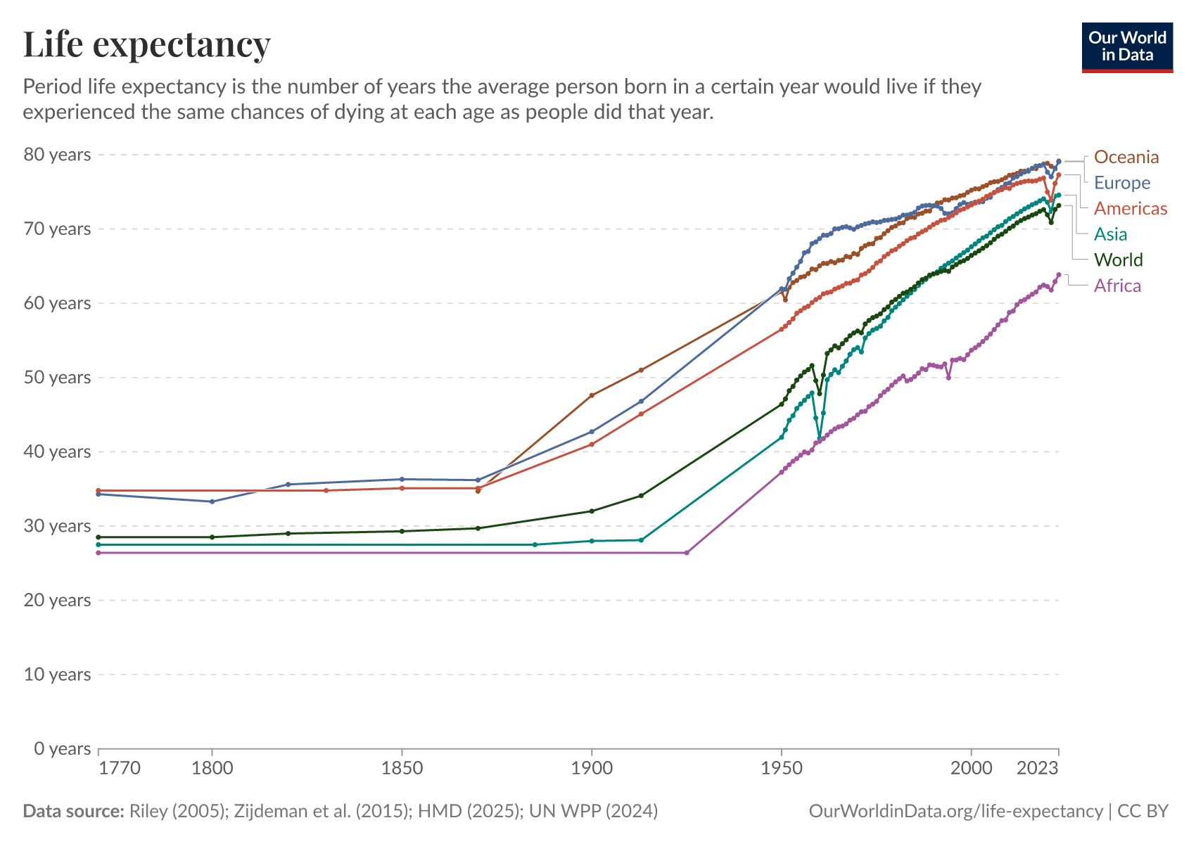
How has life expectancy changed in the long run?
The chart below summarises the available data on life expectancy over the last few centuries.
In the United Kingdom, a country for which we have the longest time series of data, the chart shows that life expectancy before 1800 was very low, but since then it has increased drastically.
In less than two centuries, life expectancy in the UK has doubled. The data shows that similarly remarkable improvements also took place in other European countries during this period.
The chart also shows large historical changes in life expectancy estimates for other regions. In the early 1900s, life expectancy in both India and South Korea was less than 25 years. A century later, life expectancy in India had more than doubled, and in South Korea, it had more than tripled.

The map view shows a comparison of life expectancy across countries. As you can see, although the global disparity in life expectancy has reduced substantially, there are still huge differences between countries.
In 2021, the life expectancy in several sub-Saharan African countries is less than 60 years, compared to more than 80 years in countries such as Japan.

Child mortality played a substantial role in increasing overall life expectancy, historically. But in recent decades, as child mortality rates have been at much lower levels, further declines have made much smaller contributions to gains in life expectancy.
Despite this, life expectancy continues to rise in many countries, because death rates have continued to fall across age groups.
You can read more in our article:
Have all countries in the world experienced increasing life expectancy?
This chart shows the average life expectancy of different countries over time. It's laid out with the world's population on the horizontal axis and life expectancy on the vertical axis. Countries are arranged from lowest to highest life expectancy, and the width of each bar represents the size of that country's population.
Looking at the year 1800, shown by the red line, we can see countries like India and South Korea on the left, with life expectancies around 25 years. On the right-hand side, no country in 1800 had a life expectancy over 40 years; Belgium had the highest life expectancy, at 40 years.
By 1950, every country's life expectancy had increased compared to 1800. However, the gap between countries widened significantly. This was mainly because health improvements were more substantial in wealthier countries, particularly in Europe and North America, while countries like India and China saw limited progress.
The 2012 data, shown with a green line, shows further improvement: life expectancy rose across all countries, and the gap between them began to close. This change was driven by significant health advancements in poorer countries, which experienced very dramatic rises in life expectancy.
From 1800 to today, the world developed from equally poor health in 1800, to great inequality in 1950, and back to more equality today, by achieving higher life expectancy for all.
You can read more in our article:
In the long run the inequality in life expectancy within countries decreased hugely
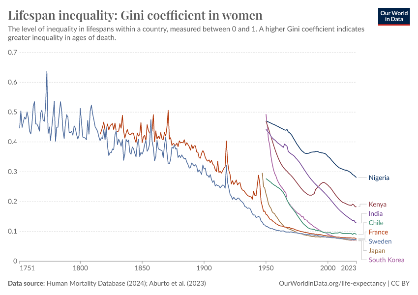
Just as researchers can measure economic inequality with the Gini coefficient, this method can also be applied to assess the inequality of lifespans within a country.
The chart below uses the Gini coefficient to illustrate the inequality of lifetimes. A higher Gini coefficient indicates higher inequality of lifespans in the population – that some live much longer or shorter than the average person.
The process to calculate the Gini coefficient for lifespan inequality involves comparing the expected age at death of two individuals chosen at random from the population, and then repeating this comparison across all possible pairs. The total is then normalized to a scale from 0 to 1.
As the chart shows, lifespan inequality has declined over time in many countries. It also shows that wealthier nations generally exhibit lower levels of lifespan inequality.

Child mortality
In the previous section, we explored life expectancy at birth as a crucial overview of a population's overall health. Now, we turn our attention to the health outcomes of children.
Studying child mortality rates is vital for understanding the overall health of a country because the early years of life involve numerous health challenges. Children who survive these earliest years have a much higher life expectancy afterward. This is why a large part of the gains in life expectancy at birth historically were due to dramatic reductions in child mortality.
Child mortality measures the share of newborns who would not survive to their fifth birthday, given death rates at young ages in a population.
Find much more about the topic of child mortality on our dedicated page:
How has cross-country child mortality changed in the long run?
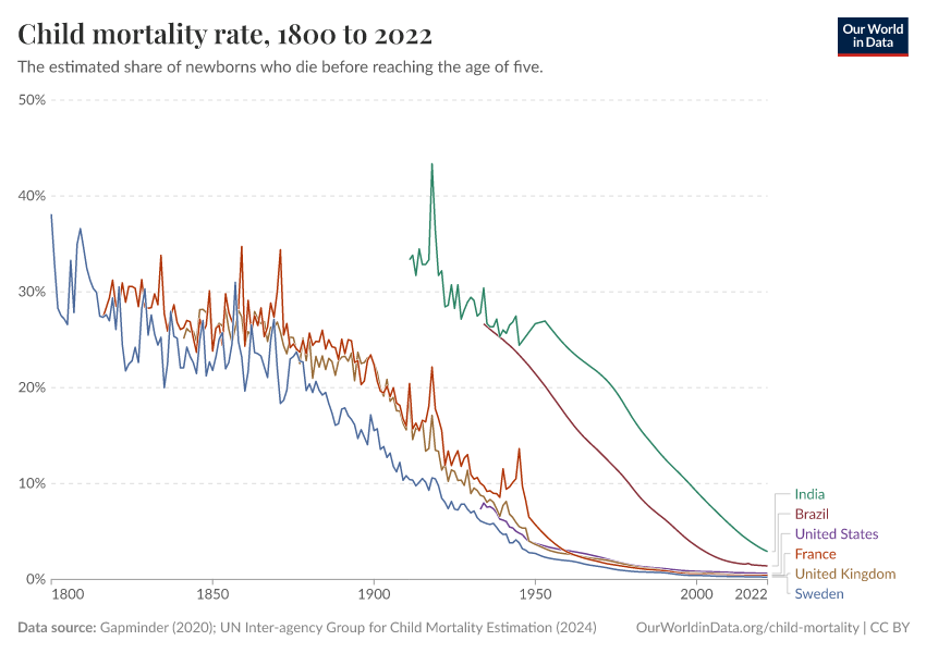
The interactive chart shows how child mortality has changed over the long run.
We can see significant improvements, especially in richer countries today, where child mortality rates have dropped to around 0.5% by 2021.
This dramatic decline, however, is a relatively recent phenomenon. Historically, in pre-modern societies, child mortality rates ranged between 30% and 50%. While health conditions for children in poorer countries are improving rapidly, their mortality rates are still substantially higher than those in richer countries.
Another notable aspect of the data shown in the chart is that there are many sharp ‘spikes’ in the 19th century. This is partly because the data quality is improving over time, but also because health crises were more frequent in pre-modern times, including food shortages, epidemics, and wars.
These crises significantly impacted living standards, which you can explore further on our page on food prices, which provides data and research on the frequency of food crises.

You can also switch to the map view in this visualization, to compare child mortality rates across different countries and periods.
This comparison reinforces that all countries have experienced a reduction in child mortality rates over time. Yet there are still large disparities between richer and poorer countries, which highlights the ongoing challenge of closing the health gap.

Are poorer countries catching up with low child mortality rates in richer countries?
Over the past fifty years, poorer countries have made significant strides in reducing child mortality, which has helped narrow the gap between nations.
The chart below shows child mortality rates in countries of different income levels. We can see a consistent decline across all income levels.
There have been rapid advancements in low-income and upper-middle-income countries, and the gap between these countries and the rest of the world has been narrowing. Upper-middle-income countries are close to catching up.
Despite this progress, important challenges remain. On average, in 2021, low-income countries face child mortality rates that are more than ten times higher than those in high-income countries. The remaining gap is still large.

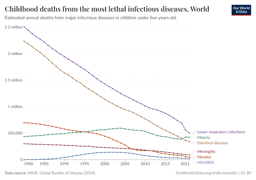
The most lethal infectious diseases over time
The chart shows the annual number of deaths from some of the most lethal infectious diseases among children.
As the chart shows, deaths caused by malaria and HIV/AIDS rose over the 1990s. From 2005 onwards, the number of deaths from these diseases has been declining.

Maternal mortality
Maternal mortality, like child mortality, serves as a critical indicator of a country's health status.
It refers to the deaths of women during pregnancy, or within 42 days of ending the pregnancy, with the rate often presented per 100,000 live births.
Find much more about the topic of maternal mortality on our dedicated page:
Maternal mortality has declined in the long run
Historical data on maternal mortality, particularly from high-income countries, shows significant reductions over time.
A century ago, maternal mortality rates ranged between 500 and 1,000 deaths per 100,000 live births. This means that, on average, for every 100 to 200 births, one resulted in the death of the mother. Since women in the past gave birth to more children than today, the deaths of mothers were a common tragedy.
Today, however, these rates have decreased to around 10 per 100,000 live births in those same countries.
This remarkable decline is largely due to advancements in medical science, particularly our understanding of hygiene's role in preventing puerperal fever, or childbed fever, a major cause of maternal deaths.
The discovery by Ignaz Semmelweis in the 19th century that hygiene could dramatically improve maternal survival was a turning point, but it was only after the germ theory of disease was established, that hygiene practices became widely adopted.
The pace of improvement in maternal mortality has varied by country.
For example, Finland began reducing its maternal mortality rates in the mid-19th century, but it took over a century to achieve today's low levels. Malaysia, on the other hand, saw similar improvements within just a few decades, which occurred much later.

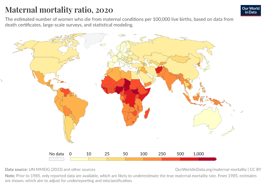
How do countries compare on maternal mortality today?
Recent data on maternal mortality shows continuing improvements around the world, as the interactive chart below shows.
However, the challenges remain substantial, particularly in sub-Saharan Africa — where the rate in 2017 exceeded 500 maternal deaths per 100,000 live births, more than 60 times the rate in the European Union.

Burden of disease
In the previous sections, we looked at health outcomes, measured only with data on mortality. But this doesn’t take into account the morbidity – the impact of disease on people alive.
The burden of disease is a related but different indicator of health outcomes, which accounts for both the mortality and the morbidity of disease.
The most common way to measure the burden of disease is to estimate the number of years of life “lost” due to poor health, which is the so-called loss in “Disability Adjusted Life Years” (DALYs).
DALYs are standardized units to measure lost health. They help compare the burden of different diseases in different countries, populations, and times.
Conceptually, one DALY represents one lost year of healthy life — it is the equivalent of losing one year in good health because of either premature death or disease or disability.
Find much more about the topic of maternal mortality on our dedicated page:
The global distribution of the disease burden
This map shows DALYs per 100,000 people in the population. It is thereby measuring the distribution of the burden of both mortality and morbidity around the world.
In some regions with the best health, the rate of DALYs was under 20,000 per 100,000 people in 2019. In contrast, in the worst-off regions, the rate was several times higher than that — over 60,000 in several countries in Africa.

Infectious diseases
The data shows that there are still major challenges regarding several diseases, including malaria, tuberculosis, HIV/AIDS, diarrheal disease, and more.
Find much more about these topics on our dedicated pages:
What explains changes and differences in health globally?
Health returns to healthcare investment
How strong is the link between healthcare expenditure and life expectancy?
Healthcare is a crucial factor affecting overall health outcomes. How much impact does it have? In this section, we’ll look at how healthcare is related to health outcomes, such as life expectancy.
Find much more about healthcare spending on our dedicated page:
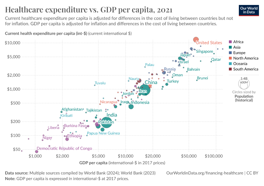
In the chart below, we can see a comparison between life expectancy and per capita healthcare expenditure across countries. The chart shows the change between 1995 and the latest year.
The data reveals a clear trend — countries with higher healthcare spending per capita generally exhibit longer life expectancy. By looking at the change over time, we can also see that, as countries spend more on health, the population’s life expectancy increases.
But the benefits of increased healthcare spending are affected by “diminishing returns”. This means that, as spending levels continue to rise, countries receive less “bang for their buck” – the health gains per dollar spent decline.
This effect is larger in wealthier countries, which suggests that lower-income countries, which have low initial spending, can substantially improve life expectancy by making relatively modest increases in healthcare spending.

The link between health spending and increasing life expectancy is also visible in rich countries in Europe, Asia, and North America in the upper right corner of the chart.
But the chart also shows significant regional differences — countries in Sub-Saharan Africa have made remarkable progress in life expectancy following increased health investments, for example.
How strong is the link between healthcare expenditure and child mortality?
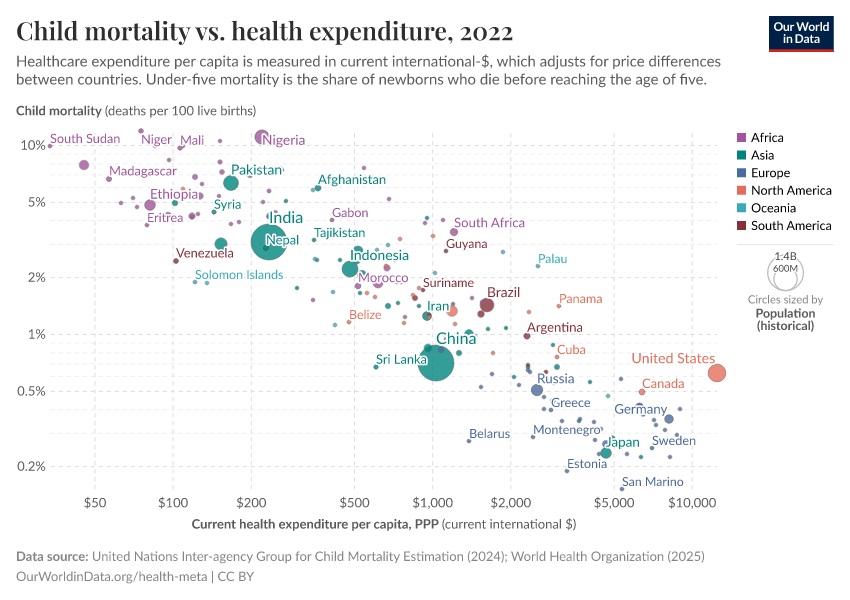
The chart below shows how healthcare spending is related to child mortality, in the same format.
By connecting data points between 1995 and 2014 with arrows for each country, the chart shows a global trend: as healthcare spending increases, child mortality rates decline.
This trend shows the positive impact of health investments on reducing child mortality across the world, highlighting the crucial role of healthcare expenditure in improving child health outcomes.

You can also see there is a stark disparity in healthcare spending globally — such as the extreme difference between countries like the Central African Republic, where healthcare spending per capita was less than 100 international dollars in 2019, and the United States, where it was higher than 10,000 international dollars. This is a very large gap, considering that these numbers are adjusted for price differences between countries.
But despite this, the decline in child mortality relative to health expenditure is surprisingly consistent across countries.
This uniformity in trends, regardless of a country's wealth, suggests a consistent benefit of increased healthcare spending on reducing child mortality.
However, the enormous gap in healthcare expenditure, where Americans spend more on health within three days than a person in the Central African Republic does in a year, also highlights the remaining challenges of global health inequality.
How strong is the link between healthcare expenditure and national income?
The strongest predictor of a country's healthcare spending is its national income.
Countries with a higher per capita income tend to spend more on healthcare, which you can see in the chart below.2
Advanced economic research shows that this relationship is not just a correlation: there is a clear and significant positive effect of per capita GDP on healthcare spending.3

The finances of healthcare
In the previous section, we looked at the evidence supporting the fact that there are potentially large health returns to healthcare investment.
Here we look at how healthcare investments are financed around the world.
When did high-income countries start expanding their healthcare systems?
The earliest data on the financing of healthcare dates back to the late 19th century. This is when many European countries began officially establishing healthcare systems through legislative acts.
The chart here shows estimates of government spending on healthcare as a percent of GDP, for a selection of high-income countries using data from multiple sources.
You can see that healthcare spending has risen substantially over time.

How quickly can healthcare coverage expand?
European countries led the expansion of healthcare systems in the early 20th century — countries like France, Austria, and Germany expanded healthcare coverage between 1920 and 1960 — followed by Spain, Portugal, and Greece between 1960 and 1980.
In contrast, China, Rwanda, and Vietnam rapidly developed their healthcare systems in the 21st century, almost from scratch, achieving near-universal coverage within just a decade. This demonstrates that significant improvements in healthcare protection can be achieved quickly, even from low starting points.
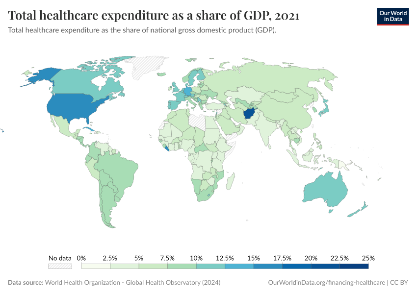
How has global expenditure on healthcare changed in recent decades?
In recent decades, spending on healthcare has been relatively stable in countries. But there are very large differences in the level of spending between countries.
This is shown in the chart below.

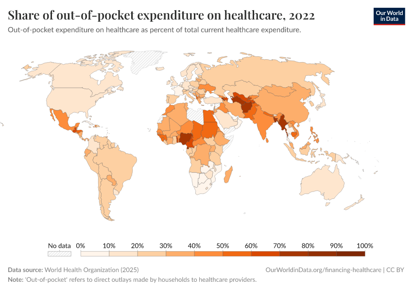
How important is out-of-pocket spending around the world?
Out-of-pocket spending — direct payments to healthcare providers by households — varies significantly around the world.
In richer countries like France, it represents a small fraction of total healthcare expenditure. But in poorer countries, such as Afghanistan and Nigeria, it can be the majority of healthcare spending.
While many countries, especially in the developing world, have made progress in reducing out-of-pocket expenses, others like Russia have seen these costs increase.

Healthcare coverage
Coverage of essential health services is increasing
Essential health services are a range of basic health provisions, such as vaccination, detection and treatment of tuberculosis (TB), HIV treatment, pregnancy care, sanitation, and access to medicines.
In the following charts, we’ll look at global trends in these different areas.
In general, there has been a rise in global coverage of essential health services since 2000. But some health services see a much steeper rise — due to specific efforts against diseases.
For example, efforts against against HIV, TB, and malaria have risen substantially, through programs such as The Global Fund and the President’s Emergency Plan for AIDS Relief (PEPFAR).
Vaccination coverage has also seen a considerable increase since 2000. This rise has been even more significant across particular regions.
In many African countries, for example, vaccination coverage has increased rapidly since 2000 — this is a strong reflection of increased funding from Gavi, the vaccine alliance, the United Nations, and additional donor funds.
Read more on our page:

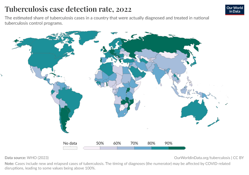
In the chart below, you can see rises in detection rates for tuberculosis in different countries. This is again helped by efforts such as The Global Fund and PEPFAR.
Read more on our page:

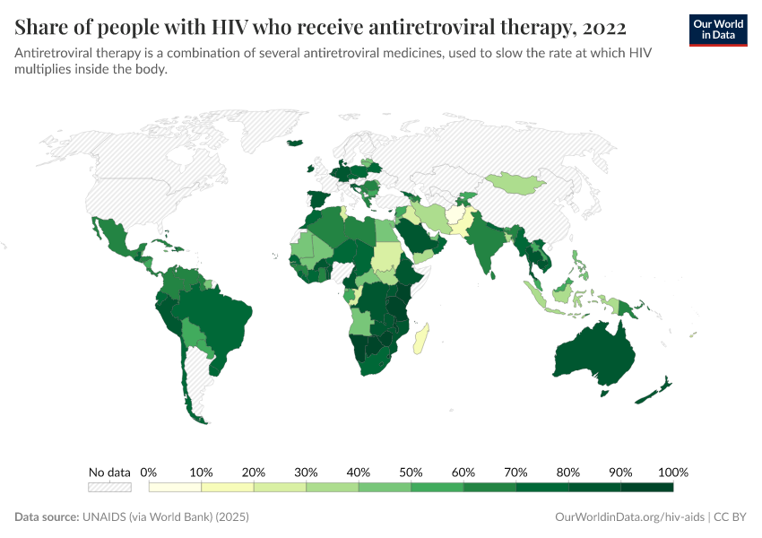
In the chart below, you can see the rise in the share of people with HIV who receive antiretroviral therapy, a lifesaving intervention against HIV/AIDS.
Read more on our page:

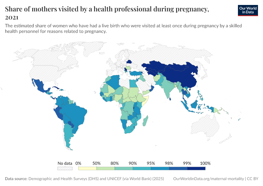
In the map, you can see coverage for antenatal care, which have been slower and remain at low levels in many countries.
Read more on our page:

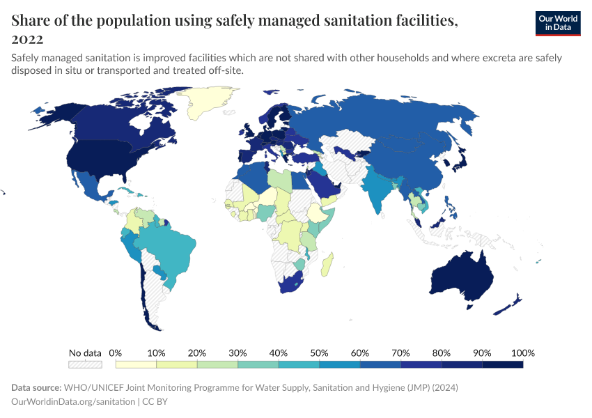
In the chart below, you can see share who use safely-managed sanitation, which has risen gradually over time.
Even now, large disparities remain. A large share of people in many countries still don’t have access to, or use, safely-managed sanitation.
Read more on our page:

Medicine availability in developing countries remains a barrier to affordable medicine access
To ensure people have access to essential medicines, medicines must be available and affordable.
But the availability of medicines is much lower in the public sector of poorer countries. Even in the private sector, where availability is higher, there is still a lack of consistent access.5
This has important implications for access to essential medicines — especially for the poorest. Most health facilities in the public sector offer medicines at low cost or free of charge, so are essential in healthcare provision for the poor. When medicines are not available in the public sector, people try to access them privately, which is typically more expensive and unaffordable for many.
This is important because people in poorer countries have higher price sensitivity to medicines, and even minimal costs can significantly reduce people’s use of essential healthcare products.
Country Profiles
Explore the key metrics on health for a country of your choice. What do people die from? How long do they typically live? And what progress is being made against key diseases and risk factors?


Key Charts on Global Health
See all charts on this topic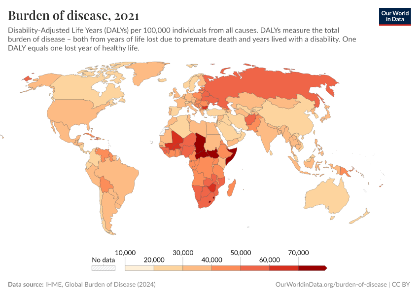


Featured Data on Global Health
Endnotes
The data on life expectancy is taken from Version 7 of the dataset published by Gapminder. The data on the population of each country is also taken from Gapminder.
The included world population in 1800 is 1,036 billion. In 1950 it is 2,72 billion. And for 2012 it is the life expectancy of that year and the population measures refer to 2010 (7 billion people are included in this analysis).
Newhouse, J.P. (1977), “Medical care expenditure: a cross-national survey”, Journal of Human Resources 12:115–125.
Interestingly, there are important institutional variables that are also significantly correlated with healthcare expenditure after controlling for income. For example, the use of primary care “gatekeepers” seems to result in lower health expenditure. And lower levels of health expenditure also appear to occur in systems where the patient first pays the provider and then seeks reimbursement, compared to other systems. For more information see page 46 in Culyer, A. J., & Newhouse, J. P. (Eds.). (2000). Handbook of health economics. Elsevier.
The source given for the data corresponds to Figure 1 in ILO, (2011), Social Protection Floor for a Fair and Inclusive Globalization. Report of the Advisory Group chaired by Michelle Bachelet convened by the ILO with the collaboration of the WHO. Geneva: International Labour Office. Available online here.
United Nations (2008). Delivering on the Global Partnership for Achieving the Millennium Development Goals. MDG Gap Task Force Report 2008. Available online.
Cite this work
Our articles and data visualizations rely on work from many different people and organizations. When citing this topic page, please also cite the underlying data sources. This topic page can be cited as:
Esteban Ortiz-Ospina and Max Roser (2016) - “Global Health” Published online at OurWorldinData.org. Retrieved from: 'https://ourworldindata.org/health-meta' [Online Resource]BibTeX citation
@article{owid-health-meta,
    author = {Esteban Ortiz-Ospina and Max Roser},
    title = {Global Health},
    journal = {Our World in Data},
    year = {2016},
    note = {https://ourworldindata.org/health-meta}
}
Reuse this work freely
All visualizations, data, and articles produced by Our World in Data are completely open access under the Creative Commons BY license. You have the permission to use, distribute, and reproduce these in any medium, provided the source and authors are credited.
The data produced by third parties and made available by Our World in Data is subject to the license terms from the original third-party authors. We will always indicate the original source of the data in our documentation, so you should always check the license of any such third-party data before use and redistribution.
All of our charts can be embedded in any site.