Burden of Disease
How is the burden of disease distributed and how did it change over time?
This page was first published in 2016, and we updated the text in February 2024.
To assess the health of a population, it’s straightforward to focus on mortality, or concepts like life expectancy, which are based on mortality estimates. But this does not take into account the suffering that diseases cause the people who live with them.
By looking at both mortality and morbidity (the prevalent diseases), we can have a more comprehensive understanding of health outcomes.
The sum of mortality and morbidity is called the “burden of disease” by researchers, and can be measured by a metric called “Disability Adjusted Life Years” (DALYs).
DALYs are standardized units to measure lost health. They help compare the burden of different diseases in different countries, populations, and times.
Conceptually, one DALY represents one lost year of healthy life – it is the equivalent of losing one year in good health because of either premature death or disease or disability.
DALYs have been measured in the Global Burden of Disease (GBD) study by the Institute of Health Metrics and Evaluation (IHME) since 1990, and by the “Disease Burden Unit” which was created in 1998 at the World Health Organization (WHO). It was also prominently featured in the World Bank’s 1993 World Development Report.
This topic page presents global data on the burden of disease across the world. The data is broken down by age, type of disability and disease, and country.
Related topics
See all interactive charts on the burden of disease ↓
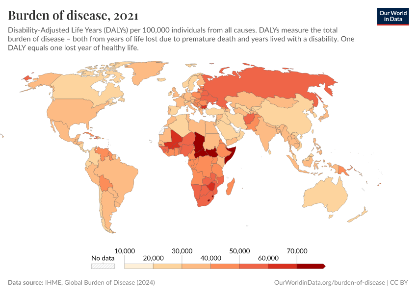
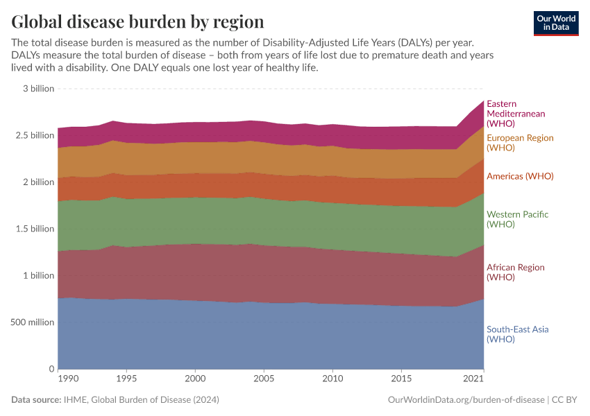
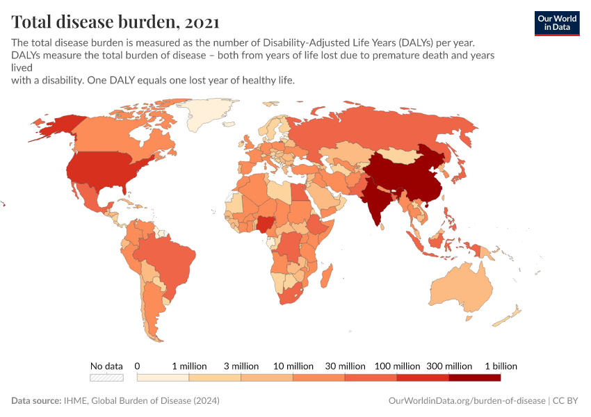
The global distribution of the disease burden
This map shows the annual rate of DALYs per 100,000 people in the population. It is thereby measuring the distribution of the burden of both mortality and morbidity around the world.
In some regions with the best health, the rate of DALYs was under 20,000 per 100,000 people in 2019. In contrast, in the worst-off regions, the rate was several times higher than that – over 60,000 in several countries in Africa.

The disease burden by cause
Epidemiologists break the disease burden down into three categories of disability or disease: non-communicable diseases (NCDs); communicable, maternal, neonatal, and nutritional diseases; and injuries. These are shown in the chart below.
At a global level, the majority of the burden of disease results from non-communicable diseases (NCDs). Communicable, maternal, neonatal, and nutritional diseases are the next most common, and finally injuries.
The chart also shows a notable shift since 1990, when communicable diseases held the highest share of the disease burden.

It’s important to note that this chart shows the relative share of DALYs from each category.
This shift towards non-communicable diseases is because the global burden from communicable diseases has declined significantly over time.
In high-income nations, non-communicable diseases account for a large share of the overall burden of disease. In contrast, communicable diseases tend to make a small share. This is shown below.
The opposite is true in low-income nations, where communicable diseases are still common.

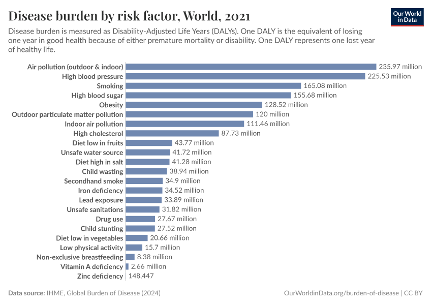
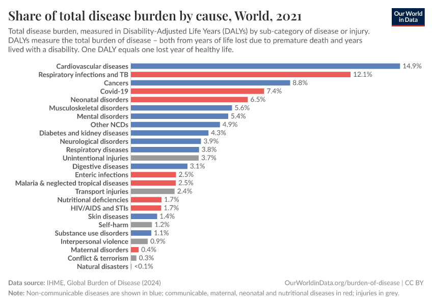
How do different diseases and disabilities contribute towards the burden of disease?
The two charts here show the breakdown of disease burden by cause. One chart shows the number of DALYs by cause, while the other shows the share of DALYs by cause.


At a global level, the largest disease burden in 2019 comes from cardiovascular diseases. This is followed by cancers, neonatal disorders, musculoskeletal disorders, respiratory infections, and mental and substance use disorders.
The ranking of these causes varies significantly across the world. You can explore the data by using the “Edit countries and regions” button in the charts.
In low-income countries, communicable and neonatal diseases tend to rank much higher. This starkly contrasts with high-income countries, where communicable diseases may not be in the top ten, and instead, cardiovascular disease and cancers tend to contribute the largest burden.
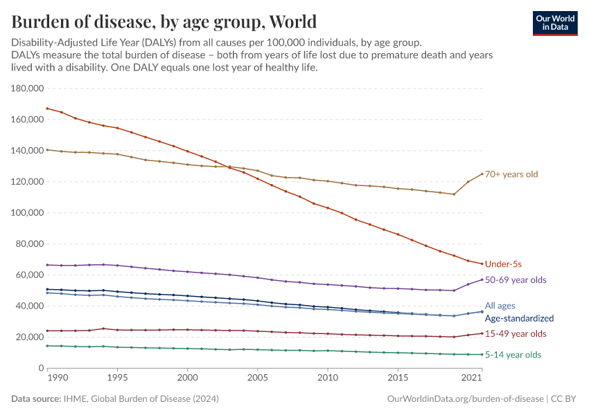
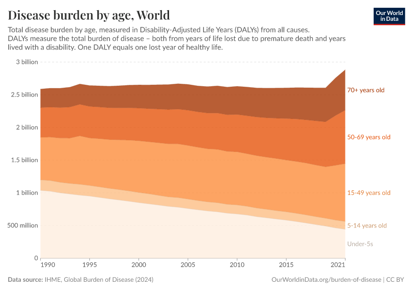
The disease burden by age
In the two charts here we see the breakdown of total disease burden by age group. This is shown as the relative breakdown of the total disease burden and by the rates of burden per 100,000 individuals within the age group.
As you can see, rates of disease burden remain highest among the youngest and oldest in society. They have, however, seen the most notable declines in recent decades.
Overall we see a continued decline in burden of disease in children under five years old. This is also reflected in the relative share of burden of disease in children under five years old.
At a global level, collective rates across all ages have steadily declined. This shows that global health has improved considerably since then.


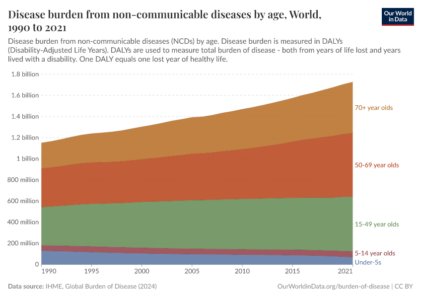
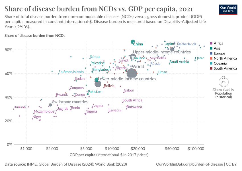
The disease burden from non-communicable diseases
The visualizations here focus on the disease burden resulting from non-communicable diseases (NCDs).

The burden from non-communicable diseases by sub-category

The burden from non-communicable diseases by age

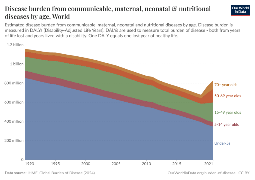
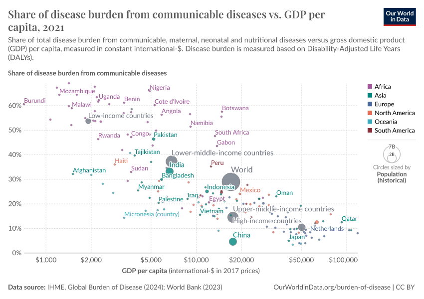
The burden from communicable, neonatal, maternal and nutritional diseases
The burden from communicable, neonatal, maternal, and nutritional diseases
The charts here show that the burden of disease from communicable, neonatal, maternal, and nutritional diseases varies widely worldwide. There is a high burden in Sub-Saharan Africa and South Asia in particular.

Communicable, neonatal, maternal and nutritional disease burden by specific cause
There has been a significant reduction in global burden from communicable, neonatal, maternal, and nutritional diseases in recent decades.

Communicable, neonatal, maternal and nutritional disease burden by age
The majority of burden of disease from communicable, neonatal, maternal and nutritional disease is seen in children, but this share has declined over time.

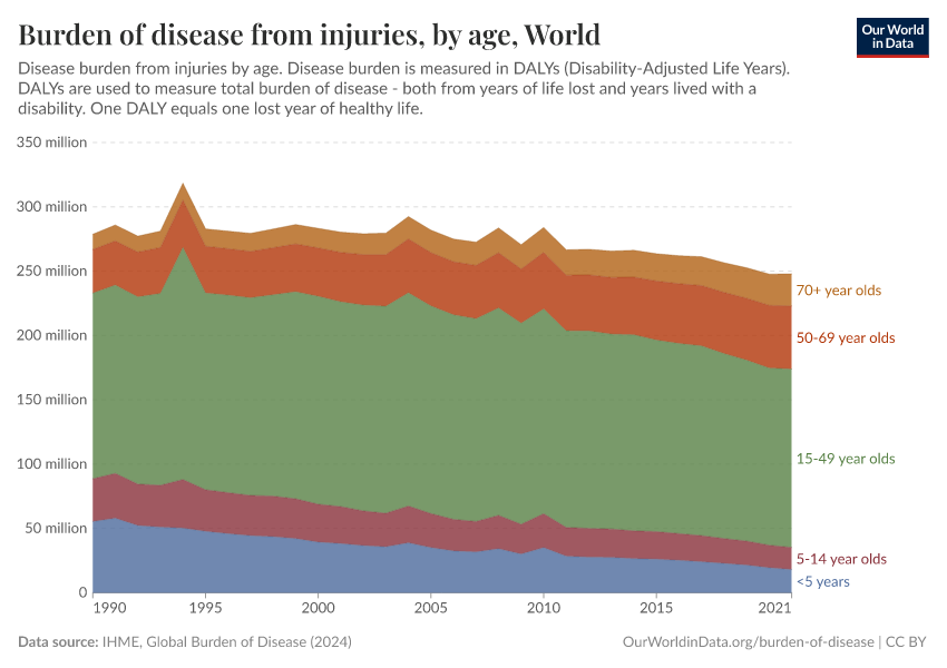
The burden from injuries, violence, self-harm and accidents
“Injuries” is a broad category that encompasses accidents (unintentional injuries such as falls, fire, and drowning, as well as transport injuries), as well as natural disasters, and violence including interpersonal violence, conflict, terrorism, and self-harm.
The charts here provide an overview of the burden of disease from injuries.
The burden from injuries, violence, self-harm and accidents

The burden of injury, violence, self-harm, and accidents by type
The chart shows the burden of disease from injuries, broken down by type. Road accidents, interpersonal violence, and self-harm contribute large shares to the burden of disease.
You will also notice that the burden attributed to both conflict & terrorism and natural disasters are highly volatile, creating dramatic spikes in some years.

The burden from injuries, violence, self-harm, and accidents by age

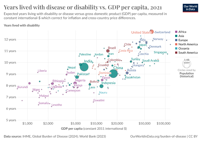
Income and disease burden
The chart shows the relationship between average income — measured by GNI per capita — and the burden of disease, with global data from 2012.
The burden of disease is broken down into communicable diseases and non-communicable diseases.
The chart shows that communicable diseases in particular are closely correlated to average income levels. The relationship that was estimated by Sterck et al. 20171 is shown in the legend. GNI per capita has a strong negative correlation with log DALYs lost due to communicable diseases, with an elasticity of -0.88. In other words, higher incomes are strongly correlated with fewer DALYs lost to communicable diseases.
On the other hand, the non-communicable disease burden is much less strongly associated with average income (the elasticity is estimated to be -0.13). So, higher incomes are also correlated with fewer DALYs lost to communicable diseases, but the change is much less strong.
Another conclusion we can draw from this chart is that the relationship between GNI per capita and DALYs lost due to the disease burden of communicable diseases is best captured by a log-log function.
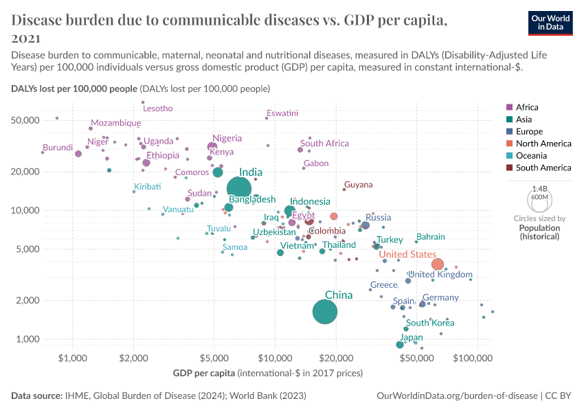
Income and disease burden from communicable diseases
The burden of disease due to communicable diseases vs GDP per capita is shown in the following charts.
The correlation between both measures is apparent: both DALY loss rates and the total share from communicable diseases tend to decline with increasing incomes. But despite this correlation, Sterck et al. 20171 find that GNI is not a significant predictor of health outcomes once other factors are controlled for.
The first of these other factors is individual poverty — relative to a health poverty line of 10.89 international-$ per day. The second factor is the epidemiological surrounding of a country which captures the health status of neighbouring countries. And the third important factor is institutional capacity.


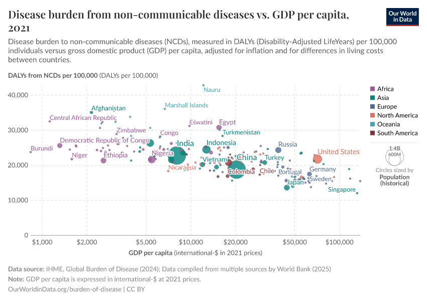
Income and disease burden from non-communicable diseases
The two charts here highlight two important relationships between non-communicable disease (NCDs) burden and income. The first suggests that rates of disease burden from NCDs are highest at lower incomes and tend to decline with development.
However, NCDs also constitute a higher share of disease burden at higher incomes. This is because communicable diseases decline more greatly with income than non-communicable diseases do.


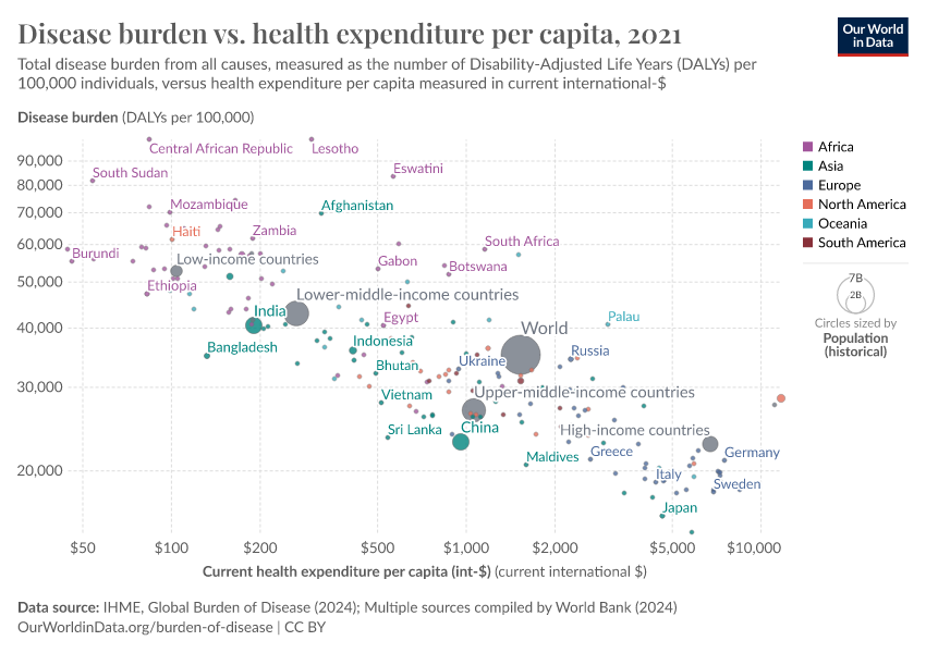
Disease burden and health expenditure
The chart below shows the relationship between the total burden of disease versus average health expenditure per person, measured in US dollars.
At low levels of health expenditure, there is a steep decline in the disease burden as expenditure rises. However, as incomes rise, the magnitude of the decline slows down.

Key Charts on Burden of Disease
See all charts on this topic


Featured Data on Burden of Disease
Endnotes
Sterck, O., Roser, M., Ncube, M., Thewissen, S. (forthcoming) — Allocation of development assistance for health: Is the predominance of national income justified? (accepted in Health Policy and Planning).
Cite this work
Our articles and data visualizations rely on work from many different people and organizations. When citing this topic page, please also cite the underlying data sources. This topic page can be cited as:
Max Roser, Hannah Ritchie, and Fiona Spooner (2021) - “Burden of Disease” Published online at OurWorldinData.org. Retrieved from: 'https://ourworldindata.org/burden-of-disease' [Online Resource]BibTeX citation
@article{owid-burden-of-disease,
    author = {Max Roser and Hannah Ritchie and Fiona Spooner},
    title = {Burden of Disease},
    journal = {Our World in Data},
    year = {2021},
    note = {https://ourworldindata.org/burden-of-disease}
}
Reuse this work freely
All visualizations, data, and articles produced by Our World in Data are completely open access under the Creative Commons BY license. You have the permission to use, distribute, and reproduce these in any medium, provided the source and authors are credited.
The data produced by third parties and made available by Our World in Data is subject to the license terms from the original third-party authors. We will always indicate the original source of the data in our documentation, so you should always check the license of any such third-party data before use and redistribution.
All of our charts can be embedded in any site.