The short history of global living conditions and why it matters that we know it
Very few think the world is making progress. In this article, we look at the history of global living conditions and show that the world has made immense progress in important aspects.
We are working on Our World in Data to provide ‘research and data to make progress against the world’s largest problems.’
Our mission only makes sense if it is in fact possible to make progress against the large problems the world faces. Very few think the world is making progress. A 2015 survey, long before the circumstances of the pandemic, asked, “All things considered, do you think the world is getting better or worse, or neither getting better nor worse?” In Sweden, 10% thought things are getting better, in the US they were only 6%, and in Germany only 4%.
What is the evidence that we need to consider when answering this question?
The question is how the world has changed, so we must take a historical perspective. And the question is about the world as a whole, so the answer must, therefore, consider everybody. The answer must consider the history of global living conditions — a history of everyone.
Poverty
Global poverty is one of the very largest problems in the world today. Is it possible to make progress against this problem? To see where we are coming from, we must go far back in time. 30 or even 50 years are not enough. When you only consider what the world looked like during our lifetime, it is easy to think of the world as static — the richer parts of the world here and the poorer regions there — and to falsely conclude that it always was like that and will always be like that.
Take a longer perspective and it becomes clear that the world is not static at all. We can change the world. The countries that are rich today were very poor just a few generations ago.
To avoid portraying the world in a static way, we have to start 200 years ago, before the time when living conditions really changed dramatically.
The United Nations focus on 'extreme poverty', an extremely low poverty line that has the purpose to draw attention to the very poorest people in the world.
The chart below shows long-run estimates of global poverty, published by the historian Michail Moatsos. These poverty figures take into account non-monetary forms of income — for poor families today and in the past, this is important, as many of them are subsistence farmers who live largely from their own food production. These poverty estimates also take into account different price levels in different countries. It is, of course, also adjusted for price changes over time (inflation). As a consequence of these adjustments, this data is expressed in 'international dollar'. One international dollar has the same purchasing power as one US dollar had in the US in 2011.
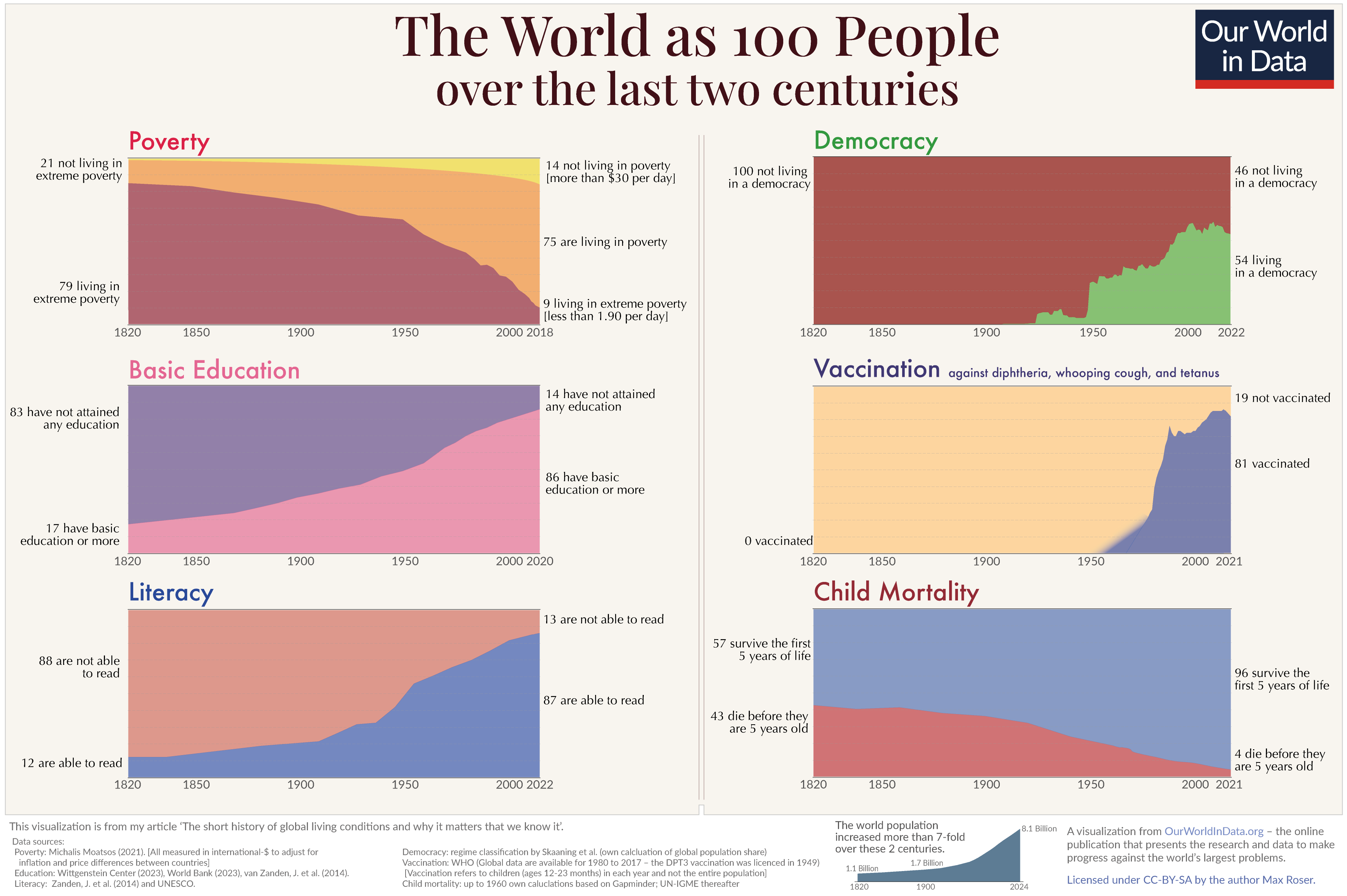
The chart shows that almost 10% of the world's population live in extreme poverty. It also tells us that two hundred years ago, the same was true for almost 80% of the world’s population. In 1820, only a small elite enjoyed higher standards of living, while the vast majority of people lived in conditions that we call extreme poverty today. Since then, the share of extremely poor people fell continuously. More and more world regions industrialized and achieved economic growth which made it possible to lift more people out of poverty: In 1950 about half the world were living in extreme poverty; in 1990, it was still more than a third. By 2019 the share of the world population in extreme poverty has fallen below 10%.
The world is also making progress against poverty relative to higher poverty lines, as this visualization shows. In fact, no matter what poverty line you choose, the share of people below that poverty line has declined globally.
That is a huge achievement. For me, as a researcher who focuses on growth and inequality, it may be humanity’s biggest achievement in the last two centuries. It is particularly remarkable if we consider that the world population has increased 7-fold over the last two centuries — via the chart’s settings, you can switch this chart to see the number of people in and out of poverty. In a world without economic growth, a 7-fold increase of the population would have resulted in less and less income for everyone, it would have driven everyone into extreme poverty. Yet, the exact opposite happened. In a time of unprecedented population growth, our world managed to give more prosperity to more people and to lift more and more people out of the worst poverty.
Increasing productivity was important because it made vital goods and services less scarce: more food, better clothing, and less cramped housing. Productivity is the ratio between the output of our work and the input that we put in our work; as productivity increased, we benefitted from more output, but also from less input — weekly working hours fell very substantially.
Economic growth was also important because it changed the relationship between people. In the long time in which the world lived in a non-growth world the only way to become better off was for someone else to get worse off. It was a zero-sum economy. Your own good luck was your neighbor's bad luck. Economic growth changed that. Growth made it possible for you to get better off while others become better off, too. The ingenuity of those who built the technology that increased productivity — modern transportation, production machinery, and communication technology — made some of them very rich and at the same time, it increased the productivity and the incomes of others. It is hard to overstate how different life is in zero-sum and positive-sum economies.
Unfortunately the media is overly obsessed with reporting single events and with things that go wrong and does not nearly pay enough attention to the slow developments that reshape our world. With this empirical data on the reduction of poverty, we can make concrete what a media that would report global development would look like. The headline could be "The number of people in extreme poverty fell by 130,000 since yesterday” and they wouldn’t have this headline once, but every single day since 1990, since, on average, there were 130,000 people fewer in extreme poverty every day. If you prefer to rely on a higher poverty line, the numbers are even more impressive. The daily headline would point out that the number of people living on more than $10 per day increased by a quarter of a million on any average day in the last decade.
It is important to know that it is possible to make progress against poverty because, despite two centuries of progress, poverty remains one of the very largest problems in the world. The majority of the world population still lives in poverty: Almost every tenth person lives in extreme poverty, and two-thirds live on less than $10 per day. In rich countries, a person is considered poor when she or he lives on less than $30 per day; if we rely on this poverty definition, then we find that 85% of the world lives in poverty.1 Much more progress is needed.
Note: Since the publication of this article, the UN has updated their measurement of extreme poverty and the World Bank has updated its poverty data. See the note at the end for more information.
Literacy
How did the education of the world population change over this period? This chart shows the increasing share of the world population that is able to read and write. Today’s education — including in today’s richest countries — is again a very recent achievement. Only in the last two centuries did literacy become the norm for the entire population.
In 1820, only every tenth person older than 15 years was literate; in 1930, it was every third, and now we are at 87% globally. Put differently, if you were alive in 1800, there was a chance of 9 in 10 that you weren’t able to read; today, close to 9 out of 10 people are able to read. And among today's young population, the chances are much higher since many of today’s illiterate population are old.
If you think science, technology, and political freedom are important to solve the world’s large problems and you think that it helps to read and write to solve problems, then consider the figures in absolute numbers. Today, there are about 5.1 billion people who can read and write.2 In 1800, there were fewer than 100 million people with the same skill.
Health
One reason why we do not see progress is that we are unaware of how bad the past was.
The chart here shows that in 1800, the health conditions were such that around 43% of the world’s newborns died before their fifth birthday. The historical estimates suggest that the entire world lived in poor conditions, so that there was little variation between different regions, in all countries of the world more than every third child died before it was five years old.
When considering the entirety of childhood — not just up to the age of five, but until the end of puberty — then we find that around half of all children died in the past (see my article on this data).
It would be wrong to believe that modern medicine was the only reason for improved health. Initially, rising prosperity, public health interventions, and the changing nature of social life mattered more than medicine. Improvements in housing and sanitation improved our chances in the age-old war against infectious disease. Healthier diets — made possible through higher productivity in the agricultural sector and overseas trade — made us more resilient against disease. Improving nutrition and health also made us taller.
Science and medicine mattered as well. A more educated population achieved a series of scientific breakthroughs that made it possible to reduce mortality and disease further. Particularly important was the discovery of the germ theory of disease in the second half of the 19th century. In retrospect, it is hard to understand why a new theory could possibly be so critical. But at a time when doctors did not wash their hands when switching from post-mortems to midwifery, the theory was crucial in convincing our ancestors that hygiene and public sanitation are essential for health.
The germ theory of disease laid the foundation for the development of antibiotics and vaccines, allowing humanity to finally gain some ground in the age-old battle against the microbes. Public health mattered hugely: Everybody benefits when everybody else is vaccinated, and everybody benefits from everybody else obeying the rules of hygiene.
With these changes, global health improved in a way that was unimaginable to our ancestors. In 2021 child mortality was down to 4% — 10-fold lower than two centuries ago.
The same data on child mortality also shows us just how large of a problem child mortality still is. On average, 15,000 children die every day. More progress is urgently needed and, as our history suggests, possible.
You have to take this long perspective to see the progress that we have achieved. It is just hard to imagine how bad the living conditions in the past were.
Freedom
Political freedom and civil liberties are at the very heart of development because they are both a means for development and an end of development.
Merely qualitative assessments of these aspects bear the risk that we are mistakingly perceiving a decline of liberties over time when, in fact, we are raising the bar by which we judge our freedom and liberty. This is why quantitative assessments can be useful. They can help us to measure freedom against the same yardstick across countries and over time.
There are various attempts to measure the types of political regimes that govern the world’s countries. To capture something as complex as a political system is necessarily controversial. There is just no way around that. In this analysis, I rely on the assessment by Svend-Erik Skaaning, John Gerring, and Henrikas Bartusevičius for a very long-term perspective of political regimes around the world.3
My colleague Bastian Herre has brought together many other datasets that assess and classify political regimes around the world. To make it possible to study them in detail and see where they agree and where they differ, we made them available in our Democracy Data Explorer.
The long-term data in the chart below shows the share of the world population living in democracies in green. Throughout the 19th century, there was hardly any country in the world that met the criteria for a democracy of Skaaning and colleagues.4 The first expansion of political freedom in the early 20th century was crushed by the rise of authoritarian regimes in the time leading up to the Second World War.
In the second half of the 20th century, the world changed significantly: Colonial empires ended, and more countries turned democratic. The share of the world population living in democracies increased from 25% in 1950 to 35% in 1980. Particularly important was the breakdown of the Soviet Union, which allowed more countries to democratize. It is worrying, however, that the share living in democracies has not increased in recent years.
Over the long-run the evidence is clear. While every generation was pessimistic that democracies can last, it should have been the autocrats who needed to worry. Autocratic rulers lost their power in more and more places over the last two centuries. Today, more than every second person in the world lives in a democracy.
Population
The world population was around 1 billion in the year 1800 and increased more than eight-fold since then.
The increase of the world population should evoke more than doom and gloom. First of all, this increase shows a tremendous achievement. It shows that humans stopped dying at the rate at which our ancestors died for the many millennia before.
In pre-modern times, fertility was high — 5 or 6 children per woman were the norm. What kept the population growth low was the very high rate at which people died, and that meant that many children were dead before they reached their reproductive age. The increase of the world population followed when humanity started to win the fight against death. Life expectancy doubled in all world regions.
Population growth is a temporary phenomenon, it is the consequence of fertility and mortality not declining simultaneously. The fast population growth happened when fertility was still as high as it was in the unhealthy environment of the past, but mortality has already declined to the low levels of our time.
What we have seen in country after country over the last 200 years is that when women gain more independence, education, and prosperity and realize that the chances of their children dying declined, they choose to have fewer children. Rapid population growth comes to an end. This transition from high mortality and high fertility to low mortality and low fertility is called the demographic transition. In those countries that industrialized first, it lasted at least from the mid-19th century to the mid-20th century — it took 95 years for fertility to decline from above six children to less than three children per woman in the UK. Countries that followed later often achieved this transition much faster: South Korea went from more than six children per woman to less than three in just 18 years, and Iran even went through it in only ten years.
Just as countries went through this transition, so is the world going through it. Global fertility has more than halved in the last 50 years, from more than 5 children per woman in the early 1960s to below 2.5 today. This means that the world is well into the demographic transition and the global population growth rate has in fact peaked half a century ago.
Now that we see fertility declining in countries around the world, we approach the end of global population growth: The global population has quadrupled over the course of the 20th century — this century, it is not expected to double. The UN demographers expect population growth to end before the end of this century.5
Education
None of the achievements over the last two centuries could have been made without the expansion of knowledge and education. The revolution in how we live was not only driven by education, but it also made education more important than ever.
Contrary to many other social aspects where forecasts are of limited use, I think education is an aspect where we can make some useful projections. The simple reason is that the educational composition today tells us something about the education of tomorrow — a literate young woman today will be a literate old woman in 2080.
As we've seen before, education — measured by the essential skill of literacy — has already improved. And we know that it will continue as the younger cohort today is much better educated than people in older cohorts.
This visualization shows the projection of the IIASA demographers for the size and the educational composition of the world population until 2100. It is an interesting look into the future: With today’s lower global fertility, the researchers expect that the number of children will decline from now — there will never be more children on the planet than today. As mentioned, before demographers expect the world population to peak in the second half of this century and to decline thereafter.
Focusing on the educational breakdown the projection suggests that by 2100, there will be almost no one without formal education and there will be more than 7 billion minds who will have received at least secondary education.
With the great importance of education for improving health, increasing political freedom, and ending poverty, this prospect is very encouraging.
Why do we not know how our world is changing?
The motivation for this history of global living conditions was the survey result that documented the negative perspective on global development that most of us have. More than 9 out of 10 people do not think that the world is getting better. How does that fit with the empirical evidence?
I do not believe that the media are the only ones to blame, but I do think that they are to blame for some part of this. This is because the media does not tell us how the world is changing, it tells us what in the world goes wrong.
One reason the media focuses on things that go wrong is that the media focuses on single events, and single events are often bad — look at the news: plane crashes, terrorism attacks, natural disasters. Positive developments, on the other hand, often happen very slowly and never make the headlines.
The result of a media — and education system — that fails to present quantitative information on long-run developments is that most people are very ignorant about global development and have little hope that progress against serious problems is even possible.
Even the decline of global extreme poverty — by any standard one of the most crucial developments in our lifetime — is only known by a small fraction of the population of the UK (10%) or the US (5%). In both countries, the majority of people think that the share of people living in extreme poverty has increased. Two thirds in the US even think the share in extreme poverty has ‘almost doubled.’ When we are ignorant about the basic facts about global development it is not surprising that we have a negative view of our times and that few have the hope that the world can get better.
The only way to tell a history of everyone is to use statistics. Only then can we hope to get an overview of the lives of the 22 billion people that lived in the last 200 years. The developments that these statistics reveal transform our global living conditions — slowly but steadily. They are reported in this online publication — Our World in Data — that my team and I have been building over the last few years. We see it as a resource to show these long-term developments and thereby complement the information in the news that focus on events.
The difficulty in telling the history of how everyone’s lives changed over the last 200 years is that you cannot pick single stories. Stories about individual people are much more engaging — our minds like these stories — but they cannot be representative for how the world has changed. To achieve a representation of how the world has changed at large, you have to tell many, many stories all at once; and that is statistics.
To make it easier for myself and for you to understand the transformation in living conditions that we have achieved, I made a summarizing visualization in which I imagine this 200-year history as the history of a group of 100 people to see how the lives of them would have changed if they lived through this transformative period of the modern world. It shows at once some of the very largest problems we face and the progress that the last generations have made.
Why it matters that we do not know how our world is changing
A single person can't change the world. The transformation of our living conditions was possible only because of collaboration. It is our collective brains and our collaborative effort that are needed for such a revolution.
There are big problems that remain. None of the above should give us reason to become complacent. On the contrary, it shows us that a lot of work still needs to be done — accomplishing the fastest reduction of extreme poverty is an important achievement, but the fact that 85% of the world live on less than $30 per day is unacceptable. We also must not accept the restrictions of our liberty that remain. It is also clear that humanity’s impact on the environment is at a level that is not sustainable and is endangering the biosphere and climate on which we depend. We urgently need to reduce our impact, and on Our World in Data, you can find detailed information about the world's environmental problems.
It is far from certain that we will make progress against these problems — there is no iron law that would ensure that the world continues this trend of improving living conditions. However, what is evident from the long-term perspective is that progress is possible and that the last 200 years have brought us to a better position than ever before to solve problems. Solving problems — big problems — is always a collaborative undertaking. The group of people that can work together today is a much stronger group than ever existed on this planet. Healthier, richer, and better educated.
For our history to be a source of encouragement, however, we have to know our history. The story that we tell ourselves about our history and our time matters. Because our hopes and efforts for building a better future are inextricably linked to our perception of the past it is important to understand and communicate the global development up to now. An understanding of our efforts and our fellow humans is a vital condition to the fruitfulness of our endeavors. Knowing that we have come a long way in improving living conditions and the notion that our work is worthwhile is to us all what self-respect is to individuals. It is a necessary condition for improvement.
Freedom is impossible without faith in free people. And if we are not aware of our history and falsely believe the opposite of what is true, we risk losing faith in each other.
Note: The World Bank has updated its poverty and inequality data since the publication of this article
The data in this article uses a previous release of the World Bank's poverty and inequality data in which incomes are expressed in 2011 international-$.
The World Bank has since updated its methods, and now measures incomes in 2017 international-$. As part of this change, the International Poverty Line used to measure extreme poverty has also been updated: from $1.90 (in 2011 prices) to $2.15 (in 2017 prices).
This has had little effect on our overall understanding of poverty and inequality around the world. But because of the change of units, many of the figures mentioned in this article will differ from the latest World Bank figures.
Read more about the World Bank's updated methodology:
The Japanese translation of this blog post is here:世界的な生活条件の短い歴史、そして私たちがそれを知っていることが重要な理由. The Portuguese translation is available here: A curta história das condições globais de vida e por que é importante que a conheçamos.
Endnotes
The latest data can always be found on the World Bank's Poverty and Inequality Platform or viewed in our Data Explorer.
There are about 5.9 billion people older than 15 years, of which, as the chart shows, 87% are literate.
The classification by Skaaning and colleagues differentiates between particular types of autocracies and democracies (here you can explore it in detail). In this chart here all categories of autocratic regimes are summarized into one, and all categories of democratic regimes are summarized into a second group.
Political regimes are classified into the following regime types by Skaaning et al.: non-electoral autocracy, one-party autocracy, multi-party autocracy without elected executive, multi-party autocracy, exclusive democracy, male democracy, electoral democracy, and polyarchy.
Exclusive democracies and male democracies are not considered democracies, as these so-called ‘non-electoral democracies’ are regimes in which either both men and women don’t have universal voting rights (exclusive democracies), or in which women don’t have the right to vote (male democracies).
This means that the share of the world population living in democracies is the share living in electoral democracies and polyarchies, in the classification by Skaaning et al.
The UN repeatedly revised down their population projections for the end of the century. The demographers from IIASA expected an end to global population growth as soon as 2075, already before the UN revised their estimates down.
Cite this work
Our articles and data visualizations rely on work from many different people and organizations. When citing this article, please also cite the underlying data sources. This article can be cited as:
Max Roser (2016) - “The short history of global living conditions and why it matters that we know it” Published online at OurWorldInData.org. Retrieved from: 'https://ourworldindata.org/a-history-of-global-living-conditions' [Online Resource]BibTeX citation
@article{owid-a-history-of-global-living-conditions,
    author = {Max Roser},
    title = {The short history of global living conditions and why it matters that we know it},
    journal = {Our World in Data},
    year = {2016},
    note = {https://ourworldindata.org/a-history-of-global-living-conditions}
}
Reuse this work freely
All visualizations, data, and code produced by Our World in Data are completely open access under the Creative Commons BY license. You have the permission to use, distribute, and reproduce these in any medium, provided the source and authors are credited.
The data produced by third parties and made available by Our World in Data is subject to the license terms from the original third-party authors. We will always indicate the original source of the data in our documentation, so you should always check the license of any such third-party data before use and redistribution.
All of our charts can be embedded in any site.