Natural Disasters
How many people die from disasters, and how are the impacts of disasters changing over time?
Disasters — from earthquakes and storms to floods and droughts — kill approximately 10,000 to 20,000 people per year globally (excluding temperature deaths, which are unevenly counted). That’s the average over the last decade.
While that’s a relatively small fraction of all deaths, disasters can have much larger impacts on specific populations. Single extreme events can kill tens to hundreds of thousands of people. In the 20th century, more than a million deaths per year were not uncommon.
Disasters have other large impacts, too. Millions of people are displaced — some left homeless — by them each year. And the economic costs of extreme events can be severe and hard to recover from.
Societies are not defenseless against disasters: deaths from disasters have fallen significantly over the last century due to early warning systems, better infrastructure, more productive agriculture, and coordinated responses.
To make communities even more resilient, we need to understand how disaster events are changing, who is most vulnerable, and what can be done to protect them.
On this page, you will find key data, charts, and research on disasters and their costs.
Death rates from disasters have fallen over the last century
The world has become much more resilient to disaster events over the last century.
In the chart below, you can see estimates of average death rates — measured as the number of deaths per 100,000 people — by decade since the early 20th century. Over the last century, death rates have fallen by more than 90%.
Even the total number of deaths has fallen substantially, despite there being four times as many people in the world as 100 years ago.

This is not because hazards have become weaker. It’s because societies have become more resilient.
Weather forecasting has allowed us to know when disasters are coming ahead of time, giving societies time to prepare. Early warning systems allow local populations to take cover and stay safe. Better buildings can withstand earthquakes and hurricanes. National and international cooperation, combined with transport and trade, means others can provide assistance when a disaster does strike.
Food systems are more productive and better connected, making the impact of a lost harvest less severe than it would have been a century ago.
Continuing to improve the resilience of systems worldwide remains crucial to reducing the toll from disasters in the future.
Disaster records are far less complete for the 20th century and earlier
At Our World in Data, we rely on the International Disaster Database (EM-DAT) of the Centre for Research on the Epidemiology of Disasters (CRED) as our main source of global disaster data.
EM-DAT is one of the most widely cited datasets on disasters. It publishes up-to-date records of disasters occurring in the current year, but has also developed a database that extends back to 1900.
When we plot the number of recorded disaster events over time, we get a chart like the one below. It suggests that the number of disasters globally skyrocketed from the 1970s through to the early 2000s.
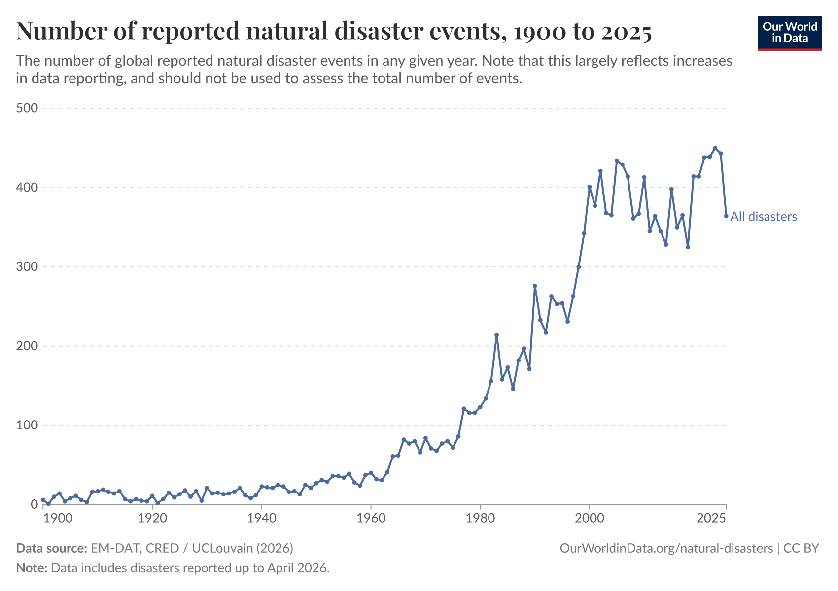
This has led to many international organizations — including the World Meteorological Organization and the United Nations — and media outlets reporting on a four or fivefold increase in disaster events.
But this rise is mostly due to improvements in disaster records. CRED was created in 1973 and started compiling disaster data. It wasn’t until 1988 that it took over the disaster database and established EM-DAT. This period of database development in the 1970s and 1980s coincides with the steep rise in the number of reported disasters.
In our article on the completeness of these records, we show that through the first half of the 20th century, it was mostly large events — making it into the history books — that were recorded; small and medium-level events that would be recorded today are absent.
This suggests that events, deaths, and impacts from earlier years are likely to be underestimates. EM-DAT suggestions caution when trying to infer complete trends using pre-2000 data.
Some disaster records — particularly temperature deaths — are very incomplete
Data gaps are far larger in records from a century ago, but that doesn’t mean records from across the world today are complete. Reports for some disaster types and impacts are particularly patchy.
One important example is deaths from extreme temperature events (which can be hot or cold).
The inequalities in reporting on heatwaves across regions are stark. Many regions have poor data coverage, and sub-Saharan Africa is almost completely overlooked.
Over half of heat events in EM-DAT were reported across only nine countries: Japan, India, Pakistan, the United States, France, Belgium, the United Kingdom, Spain, and Germany. It’s highly unlikely that these are the only countries experiencing extreme heat events. Such events are just not being recorded or estimated in other regions.
Proper quantification of the health effects of extreme temperatures is also difficult. We often think about acute or very sudden deaths, such as heat strokes. But most heat-related deaths come from an increase in the risk of less obvious conditions, such as cardiovascular disease.1 These seemingly indirect deaths are not recorded as “heat-related” at the time and can only be estimated using various statistical methods later.
There is an emerging literature that tries to quantify heat-related mortality — with projections into the future — but heat deaths are not always captured (at least not fully) in disaster databases.2
We cover the topic of heat deaths in far more detail in a series of articles.
We suggest caution when using heat death figures. In our charts, we offer indicators with and without temperature-related deaths included, as including them can make it difficult to understand the true trends in the impacts of other disasters.
Around 10,000 to 20,000 people die from disasters every year
How many people die from disasters every year?
The chart below shows EM-DAT estimates from 2000 onwards. Due to the incompleteness of temperature-related death records that we described above, they are not included here.
You can see that in most years over the last 10 to 15 years, disasters have killed approximately 10,000 to 20,000 people per year. For context, that’s less than 0.1% of global deaths.3
But you can also see that this total can vary a lot from year to year, and there are often individual years with far higher totals.
These spikes in deaths tend to come from very strong earthquake events. In 2023, Turkey and Syria were struck by a severe earthquake that killed tens of thousands. In 2010, it was the earthquake that hit Haiti, killing hundreds of thousands; in 2008, Cyclone Nargis, which killed 140,000 people in Myanmar; and in 2004, the Indian Ocean earthquake and tsunami that killed many across Indonesia, Sri Lanka, Thailand, and India.

More than 100 million people are affected by disasters every year
Tens of thousands tragically die in disaster events each year. But this is just a fraction of the total number that are affected in other ways.
Some are physically injured in these events. People are left homeless by flooding, earthquakes, or storms. Others are pushed into food insecurity by drought or floods.
EM-DAT also provides estimates of how many people are affected by disasters; this includes those who are injured, left homeless, or require assistance.
You can see these estimates over the past few decades in the chart below. In most years, the total is over 100 million people. In extreme years, it can be as much as 400 million.
When looking at the breakdown across disaster types, we see that these numbers are usually dominated by droughts and floods. These events can not only have direct, immediate impacts but also medium-term impacts on agriculture, food production, and livelihoods.

Research & Writing
June 3, 2024
Is the number of natural disasters increasing?
A deep dive into missing data and the limitations of disaster databases.
March 12, 2024
Weather forecasts have become much more accurate; we now need to make them available to everyone
A four-day forecast today is as accurate as a one-day forecast 30 years ago.
May 20, 2024
The world has become more resilient to disasters, but investment is needed to save more lives
Deaths from disasters have fallen, but we need to build even more resilience to ensure this progress doesn’t reverse.
May 20, 2024
How are extreme weather events and the climate evolving in the United States?
Explore century-long data on temperatures, precipitation, heatwaves, drought, and hurricanes in the United States.
February 15, 2022
A century of global deaths from disasters
How has the death toll from disasters changed over the last century?
October 5, 2018
What were the world's deadliest earthquakes?
July 19, 2017
Not all deaths are equal: How many deaths make a natural disaster newsworthy?
How many deaths make a natural disaster newsworthy?
Explore the data
Deaths from disasters
Deaths and death rates are two of the key metrics used to track the human toll of disasters.
EM-DAT, the International Disaster Database, tracks the estimated death tolls of disaster events across the world. This collection effort has been ongoing since the 1980s, generating detailed records that allow us to track estimates over time.
As we described above, earlier records are less complete than modern ones, and some 20th-century estimates are likely to be underestimates.
In this chart, you can explore data on disaster deaths, broken by type, and viewable as annual or decadal averages, or as absolute numbers or rates.
From this data, we see:
- In most years over the past 15 years, approximately 10,000 to 20,000 people have died from disasters each year.
- This is clearer when deaths from extreme temperatures — which are inconsistently recorded across countries over time — are excluded from the series.
- Deaths tend to spike in years with severe earthquakes; the 2004 Indian Ocean earthquake and tsunami, the 2010 earthquake in Haiti, and the 2023 earthquake in Turkey and Syria are all very prominent in global death tolls.
- Many countries have become more resilient to disasters, thanks to early warning systems, improved forecasting, and community response. One example of this is Bangladesh, where strong cyclones could kill hundreds of thousands in a single year. In recent years, this death toll has been several orders of magnitude lower, thanks to improved response.
- We can also see this improved resilience in global data over the last century: death rates have fallen substantially from a century ago, not because hazards have become less severe, but because societies have been able to protect themselves better and respond in the aftermath.

People affected by disasters
EM-DAT also collects data on the total number of people affected by disasters. This includes those who are injured, left homeless, or require assistance.
In the chart, you can explore this data by disaster type and impact, and switch between absolute numbers and rates for each country.
From this data, we see that:
- Over 100 million people are affected by disasters each year.
- Droughts and floods tend to affect the largest numbers; these events don’t just have direct, immediate effects, but longer-lasting impacts on food production, access to clean water, and other basic necessities.
- In most years, droughts affect tens of millions.
- Every year, floods affect tens of millions.
- The number of people injured in disasters typically ranges from 20,000 to 60,000 per year, but in some years it can be over 100,000.
- Hundreds of thousands are typically left homeless every year, usually due to flooding, but in severe earthquake years, these events dominate.

Economic damages from disasters
Societies are also affected by disasters through economic damage. Infrastructure, such as buildings and homes, can be destroyed in an earthquake or hurricane; fields of crops can be destroyed in a flood or drought.
EM-DAT also publishes estimates of economic damage, but it’s important to note that these are often incomplete; many disasters in the database lack an economic damage estimate.
In the chart, you can see the economic damage from disasters as a share of gross domestic product (GDP). You can explore this data for any country and see breakdowns by disaster type.
From this data, we see that:
- In recent years, disaster damages were equal to around 0.2% of global GDP, reaching up to 0.5% in some years.
- Storms tend to be the most costly events, dominating damages in years without severe earthquakes.
- This is particularly true in countries such as the United States, where hurricanes often inflict damage equal to around 0.5% of GDP (and sometimes as much as 1%). These damages likely make up a substantial portion of global costs.
- In other parts of the world, flooding is the most costly: this is true of areas such as the European Union, or Pakistan in South Asia, where damages can be as much as 5% of GDP.

Featured Data on Natural Disasters
Data Insights on Natural Disasters
Update
This page was first published in December 2022 and was republished with substantial revisions in May 2026.
Endnotes
Vicedo-Cabrera, A. M., Tobias, A., Jaakkola, J. J., Honda, Y., Hashizume, M., Guo, Y., ... & Gasparrini, A. (2022). Global mortality burden attributable to non-optimal temperatures. Lancet.
Ballester, J., Quijal-Zamorano, M., Méndez Turrubiates, R. F., Pegenaute, F., Herrmann, F. R., Robine, J. M., ... & Achebak, H. (2023). Heat-related mortality in Europe during the summer of 2022. Nature medicine.
In 2023, 61.7 million people died globally. 15,000 as a share of 61.7 million is 0.02%. Even in most peak years, where the total is closer to 100,000 disaster deaths, this is still roughly 0.1% of the total.
Cite this work
Our articles and data visualizations rely on work from many different people and organizations. When citing this topic page, please also cite the underlying data sources. This topic page can be cited as:
Hannah Ritchie, Pablo Rosado, and Max Roser (2022) - “Natural Disasters” Published online at OurWorldinData.org. Retrieved from: 'https://ourworldindata.org/natural-disasters' [Online Resource]BibTeX citation
@article{owid-natural-disasters,
    author = {Hannah Ritchie and Pablo Rosado and Max Roser},
    title = {Natural Disasters},
    journal = {Our World in Data},
    year = {2022},
    note = {https://ourworldindata.org/natural-disasters}
}
Reuse this work freely
All visualizations, data, and articles produced by Our World in Data are completely open access under the Creative Commons BY license. You have the permission to use, distribute, and reproduce these in any medium, provided the source and authors are credited.
The data produced by third parties and made available by Our World in Data is subject to the license terms from the original third-party authors. We will always indicate the original source of the data in our documentation, so you should always check the license of any such third-party data before use and redistribution.
All of our charts can be embedded in any site.