Wildfires
Explore global and country-level data on the extent of wildfires and how they’ve changed over time.
First published on 2nd April, 2024. Statistics updated weekly.
A wildfire is an uncontrolled burn of vegetation, which includes the burning of forests, shrublands and grasslands, savannas, and croplands.
Wildfires can be caused by human activity — such as arson, unattended fires, or the loss of control of planned burns — and natural causes, such as lightning.
The spread of wildfires, once ignited, is determined by a range of factors, such as the amount and types of dry vegetation in the surrounding area, wind direction and speed, moisture levels, and heat. The amount of area burned by wildfires — and the impacts on ecosystems — is driven by a combination of weather patterns, human activity, the management of vegetation and landscapes, and responses to suppress their spread.
Humans are affected by wildfires both directly and indirectly. In most years, several hundred people die directly from the fire. Far more — typically tens or hundreds of thousands are evacuated, or in some cases, permanently displaced from their homes. Wildfires also emit particulates and local air pollutants that are damaging to human health. These fires also emit carbon dioxide — a drive of climate change — and can disrupt or damage ecosystems.
On this page, we look at data on wildfires' extent and how they are changing over time.
This data is updated frequently, including some charts on a weekly basis.
See all interactive charts on wildfires ↓
Tracking the extent of wildfires across the world
To track the progression of wildfires over the course of the current year and understand the historical trends in these fires, we’ve published a range of charts that we will update frequently.
Most of this data is sourced from the Global Wildfire Information System (GWIS). This is a joint initiative of the Group on Earth Observation (GEO) and Copernicus, the Earth observation component of the European Union’s space program.
GWIS detects wildfires through the use of satellite imagery1 and provides excellent, up-to-date reports on wildfire extent, emissions, and pollution at a very high resolution. Here, we visualize its national, regional, and global summaries. Detailed mappings of active wildfires are also available on its website.
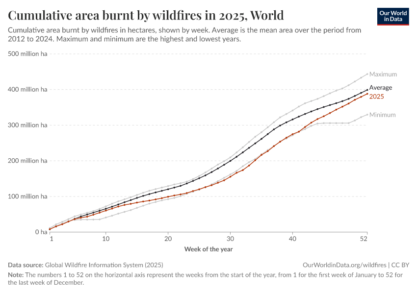
Weekly burned area
A useful way of tracking the evolution of wildfires across the year is to look at their week-by-week progression. This allows us to compare the extent of wildfires at a given time this year to the same period in a previous year.
It lets us see whether wildfires have started earlier or later than in previous years and whether they’re tracking above or below what we might expect from historical records.
In the chart below, you can see the cumulative area of land burned by wildfires by week. The horizontal axis starts on week 1 (January 1st) and continues to 52 (the last week of December). Each line represents one year and shows the cumulative area burnt by any given week in that year.
You can explore this data for any country in the interactive chart. What you’ll find is that wildfires start at different times depending on the region. Peak wildfire season in Europe, for example, tends to be from June to August. In Southern Australia, it tends to be later in the year, coinciding with the South Hemisphere’s spring and summer months. You can also explore this data expressed as a share of the total land area.

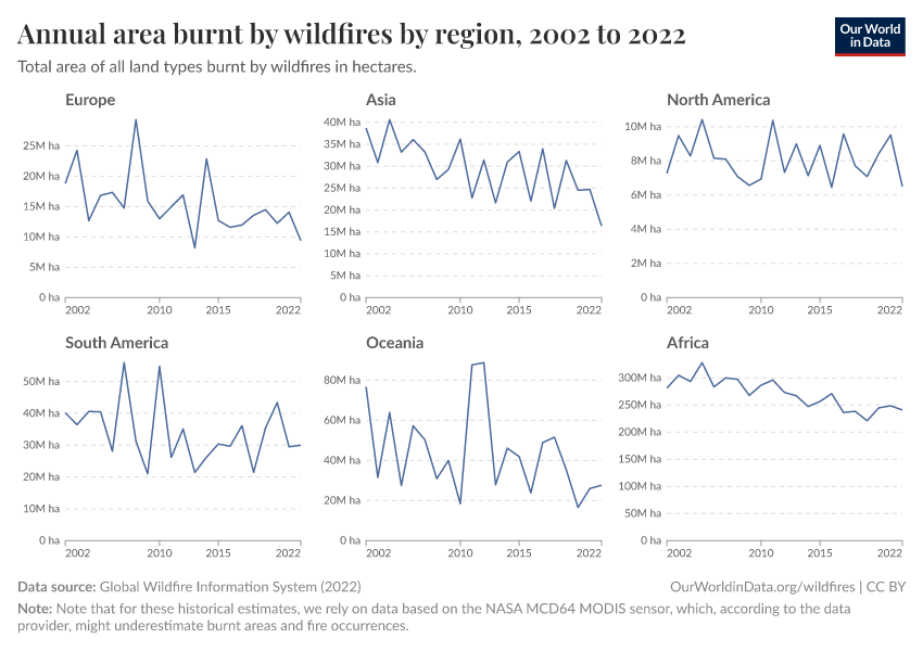
Burned area by year
How much area is burned by wildfires each year?
In the chart below, you can see the annual totals since 2012.
The data for the current year is also included to allow you to put this year’s current burn figures into context. It will be updated frequently, with the date of the latest published figures shown on the chart. Obviously, this means the final year of data is incomplete until the end of the fire season in each respective country.

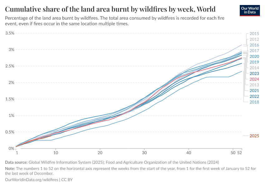
Share of land area burned by wildfires
It’s useful to put the total extent of wildfires in the context of total land area: what share of land is burned each year?
In the chart below, you can explore this data by country and region.
Africa tends to be the region with the largest share of area burned — typically ranging from 6% to 8% each year. Figures tend to be lower in other regions but can vary a lot from year to year.
It’s important to note that the same land area can burn multiple times over successive years. So, a rate of 5% burn per year doesn’t mean that 50% of a country is burned over a decade. Some areas will burn multiple times over that period, while others will never be exposed.

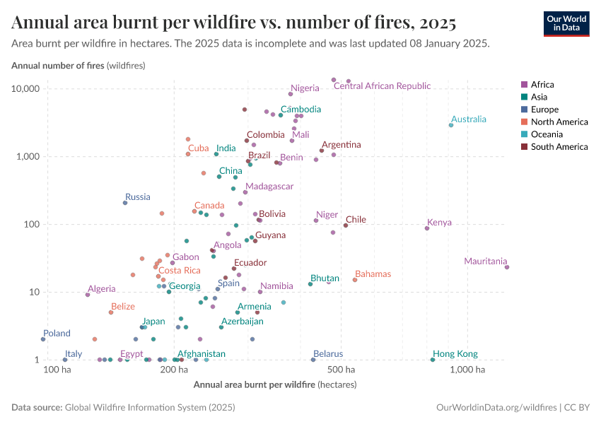
Land area burned per wildfire
The spread of a wildfire, once ignited, will be influenced by many factors. Natural phenomena such as the type of vegetation, weather conditions, and the intensity of heat will influence how well the fire will be contained. Certain types of vegetation, for example, burn more easily than others. The effectiveness of the local fire containment management strategies will also play a role. This means some wildfires end up being significantly larger than others, and the impact can vary across different regions and countries.
In the chart below, you can explore how the average land area burnt per wildfire varies across different countries and regions. As before, the current year’s data is included but will remain incomplete until the end of the fire season. You can further explore in this scatterplot how the same number of wildfires can lead to significantly different amounts of land being burnt per wildfire.

Burned area by land type
When “wildfires” are mentioned, people often picture forest fires. But lots of other ecosystem types can burn. Much larger areas of grasslands and savannas are burned each year than forests.
In the chart below, you can see the area burned in any given year by the type of land cover.
This can vary a lot depending on a country’s landscape. Savannas, for example, are much more dominant in Africa and South America America. In Oceania, it’s shrubs and grasslands. In Europe and North America, large areas of croplands are often burned.

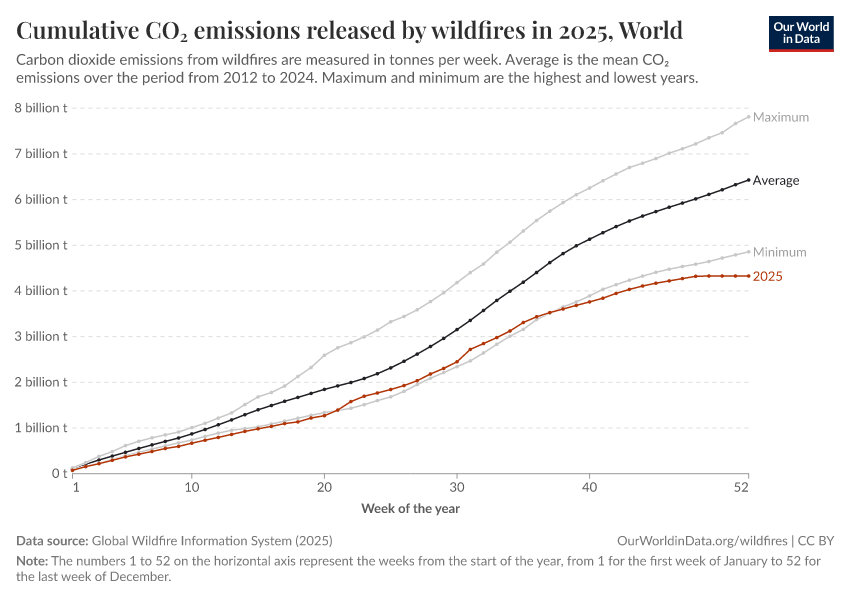
Carbon emissions from wildfires
Wildfires can lead to large emissions of carbon dioxide (CO2), as the carbon stored in the vegetation — trees, grasslands, or crops — is released into the atmosphere when burned.
How much carbon is emitted from wildfires depends on a range of factors: the amount of material burned, as well as the type. A hectare of carbon-rich forest might emit more CO2 than a hectare of cropland.2
Calculating the amount of carbon released from wildfires is difficult. Researchers can use several methods to estimate it. They can, for example, use a combination of satellite measurements and atmospheric models. Or measure the amount of vegetation before and after a fire to estimate how much has been lost. Finally, they might use more direct measurements of the heat released from a fire to estimate the amount of vegetation that burned; this allows them to estimate how much carbon was released. Carbon Brief provides a detailed explanation of how scientists estimate these figures.
CO2 emissions from wildfires — as estimated by the Global Wildfire Information System — are shown in the chart below.
Wildfires globally add around 5 to 8 billion tonnes of CO2 each year. For context, globally, we emit around 37 billion tonnes of CO2 from fossil fuels and cement yearly.
While it’s tempting to compare these numbers directly, that is not always appropriate, because some emissions from wildfires can be offset in later years by the regrowth of vegetation. This is not the case for fossil fuels: most of the carbon they emit persists in the atmosphere for centuries or more. The contribution of wildfire emissions to climate change is, therefore, a more complex balance between how burning and revegetation are changing over time. You can also track the evolution of CO2 emissions from wildfires across the year week by week.

Air pollution from wildfires
The burning of biomass emits air pollutants such as black carbon, volatile organic compounds, and nitrogen oxides (NOx). These compounds can be damaging to human health, resulting in respiratory problems, and have been linked to premature death from non-communicable conditions such as heart disease and strokes.3
One major pollutant of concern is called PM2.5. This is fine particulate matter with a diameter of less than 2.5 micrometers. These very small particles are particularly damaging because they can penetrate deeply into the lungs.
In the chart below, we show estimates of the amount of PM2.5 that is emitted from wildfires across the world.

Is the area burnt by wildfires increasing or decreasing globally?
There is increasing concern about the impacts of global warming on wildfire frequency and severity. Factors such as increased heat, humidity, the drying effect on vegetation, and wind patterns can all affect the risk of large wildfires.
However, some observers have noted that globally, the amount of area burned by wildfires each year has gone down over the last few decades.
If you look at statistics from the Global Wildfire Information System shown in the chart here, since the early 2000s, there has been a noticeable decline in the annual extent of land affected by wildfires.4
To understand what’s going on, it’s useful to look at how areas burnt have changed across different landscapes. In the chart below, we see the amount of area burned by land cover. You can see that most of this decline has come from shrublands, grasslands, and croplands (with small declines in savannas). Forest fires have been relatively stable.
Much of this decline has occurred in Africa and, to a lesser extent, in Oceania. The data suggests small declines in Europe, too.
In a paper published in Science, researchers note this same trend: “Unexpectedly, global burned area declined by ∼25% over the past 18 years, despite the influence of climate.”5 They, too, point out that this is largely driven by a decline in burn rates in grasslands and savannas as a result of the expansion and intensification of agriculture.
This highlights the strong role that human activity and land use management play in wildfire extent, alongside weather- and climate-related factors. Both factors must be considered when trying to minimize the damage of increasing fire risk in a changing climate.

Key Charts on Wildfires
See all charts on this topic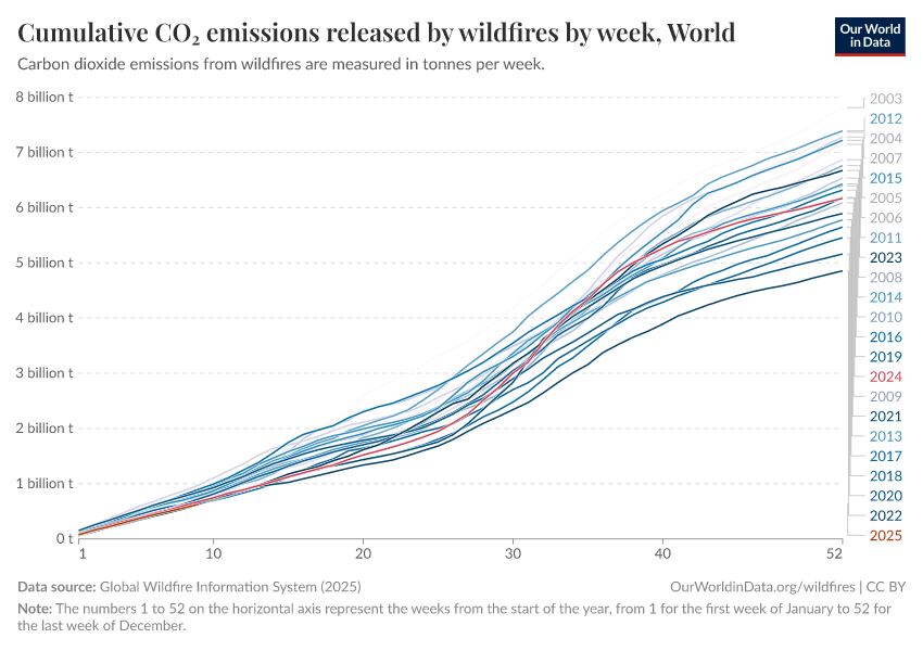


Featured Data on Wildfires
Endnotes
GWIS uses various satellite sensors for their wildfire data analysis. The historical estimates are primarily based on the NASA MCD64 MODIS product, but the authors note that it can underestimate burnt areas and fire occurrences. For higher spatial resolution and enhanced accuracy, they also rely on Sentinel-2, but unfortunately, these data are only available for the European region. Therefore, we’ve chosen to rely largely on the near-real-time data provided by GWIS, which is derived from MODIS & VIIRS Active Fire sensors, except when discussing historical trends. The authors note that these provide a reliable estimate while acknowledging that they might still be underestimating the genuine impact of wildfires, primarily due to constraints imposed by the spatial resolution of the MODIS and VIIRS sensors.
Zheng, B., Ciais, P., Chevallier, F., Chuvieco, E., Chen, Y., & Yang, H. (2021). Increasing forest fire emissions despite the decline in global burned area. Science Advances, 7(39), eabh2646.
Alexeeff, S. E., Liao, N. S., Liu, X., Van Den Eeden, S. K., & Sidney, S. (2021). Long‐term PM2. 5 exposure and risks of ischemic heart disease and stroke events: review and meta‐analysis. Journal of the American Heart Association, 10(1), e016890.
Murray, C. J., Aravkin, A. Y., Zheng, P., Abbafati, C., Abbas, K. M., Abbasi-Kangevari, M., ... & Borzouei, S. (2020). Global burden of 87 risk factors in 204 countries and territories, 1990–2019: a systematic analysis for the Global Burden of Disease Study 2019. The lancet, 396(10258), 1223-1249.
Note that for these historical estimates, we rely on the data that is based on the NASA MCD64 MODIS sensor, which according to the data provider might be underestimating burnt areas and fire occurrences. However, since the underestimation would be consistent across years due to using the same methods, the observed decline in burned areas remains valid.
Andela, N., Morton, D. C., Giglio, L., Chen, Y., van der Werf, G. R., Kasibhatla, P. S., ... & Randerson, J. T. (2017). A human-driven decline in global burned area. Science, 356(6345), 1356-1362.
Cite this work
Our articles and data visualizations rely on work from many different people and organizations. When citing this topic page, please also cite the underlying data sources. This topic page can be cited as:
Veronika Samborska and Hannah Ritchie (2024) - “Wildfires” Published online at OurWorldinData.org. Retrieved from: 'https://ourworldindata.org/wildfires' [Online Resource]BibTeX citation
@article{owid-wildfires,
    author = {Veronika Samborska and Hannah Ritchie},
    title = {Wildfires},
    journal = {Our World in Data},
    year = {2024},
    note = {https://ourworldindata.org/wildfires}
}
Reuse this work freely
All visualizations, data, and articles produced by Our World in Data are completely open access under the Creative Commons BY license. You have the permission to use, distribute, and reproduce these in any medium, provided the source and authors are credited.
The data produced by third parties and made available by Our World in Data is subject to the license terms from the original third-party authors. We will always indicate the original source of the data in our documentation, so you should always check the license of any such third-party data before use and redistribution.
All of our charts can be embedded in any site.