


Which countries have already passed peak population, and when will the rest do so?
Falling fertility rates have created a unique scenario in human history: many countries are experiencing structural population decline.
Many countries around the world are in a unique position in human history: rather than having a constant or growing population, their populations are starting to shrink. This is not a temporary decline, caused by war or famine. There are plenty of population shocks like that in the history books.
Instead, this decline is structural. It is caused by falling birth rates.
If we look at the United Nations’ population estimates and medium projections, 64 countries and territories had already passed peak population in 2026.
In the map below, you can see which countries they are. Almost all of them are in Europe and East Asia, which have seen rapid reductions in fertility rates and persistently low rates since then. Many Eastern European countries have also seen large numbers emigrating, adding to the decline.
There are a few other, more surprising, countries that may have passed their peak, too. Thailand in Southeast Asia — which dropped below two births per woman in the early 1990s — now has a rate below 1.2. Uruguay in South America has also seen fertility rates drop to an average of 1.4 births per woman.
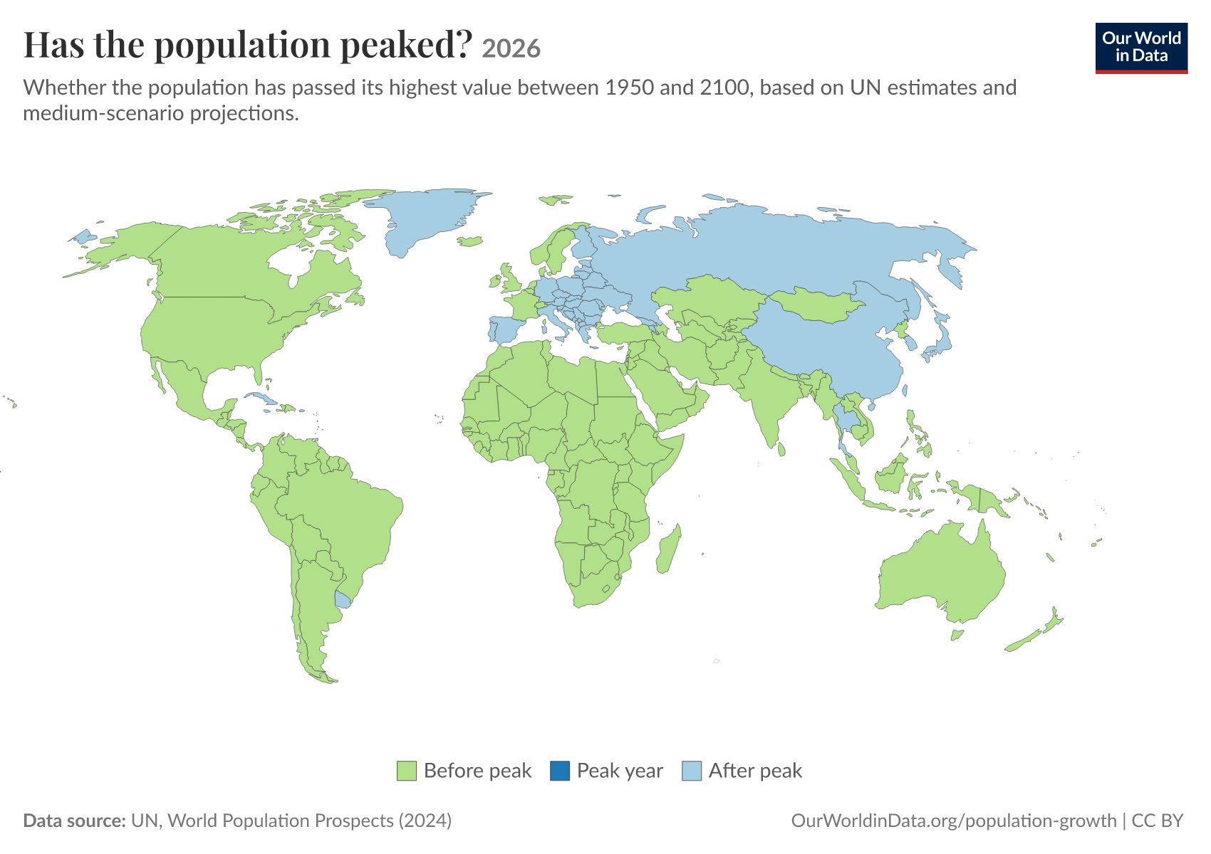
Many of these countries have only just passed the peak. But some, such as Japan and Italy, peaked more than a decade ago. In the chart below, you can see the trajectories of a small selection of countries.

If we include the UN’s projections to the end of the century, the decline is substantial. South Korea and China’s populations could more than halve. Italy could shrink by more than 40%. Spain and Thailand, by a third.

Which countries will peak in the middle of the century?
In the coming decades, many more countries are expected to join them.
By the 2050s, much of South America is projected to have passed the peak. By the 2060s, much of South Asia may do so. This includes the world’s most populous country today: India.
In the map below, you can see which specific countries these are. Using the interactive timeline, you can see how this evolves over different time periods.

What if birth rates or migration patterns become very different from expectations?
These projections of population peaks are based on the UN’s “medium variant” projection, and sensitive to its assumptions about three things: fertility rates, life expectancy, and migration. All of these things are hard to predict 50 years into the future.
Recently, we published a tool that allows you to see how future populations would change if these assumptions were different.
One factor that could change these maps a lot is migration rates. Many high-income countries only have constant or growing populations today because of immigration; without it, they’d be shrinking.
In this small map (click to enlarge), you can see which countries would be shrinking (in orange) in 2060, if we were to assume no migration.
The United States is one of the most stark examples. You might have noticed that in our earlier peak maps, the US never turned blue. Even by the end of the century, its population is not expected to peak. This is because the UN’s projections assume that there is enough immigration into the country to offset low birth rates.
If we were to assume zero migration in the US, its population would peak soon and would shrink by 60 million by 2100. Compared to the scenario with migration, the US population would be 130 million smaller at the end of the century.
You can see this comparison in the chart below.
So, for some countries, the timing of population peaks is very sensitive to the assumptions demographers make about future changes in migration rates, fertility rates, and longevity.
For others, a shrinking population now seems all but inevitable. In a recent article, I used our population tool to explore what would need to happen to any of these three factors in South Korea to stop its decline. I came away from the experiment concluding that it was next to impossible. The necessary rebounds in fertility rate, leaps in life expectancy, or rise in immigration levels did not seem plausible.
There, like in many other countries with steep declines, this new demographic reality seems inevitable.
Population tool: How will populations across the world change in the 21st century?
We created an interactive tool that lets you test how changes in fertility rates, life expectancy, and migration rates will change future populations.
South Korea’s population is set to shrink: what would it take to stop the decline?
How much would fertility rates, life expectancy, or migration rates need to change to stop the population from shrinking?
The global population pyramid: How global demography has changed and what we can expect for the 21st century
Global demographic transition signals a shift from young, growing populations to older, stable ones, reshaping societies and economies.
Cite this work
Our articles and data visualizations rely on work from many different people and organizations. When citing this article, please also cite the underlying data sources. This article can be cited as:
Hannah Ritchie, Edouard Mathieu, and Lucas Rodés-Guirao (2026) - “Which countries have already passed peak population, and when will the rest do so?” Published online at OurWorldinData.org. Retrieved from: 'https://archive.ourworldindata.org/20260910-003655/which-countries-have-already-passed-peak-population-and-when-will-the-rest-do-so.html' [Online Resource] (archived on September 10, 2026).BibTeX citation
@article{owid-which-countries-have-already-passed-peak-population-and-when-will-the-rest-do-so,
    author = {Hannah Ritchie and Edouard Mathieu and Lucas Rodés-Guirao},
    title = {Which countries have already passed peak population, and when will the rest do so?},
    journal = {Our World in Data},
    year = {2026},
    note = {https://archive.ourworldindata.org/20260910-003655/which-countries-have-already-passed-peak-population-and-when-will-the-rest-do-so.html}
}
Past versions
We are a live site and we keep our work maintained. So our articles are often changed, including the data. You can browse previous versions of this work here.

Reuse this work freely
All visualizations, data, and articles produced by Our World in Data are completely open access under the Creative Commons BY license. You have the permission to use, distribute, and reproduce these in any medium, provided the source and authors are credited.
The data produced by third parties and made available by Our World in Data is subject to the license terms from the original third-party authors. We will always indicate the original source of the data in our documentation, so you should always check the license of any such third-party data before use and redistribution.
All of our charts can be embedded in any site.