Taxation
Taxes are the most important source of government revenue. Who is paying how much and how do tax systems differ?
This page was first published in September 2016. We made minor changes to the text in March 2024.
Taxation is, by and large, the most important source of government revenue in nearly all countries.
We begin this topic page by providing an overview of historical changes in taxation patterns, and then move on to an analysis of available data from the last couple of decades, discussing trends and patterns in taxation around the world.
From a historical perspective, the growth of governments and the extent to which they are able to collect revenues from their citizens is a striking economic feature of the last two centuries. The available long-run data shows that in the process of development, states have increased the levels of taxation, while at the same time changing the patterns of taxation, mainly by providing an increasing emphasis on broader tax bases.
Taxation patterns around the world today reveal large cross-country differences, especially between developed and developing countries. In particular, developed countries today collect a much larger share of their national output in taxes than do developing countries; and they tend to rely more on income taxation to do so. Developing countries, in contrast, rely more heavily on trade taxes, as well as taxes on consumption.
Moreover, the data shows that developed countries actually collect much higher tax revenue than developing countries despite comparable statutory taxation rates, even after controlling for underlying differences in economic activity. This suggests that cross-country heterogeneity in fiscal capacity is largely determined by differences in compliance and efficiency of tax collection mechanisms. Both of these factors seem to be affected by the strength of political institutions.
In the last part of this topic page, we provide an overview of empirical evidence regarding the equity and efficiency implications of taxation. In particular, we show that taxation does have a powerful redistributive effect, but it is important to consider how taxation also affects the behavior of individuals, by changing economic incentives.
Related topics
See all interactive charts on taxation ↓
History of taxation
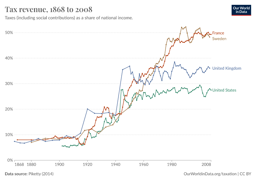
Taxes started growing in early-industrialized countries after the First World War
The visualization shows the evolution of tax revenues, as a share of national income, for a selection of early-industrialized countries.

As we can see, until 1920 tax revenues were low across all these countries. Indeed, until 1910 less than 10% of national income was collected by these governments through taxation – just enough for them to fulfill basic functions, such as maintaining order and enforcing property rights.
After the First World War, however, taxation started growing considerably. In the period 1920-1980 taxation as a share of national income increased drastically, more than doubling across all countries in the chart. These increases in taxation went together with more government expenditure on public services, particularly education and healthcare.
After 1980, tax revenues started stabilizing, albeit with marked differences in levels for each country. Today these differences remain significant.
Income taxation played a fundamental role in the historical expansion of tax revenues
The growth of tax revenues that took place in early-industrialized countries after the First World War was largely supported by the extension of income taxes. This required states to build tax administration systems and implement tax withholding at source, in order to effectively raise compliance.
The visualization from Besley and Persson (2013)1 tracks a group of 18 countries, in order to show how different taxation instruments became increasingly more common during the 20th century.
The vertical axis shows the relative frequency of taxation instruments within the sample of countries, and the horizontal axis shows time.2 The red line plots the share of countries with income taxation, the blue line plots the share with income-tax withholding, and the green line plots the share with value-added taxation.
As we can see, income taxes began appearing around 1850, with direct withholding following about 25 years later; and VAT again somewhat later. By 1950 all countries in the sample had already both income taxation and direct withholding.
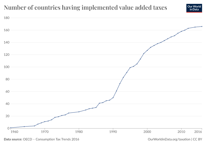
In this interactive chart, you can see in detail how VAT, specifically, has spread around the world in the last few decades.
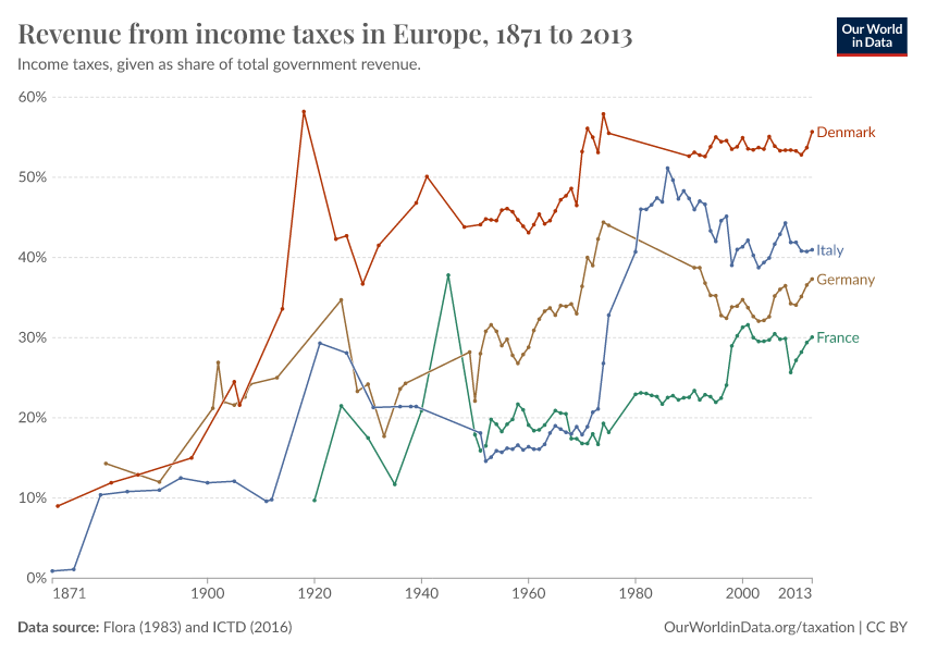
In the 20th century, European countries expanded revenues from direct taxation faster than other sources of government revenue
As pointed out above, early-industrialized countries increased tax revenues after the First World War specifically by increasing direct forms of taxation. Here we provide further evidence of this and show how the taxation of incomes became increasingly important to collect revenues in these countries, also in relation to other sources of revenue.
The graph shows the proportion of total government revenue that is accounted for by income taxation. The data plotted corresponds to historical estimates from Flora (1983)4 up until 1975, and more recent estimates, starting 1980, from the International Centre for Tax and Development.
As we can see, the relative importance of income tax within government budgets fluctuates with time, but there is a clear positive trend in all cases.

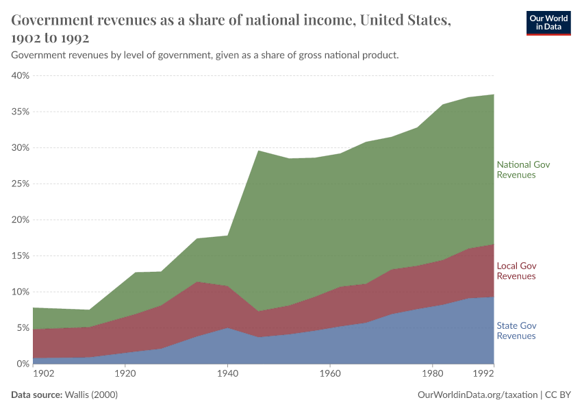
Revenue structure and government structure in the US are historically interdependent
The experience of government expansion in the US shows that there is a link between tax revenues, and government structure more generally.
As Wallis (2000) points out, the US has passed through three distinct systems of government finance in the last two centuries.5 In the first financial system, lasting from 1790 until about 1842, state governments played an important role in raising government revenue, mainly by generating 'asset income' through activities such as the sale of land. In the second financial system, starting around 1840, local governments became more important, contributing an increasing share of government revenue from property taxes. In the third system, starting with the Great Depression, the federal government became more important, generating increasingly larger revenues through the collection of income taxes.
The visualization shows how this transition took place. It provides details regarding the evolution of government revenues by level of government, expressed as a share of national income.
As can be seen in the chart, the implementation of new forms of taxation during the 20th century in the US was associated with underlying changes in the structure of the government. By displaying relative values in ‘Settings’, you can see how the share of national revenues rose sharply after the Second World War. This is when income tax revenues started expanding.

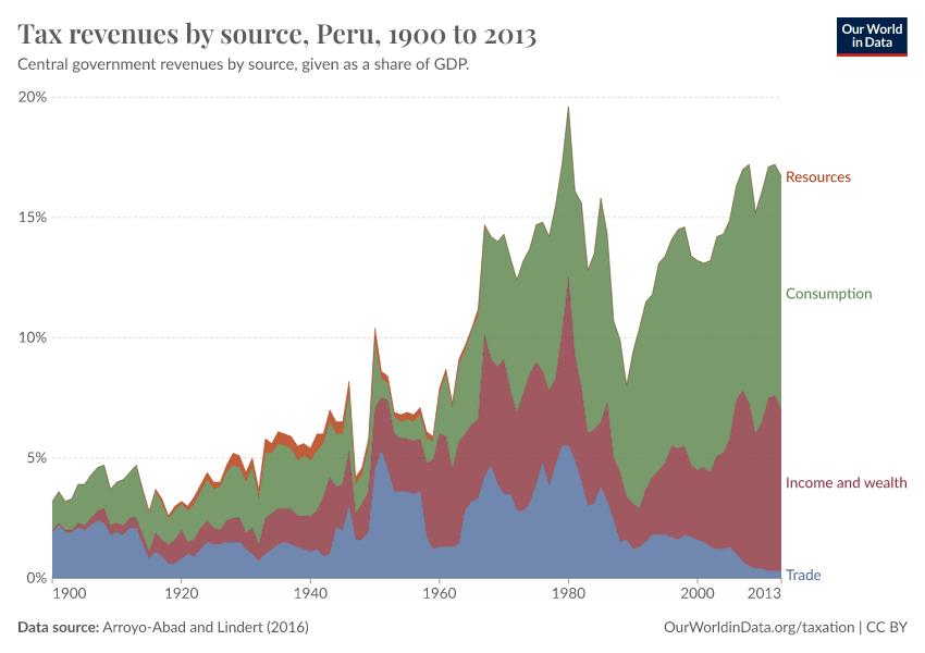
In the process of development, middle-income countries have increased tax revenues
The evidence that we have discussed so far is mainly from high-income countries. However, the available long-run data from Latin America suggests that middle-income countries have also expanded tax revenues in the process of development – albeit later, and with some differences in the relative importance of specific tax instruments.
The visualization, using data from Arroyo-Abad and Lindert (2016)6, shows the composition of tax revenues for Colombia. These estimates correspond to central government revenues and are expressed as a share of national income – specifically GDP. Comparable data, from the same source, is also available for Peru; you can see the corresponding figures by clicking on ‘Edit countries' and selecting Peru.
As we can see, tax revenues started growing noticeably in the 1960s, mainly through the collection of consumption taxes. By displaying relative values in ‘Settings’, you can see the relative importance of the different tax instruments.
As can be seen, income taxation became an important source of revenue in the second half of the 20th century, although consumption taxation grew faster than income taxation throughout this period.

Taxation today
What are the main instruments used by governments to collect revenue?
In the preceding section, we discussed the historical evolution of government revenues and provided evidence of the important role that taxes, specifically, played in the expansion of governments. But what is the full menu of instruments that governments have to collect revenues?
Roughly speaking, governments finance policy from taxes, grants (typically in the form of 'development assistance' transfers), and debt (more precisely budget deficits, or reductions of budget surpluses).
The diagram, from Prichard et al. (2014)7, provides a conceptual classification of revenues other than debt.
As we can see, these revenues include grants, direct taxes (such as taxes on income, profits, property, etc.), indirect taxes (such as taxes on consumption, sales, trade, etc.), and social contributions.
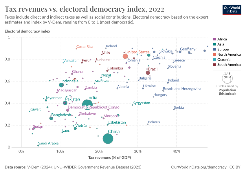
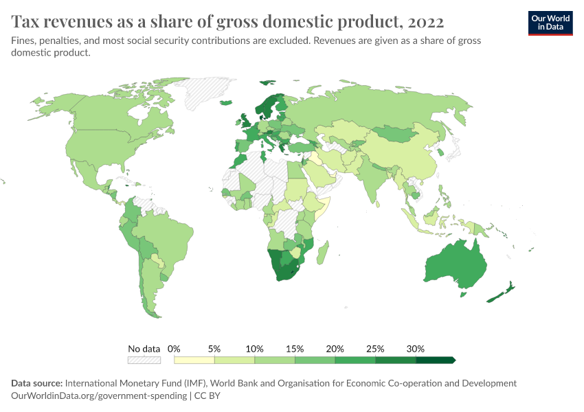
How much tax revenue do countries collect today?
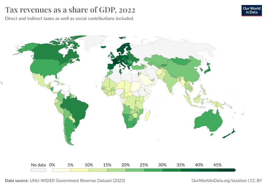
The visualization shows a map of total tax revenues, expressed as a share of GDP.
As we can see from the most recent data, at one extreme of the spectrum we have countries where total tax revenues are higher than 40%. At the other extreme, we have countries where taxes account for only a few percent of national income.
More generally, this map shows that there is a clear correlation between GDP and tax revenues – richer countries tend to collect through taxes a much larger share of their domestic production. This is a remark that we address in more detail in the following sections.

The next visualization uses the same data but plots the evolution of tax revenues for individual countries.
The time series shows that most high-income countries have had relatively stable levels of tax revenues in the last decade; while trends and patterns are less clear across the developing world. In some cases, tax revenues have been going up consistently.
In any case, differences today remain large and there is no clear evidence of global convergence. In many developing countries levels are very low and trends have not been persistently going up by a significant margin.

How do developing and developed countries compare in terms of tax revenue?
The table, from Jha (2008)8, shows differences in tax revenues as a share of GDP for various country groups. The table pools countries within groups, across two periods of time: 1990-1995 and 1996-2002. For each time-group pool of countries, the author ranks countries by tax revenue as a share of national income and reports the level for the country in the middle (i.e. the median tax revenue within that time-group pool). This gives us an idea of the 'typical' country in that region, at that point in time.
As we can see, developed countries collect almost twice as much as developing countries in tax revenue. And developing countries, in turn, collect almost half as much as transition economies. Also, we can see that developed countries had little change in tax-to-GDP ratios in the second half of the 20th century, whereas in developing countries there seems to be a broad negative trend.
Which forms of taxation dominate revenues in different world regions?
We have already discussed the fact that levels of taxation differ greatly across world regions – both in levels and trends. Now we focus on differences in the composition of tax revenues.
The visualization presents a breakdown of tax revenue sources, comparing figures from 1986 and 1996. The estimates are provided for a selection of country groups (you can switch country groups by clicking on the option 'change country group'), and are expressed as a share of GDP. The data comes from Todaro and Smith (2014)9, and includes direct taxes (corporate and income taxes), as well as indirect taxes (general, commodity, and excise taxes) and social security contributions.
Although these estimates are somewhat dated, they do provide a rough idea of taxation patterns by world regions. As it can be seen, developing countries depend significantly on indirect taxes, particularly taxes on trade and consumption. This can be contrasted with the case of OECD countries, where direct taxation – especially personal income taxation – is comparatively more important.
It is also worth noting the important role of social security revenues in advanced economies: at 10% of GDP in 1996, social security revenues are almost 10 times larger than in developing countries.

More recent data suggests that direct taxation, and specifically income taxation, remains more important in developed countries than in developing countries.
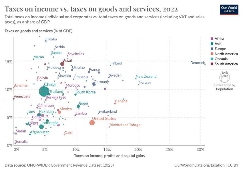
The next visualization plots total revenue from taxes on income and profits (horizontal axis) against revenue from taxes on goods and services (vertical axis), both expressed as a share of GDP.
As we can see, there is a positive correlation on the aggregate, and European countries are consistently located further towards the top right.
It can also be checked that most countries in the OECD are close, or below a hypothetical line with a slope equal to one (i.e. feature higher income tax revenues than commodity tax revenues).

Taxation of incomes
How have income tax revenues evolved around the world?
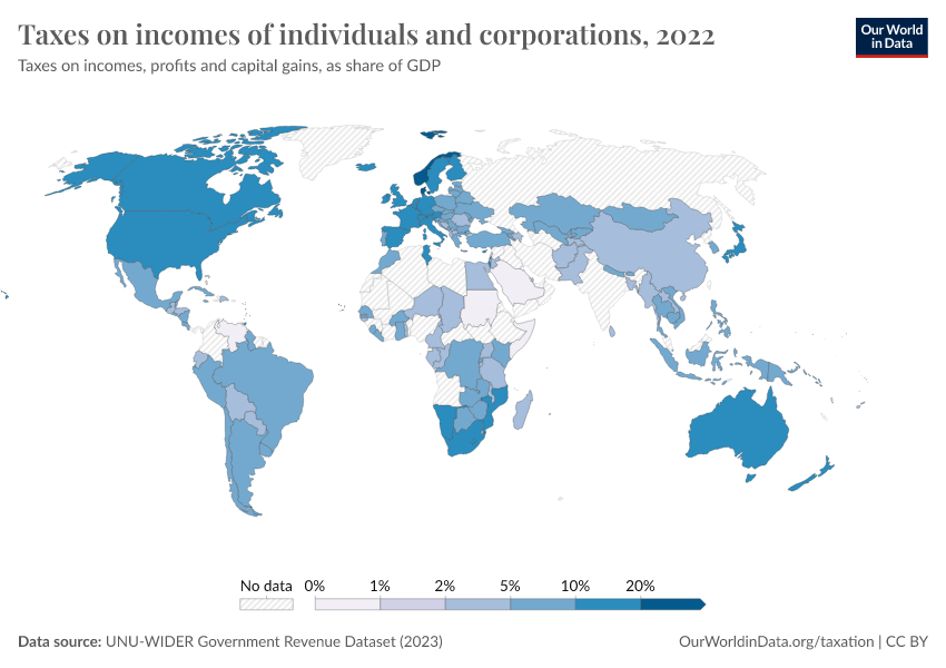
The next visualization provides an overview of revenues from income taxation (specifically taxes on incomes, profits, and capital gains) over recent decades. The estimates correspond to direct taxation of individuals and corporations and are expressed as a share of GDP.
The data shows large and persistent cross-country heterogeneity, even within relatively similar countries, such as those in the OECD.
In comparison to developing countries, the data also shows that in developed countries the direct taxation of corporations and individuals accounts for a larger share of national production. And this has been consistently the case throughout the last couple of decades.
As noted before, an important part of government revenue in developed countries comes from direct forms of taxation, so it is not surprising that the evolution of income taxation tracks closely the stable evolution of tax revenues that we discuss above.

Marginal income tax rates from a historical perspective
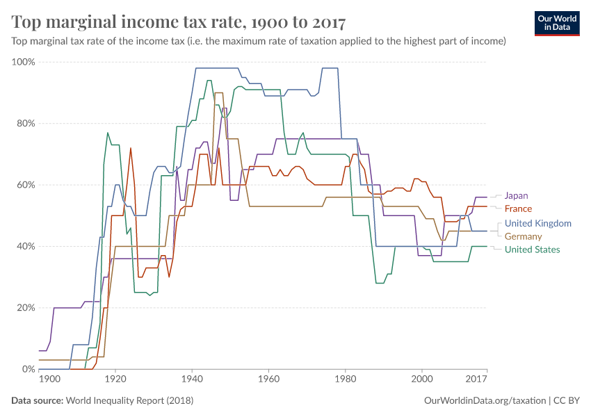
One important feature of income tax systems is the statutory rate of taxation that applies to the highest bracket of income. This measure, usually known as the 'top marginal rate of taxation', corresponds to the tax rate that applies to the 'last dollar' of income earned by the rich.
The chart here gives us an idea of how income taxation has changed in rich countries, by plotting trends in top marginal rates across France, Germany, the UK, the US, and Japan, over more than the last century.
As we can see, at the turn of the 20th century the top earners in these countries faced almost zero taxation on the last part of their incomes; but this changed drastically around 1910-1930, when high top marginal rates were introduced. Interestingly, however, this lasted only until about 1980, when again all countries substantially reduced rates. Today the levels are about half of what they used to be at the highest point.

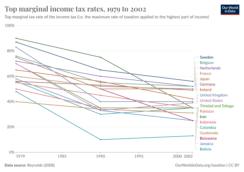
How have statutory tax rates for the rich evolved in the last few decades?
The chart here shows the sharp trend of reducing top marginal tax rates after the 1980s, as a global phenomenon expanding both developed and developing countries.
The interpretation of this graph often leads to confusion. A common mistake is to interpret the top marginal tax rate as the effective rate of taxation applied to the rich. This is incorrect because the top marginal rate applies (as the 'marginal' name suggests) only to the last portion of income earned by the rich. By implication, lower marginal rates at the top do not directly imply lower economic incidence of taxation for the rich.
Having said that, additional evidence does seem to suggest that the reduction of top marginal income tax rates has been one of the ingredients contributing to lower effective tax rates for the rich. We discuss this additional evidence in the next section.

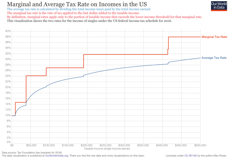
How do marginal rates of taxation compare to average rates of taxation?
The marginal rate of taxation is defined as the rate of tax that is applied to the ‘last dollar’ added to the taxable income. This means that marginal rates apply only to the portion of taxable income that exceeds the lower income threshold for that marginal rate.
In contrast, the average, or effective rate of taxation is defined as the ratio of total taxes paid by total income earned – that is, the share of income that is paid in income taxes.
The distinction between these two concepts is important because for many people, a portion of their income is taxed at one rate, and the rest is taxed at another rate. In the US, for example, if a married couple earns $40,000 a year, they pay federal income taxes at a rate of 10% on the first $18,500 or so, and at a rate of 15% on the rest. Hence, while the marginal rate applied to the last dollar earned is 15%, the effective income tax rate is lower.
Using the US federal income tax schedule, the visualization shows the marginal and average rates for the income of married couples (filing jointly). These figures use estimated tax brackets for 2016 from the Tax Foundation.
This visualization shows that average and marginal income tax rates are clearly different. Specifically, while both average and marginal rates are increasing, average rates are smoother and generally lower.
A similar chart showing marginal and average rates for the income of single individuals – as opposed to married couples filing jointly – can be found here.
Taxation of consumption
How is consumption taxed?
We have already outlined above the main instruments used by governments to collect revenue. Here we want to provide more detail regarding different forms of 'commodity taxation', in particular consumption taxes.
In the OECD nomenclature, consumption taxes (taxes on production, sale, transfer, leasing, and delivery of goods and rendering of services) include two sub-categories: general taxes on goods and services (taxes on general consumption including VAT, sales taxes, and other general taxes on goods and services) as well as taxes on specific goods and services consisting primarily of excise taxes (as well as customs and import duties and taxes on specific services, such as taxes on insurance premiums and financial services). For more details see OECD (2016).10
The key distinction between VAT and excise taxes is that VAT is paid by consumers, while excise taxes are paid by producers. In other words, they have a different statutory burden. As we discuss below, the statutory burden of a tax does not necessarily describe who really bears the economic burden of the tax.
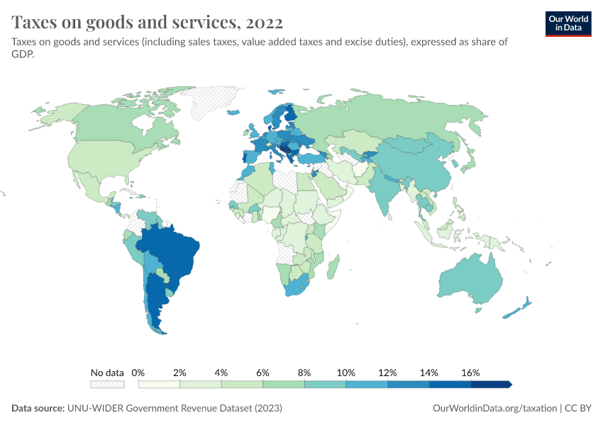
How has the taxation of goods and services evolved around the world?
The visualization provides an overview of revenues from the taxation of goods and services over recent decades. The estimates account for sales taxes, value-added taxes, and excise duties; and are expressed as a share of GDP.
The data shows some cross-country heterogeneity although, relative to revenue from income taxation, heterogeneity in commodity taxation is smaller, especially among high-income countries.

How important are different forms of commodity taxation in OECD countries?
We have already noted that taxes on goods and services tend to be less important in high-income countries than in low-income countries. Here we want to focus on the relative importance of different forms of commodity taxation.
The visualization plots the evolution of VAT and excise taxes in the OECD. The figures correspond to OECD averages and all values are expressed as a percentage of total taxation. These figures give us an idea of the evolution of the importance of different forms of commodity taxation in OECD countries.
As we can see, the composition of consumption taxes has fundamentally changed in the OECD over the last few decades: the weight of consumption taxes has been stable because the substantially increased importance of VAT has been effectively balanced by a reduction in the importance of other taxes on specific goods and services, the bulk of which are excise taxes.
How do statutory consumption tax rates compare across countries?
The next visualization shows how value-added tax rates compare between world regions. These figures come from the World Development Report (2005), and include corporate tax rates as a benchmark.
This visualization shows that value-added tax rates are similar in developed and developing countries, which suggests that the differences we observe in revenue between regions are likely due to differences in compliance. In fact, this is not only specific to commodity taxation – Besley and Persson (2013)1 show that developed countries tend to raise much more income-tax revenue than developing countries with comparable statutory rates, which suggests that the tax base in low-income countries is more strongly affected by compliance difficulties.
In summary, the evidence suggests that fiscal capacity (i.e. the extent to which countries can extract revenues through taxation at any given level of economic activity) is considerably less developed in poor countries.
How common are VAT exceptions?
Most VAT systems around the world adopt multi-rate systems with one or more reduced rates applying to particular goods. The chart, from OECD-KIPF (2014),11 shows the goods and services that are most commonly subject to reduced VAT rates in OECD countries.
As can be seen, in most countries that use VAT exceptions, reduced rates tend to apply to basic products in which low-income households spend a larger share of their income (such as food); as well as to products with perceived positive social spillovers (such as newspapers, books and medicines).
Many countries also use reduced rates for other reasons. From this chart, it seems like providing support to specific industries, such as tourism, is another important factor considered by governments.
Recent trends in the incidence of taxation
Taxes affect market prices, so the statutory burden of a tax does not describe who really bears the tax
Taxes affect economic interactions by changing the relative prices of goods and services in the economy. This implies that to assess who bears the burden of a tax, it is not sufficient to look at statutory tax rates. For example, if a tax is imposed on producers, in a competitive market they will raise prices to some extent to offset this tax burden – so the producers’ income will not fall by the full amount of the tax. A similar argument can be made if the tax is levied on consumers, since in a market economy the tax will lower demand, and this will have a consequence also for producers.
The key point is that, in order to analyze the economic incidence of taxation in a market economy, we need to look beyond statutory tax rates. Below we provide concrete examples of how economists try to estimate the economic incidence of taxation.
How much taxes do rich households pay in the US?
In the US, the Congressional Budget Office (CBO) produces estimates of the incidence of taxation across the population. To do this, they make the following assumptions: (i) Taxes on earnings are borne by workers; (ii) Taxes on individual income are borne by the households that pay them; (iii) Taxes on corporate income are borne by individuals in proportion to their capital income; (iv) Taxes on consumption are borne by individuals in proportion to their consumption.12
Based on these assumptions, the CBO calculates total tax contributions as a share of pre-tax income for different segments of the pre-tax income distribution.13 These estimates, often referred to as 'average tax rates', can be interpreted as the effective rates of taxation that apply to individuals with different incomes, after accounting for government transfers (specifically cash payments and in-kind benefits from social insurance and other government assistance programs).
The visualization, plotting CBO estimates of average tax rates, shows that the federal tax system in the US has been generally progressive: those located higher in the ranking of incomes, pay a higher share of their income in taxes.
Across time, we can also see that progressivity has not been constant – the period 1980-1990 saw important reductions in tax rates for the rich, without comparable reductions for the poor.
The hike in tax rates towards the end corresponds primarily to significant changes in tax rules in 2012. Up until that point, and since around 1995, tax rates for the richest 1% went down every year (although they also went down for the lower-income groups in the same period).
How progressive is taxation at the top of the income distribution in developed countries?
The visualization above shows that, according to the estimates from the Congressional Budget Office, richer individuals in the US generally tend to bear a larger burden of taxation than the poor. Here we examine whether this is also true within the top of the income distribution – that is, whether the 'ultra-rich' shoulder a larger tax burden than the 'rich'.
The next visualization, from Piketty and Saez (2007)15 shows estimated average tax rates in France, the US, and the UK, at two points in time: 1970 and 2005. Notice that these are average rates (i.e. total tax contributions as a share of pre-tax income), which are different from marginal tax rates.
Displayed are rates for the bottom 90% of the income distribution, as well as higher percentiles. Again, we can see in these estimates that the systems in question are progressive – increasingly higher percentiles in the income distribution pay increasingly higher effective rates of taxation. However, the lines are much flatter in 2005, which shows that the systems have become less progressive at the top: the average share of income paid by those at the very top of the income distribution has dropped substantially since 1970. This is important because, as the authors of the figure point out, over the same period pre-tax income inequality grew significantly: a few very rich individuals at the very top are accumulating an increasingly large share of national incomes.
An important point that should be kept in mind is that these estimates are not directly comparable to those from the Congressional Budget Office discussed above, because they do not take into account government transfers, and rely on different methodological assumptions – for example, they do not consider excise taxes (but they do consider estate taxes). For more details see Piketty and Saez (2007).15
The drivers of tax revenues
Rising GDP is associated with rising tax revenues
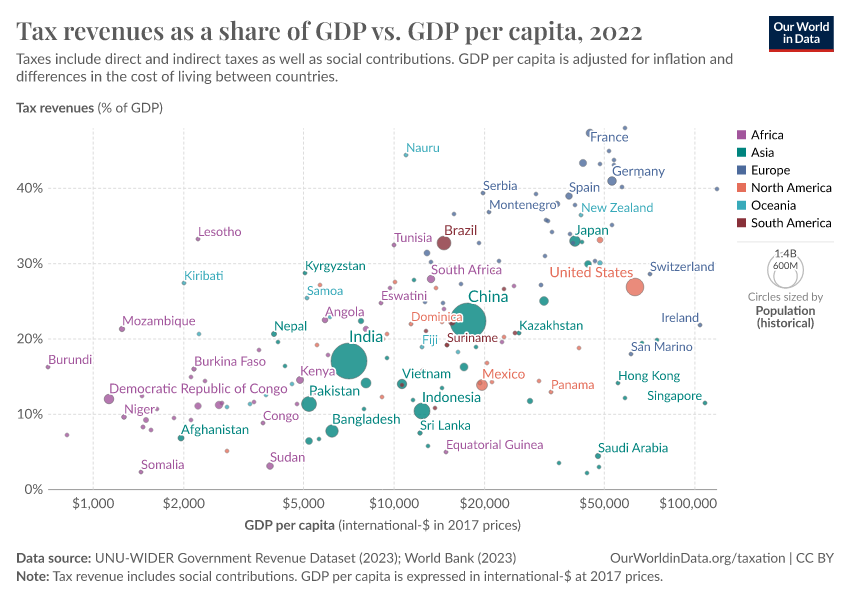
We have already pointed out that rich countries tend to collect much higher tax revenues than poor countries. The visualization provides further evidence of the extent of this correlation.
The vertical axis measures tax revenues as a share of GDP, while the horizontal axis measures GDP per capita (after accounting for differences in purchasing power across countries). The horizontal axis is expressed by default in a logarithmic scale, so that the correlation is easier to appreciate – you can change to a linear scale by clicking the ‘Settings' button.
We can see that there is a strong positive correlation: richer countries tend to have higher tax revenues as a share of their GDP. And this is also true within world regions (represented here with different colors).

Early-industrialized countries became better at collecting revenue as they developed
We argued above that the efficiency of tax collection is a strong predictor of cross-country differences in tax revenues – rich countries have more capacity to extract revenues. As historical data shows, this capacity was largely possible because, throughout the 19th century and up until the first half of the 20th century, these countries found increasingly cheaper ways to collect taxes.
The visualization, from Lindert (2012)17, shows that the US and the UK saw steep declines in the administrative cost shares of indirect tax collection across the 19th century and the early 20th. As we can see, the cost of collections dropped, from over 4.5% of the amounts collected in the mid-19th century to 2% since the middle of the 20th century.
Tax collection relates to the strength of political institutions
Cross-country differences in tax revenues are linked to the capacity of countries to implement efficient tax collection systems. Here we provide evidence suggesting that political factors – such as the extent of institutionalized constraints on the decision-making powers of policymakers – help shape the level and evolution of the fiscal capacity of countries.
The chart, from Besley and Persson (2013)1, plots the cross-country relationship between political institutions and tax revenues. The authors approximate the strength of political institutions by calculating the proportion of years since independence (or since 1800 if independence is earlier) that a country had strong constraints on the executive. Having 'strong constraints on the executive', in turn, is measured with data from the Polity IV database. In essence, this variable aims to capture the extent to which accountability groups impose institutionalized constraints on the decision-making powers of policymakers.
The scatter plot controls for baseline differences in GDP – that is, what we observe is the correlation between tax revenues and political institutions conditional on GDP levels. As we can see, countries with strong executive constraints collect higher tax revenues, when income per capita is held constant, than do countries with weak executive constraints.
Some studies suggest that, under weak accountability, countries may not only have generally weak taxation systems but may also be subject to ‘political budget cycles' whereby tax collection declines prior to elections, as politicians seek to secure short-term political support.18
Aid correlates negatively with tax revenue, but the link does not seem to be causal
A large body of academic literature has studied the relationship between revenue from development assistance ('foreign aid') and revenue from taxation. The hypothesis supporting this strand of literature is straightforward: foreign assistance may 'crowd out' domestic tax revenues, as it reduces the incentives for policy-makers to pursue politically costly tax collection.
This hypothesis seems to be supported by raw correlations. The plot, from Benedek et al. (2014)19, shows the evolution of tax revenues and foreign aid (Overseas Development Assistance – ODA). It shows a broad negative association: between 1980 and 1995, when foreign aid as a share of GDP was increasing, average tax revenue in relation to GDP decreased slightly. Post-1995, a decline in the share of total net ODA to GDP was accompanied by higher tax revenues as a percentage of GDP.
This relationship cannot be interpreted causally, as there are many factors that simultaneously drive ODA flows and tax revenues. More complex econometric studies that try to account for further sources of bias find that there is no consistently significant relationship between aid and tax collection.20
The consequences of taxation
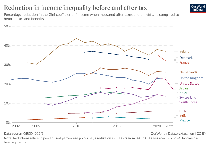
Taxation is an important instrument for reducing inequality
One way to gauge the extent to which taxation redistributes resources between individuals in a country is by looking at how the distribution of incomes change before and after taxes. The visualization does this, showing the reduction of inequality that different OECD countries achieve through taxes and transfers.
The estimates correspond to the percentage point reduction in inequality, as measured by changes in the Gini coefficients of income, before and after taxes and transfers. In a nutshell, income 'before taxes' corresponds to what is usually known as market income (wages and salaries, self-employment income, capital and property income); while income after taxes and transfers corresponds to disposable income (market income, plus social security, cash transfers and private transfers, minus income taxes).
The data shows that across the countries covered, taxes and transfers lower income inequality by around one-third on average (equivalent to around 0.15 Gini points). Yet cross-country differences are substantial.
Generally speaking, countries that achieve the largest redistribution through taxes and transfers tend to be those with the lowest after-tax inequality.

While informative for the purpose of cross-country comparisons, these results have to be interpreted carefully, since the before-tax distribution of incomes is already the result of choices made by individuals who take taxes and transfers into consideration. Put simply, the before-tax distributions of incomes are likely to be different to the actual distributions of incomes that would be in place if there were no taxes or transfers. This can be clearly explained in the context of pensions: individuals receiving state pensions appear in the data as poor before transfers; but many of them would of course have private pensions if they lived in a country without state transfers.
The extent to which taxes affect behavior is discussed in more detail next.
Taxation can lead to efficiency losses
In market economies, consumers and producers change their behavior in response to taxes. For example, if a taxed good has a substitute that is not taxed, some consumers will shift to the substitute to avoid the tax. These changes in behavior can lead to inefficiencies. For example, high tax rates may discourage labor supply; and in the case of very rich individuals, they may even induce migration of talent to countries where the tax burden is lower. In both cases, the 'size of the pie' would be reduced by taxation. So how large are these behavioral responses?
Using data from the European football market, Kleven et al (2013)22 find evidence of strong mobility responses to taxation for 'superstars'. The scatterplots support this.
The two plots correspond to different time periods. The vertical axis represents the fraction of all top-league professional football players who are foreign nationals in the country where they play, and the horizontal axis shows the average top earnings tax rate for foreign players in that country.
As we can see, in the period 1985-1995 there was no correlation between migration and tax rates; yet in the period 1996-2008, after the Bosman ruling on free mobility was enacted, the correlation became strongly negative: the countries with higher top earnings tax rates became less likely to have foreign players.23
The authors also show that the mobility of players had a negative impact on the performance of football clubs in countries with high tax rates.
This evidence, suggesting that 'superstars' are very responsive to taxation, contrasts with the available evidence for typical individuals – while still highly debated, most empirical estimates suggest that for the majority of the population, labor supply choices are not very responsive to changes in income tax rates.24
Key Charts on Taxation
See all charts on this topic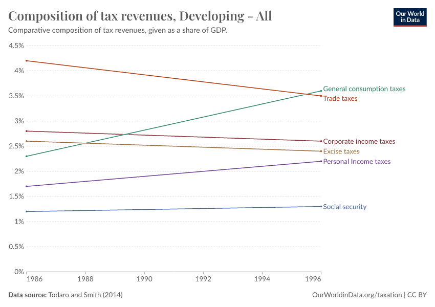


Featured Data on Taxation
Endnotes
Besley T. and Persson T. Taxation and Development. Handbook of Public Economics, Volume 5, Pages 1-474 (2013), vol. 5
The countries in the sample are Argentina, Australia, Brazil, Canada, Chile, Colombia, Denmark, Finland, Ireland, Japan, Mexico, the Netherlands, New Zealand, Norway, Sweden, Switzerland, the United Kingdom, and the United States.
The countries in the sample are Argentina, Australia, Brazil, Canada, Chile, Colombia, Denmark, Finland, Ireland, Japan, Mexico, the Netherlands, New Zealand, Norway, Sweden, Switzerland, the United Kingdom, and the United States.
The source is Besley T. and Persson T. Taxation and Development. Handbook of Public Economics, Volume 5, Pages 1-474 (2013), vol. 5
Flora, Peter et al. 1983. State, Economy and Society in Western Europe, 1815-1975. Frankfurt: Campus Verlag
Wallis, J. J. (2000). American government finance in the long run: 1790 to 1990. The Journal of Economic Perspectives, 14(1), 61-82.
Arroyo Abad, L. and P. Lindert. "Fiscal Redistribution in the Americas since the Mid-Nineteenth Century" in Latin American Inequality in the Long Run, edited by L. Bertola and J. Williamson, 2016.
Prichard, W., Cobham, A., & Goodall, A. (2014). ICTD Government Revenue Dataset ICTD working paper 19. Institute of Development Studies, Brighton.
Jha, Raghbendra. (2008). Chapter 55, International Handbook of Development Economics, Volume 1. Edward Elgar Publishing, Incorporated, 2008.
Todaro, M. and Smith, S. (2014) Economic Development, 12th Edition. Pearson. ISBN: 1292002972
OECD (2016) Consumption Tax Trends 2016, OECD Publishing, Paris.
OECD/KIPF (2014), The Distributional Effects of Consumption Taxes in OECD Countries, OECD Publishing, Paris.
For more details see Congressional Budget Office (2016). The Distribution of Household Income and Federal Taxes, 2013.
Pre-tax income corresponds to 'market income'. This includes labor income, business income, capital gains (profits realized from the sale of assets), capital income excluding capital gains, income received in retirement for past services, and other sources of income.
Congressional Budget Office (2016). The Distribution of Household Income and Federal Taxes, 2013.
Piketty, T., & Saez, E. (2007). How Progressive Is the U.S. Federal Tax System? A Historical and International Perspective. The Journal of Economic Perspectives, 21(1), 3-24.
Piketty, T., & Saez, E. (2007). How Progressive Is the U.S. Federal Tax System? A Historical and International Perspective. The Journal of Economic Perspectives, 21(1), 3-24. Retrieved from http://www.jstor.org/stable/30033699
Lindert, P. H. (2012). Social Contract Budgeting: Prescriptions from Economics and History. Renewing the American Social Contract policy papers. New American Foundation.
Prichard, W. (2016). Reassessing Tax and Development Research: A New Dataset, New Findings, and Lessons for Research. World Development, 80, 48-60.
Benedek, D., Crivelli, E., Gupta, S., & Muthoora, P. (2014). Foreign aid and revenue: Still a crowding-out effect?. FinanzArchiv: Public Finance Analysis, 70(1), 67-96.
Kleven, H. J., Landais, C., & Saez, E. (2013). Taxation and international migration of superstars: Evidence from the European football market. The American Economic Review, 103(5), 1892-1924.
The Bosman ruling banned restrictions on foreign EU players within national leagues and allowed players in the EU to move to another club at the end of a contract without a transfer fee being paid.
Saez, E., Slemrod, J., & Giertz, S. H. (2012). The elasticity of taxable income with respect to marginal tax rates: A critical review. Journal of economic literature, 50(1), 3-50.
Cite this work
Our articles and data visualizations rely on work from many different people and organizations. When citing this topic page, please also cite the underlying data sources. This topic page can be cited as:
Esteban Ortiz-Ospina and Max Roser (2016) - “Taxation” Published online at OurWorldinData.org. Retrieved from: 'https://ourworldindata.org/taxation' [Online Resource]BibTeX citation
@article{owid-taxation,
    author = {Esteban Ortiz-Ospina and Max Roser},
    title = {Taxation},
    journal = {Our World in Data},
    year = {2016},
    note = {https://ourworldindata.org/taxation}
}
Reuse this work freely
All visualizations, data, and articles produced by Our World in Data are completely open access under the Creative Commons BY license. You have the permission to use, distribute, and reproduce these in any medium, provided the source and authors are credited.
The data produced by third parties and made available by Our World in Data is subject to the license terms from the original third-party authors. We will always indicate the original source of the data in our documentation, so you should always check the license of any such third-party data before use and redistribution.
All of our charts can be embedded in any site.