Healthcare Spending
How is healthcare financed? How much do we spend on it? What are the returns?
This page was first published in June 2017. We made minor changes to the text in March 2024.
Good health is a key part of our quality of life. In this article we focus on healthcare – one of the most important inputs to protect and improve health. There are many other factors affecting health, and you can read more about some of them in our topic page on global health.
Publicly funded healthcare is a legacy of the Age of Enlightenment.1 The first examples of legislation on health insurance date back to the late 19th century.2 Data from these early systems shows that healthcare expenditure only began rising several years after the expansion of insurance coverage, with the discovery of powerful new treatments.3
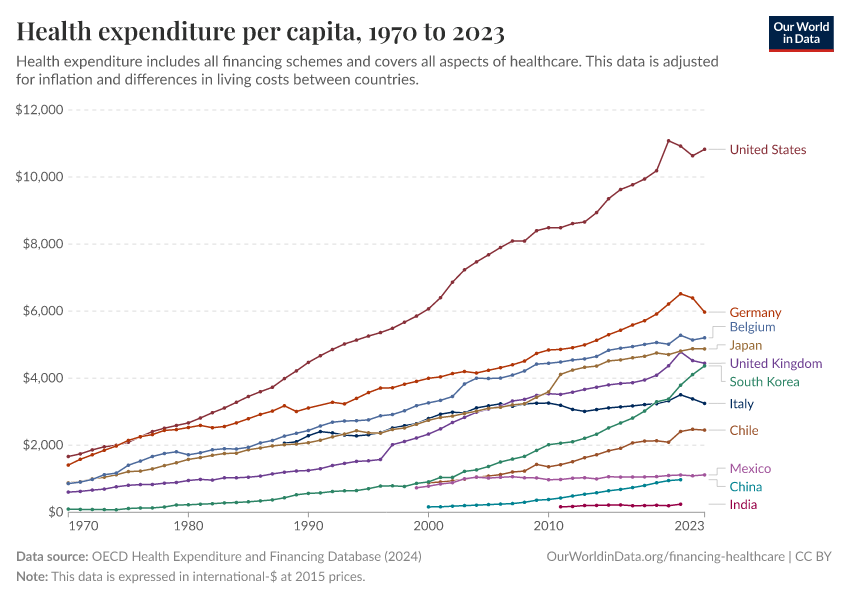
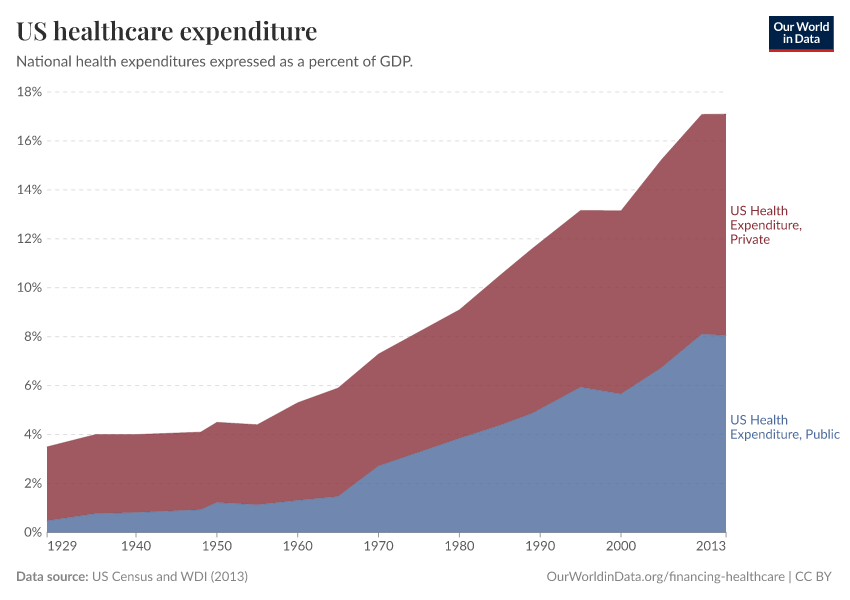
The impact that scientific developments had on healthcare expenditure is epitomized in the U.S. experience: in recent decades, as treatment possibilities expanded rapidly, expenditure on healthcare increased – in any way you want to measure it: private and public, both per capita and as a share of gross domestic product. This occurred without major changes in insurance coverage and had two important consequences: (i) the U.S. currently spends more government money per person on healthcare than many countries that fund universal programs, and (ii) spending is so concentrated that the top 1% of spenders account for more than 20% of total healthcare expenditure.4
Global expenditure on healthcare as a share of world income has been increasing, steadily but slowly over the course of the last couple of decades. In the background, however, there has been substantial cross-country heterogeneity, both in levels and trends. Regionally, high-income countries spend – and have been spending – a much larger share of their income on healthcare than low-income countries (about twice as much). Moreover, in contrast to high-income countries, in low and middle-income countries the public share of healthcare funding is much lower – although it has been catching up – and the role of out-of-pocket expenditures is much higher (above 50% of total expenditure in many countries).5
Healthcare financing in developing countries in the 21st century has been largely shaped by the flow of resources channeled through development assistance. These flows – which saw a steep increase after the introduction of the Millennium Development Goals – account for around 0.7% of the resources spent by high-income countries on healthcare. Although this may seem small in proportion to the national commitments of rich countries, for low-income countries at the receiving end of the transfers, these resources are substantial.6 This implies that development assistance for health, if suitably targeted and managed, has the potential of drastically reducing inequality in health outcomes: the robust empirically observed relationship between health outcomes and healthcare spending is indicative of large returns to healthcare investments, particularly at low levels of baseline expenditure.7
History of healthcare spending
A long-term perspective on government healthcare spending
Nowadays healthcare is commonly considered a ‘merit good’ – a commodity which is judged that an individual or society should have on the basis of need rather than ability and willingness to pay. This view, partly grounded on the recognized positive externalities of healthcare consumption, is perhaps most visibly materialized in the fact that access to healthcare is currently a constitutional right in many countries.8
However, just a few generations ago the situation was very different. In fact, during the Middle Ages health was considered a matter of destiny across most of Western Europe; it was only afterward, under the influence of Mercantilism and the Enlightenment, that this view started changing and public authorities increased their ambitions concerning the promotion of public health.9 Sundin and Willner (2007) say that “[g]enerally, before the era of the Enlightenment, it was thought that health was God’s gift and disease and death was His punishment for the sins of an individual, the congregation, the whole nation or its rulers. Hence, to live a decent life in accordance with His will and repenting one’s sins were considered the most effective preventive measures against illnesses".10
To show this development we have produced a long-run dataset with estimates of government expenditure on healthcare as a percent of gross domestic product (GDP) for a selection of high-income countries, going back to 1880.
As the data show, in 1880 government health spending was below 1% of GDP in all countries; but this started changing quickly in the first half of the 20th century, and by 1970 government spending on healthcare was above 2% of GDP in all these countries.

In European countries healthcare expenditure only began rising several years after the expansion of insurance coverage
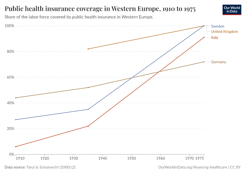
The steeper increase in public expenditure on healthcare observed in European countries after the Second World War is largely due to the fact that medicine had major breakthroughs during the second half of the 20th century – beginning, notably, with the discovery and use of penicillin and other antibiotics. Before these scientific developments took place, the main component of healthcare was not treatment but income insurance, insurance paying benefits to those who were unable to work due to poor health. In fact, public health insurance for workers was already substantial in a number of European countries before the Second World War.
The visualization presents public health insurance coverage as a percentage of the labor force for a number of European countries. Tanzi and Schuknecht (2000) – the source for the data in this figure – note that by 1929 all the eleven European countries shown in this visualization had at least voluntary insurance schemes; and that by 1935 half their labor force was covered by health insurance.

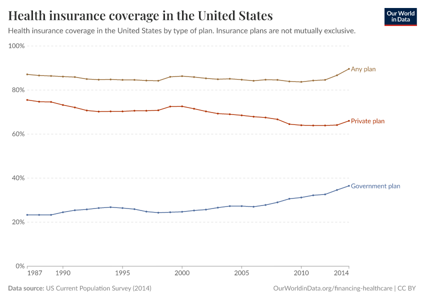
How did insurance coverage change in the US during the period of rapid growth in healthcare expenditure in the 20th century?
The lion's share of the above-mentioned historical increase in healthcare expenditure in the U.S. took place without an underlying increase in the share of people who were covered by health insurance. The visualization supports this; it presents a plot of coverage rates by type of plan (particular care should be taken when reading this graph, as insurance plans are not mutually exclusive; this means that those covered by 'private' and 'government' plans add up to more than those covered by 'any plan').
As can be seen, total health insurance coverage remained virtually constant at around 85% for decades, while private and public healthcare expenditures increased continuously over the same period. Interestingly, this data also shows an apparent change in coverage trends after 2012, when the ‘Affordable Care Act’ started kicking in.

What was the consequence of growing expenditure without insurance expansion in the US?
The fact that insurance coverage remained stable while healthcare spending was increasing rapidly due to major improvements in treatment possibilities during the 20th century, implied that healthcare expenditure in the U.S. grew highly concentrated.
The graph, produced by the National Institute for Health Care Management (NIHCM), shows the cumulative distribution of healthcare spending in the U.S., using data on personal expenditures during the year 2009, across the entire 'non-institutionalized civilian population'.
This graph should be read similarly to a Lorenz curve: the fact that the cumulative distribution of spending bends sharply away from the 45% degree line is a measure of high inequality.
As it can be seen, the top 5% of spenders account for almost half of spending, and the top 1% account for more than 20%. While some concentration in expenditure is to be expected when looking at the distribution across the entire population – because it is in the nature of healthcare that some individuals, particularly those older and with complicated health conditions, will require large expenditure –, these figures seem remarkably large. They suggest important inequality in access, over and above inequality in need. Indeed, the publisher of the graph notes that a report from the Medicare Payment Assessment Commission shows that personal spending for individuals covered by Medicaid is somewhat less concentrated than for the population as a whole.11
How quickly can insurance coverage expand?
We have already pointed out that European countries pioneered the expansion of healthcare insurance coverage in the first half of the twentieth century. The visualization, from the Human Development Report (2014), places the achievements of these countries in perspective. Specifically, the graph plots healthcare protection coverage for a selection of countries during the period 1920-2010. As we can see, France, Austria, and Germany increased healthcare coverage in the years 1920-1960, while Spain, Portugal, and Greece did it later, in the years 1960-1980. Interestingly, however, this graph also shows some notable examples of countries that expanded healthcare coverage much later, but much more quickly. In particular, China, Rwanda, and Vietnam built health protection systems in the 21st century, almost from scratch, achieving near-universal coverage in only a decade. These examples show that healthcare protection can be expanded very quickly, and not only at low baseline levels of coverage.
Health insurance across the world
The map shows estimates of healthcare insurance coverage across the world. Insurance coverage here includes affiliated members of health insurance, as well as the population having free access to healthcare services provided by the government.
As can be seen, all high-income countries have virtually full health insurance coverage, with the notable exception of the US. Similarly, many middle-income countries, such as Brazil and China, also have very high levels of coverage.
In most low-income countries coverage remains a challenge; but here there are also important exceptions. Gambia, Rwanda, and Vanuatu, for example, all have higher health protection coverage than the US.
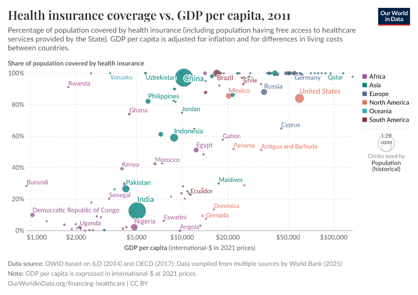
In this scatter plot, you can compare health insurance coverage figures by national GDP levels.

Healthcare spending in developing countries
How large is domestic public expenditure in developing countries after removing funds from development assistance?
The visualization – produced by the Institute for Health Metrics and Evaluation (IHME) – presents public health expenditure from autonomous sources in absolute terms (billions of 2011 U.S. dollars) for developing countries.14 These numbers correspond to public healthcare expenditure after removing funds provided directly to developing countries by development assistance partners.
As we can see, healthcare spending from autonomous sources has increased substantially in these countries. Below we discuss development assistance for health in more detail.
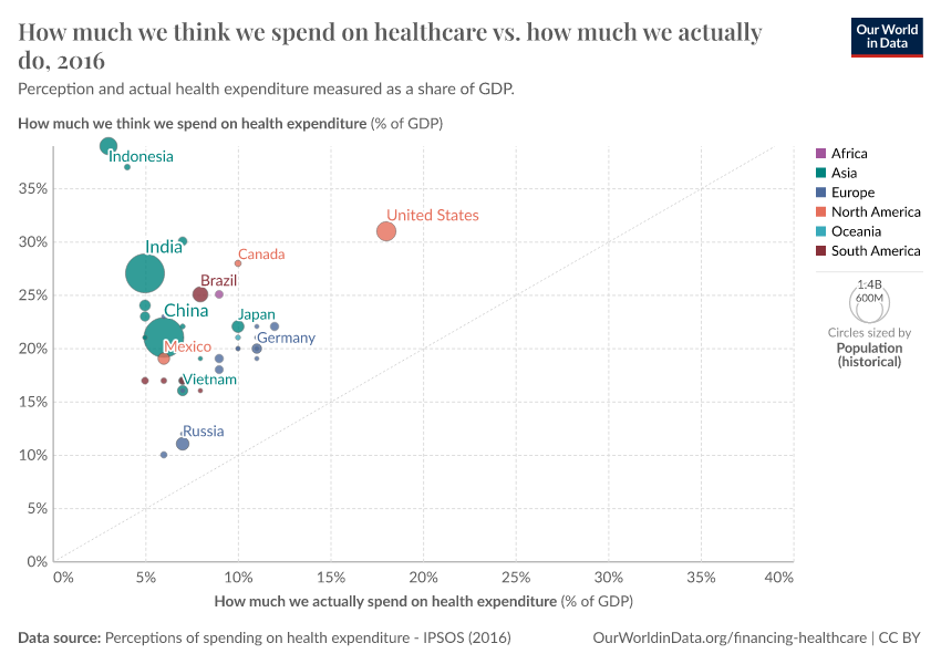
The (mis)perceptions of spending on healthcare across the world
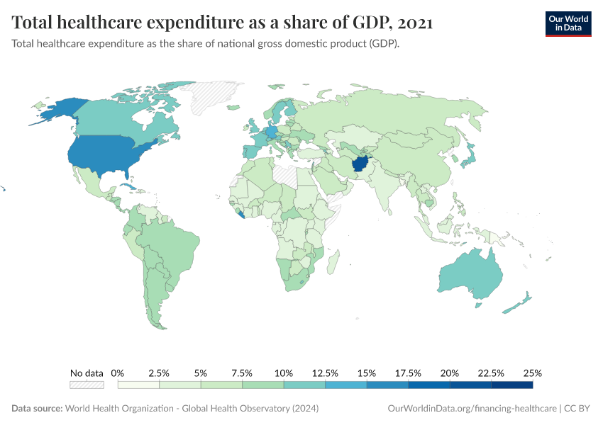
Despite significant cross-country heterogeneity in health expenditure, all countries spend less than a quarter of gross domestic product (GDP) on healthcare. As the chart shows, most countries spend between 5-12.5 percent of GDP.

This is largely at odds with public perception of healthcare spending—all over the world, people grossly overestimate actual healthcare spending.
The chart shows this using data from the Perils of Perception Survey (Ipsos MORI, 2016). On the vertical axis, we see the average that survey respondents guess is spent on health every year, as a share of GDP. On the horizontal axis, we see estimated actual expenditure (also as a share of GDP).
As we see, all countries included in the survey lie above a hypothetical parity diagonal (i.e. a line with slope one), meaning that people everywhere think they spend more on healthcare than they actually do. In those countries that lie closest to the parity diagonal, people have a more accurate perception of health spending.
While estimates of actual healthcare spending are subject to an important margin of error, perceptions are so far from official figures that it is hard to reconcile the discrepancies through measurement error. The most likely explanation is that people have skewed perceptions.

International flows of global health finance
How large are international flows of global health financing?
The Millennium Development Goals have been associated with major increases in global health financing flows, particularly for the health focus areas explicitly targeted (fight against child mortality, maternal mortality, HIV/AIDS, malaria, and tuberculosis). An important part of these financing flows occurs under the label of development assistance. The Institute for Health Metrics and Evaluation (IHME) defines development assistance for health as all financial and in-kind contributions provided by global health channels to improve health in developing countries (including grants, as well as concessionary loans, provided with no interest or at a rate significantly lower than the going market rate).
The IHME reports that since the formation of the Millennium Development Goals, $227.9 billion in development assistance had targeted these health focus areas until 2014. These flows account for around 0.7% of the resources spent by high-income countries on healthcare. Although this may seem small in proportion to the national commitments of rich countries, for low-income countries at the receiving end of the transfers, these resources are substantial; in sub-Saharan Africa they finance more than 25% of total expenditure on healthcare.16 The report Financing Global Health 2014, produced by the IHME, provides a detailed account of this source of funding for healthcare, and how it has changed over the previous two decades.
The chart shows the evolution of development assistance for health by source, from 1990 to 2014. As can be seen, these funds increased sharply in the period 2000-2010, but plateaued since. Considering that this source of funding has a larger weight in those countries with the lowest income, the trend is particularly problematic for the poorest.
What are the main channels and recipients of development assistance for health?
The visualization uses aggregate 2000-2012 figures to show the relationship between sources of development assistance funds, and the corresponding channels and recipient regions. The main features here are the weight of the U.S. as a source channel, and the sub-Saharan Africa region as a recipient.
Private healthcare funding
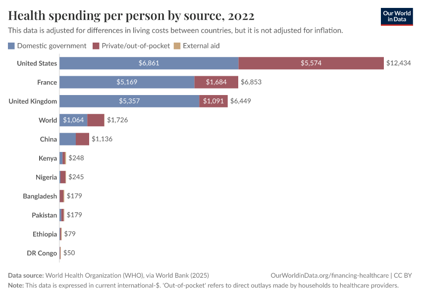
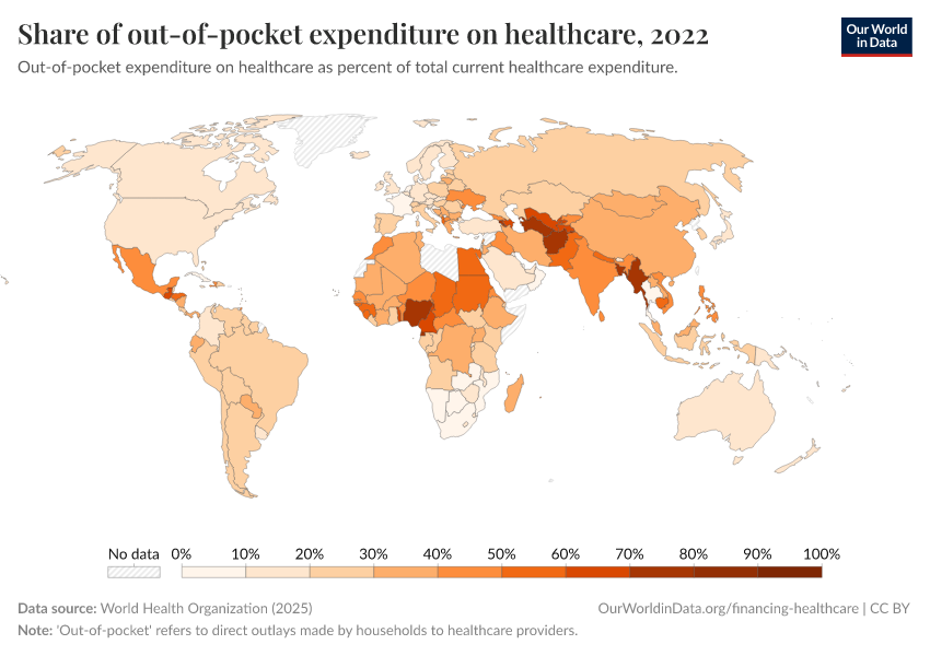
How important are out-of-pocket expenditures around the world?
In many countries an important part of the private funding for healthcare takes the form of 'out-of-pocket' spending. This refers to direct outlays made by households, including gratuities and in-kind payments, to healthcare providers.
The visualization presents out-of-pocket expenditure on healthcare by country (as a percentage of total healthcare expenditure). As can be seen, in high-income countries these outlays tend to account for only a small fraction of expenditure on healthcare; while in low-income countries, they account for a large part of funding. Many countries have followed a clear path in the direction of reducing this type of expenditure (particularly in the developing world), yet some countries have moved in the opposite direction.

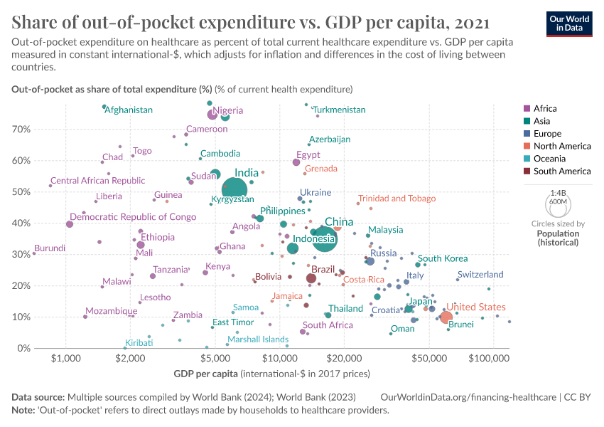
This relationship between income and reliance on out-of-pocket health expenditures is further shown in the chart. Here, we see the share of out-of-pocket expenditure as a percentage of total healthcare expenditure (on the y-axis) versus gross domestic product (GDP) per capita (which has been PPP-adjusted) on the x-axis. Overall, we see that these outlays tend to account for a smaller fraction of overall health spending in higher-income countries versus low-income nations.

Donor funding for healthcare tends to decline sharply as countries get richer
Levels of income can therefore affect two aspects of healthcare financing: the magnitude of total health expenditure, in addition to the source of such funding.
This is shown in the chart, which presents the best-fit global trends of total per capita health expenditure (the blue line); the share of out-of-pocket expenditure in total spending (orange line); and the share that comes from external (donor) funding (green line). Here, external funding refers to economic resources from non-resident units channeled towards healthcare (whether explicitly labeled so, or not), through the government or private sector.19 This data is measured relative to the average GDP per capita (shown on a log-scale x-axis).20
The first point concerns the relationship between per capita health expenditure and income. Overall, as countries get richer, per capita expenditure on healthcare tends to increase, as discussed above.
The second key point concerns the source of healthcare funding. In the chart, we observe that as per capita income increases, the share of both out-of-pocket outlays and external donor funding decreases. As the contribution of these sources declines, typically the share from public (i.e. governmental) funding increases.
However, we also notice that out-of-pocket and external funding contributions decline at different rates. On average, external donor funding decreases at a lower income level than out-of-pocket outlays, and shows a significantly steeper decline. External donor funding is often the dominant source of healthcare spending for the poorest, but is quickly replaced by other sources as those on very low incomes move towards low- and lower-middle incomes.
For poor countries with a per capita GDP of less than 500 US$ per year, donor funding accounts for approximately 45 percent of health expenditure, on average. This drops to 34 percent for countries up to 1000 US$; just under 30 percent when extended to 1500 US$; and below 25 percent up to 3000 US$ per capita per year. For most countries with a GDP per capita of more than 3000 US$ per year, donor funding makes up a very small share of total expenditure—typically less than five percent (with a few exceptions).
Can universal healthcare coverage be realistically achieved through private expenditure?
In countries where healthcare is principally financed through public funds, out-of-pocket spending is typically low; this is natural since in these countries there is essentially universal coverage through public insurance (e.g. Cuba, UK, Sweden, France). By the same logic, out-of-pocket spending is also low in countries where healthcare is largely financed through private funds in the form of private voluntary insurance (e.g. US). It is in countries with low public healthcare spending and low private voluntary insurance that out-of-pocket expenditure is high (e.g. India, Afghanistan, Sudan).
This is shown in the visualization from Jamison et al (2013)21; it illustrates how much progress different countries have made in providing 'prepaid care' and the extent to which they use public funds (compulsory social insurance or funding from general government revenue) or private voluntary insurance.
As can be seen, there are no countries near the top-left corner while there are several in the bottom-right. The message seems to be that achieving universal coverage requires government or publicly mandated finance.
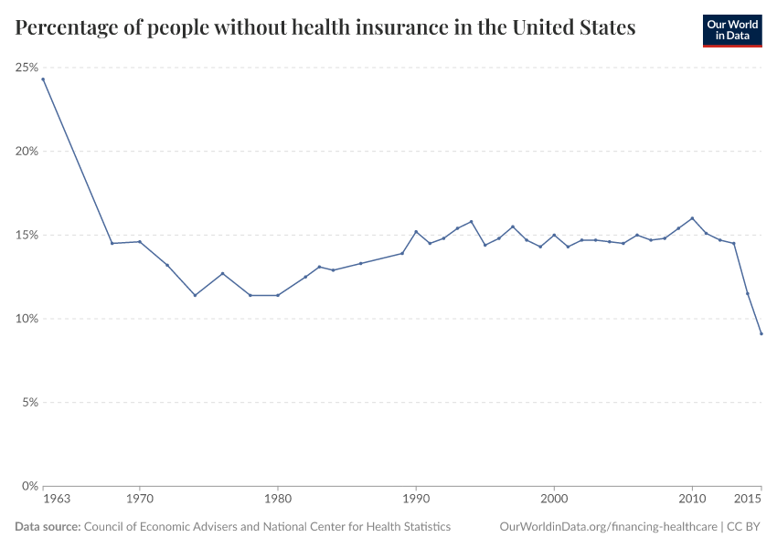
Is the Affordable Care Act in the US improving healthcare coverage?
In June 2012 the US introduced the Affordable Care Act (ACA) – a legal reform aiming to improve the accessibility, affordability, and quality of healthcare.23 In other sections of this article we provide evidence of some of the underlying issues that motivated a reform to improve healthcare coverage in the US. Here we want to focus on whether insurance coverage indeed improved after the introduction of the ACA.
The visualization shows the percentage of individuals in the US without health insurance for the period 1963-2015. As we can see there are two marked changes in the trends separated by a long period of remarkable stability: there was a sharp drop in the number of uninsured in 1965 with the creation of Medicare and Medicaid, then relatively little change for decades, and then another sharp drop in 2012 with the introduction of the ACA.

Disaggregated data shows that those states that decided to expand their Medicaid programs saw larger reductions in their uninsured rates from 2013 to 2015, especially when those states had large uninsured populations to start with.24
While strictly speaking this is only descriptive evidence – we cannot know what would have happened to the trends without the introduction of the ACA –, it seems reasonable to assume that the observed improvements in healthcare coverage are indeed a consequence of the ACA.
What affects healthcare spending?
How strong is the link between healthcare expenditure and national income?
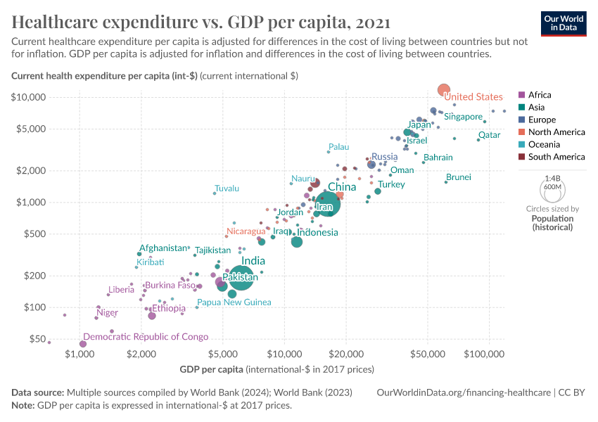
At a cross-country level, the strongest predictor of healthcare spending is national income.
The visualization presents evidence of this relationship. The correlation is striking: countries with a higher per capita income are much more likely to spend a larger share of their income on healthcare.

In a seminal paper, Newhouse (1977) showed that aggregate income explains almost all of the variance in the level of healthcare expenditure25 Other studies have confirmed that this strong positive relationship remains after accounting for additional factors, such as country-specific demographic characteristics.26
Although in a strict sense this result cannot be interpreted causally – since countries differ in many unobservable aspects that relate both to income and healthcare spending –, more sophisticated econometric models dealing with the issue of 'omitted variables' seem to confirm that the effect of per capita GDP on expenditure is clearly positive and significant.27
As we discussed in the previous section on international flows of global health financing, in some countries an important part of the income that is available to finance healthcare comes from international development assistance. Lu et al. (2010) use data from the IHME – the same data we discussed in the previous section – to show that there is a negative correlation between development assistance for health provided to governments, and government health funding from autonomous sources.28 Interestingly, this 'crowding-out' effect depends on the channel: the correlation between international health aid to non-governmental organizations and government health funding is negative.
How strong is the link between healthcare expenditure and government tax revenue?
Above, we pointed out that healthcare spending from autonomous sources has increased substantially in many low and middle-income countries over the last couple of decades. The chart shows a recent snapshot of the cross-country correlation between tax revenue and healthcare spending in these countries.
We can see that developing countries with higher tax revenues tend to spend more on healthcare. In fact, in a recent paper, Reeves et al. (2015) estimate the relationship between tax revenue and access to healthcare in developing countries, and find that tax revenue is an important statistical determinant of progress towards universal health coverage – and this remains true after controlling for country-specific time-invariant factors.29

If we interpret these results causally – which as usual requires making strong assumptions–, the implication seems to be that increasing domestic tax revenues contributes importantly to achieving universal health coverage, particularly in countries with low tax bases.
Exploring the relationship between health outcomes and different types of taxation, Reeves et al. (2015) further suggest that pro-poor taxes on profits and capital gains may support expanding health coverage without the adverse associations with health outcomes observed for higher consumption taxes.30
How sensitive is healthcare spending to changes in prices?
Empirical evidence suggests that healthcare spending is not only sensitive to changes in income (as discussed above), but in many instances, also sensitive to changes in prices.
As it turns out, price sensitivity is so critical in low-income countries, that small costs for important healthcare products make a vast difference in demand.31 The graph, from a policy report produced by the think-tank Poverty Action Lab, summarizes the findings from a number of studies testing the link between demand and small price changes in experimental settings investigated in randomized control trials.
Prices for healthcare services are affected by productivity changes in other markets
In most countries with market economies, the market for healthcare is only one of many markets competing for the same resources; because of this the prices for healthcare services are affected by productivity changes in other markets. Economic theory suggests that, if the productivity of the healthcare industry increases slower than that of other industries (a probable scenario given that healthcare provision is particularly labor-intensive), then prices in the healthcare sector are likely to grow faster than inflation, and expenditure as a share of income is thus likely to grow (this argument is known as Baumol’s ‘cost disease’).
The graph from Culyer and Newhouse (2000) shows that in the U.S., over the course of the 20th century, the growth in the consumer price index for all goods and services (CPI) was lower than the growth in the medical consumer price index (MCPI).
Health returns to investment
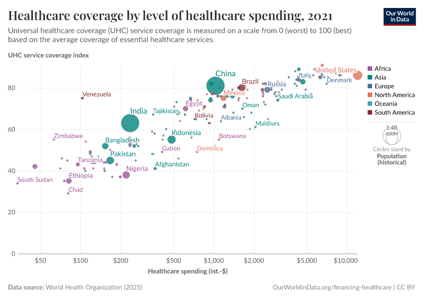
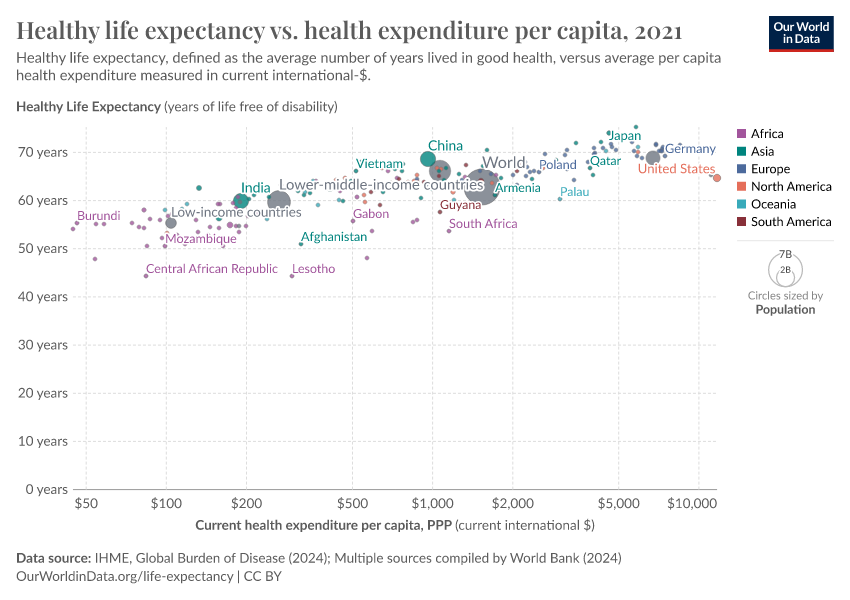
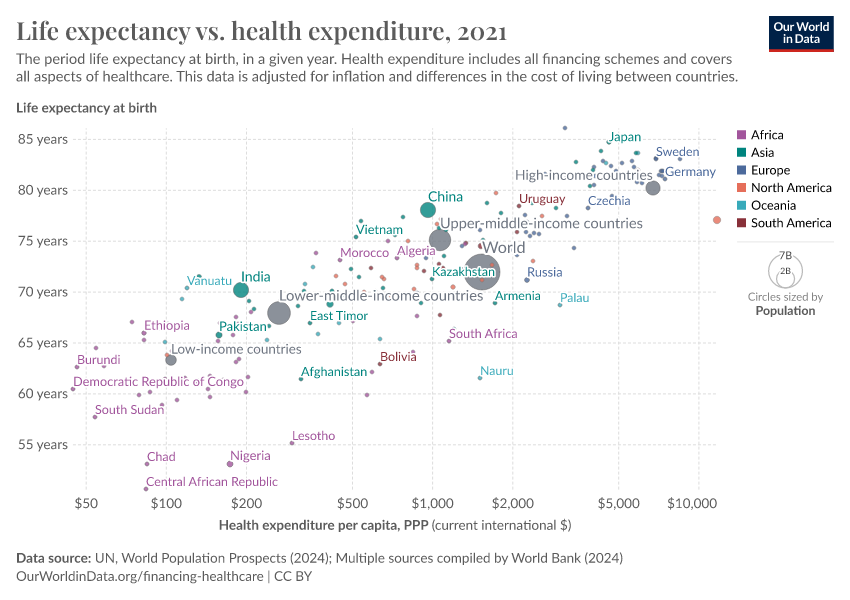
How strong is the link between healthcare expenditure and life expectancy?
Healthcare is one of the most important inputs to produce health; and life expectancy is one of the key measures of a population's health.
The visualization shows the relationship between life expectancy at birth and healthcare expenditure per capita. This chart shows the level of both measures in the first and last year for which data is available. The arrows connect these two observations, thereby showing the change over time for all countries in the world.
As can be seen, countries with higher expenditure on healthcare per person tend to have a higher life expectancy. And looking at the change over time, we see that as countries spend more money on health, the life expectancy of the population increases.
Notice that the relationship in this chart follows a pattern of 'diminishing returns': the additional increase in life expectancy associated with an increase in healthcare expenditure decreases as expenditure increases. This means the proportional highest gains are achieved in countries with low baseline levels of spending. This pattern is similar to that observed between life expectancy and per capita income.
The countries are color-coded by world region. Many of the African countries (in purple) achieved remarkable progress over the last 2 decades: health spending often increased substantially and life expectancy in many African countries increased by more than 10 years.
The association between health spending and increasing life expectancy also holds for rich countries in Europe, Asia, and North America in the upper right corner of the chart. The US is an outlier that achieves only a comparatively short life expectancy considering the fact that the country has by far the highest health expenditure of any country in the world. We will get back to this below.

How strong is the link between healthcare expenditure and child mortality?
The visualization presents the relationship between child mortality – measured as the share of children dying before their fifth birthday – and healthcare expenditure per capita. The chart shows the level of both measures in the first and last year for which data is available. The arrows connect these two observations, thereby showing the change over time for all countries in the world. We can see that child mortality is declining as more money is spent on health.
Focusing on change over time we can see a particularly striking fact: while there is a huge inequality in levels – child mortality in the best-off countries is almost 100 times lower than in the worst – inequality in trends is surprisingly low. Specifically, if you look at the paths over time it is surprising how little heterogeneity there is between very different countries in the world. No matter whether it is a rich country in Europe or a much poorer country in Africa, the proportional decline in child mortality associated with a proportional increase in health expenditure is remarkably similar.

Cross-country evidence suggests substantial health returns to healthcare investment
The above-mentioned cross-sectional relationships cannot be interpreted causally because countries differ in a number of ways that simultaneously affect health outcomes and health expenditure. Income is one of them. But we can get a step closer by concentrating on countries with similar income per capita, and looking at changes across time for each country, which eliminates the potential confounding effect of country-specific time-invariant factors.
The graph visualizes the relationship between life expectancy and health expenditure, for a number of OECD countries since 1970.
Two points are worth mentioning. Firstly, all countries in this graph have followed an upward trajectory (life expectancy increased as health expenditure increased), but the U.S. stands out as an exception following a much flatter trajectory; gains in life expectancy from additional health spending in the U.S. were much smaller than in the other high-income countries, particularly since the mid-1980s.
Secondly, the gains for all countries (except for the U.S.) were not diminishing, as in the previous graph. This suggests that there are many other factors affecting life expectancy, that are not determined by healthcare spending. Indeed, as we have pointed out before, healthcare is just one of many inputs to produce health.

The ever-elusive question of causality is not fully addressed in the analysis above (the issue of time-varying unobservables and potential simultaneity remains), but the presented visualizations are nevertheless indicative of a clear and strong relationship; the health returns to healthcare investment suggested by the figures above are substantial, particularly for low-income countries.
Indeed, these returns coupled with the returns estimated for conditional-cash-transfer programs in low and middle-income countries, suggest that with current worldwide resources – suitably targeted – it could be feasible to drastically reduce world inequality in health outcomes and achieve the so-called "grand convergence".34
Key Charts on Healthcare Spending
See all charts on this topic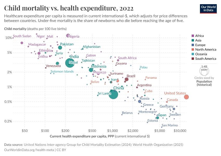


Featured Data on Healthcare Spending
Endnotes
A discussion of this argument is presented in Sundin, Jan, and Sam Willner. (2007) Social change and health in Sweden: 250 years of politics and practice. Swedish National Institute of Public Health.
For concrete instances see "Evolution of Health-Care Reforms", CESifo DICE Report 2 (4), 2004, 74-77
See (a) Tanzi, Vito, and Ludger Schuknecht. Public spending in the 20th century: A global perspective. Cambridge University Press, 2000; and (b) Lindert, Peter H. "The rise of social spending, 1880-1930." Explorations in Economic History 31, no. 1 (1994): 1-37.
Estimates from OECD – Health Expenditure and Financing Dataset; and Schoenman, Julie A. "The concentration of health care spending." NIHCM Foundation Data Brief, National Institute of Health Care Management, Washington, DC (2012).
Estimates from WHO – Global Health Expenditure Database from the World Health Organization
Estimates from the Institute for Health Metrics and Evaluation. Financing Global Health 2014: Shifts in Funding as the MDG Era Closes. Seattle, WA: IHME, 2015. Available online from www.healthdata.org
We present evidence of this result in the section about Correlates and Determinants. For a technical discussion see Chapter 1 in Culyer, A. J., & Newhouse, J. P. (Eds.). (2000). Handbook of health economics. Elsevier.
That healthcare should be considered a human right is nevertheless still the subject of much debate. For an academic discussion of the principle of health care as a human right, see Smith, Richard, et al. "Shared ethical principles for everybody in health care: a working draft from the Tavistock Group." British Medical Journal 318.7178 (1999): 248.
For instance, concrete cases of successful interventions aimed at curbing the spread of the plague are recorded in Marseille and Provence 1720–1722.
Sundin, Jan, and Sam Willner. (2007) Social change and health in Sweden: 250 years of politics and practice. Swedish National Institute of Public Health.
Medicare Payment Assessment Commission. (2011) A Data Book: Health Care Spending and the Medicare Program.
Figure published in Schoenman, Julie A. "The concentration of health care spending." NIHCM Foundation Data Brief, National Institute of Health Care Management, Washington, DC (2012). Original source data comes from the Medical Expenditure Panel Survey – a nationally representative longitudinal survey that collects information on healthcare utilization and expenditure, health insurance, and health status, as well as sociodemographic and economic characteristics for the civilian non-institutionalized population. According to the source, the data refers to the 'non-institutionalized civilian population', in the sense that it excludes care provided to residents of institutions, such as long-term care facilities and penitentiaries, as well as care for military and other non-civilian members of the population. The data corresponds to 'personal healthcare services', in the sense that they exclude administrative costs, research, capital investments, and many other public and private programs such as school health and worksite wellness.
The source given for the data corresponds to Figure 1 in ILO, (2011), Social Protection Floor for a Fair and Inclusive Globalization. Report of the Advisory Group chaired by Michelle Bachelet convened by the ILO with the collaboration of the WHO. Geneva: International Labour Office.
For the list of countries considered as 'developing' in this visualization see the appendix A in IHME DAH Database 1990-2015 - User Guide
Institute for Health Metrics and Evaluation. Financing Global Health 2013: Transition in an Age of Austerity. Seattle, WA: IHME, 2014.
In middle-income countries, also receiving some of such development assistance funds, the weight is much lower – external funding accounts for less than 5% of spending in these countries.
Snapshot from IHME interactive visualization available at http://vizhub.healthdata.org/fgh
Institute for Health Metrics and Evaluation. Financing Global Health 2014: Shifts in Funding as the MDG Era Closes. Seattle, WA: IHME, 2015.
The official WHO definition of external funding is: “The sum of resources channeled towards health by all non-resident institutional units that enter into transaction with resident units, or have other economic links with resident units, explicitly labelled or not to health, to be used as a means of payments of health goods and services by financing agents in the government or private sectors. Includes donations and loans, in cash and in-kind resources.”
The source for this chart is: WHO (2017) World Health Statistics: Monitoring Health for the SDGs. World Health Organization.
Jamison, Dean T., et al. "Global health 2035: a world converging within a generation." The Lancet 382.9908 (2013): 1898-1955
Jamison, Dean T., et al. "Global health 2035: a world converging within a generation." The Lancet 382.9908 (2013): 1898-1955
See White, C. (2010). The health care reform legislation: an overview. The Economists' Voice, 7(5) for a non-specialist overview of the ACA’s major provisions, their logic, and the federal budgetary implications.
Obama, B. (2016). United States health care reform: progress to date and next steps. JAMA.
Newhouse, J.P. (1977), “Medical care expenditure: a cross-national survey”, Journal of Human Resources 12:115–125.
Specifically, Newhouse (1977) showed that among a group of 13 developed countries, GDP per capita explained 92 percent of the variance in per capita health expenditure.
Interestingly, there are important institutional variables that are also significantly correlated with healthcare expenditure after controlling for income. For example, the use of primary care “gatekeepers” seems to result in lower health expenditure. Lower levels of health expenditure also appear to occur in systems where the patient first pays the provider and then seeks reimbursement, compared to other systems. For more information see page 46 in Culyer, A. J., & Newhouse, J. P. (Eds.). (2000). Handbook of health economics. Elsevier.
For a technical discussion of this conclusion see: Culyer, A. J., & Newhouse, J. P. (Eds.). (2000). Handbook of health economics. Elsevier.
Lu, C., Schneider, M. T., Gubbins, P., Leach-Kemon, K., Jamison, D., & Murray, C. J. (2010). Public financing of health in developing countries: a cross-national systematic analysis. The Lancet, 375(9723), 1375-1387.
Reeves, A., Gourtsoyannis, Y., Basu, S., McCoy, D., McKee, M., & Stuckler, D. (2015). Financing universal health coverage—effects of alternative tax structures on public health systems: cross-national modelling in 89 low-income and middle-income countries. The Lancet, 386(9990), 274-280.
One has to be cautious when interpreting these results causally. Bear in mind that the fixed-effect approach used by Reeves et al. (2015) does not solve problems associated with time-varying unobservables, or potential simultaneity of variables in the model.
Whether healthcare spending is highly responsive to price changes in other contexts is still the subject of academic discussion. We reference here empirical evidence from developing countries, focusing on price changes in the form of user fees. Other studies focusing on other populations find different results. For an interesting (technical) discussion about estimates of the price elasticity of healthcare in the U.S. see Kowalski, Amanda. "Censored quantile instrumental variable estimates of the price elasticity of expenditure on medical care." Journal of Business & Economic Statistics 34.1 (2016): 107-117.
JPAL Bulleting 2011, "The Price is Wrong", Poverty Action Lab.
Culyer, A. J., & Newhouse, J. P. (Eds.). (2000). Handbook of health economics. Elsevier.
Conditional Cash Transfers (CCTs) are increasingly common in the developing world. There is substantial evidence suggesting that CCTs have a significant impact on the intended outcomes, typically schooling, health, infant mortality, child labor, and poverty reduction.
For an overview of CCTs and their impacts in Latin America – the region that pioneered large-scale CCTs – see Handa, S., & Davis, B. (2006). The experience of conditional cash transfers in Latin America and the Caribbean. Development policy review, 24(5), 513-536.
A report commissioned by The Lancet, using evidence similar to what we discuss here, concludes that "[a] unique characteristic of our generation is that collectively we have the financial and the ever-improving technical capacity to reduce infectious, child, and maternal mortality rates to low levels universally by 2035, to achieve a “grand convergence” in health. With enhanced investments to scale up health technologies and systems, these rates in most low-income and middle-income countries would fall to those presently seen in the best-performing middle-income countries."
Jamison, Dean T., et al. "Global health 2035: a world converging within a generation." The Lancet 382.9908 (2013): 1898-1955.
Cite this work
Our articles and data visualizations rely on work from many different people and organizations. When citing this topic page, please also cite the underlying data sources. This topic page can be cited as:
Esteban Ortiz-Ospina, Pablo Arriagada, and Max Roser (2017) - “Healthcare Spending” Published online at OurWorldinData.org. Retrieved from: 'https://ourworldindata.org/financing-healthcare' [Online Resource]BibTeX citation
@article{owid-financing-healthcare,
    author = {Esteban Ortiz-Ospina and Pablo Arriagada and Max Roser},
    title = {Healthcare Spending},
    journal = {Our World in Data},
    year = {2017},
    note = {https://ourworldindata.org/financing-healthcare}
}
Reuse this work freely
All visualizations, data, and articles produced by Our World in Data are completely open access under the Creative Commons BY license. You have the permission to use, distribute, and reproduce these in any medium, provided the source and authors are credited.
The data produced by third parties and made available by Our World in Data is subject to the license terms from the original third-party authors. We will always indicate the original source of the data in our documentation, so you should always check the license of any such third-party data before use and redistribution.
All of our charts can be embedded in any site.