Measuring inequality: what is the Gini coefficient?
The Gini coefficient is the most common way of measuring inequality. But what does it actually measure? And how does it differ from other measures of inequality?
The Gini coefficient, or Gini index, is the most commonly used measure of inequality. It was developed by Italian statistician Corrado Gini (1884–1965) and is named after him.
It is typically used as a measure of income inequality, but it can be used to measure the inequality of any distribution — such as the distribution of wealth or even life expectancy.1
It measures inequality on a scale from 0 to 1, where higher values indicate higher inequality. This can sometimes be shown as a percentage from 0 to 100%, called the “Gini Index”.
A value of 0 indicates perfect equality: everyone has the same income. A value of 1 indicates perfect inequality, where one person receives all the income, and everyone else receives nothing.

How is the Gini coefficient calculated?
There are two main ways of calculating the Gini coefficient. Both arrive at the same value, but they provide us with two different angles for understanding what it measures.
Method 1: The Gini tells us the difference we expect to find between any two people’s incomes relative to the mean
The first method can be illustrated with the following thought experiment.
Imagine two people bumping into each other in the street at random. They compare their incomes and find out how rich one person is compared to the other. How big a gap would we expect there to be?
This expected gap between two randomly chosen people is what the Gini coefficient measures. It is calculated by taking the average gap between all pairs of people.
Where incomes are distributed equally, we expect the gap between two randomly selected people to be small. Where inequality is high, we expect the gap to be large.
However, if measured in absolute terms, this will also depend on how rich or poor the population is generally. Where even the most well-off in society have a low income, the absolute gap between people’s incomes cannot be high. Conversely, where incomes are generally high, even very small relative differences between people's incomes can result in large absolute gaps.
For this reason, the Gini coefficient expresses the expected absolute gap between people’s incomes relative to the mean income in the population.
In particular, it is calculated as the expected gap as a share of twice the mean income. Twice the mean income is the highest possible value for the average gap — a situation of perfect inequality, where one person has all the income and everyone else has none.2 So in this case of maximum inequality, the Gini coefficient is 1.
The lowest possible value for the average gap between all pairs of people is zero—a situation of perfect equality, where there are no gaps between any two people’s incomes because everyone earns the same. In this case, the Gini coefficient is 0.
Method 2: The Gini tells us how far the “Lorenz curve” falls from perfect equality
The figure illustrates a second visual definition of the Gini coefficient.
The left panel shows the share of income received by each fifth of a hypothetical population. The right panel shows this data plotted cumulatively. This is known as a “Lorenz curve”.
In a population where income is shared perfectly equally, the Lorenz curve would be a straight diagonal line: 10% of the population would earn 10% of the total income, 20% would earn 20% of the total income, and so on. This is shown in the chart as the “line of equality”.
In the hypothetical population shown in the chart, though, incomes are not distributed equally. The bottom 60% of the population earns 30% of the total income.
The Gini coefficient captures how far the Lorenz curve falls from the “line of equality” by comparing the areas A and B, as calculated in the following way:
Gini coefficient = A / (A + B)
The Lorenz curve is the “line of equality” where incomes are shared perfectly equally. Area A is 0, and hence so is the Gini coefficient. Where one person has all income and all others receive no income, the Lorenz curve will run along the bottom axis of the chart — the cumulative share of income is zero until the very last person. Area B will be zero, and the Gini coefficient will equal 1.
Comparing measures: Does the Gini tell the same story as other inequality measures?
A measure of inequality summarizes how spread out the distribution is — just like the standard deviation, which you may have learned about in school.3
Implicit in such summary measures are judgments about what should count most when measuring inequality.4 For example, compare two hypothetical populations. In one, the rich are much richer than those in the middle, but the incomes of poorer people are only a little below those in the middle. In another, there is the opposite situation: the incomes of the rich are only a little above those in the middle, but the poor are much poorer. In which population would you say inequality is highest? Your answer will depend on your personal judgments about how these gaps in different parts of the distribution compare in terms of their contribution to inequality overall. Such value judgments are implicitly built into the mathematical definition of an inequality measure.
That is true of all inequality measures, and the Gini coefficient is no exception. One property of the Gini, compared to other inequality metrics, is that it is more sensitive to changes around the middle of the distribution than at the very top and bottom.5
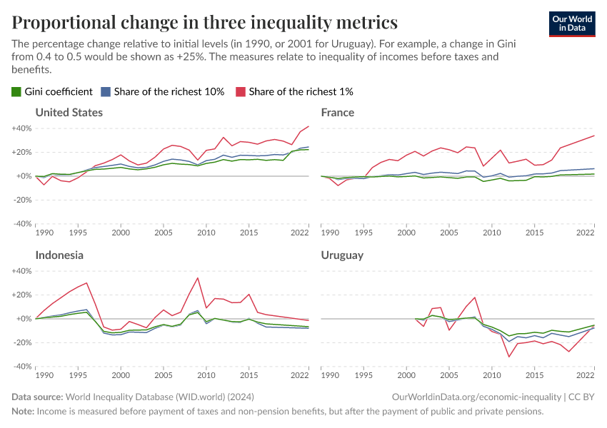
You can see this from the examples in the chart below. For four countries, it shows how the Gini compares to two other inequality measures: the share of income received by the richest 10% and 1%, respectively. To make more direct comparisons, the chart shows the relative change in each measure over time.
We see that modest relative changes in the Gini coefficient can be accompanied by much more substantial relative changes in the share of income received by the richest 1%. That is true where inequality is rising (as in the United States) and where inequality is falling (as in Uruguay).
In contrast, the Gini coefficient tracks the top 10% share of income much more closely. The Gini's lack of sensitivity to changes at the top of the distribution is mostly a matter of concern for the very top.
Endnotes
Generally, the Gini coefficient is not used to calculate inequality for distributions that include negative values. For example, the distribution of wealth will include many people with negative wealth — those whose debts are greater than their assets. The Gini coefficient can be calculated over such distributions, but this can result in values greater than 1 — making the metric difficult to interpret. When calculating a Gini coefficient on a distribution that includes negative values, these values are typically dropped or replaced with a value of zero.
To help give an intuition as to why twice the mean is the highest value for the average gap, we can think of the simplest case. Imagine our population now consists of just those two people who met in the street, and their total income equals $100. The average income between the two people is $50. If inequality is at its highest — so that one person has $100, and the other has $0 — the gap between them will be $100, which is twice the mean income.
The standard deviation too is sometimes used as a measure of income inequality — though, to make it a measure of relative inequality, it is usually first used by dividing by the mean, similar to the Gini. This measure is known as the Coefficient of Variation.
This point was championed by Anthony Atkinson, including in his well-known paper On the Measurement of Inequality. See Anthony B Atkinson, “On the Measurement of Inequality”. Journal of Economic Theory 2, no. 3 (1970): 244–63. Available here.
See Anthony B Atkinson, “On the Measurement of Inequality”. Journal of Economic Theory 2, no. 3 (1970): 244–63. Available here.
Cite this work
Our articles and data visualizations rely on work from many different people and organizations. When citing this article, please also cite the underlying data sources. This article can be cited as:
Joe Hasell (2023) - “Measuring inequality: what is the Gini coefficient?” Published online at OurWorldinData.org. Retrieved from: 'https://archive.ourworldindata.org/20260707-125341/what-is-the-gini-coefficient.html' [Online Resource] (archived on July 7, 2026).BibTeX citation
@article{owid-what-is-the-gini-coefficient,
    author = {Joe Hasell},
    title = {Measuring inequality: what is the Gini coefficient?},
    journal = {Our World in Data},
    year = {2023},
    note = {https://archive.ourworldindata.org/20260707-125341/what-is-the-gini-coefficient.html}
}
Reuse this work freely
All visualizations, data, and articles produced by Our World in Data are completely open access under the Creative Commons BY license. You have the permission to use, distribute, and reproduce these in any medium, provided the source and authors are credited.
The data produced by third parties and made available by Our World in Data is subject to the license terms from the original third-party authors. We will always indicate the original source of the data in our documentation, so you should always check the license of any such third-party data before use and redistribution.
All of our charts can be embedded in any site.