Smoking
Tobacco smoking is one of the world’s largest health problems today.
This article was first published in May 2013. The last revisions were done in November 2023.
See all our interactive charts on smoking ↓
Tobacco smoking is one of the world's largest health problems. Millions of people live in poor health because of it. Researchers estimate that every year around 8 million people die an early death due to smoking.
It has been a major health problem for many decades. For the entire 20th century, it is estimated that around 100 million people died prematurely because of smoking, most of them in rich countries.1
The share of smokers among the world population is falling, and because smoking is such a large health problem today, this is one of the most positive developments in global health. It makes it possible for millions of people to live a longer and healthier life.
For a brief overview of the most important facts, see the following article:
Other research and writing on smoking on Our World in Data:
- In which countries do people smoke the most?
- Who smokes more, men or women?
- Why is life expectancy in the US lower than in other rich countries?
- How do researchers estimate the death toll caused by each risk factor, whether it’s smoking, obesity, or air pollution?
Smoking is one of the leading risks for early death
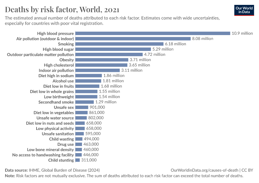
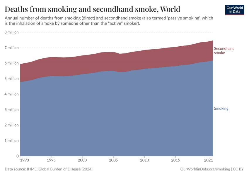
Smoking is responsible for about 8 million premature deaths each year
The two regularly updated studies on the global death toll from tobacco use – published by the World Health Organization and the Institute for Health Metrics and Evaluation – agree that around 8 million people die prematurely yearly.
The aggregate statistics refer to ‘tobacco use’ (rather than smoking alone) because other forms of consuming tobacco, such as chewing tobacco, also lead to premature deaths. The huge majority of deaths from tobacco use, however, are due to smoking. The death toll from smoking is very close to the total sum of deaths from tobacco use (higher than 99.9% in the case of the IHME estimates).
World Health Organization: More than 8 million die from tobacco use every year
The WHO estimates that more than 8 million people die prematurely yearly from tobacco use. This is the latest available WHO estimate as of November 2023.2
More than 7 million of those deaths result from direct tobacco use. About 1.3 million are non-smokers who are dying because they are exposed to second-hand smoke.
IHME's Global Burden of Disease study: 8.7 million die from tobacco use every year
The IHME – in their annual Global Burden of Disease study – estimates that 8.7 million people die prematurely from tobacco use every year. As of November 2023, these are the latest estimates and refer to deaths in the year 2019. The references can be found in the footnote.3
7.7 million of those deaths result from smoking, while 1.3 million are non-smokers who are dying because they are exposed to second-hand smoke. (An additional 56,000 people die annually from chewing tobacco.)
Most (71%) of those who die prematurely from smoking are men.
These estimates of the annual number of deaths attributed to a wide range of risk factors are shown in the interactive chart. This visualization is, by default, showing the global total, but can be explored for any country or region using the "change country" option. Smoking is a risk factor for several of the world's leading causes of death, including lung and other forms of cancer, heart disease, and respiratory diseases.
Smoking led to about 100 million premature deaths in the 20th-century
Tobacco smoking has been one of the world's largest health problems for decades. Over the course of the 20th century, it killed around 100 million people, most of them in today's rich countries.1 The health burdens of smoking are now moving from high-income to low-to-middle-income countries; some estimates have suggested that one billion people could die from tobacco over the 21st century.4
The global distribution of smoking deaths
In many countries, a high share of deaths is attributed to smoking
In the map, we see the share of deaths attributed to direct smoking across the world. In many countries, this share is substantial.
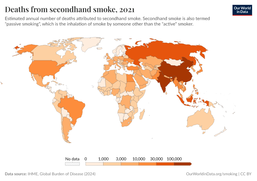
Related – the share of deaths from secondhand smoking: This map shows the share of premature deaths attributed to secondhand smoke across the world.
Death rates from smoking are highest across Asia and Eastern Europe
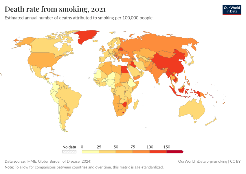
In the interactive map, we show death rates from tobacco smoking across the world. Death rates measure the number of premature deaths from smoking per 100,000 people in a given country or region.
We see large differences in death rates across the world. Rates tend to be highest across Asia and Eastern Europe, where figures are often over 100, and in some cases, over 150 deaths per 100,000 people.
Death rates are much lower across some of the lowest-income countries in the world, where very few people smoke.
Related – the number of deaths from smoking. This map shows the annual number of deaths from tobacco smoking across the world.
Most deaths from smoking occur in older populations
When we look at the breakdown of deaths from smoking by age, we see that it is mainly older populations that are affected.
In the visualizations, we show the death rates from smoking by age bracket and the share of annual deaths that occur in each age group.
Here, we see that death rates from smoking are much higher in people older than 70 years old, followed by those aged 50 to 69.
How has the death toll due to smoking changed over time?
Death rates from smoking have declined in most countries
Globally, smoking-related death rates have fallen.
But there are differences across countries. Where in the world are death rates falling or rising?
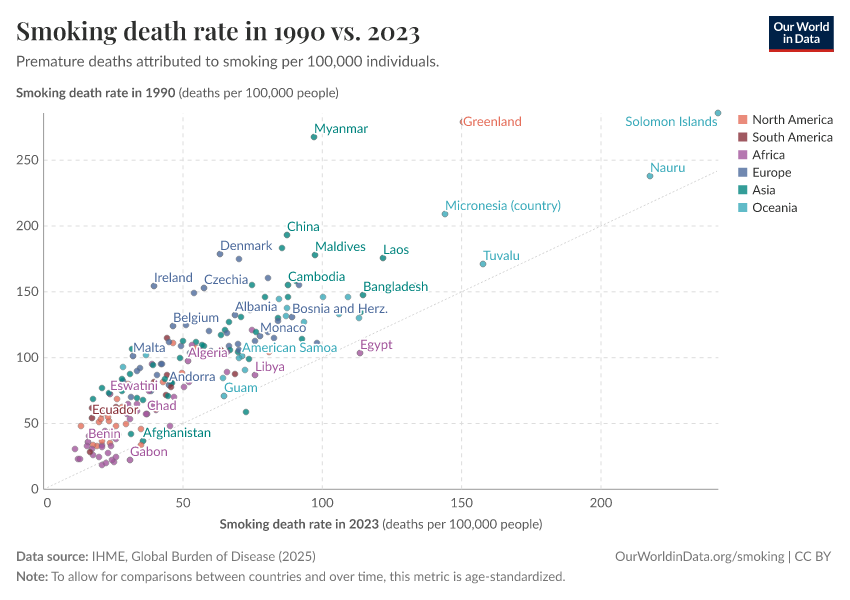
In the scatterplot, we see the comparison of smoking death rates in 1990 (shown on the y-axis) versus the death rate in the latest data (on the x-axis). The grey line is the line of parity: countries that lie along this line had equal death rates at both points in time. Countries that lie above the grey line had higher death rates in 1990; for those that lie below the grey line, the opposite is true.
We see that almost all countries in the world lie above the grey line. This means that most countries have achieved a decline in death rates from smoking in recent decades.
Prevalence of smoking across the world
Share of smokers among the population
In which countries do people smoke the most?
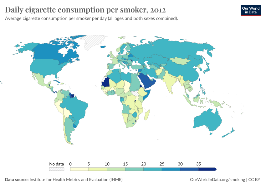
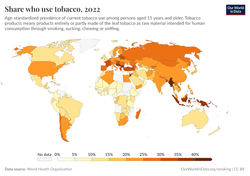
Around one-in-four adults in the world smoke tobacco.
But where in the world is smoking most common?
In the map, we see the share of adults aged 15 years and older who smoke tobacco.
There are a number of countries where more than a third of the population smokes. The places where many people smoke are clustered in regions. South-East Asia, the Pacific islands, and parts of Europe.
In some countries, very few people smoke.
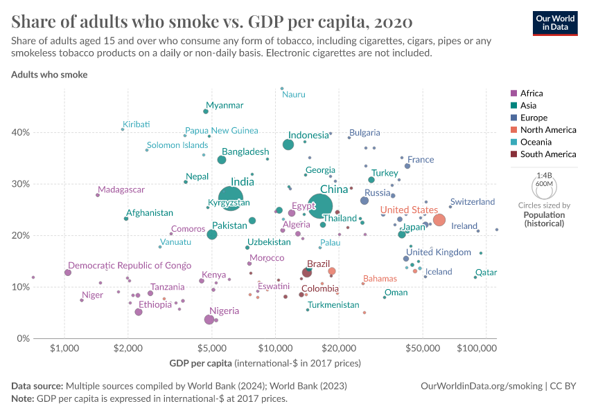
Several factors influence the prevalence of smoking. One is prosperity: if we look at the relationship between smoking prevalence and income, we find that richer countries tend to smoke more. But as you see in this correlation, there are very large differences at each level of income.
Smoking rates are high across many countries, but we know from the history of many countries that this can change quickly. Many of today’s high-income countries had much higher smoking rates in the past and have seen a large reduction.
The prevalence of smoking also differs significantly between men and women. In this article, we look at sex differences in smoking across the world.
Smoking by gender
Who smokes more, men or women?
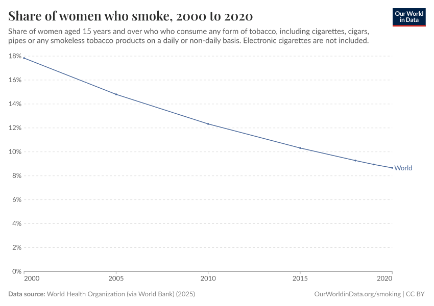
Nearly one-in-four adults in the world smokes tobacco. But there are large differences between men and women.
More than one-third of men in the world smoke. Less than one-in-ten women do.
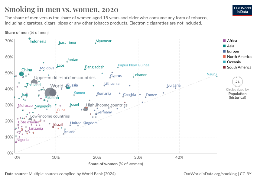
In almost all countries, it is true that a large share of men smoke. In the visualization, we see the share of men who smoke (plotted on the vertical axis) compared with the same metric for women (plotted on the horizontal axis).
The grey line in the plot represents equality in the prevalence: countries where smoking is more common in men will lie above this line, and countries where more women smoke lie below.
We see that almost all countries lie above the grey line, meaning a higher share of men smoke. There are only a few exceptions.
In many countries — particularly across Asia and Africa — the differences are very large.
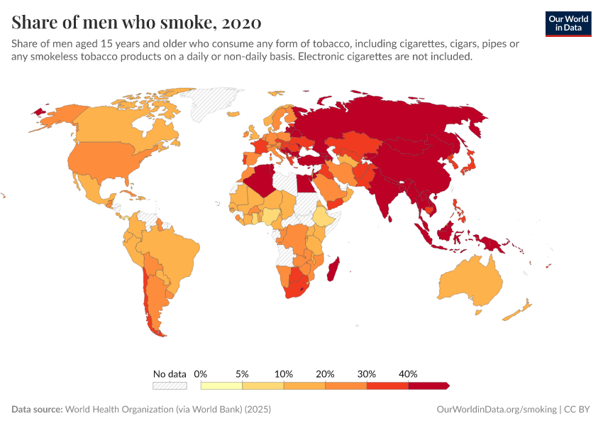
We also see this when we look at a global map of smoking among women: across much of Africa and Asia, rates are very low. For comparison, here is the world map of smoking rates in men.
The fact that men are more likely than women to smoke is reflected in health statistics, particularly lung cancer, for which smoking is a primary risk factor. We see that in nearly every country in the world, men are more likely to die from lung cancer.
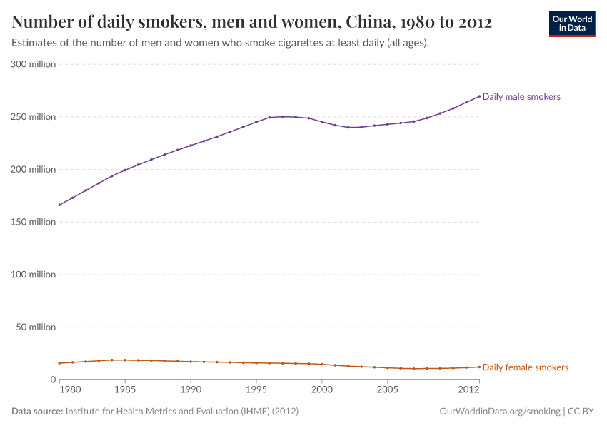
Related – number of daily smokers by sex. This chart details the number of men and women who smoke daily.
How has the prevalence of smoking changed over time?
The rise and fall of smoking
The smoking of cigarettes first saw a significant rise across today's rich countries in the early 20th century. Since then, trends in smoking have undergone a century-long cycle of peak and decline.
In the visualization, we see the average number of cigarettes sold per adult per day across many of today's rich countries, including the United States and European countries.
Here, we see that all countries followed a very similar trajectory: a steep rise in cigarette consumption during the early-to-mid 1900s, peaking from the mid-to-latter half of the century before entering into a steep decline in the decades which followed.
Notably, this rise-peak-fall pathway took around a century in all cases. This long trajectory has had major health impacts on the populations of rich countries today.
Smoking rates are now falling in almost all countries
The rise, peak, and decline of smoking in rich countries took around a century. The high peak had severe health impacts.
This timescale is important when we consider low-to-middle-income countries today: if they are to avoid the scale of the health consequences seen by rich countries, they must move through this pathway much quicker. The positive news is that most have – smoking is already falling in most countries today.
In this visualization, we see the share of adults who smoked in the year 2000 (on the y-axis) and in the most recent data (on the x-axis). The grey line here shows parity: countries that lie along this line would have the same smoking prevalence at both points in time. Countries that lie above this line had higher smoking prevalence back in 2000; for those below the opposite is true.
We see that most countries lie above the grey line: this means the share of adults who smoke has declined in most countries in the world over the past decade. This is a surprising fact to many, since it means smoking prevalence is not only falling in high-income countries but also in most low-to-middle incomes.5
Low-to-middle income countries have effectively 'leapfrogged' the century-long rise-peak-decline pathway of rich countries. Almost everywhere, smoking is on the decline.
Smoking and cancer
The rise and fall of lung cancer
This chart shows death rates from lung cancer in the US since 1950. It is possible to view the data for other countries by using the tools in the chart.
We see the same rise, peak, and decline pattern that we have seen in the cigarette consumption statistics.
These trends are largely driven by the trends in smoking. Smoking is the biggest risk factor for lung cancer and we see that the trends in lung cancer follow those in smoking with a lag.
Share of cancer deaths attributed to smoking
The world map shows the Global Burden of Disease estimates of the share of cancer deaths that can be attributed to smoking.
Globally, about a quarter of cancer deaths are attributed to smoking.
In most richer countries, the share is even higher.
In poor countries, where fewer people were smoking in the past, tobacco is responsible for a smaller fraction of cancer deaths.
What can be done to reduce smoking?
Pricing and taxes
Affordability of cigarettes
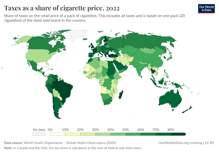
Taxes on cigarettes
Bans on tobacco advertising
Support to quit smoking
Data Sources
International Mortality and Smoking Statistics (IMASS)
- Data: Consumption of tobacco products, prevalence of smoking and mortality
- Geographical coverage: 30 countries
- Time span: Often spanning back 100 years
- Available at: Online here
Institute of Health Metrics and Evaluation (IHME), Global Burden of Disease (GBD)
- Data: Death rates and absolute number of premature deaths from smoking and secondhand-smoke
- Geographical coverage: Global, across all regions and countries
- Time span: 1990 onwards
- Available at: Online here
World Health Organization (WHO) Global Health Observatory (GHO)
- Data: Smoking prevalence, prices, taxes and policy support
- Geographical coverage: Global, across all regions and countries
- Available at: Online here
Key Charts on Smoking
See all charts on this topicFeatured Data on Smoking
Endnotes
Jha, P. (2009). Avoidable global cancer deaths and total deaths from smoking. Nature Reviews Cancer, 9(9), 655.
WHO (2023) – Fact Sheet: Tobacco, updated in July 2023
The estimates of the Global Burden of Disease study can be found here. The latest study can be found at the website of The Lancet here: TheLancet.com/GBD
There are two publications that are closely related to the Global Burden of Disease study:
Reitsma et al. (2021) – Spatial, temporal, and demographic patterns in prevalence of smoking tobacco use and attributable disease burden in 204 countries and territories, 1990–2019: A systematic analysis from the Global Burden of Disease Study 2019. In The Lancet, 397(10292), 2337–2360.
The GBD estimates are also presented in yet another prominent publication. The Tobacco Atlas is published by the American Cancer Society and Vital Strategies and presents estimates for the global death toll from smoking taken from the Global Burden of Disease Study published by the Institute for Health Metrics and Evaluation (IHME).
Note that deaths from different risk factors are not summable.
Mathers, C. D., & Loncar, D. (2006). Projections of global mortality and burden of disease from 2002 to 2030. PLoS medicine, 3(11), e442.
Jha, P., & Peto, R. (2014). Global effects of smoking, of quitting, and of taxing tobacco. New England Journal of Medicine, 370(1), 60-68.
Bilano, V., Gilmour, S., Moffiet, T., d'Espaignet, E. T., Stevens, G. A., Commar, A., ... & Shibuya, K. (2015). Global trends and projections for tobacco use, 1990–2025: an analysis of smoking indicators from the WHO Comprehensive Information Systems for Tobacco Control. The Lancet, 385(9972), 966-976.
Cite this work
Our articles and data visualizations rely on work from many different people and organizations. When citing this topic page, please also cite the underlying data sources. This topic page can be cited as:
Hannah Ritchie and Max Roser (2023) - “Smoking” Published online at OurWorldinData.org. Retrieved from: 'https://ourworldindata.org/smoking' [Online Resource]BibTeX citation
@article{owid-smoking,
    author = {Hannah Ritchie and Max Roser},
    title = {Smoking},
    journal = {Our World in Data},
    year = {2023},
    note = {https://ourworldindata.org/smoking}
}
Reuse this work freely
All visualizations, data, and code produced by Our World in Data are completely open access under the Creative Commons BY license. You have the permission to use, distribute, and reproduce these in any medium, provided the source and authors are credited.
The data produced by third parties and made available by Our World in Data is subject to the license terms from the original third-party authors. We will always indicate the original source of the data in our documentation, so you should always check the license of any such third-party data before use and redistribution.
All of our charts can be embedded in any site.
