Fossil fuels
Fossil fuels were key to industrialization and rising prosperity, but their impact on health and the climate means that we should transition away from them.
This page was first published in October 2022. We made minor changes to the text in January 2024.
For most of human history, our ancestors relied on very basic forms of energy: human muscle, animal muscle, and the burning of biomass such as wood or crops. But the Industrial Revolution unlocked a whole new energy resource: fossil fuels. Fossil energy has been a fundamental driver of the technological, social, economic, and development progress that has followed.
Fossil fuels (coal, oil, gas) have, and continue to, play a dominant role in global energy systems.
But they also come with several negative impacts. When burned, they produce carbon dioxide (CO2) and are the largest driver of global climate change. They are also a major contributor to local air pollution, which is estimated to be linked to millions of premature deaths each year.
As low-carbon sources of energy – nuclear and renewables – become readily available, the world needs to rapidly transition away from fossil fuels.
This article presents the long-run and recent perspectives on coal, oil, and gas – how much countries produce and consume, where our fossil fuel reserves are, and what role the fuels play in our energy and electricity systems.
Fossil fuel consumption
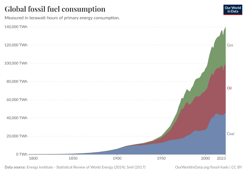
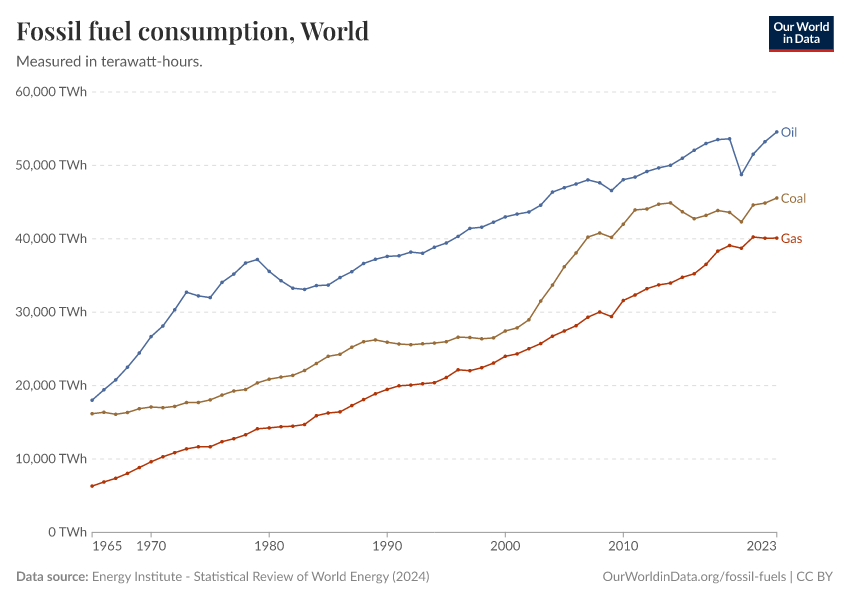
Global fossil fuel consumption
The burning of fossil fuels for energy began around the Industrial Revolution. But fossil fuel consumption has changed significantly over the past few centuries – both in terms of what and how much we burn.
In the interactive chart, we see global fossil fuel consumption broken down by coal, oil, and gas since 1800. Earlier data, pre-1965, is sourced from Vaclav Smil's work on energy transitions; this has been combined with data published in BP's Statistical Review of World Energy from 1965 onwards.1
Fossil fuel consumption has increased significantly over the past half-century, around eight-fold since 1950 and roughly doubling since 1980.
But the types of fuel we rely on have also shifted from solely coal towards a combination with oil and gas. Today, coal consumption is falling in many parts of the world. But oil and gas are still growing quickly.
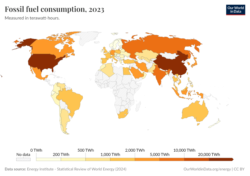
Fossil fuel consumption: which countries use the most energy from fossil fuels?
We've looked at how much fossil fuel energy is consumed globally. But what about countries? How much fossil energy do they consume?
The interactive chart here shows the amount of primary energy from fossil fuels that is consumed each year.
This is the sum of energy from coal, oil, and gas. In the sections below, we look at each of these sources individually.
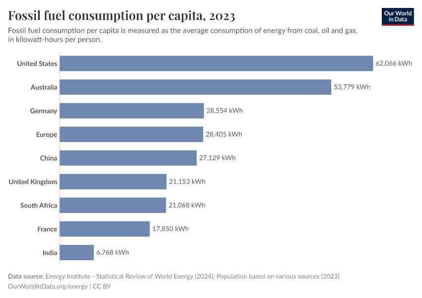
Per capita: where do people consume the most energy from fossil fuels?
Looking at energy consumption at the country level is often a strong reflection of population size rather than actual fossil fuel consumption per person.
How do these comparisons look when we adjust for population?
In the interactive chart we see the amount of energy from fossil fuels consumed per person. This is the sum of primary energy from coal, oil, and gas combined.
Across the world, we see that the largest consumers use more than ten times the amount of fossil energy than some of the smallest consumers.
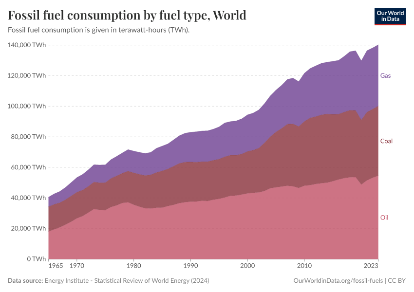
Fossil fuel consumption by type
In the sections above, we looked at the consumption of fossil fuels collectively. But it's important to look at the role of coal, oil, and gas individually – their impacts are not equal. Coal, for example, typically produces more CO2 and local air pollution per unit of energy [see our article on the relative safety and impacts of different energy sources].
In the interactive charts here, we show fossil fuel consumption disaggregated by type. This is shown as a stacked area chart – useful for seeing the relative contribution of each; but also as a line chart which allows us to see how the consumption of each is changing over time.
Fossil fuels in the energy and electricity mix
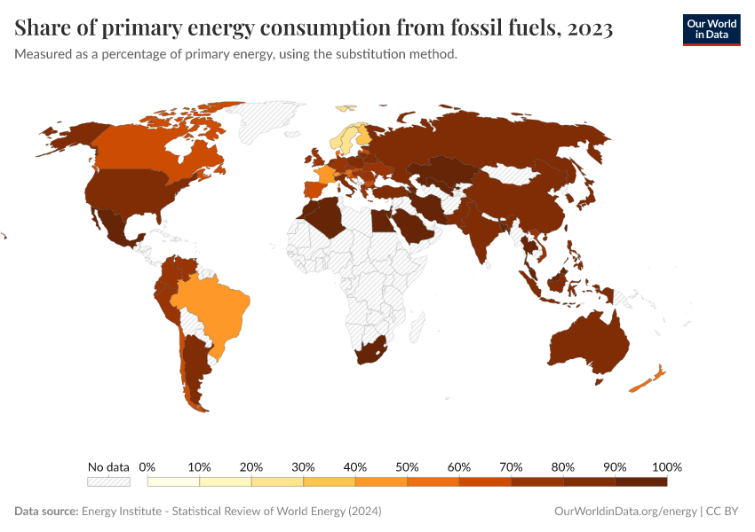
What share of primary energy comes from fossil fuels?
How do fossil fuels fit in within the rest of the energy mix? What share of primary energy comes from fossil fuels?
Around four-fifths of global primary energy comes from coal, oil, and gas. Over the coming decades, we must rapidly reduce this share by displacing them with low-carbon energy sources.
In the interactive chart, we see how this share varies across the world.
What share of electricity comes from fossil fuels?
Electricity is one component of total energy consumption – the other two being transport and heating.
Globally, fossil fuels account for a much smaller share of electricity production than the energy system as a whole.
This interactive map shows the share of electricity that comes from fossil fuels (coal, oil, and gas summed together) across the world. Oil accounts for only a small share of electricity production – most come from coal and gas. The share from coal, oil and gas individually can be found in the sections below.
Coal
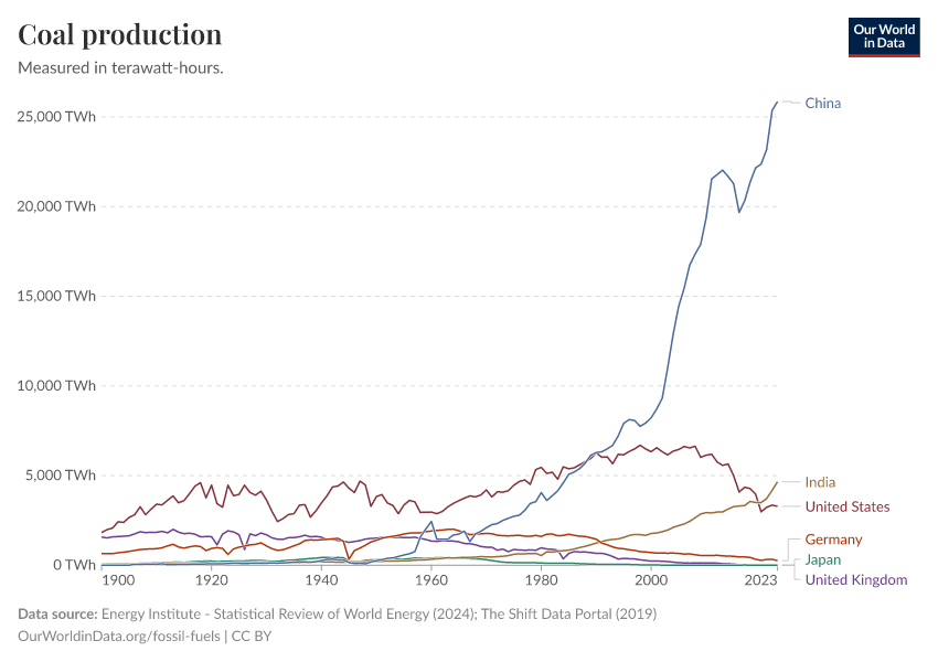
Coal production: how much do countries produce?
Which countries produce the most coal? How has this changed over time?
In the interactive chart here we see coal production by country. This has been converted into primary energy equivalents (i.e., terawatt-hours of energy) for comparability across our other data on energy.
Note that this measures coal production, not consumption. Many countries consume energy from coal in their energy supply. However, not all countries have coal reserves to produce this themselves. This therefore measures coal production before trade between countries.
Energy from coal: how much do countries consume?
Fossil fuel production is an important metric – it helps us understand where fossil fuels are being extracted. But we also care about where that energy is being consumed – that tells us what role fossil fuels are playing in the energy system of each country.
This interactive chart shows primary energy consumption from coal across the world. This represents coal production adjusted for trade (so, coal exports are subtracted and imports are added).
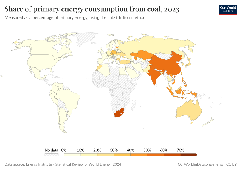
What share of primary energy comes from coal?
Coal has been a critical energy source and a mainstay in global energy production for centuries.
But it's also the most polluting energy source: both in terms of the amount of CO2 it produces per unit of energy, but also the amount of local air pollution it creates. Moving away from coal energy is important for climate change and human health.
This interactive map shows the share of primary energy from coal worldwide.
What share of electricity comes from coal?
Coal is currently the largest source of electricity globally. For many countries remains the dominant source. But, we also see that others have seen a massive shift away from coal in recent years – the UK is one such example.
This interactive map shows the share of electricity that comes from coal worldwide.
When do countries plan to phase out coal?
Coal is the world's oldest industrial source of energy. It is still a dominant source of energy across the world today – especially within our electricity mix.
But coal is the world's dirtiest fuel – it not only emits the most carbon dioxide emissions per unit of energy, it severely impacts health through air pollution.
Many countries are committing to phasing coal power out of their electricity mix. This map shows countries’ pledges to achieve this. Some countries are already coal-free. Some have set to phase it out by 2030, 2040, or later. Some have not yet committed to eliminating it.2
Oil
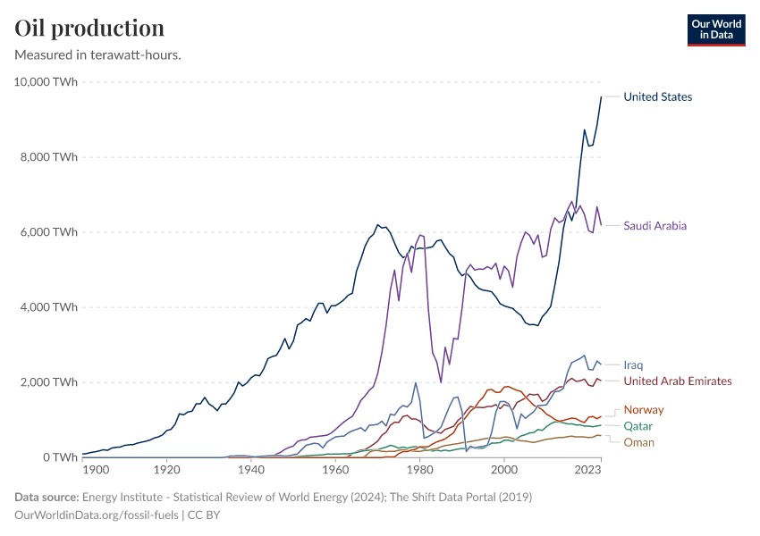
Oil production: how much do countries produce?
Which countries produce the most oil? How has this changed over time?
In the interactive chart here we see oil production by country. This has been converted into primary energy equivalents (i.e., terawatt-hours of energy) for comparability across our other data on energy.
Note that this measures oil production, not consumption. Many countries consume energy from oil in their energy supply. However, not all countries have oil reserves to produce this themselves. This therefore measures oil production before trade between countries.
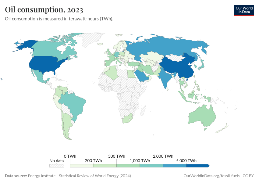
Energy from oil: how much do countries consume?
Oil production is an important indicator to follow – it helps us understand where it's being extracted, who the main oil producers are, and how this relates to oil reserves. But we also care about where that oil is being consumed – that tells us what role it's playing in the energy system of each country.
This interactive chart shows primary energy consumption from oil across the world. This represents oil production adjusted for trade (so, oil exports are subtracted and imports are added).
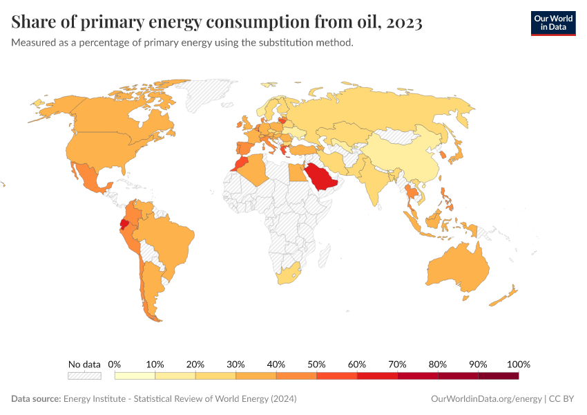
What share of primary energy comes from oil?
Oil is the world's largest energy source today. It is the dominant source of energy for the transport sector in particular.
This interactive map shows the share of primary energy from oil worldwide.
Gas
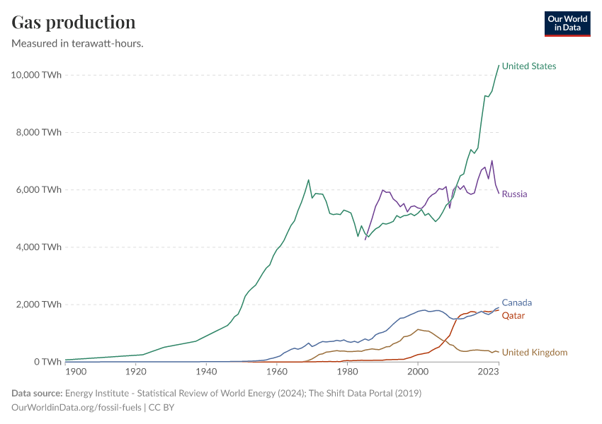
Gas production: how much do countries produce?
Which countries produce the most gas? How has this changed over time?
In the interactive chart here we see gas production by country. This has been converted into primary energy equivalents (i.e., terawatt-hours of energy) for comparability across our other data on energy.
Note that this measures gas production, not consumption. Many countries consume energy from gas in their energy supply. But not all countries have gas reserves to produce this themselves. This therefore measures gas production before trade between countries.
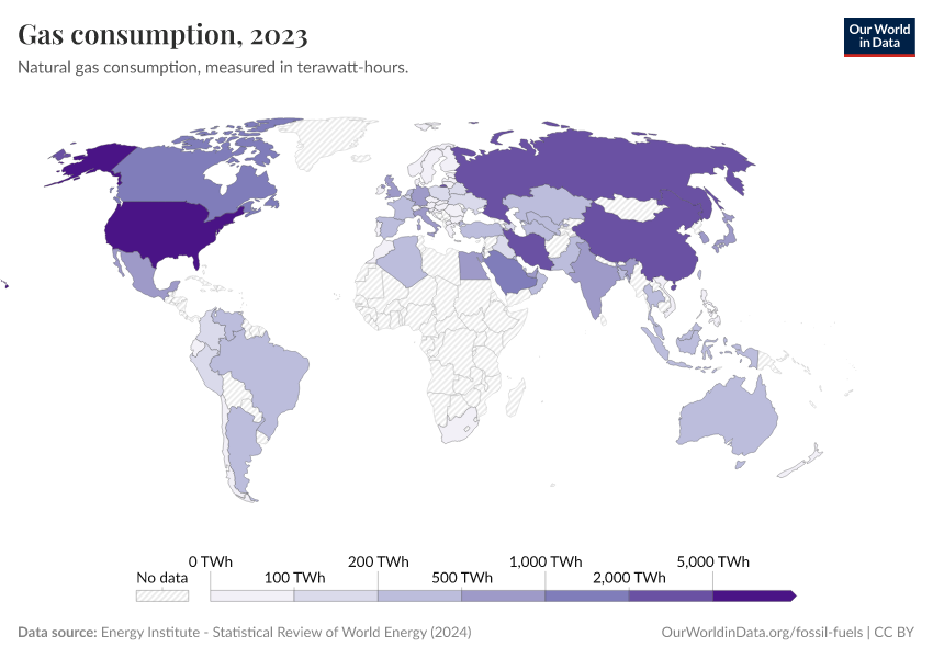
Energy from gas: how much do countries consume?
In the section above we looked at where in the world gas is produced. But, after trade, where in the world is gas consumed?
This interactive chart shows primary energy consumption from gas across the world. This represents gas production adjusted for trade (so, gas exports are subtracted and imports are added).
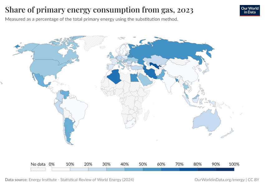
What share of primary energy comes from gas?
Natural gas has, for decades, lagged behind coal and oil as an energy source. But today, its consumption is growing rapidly – often as a replacement for coal in the energy mix. Gas is a major provider of electricity production and a key source of heat.
This interactive map shows the share of primary energy from gas worldwide.
What share of electricity comes from gas?
Gas is now the second largest source of electricity production globally.
Its contribution is growing quickly in many countries as they substitute it for coal in the electricity mix. From a climate perspective, this transition is positive since gas typically emits less CO2 per unit of energy. But, we still ultimately want to shift away from gas towards low-carbon sources such as renewables and nuclear.
This interactive map shows the share of electricity that comes from gas worldwide.
Fossil fuel reserves
In previous sections, we examined how much fossil fuels different countries produced or consumed. But where in the world do our existing reserves of fossil fuels remain?
It's important to distinguish reserves versus resources here. "Proven reserves" represent quantities of fossil fuels that we know with reasonable certainty could be recovered in the future under existing economic and technological operating conditions. In other words, we know it's there, and it would be technologically and economically feasible to extract it.
Reserves represent only some fraction of resources, however; we continue to discover new quantities of fossil fuels, and with time more becomes technologically feasible to extract. This means our quantity of reserves changes all the time – not only based on how much we consume, but by how many new resources are 'unlocked'.
We look at the difference between reserves and resources in more detail below.
Coal reserves
The United States has the largest coal reserves. Russia, China, Australia, and India are also rich in coal reserves.
The chart shows proven coal reserves across the world.
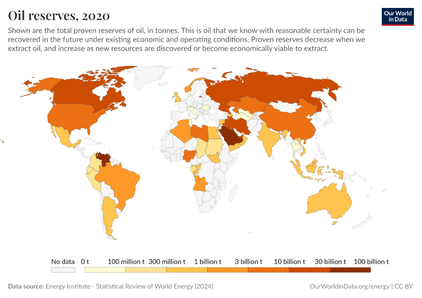
Oil reserves
The Middle East is the richest region in terms of oil reserves, although on a country basis Venezuela has the largest global reserves. Russia and Canada also have relatively high stocks.
In the interactive chart, we see proven oil reserves across the world.
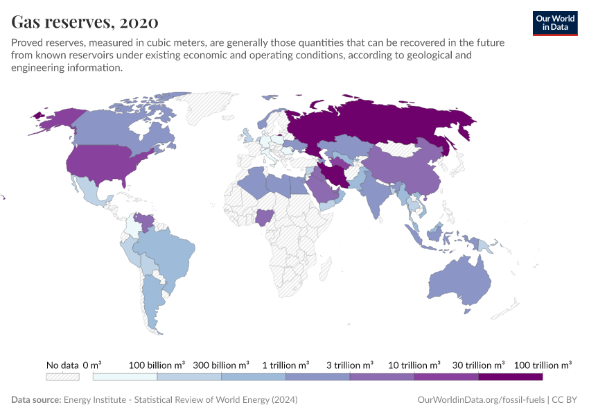
Gas reserves
The Middle East is also rich in natural gas, although Russia has the largest gas reserves as an individual country.
The chart shows proven natural gas reserves around the world.
Definitions and measurement
Reserves vs. resources: when does a resource become a reserve?
The terms “reserves” and “resources” are often used interchangeably. However, there is an important distinction between the two. The chart explains this distinction visually.
Every reserve is indeed a resource, but not every resource is a reserve. Two requirements determine whether a mineral resource becomes a reserve. The first is the degree of certainty that it exists: the planet likely has many mineral resources that we have not yet discovered. So to be defined as a reserve, we must have either a proven, probable, or possible understanding of its existence. The second criterion relates to the economic feasibility of being able to access and extract the mineral resource. To be defined as a reserve, it must be economically and technologically viable to recover. If the economics are subeconomic (i.e. would result in a net loss) or marginal, a mineral resource is not defined as a reserve.
Whilst the original source of this concept – the American geologist Vincent McKelvey – visualized it as a static box, this transition between resources and reserve classifications is dynamic. As we discover previously unknown resources and develop improved extraction technologies for economic recovery, this reserve box can grow with time (or shrink as we consume them).
Endnotes
Vaclav Smil (2017). Energy Transitions: Global and National Perspectives.
This dataset is collated by Our World in Data based on several data sources, including:
Powering Past Coal Alliance (PPCA): https://www.poweringpastcoal.org/Beyond Coal EU: https://beyond-coal.eu/coal-exit-tracker/Bloomberg Global Coal Countdown: https://bloombergcoalcountdown.com/EMBER Climate: https://ember-climate.org/National announcements during the COP26 Climate Summit.
Cite this work
Our articles and data visualizations rely on work from many different people and organizations. When citing this topic page, please also cite the underlying data sources. This topic page can be cited as:
Hannah Ritchie and Pablo Rosado (2017) - “Fossil fuels” Published online at OurWorldinData.org. Retrieved from: 'https://ourworldindata.org/fossil-fuels' [Online Resource]BibTeX citation
@article{owid-fossil-fuels,
    author = {Hannah Ritchie and Pablo Rosado},
    title = {Fossil fuels},
    journal = {Our World in Data},
    year = {2017},
    note = {https://ourworldindata.org/fossil-fuels}
}
Reuse this work freely
All visualizations, data, and articles produced by Our World in Data are completely open access under the Creative Commons BY license. You have the permission to use, distribute, and reproduce these in any medium, provided the source and authors are credited.
The data produced by third parties and made available by Our World in Data is subject to the license terms from the original third-party authors. We will always indicate the original source of the data in our documentation, so you should always check the license of any such third-party data before use and redistribution.
All of our charts can be embedded in any site.
