Electricity Mix
Explore data on where our electricity comes from and how this is changing.
This page was first published in July 2020. We made minor changes to the text in January 2024.
Electricity is one of three components that make up total energy production. The other two are transport and heating.
As we see in more detail in this article, the breakdown of sources — coal, oil, gas, nuclear, and renewables — is different in electricity versus the energy mix. Generally, low-carbon sources (nuclear and renewables) account for a larger share of our electricity than our total energy mix.
This means it's important to distinguish between the two. On another page, we provide the full breakdown of the Energy Mix. But in this article, we focus on the Electricity Mix.
Where do we get our electricity from? Which countries have the cleanest electricity grids? In this article, we look at the breakdown across the world.
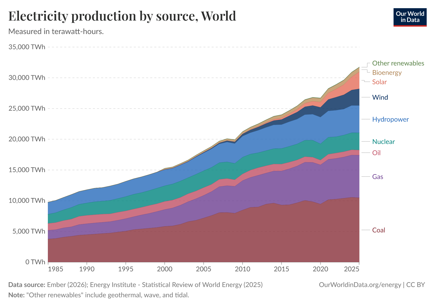
Where does our electricity come from?
What sources make up our electricity mix? How much comes from coal, oil, and gas, and how much from nuclear, hydropower, solar, or wind?
In the interactive charts shown here, we see the breakdown of the electricity mix by source.
The stacked area chart shows electricity production in absolute terms, allowing you to see how these sources add up. The line chart shows each source's share of the total and gives a better perspective on how each changes over time.
Globally, coal, followed by gas, is the largest source of electricity production. Of the low-carbon sources, hydropower and nuclear make the largest contribution; although wind and solar are growing quickly.
Looking at the electricity mix of particular countries, we can see dramatic changes over time.
Take the UK as an example: there, we see a dramatic decline in the role of coal in its electricity mix. From being the source of more than half of the electricity in the late 1980s, coal's contribution has now dwindled to just a mere couple of percent, reflecting a substantial shift in the country's energy landscape.

The charts here show the breakdown of the electricity mix by country. First, there is the higher-level breakdown by fossil fuels, nuclear, and renewables. Then, there is the specific breakdown by source, including coal, gas, oil, nuclear, bioenergy, hydro, solar, wind, and other renewables (which include wave and tidal).
This is given in terms of per capita consumption.

How much of our electricity comes from low-carbon sources?
The chart below shows the percentage of global electricity production that comes from nuclear or renewable energy, such as solar, wind, hydropower, wind and tidal, and some biomass.
Globally, more than a third of our electricity comes from low-carbon sources. However, the majority is still generated from fossil fuels, predominantly coal and gas.
This is more than double the share in the total energy mix, where nuclear and renewables account for only about one-fifth. When people quote a high number for the share of low-carbon energy in the electricity mix, we need to be aware that electricity is only part of the energy equation. The share in the total energy mix is much smaller.

Low-carbon electricity: how much comes from renewables and nuclear?
What is the breakdown of our electricity supply in terms of fossil fuels, renewable energy, and nuclear power?
The majority of global electricity is still generated from fossil fuels. The rest comes from low-carbon sources, with renewables making up a larger portion than nuclear energy.
Over the past decades, the balance between fossil fuels and low-carbon electricity sources has remained relatively unchanged. A decline in nuclear energy has offset the progress made in renewables; nuclear declined almost as much as renewables gained.
Some countries get most of their electricity from low-carbon sources
Globally, we get just over one-third of our electricity from low-carbon sources. But some countries get much more — some nearly all — from fossil-free sources.
In the interactive map shown, we see this share across the world. Some countries get over 90% of their electricity from nuclear or renewables — Sweden, Norway, France, Paraguay, Iceland, and Nepal, among others.
Nearly all these countries have one thing in common: they get a lot of electricity from hydropower and/or nuclear energy. Solar, wind, and other renewable technologies are growing quickly. They will hopefully account for a large share of electricity production in the future — but the countries that have a low-carbon electricity mix today have relied heavily on hydroelectric and nuclear power in recent years.
We must learn from these country-level examples. In the years to come, accelerating the transition to clean electricity will become increasingly important as we electrify other parts of the energy system (shifting to electric vehicles, for example). We will need to rely on lots of low-carbon electricity.

Carbon intensity of electricity
Carbon intensity of electricity measures the amount of CO2 produced per unit of electricity. It is measured as the grams of CO2 produced per kilowatt-hour (kWh).
Countries with a large share of their electricity from low-carbon sources (renewables and nuclear) will have a lower carbon intensity.
This interactive map shows the carbon intensity of electricity.

Electricity production by source
Fossil fuels: what share of electricity comes from fossil fuels?
Fossil fuels are the sum of coal, oil, and gas. Combined, they are the largest source of global carbon dioxide (CO2) emissions. We, therefore, need to transition away from them.
This interactive map shows the share of electricity produced from fossil fuels (coal, oil, and gas summed together) worldwide. Oil accounts for only a small share of electricity production — most come from coal and gas. The share of coal and gas can be found in the sections below.

Coal: what share of electricity comes from coal?
Coal is currently the largest source of electricity globally and remains the dominant source for many countries. However, others have seen a massive shift away from coal in recent years — the UK is one such example.
This interactive map shows the share of electricity that comes from coal worldwide.

Gas: what share of electricity comes from gas?
Gas is now the second largest source of electricity production globally.
Its contribution is growing quickly in many countries as they substitute it for coal in the electricity mix. From a climate perspective, this transition is positive since gas typically emits less CO2 per unit of energy. But ultimately, we still want to shift from gas to low-carbon sources such as renewables and nuclear energy.
This interactive map shows the share of electricity that comes from gas worldwide.

Nuclear: what share of electricity comes from nuclear?
For decades, nuclear power has played a key role in low-carbon electricity production. In some countries, it is one of — if not the single — largest sources of electricity.
For example, France obtains a significant portion, around three-quarters, of its electricity from nuclear power.
This interactive map shows the share of electricity that comes from nuclear across the world.
By clicking on a given country, you can see how this share has changed over time. In some countries, we see a dramatic decline in nuclear's role as plants have been taken offline. Japan is an obvious example of this.
Renewables: what share of electricity comes from renewables?
'Renewables' combine multiple electricity sources, including hydropower, solar, wind, geothermal, biomass, and wave & tidal.
This interactive map shows the share of electricity from renewables (the sum of all renewable energy technologies) worldwide.
The sections below give the share of electricity we get from individual renewable technologies—solar or wind, for example.

Hydropower: what share of electricity comes from hydropower?
Hydropower makes a large contribution to low-carbon electricity across the world: globally, it accounts for around one-sixth of production.
This interactive map shows the share of electricity that comes from hydropower across the world.

Solar: what share of electricity comes from solar?
This interactive map shows the share of electricity that comes from solar power worldwide.

Wind: what share of electricity comes from wind?
This interactive map shows the share of electricity that comes from wind worldwide.

Cite this work
Our articles and data visualizations rely on work from many different people and organizations. When citing this topic page, please also cite the underlying data sources. This topic page can be cited as:
Hannah Ritchie and Pablo Rosado (2020) - “Electricity Mix” Published online at OurWorldinData.org. Retrieved from: 'https://ourworldindata.org/electricity-mix' [Online Resource]BibTeX citation
@article{owid-electricity-mix,
    author = {Hannah Ritchie and Pablo Rosado},
    title = {Electricity Mix},
    journal = {Our World in Data},
    year = {2020},
    note = {https://ourworldindata.org/electricity-mix}
}
Reuse this work freely
All visualizations, data, and articles produced by Our World in Data are completely open access under the Creative Commons BY license. You have the permission to use, distribute, and reproduce these in any medium, provided the source and authors are credited.
The data produced by third parties and made available by Our World in Data is subject to the license terms from the original third-party authors. We will always indicate the original source of the data in our documentation, so you should always check the license of any such third-party data before use and redistribution.
All of our charts can be embedded in any site.