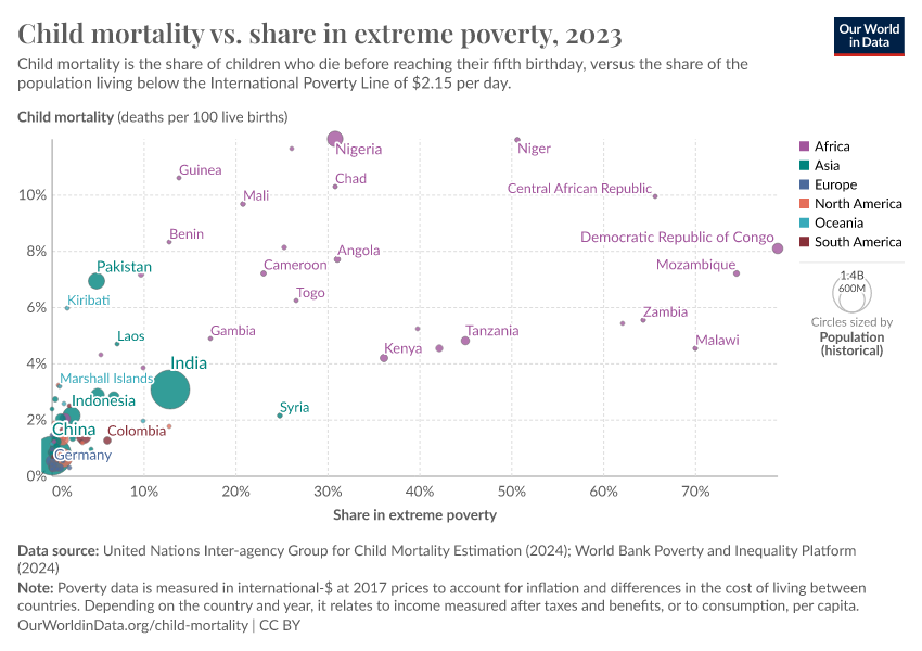
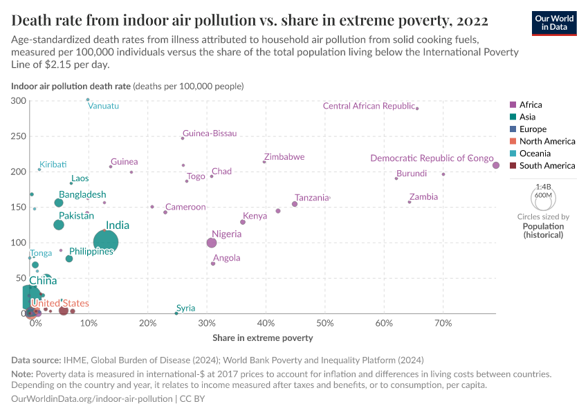
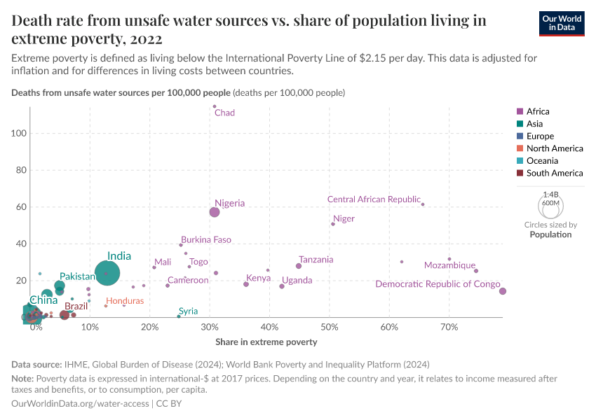
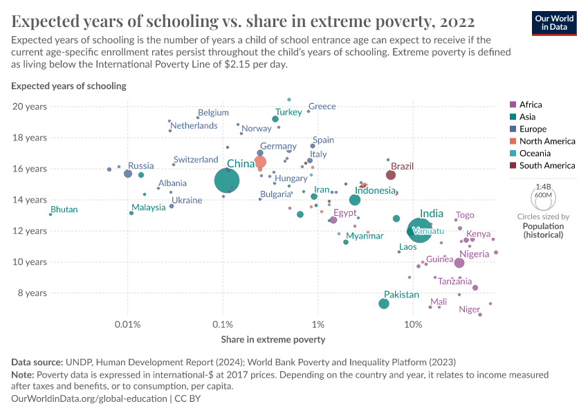
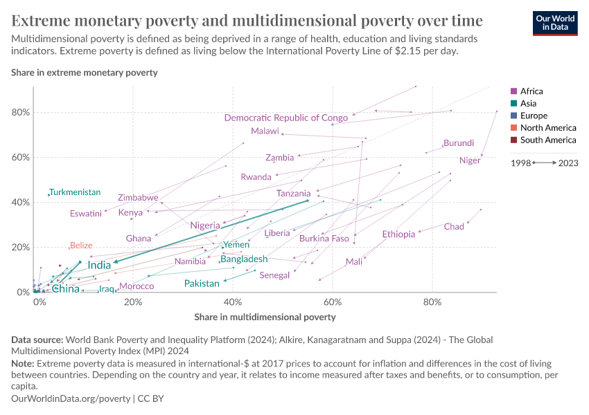
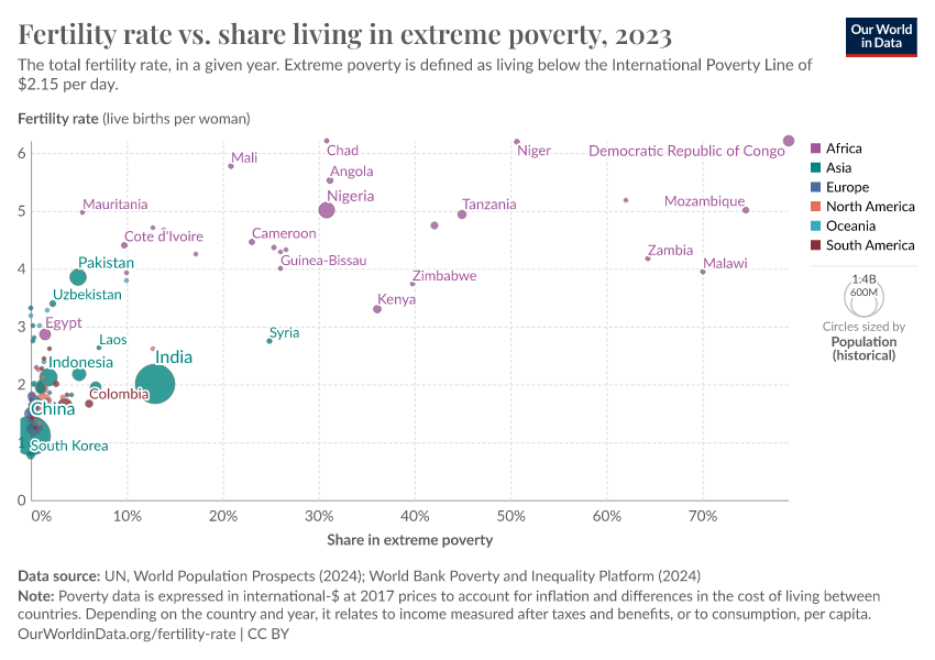
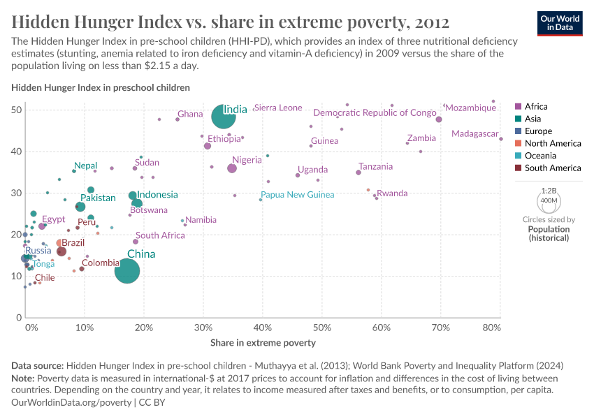
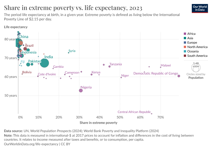
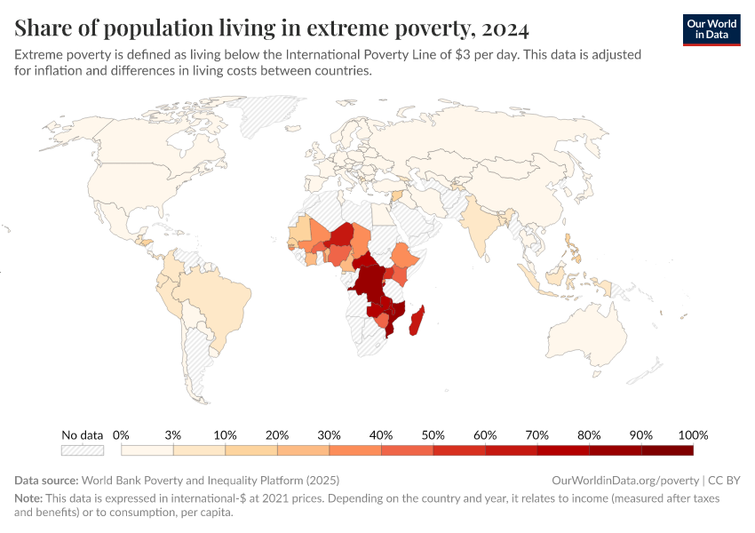
Share of population living in extreme poverty
What you should know about this indicator
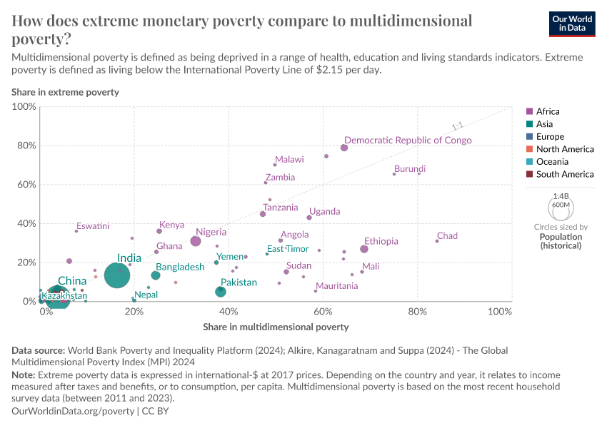
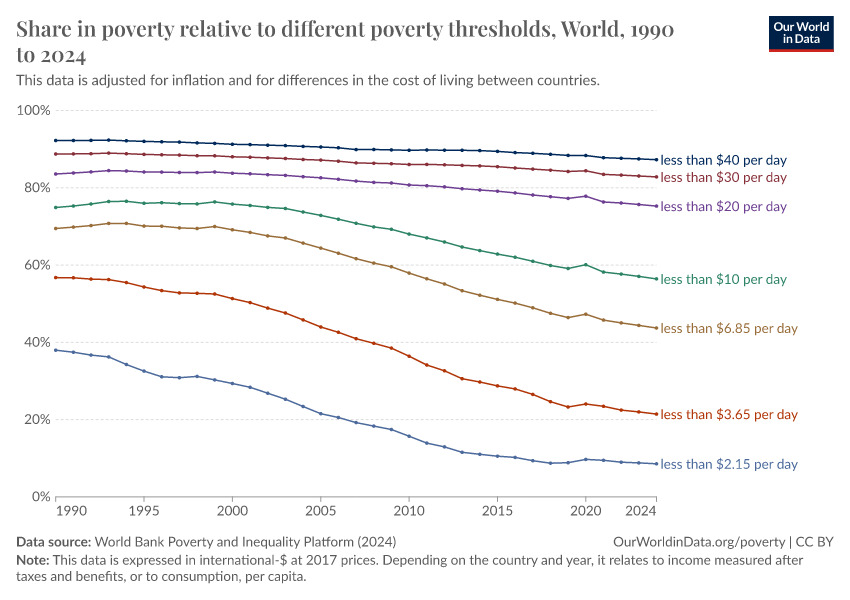
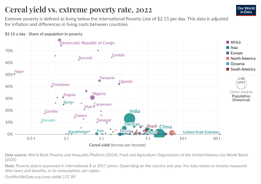
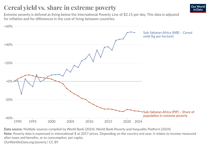
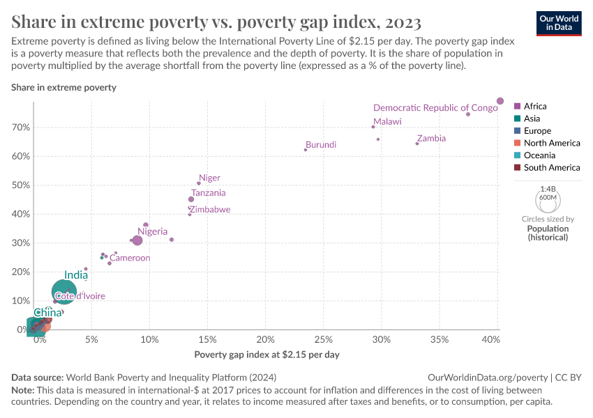
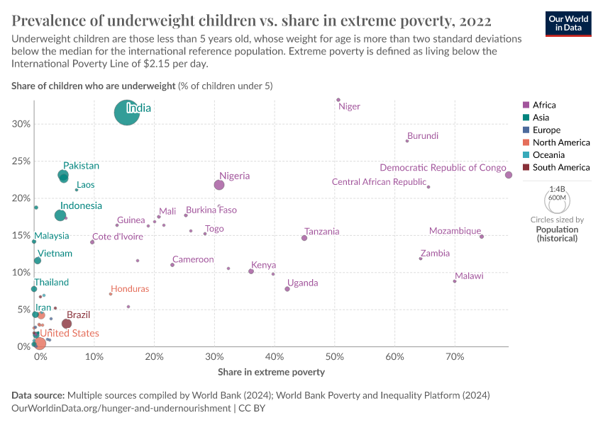
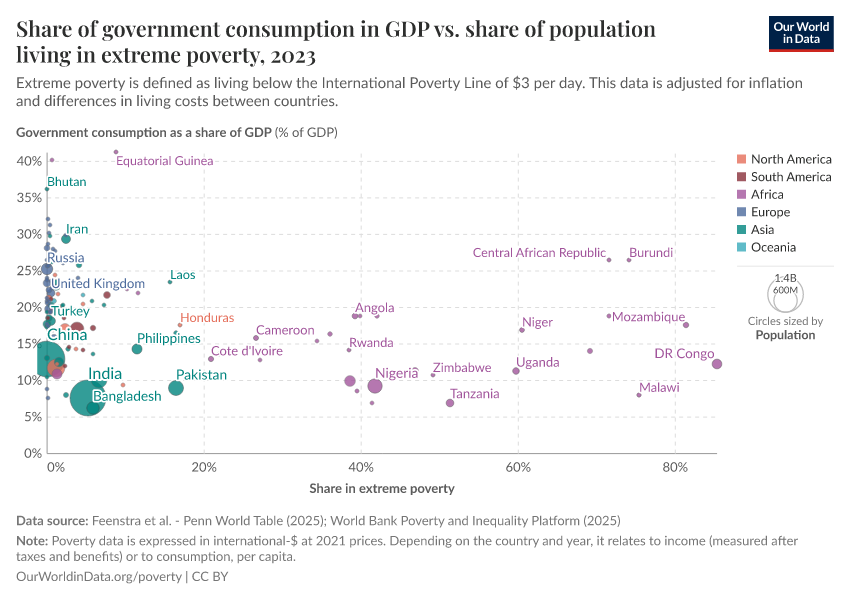
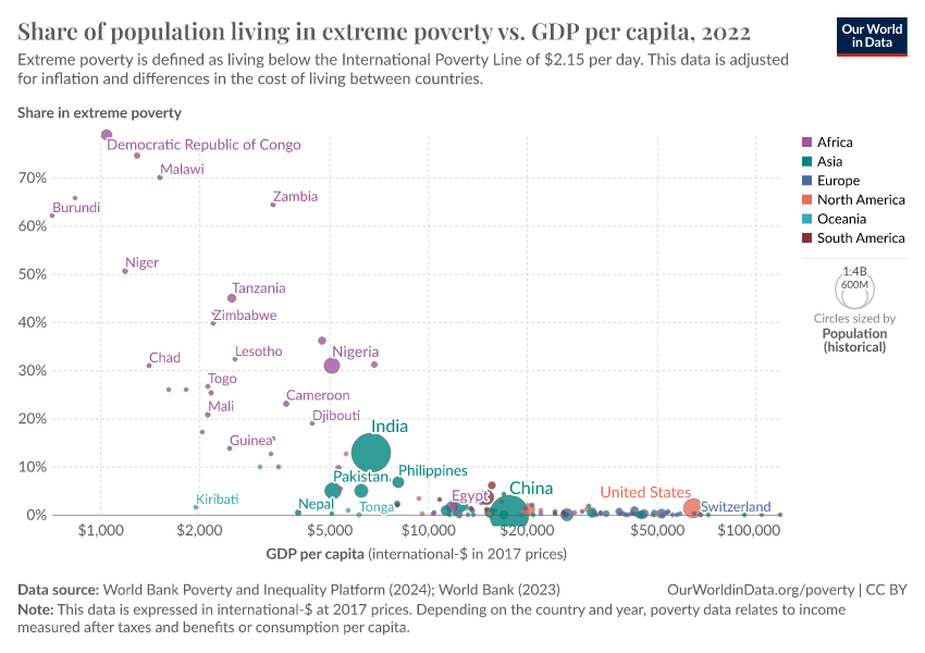
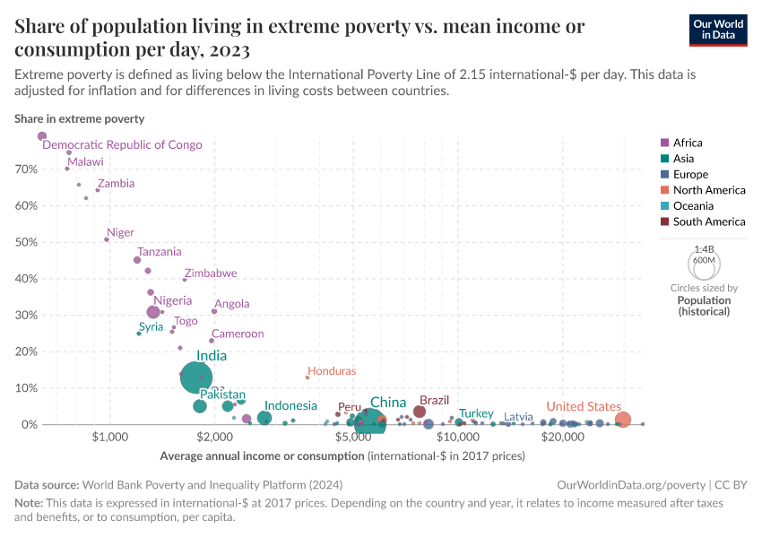
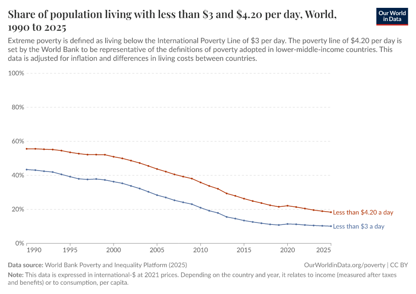
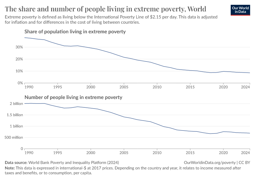
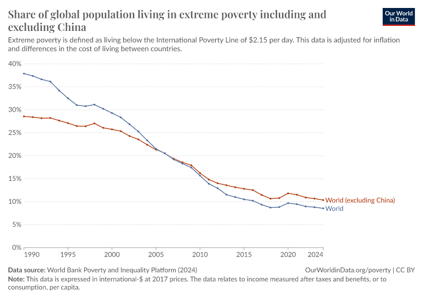
- The World Bank defines extreme poverty as living on less than $3 per day. This threshold, known as the "International Poverty Line", is set so that poverty can be compared across countries. This indicator plays an important and successful role in focusing the world's attention on the very poorest people. The UN uses this indicator to track progress towards ending extreme poverty by 2030.
- Two centuries ago, most of the world's population was extremely poor. Many believed that widespread poverty was inevitable. But this turned out to be wrong. Economic growth is possible, and poverty can decline. With this poverty line, we can track whether countries are leaving the worst poverty behind.
- This data is expressed in constant international dollars to adjust for inflation and differences in living costs between countries. Read more in our article, What are international dollars?
- Many people, today and in the past, have no monetary income. This data accounts for this by including the estimated value of non-market income, such as food grown by subsistence farmers for their own use.
- Regional and global estimates are extrapolated up until the year of the data release using GDP growth estimates and forecasts. For more details about the methodology, please refer to the World Bank PIP documentation.
- Depending on the country and year, the data refers either to income (after taxes and benefits) or to consumption, per capita. For most countries, we have only one option available. But when there is a mix of consumption and income data points, we process the data to keep one observation per country and year. Our Poverty Data Explorer shows the original data with all available income and consumption measures separately.
Related research and writing
More Data on Poverty
Frequently Asked Questions
What is the International Poverty Line and how is it set?
There is no single definition of poverty. Our understanding of the extent of poverty and how it is changing depends on which definition we have in mind.
What are international-$ and why are they used to measure incomes?
Much of the economic data we use to understand the world, such as the incomes people receive or the goods and services firms produce and people buy, is recorded in the local currencies of each country. That means the numbers start out in rupees, US dollars, yuan, and many others, and without adjusting for inflation over time. This is known as being in “current prices” or “nominal” terms.
How comparable is the World Bank data on household incomes across time or between countries?
Because there is no global survey of incomes, researchers need to rely on available national surveys. Such surveys are designed with cross-country comparability in mind, but because the surveys reflect the circumstances and priorities of individual countries at the time of the survey, there are some important differences. In collating this survey data the World Bank takes steps to harmonize it where possible, but comparability issues remain.
How does the World Bank produce global and regional estimates of poverty and inequality from national data?
Sources and processing
This data is based on the following sources
How we process data at Our World in Data
All data and visualizations on Our World in Data rely on data sourced from one or several original data providers. Preparing this original data involves several processing steps. Depending on the data, this can include standardizing country names and world region definitions, converting units, calculating derived indicators such as per capita measures, as well as adding or adapting metadata such as the name or the description given to an indicator.
At the link below you can find a detailed description of the structure of our data pipeline, including links to all the code used to prepare data across Our World in Data.
Notes on our processing step for this indicator
For most countries in the dataset, estimates relate to disposable income or consumption, for all available years. Several countries, however, have a mix of income and consumption data points, with both data types sometimes available for particular years.
In most of our charts, we present the data with some data points dropped to present a single series for each country. This allows us to make readable visualizations that combine multiple countries. In choosing which data points to keep, we strike a balance between maintaining comparability over time and showing as long a time series as possible. As such, the exact approach varies across countries.
The original data with all available income and consumption measures is shown separately in our Poverty Data Explorer.
Reuse this work
Citations
How to cite this page
To cite this page overall, including any descriptions, FAQs or explanations of the data authored by Our World in Data, please use the following citation:
“Data Page: Share of population living in extreme poverty”, part of the following publication: Joe Hasell, Bertha Rohenkohl, Pablo Arriagada, Esteban Ortiz-Ospina, and Max Roser (2022) - “Poverty”. Data adapted from World Bank Poverty and Inequality Platform. Retrieved from https://archive.ourworldindata.org/20260325-171315/grapher/share-of-population-in-extreme-poverty.html [online resource] (archived on March 25, 2026).How to cite this data
In-line citationIf you have limited space (e.g. in data visualizations), you can use this abbreviated in-line citation:
World Bank Poverty and Inequality Platform (2025) – with major processing by Our World in DataFull citation
World Bank Poverty and Inequality Platform (2025) – with major processing by Our World in Data. “Share of population living in extreme poverty – World Bank” [dataset]. World Bank Poverty and Inequality Platform, “World Bank Poverty and Inequality Platform (PIP) 20250930_2021, 20250930_2017” [original data]. Retrieved April 1, 2026 from https://archive.ourworldindata.org/20260325-171315/grapher/share-of-population-in-extreme-poverty.html (archived on March 25, 2026).Download
Quick download
Download the data shown in this chart as a ZIP file containing a CSV file, metadata in JSON format, and a README. The CSV file can be opened in Excel, Google Sheets, and other data analysis tools.
Data API
Use these URLs to programmatically access this chart's data and configure your requests with the options below. Our documentation provides more information on how to use the API, and you can find a few code examples below.
Data URL (CSV format)
https://ourworldindata.org/grapher/share-of-population-in-extreme-poverty.csv?v=1&csvType=full&useColumnShortNames=falseMetadata URL (JSON format)
https://ourworldindata.org/grapher/share-of-population-in-extreme-poverty.metadata.json?v=1&csvType=full&useColumnShortNames=falseExcel / Google Sheets
=IMPORTDATA("https://ourworldindata.org/grapher/share-of-population-in-extreme-poverty.csv?v=1&csvType=full&useColumnShortNames=false")Python with Pandas
import pandas as pd
import requests

# Fetch the data.
df = pd.read_csv("https://ourworldindata.org/grapher/share-of-population-in-extreme-poverty.csv?v=1&csvType=full&useColumnShortNames=false", storage_options = {'User-Agent': 'Our World In Data data fetch/1.0'})

# Fetch the metadata
metadata = requests.get("https://ourworldindata.org/grapher/share-of-population-in-extreme-poverty.metadata.json?v=1&csvType=full&useColumnShortNames=false").json()
R
library(jsonlite)

# Fetch the data
df <- read.csv("https://ourworldindata.org/grapher/share-of-population-in-extreme-poverty.csv?v=1&csvType=full&useColumnShortNames=false")

# Fetch the metadata
metadata <- fromJSON("https://ourworldindata.org/grapher/share-of-population-in-extreme-poverty.metadata.json?v=1&csvType=full&useColumnShortNames=false")
Stata
import delimited "https://ourworldindata.org/grapher/share-of-population-in-extreme-poverty.csv?v=1&csvType=full&useColumnShortNames=false", encoding("utf-8") clear