CO₂ emissions
How much CO₂ does the world emit? Which countries emit the most?
Carbon dioxide emissions are the primary driver of global climate change. It's widely recognized that to avoid the worst impacts of climate change, the world needs to urgently reduce emissions. But, how this responsibility is shared between regions, countries, and individuals has been an endless point of contention in international discussions.
This debate arises from the various ways in which emissions are compared: as annual emissions by country; emissions per person; historical contributions; and whether they adjust for traded goods and services. These metrics can tell very different stories.
We teamed up with the YouTube channel Kurzgesagt to produce a video that explored these different metrics in detail: ‘Who is responsible for climate change? – Who needs to fix it?’.
This page is just one in our collection of work on CO2 and Greenhouse Gas Emissions where you can explore emissions of other greenhouse gases; where our emissions come from; what trajectories of future emissions look like; and what is driving emissions across the world.
You can also download our complete Our World in Data CO2 and Greenhouse Gas Emissions database.
Other research and writing on CO₂ emissions on Our World in Data:
- Many countries have decoupled economic growth from CO2 emissions, even if we take offshored production into account
- How do CO2 emissions compare when we adjust for trade?
- Global inequalities in CO2 emissions
Global CO2 emissions from fossil fuels
How have global emissions of carbon dioxide (CO2) changed over time?
In this chart, we see the growth of global emissions from the mid-18th century through to today.
We see that before the Industrial Revolution, emissions were very low. Growth in emissions was still relatively slow until the mid-20th century. In 1950 the world emitted 6 billion tonnes of CO2. By 1990 this had almost quadrupled, reaching more than 20 billion tonnes. Emissions have continued to grow rapidly; we now emit over 35 billion tonnes each year. Emissions growth has slowed over the last few years, but they have yet to reach their peak.

Global CO2 emissions from fossil fuels and land use change
How have global emissions of carbon dioxide (CO2) from fossil fuels and land use changed over time?
We see that while emissions from fossil fuels have increased, emissions from land use change have declined slightly in recent years. Overall, this means total emissions have roughly stabilized over the past decade.

CO2 emissions by region
This interactive chart shows the breakdown of global CO2 emissions by region. We see that until well into the 20th century, global emissions were dominated by Europe and the United States. In 1900, more than 90% of emissions were produced in Europe or the US; even by 1950, they accounted for more than 85% of emissions each year. But in recent decades this has changed significantly. In the second half of the 20th century, we see a significant rise in emissions in the rest of the world, particularly across Asia, and most notably, China. The US and Europe now account for less than one-third of emissions.

Per capita CO2 emissions
Where in the world does the average person emit the most carbon dioxide (CO2) each year?
We can calculate the contribution of the average citizen of each country by dividing its total emissions by its population. This gives us CO2 emissions per capita. In the visualization, we see the differences in per capita emissions across the world.
Here we look at production-based emissions – that is, emissions produced within a country’s boundaries without accounting for how goods are traded across the world. In our post on consumption-based emissions, we look at how these figures change when we account for trade. Production figures matter – these are the numbers that are taken into account for climate targets1 and thanks to historical reconstructions they have been available for the entire world since the mid-18th century.

There are very large inequalities in per capita emissions across the world.
The world’s largest per capita CO2 emitters are the major oil-producing countries; this is particularly true for those with relatively low population size. Most are in the Middle East and include Qatar, the United Arab Emirates, Bahrain, and Kuwait.
However, many of the major oil producers have a relatively small population meaning their total annual emissions are low. More populous countries with some of the highest per capita emissions – and therefore high total emissions – are the United States, Australia, and Canada which on average have emissions that are around 3 times higher than the global average.
Since there is such a strong relationship between income and per capita CO2 emissions, we’d expect this to be the case: countries with high standards of living would have a high carbon footprint. But what becomes clear is that there can be large differences in per capita emissions, even between countries with similar standards of living. Many countries across Europe, for example, have much lower emissions than the US, Canada, or Australia.
In fact, some European countries have emissions not far from the global average, including Portugal, France, and the UK. This is also much lower than some of their neighbors with similar standards of living, such as Germany, the Netherlands, or Belgium. The choice of energy sources plays a key role here: in the UK, Portugal, and France, a much higher share of electricity is produced from nuclear and renewable sources – you can explore this electricity mix by country here. While approximately half of Germany's electricity is derived from fossil fuels, the percentage in France is markedly lower.
Prosperity is a primary driver of CO2 emissions, but clearly, policy and technological choices make a difference.
Many countries in the world still have very low per capita CO2 emissions. In many of the poorest countries in Sub-Saharan Africa – such as Chad, Niger, and the Central African Republic – the average footprint is around 0.1 tonnes per year. That’s around 150 times lower than the USA, Australia, and Canada. The average American or Australian produces the same amount of emissions in under two days as the average person in Mali or Niger does in an entire year.
Annual CO2 emissions
Who emits the most CO2 each year? In the following visualization, we show annual CO2 emissions aggregated by region, with a special focus on the leading emitters including India, China, and the United States. The emissions shown here relate to where CO2 is produced (i.e., production-based CO2), not where the goods and services that generate emissions are finally consumed. We look at the difference in each country’s production vs. consumption (trade-adjusted) emissions here.
Asia is by far the largest emitter, accounting for around half of global emissions. As it is home to almost 60% of the world’s population this means that per capita emissions in Asia are slightly lower than the world average, however.
China is, by a significant margin, Asia’s and the world’s largest emitter: it emits more than one-quarter of global emissions.
North America – dominated by the USA – is the second largest regional emitter at one-fourth of global emissions and it’s followed closely by Europe. Here we have grouped the countries in the European Union since they typically negotiate and set targets as a collective body. You can see the data for individual EU countries in the interactive maps that follow.
Africa and South America are both fairly small emitters: accounting for 3-4% of global emissions each. Both have emissions similar in size to international aviation and shipping combined. Aviation and shipping are not included in national or regional emissions. This is because of disagreement over how emissions that cross country borders should be allocated: do they belong to the country of departure or country of origin? How are connecting flights accounted for? The tensions in reaching international aviation and shipping deals are discussed in detail in the Carbon Brief here.

How did CO2 emissions change over time?
The same data is also explorable by country and over time in the interactive map.
By clicking on any country you can see how its annual emissions have changed, and compare it with other countries.

Share of global CO2 emissions by country
In the interactive chart, you can explore each country’s share of global emissions. Using the timeline at the bottom of the map, you can see how the global distribution has changed since 1750. By clicking on any country you can see its evolution and compare it with others.
The distribution of emissions has changed significantly over time. The UK was – until 1888 when it was overtaken by the US – the world’s largest emitter. This was because the UK was the first country to industrialize, a transition that later contributed to massive improvements in living standards for much of its population.
Whilst rising CO2 emissions have clear negative environmental consequences, it is also true that they have historically been a by-product of positive improvements in human living conditions. But, it’s also true that reducing CO2 emissions is important to protect the living conditions of future generations. This perspective – that we must consider both the environmental and human welfare implications of emissions – is important if we are to build a future that is both sustainable and provides high standards of living for everyone.
Rising emissions and living standards in North America and Oceania followed soon after developments in the UK.
Many of the world’s largest emitters today are in Asia. However, Asia’s rapid rise in emissions has only occurred in very recent decades. This too has been a by-product of massive improvements in living standards: since 1950 life expectancy in Asia has increased by more than 30 years, it has seen a dramatic fall in extreme poverty; and for the first time, most of its population received formal education.
Whilst all countries must work collectively, action from the very top emitters will be essential. China, the USA, and the 28 countries of the EU account for more than half of global emissions. Without a commitment from these largest emitters, the world will not come close to meeting its global targets.

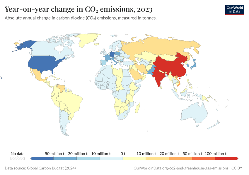
Annual change in CO2 emissions
This interactive chart shows the year-on-year growth rate of CO2 emissions.
A positive figure in a given year indicates that emissions were higher than the previous year. A negative figure indicates they were lower than the year before. For example, a change of 1.5% indicates that global emissions were 1.5% higher than the previous year (–1.5% would mean they were 1.5% lower).
This measure allows us to see firstly where emissions are rising, and where they are falling; and secondly, the rate at which emissions are changing – whether the growth in emissions is slowing down or accelerating.

Related chart:
Cumulative CO2 emissions
Since 1751 the world has emitted over 1.5 trillion tonnes of CO2.2 To reach our climate goal of limiting average temperature rise to 2°C, the world needs to urgently reduce emissions. One common argument is that those countries that have added most to the CO2 in our atmosphere – contributing most to the problem today – should take on the greatest responsibility in tackling it.
We can compare each country’s total contribution to global emissions by looking at cumulative CO2. We can calculate cumulative emissions by adding up each country’s annual CO2 emissions over time. We did this calculation for each region and the largest CO2 emitters over the period from 1751 through to 2017.3
There are some key points we can learn from this perspective:
- The United States has emitted more CO2 than any other country to date: at around 400 billion tonnes since 1751, it is responsible for almost one-quarter of historical emissions;
- This exceeds the contribution of China, the world's second-largest national contributor, by more than 1.5 times;
- The countries of the European Union – which are grouped together here as they typically negotiate and set targets on a collaborative basis – are also a large historical contributor at almost a fifth of all emissions;
- Many of the large annual emitters today – such as India and Brazil – are not large contributors in a historical context;
- Africa’s regional contribution – relative to its population size – has been very small. This is the result of very low per capita emissions – both historically and currently.

All of this data is also explorable by country and over time in the interactive map. By clicking on any country you can see the country’s cumulative emissions over time, and compare it with other countries.

How has each region’s share of global cumulative CO2 emissions changed over time?
In the paragraph above we focused on each country or region’s total cumulative emissions in absolute terms.
In the following chart, we see the change in the share of global cumulative emissions by region over time from 1751.
Up until 1950, more than half of historical CO2 emissions were emitted by Europe. The vast majority of European emissions back then were emitted by the United Kingdom; as the data shows, until 1882 more than half of the world’s cumulative emissions came from the UK alone.
Over the century that followed, industrialization in the USA rapidly increased its contribution.
It’s only over the past 50 years that growth in South America, Asia, and Africa has increased these regions’ share of total contribution.
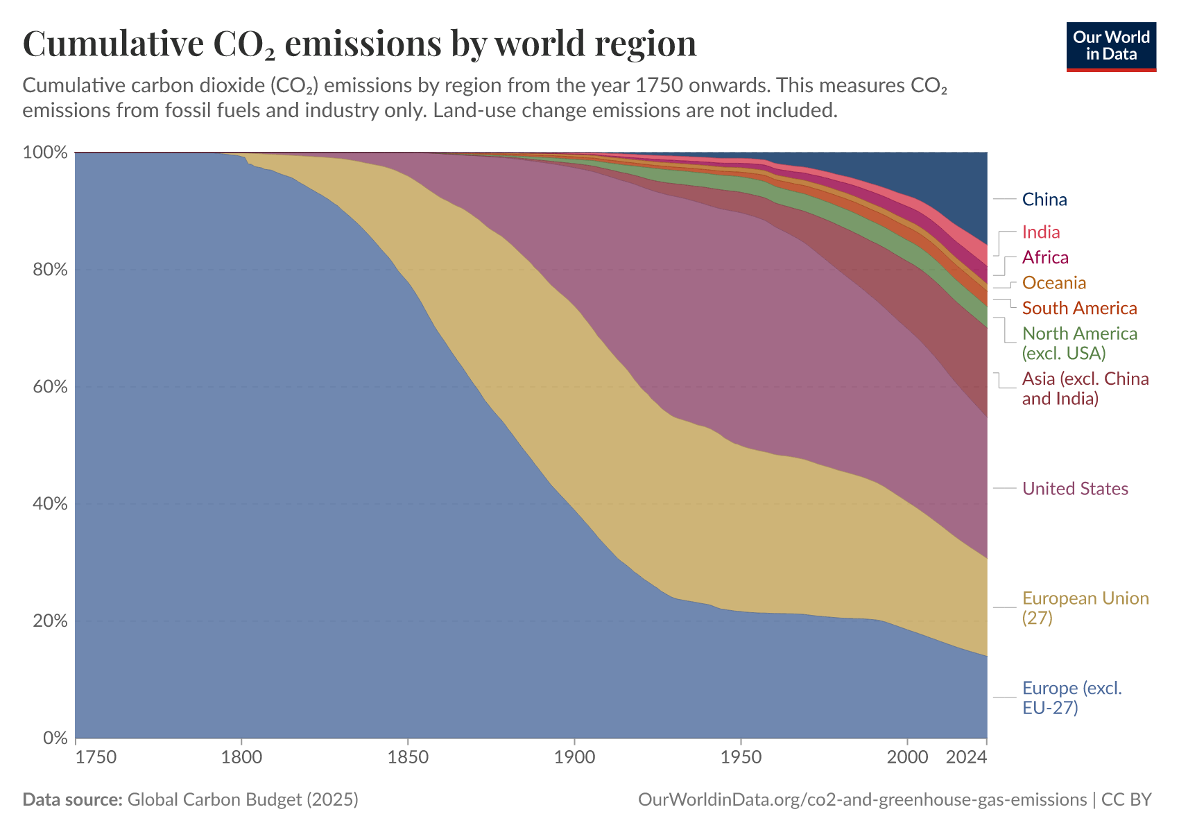
How has each country’s share of global cumulative CO2 emissions changed over time?
In the final visualization you can explore the same cumulative CO2 emissions as you have seen above but now split by country. Using the timeline at the bottom of the chart you can see how contribution across the world has evolved since 1751. By clicking on a country you can see an individual country’s cumulative contribution over time.
The map shows large inequalities of contribution across the world. The USA has emitted the most to date: around a quarter of all historical CO2: twice that of China which is the second largest contributor. In contrast, most countries across Africa have been responsible for less than 0.02% of all emissions since 1750.
What becomes clear when we look at emissions across the world today is that the countries with the highest emissions over history are not always the biggest emitters today. The UK, for example, is now responsible for less than 1% of global emissions. Reductions here will have a relatively small impact on emissions at the global level – or at least fall far short of the scale of change we need. This creates tension with the argument that the largest contributors in the past should be those doing the most to reduce emissions today. This is because a large fraction of CO2 remains in the atmosphere for hundreds of years once emitted.4
This inequality is one of the main reasons that makes international agreement on who should take action so challenging.

How do we measure or estimate CO2 emissions?
Historical fossil fuel CO2 emissions can be reconstructed back to 1751 based on energy statistics. These reconstructions detail the production quantities of various forms of fossil fuels (coal, brown coal, peat, and crude oil), which when combined with trade data on imports and exports, allow for national-level reconstructions of fossil fuel production and resultant CO2 emissions. More recent energy statistics are sourced from the UN Statistical Office, which compiles data from official national statistical publications and annual questionnaires. Data on cement production and gas flaring can also be sourced from UN data, supplemented by data from the US Department of Interior Geological Survey (USGS) and the US Department of Energy Information Administration. A full description of data acquisition and original sources can be found at the Carbon Dioxide Information Analysis Center (CDIAC).
As an example: how do we estimate Canada's CO2 emissions in 1900? Let's look at the steps involved in this estimation.
- Step 1: we gather industrial data on how much coal, brown coal, peat, and crude oil Canada extracted in 1900. This tells us how much energy it could produce if it used all of this domestically.
- Step 2: we cannot assume that Canada only used fuels produced domestically—it might have imported some fuel, or exported it elsewhere. To find out how much Canada actually burned domestically, we therefore have to correct for this trade. If we take its domestic production (account for any fuel it stores as stocks), add any fuel it imported, and subtract any fuel it exported, we have an estimate of its net consumption in 1900. In other words, if we calculate: Coal extraction − Coal exported + Coal imported − Coal stored as stocks, we can estimate the amount of coal Canada burned in 1900.
- Step 3: converting energy produced to CO2 emissions. we know, based on the quality of coal, its carbon content, and how much CO2 would be emitted for every kilogram burned (i.e. its emission factor). Multiplying the quantity of coal burned by its emission factor, we can estimate Canada's CO2 emissions from coal in 1900.
- Step 4: by doing this calculation for all fuel types, we can calculate Canada's total emissions in 1900.
Providing good estimates of CO2 emissions requires reliable and extensive coverage of domestic and traded energy—the international framework and monitoring of this reporting have significantly improved through time. For this reason, our understanding of emissions in the late 20th and 21st centuries is more reliable than our long-term reconstructions. The Intergovernmental Panel on Climate Change (IPCC) provides clear guidelines on methodologies and best practices for measuring and monitoring CO2 estimates at the national level.5
There are two key ways uncertainties can be introduced: the reporting of energy consumption, and the assumption of emissions factors (i.e. the carbon content) used for fuel burning. Since energy consumption is strongly related to economic and trade figures (which are typically monitored closely), uncertainties are typically low for energy reporting. Uncertainty can be introduced in the assumptions nations make on the correct CO2 emission factor for certain fuel types.
Country size and the level of uncertainty in these calculations have a significant influence on the inaccuracy of our global emissions figures. In the most extreme example to date, Lui et al. (2015) revealed that China overestimated its annual emissions in 2013 by using global average emission factors, rather than specific figures for the carbon content of its domestic coal supply.6
As the world's largest CO2 emitter, this inaccuracy had a significant impact on global emissions estimates, resulting in a 10% overestimation. More typically, uncertainty in global CO2 emissions ranges between 2-5%.7
Endnotes
The Intergovernmental Panel for Climate Change (IPCC) guidelines on national emissions accounting and reporting are written on the basis of production-based, rather than consumption-based emissions. These are the standards adopted internationally for emissions reporting. Eggleston, S., Buendia, L., Miwa, K., Ngara, T., & Tanabe, K. (Eds.). (2006). 2006 IPCC guidelines for national greenhouse gas inventories (Vol. 5). Hayama, Japan: Institute for Global Environmental Strategies]
Carbon dioxide (CO2) emissions from fossil fuel combustion were almost zero prior to 1750. The United Kingdom was the world’s first industrialized nation – and first fossil-fuel CO2 emitter. In 1751 its (and global) emissions were less than 10 million tonnes – 3600 times less than global emissions today. We can conclude that emissions prior to 1750 were very low (and inconsequential to the numbers we compare today). You can find further information on how long historical emissions (dating back to 1751) are estimated here.
The underlying data sources for annual CO2 emissions data come from the Carbon Dioxide Analysis Center (CDIAC) and the Global Carbon Project. The cumulative figures were calculated by Our World in Data based on these annual estimate sources.
IPCC, 2013: Climate Change 2013: The Physical Science Basis. Contribution of Working Group I to the Fifth Assessment Report of the Intergovernmental Panel on Climate Change [Stocker, T.F., D. Qin, G.-K. Plattner, M. Tignor, S.K. Allen, J. Boschung, A. Nauels, Y. Xia, V. Bex and P.M. Midgley (eds.)]. Cambridge University Press, Cambridge, United Kingdom and New York, NY, USA, 1535 pp.
IPCC Good Practice Guidance and Uncertainty Management in National Greenhouse Gas Inventories. Available online.
Liu, Z., Guan, D., Wei, W., Davis, S. J., Ciais, P., Bai, J., … & Andres, R. J. (2015). Reduced carbon emission estimates from fossil fuel combustion and cement production in China. Nature, 524(7565), 335-338. Available online.
Macknick, J. (2011). Energy and CO2 emission data uncertainties. Carbon Management, 2(2), 189-205. Available online.
Cite this work
Our articles and data visualizations rely on work from many different people and organizations. When citing this article, please also cite the underlying data sources. This article can be cited as:
Hannah Ritchie and Max Roser (2020) - “CO₂ emissions” Published online at OurWorldinData.org. Retrieved from: 'https://archive.ourworldindata.org/20260608-233547/co2-emissions.html' [Online Resource] (archived on June 8, 2026).BibTeX citation
@article{owid-co2-emissions,
    author = {Hannah Ritchie and Max Roser},
    title = {CO₂ emissions},
    journal = {Our World in Data},
    year = {2020},
    note = {https://archive.ourworldindata.org/20260608-233547/co2-emissions.html}
}
Reuse this work freely
All visualizations, data, and articles produced by Our World in Data are completely open access under the Creative Commons BY license. You have the permission to use, distribute, and reproduce these in any medium, provided the source and authors are credited.
The data produced by third parties and made available by Our World in Data is subject to the license terms from the original third-party authors. We will always indicate the original source of the data in our documentation, so you should always check the license of any such third-party data before use and redistribution.
All of our charts can be embedded in any site.