Who has contributed most to global CO2 emissions?
Our impact on climate change is not just about emissions that occur today. How much we emitted in the past also matters.
Since 1751, the world has emitted over 1.5 trillion tonnes of CO2.1 To reach our climate goal of limiting average temperature rise to 2°C, the world needs to urgently reduce emissions. One common argument is that those countries that have added most to the CO2 in our atmosphere – contributing most to the problem today – should take on the greatest responsibility in tackling it.
We can compare each country’s total contribution to global emissions by looking at cumulative CO2. We can calculate cumulative emissions by adding each country’s annual CO2 emissions over time. We did this calculation for each country and region over the period from 1751 through to 2017.2
The distribution of cumulative emissions worldwide is shown in the treemap. Treemaps are used to compare entities (such as countries or regions) with others and relative to the total. Here, countries are presented as rectangles and colored by region. The size of each rectangle corresponds to the sum of CO2 emissions from a country between 1751 and 2017. Combined, all rectangles represent the global total.
There are some key points we can learn from this perspective:
- the United States has emitted more CO2 than any other country to date: at around 400 billion tonnes since 1751, it is responsible for 25% of historical emissions;
- this is twice more than China – the world’s second-largest national contributor;
- the 28 countries of the European Union (EU-28) – which are grouped here as they typically negotiate and set targets on a collaborative basis – is also a large historical contributor at 22%;
- many of the large annual emitters today – such as India and Brazil – are not large contributors in a historical context;
- Africa’s regional contribution – relative to its population size – has been very small. This is the result of very low per capita emissions – both historically and currently.
This data is also explorable by country and over time in the interactive map. By clicking on any country, you can see its cumulative emissions over time, and compare it with other countries.

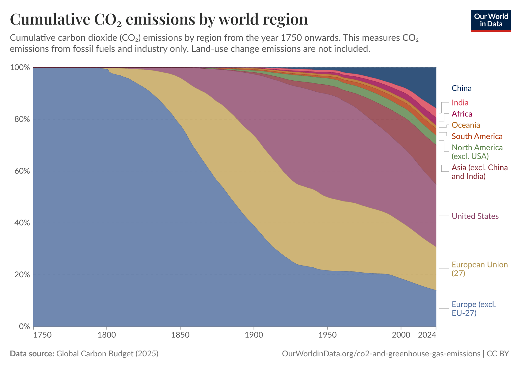
How has each region’s share of global cumulative CO2 emissions changed over time?
In the visualizations above, we focused on each country or region’s total cumulative emissions (1) in absolute terms and (2) at a single point in time: as of 2017.
In the chart, we see the change in the share of global cumulative emissions by region over time – from 1751 through to 2017.
Up until 1950, more than half of historical CO2 emissions were emitted by Europe. The vast majority of European emissions back then were emitted by the United Kingdom; as the data shows, until 1882, more than half of the world’s cumulative emissions came from the UK alone.
Over the century that followed, industrialization in the USA rapidly increased its contribution.
It’s only over the past 50 years that growth in South America, Asia, and Africa has increased these regions’ share of total contribution.
How has each country’s share of global cumulative CO2 emissions changed over time?
In the final visualization, you can explore the same cumulative CO2 emissions as you have seen above but now visualized by country. Using the timeline at the bottom of the chart you can see how contribution across the world has evolved since 1751. By clicking on a country, you can see an individual country’s cumulative contribution over time.

The map for 2017 shows the large inequalities of contribution across the world that the first treemap visualization has shown. The USA has emitted the most to date: more than a quarter of all historical CO2 — twice that of China, which is the second largest contributor.
In contrast, most countries across Africa have been responsible for less than 0.01% of all emissions over the last 266 years.
What becomes clear when we look at emissions across the world today is that the countries with the highest emissions over history are not always the biggest emitters today. The UK, for example, was responsible for only 1% of global emissions in 2017. Reductions here will have a relatively small impact on emissions at the global level – or at least fall far short of the scale of change we need. This creates tension with the argument that the largest contributors in the past should be those doing the most to reduce emissions today. This is because a large fraction of CO2 remains in the atmosphere for hundreds of years once emitted.3
This inequality is one of the main reasons why it’s so challenging to find international agreement on who should take action.
Endnotes
Carbon dioxide (CO2) emissions from fossil fuel combustion were almost zero before 1750. The United Kingdom was the world’s first industrialized nation – and first fossil-fuel CO2 emitter. In 1751, its (and global) emissions were less than 10 million tonnes – 3600 times less than global emissions today. We can conclude that emissions before 1750 were very low (and inconsequential to the numbers we compare today). You can find further information on how long historical emissions (dating back to 1751) are estimated here.
The underlying data sources for annual CO2 emissions data come from the Carbon Dioxide Analysis Center (CDIAC) and the Global Carbon Project. The cumulative figures were calculated by Our World in Data based on these annual estimate sources.
IPCC, 2013: Climate Change 2013: The Physical Science Basis. Contribution of Working Group I to the Fifth Assessment Report of the Intergovernmental Panel on Climate Change [Stocker, T.F., D. Qin, G.-K. Plattner, M. Tignor, S.K. Allen, J. Boschung, A. Nauels, Y. Xia, V. Bex and P.M. Midgley (eds.)]. Cambridge University Press, Cambridge, United Kingdom and New York, NY, USA, 1535 pp.
Cite this work
Our articles and data visualizations rely on work from many different people and organizations. When citing this article, please also cite the underlying data sources. This article can be cited as:
Hannah Ritchie (2019) - “Who has contributed most to global CO2 emissions?” Published online at OurWorldinData.org. Retrieved from: 'https://archive.ourworldindata.org/20260710-182139/contributed-most-global-co2.html' [Online Resource] (archived on July 10, 2026).BibTeX citation
@article{owid-contributed-most-global-co2,
    author = {Hannah Ritchie},
    title = {Who has contributed most to global CO2 emissions?},
    journal = {Our World in Data},
    year = {2019},
    note = {https://archive.ourworldindata.org/20260710-182139/contributed-most-global-co2.html}
}
Reuse this work freely
All visualizations, data, and articles produced by Our World in Data are completely open access under the Creative Commons BY license. You have the permission to use, distribute, and reproduce these in any medium, provided the source and authors are credited.
The data produced by third parties and made available by Our World in Data is subject to the license terms from the original third-party authors. We will always indicate the original source of the data in our documentation, so you should always check the license of any such third-party data before use and redistribution.
All of our charts can be embedded in any site.