Government Spending
What do governments spend their financial resources on?
This page was first published in October 2016. We made minor changes to the text in April 2025.
Public spending enables governments to produce and purchase goods and services in order to fulfill their objectives — such as the provision of public goods or the redistribution of resources. On this topic page, we study government spending through the lens of aggregate cross-country data on government expenditures. For readability, we use the term “spending” rather than the more technical “expenditure” to refer to all government-financed activities.
We begin with an analysis of historical trends and then move on to analyze recent developments in public spending patterns around the world.
The available long-run data shows that the role and size of governments around the world have changed drastically in the last couple of centuries. In early-industrialized countries, specifically, the historical data shows that public spending increased remarkably in the 20th century, as governments started spending more resources on social protection, education, and healthcare.
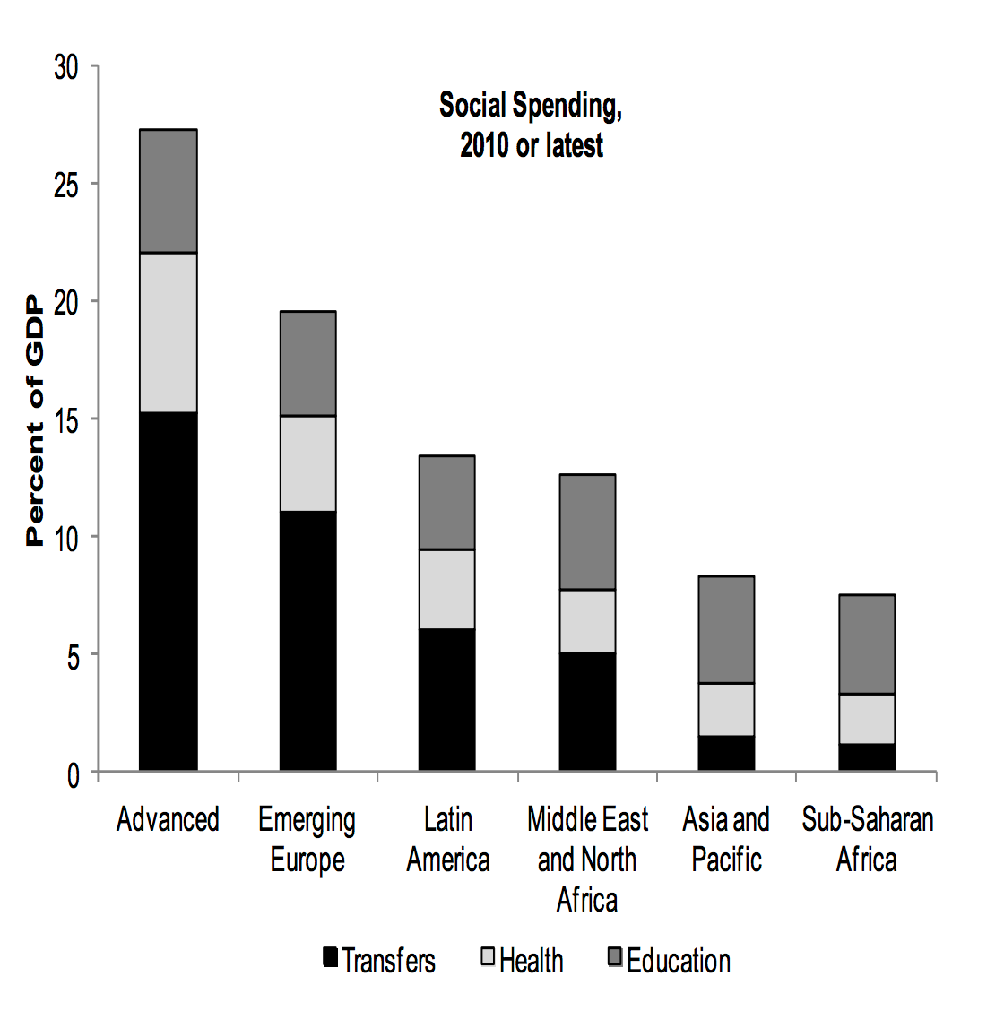
Recent data on public spending reveals substantial differences across countries. Relative to low-income countries, government spending in high-income countries tends to be much larger (both in per capita terms and as a share of GDP), and it also tends to be more focused on social spending.
Recent data on public spending also shows that governments around the world often rely on the private sector to produce and manage goods and services. Public-private partnerships, in particular, have become a popular mechanism for governments to finance, design, build, and operate infrastructure projects. In the period 2005–2010 alone, the total value of these projects in low and middle-income countries more than doubled.
Other research and writing on government spending on Our World in Data:
- Historical poverty reductions: more than a story about ‘free-market capitalism’
- Healthcare Spending
- Education Spending
Related topics
See all interactive charts on government spending ↓
History of government spending
Government spending in early-industrialised countries grew remarkably during the last century
The visualization shows the evolution of government spending as a share of Gross Domestic Product (GDP), for a selection of countries over the last century.

If we focus on early-industrialized countries, we can see that there are four broad periods in this chart. In the first period, until the First World War, spending was generally low. These low levels of public spending were just enough for governments to be concerned with basic functions, such as maintaining order and enforcing property rights.
In the second period, between 1915 and 1945, public spending was generally volatile, particularly for countries that were more heavily involved in the First and Second World Wars. Government spending as a share of national output went sharply up and down in these countries, mainly because of changes in defense spending and national incomes.
In the third period, between 1945 and 1980, public spending grew particularly fast. As we show in more detail later, this was the result of growth in social spending, which was largely made possible by historical increases in government revenues over the same period.
Since 1980, the growth of government spending has been slowing down in early-industrialized countries — and in some cases, it has gone down in relative terms. However, in spite of differences in levels, in all these countries public spending as a share of GDP is higher today than before the Second World War.
Although the increase in public spending has not been equal in all countries, it is still remarkable that growth has been a general phenomenon despite large underlying institutional differences.
At the end of the 19th century, governments in European countries spent around 10% of their GDP. In the 21st century, this figure is closer to 50% in many European countries. The increase in absolute terms — rather than the shown relative terms — is much larger since the level of GDP per capita increased substantially over this period.
These figures from the International Monetary Fund (IMF) refer to “general government” spending, when available. This includes all levels of government: central, state or regional, and local. In countries where such data is unavailable, the figures only cover the central government.
Public spending growth in early-industrialised countries was largely driven by social spending
The chart above shows that government spending in early-industrialized countries grew substantially in the 20th century. The next visualization shows that this was the result of growth, specifically in social spending.
The steep growth of social spending in the second half of the 20th century was largely driven by the expansion of public funding for healthcare and education.

Government spending across the world
Total government spending
The map shows recent estimates of total government spending across the world, measured as a share of GDP. The data comes from the International Monetary Fund (IMF) and refers to the general government, when available.
The most striking feature of the chart is the wide variation between world regions. Governments in high-income countries — particularly in Europe — tend to spend much more relative to the size of their economies than those in low-income countries.
Countries like France spend multiple times as much as countries like Ethiopia.

Spending per person
The chart shows total public spending per person across all levels of government in OECD countries.
To allow for cross-country comparability, these estimates are expressed in current international dollars — a metric that adjusts for differences in living costs between countries.
As we can see, cross-country differences are also large here. In Mexico, the government spends a fraction per person than countries like Norway.

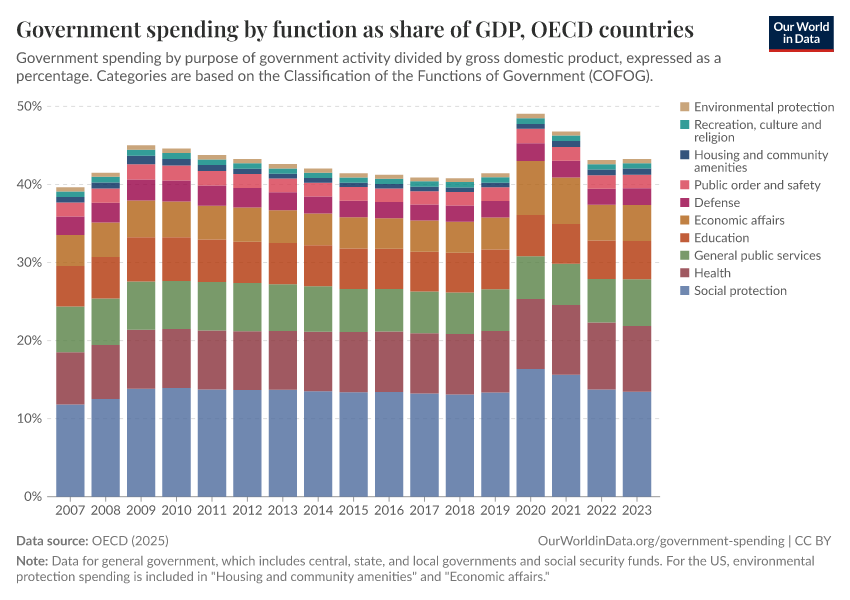
Composition of government spending
Governments differ substantially not only in size but also in priorities
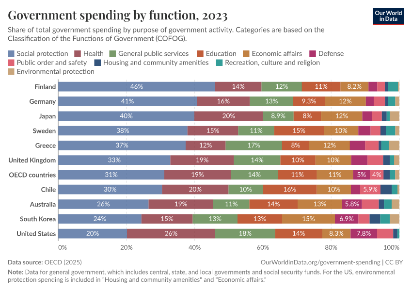
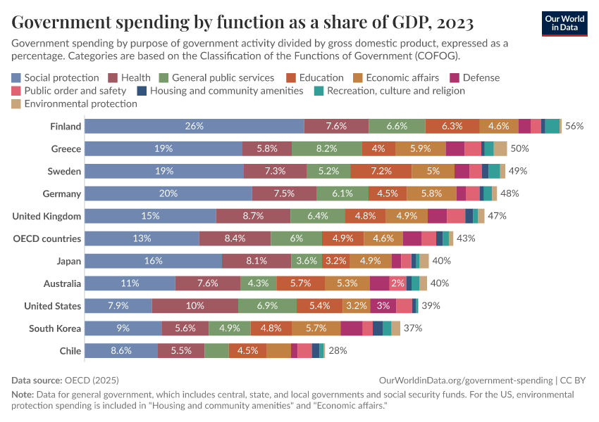
The charts above show that governments around the world vary considerably in size, even after accounting for underlying differences in economic activity and population. Here, we show that governments also differ in terms of how they prioritize spending.
The chart shows how governments divide total spending across ten categories.1 You can also see spending in these categories as a share of GDP.
There are large cross-country differences in spending priorities. On average, in OECD countries, about half of total spending goes to social protection and health. But in some countries, these categories make up a smaller share.

Looking more closely, we can also see variation within specific categories. For example, education spending in some countries is twice or three times higher than in others.
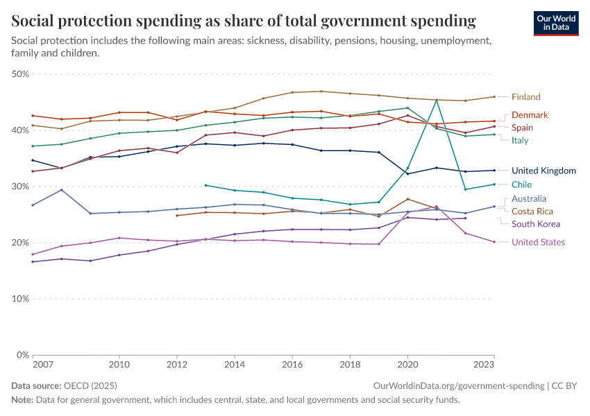
The proportion of government spending that goes towards social protection varies substantially across OECD countries
We have already pointed out that governments in high-income countries spend more resources than governments in low-income countries, both in per capita terms and as a share of their GDPs.
More so, high-income countries also have higher levels of social spending than countries with lower average incomes.2
The chart here shows spending on social protection as a share of total government spending for OECD countries. As we can see, there are also large differences across OECD countries themselves.

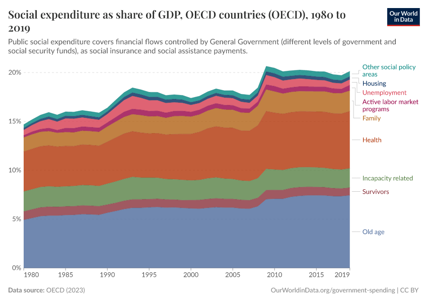
How do OECD countries distribute their allocations to social spending?
In the chart here we see the allocation of government spending (shown as a share of a country's GDP) across a range of “social spending” categories. Note that you can change which country is shown.
Social spending here is a broader concept than social protection, as shown in the chart above. It includes public spending on health services, active labor market programs, pre-primary education, and a few other areas.3
Although there are some differences across countries in how social spending is distributed, the three main priorities are predominantly the same across the OECD. Spending on old age (in the form of pensions and elderly care) typically receives the largest allocation of social spending, followed by health, with either family or incapacity-related benefits coming in third.
While the relative ranking of these priorities has remained largely unchanged since 1980, most countries now allocate a larger share of their GDP to each.

Employee compensation accounts for a large share of public spending in many low-income countries
The next chart shows the share of central government spending that goes to the compensation of government employees. Compensation of employees includes all salaries and benefits (both in cash and in-kind).
As we can see, the salaries of public servants and other government employees are an important component of public spending in most countries. Yet, the differences between countries are very large.
Throughout Europe, the share of government spending that is devoted to the compensation of government employees ranges between 5% and 20%. In contrast, throughout most of Africa, the available figures range between 30% and 50%.
These estimates have to be interpreted with caution, since central government spending can provide a somewhat distorted picture of total government spending, particularly in federal countries with large sub-national governments.

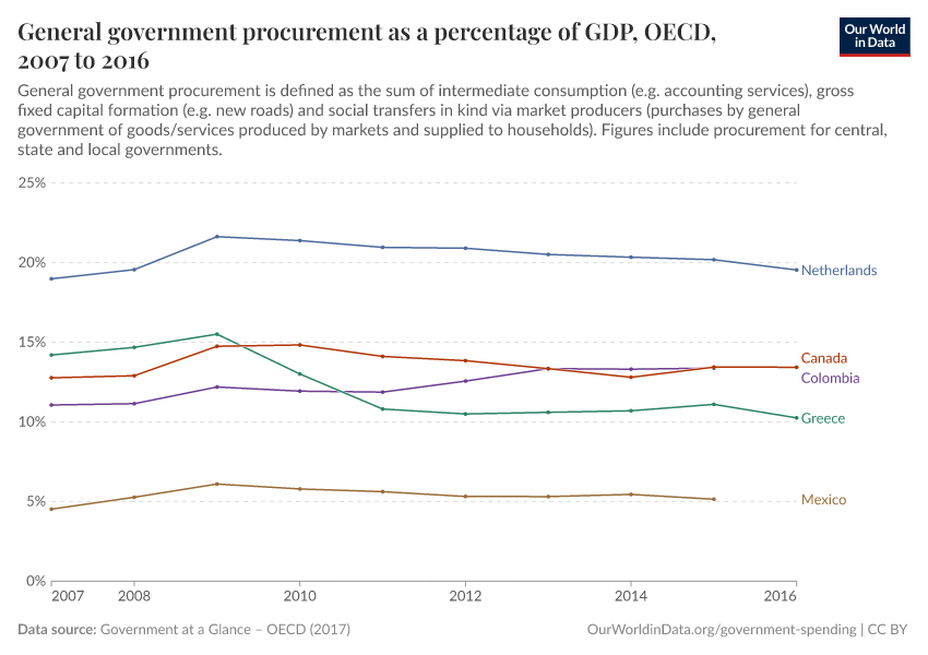
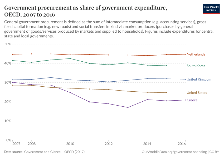
Public procurement
Procurement plays an important role in government spending
Governments around the world often rely on the private sector to produce and manage goods and services. The process through which governments purchase works, goods, and services from companies, which they have selected for this purpose, is often referred to as “public procurement.”
The chart shows the importance of public procurement in OECD countries (and partner countries providing comparable data). It shows the value of government spending on procurement as a share of GDP.
As we can see, public sector purchases from the private sector are significant in many high-income countries.

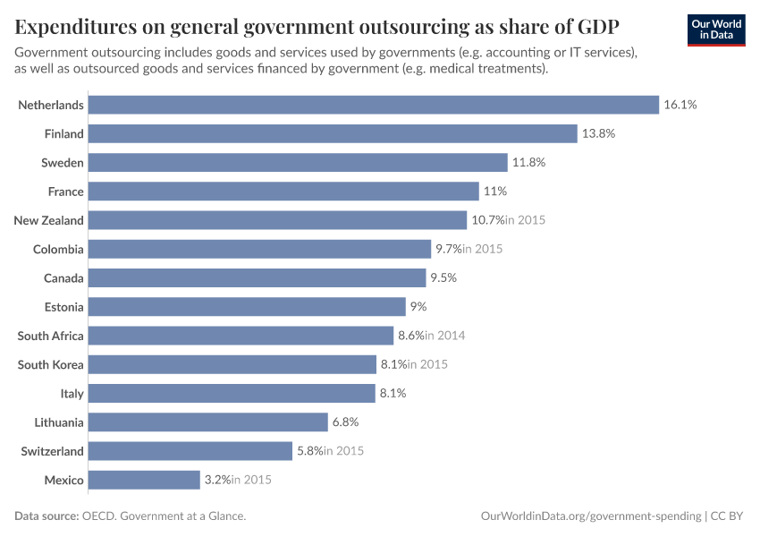
Procurement is more than subcontracting large infrastructure projects
Public procurement comprises many different forms of purchases. It includes, for example, tendering and contracting to build large infrastructural projects. However, public procurement goes beyond infrastructure. It also includes, for example, purchases of routine office supplies.
Generally speaking, the part of public procurement that does not fall within the category of gross fixed capital formation (e.g., building new roads) is referred to as “outsourcing” or “contracting out.” This form of procurement often relies on short-term contracts.
According to the definitions used by the OECD, outsourcing includes both intermediate goods used by governments (such as procurement of information technology services), or the outsourcing of final goods and services financed by governments (such as social transfers in kind via market producers paid for by governments).
The chart shows total spending on government outsourcing (accounting for both intermediate and final goods) as a share of GDP.
As we can see, governments in many high-income countries spend substantial resources via outsourcing.

Procurement of infrastructure projects has grown substantially in low and middle-income countries
Public procurement strategies available to governments are varied. Governments may choose to take responsibility for financing, designing, building, and operating infrastructure projects, and they simply outsource specific elements. Or they may decide to pursue a public-private partnership, where private actors directly take responsibility for all these aspects, from financing to operation.
The term “private finance initiative” is often used to denote a public procurement strategy whereby governments choose a private firm (or consortium) to construct and operate — and sometimes also finance — public infrastructure. These initiatives typically take the form of long-term contracts. The term “public-private partnerships” is often used to denote those private finance initiatives where the public sector retains an important participation. More information about terms and classification methodologies can be found in the resources provided by the World Bank's Private Participation in Infrastructure Database (PPID).
The chart below, from the World Bank's PPID, shows the evolution of public-private partnerships in infrastructure (PPI), aggregating projects across 137 low and middle-income countries. The blue series shows the total value of investments in US dollars (scale on the left vertical axis), while the orange series shows the total number of projects (scale on the right vertical axis).
As we can see, the last two decades have seen a marked increase in public-private partnerships in low and middle-income countries. In the World Bank's PPID Visualization Dashboard, you can explore the data in more detail. The estimates by sectors and world regions suggest that electricity and roads, specifically in South Asia and Latin America, have been the key drivers of these aggregate trends.
What is linked to government spending?
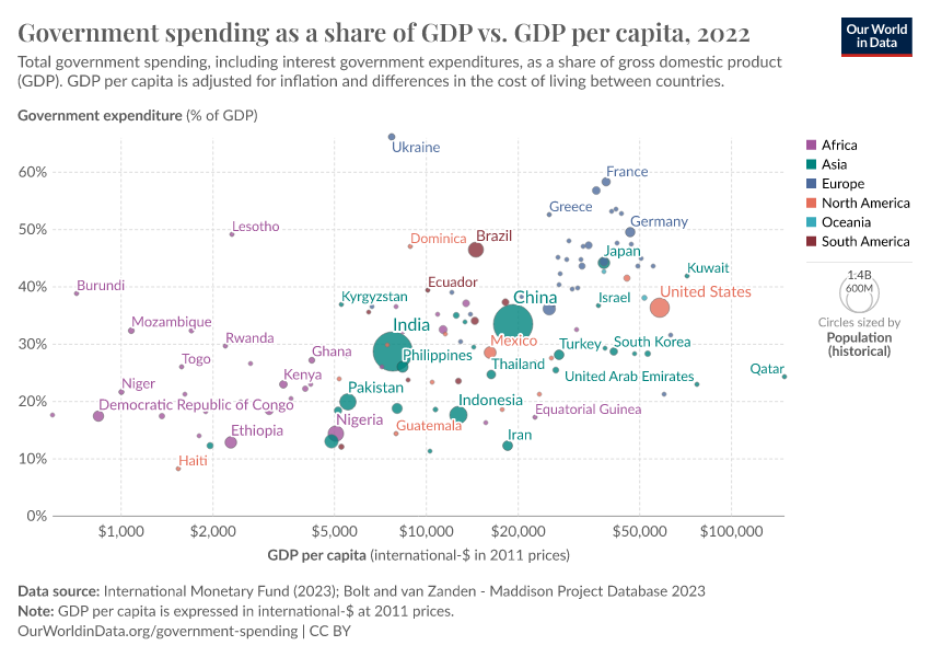
Government spending correlates with national income
We have already pointed out that government spending as a share of GDP is higher in richer countries. The visualization provides further evidence of the extent of this correlation.
The horizontal axis measures GDP per capita (after accounting for differences in purchasing power across countries), while the vertical axis measures government spending as a share of GDP. The horizontal axis is expressed in a logarithmic scale so that the correlation is easier to see — you can change to a linear scale by clicking on “Settings.”
We can see that there is a positive correlation: high-income countries tend to have larger government spending as a share of their GDP. And this pattern also holds within world regions (represented here with different colors).
This correlation likely reflects the fact that high-income countries tend to have more capacity to raise public revenues, which in turn relates to their capacity to implement efficient tax collection systems.
In our topic page on Taxation, we discuss the drivers of tax revenues in more detail.

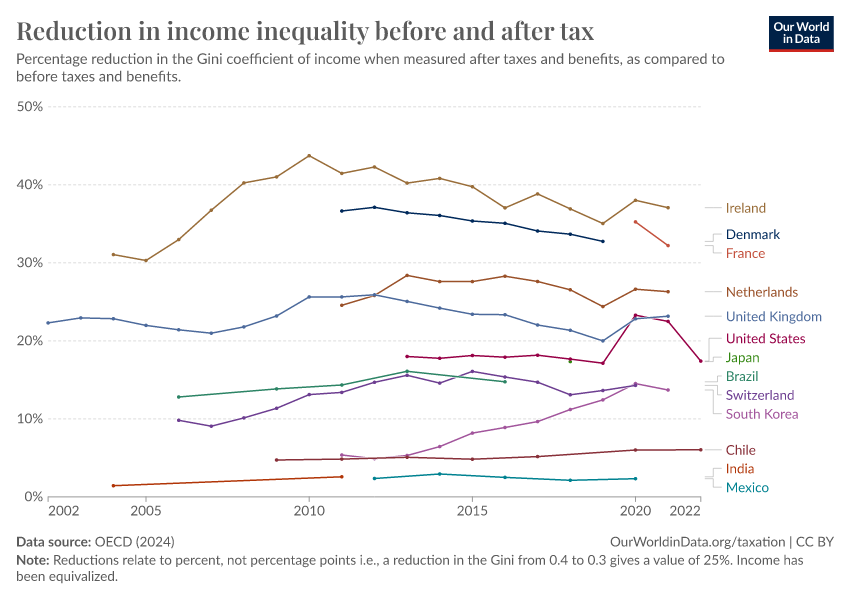
Government spending is an important instrument for reducing inequality
The visualization shows the reduction of inequality that different OECD countries achieve through taxes and transfers.
The estimates correspond to the percentage point reduction in inequality, as measured by changes in the Gini coefficients of income before and after taxes and transfers. Income “before taxes” corresponds to what is usually known as market income (wages and salaries, self-employment income, capital, and property income), while income after taxes and transfers corresponds to disposable income (market income, plus social security, cash transfers, and private transfers, minus income taxes).
The data shows that across the 45 countries covered, taxes and transfers lower income inequality by about one-quarter on average, though there is considerable variation between countries.
Generally speaking, countries that achieve the largest redistribution through taxes and transfers tend to be those with the lowest after-tax inequality.

Key Charts on Government Spending
See all charts on this topic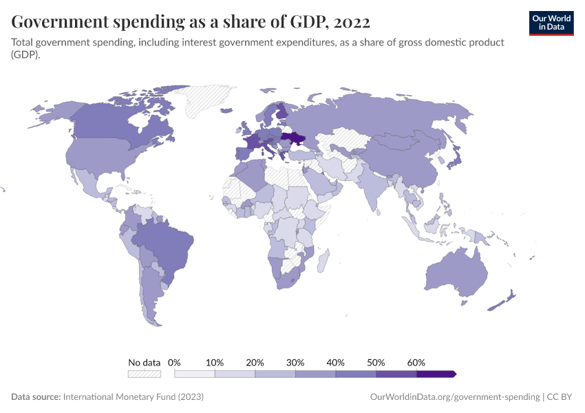


Featured Data on Government Spending
Endnotes
These categories are based on the Classification of the Functions of Government (COFOG), which groups spending by the purpose or function of the expenditure, such as health, education, and social protection.
Bastagli, F., Coady, D., & Gupta, S. (2012). Income inequality and fiscal policy (No. 12/08R). International Monetary Fund.
This data comes from the OECD Social Expenditure Database (SOCX). It includes what governments spend on social protection — as defined in the Classification of the Functions of Government (COFOG) — but also covers other areas that COFOG lists separately. The full list of social expenditures included is available in the OECD SOCX Manual.
Cite this work
Our articles and data visualizations rely on work from many different people and organizations. When citing this topic page, please also cite the underlying data sources. This topic page can be cited as:
Esteban Ortiz-Ospina, Bertha Rohenkohl, Pablo Arriagada, and Max Roser (2016) - “Government Spending” Published online at OurWorldinData.org. Retrieved from: 'https://ourworldindata.org/government-spending' [Online Resource]BibTeX citation
@article{owid-government-spending,
    author = {Esteban Ortiz-Ospina and Bertha Rohenkohl and Pablo Arriagada and Max Roser},
    title = {Government Spending},
    journal = {Our World in Data},
    year = {2016},
    note = {https://ourworldindata.org/government-spending}
}
Reuse this work freely
All visualizations, data, and code produced by Our World in Data are completely open access under the Creative Commons BY license. You have the permission to use, distribute, and reproduce these in any medium, provided the source and authors are credited.
The data produced by third parties and made available by Our World in Data is subject to the license terms from the original third-party authors. We will always indicate the original source of the data in our documentation, so you should always check the license of any such third-party data before use and redistribution.
All of our charts can be embedded in any site.