Trade and Globalization
How have international trade and globalization changed over time? What is the structure of global trade today, and what is its impact?
This page was first published in 2014. We made changes to the text and added several new charts in December 2025.
On this topic page, you can find data, visualizations, and research on historical and current patterns of international trade, as well as discussions of their origins and effects.
The rise of global trade
One of the most important developments of the last century has been the integration of national economies into a global economic system. This process of integration, often called globalization, has resulted in a remarkable growth in trade between countries.
One way to see this growth in the data is to track how exports and imports have changed over time. The chart here does this by showing the volume of world trade since 1800, adjusting the figures for inflation and indexing them to their 1800 values.
What the chart shows is the long-run expansion of international trade: the average volume of imports and exports in 2024 was more than two thousand times larger than in 1800, after adjusting for inflation.1

The first and second waves of globalization
To understand the rise of globalization and to place more recent international trade growth in context, we need more granular long-run data.
The long-run data we present here comes from the work of historians and other researchers who draw on historical sources such as archival customs records, early statistical yearbooks, and other primary documents. These historical estimates give us a broad view of how global trade evolved, but they are harder to update, which is why not all charts (and not all series within some charts) extend to the present. If you want to explore up-to-date figures on current trading patterns, you can find them in the section “The scale and composition of global trade today” below.
What these long-run estimates allow us to see is that globalization did not grow along a steady, continuous path. Instead, it expanded in two major waves.
The first wave of globalization started in the 19th century, and the second one after World War II
The chart below presents a compilation of available historical trade estimates, showing the evolution of world exports and imports as a share of global economic output.
What is shown is the "trade openness index". This index is defined as the sum of world exports and imports, divided by global GDP. Each series corresponds to a different source. The higher the index, the higher the influence of trade transactions on global economic activity.2
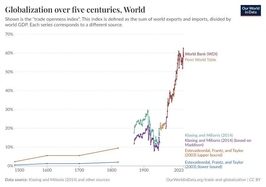
As the chart shows, until 1800, there was a long period characterized by persistently low international trade — globally the index never exceeded 10% before 1800.
This then changed over the course of the 19th century, when technological advances triggered a period of marked growth in world trade — the so-called “first wave of globalization”.
This first wave came to an end with the beginning of World War I, when the decline of liberalism and the rise of nationalism led to a slump in international trade. In the chart, we see a large drop in the interwar period.
After World War II, trade started growing again. This new and ongoing wave of globalization has seen international trade grow faster than ever before. Today, the sum of exports and imports across nations amounts to more than 50% of the value of total global output.
The first wave of globalization was marked by the rise and collapse of intra-European trade
The following visualization shows a detailed overview of Western European exports by destination. Figures correspond to export-to-GDP ratios (i.e., the sum of the value of exports from all Western European countries, divided by the total GDP in this region).
This chart shows that growth in Western European trade throughout the 19th century was largely driven by trade within the region. In the period 1830–1900, intra-European exports went from 1% of GDP to 10% of GDP, and this meant that the relative weight of intra-European exports almost doubled over the period. However, this process of European integration then collapsed sharply in the interwar period.

After World War II, trade within Europe rebounded, and from the 1990s onwards exceeded the highest levels of the first wave of globalization. In addition, Western Europe then started to increasingly trade with Asia, the Americas, and, to a smaller extent, Africa and Oceania.
The next chart, using data from Broadberry and O'Rourke (2010), shows another perspective on the integration of the global economy and plots the evolution of three indicators measuring integration across different markets — specifically goods, labor, and capital markets.4
The indicators in this chart are indexed, so they show changes relative to the levels of integration observed in 1900. This gives us another perspective on how quickly global integration collapsed with the two World Wars.5
The second wave of globalization was enabled by technology
The worldwide expansion of trade after World War II was largely possible because of reductions in transaction costs stemming from technological advances, such as the development of commercial civil aviation, the improvement of productivity in the merchant marines, and the democratization of the telephone as the main mode of communication. This chart shows that, at the global level, costs across these three variables have been going down since 1930.
Reductions in transaction costs impacted not only the volumes of trade but also the types of exchanges that were possible and profitable.
The first wave of globalization was characterized by inter-industry trade. This means that countries exported goods that were very different from what they imported. For example, England exchanged machines for Australian wool and Indian tea. As transaction costs went down, this changed. In the second wave of globalization, we see a rise in intra-industry trade (i.e., the exchange of broadly similar goods and services becoming more common). France, for example, now both imports and exports machines to and from Germany.
The following visualization, from the UN World Development Report (2009), plots the fraction of total world trade that is accounted for by intra-industry trade, by type of goods. As we can see, intra-industry trade has been going up for primary, intermediate, and final goods.
This pattern of trade is important because the scope for specialization increases if countries can exchange intermediate goods (e.g., auto parts) for related final goods (e.g., cars).
The two waves of globalization unfolded differently across countries
After examining the global trends behind the first and second waves of globalization, we can look at how these patterns played out within individual countries.
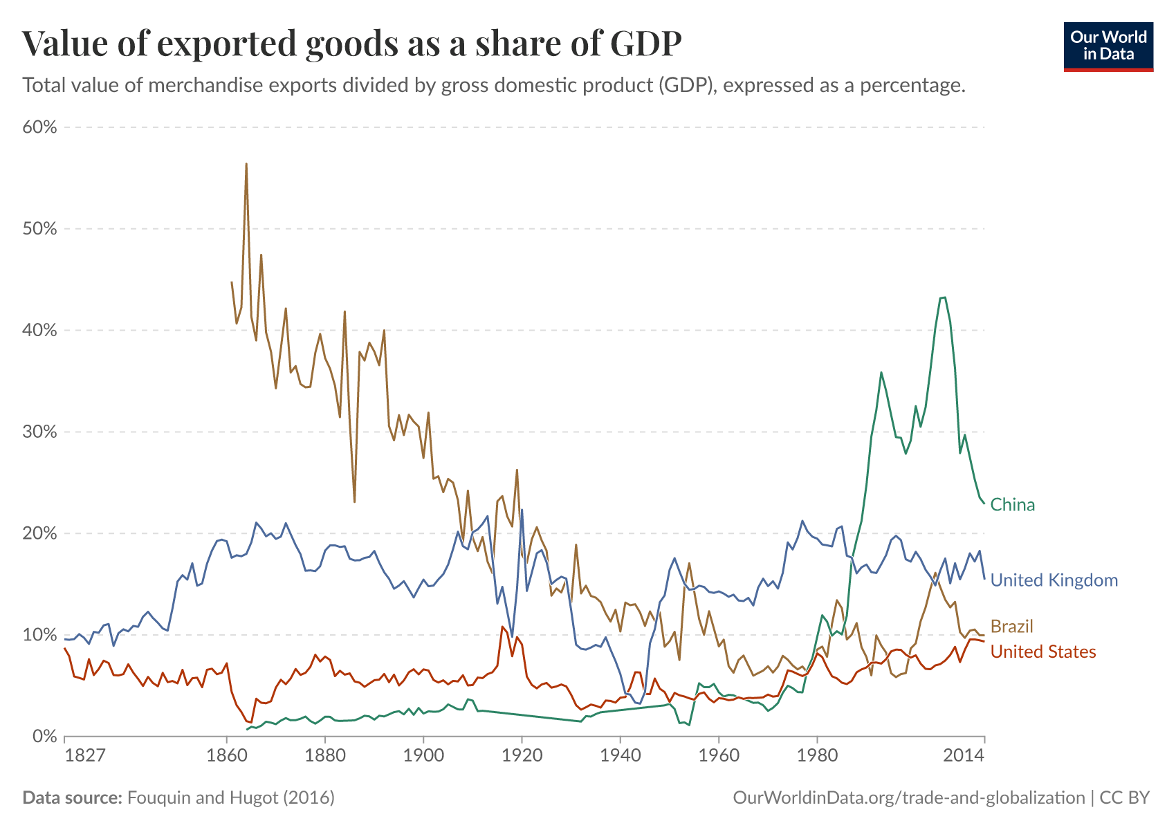
The chart here plots long-run estimates of merchandise exports as a share of GDP. You can edit the countries and regions selected; each country tells a different story.7
The same historical sources also allow us to explore where countries sent their exports over time. This breakdown by destination provides a complementary view of globalization: not only did countries integrate at different moments, but the partners they traded with also changed in different ways.
The scale and composition of global trade today
To understand how globalization looks today, we now turn from long-run historical sources to data that national statistical offices update regularly. These figures are derived from modern trade records, customs data, and international databases. With this data, we can track current patterns in trade volumes, trade composition, and trading partners. (You can read more about data sources and measurement issues at the end of this page.)
How much do countries trade?
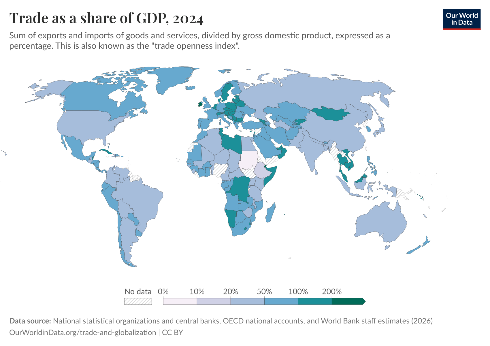
Trade openness
Trade openness (exports plus imports as a share of gross domestic product) shows how large a country’s cross-border flows are relative to the size of its domestic economy. The map here plots this metric and highlights large cross-country differences. International trade is much smaller relative to the domestic economy in the US than in almost all European countries, for example. This is partly explained by the large volume of trade that takes place within the European Union.
If you press the play button on the map, you can see how trade openness has changed over time across all countries.
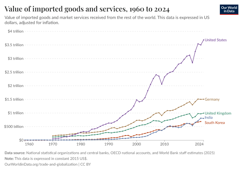
Exports and imports in dollars
Expressing the value of trade as a share of GDP tells us the importance of trade in relation to the size of economic activity. Let's now take a look at trade in monetary terms. This tells us the importance of trade in absolute, rather than relative terms.
The chart shows the value of exports (goods and services) in US dollars, country by country, after adjusting for inflation.
As you can see, the rise of global trade is more pronounced in these monetary inflation-adjusted figures than in the previous charts showing shares of GDP. This is not surprising: most countries today produce more than they did a couple of decades ago, and at the same time, they trade more of what they produce.

What do countries trade?
The role of food in countries’ export baskets
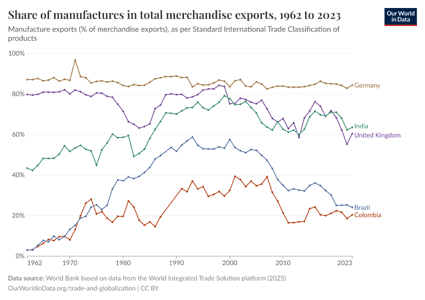
As trade has expanded over the last half-century, the composition of what countries export has also changed. One clear pattern is the long-run decline in the share of food products in total merchandise exports.
The next chart plots the share of food exports in relation to each country's total merchandise exports. These figures, published by the World Bank, correspond to the Standard International Trade Classification, in which “food” includes, among other goods, live animals, beverages, tobacco, coffee, oils, and fats.

The chart shows two broad trends. First, in most countries, food has become a smaller share of merchandise exports relative to the 1960s. There are some exceptions (for example, Germany’s share is slightly higher today than it was then), but the dominant pattern across countries is a decline. You can explore the interactive chart to see the trajectories for other countries, or select the Map view for a full overview across all countries for any given year.
Second, the decline in the share of food within total merchandise exports has generally been larger in middle and lower-income countries than in high-income ones. This is because many of these countries have diversified their economies over the past few decades, shifting from agriculture to manufacturing and services, so food now accounts for a smaller portion of what they sell abroad.
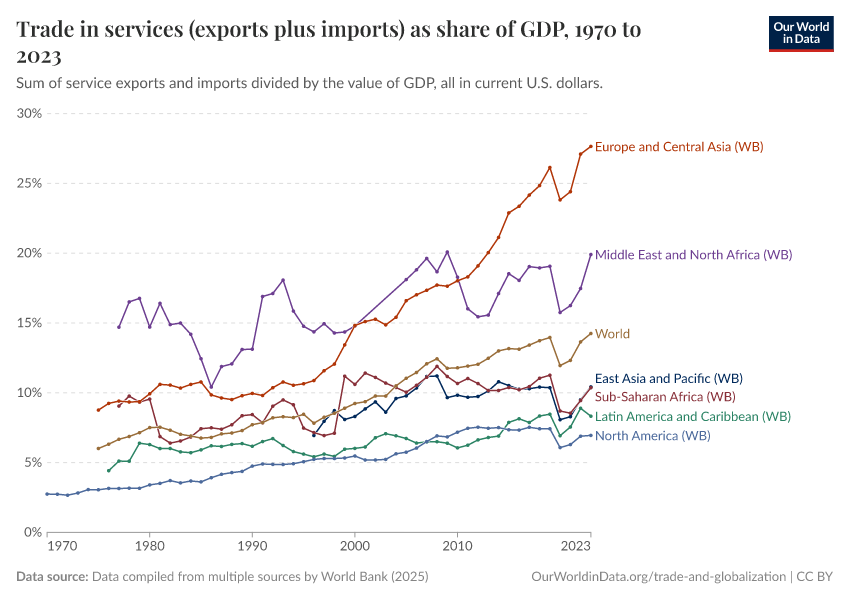
Trade in goods vs. trade in services
Trade transactions include goods (tangible products that are physically shipped across borders by road, rail, water, or air) and services (intangible commodities, such as tourism, financial services, and legal advice).
Many traded services make merchandise trade easier or cheaper — for example, shipping services, or insurance and financial services.
Trade in goods has been happening for millennia, while trade in services is a relatively recent phenomenon.
In some countries, services are today an important driver of trade: in the UK, services account for around half of all exports, and in the Bahamas, almost all exports are services.
In other countries, such as Nigeria and Venezuela, services account for a small share of total exports.
Globally, trade in goods accounts for the majority of trade transactions. But as this chart shows, the share of services in total global exports has been increasing in recent decades.

Trade partnerships
A natural complement to understanding how much countries trade is understanding who they trade with. Trade partnerships shape supply chains, influence economic and political dependencies, and reveal broader shifts in global integration. Here, we look at how these relationships have evolved and how today’s trade connections differ from those of the past.
Bilateral trade
A starting point for understanding international trade relationships is to look at whether trade is reciprocal.
Let's consider all pairs of countries that engage in trade around the world. We find that in the majority of cases, there is a bilateral relationship today: most countries that export goods to a country also import goods from the same country. The next interactive chart shows this.8
In the chart, all possible country pairs are partitioned into three categories: the top portion represents the fraction of country pairs that do not trade with one another; the middle portion represents those that trade in both directions (they export to one another); and the bottom portion represents those that trade in one direction only (one country imports from, but does not export to, the other country).
As we can see, bilateral trade has become increasingly common (the middle portion has grown substantially). However, many countries still do not trade with each other at all.

South-South trade
Another way to look at trade relationships is to examine which groups of countries trade with one another. The next visualization shows the share of world merchandise trade that corresponds to exchanges between today's rich nations and the rest of the world.
As we can see, up until the Second World War, the majority of trade transactions involved exchanges between this small group of rich countries. But this has changed quickly since the early 2000s, and by 2014, trade between non-rich countries was just as important as trade between rich countries.

China’s changing role in global trade
China is now the top import partner for most countries, measured by the value of trade
Over the past two decades, China’s role in global trade has expanded substantially. It has become a central hub, particularly through growing relationships with many lower and middle-income countries.
The map below shows how China ranks as a source of imports into each country. A rank of 1 means that China is the largest source of merchandise goods (by value) that a country buys from abroad.
In 2024, China was the top source of imported goods for around 40% of countries worldwide. This includes nearly all of Asia, much of Africa and Latin America, and parts of Europe. Using the slider, you can see how this has changed over time. In many countries, China has overtaken the United States as the largest origin of their imported goods. This shift has occurred relatively recently, mainly over the past two decades.
One important point not visible from the map, but clear in the underlying data, is the magnitude of China’s lead. In more than half of the countries where China ranks first, the value of imports from China is at least twice that of imports from the United States, which is often the second-ranked partner.9 As such, China’s dominance as the top import partner is not marginal.
In Africa and South America, the shift toward China has been especially sharp
China’s dominance in merchandise trade is the result of a large change that has taken place in just a few decades. This change has been especially large in Africa and South America.
In 1990, most African countries imported mainly from Europe, and most South American imports came from North America. Today, Asia is the top source of imports for both regions, primarily due to the rapid growth of trade with China.
Let’s look at two countries that illustrate this shift, Ethiopia and Colombia.
Ethiopia, home to around 130 million people, is one of Africa’s largest countries and has experienced rapid economic growth in recent decades. In the early 1990s, over 40% of Ethiopia’s imports came from Europe, while very little came from China. Since then, the roles of China and Europe have almost reversed. Imports from China now account for one-third of Ethiopia’s total imported goods.10

Ethiopia’s experience reflects a broader shift across Africa, as shown in the regional data.
A similar transformation has taken place in South America. Colombia offers a representative case: in 1990, most imported goods came from North America, and imports from China were minimal. Three decades later, Colombia imports slightly more from Asia than from North America, with much of this increase coming from China.11
Unlike in Africa, where the share of imports from Europe has declined, in South America, it is primarily North America’s share that has gone down.
But these figures represent relative shares, not absolute declines. Trade with Europe and North America has not disappeared — in fact, it has grown in nominal terms. What changed is the balance: imports from China have expanded even faster, enough to overtake long-established partners within just a few decades.

In most countries, the value of imported goods from China is relatively small compared with the size of their economy
We’ve seen that China is the top source of imports for many countries. But this tells us only how China compares with other trading partners. It does not tell us how large these imports are relative to the size of each country’s economy.
That’s what this map shows. It plots the total value of merchandise imports from China as a share of each country’s GDP. It shows us that these imports are relatively small when compared to the overall size of the importing economy.
Take the Netherlands as an example: China is the country’s leading source of imports. But compared to the size of the whole Dutch economy, this is a relatively small amount: about 10% as a share of GDP.12 And as the map shows, the Netherlands is at the high end — largely because it imports a lot overall. In many countries, imports from China account for much less than 10% of GDP.
There are a few reasons for this. First, even if China is the leading partner, most countries still import from a wide range of places. And second, in most countries, the economic value produced domestically is larger than the total value of the goods they import.

Trade and economic efficiency
The raw correlation between trade and growth
Over the last couple of centuries, the world economy has experienced sustained positive economic growth. Over the same period, this process of economic growth has been accompanied by even faster growth in global trade.
In a similar way, if we look at country-level data from the last half-century, we find that there is also a correlation between economic growth and trade: countries with higher rates of GDP growth also tend to have higher rates of growth in trade as a share of output.
Is this statistical association between economic output and trade causal?
Among the potential growth-enhancing factors that may come from greater global economic integration are: competition (firms that fail to adopt new technologies and cut costs are more likely to fail and be replaced by more dynamic firms); economies of scale (firms that can export to the world face larger demand, and under the right conditions, they can operate at larger scales where the price per unit of product is lower); learning and innovation (firms that trade gain more experience and exposure to develop and adopt technologies and industry standards from foreign competitors).13
Does the data support these mechanisms? Let's take a look at the available empirical evidence.
Evidence from cross-country differences in trade, growth, and productivity
When it comes to academic studies estimating the impact of trade on GDP growth, the most cited paper is Frankel and Romer (1999).14
In this study, Frankel and Romer used geography as a proxy for trade to estimate the impact of trade on growth. This is a classic example of the so-called instrumental variables approach. The idea is that a country's geography is assumed to affect national income mainly through trade. So if we observe that a country's distance from other countries is a powerful predictor of economic growth (after accounting for other characteristics), then the conclusion is drawn that it must be because trade has an effect on economic growth. Following this logic, Frankel and Romer find evidence of a strong impact of trade on economic growth.
Other papers have applied the same approach to richer cross-country data, and they have found similar results. A key example is Alcalá and Ciccone (2004).15
This body of evidence suggests trade is indeed one of the factors driving national average incomes (GDP per capita) and macroeconomic productivity (GDP per worker) over the long run.16
Evidence from changes in labor productivity at the firm level
If trade is causally linked to economic growth, we would expect that trade liberalization episodes also lead to firms becoming more productive in the medium and even short run. There is evidence suggesting this is often the case.
Pavcnik (2002) examined the effects of liberalized trade on plant productivity in the case of Chile, during the late 1970s and early 1980s. She found a positive impact on firm productivity in the import-competing sector. She also found evidence of aggregate productivity improvements from the reshuffling of resources and output from less to more efficient producers.17
Bloom, Draca, and Van Reenen (2016) examined the impact of rising Chinese import competition on European firms over the period 1996-2007 and obtained similar results. They found that innovation increased more in those firms most affected by Chinese imports. They also found evidence of efficiency gains through two related channels: innovation increased, and new technologies were adopted within firms, and aggregate productivity also increased because employment was reallocated towards more technologically advanced firms.18
Trade improves more than economic efficiency
Overall, the available evidence suggests that trade liberalization does improve economic efficiency. This evidence comes from different political and economic contexts and includes both micro and macro measures of efficiency.
This result is important because it shows that there are gains from trade. But of course, efficiency is not the only relevant consideration here. As we discuss in a companion article, the efficiency gains from trade are not generally equally shared by everyone. The evidence from the impact of trade on firm productivity confirms this: "reshuffling workers from less to more efficient producers" means closing down some jobs in some places. Because distributional concerns are real, it is important to promote public policies — such as unemployment benefits and other safety-net programs — that help redistribute the gains from trade.
Trade and incomes
The conceptual link between trade and household welfare
When a country opens up to trade, the demand and supply of goods and services in the economy shift. As a consequence, local markets respond, and prices change. This has an impact on households, both as consumers and as wage earners.
The implication is that trade has an impact on everyone. It's not the case that the effects are restricted to workers from industries in the trade sector, or to consumers who buy imported goods. The effects of trade extend to everyone because markets are interlinked, so imports and exports have knock-on effects on all prices in the economy, including those in non-traded sectors.
Economists usually distinguish between "general equilibrium consumption effects" (i.e. changes in consumption that arise from the fact that trade affects the prices of non-traded goods relative to traded goods) and "general equilibrium income effects" (i.e. changes in wages that arise from the fact that trade has an impact on the demand for specific types of workers, who could be employed in both the traded and non-traded sectors).
Considering all these complex interrelations, it's not surprising that economic theories predict that not everyone will benefit from international trade in the same way. The distribution of the gains from trade depends on what different groups of people consume, and which types of jobs they have, or could have.19
The link between trade, jobs, and wages
Evidence from Chinese imports and their impact on factory workers in the US
The most famous study looking at this question is Autor, Dorn, and Hanson (2013): "The China syndrome: Local labor market effects of import competition in the United States".20
In this paper, Autor and coauthors examined how local labor markets changed in the parts of the country most exposed to Chinese competition. They found that rising exposure increased unemployment, lowered labor force participation, and reduced wages. Additionally, claims for unemployment and healthcare benefits also increased in more trade-exposed labor markets.
The visualization here is one of the key charts from their paper. It's a scatter plot of cross-regional exposure to rising imports, against changes in employment. Each dot is a small region (a “commuting zone” to be precise). The vertical position of the dots represents the percent change in manufacturing employment for the working-age population, and the horizontal position represents the predicted exposure to rising imports (exposure varies across regions depending on the local weight of different industries).
The trend line in this chart shows a negative relationship: more exposure goes along with less employment. There are large deviations from the trend (there are some low-exposure regions with big negative changes in employment). Still, the paper provides more sophisticated regressions and robustness checks, and finds that this relationship is statistically significant.
This result is important because it shows that the labor market adjustments were large. Many workers and communities were affected over a long period of time, with newer work by Autor and colleagues (2021) showing that the negative effects persisted for more than a decade after the initial shock.21
But it's also important to keep in mind that Autor and colleagues are only giving us a partial perspective on the total effect of trade on employment. In particular, comparing changes in employment at the regional level misses the fact that firms operate in multiple regions and industries at the same time. Indeed, Ildikó Magyari found evidence suggesting the Chinese trade shock provided incentives for US firms to diversify and reorganize production.22
So companies that outsourced jobs to China often ended up closing some lines of business, but at the same time expanded other lines elsewhere in the US. This means that job losses in some regions subsidized new jobs in different parts of the country.
On the whole, Magyari finds that although Chinese imports may have reduced employment within some establishments, these losses were more than offset by gains in employment within the same firms in other places. This is no consolation to people who lost their jobs. But it is necessary to add this perspective to the simplistic story of "trade with China is bad for US workers".
Evidence from the expansion of trade in India and its impact on poverty reduction
Another important paper in this field is Topalova (2010): "Factor immobility and regional impacts of trade liberalization: Evidence on poverty from India".23
In this paper, Topalova examines the impact of trade liberalization on poverty across different regions in India, using the sudden and extensive change in India's trade policy in 1991. She finds that rural areas more exposed to liberalization experienced a slower decline in poverty and lower consumption growth.
Analyzing the mechanisms underlying this effect, Topalova finds that liberalization had a stronger negative impact among the least geographically mobile at the bottom of the income distribution and in places where labor laws deterred workers from reallocating across sectors.
The evidence from India shows that (i) discussions that only look at "winners" in poor countries and "losers" in rich countries miss the point that the gains from trade are unequally distributed within both sets of countries; and (ii) context-specific factors, like worker mobility across sectors and geographic regions, are crucial to understand the impact of trade on incomes.
The link between trade and the cost of living
The fact that trade negatively affects labor market opportunities for specific groups of people does not necessarily imply that trade has a negative aggregate effect on household welfare. This is because, while trade affects wages and employment, it also affects the prices of consumption goods. So households are affected both as consumers and as wage earners.
Most studies focus on the earnings channel and try to approximate the impact of trade on welfare by looking at how much wages can buy, using as a reference the changing prices of a fixed basket of goods.
This approach is problematic because it fails to consider welfare gains from increased product variety and obscures complicated distributional issues, such as the fact that poor and rich individuals consume different baskets, so they benefit differently from changes in relative prices.27
Ideally, studies looking at the impact of trade on household welfare should rely on fine-grained data on prices, consumption, and earnings. This is the approach followed in Atkin, Faber, and Gonzalez-Navarro (2018): "Retail globalization and household welfare: Evidence from Mexico".28
Atkin and coauthors use a uniquely rich dataset from Mexico and find that the arrival of global retail chains led to reductions in the incomes of traditional retail sector workers but had little impact on average municipality-level incomes or employment, and led to lower costs of living for both rich and poor households.
The chart here shows the estimated distribution of total welfare gains across the household income distribution (the light-gray lines correspond to confidence intervals). These are proportional gains expressed as a percent of initial household income.
As we can see, there is a net positive welfare effect across all income groups. Still, these improvements in welfare are regressive, in the sense that richer households gain proportionally more (about 7.5% gain compared to 5%).29
Evidence from other countries confirms this is not an isolated case — the expenditure channel really seems to be an important and understudied source of household welfare. Giuseppe Berlingieri, Holger Breinlich, and Swati Dhingra, for example, investigated the consumer benefits from trade agreements implemented by the EU between 1993 and 2013. They found that these trade agreements increased the quality of available products, which translated into a cumulative reduction in consumer prices equivalent to savings of €24 billion per year for EU consumers.30
Implications of trade’s distributional effects
The available evidence shows that, for some groups of people, trade has a negative effect on wages and employment opportunities; at the same time, it has a large positive impact via lower consumer prices and increased product availability.
Two points are worth emphasizing.
For some households, the net effect is positive; that's not always the case. In particular, workers who lose their jobs can be affected for extended periods of time, so the positive effect via lower prices is not enough to compensate them for the reduction in earnings.
On the whole, if we aggregate changes in welfare across households, the net effect is usually positive. But this is hardly a consolation for the worse off.
This highlights a complex reality: There are aggregate gains from trade, but there are also real distributional concerns. Even if trade is not a major driver of income inequalities, it's important to keep in mind that public policies, such as unemployment benefits and other safety-net programs, can and should help redistribute the gains from trade.
Determinants of international trade
Comparative advantage
What is “comparative advantage” and why does it matter to understand trade?
In economic theory, the “economic cost” — or the “opportunity cost” – of producing a good is the value of everything you need to give up to make that good.
Economic costs include physical inputs (the value of the stuff you use to produce the good), plus forgone opportunities (when you allocate scarce resources to a task, you give up alternative uses of those resources).
A country or a person is said to have a “comparative advantage” if it can produce something at a lower opportunity cost than its trade partners.
The forgone opportunities of production are key to understanding this concept. It is precisely this that distinguishes absolute advantage from comparative advantage.
To see the difference between comparative and absolute advantage, consider a commercial aviation pilot and a baker. Suppose the pilot is an excellent chef, and she can bake just as well, or even better than the baker. In this case, the pilot has an absolute advantage in both tasks. Yet the baker probably has a comparative advantage in baking, because the opportunity cost of baking is much higher for the pilot.
The freely available economics textbook The Economy: Economics for a Changing World explains this as follows: "A person or country has comparative advantage in the production of a particular good, if the cost of producing an additional unit of that good relative to the cost of producing another good is lower than another person or country’s cost to produce the same two goods."
At the individual level, comparative advantage explains why you might want to delegate tasks to someone else, even if you can do those tasks better and faster than they can. This may sound counterintuitive, but it is not: If you are good at many things, it means that investing time in one task has a high opportunity cost, because you are not doing the other amazing things you could be doing with your time and resources. So, at least from an efficiency point of view, you should specialize in what you are best at, and delegate the rest.
The same logic applies to countries. Broadly speaking, the principle of comparative advantage postulates that all nations can gain from trade if each specializes in producing what they are relatively more efficient at producing, and imports the rest: “do what you do best, import the rest”.31
In countries with a relative abundance of certain factors of production, the theory of comparative advantage predicts that they will export goods that rely heavily upon those factors: a country typically has a comparative advantage in those goods that use its abundant resources. Colombia exports bananas to Europe because it has comparatively abundant tropical weather.
Is there empirical support for comparative-advantage theories of trade?
The empirical evidence suggests that the principle of comparative advantage does help explain trade patterns. Bernhofen and Brown (2004), for instance, provide evidence using the experience of Japan.32 Specifically, they exploit Japan’s dramatic nineteenth-century move from a state of near complete isolation to wide trade openness.
The graph here shows the price changes of the key tradable goods after the opening up to trade. It presents a scatter diagram of the net exports in 1869 graphed in relation to the change in prices from 1851–53 to 1869. As we can see, this is consistent with the theory: after opening to trade, the relative prices of major exports such as silk increased (Japan exported what was cheap for them to produce and which was valuable abroad), while the relative price of imports such as sugar declined (they imported what was relatively more difficult for them to produce, but was cheap abroad).
Trade and geographic proximity
The resistance that geography imposes on trade has long been studied in the empirical economics literature. The main conclusion is that trade intensity is strongly linked to geographic distance.
The visualization, from Eaton and Kortum (2002), graphs “normalized import shares” against distance.33 Each dot represents a country pair from a set of 19 OECD countries, and both the vertical and horizontal axes are expressed on logarithmic scales.
The “normalized import shares” in the vertical axis provide a measure of how much each country imports from different partners (see the paper for details on how this is calculated and normalized), while the distance in the horizontal axis corresponds to the distance between central cities in each country (see the paper and references therein for details on the list of cities). As we can see, there is a strong negative relationship. Trade diminishes with distance. Through econometric modeling, the paper shows that this relationship is not just a correlation driven by other factors: their findings suggest that distance imposes a significant barrier to trade.
The fact that trade diminishes with distance is also corroborated by data on trade intensity within countries. The visualization here shows, through a series of maps, the geographic distribution of French firms that export to France's neighboring countries. The colors reflect the percentage of firms that export to each specific country.
As we can see, the share of firms exporting to each of the corresponding neighbors is the largest close to the border. The authors also show in the paper that this pattern holds for the value of individual-firm exports — trade value decreases with distance to the border.
Institutions
Conducting international trade requires both financial and non-financial institutions to support transactions. Some of these institutions are fairly obvious (e.g., law enforcement), but some are less obvious. For example, the evidence shows that producers in exporting countries often need credit in order to engage in trade.
The scatter plot, from Manova (2013), shows the correlation between levels in private credit (specifically exporters’ private credit as a share of GDP) and exports (average log bilateral exports across destinations and sectors).35 As can be seen, financially developed economies — those with more dynamic private credit markets — typically outperform exporters with less evolved financial institutions.
Other studies have shown that country-specific institutions, like the knowledge of foreign languages, for instance, are also important to promote foreign relative to domestic trade.36
Increasing returns to scale
The concept of comparative advantage predicts that if all countries had identical endowments and institutions, there would be little incentive for specialization because the opportunity cost of producing any good would be the same in every country.
So you may wonder: why is it then the case that in the last few years, we have seen such rapid growth in intra-industry trade between rich countries?
The increase in intra-industry trade between rich countries seems paradoxical in light of comparative advantage because, in recent decades, we have seen convergence in key factors, such as human capital, across these countries.
The solution to the paradox is actually not very complicated: Comparative advantage is one, but not the only force driving incentives to specialization and trade.
Several economists, most notably Paul Krugman, have developed theories of trade in which trade is not due to differences between countries, but instead due to "increasing returns to scale" — an economic term used to denote a technology in which producing extra units of a good becomes cheaper if you operate at a larger scale.
The idea is that specialization allows countries to reap greater economies of scale (i.e., to reduce production costs by focusing on producing large quantities of specific products), so trade can be a good idea even if the countries do not differ in endowments, including culture and institutions.
These models of trade, often referred to as “New Trade Theory”, help explain why, in the last few years, we have seen such rapid growth in two-way exchanges of goods within industries between developed nations.
In a much-cited paper, Evenett and Keller (2002) show that both factor endowments and increasing returns help explain production and trade patterns around the world.37
You can learn more about New Trade Theory, and the empirical support behind it, in Paul Krugman's Nobel lecture.
Measurement and data quality
There are dozens of official sources of data on international trade, and if you compare these different sources, you will find that they do not agree with one another. Even if you focus on what seems to be the same indicator for the same year in the same country, discrepancies are large.
Such differences between sources can also be found in rich countries where statistical agencies tend to follow international reporting guidelines more closely.
There are also large bilateral discrepancies within sources: the value of goods that country A exports to country B can be more than the value of goods that country B imports from country A.
Here we explain how international trade data is collected and processed, and why there are such large discrepancies.
What data is available?
The data hubs from several large international organizations publish and maintain extensive cross-country datasets on international trade. Here's a list of the most important ones:
- World Bank Open Data
- IMF International Trade in Goods
- WTO Statistics
- UN Comtrade
- UNCTAD World Integrated Trade Solutions
- Eurostat
- OECD Balanced Trade Statistics
In addition to these sources, there are also many other academic projects that publish data on international trade. These projects tend to rely on data from one or more of the sources above, and they typically process and merge series in order to improve coverage and consistency. Three important sources are:
- The Correlates of War Project.38
- The NBER-United Nations Trade Dataset Project.
- The CEPII Bilateral Trade and Gravity Data Project.39
How large are the discrepancies between sources?
In the visualization here, we compare the data published by several of the sources listed above, country by country, from 1955 to today.
For each country, we exclude trade in services, and we focus only on estimates of the total value of exported goods, expressed as shares of GDP.40
As this chart clearly shows, different data sources often tell very different stories. If you change the country or region shown, you will see that this is true, to varying degrees, across all countries and years.

Constructing this chart was demanding. It required downloading trade data from many different sources, collecting the relevant series, and then standardizing them so that the units of measure and the geographical territories were consistent.
All series, except the two long-run series from CEPII and NBER-UN, were produced from data published by the sources in current US dollars and then converted to GDP shares using a unique source (World Bank).
So, if all series are in the same units (share of national GDP) and they measure the same thing (value of goods exported from one country to the rest of the world), what explains the differences?
Let's dig deeper to understand what's going on.
Why doesn't the data add up?
Differences in guidelines used by countries to record and report trade data
Broadly speaking, there are two main approaches used to estimate international merchandise trade:
- The first approach relies on estimating trade from customs records, often complementing or correcting figures with data from enterprise surveys and administrative records associated with taxation. The main manual providing guidelines for this approach is the International Merchandise Trade Statistics Manual (IMTS).
- The second approach relies on estimating trade from macroeconomic data, typically National Accounts. The main manual providing guidelines for this approach is the Balance of Payments and International Investment Position Manual (BPM6), which was drafted in parallel with the 2008 System of National Accounts of the United Nations (SNA 2008). The idea behind this approach is to record changes in economic ownership.41
Under these two approaches, it is common to distinguish between “traded merchandise” and “traded goods”. The distinction is often made because goods simply being transported through a country (i.e., goods in transit) are not considered to change a country's stock of material resources and are hence often excluded from the more narrow concept of “merchandise trade”.
Also, adding to the complexity, countries often rely on measurement protocols developed alongside approaches and concepts that are not perfectly compatible to begin with. In Europe, for example, countries use the “Compilers guide on European statistics on international trade in goods”.
Measurement error and other inconsistencies
Even when two sources rely on the same broad accounting approach, discrepancies arise because countries fail to adhere perfectly to the protocols.
In theory, for example, the exports of country A to country B should mirror the imports of country B from country A. But in practice, this is rarely the case because of differences in valuation. According to the BPM6, imports and exports should be recorded in the balance of payments accounts on a “free on board (FOB) basis”, which means using prices that include all charges up to placing the goods on board a ship at the port of departure. Yet many countries stick to FOB values only for exports, and use CIF values for imports (CIF stands for “Cost, Insurance and Freight”, and includes the costs of transportation).42
The chart here gives you an idea of how large import-export asymmetries are. The differences can be substantial and both positive and negative, suggesting that there is more at play than just differences in FOB vs. CIF values.43
What else may be going on here?
Another common source of measurement error relates to the inconsistent attribution of trade partners. An example is failure to follow the guidelines on how to treat goods passing through intermediary countries for processing or merchanting purposes. As global production chains become more complex, countries find it increasingly difficult to unambiguously establish the origin and final destination of merchandise, even when rules are established in the manuals.44
And there are still more potential sources of discrepancies. For example, differences in customs and tax regimes, and differences between "general" and "special" trade systems (i.e., differences between statistical territories and actual country borders, which do not often coincide because of things like “customs-free zones”).45
Even when two sources have identical trade estimates, inconsistencies in published data can arise from differences in exchange rates. If a dataset reports cross-country trade data in US dollars, estimates will vary depending on the exchange rates used. Different exchange rates will lead to conflicting estimates, even if figures in local currency units are consistent.
A checklist for comparing sources
Asymmetries in international trade statistics are large and arise for a variety of reasons. These include conceptual inconsistencies across measurement standards and inconsistencies in the way countries apply agreed-upon protocols. Here's a checklist of issues to keep in mind when comparing sources.
- Differences in underlying records: is trade measured from National Accounts data rather than directly from customs or tax records?
- Differences in import and export valuations: are transactions valued at FOB or CIF prices?
- Inconsistent attribution of trade partners: how is the origin and final destination of merchandise established?
- Difference between “goods” and “merchandise”: how are re-importing, re-exporting, and intermediary merchanting transactions recorded?
- Exchange rates: how are values converted from local currency units to the currency that allows international comparisons (most often the US-$)?
- Differences between “general” and “special” trade systems: how is trade recorded for customs-free zones?
- Other issues: Time of recording, confidentiality policies, product classification, deliberate mis-invoicing for illicit purposes.
Many organizations producing trade data have long recognized these factors. Indeed, international organizations often incorporate corrections in an attempt to improve data quality.
The OECD's Balanced International Merchandise Trade Statistics (BIMTS), for example, use its own specific approach to correct and reconcile international merchandise trade statistics.46The OECD's “reconciled” series is available from 1995 and is currently one of the best sources for comparing exports and imports.
At Our World in Data, we have chosen to rely on CEPII as the main source for exploring long-run changes in international trade, but we also rely on World Bank, OECD, and IMF data for up-to-date cross-country comparisons.
There are two key lessons from all of this. The first lesson is that, for most users of trade data out there, there is no obvious way of choosing between sources. And the second lesson is that, because of statistical glitches and nuance, researchers and policymakers should always take analyses of trade data with a pinch of salt. For example, in a high-profile report, researchers attributed mismatches in bilateral trade data to illicit financial flows through trade misinvoicing (or trade-based money laundering). As we show here, this interpretation of the data is not appropriate, since mismatches in the data can, and often do, arise from measurement inconsistencies rather than malfeasance.47
Hopefully, the discussion and checklist above can help researchers better interpret and choose between conflicting data sources.
Featured Data on Trade & Globalization
Data Insights on Trade & Globalization
Endnotes
Over the last couple of centuries, the world economy has also experienced sustained positive economic growth, so looking at changes in trade relative to gross domestic product (GDP) offers another interesting perspective. How much more do countries trade today relative to what they now produce? If we focus on exports, for example, we see that exports were less than 10% of global output in the early 19th century; today, the share is above 20%.
The openness index, when calculated for the world as a whole, includes double-counting of transactions: When country A sells goods to country B, this shows up in the data both as an import (B imports from A) and as an export (A sells to B).
Indeed, if you compare the chart showing the global trade openness index and the chart showing global merchandise exports as a share of GDP, you find that the former is almost twice as large as the latter.
Why is the global openness index not exactly twice the value reported in the chart plotting global merchandise exports? There are three reasons.
First, the global openness index uses different sources. Second, the global openness index includes trade in goods and services, while merchandise exports include goods but not services. And third, the amount that country A reports exporting to country B does not usually match the amount that B reports importing from A.
We explore this in more detail in our measurement section.
Leonor Freire Costa, Nuno Palma, and Jaime Reis (2015). The great escape? The contribution of the empire to Portugal's economic growth, 1500–1800 Leonor Freire Costa Nuno Palma Jaime Reis European Review of Economic History, Volume 19, Issue 1, 1 February 2015, Pages 1–22, https://doi.org/10.1093/ereh/heu019
Broadberry and O'Rourke (2010). The Cambridge Economic History of Modern Europe: Volume 2, 1870 to the Present. Cambridge University Press.
Integration in the goods markets is measured here through what the authors call “trade openness”, which is defined as exports as a share of GDP. In this other chart, you can explore trends in the “trade openness index” (exports and imports as a share of GDP) over this period for a selection of European countries.
Broadberry and O'Rourke (2010) - The Cambridge Economic History of Modern Europe: Volume 2, 1870 to the Present. Cambridge University Press. The graph depicts the “evolution of three indicators measuring integration in commodity, labor, and capital markets over the long run. Commodity market integration is measured by computing the ratio of exports to GDP. Labor market integration is measured by dividing the migratory turnover by population. Financial integration is measured using Feldstein–Horioka estimators of current account disconnectedness.”
If you want to explore this from a different angle, we also have the same chart, but showing imports.
This chart was inspired by a chart from Helpman, E., Melitz, M., & Rubinstein, Y. (2007). Estimating trade flows: Trading partners and trading volumes (No. w12927). National Bureau of Economic Research.
You can explore this pattern on the IMF website by selecting a country where China is a top partner, choosing Imports of goods, Cost insurance freight (CIF), in the indicator menu, and then selecting the United States and China.
Three of the largest import categories from China are machines, transportation, and textiles. We can see this using data from the Observatory of Economic Complexity, which you can further explore here.
The top products Colombia imports from China are machines, metals, and chemical products. We can see this using data from the Observatory of Economic Complexity, which you can further explore here.
This doesn’t mean imports are counted as part of GDP. Gross domestic product is a measure of domestic production, and imports are recorded separately. But this comparison shows how modest even the largest trade flow is, relative to the overall size of the domestic economy.
The textbook The Economy: Economics for a Changing World explains this in more detail.
Frankel, J. A., & Romer, D. H. (1999). Does trade cause growth? American Economic Review, 89(3), 379-399.
Alcalá, F., & Ciccone, A. (2004). Trade and productivity. The Quarterly Journal of Economics, 119(2), 613-646.
Many papers try to answer this specific question with macro data. For an overview of papers and methods, see: Durlauf, S. N., Johnson, P. A., & Temple, J. R. (2005). Growth econometrics. Handbook of economic growth, 1, 555-677.
Pavcnik, N. (2002). Trade liberalization, exit, and productivity improvements: Evidence from Chilean plants. The Review of Economic Studies, 69(1), 245-276.
Bloom, N., Draca, M., & Van Reenen, J. (2016). Trade induced technical change? The impact of Chinese imports on innovation, IT and productivity. The Review of Economic Studies, 83(1), 87-117. Available online here.
You can read more about these economic concepts, and the related predictions from economic theory, in Chapter 18 of the textbook The Economy: Economics for a Changing World.
David, H., Dorn, D., & Hanson, G. H. (2013). The China syndrome: Local labor market effects of import competition in the United States. American Economic Review, 103(6), 2121-68.
It's important to mention here that the economist Jonathan Rothwell wrote a paper suggesting these findings are the result of a statistical illusion. Rothwell's critique received some attention from the media, but Autor and coauthors provided a reply and later published a follow-up paper: Autor, D., Dorn, D., & Hanson, G. H. (2021). On the persistence of the China shock (No. w29401). National Bureau of Economic Research.
Magyari, I. (2017). Firm Reorganization, Chinese Imports, and US Manufacturing Employment. US Census Bureau, Center for Economic Studies.
Topalova, P. (2010). Factor immobility and regional impacts of trade liberalization: Evidence on poverty from India. American Economic Journal: Applied Economics, 2(4), 1-41.
Donaldson, D. (2018). Railroads of the Raj: Estimating the impact of transportation infrastructure. American Economic Review, 108(4-5), 899-934.
Porto, G. (2006). Using Survey Data to Assess the Distributional Effects of Trade Policy. Journal of International Economics 70 (2006) 140–160.
Trefler, D. (2004). The long and short of the Canada-US free trade agreement. American Economic Review, 94(4), 870-895.
See: (i) Feenstra, R. C., & Weinstein, D. E. (2017). Globalization, markups, and US welfare. Journal of Political Economy, 125(4), 1040-1074. (ii) Fajgelbaum, P. D., & Khandelwal, A. K. (2016). Measuring the unequal gains from trade. The Quarterly Journal of Economics, 131(3), 1113-1180.
Atkin, David, Benjamin Faber, and Marco Gonzalez-Navarro. "Retail globalization and household welfare: Evidence from Mexico." Journal of Political Economy 126.1 (2018): 1-73.
In the paper, Atkin and coauthors explore the reasons for this and find that the regressive nature of the distribution is mainly due to richer households placing higher weight on the product variety and shopping amenities on offer at these new foreign stores.
Berlingieri, G., Breinlich, H., & Dhingra, S. (2018). The Impact of Trade Agreements on Consumer Welfare—Evidence from the EU Common External Trade Policy. Journal of the European Economic Association.
Nobel laureate Paul Samuelson (1969) was once challenged by the mathematician Stanislaw Ulam: "Name me one proposition in all of the social sciences which is both true and non-trivial." It was several years later that he thought of the correct response: comparative advantage. "That it is logically true need not be argued before a mathematician; that it is not trivial is attested by the thousands of important and intelligent men who have never been able to grasp the doctrine for themselves or to believe it after it was explained to them."
(NB. This is an excerpt from https://www.wto.org/english/res_e/reser_e/cadv_e.htm)
Bernhofen, D., & Brown, J. (2004). A Direct Test of the Theory of Comparative Advantage: The Case of Japan. Journal of Political Economy, 112(1), 48-67. Retrieved from https://www.jstor.org/stable/10.1086/379944
Eaton, J., & Kortum, S. (2002). Technology, geography, and trade. Econometrica, 70(5), 1741-1779.
Crozet, M., & Koenig, P. (2010). Structural Gravity Equations with Intensive and Extensive Margins. The Canadian Journal of Economics / Revue Canadienne D'Economique, 43(1), 41-62. Retrieved from http://www.jstor.org/stable/40389555
Manova, Kalina. "Credit constraints, heterogeneous firms, and international trade." The Review of Economic Studies 80.2 (2013): 711-744.
Melitz, J. (2008). Language and foreign trade. European Economic Review, 52(4), 667-699.
Evenett, S. J., & Keller, W. (2002). On theories explaining the success of the gravity equation. Journal of Political Economy, 110(2), 281-316.
For more information on how the COW trade datasets were constructed, see: (i) Barbieri, Katherine, and Omar M. G. Omar Keshk. 2016. Correlates of War Project Trade Data Set Codebook, Version 4.0. Available at http://correlatesofwar.org and (ii) Barbieri, Katherine, Omar M. G. Keshk, and Brian Pollins. 2009. TRADING DATA: Evaluating our Assumptions and Coding Rules. Conflict Management and Peace Science, 26(5): 471–491.
Further information on CEPII's methodology can be found in their working paper.
The chart includes series labeled by the sources as “merchandise trade” and “goods trade”. As we explain below, part of the asymmetries in trade data comes from the fact that, although “merchandise” and “goods” are equivalent in the dictionary, these two terms often measure related but different things.
For example, if there is no change in ownership (e.g. a firm exports goods to its factory in another country for processing, and then re-imports the processed goods) the manual says that statistical agencies should only record the net difference in value. You can find more details about this in an OECD Statistics Briefing.
This issue is actually also a source of disagreement between National Accounts data and customs data. You can read more about it in this report: Harrison, Anne (2013) FOB/CIF Issue in Merchandise Trade/Transport of Goods in BPM6 and the 2008 SNA, Twenty-Fifth Meeting of the IMF Committee on Balance of Payments Statistics, Washington, D.C.
If all asymmetries were coming from FOB-CIF differences, then we should only see positive differences (recall that, unlike FOB values, CIF values include the cost of transportation, so CIF values are larger).
Precisely because of the difficulty that arises when trying to establish the origin and final destination of merchandise, some sources distinguish between national and dyadic (i.e., “directed”) trade estimates.
For more details about general and special trade, see the Eurostat glossary.
The OECD approach consists of four steps, which they describe as follows: First, data (from the UN Comtrade+) is collected, cleaned, and harmonized. Then, imports are converted to FOB prices to match the valuation of exports. The data is adjusted for several specific large problems known to drive asymmetries. These include “modular” adjustments for unallocated and confidential trade, identification and reallocation of re-exports, and for clear-cut cases of product misclassifications. In the fourth step, the adjusted data is “balanced”. The balanced value is a weighted average of the flows as reported by the importer and the exporter. As the final step, the data is converted to Classification of Products by Activity (CPA) products to better align with National Accounts statistics. You can read more about the BIMTS methodology here.
For more details on this, see Forstater, M. (2018) Illicit Financial Flows, Trade Misinvoicing, and Multinational Tax Avoidance: The Same or Different?, CGD Policy Paper 123.
Cite this work
Our articles and data visualizations rely on work from many different people and organizations. When citing this topic page, please also cite the underlying data sources. This topic page can be cited as:
Esteban Ortiz-Ospina, Bertha Rohenkohl, Veronika Samborska, Simon Van Teutem, Diana Beltekian, and Max Roser (2018) - “Trade and Globalization” Published online at OurWorldinData.org. Retrieved from: 'https://ourworldindata.org/trade-and-globalization' [Online Resource]BibTeX citation
@article{owid-trade-and-globalization,
    author = {Esteban Ortiz-Ospina and Bertha Rohenkohl and Veronika Samborska and Simon Van Teutem and Diana Beltekian and Max Roser},
    title = {Trade and Globalization},
    journal = {Our World in Data},
    year = {2018},
    note = {https://ourworldindata.org/trade-and-globalization}
}
Reuse this work freely
All visualizations, data, and articles produced by Our World in Data are completely open access under the Creative Commons BY license. You have the permission to use, distribute, and reproduce these in any medium, provided the source and authors are credited.
The data produced by third parties and made available by Our World in Data is subject to the license terms from the original third-party authors. We will always indicate the original source of the data in our documentation, so you should always check the license of any such third-party data before use and redistribution.
All of our charts can be embedded in any site.