Energy
Many of us want an overview of how much energy our country consumes, where it comes from, and if we’re making progress on decarbonizing our energy mix. This page provides the data for your chosen country across all of the key metrics on this topic.
In the selection box above you can also add or remove additional countries and they will appear on all of the charts on this page. This allows you to compare specific countries you might be interested in, and measure progress against others.
In the energy domain, there are many different units thrown around — joules, exajoules, million tonnes of oil equivalents, barrel equivalents, British thermal units, terawatt-hours, to name a few. This can be confusing, and make comparisons difficult. So at Our World in Data we try to maintain consistency by converting all energy data to watt-hours. We do this to compare energy data across different metrics and sources.
We will continue to update our data and charts with the latest global and country figures, typically on an annual basis.
What is Norway’s average energy consumption per person?
When comparing the total energy consumption of countries, the differences often reflect variations in population size.
It’s useful to look at differences in energy consumption per capita.
This interactive chart shows the average energy consumption per person each year.

A few points to keep in mind when considering this data:
- These figures reflect energy consumption — that is the sum of all energy uses including electricity, transport and heating. Many people assume energy and electricity to mean the same, but electricity is just one component of total energy consumption. We look at electricity consumption later in this profile.
- These figures are based on primary energy consumption, given by the ‘substitution method’. See our explainer on the different metrics used to measure energy for more information.
How much energy does Norway consume each year?
How much total energy — combining electricity, transport and heat — does the country consume each year?
This interactive chart shows primary energy consumption for the country each year.

In Norway, how much electricity is generated per person?
Electricity is often the most ‘visible’ form of energy that we rely on day-to-day; it keeps our lights, TVs, computers and internet running.
How much electricity is generated per person?
This interactive chart shows per capita electricity generation.

These figures reflect electricity generation, which is one component of total energy consumption. People often use the terms ‘electricity’ and ‘energy’ interchangeably, but it’s important to remember that the amount of electricity we use is just one part of our total energy demand.
How much electricity does Norway generate each year?
Like total energy, the amount of electricity a country generates in total is largely reflected by population size, as well as the average income of people in the given country.
This interactive chart displays the total amount of electricity generated by the country in a given year.

What sources does Norway get its energy from?
Where do countries get their energy from: coal, oil, gas, nuclear power or renewables? It’s usually some combination of some, if not all, of these sources.
But the energy mix — the balance of sources of energy in the supply — is becoming increasingly important as countries try to shift away from fossil fuels towards low-carbon sources of energy (nuclear or renewables including hydropower, solar and wind).
These interactive charts show the energy mix of the country.
One is presented as a stacked area chart, allowing us to see a full breakdown of the sources of energy in the supply. The line chart shows the percentage of total energy supplied by each source.


How much of Norway’s energy comes from fossil fuels?
Since the Industrial Revolution, fossil fuels have become the dominant energy source for most countries across the world.
But the burning of fossil fuels — coal, oil, and gas — is responsible for around three-quarters of global greenhouse gas emissions. They are also a major source of air pollution, which is responsible for at least five million premature deaths every year.
For both climate change and human health, we want to transition away from fossil fuels. But how quickly are we making progress on this?
This interactive chart shows the share of energy that comes from fossil fuels.

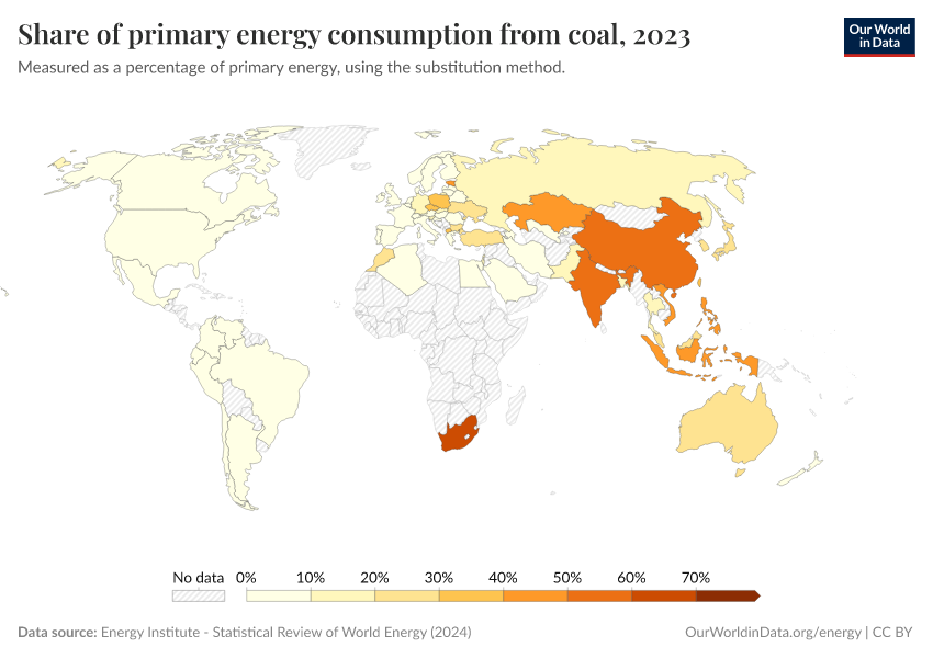
Share of primary energy consumption from coal
Measured as a percentage of primary energy, using the substitution method.
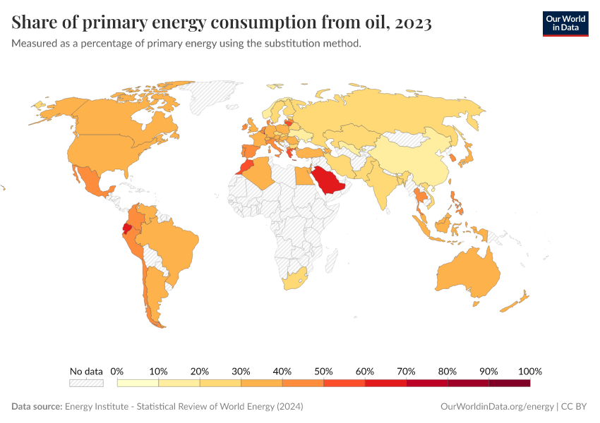
Share of primary energy consumption from oil
Measured as a percentage of primary energy using the substitution method.
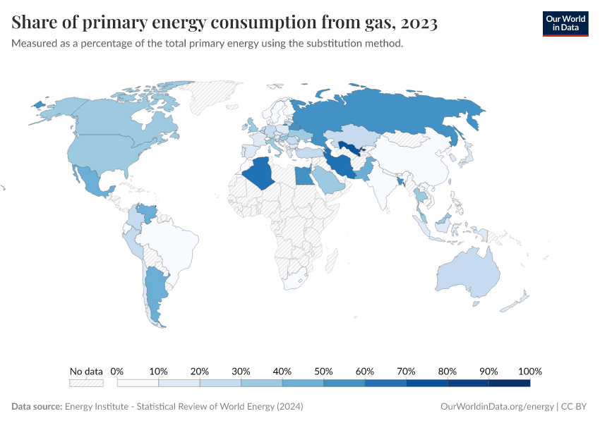
Share of primary energy consumption from gas
Measured as a percentage of the total primary energy using the substitution method.
How much of Norway’s energy comes from low-carbon sources?
To reduce CO2 emissions and exposure to local air pollution, we want to transition our energy systems away from fossil fuels towards low-carbon sources.
Low-carbon energy sources include nuclear and renewable technologies.
This interactive chart allows us to see the country’s progress on this. It shows the share of energy that comes from low-carbon sources. We look at data on renewables and nuclear energy separately in the sections which follow.

How much of Norway’s energy comes from renewables?
Low-carbon energy can come from nuclear or renewable technologies. How big a role do renewable technologies play?
This interactive chart shows the share of energy that comes from renewables.
A few points to note about this data:
- Renewable energy here is the sum of hydropower, wind, solar, geothermal, modern biomass and wave and tidal energy.
- Traditional biomass — the burning of charcoal, crop waste, and other organic matter — is not included. This can be an important energy source in lower-income settings.
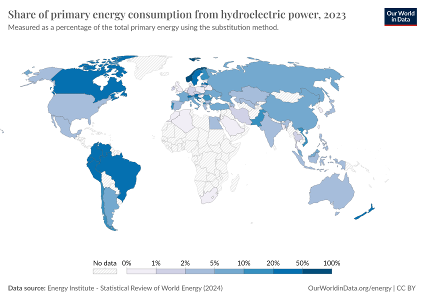
Share of primary energy consumption from hydroelectric power
Measured as a percentage of the total primary energy using the substitution method.
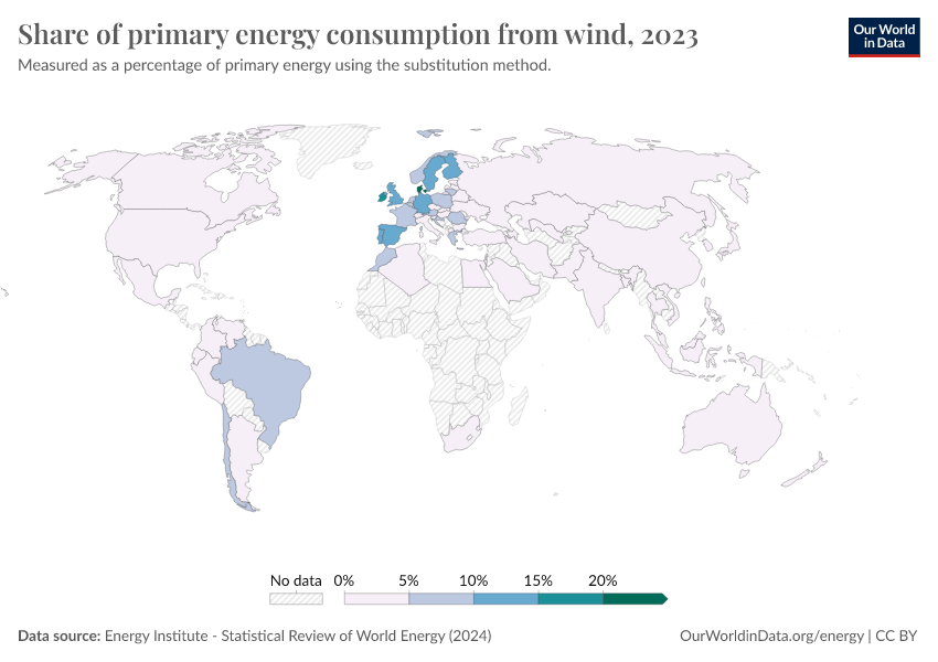
Share of primary energy consumption from wind
Measured as a percentage of primary energy using the substitution method.
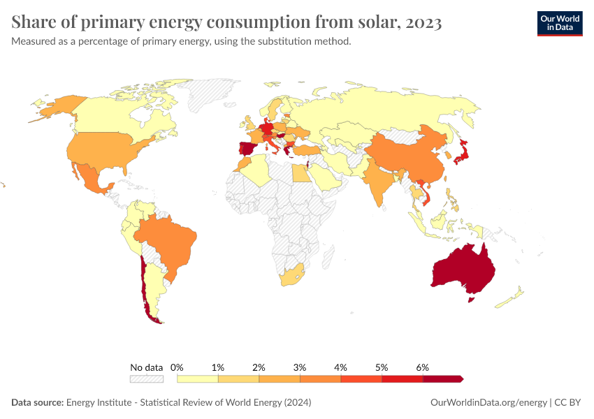
Share of primary energy consumption from solar
Measured as a percentage of primary energy, using the substitution method.
How much of Norway’s energy comes from nuclear power?
Nuclear energy — alongside renewables — is a low-carbon energy source. For a number of countries, it makes up a large share of energy consumption.
This interactive chart shows the share of energy that comes from nuclear sources.
How much is Norway’s consumption of energy sources changing each year?
When looking at longer historical data it can be difficult to see how the energy mix is changing from year-to-year. Are we adding more renewables than fossil fuels? Are we in fact reducing our consumption of coal or oil?
This interactive chart shows the change in primary energy consumption from these sources each year. A positive figure means the country consumed more energy from that source than the previous year; a negative means it consumed less.

What sources does Norway get its electricity from?
Where do countries get their electricity from: coal, oil, gas, nuclear power or renewables? It’s usually some combination of some, if not all, of these sources.
But the electricity mix — the balance of sources of electricity in the supply — is becoming increasingly important as countries try to shift away from fossil fuels towards low-carbon sources of electricity (nuclear or renewables including hydropower, solar and wind).
These interactive charts show the electricity mix of the country.
One is presented as a stacked area chart, allowing us to see a full breakdown of the sources of electricity in the supply. The line chart shows the percentage of electricity supplied by each source.


A point to keep in mind when considering this data:
Electricity is just one component of total energy – the other two being transport and heating. The electricity mix should not be misinterpreted as the breakdown of the total energy mix. We look at the importance of this difference here.
How much of Norway’s electricity comes from fossil fuels?
Since the Industrial Revolution, fossil fuels have become the dominant electricity source for most countries across the world.
But the burning of fossil fuels — coal, oil, and gas — is responsible for around three-quarters of global greenhouse gas emissions. They are also a major source of air pollution, which is responsible for at least five million premature deaths every year.
For both climate change and human health, we want to transition away from fossil fuels. But how quickly are we making progress on this?
This interactive chart shows the share of electricity that comes from fossil fuels.


How much of Norway’s electricity comes from low-carbon sources?
To reduce CO2 emissions and exposure to local air pollution, we want to transition our electricity away from fossil fuels towards low-carbon sources.
‘Low-carbon electricity’ includes nuclear and renewable technologies.
This interactive chart allows us to see the country’s progress on this. It shows the share of electricity that comes from low-carbon sources. We look at data on renewables and nuclear power separately in the sections which follow.

How much of Norway’s electricity comes from renewables?
Low-carbon electricity can come from nuclear or renewable technologies. How big a role do renewable technologies play?
This interactive chart shows the share of electricity that comes from renewables.

A few points to note about this data:
- Renewable electricity here is the sum of hydropower, wind, solar, geothermal, modern biomass and wave and tidal power.
- Traditional biomass – the burning of charcoal, crop waste, and other organic matter – is not included. This can be an important source in lower-income settings.

How much of Norway’s electricity comes from nuclear power?
Nuclear power — alongside renewables — is a low-carbon source of electricity. For a number of countries, it makes up a large share of electricity production.
This interactive chart shows the share of electricity that comes from nuclear sources.
Energy intensity: how much energy does Norway use per unit of GDP?
Energy is a large contributor to CO2 and the burning of fossil fuels accounts for around three-quarters of global greenhouse gas emissions. So, reducing energy consumption can inevitably help to reduce emissions. However, some energy consumption is essential to human wellbeing and rising living standards.
Energy intensity can therefore be a useful metric to monitor. Energy intensity measures the amount of energy consumed per unit of gross domestic product. It effectively measures how efficiently a country uses energy to produce a given amount of economic output. A lower energy intensity means it needs less energy per unit of GDP.
This interactive chart shows energy intensity.

Carbon intensity: how much carbon does Norway emit per unit of energy?
Energy intensity — shown in the chart above — is one important metric to monitor whether countries are making progress in reducing emissions. The other key part of this equation is carbon intensity: the amount of CO2 emitted per unit of energy.
We can reduce emissions by (1) using less energy; and/or (2) using lower-carbon energy.
This metric monitors the second option. As we transition our energy mix towards lower-carbon sources (such as renewables or nuclear energy), the amount of carbon we emit per unit of energy should fall.
This chart shows carbon intensity, measured in kilograms of CO2 emitted per kilowatt-hour of energy generated.

Endnotes
Panos, E., Densing, M., Volkart, K. (2016). Access to electricity in the World Energy Council’s global energy scenarios: An outlook for developing regions until 2030. Energy Strategy Reviews, 9, 28-49. Available online.
Cite this work
Our articles and data visualizations rely on work from many different people and organizations. When citing this profile page, please also cite the underlying data sources. This profile page can be cited as:
Hannah Ritchie and Pablo Rosado (2025) - “Energy” Published online at OurWorldinData.org. Retrieved from: 'https://ourworldindata.org/profile/energy/norway' [Online Resource]BibTeX citation
@article{owid-energy-norway,
    author = {Hannah Ritchie and Pablo Rosado},
    title = {Energy},
    journal = {Our World in Data},
    year = {2025},
    note = {https://ourworldindata.org/profile/energy/norway}
}
Reuse this work freely
All visualizations, data, and articles produced by Our World in Data are completely open access under the Creative Commons BY license. You have the permission to use, distribute, and reproduce these in any medium, provided the source and authors are credited.
The data produced by third parties and made available by Our World in Data is subject to the license terms from the original third-party authors. We will always indicate the original source of the data in our documentation, so you should always check the license of any such third-party data before use and redistribution.
All of our charts can be embedded in any site.