Energy Production and Consumption
Explore data on how energy production and use varies across the world.
The availability of energy has transformed the course of humanity over the last few centuries. Not only have new sources of energy been unlocked — first fossil fuels, followed by diversification to nuclear, hydropower, and now other renewable technologies — but also in the quantity we can produce and consume.
This article focuses on the quantity of energy we consume — looking at total energy and electricity consumption; how countries compare when we look at this per person; and how energy consumption is changing over time.
In our pages on the Energy Mix and Electricity Mix, we look in more detail at what sources provide this energy.
Global energy consumption
How much energy does the world consume?
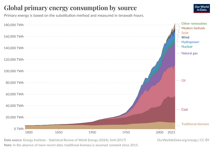
The energy system has transformed dramatically since the Industrial Revolution. We see this transformation of the global energy supply in the interactive chart shown here. It graphs global energy consumption from 1800 onwards.
It is based on historical estimates of primary energy consumption from Vaclav Smil, combined with updated figures from the Energy Institute Statistical Review of World Energy.1
Note that this data presents primary energy consumption via the “substitution method”. The substitution method — in comparison to the direct method — attempts to correct for the inefficiencies (energy wasted as heat during combustion) in fossil fuel and biomass conversion. It does this by correcting nuclear and modern renewable technologies to their “primary input equivalents” if the same quantity of energy was produced from fossil fuels.
How is global energy consumption changing year-to-year?
Demand for energy is growing across many countries in the world, as people get richer and populations increase.
If this increased demand is not offset by improvements in energy efficiency elsewhere, then our global energy consumption will continue to grow year-on-year. Growing energy consumption makes the challenge of transitioning our energy systems away from fossil fuels towards low-carbon sources of energy more difficult: new low-carbon energy has to meet this additional demand and try to displace existing fossil fuels in the energy mix.
This interactive chart shows how global energy consumption has been changing from year to year. The change is given as a percentage of consumption in the previous year.
We see that global energy consumption has increased nearly every year for more than half a century. The exceptions to this are in the early 1980s, 2009 following the financial crisis, and 2020 due to the COVID-19 pandemic.
Global energy consumption continues to grow, but it does seem to be slowing — averaging around 1% to 2% per year.

Primary energy consumption
Total energy consumption
How much energy do countries across the world consume?
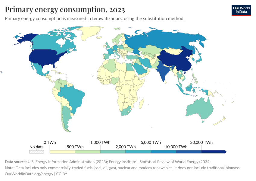
This interactive chart shows primary energy consumption country-by-country. It is the sum of total energy consumption, including electricity, transport, and heating. We look at electricity consumption individually later in this article.
Note, again, that this is based on primary energy via the substitution method: this means nuclear and renewable energy technologies have been converted into their “primary input equivalents” if they had the same levels of inefficiency as fossil fuel conversion.
Per capita: where do people consume the most energy?
When we look at total energy consumption, differences across countries often reflect differences in population size: countries with lots of people inevitably consume more energy than tiny countries.
How do countries compare when we look at energy consumption per person?
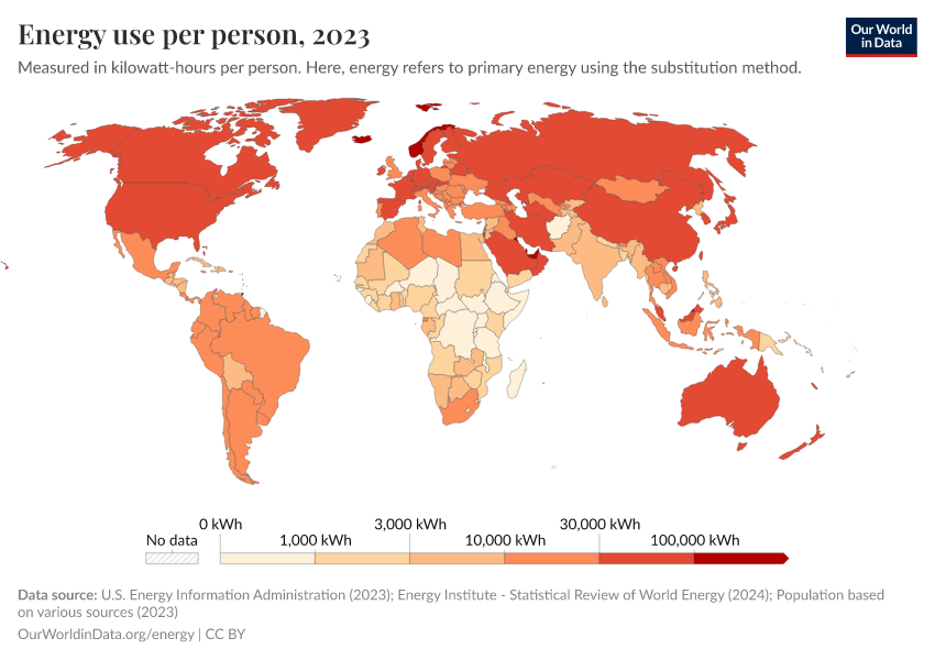
This interactive chart shows per capita energy consumption. We see vast differences across the world.
The largest energy consumers include Iceland, Norway, Canada, the United States, and wealthy nations in the Middle East such as Oman, Saudi Arabia, and Qatar. The average person in these countries consumes as much as 100 times more than those in some of the poorest countries.
In fact, the true differences between the richest and poorest might be even greater. We do not have high-quality data on energy consumption for many of the world's poorest countries. This is because they often use very few commercially traded energy sources (such as coal, oil, gas, or grid electricity) and instead rely on traditional biomass — crop residues, wood, and other organic matter that is difficult to quantify. This means we often lack good data on energy consumption for the world's poorest.
Where is energy consumption growing or falling?
Year-on-year change in primary energy consumption
Globally, primary energy consumption has increased nearly every year for at least half a century. But this is not the case everywhere in the world.
Energy consumption is rising in many countries where incomes are rising quickly and the population is growing. But in many countries — particularly richer countries trying to improve energy efficiency — energy consumption is actually falling.
This interactive chart shows the annual growth rate of energy consumption. Positive values indicate a country's energy consumption was higher than the previous year. Negative values indicate its energy consumption was lower than the previous year.

Electricity generation
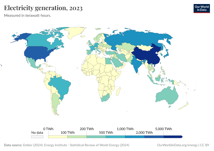
Total electricity generation: how much electricity does each country generate?
We previously looked at total energy consumption. This is the sum of energy used for electricity, transport, and heating.
Although the terms “electricity” and “energy” are often used interchangeably, it's important to understand that electricity is just one component of total energy consumption.
Let's take a look at electricity data. This interactive chart shows the amount of electricity generated by a country each year.
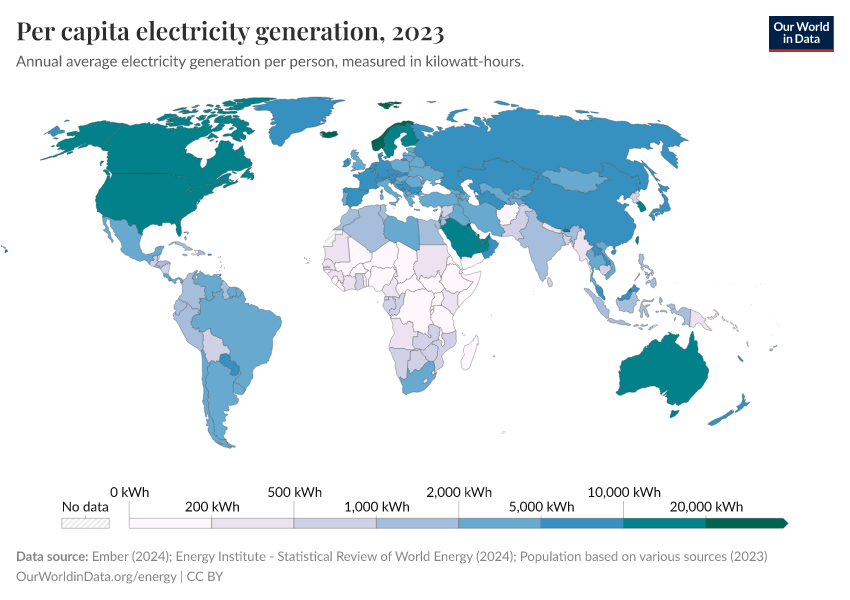
Per capita: which countries generate the most electricity?
Just as with total energy, comparisons of levels of electricity generation often reflect population size. It tells us nothing about how much electricity the average person in a given country consumes relative to another.
This interactive chart shows per capita electricity generation per person. Again we see vast differences in electricity per person across the world. The largest producers — Iceland, Norway, Sweden, and Canada — generate hundreds of times as much electricity as the smallest.
In many of the poorest countries in the world, people consume very little electricity, which is estimated to be lower than 100 kilowatt-hours per person in some places.
Energy production and consumption by source
This page focuses on total energy and electricity consumption, without digging into the details of where this energy comes from, and how sources are changing over time.
In our pages on the Energy Mix and Electricity Mix, we look at full breakdowns of the energy system; how much of our energy comes from fossil fuels versus low-carbon sources; and whether we're making progress on decarbonization.
Endnotes
Vaclav Smil (2017). Energy Transitions: Global and National Perspectives.
Cite this work
Our articles and data visualizations rely on work from many different people and organizations. When citing this article, please also cite the underlying data sources. This article can be cited as:
Hannah Ritchie, Pablo Rosado, and Max Roser (2020) - “Energy Production and Consumption” Published online at OurWorldinData.org. Retrieved from: 'https://archive.ourworldindata.org/20260417-112857/energy-production-consumption.html' [Online Resource] (archived on April 17, 2026).BibTeX citation
@article{owid-energy-production-consumption,
    author = {Hannah Ritchie and Pablo Rosado and Max Roser},
    title = {Energy Production and Consumption},
    journal = {Our World in Data},
    year = {2020},
    note = {https://archive.ourworldindata.org/20260417-112857/energy-production-consumption.html}
}
Reuse this work freely
All visualizations, data, and code produced by Our World in Data are completely open access under the Creative Commons BY license. You have the permission to use, distribute, and reproduce these in any medium, provided the source and authors are credited.
The data produced by third parties and made available by Our World in Data is subject to the license terms from the original third-party authors. We will always indicate the original source of the data in our documentation, so you should always check the license of any such third-party data before use and redistribution.
All of our charts can be embedded in any site.