Coronavirus (COVID-19) Vaccinations
Explore the global data on COVID-19 vaccinations
The Our World in Data COVID vaccination data
Vaccination has saved millions of lives during the COVID-19 pandemic. Within a year of the start of the pandemic, several vaccines were developed against the SARS-CoV-2 virus.
This speed was possible due to prior research into coronavirus vaccines, greater attention and R&D funding, and high interest in volunteering for clinical trials. As the virus has continued to evolve to evade immunity, new boosters and updated vaccines have been developed.
To track this effort, we at Our World in Data have built the international vaccination dataset that we make available on this page.
Open access: As with all our data, we have made this dataset openly available so that everyone can check and use the data we compile. You can find the vaccination data and the detailed list of our sources in our repository on GitHub.
This page also provides data from other organizations on vaccination policies, attitudes towards vaccination, and donations to COVAX, the initiative to ensure access to vaccines for low and middle-income countries worldwide.
Related articles:
- How do death rates from COVID-19 differ between people who are vaccinated and those who are not?
- Our World in Data is now tracking Coronavirus (COVID-19) vaccinations across the world
- The Our World in Data COVID-19 vaccination dataset has been published in the academic journal, Nature
What share of the population has received at least one dose, and completed the initial vaccination protocol?
The following charts show the breakdown of people vaccinated.
They show the number of people who have completed the initial vaccination protocol or received only their first vaccine dose out of multiple (“only partly vaccinated”).
The initial vaccination protocol includes two doses for most vaccines but one or three for a few manufacturers.
How many vaccine doses have been administered in total?
The following map and chart show the number of vaccine doses administered per 100 people within a given population. Each dose, including boosters, is counted as an individual dose.


How many vaccine doses have been administered in the last 12 months?
The following chart shows the total number of vaccine doses administered in the 12 months preceding a given date. This is provided as a rate per 100 people in the population.
All doses, including boosters, are counted as individual doses.
Related charts:
What share of the population has received at least one dose of vaccine?
The following charts show the share of the total population that has received at least one dose of vaccine. This may not be equivalent to the share with a complete initial protocol if the vaccine requires two doses.


Total number of people who have received at least one dose of vaccine
The following charts show the total number of people who have received at least one dose of the COVID-19 vaccine. This may not be equivalent to the number with a complete initial protocol if the vaccine requires two doses.
If a person receives the first dose of a two-dose vaccine, this metric increases by 1. If they receive the second dose, the metric stays the same.


What share of the population has completed the initial vaccination protocol?
The following chart shows the share of the total population that has completed the initial vaccination protocol.


Total number of people who have completed the initial vaccination protocol
The following chart shows the total number of people who have completed the initial vaccination protocol.
If a person receives the first dose of a two-dose vaccine, this metric stays the same. If they receive the second dose, the metric increases by 1.


How many vaccine booster doses have been administered?
The following charts show the number of booster doses administered.
Booster doses are those administered beyond the number prescribed by the initial vaccination protocol — for example, a third dose of the Pfizer/BioNTech vaccine or a second dose of the Johnson & Johnson vaccine.

Vaccinations by age
The following charts provide data on the share of people who have been vaccinated by age group.
This is provided as three metrics:
- the share that has received at least one dose
- the share that has completed the initial protocol
- the share that is only partially vaccinated
This data is only available for countries that report the breakdown of doses administered by first and second doses by age.
Share who have received at least one dose by age
The following chart shows the share of the population in each age group that has received at least one dose.
This metric includes those who are partly vaccinated or have completed the initial protocol.

Share who have completed the initial protocol by age
The following chart shows the share of the population in each age group that has completed the initial protocol.

Share who have received a booster dose by age
The following chart shows the share of the population in each age group that has received a booster dose.

Which vaccines have been administered in each country?
The following chart shows the cumulative doses administered, broken down by vaccine manufacturer.
This is only available for the countries which report the necessary data.

How many doses are administered daily?
Daily share of the population receiving a dose
The following chart shows the share of people receiving a COVID-19 vaccine dose. This is shown as a seven-day rolling average.


Daily number of doses administered per 100 people
The following chart shows the daily number of doses administered per 100 people. This is shown as a seven-day rolling average.

How many doses have been donated by each country?
COVID-19 Vaccines Global Access (COVAX) is an initiative that coordinates international resources to help ensure equitable access to COVID-19 vaccines, therapies, and tests.
It is directed by Gavi, the Vaccine Alliance, the Coalition for Epidemic Preparedness Innovations (CEPI), and the World Health Organization (WHO).
These charts show the cumulative number of doses donated to the COVAX initiative by different countries, broken down by whether the donations have only been announced, actually donated, or delivered to the recipients.
This is only available for a select number of countries for which the COVID-19 Task Force reports the necessary data.
The first chart shows the number of doses donated.
The following three charts show that number adjusted for:
- The population of the donating country;
- The GDP of the donating country;
- The number of doses administered by the donating country to its own population.
Vaccination policies
This interactive chart maps government policies on COVID-19 vaccination. Note that only policies on the availability of vaccinations are tracked. It does not track the number of people who have been vaccinated.
Countries are grouped into six categories:
- No availability
- Availability for ONE of the following: key workers / clinically vulnerable groups / elderly groups
- Availability for TWO of the following: key workers / clinically vulnerable groups / elderly groups
- Availability for ALL of the following: key workers / clinically vulnerable groups / elderly groups
- Availability for all three plus partial additional availability (select broad groups/ages)
- Universal availability

This data on vaccination policies is sourced from the Oxford Coronavirus Government Response Tracker (OxCGRT).
This resource is published by researchers at the Blavatnik School of Government at the University of Oxford: Thomas Hale, Anna Petherik, Beatriz Kira, Noam Angrist, Toby Phillips and Samuel Webster.
The tracker presents data collected from public sources by a team of over one hundred Oxford University students and staff from every part of the world.
The data presented here is taken directly from the OxCGRT project; we at Our World in Data don’t track policy responses ourselves and we don’t make additions to the tracker’s dataset.
These charts are regularly updated based on the latest version of the response tracker.
OxCGRT is an ongoing collation project of live data. If you see any inaccuracies in the underlying data, or for specific feedback on the analysis or another aspect of the project please contact OxCGRT team. See the tracker’s notes and guidance on data quality.
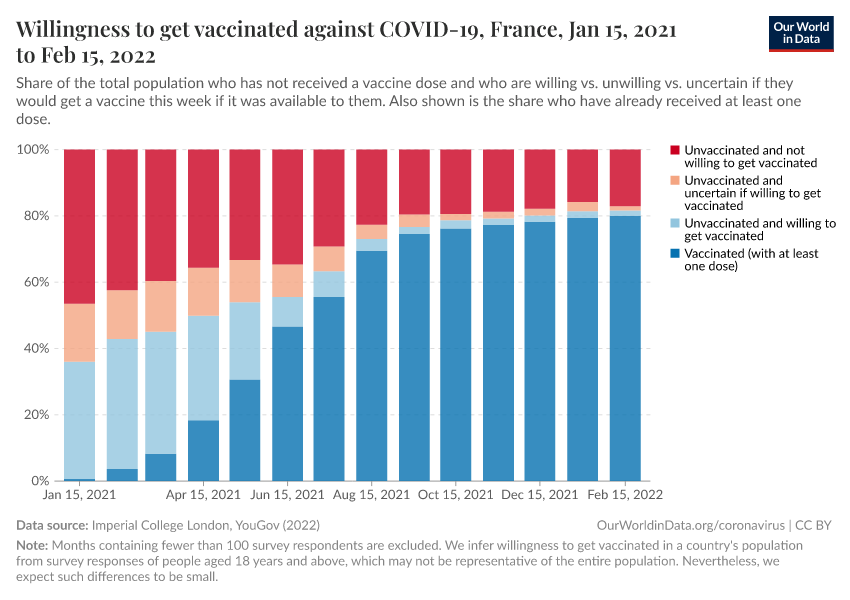
Attitudes to COVID-19 vaccination
The Imperial College London YouGov Covid-19 Behaviour Tracker Data Hub has gathered global insights on people’s behaviors in response to COVID-19 throughout the pandemic.
This survey covers public behaviors and attitudes ranging from mask-wearing to self-isolation, social distancing, symptoms, and testing.
Their dataset on attitudes to vaccination extended from January 2021 until March 2022. You can explore the change in attitudes across countries over time here:
Frequently asked questions
Why do the figures displayed on this page look different from the ones published by my government?
In some cases, the vaccination figures on this page can look different from the ones reported by governments.
This is typically not because of the numerator (number of people vaccinated) but rather because of the denominator (number of people in the population). This usually happens for two main reasons:
- The official data may report a vaccination coverage rate that refers to the share of people vaccinated in the population eligible for vaccination (very often, among adults only) rather than the total population. Our priority is to make our data comparable between countries — regardless of criteria for eligibility, which tend to vary across countries and across time. For this reason, we always use the total population of the country (i.e. people of all ages) as the denominator.
- The official data may use a different population estimate. The population estimates we use come from the United Nations World Population Prospects. We use this dataset for its reliability, its consistent methods, and because it is a global dataset, which makes our work easier (see below). In a few cases, we use other sources when the figures provided by the UN differ substantially from reliable and more recent national estimates.
Which population data source are the per-capita metrics based on?
The population estimates we use come from the United Nations World Population Prospects. We use this data for its reliability, its consistent methods, and because it makes our work much easier. The exact values can be viewed in our GitHub repository.
The United Nations estimates may not always reflect the latest censuses or national figures — but there are several reasons why we use this data rather than national population estimates from each country.
- The UNWPP dataset is the standard in research. The main reason is that it uses a reliable and consistent methodology for all countries. For example, if we used individual country data, some countries may include overseas workers, expats, undocumented immigrants, etc. in their population estimates while other countries may not.
- Using data from the UN allows us to get accurate population estimates for all territories in the world very easily. Finding and maintaining estimates based on national censuses would be very time-consuming for our small team, without bringing much additional value to our work.
- Other reasons include the availability of yearly data (national censuses are only conducted every few years), and avoiding double-counting in cases of border disputes.
For all these reasons, the UN data is the best solution to bring accurate per-capita metrics to our COVID data. In a few cases, we use other sources when the figures provided by the UN differ substantially from reliable and more recent national estimates.
What are the sources of the data for each country, and which vaccines do they use?
Data comes from many sources including the World Health Organization, European CDC, government ministries of health, and other health divisions.
You can download the full dataset alongside the detailed sources for each country on GitHub.
Can the value of per-capita metrics exceed 100%?
The population estimates we use to calculate per-capita metrics are all based on the last revision of the United Nations World Population Prospects. In a few cases, we use other sources when the figures provided by the UN differ substantially from reliable and more recent national estimates.
Additionally, it’s important to bear in mind that in some territories, vaccination coverage may include non-residents (such as tourists and foreign workers).
For these reasons, per-capita metrics may sometimes exceed 100%.
What is the definition of a complete initial protocol?
In our data, people with a complete initial protocol are those who have received all doses prescribed by their vaccination regimen (e.g. two doses for Pfizer/BioNTech, Moderna, Oxford/AstraZeneca, etc. and one dose for Johnson & Johnson, CanSino, etc.).
Some countries also allow for alternative definitions, such as having been infected with SARS-CoV-2 in the past and having received 1 dose of a two-dose regimen.
We currently ignore these alternative definitions to preserve the common definition of a complete protocol, i.e. all doses prescribed in the vaccine regimen. This allows for better comparability in vaccination coverage between countries.
What classification are the income groups based on?
The income groups we use come from the World Bank income classification. The exact list of countries can be viewed in our GitHub repository.
Why isn’t my country shown by default on a chart? How do you choose which countries are shown?
Due to the limited space on our charts and the number of countries in the world, unfortunately, we cannot show every country in the world by default.
On each chart of this page, therefore we choose a default selection of countries based on a mix of criteria, including their total population, but also the number of doses administered and share of the population vaccinated. These lists are updated about once a month.
Are participants in vaccine clinical trials included in your data?
We do not include participants in the vaccine arm of clinical trials, as this data is not available for many of the hundreds of trials currently taking place.
How do you report vaccinations performed in Israel and Palestine?
In our dataset and charts on COVID-19 vaccinations, we report vaccinations performed in Israel and Palestine separately.
Vaccination data are needed to understand how the pandemic is evolving. To this end, it is key to present vaccination data along with data on COVID-19 cases and deaths.
Global health institutions that report on the pandemic are reporting these metrics separately:
- The World Health Organization reports the measures for Israel separately from Palestine in its data.
- Johns Hopkins University also reports Israel separately from Palestine in its data on cases & deaths of COVID-19, which has been used worldwide in the last year.
Reporting the data for Palestine and Israel separately also allows us to show their respective reported vaccination levels. It makes clear what the respective vaccination levels are, as reported by the Government of Israel and the Palestinian Ministry of Health.
Finally, our dataset on COVID-19 vaccinations is sourced from official data published by governments and ministries of health from countries around the world. This is also the case for Israel and Palestine. We show figures for Palestine and Israel separately, as they are reported separately by the Government of Israel and the Palestinian Ministry of Health.
The Populations Division of the United Nations reports population figures for countries around the world, and we are relying on their latest publication of population estimates for countries around the world.
The resulting shares of people vaccinated in Israel and Palestine can be seen in our COVID-19 Data Explorer.
Our work belongs to everyone
Download the complete Our World in Data COVID-19 dataset
- All our code is open-source
- All our research and visualizations are free for everyone to use for all purposes
Cite this work
Our articles and data visualizations rely on work from many different people and organizations. When citing this article, please also cite the underlying data sources. This article can be cited as:
Edouard Mathieu, Hannah Ritchie, Lucas Rodés-Guirao, Cameron Appel, Daniel Gavrilov, Charlie Giattino, Joe Hasell, Bobbie Macdonald, Saloni Dattani, Diana Beltekian, Esteban Ortiz-Ospina, and Max Roser (2020) - “Coronavirus (COVID-19) Vaccinations” Published online at OurWorldinData.org. Retrieved from: 'https://archive.ourworldindata.org/20260715-064505/covid-vaccinations.html' [Online Resource] (archived on July 15, 2026).BibTeX citation
@article{owid-covid-vaccinations,
    author = {Edouard Mathieu and Hannah Ritchie and Lucas Rodés-Guirao and Cameron Appel and Daniel Gavrilov and Charlie Giattino and Joe Hasell and Bobbie Macdonald and Saloni Dattani and Diana Beltekian and Esteban Ortiz-Ospina and Max Roser},
    title = {Coronavirus (COVID-19) Vaccinations},
    journal = {Our World in Data},
    year = {2020},
    note = {https://archive.ourworldindata.org/20260715-064505/covid-vaccinations.html}
}
Reuse this work freely
All visualizations, data, and articles produced by Our World in Data are completely open access under the Creative Commons BY license. You have the permission to use, distribute, and reproduce these in any medium, provided the source and authors are credited.
The data produced by third parties and made available by Our World in Data is subject to the license terms from the original third-party authors. We will always indicate the original source of the data in our documentation, so you should always check the license of any such third-party data before use and redistribution.
All of our charts can be embedded in any site.