Who emits the most CO2 today?
Which countries emit the most CO2 today? How do annual emissions vary across the world?
Who emits the most CO2 each year? In the treemap visualization we show annual CO2 emissions by country, and aggregated by region. Treemaps are used to compare entities (such as countries or regions) in relation to others, and relative to the total. Here each inner rectangle represents a country – which are then nested and colored by region. The size of each rectangle corresponds to its annual CO2 emissions in 2017. Combined, all rectangles represent the global total.
The emissions shown here relate to the country where CO2 is produced (i.e.production-based CO2) , not to where the goods and services that generate emissions are finally consumed. We look at the difference in each country’s production vs. consumption (trade-adjusted) emissions here.
Asia is by far the largest emitter, accounting for 53% of global emissions. As it is home to 60% of the world’s population this means that per capita emissions in Asia are slightly lower than the world average, however.
China is, by a significant margin, Asia’s and the world’s largest emitter: it emits nearly 10 billion tonnes each year, more than one-quarter of global emissions.
North America – dominated by the USA – is the second largest regional emitter at 18% of global emissions. It’s followed closely by Europe with 17%. Here we have grouped the 28 countries of the European Union together, since they typically negotiate and set targets as a collective body. You can see the data for individual EU countries in the interactive maps which follow.
Africa and South America are both fairly small emitters: accounting for 3-4% of global emissions each. Both have emissions almost equal in size to international aviation and shipping. Both aviation and shipping are not included in national or regional emissions. This is because of disagreement over how emissions which cross country borders should be allocated: do they belong to the country of departure, or country of origin? How are connecting flights accounted for? The tensions in reaching international aviation and shipping deals are discussed in detail at the Carbon Brief here.
How did CO2 emissions change over time?
The same data is also explorable by country and over time in the interactive map.
By clicking on any country you can see how its annual emissions have changed, and compare it with other countries.
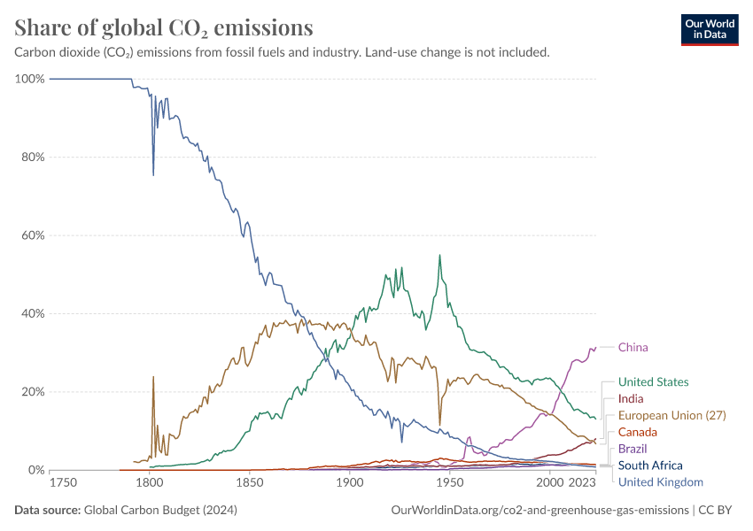
Share of global CO2 emissions by country
In the interactive chart you can explore each country’s share of global emissions. Using the timeline at the bottom of the map, you can see how the global distribution has changed since 1751. By clicking on any country you can see its evolution and compare it with others.
If you’re interested in which countries emit more or less than their ‘fair share’ based on their share of global population, you can explore this here.
The distribution of emissions has changed significantly over time. The UK was – until 1888, when it was overtaken by the US – the world’s largest emitter. This was because the UK was the first country to industrialize, a transition which later contributed to in massive improvements in living standards for much of its population.
Whilst rising CO2 emissions have clear negative environmental consequences, it is also true that they have historically been a by-product of positive improvements in human living conditions. But, it’s also true that reducing CO2 emissions is important to protect the living conditions of future generations. This perspective – that we must consider both the environmental and human welfare implications of emissions – is important if we are to build a future that is both sustainable and provides high standards of living for everyone.
Rising emissions and living standards in North America and Oceania followed soon after developments in the UK.
Many of the world’s largest emitters today are in Asia. However, Asia’s rapid rise in emissions has only occurred in very recent decades. This too has been a by-product of massive improvements in living standards: since 1950 life expectancy in Asia has increased from 41 to 74 years; it has seen a dramatic fall in extreme poverty; and for the first time most of its population received formal education.
Whilst all countries must work collectively, action from the very top emitters will be essential. China, the USA and the 28 countries of the EU account for more than half of global emissions. Without commitment from these largest emitters, the world will not come close to meeting its global targets.
Cite this work
Our articles and data visualizations rely on work from many different people and organizations. When citing this article, please also cite the underlying data sources. This article can be cited as:
Hannah Ritchie (2019) - “Who emits the most CO2 today?” Published online at OurWorldinData.org. Retrieved from: 'https://archive.ourworldindata.org/20260417-112857/annual-co2-emissions.html' [Online Resource] (archived on April 17, 2026).BibTeX citation
@article{owid-annual-co2-emissions,
    author = {Hannah Ritchie},
    title = {Who emits the most CO2 today?},
    journal = {Our World in Data},
    year = {2019},
    note = {https://archive.ourworldindata.org/20260417-112857/annual-co2-emissions.html}
}
Reuse this work freely
All visualizations, data, and code produced by Our World in Data are completely open access under the Creative Commons BY license. You have the permission to use, distribute, and reproduce these in any medium, provided the source and authors are credited.
The data produced by third parties and made available by Our World in Data is subject to the license terms from the original third-party authors. We will always indicate the original source of the data in our documentation, so you should always check the license of any such third-party data before use and redistribution.
All of our charts can be embedded in any site.

