Renewable Energy
Renewable energy sources are growing quickly and will play a vital role in tackling climate change.
This page was first published in December 2020. We made minor changes to the text in January 2024.
Since the Industrial Revolution, the energy mix of most countries across the world has become dominated by fossil fuels. This has major implications for the global climate, as well as for human health. Three-quarters of global greenhouse gas emissions result from the burning of fossil fuels for energy. Fossil fuels are responsible for large amounts of local air pollution – a health problem that leads to at least 5 million premature deaths each year.
To reduce CO2 emissions and local air pollution, the world needs to rapidly shift towards low-carbon sources of energy – nuclear and renewable technologies.
Renewable energy will play a key role in decarbonizing our energy systems in the coming decades. But how rapidly is our production of renewable energy changing? What technologies look most promising in transforming our energy mix?
In this article we look at the data on renewable energy technologies across the world; what share of energy they account for today, and how quickly this is changing.
Renewable energy generation
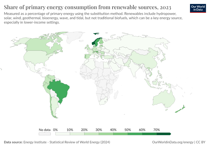
How much of our primary energy comes from renewables?
We often hear about the rapid growth of renewable technologies in media reports. But how much of an impact has this growth had on our energy systems?
In this interactive chart, we see the share of primary energy consumption that came from renewable technologies – the combination of hydropower, solar, wind, geothermal, wave, tidal, and modern biofuels. Traditional biomass – which can be an important energy source in lower-income settings is not included.
Note that this data is based on primary energy calculated by the 'substitution method' which attempts to correct for the inefficiencies in fossil fuel production. It does this by converting non-fossil fuel sources to their 'input equivalents': the amount of primary energy that would be required to produce the same amount of energy if it came from fossil fuels.
Approximately one-seventh of the world's primary energy is now sourced from renewable technologies.
Note that this is based on renewable energy's share in the energy mix. Energy consumption represents the sum of electricity, transport, and heating. We look at the electricity mix later in this article.
Breakdown of renewables in the energy mix
In the section above we looked at what share renewable technologies collectively accounted for in the energy mix.
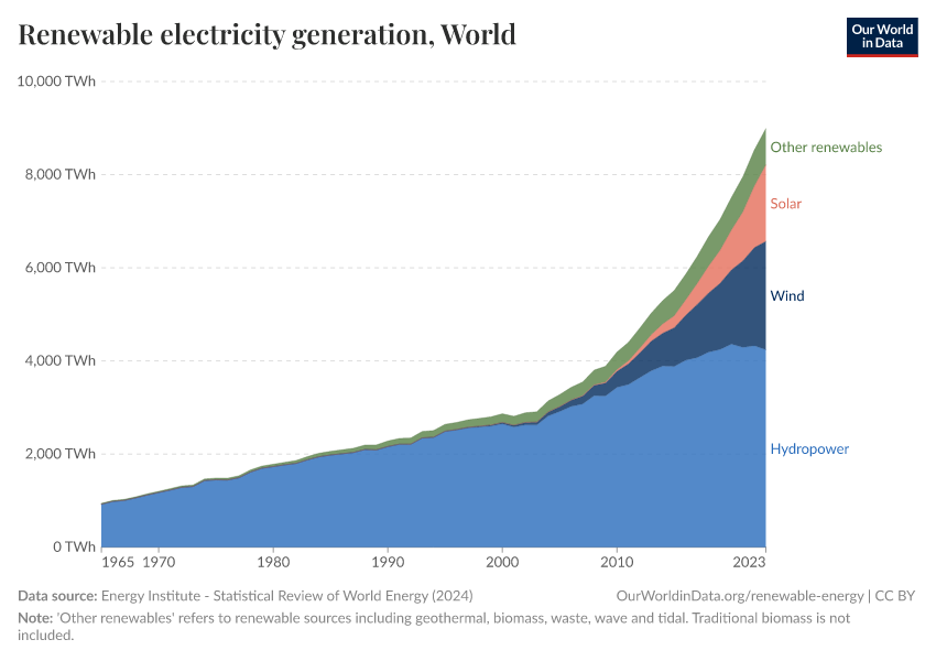
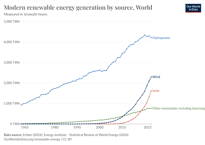
In the charts shown here, we look at the breakdown of renewable technologies by their components – hydropower, solar, wind, and others.
The first chart shows this as a stacked area chart, which allows us to more readily see the breakdown of the renewable mix and the relative contribution of each. The second chart is shown as a line chart, allowing us to see more clearly how each source is changing over time.
Globally we see that hydropower is by far the largest modern renewable source. However, we also see wind and solar power both growing rapidly.
Renewables in the electricity mix
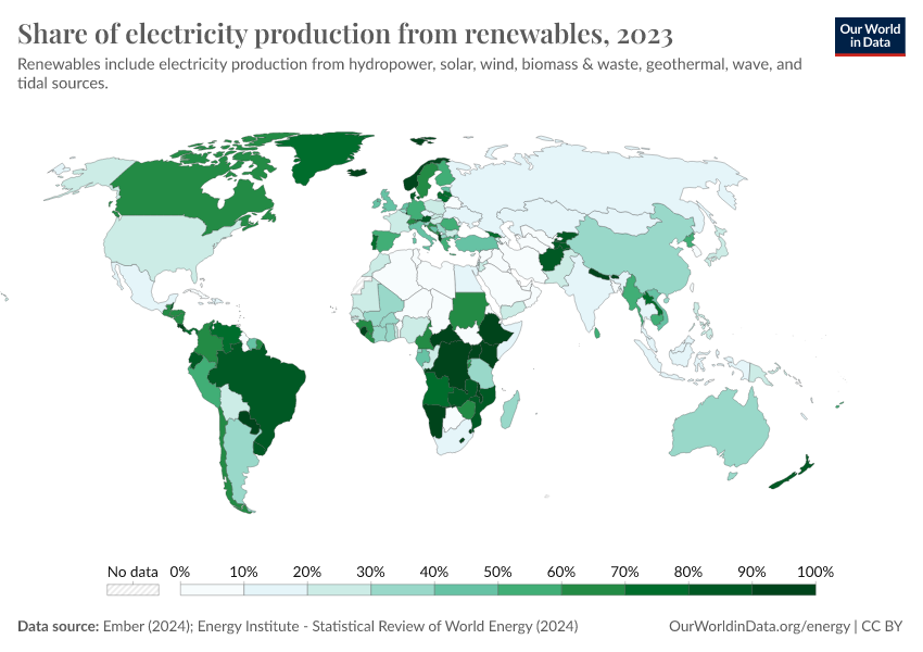
How much of our electricity comes from renewables?
In the sections above we looked at the role of renewables in the total energy mix. This includes not only electricity but also transport and heating. Electricity forms only one component of energy consumption.
Since transport and heating tend to be harder to decarbonize – they are more reliant on oil and gas – renewables tend to have a higher share in the electricity mix versus the total energy mix.
This interactive chart shows the share of electricity that comes from renewable technologies.
Globally, almost one-third of our electricity comes from renewables.
Hydropower
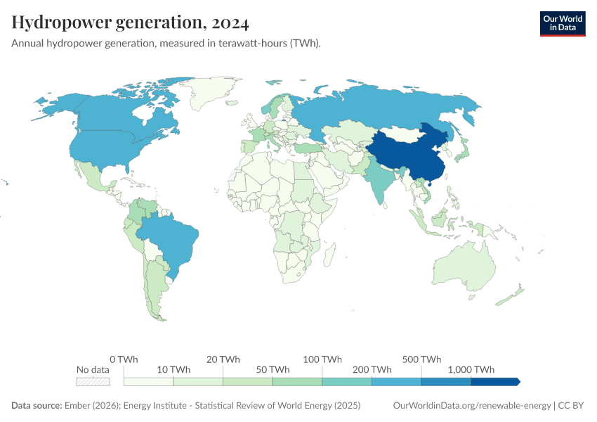
Hydropower generation
Hydroelectric power has been one of our oldest and largest sources of low-carbon energy. Hydroelectric generation at scale dates back more than a century, and is still our largest renewable source – excluding traditional biomass, it still accounts for approximately half of renewable generation.
However, the scale of hydroelectric power generation varies significantly across the world. This interactive chart shows its contribution by country.
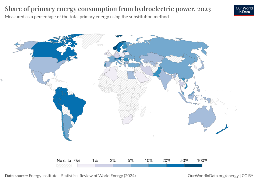
Share of primary energy that comes from hydropower
This interactive chart shows the share of primary energy that comes from hydropower.
Note that this data is based on primary energy calculated by the 'substitution method' which attempts to correct for the inefficiencies in fossil fuel production. It does this by converting non-fossil fuel sources to their 'input equivalents': the amount of primary energy that would be required to produce the same amount of energy if it came from fossil fuels.
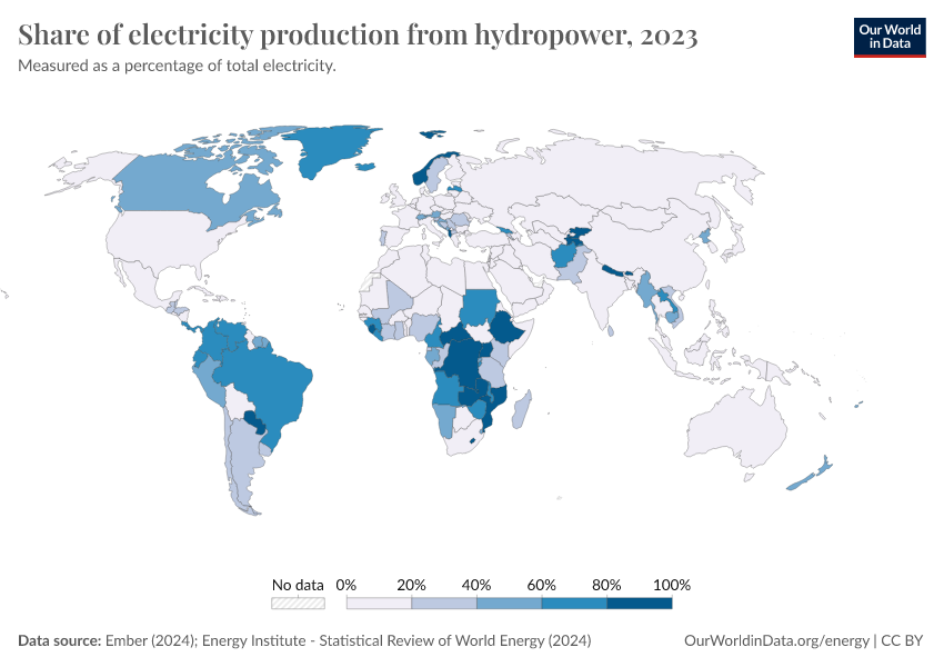
Share of electricity that comes from hydropower
This interactive chart shows the share of electricity that comes from hydropower.
Wind energy
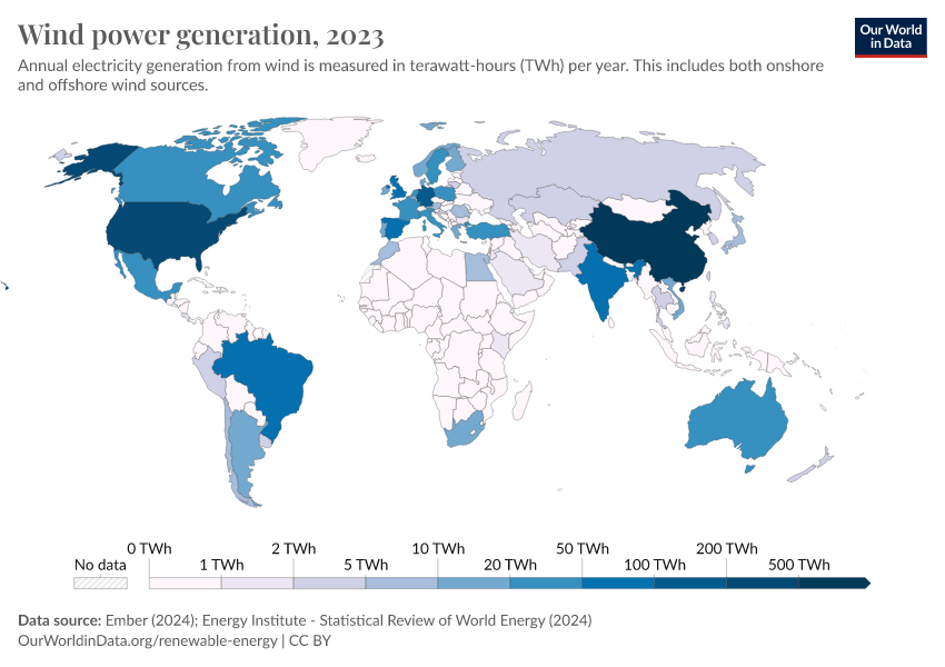
Wind energy generation
This interactive chart shows the amount of energy generated from wind each year. This includes both onshore and offshore wind farms.
Wind generation at scale – compared to hydropower, for example – is a relatively modern renewable energy source but is growing quickly in many countries across the world.
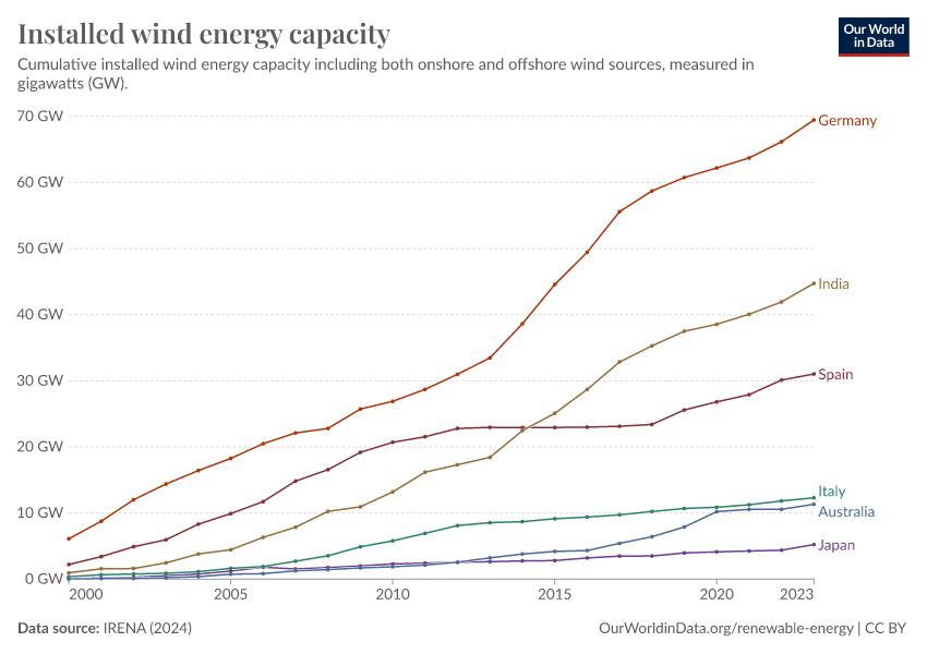
Installed wind capacity
The previous section looked at the energy output from wind farms across the world. Energy output is a function of power (installed capacity) multiplied by the time of generation.
Energy generation is therefore a function of how much wind capacity is installed. This interactive chart shows installed wind capacity – including both onshore and offshore – across the world.
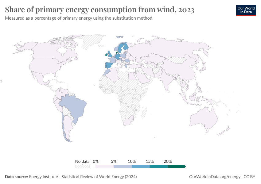
Share of primary energy that comes from wind
This interactive chart shows the share of primary energy that comes from wind.
Note that this data is based on primary energy calculated by the 'substitution method' which attempts to correct for the inefficiencies in fossil fuel production. It does this by converting non-fossil fuel sources to their 'input equivalents': the amount of primary energy that would be required to produce the same amount of energy if it came from fossil fuels.
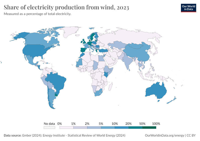
Share of electricity that comes from wind
This interactive chart shows the share of electricity that comes from wind.
Solar energy
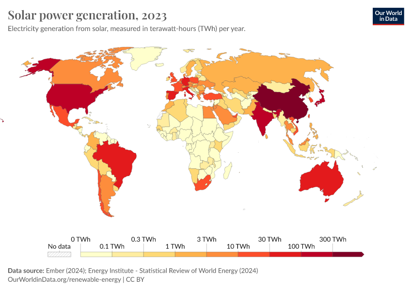
Solar energy generation
This interactive chart shows the amount of energy generated from solar power each year.
Solar generation at scale – compared to hydropower, for example – is a relatively modern renewable energy source but is growing quickly in many countries across the world.
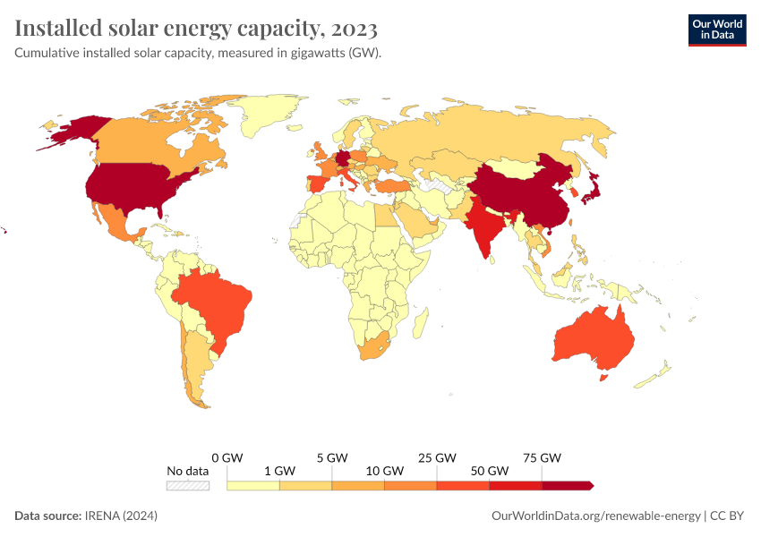
Installed solar capacity
The previous section looked at the energy output from solar across the world. Energy output is a function of power (installed capacity) multiplied by the time of generation.
Energy generation is therefore a function of how much solar capacity is installed. This interactive chart shows installed solar capacity across the world.
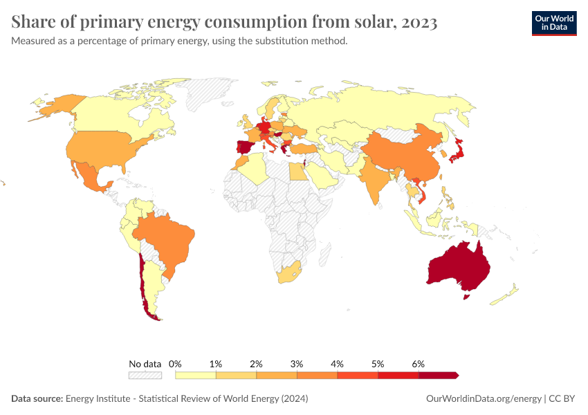
Share of primary energy that comes from solar
This interactive chart shows the share of primary energy that comes from solar power.
Note that this data is based on primary energy calculated by the 'substitution method' which attempts to correct for the inefficiencies in fossil fuel production. It does this by converting non-fossil fuel sources to their 'input equivalents': the amount of primary energy that would be required to produce the same amount of energy if it came from fossil fuels.
Share of electricity that comes from solar
This interactive chart shows the share of electricity that comes from solar power.
Biofuels
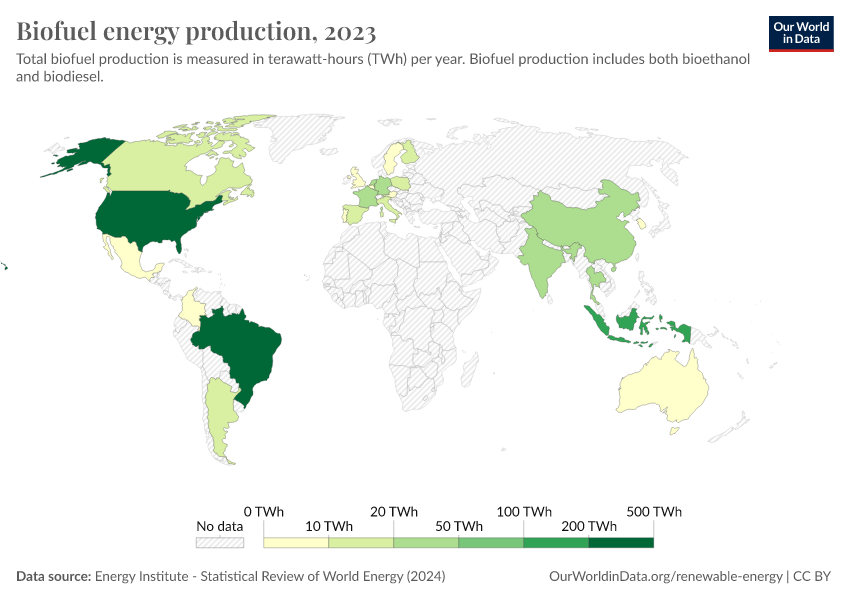
Biofuel production
Traditional biomass – the burning of charcoal, organic wastes, and crop residues – was an important energy source for a long period of human history. It remains an important source in lower-income settings today. However, high-quality estimates of energy consumption from these sources are difficult to find. The Energy Institute Statistical Review of World Energy – our main data source on energy – only publishes data on commercially traded energy, so traditional biomass is not included.
However, modern biofuels are included in this energy data. Bioethanol and biodiesel – fuel made from crops such as corn, sugarcane, hemp, and cassava – are now a key transport fuel in many countries.
This interactive chart shows modern biofuel production across the world.
Geothermal
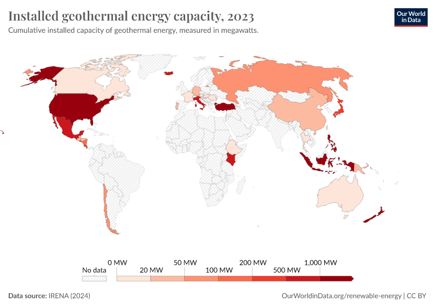
Installed geothermal capacity
This interactive chart shows the installed capacity of geothermal energy across the world.
Cite this work
Our articles and data visualizations rely on work from many different people and organizations. When citing this topic page, please also cite the underlying data sources. This topic page can be cited as:
Hannah Ritchie, Max Roser, and Pablo Rosado (2020) - “Renewable Energy” Published online at OurWorldinData.org. Retrieved from: 'https://ourworldindata.org/renewable-energy' [Online Resource]BibTeX citation
@article{owid-renewable-energy,
    author = {Hannah Ritchie and Max Roser and Pablo Rosado},
    title = {Renewable Energy},
    journal = {Our World in Data},
    year = {2020},
    note = {https://ourworldindata.org/renewable-energy}
}
Reuse this work freely
All visualizations, data, and code produced by Our World in Data are completely open access under the Creative Commons BY license. You have the permission to use, distribute, and reproduce these in any medium, provided the source and authors are credited.
The data produced by third parties and made available by Our World in Data is subject to the license terms from the original third-party authors. We will always indicate the original source of the data in our documentation, so you should always check the license of any such third-party data before use and redistribution.
All of our charts can be embedded in any site.
