CO₂ and Greenhouse Gas Emissions
Many of us want an overview of where our country stands on CO₂ and other greenhouse gas emissions. Are they increasing or decreasing? How do levels compare to other countries? This page provides the data for your chosen country across key metrics on this topic.
The data will be updated — often on an annual basis — with the latest global and country emissions estimates.
How much CO₂ does South Korea emit per person?
Annual emissions figures are often used to compare countries’ contribution to climate change. But this metric often reflects differences in population size across the world.
To understand the ‘footprint’ of the average person in a given country, this chart shows per capita emissions.
These figures reflect territorial emissions — emissions generated within a given country’s borders — so do not adjust for traded goods.

What are South Korea’s total annual emissions?
A country’s total contribution to climate change is obviously its footprint per person, multiplied by its population. This is what the chart here shows.
Again, these are “territorial” emissions, which are those produced within the country’s borders. We looked at “consumption-based” emissions, which adjust for imports and exports, later in this profile.

What share of global CO₂ emissions are emitted by South Korea?
Looking at a country’s annual emissions is useful, but it can be hard to put these numbers in context. Is 10 million tonnes of CO2 large or small? What about 100 million or 1 billion tonnes?
This interactive chart shows annual emissions as a percentage of the global total in a given year.

How much CO₂ has South Korea produced historically?
When we only look at emissions produced today, we fail to recognise historical responsibility for emissions in recent decades or centuries.
This interactive chart shows cumulative CO2 emissions — the sum of emissions produced since 1751 to the given year. This allows us to understand how much a given country has contributed to global emissions through its history.

What share of global historical CO₂ has South Korea emitted?
Just as with annual emissions, simply presenting cumulative CO2 figures can be hard to contextualize. Has a given country’s contribution to the global total been large or small?
This chart shows the country’s cumulative emissions as a share of global cumulative emissions.

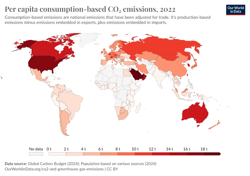
How do South Korea’s emissions compare when we adjust for trade?
When countries set targets, measure or compare CO2 emissions, they tend to focus on territorial emissions — CO2 emitted within a country’s own borders. However, this doesn’t capture emissions from traded goods — the CO2 emitted in the production of goods elsewhere, which are later imported (or the opposite: emissions from goods that are exported).
We can estimate consumption-based CO2 emissions by correcting for trade. These emissions are shown in the interactive chart. Note that the resolution of data needed to calculate this is not available for all countries.

What share of South Korea’s CO₂ emissions are produced from different fuels?
CO2 emissions are dominated by the burning of fossil fuels for energy production, and industrial production of materials such as cement.
What is the contribution of each fuel source to the country’s CO2 emissions?
This interactive chart shows the breakdown of annual CO2 emissions by source: either coal, oil, gas, cement production or gas flaring. This breakdown is strongly influenced by the energy mix of a given country, and changes as a country shifts to or from a given energy source.

How are South Korea’s CO₂ emissions from different fuels changing?
The chart above allows us to see the breakdown of CO2 emissions by fuel type. But it makes it more difficult to see the absolute change in particular fuel sources over time.
This interactive chart shows the same data — CO2 emissions from coal, oil, gas, cement and flaring — but as individual lines to see clearly how each is changing over time.

In discussions on climate change, we tend to focus on carbon dioxide (CO2) – the most dominant greenhouse gas produced by the burning of fossil fuels, industrial production, and land use change.
But CO2 is not the only greenhouse gas that is driving global climate change. There are a number of others – methane, nitrous oxide, and trace gases such as the group of ‘F-gases’ – which have contributed a significant amount of warming to date.
Here we look at total greenhouse gas (GHG) emissions across the world, plus breakdowns of other major gases including methane and nitrous oxide.
How much does the average person in South Korea emit? Where do emissions come from?
The charts above focused on carbon dioxide (CO2). But CO2 is not the only greenhouse gas. Others, including methane and nitrous oxide, have also had a significant impact on global warming to date.
The first interactive chart shows per capita greenhouse gas emissions. This is measured as the sum of all greenhouse gases, and given by a metric called ‘carbon dioxide equivalents’.
‘Carbon dioxide equivalents’ try to correct for the fact that one unit (e.g. a tonne) of a given gas doesn’t have the same impact on warming as another. We therefore multiply the emissions of each gas by its ‘global warming potential’ (GWP) value: this measures the amount of warming one tonne of that gas would create relative to one tonne of CO2.
The other interactive chart shows where these emissions come from: the contribution of each sector.


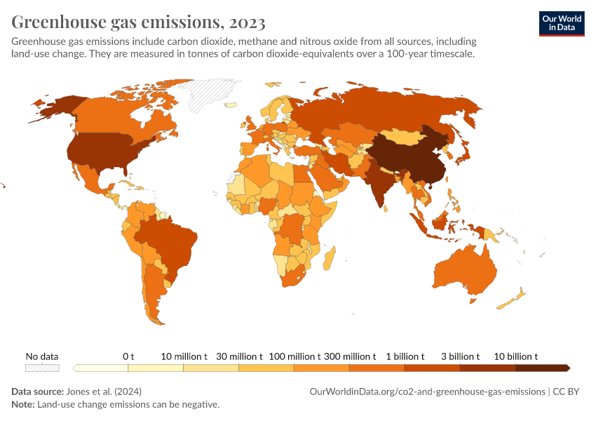
Greenhouse gas emissions
Greenhouse gas emissions include carbon dioxide, methane and nitrous oxide from all sources, including land-use change. They are measured in tonnes of carbon dioxide-equivalents over a 100-year timescale.
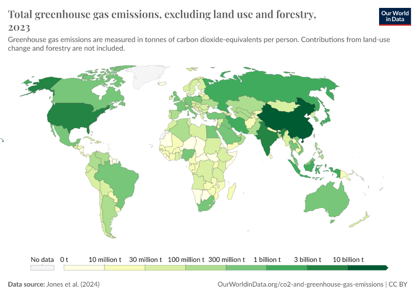
Total greenhouse gas emissions, excluding land use and forestry
Greenhouse gas emissions are measured in tonnes of carbon dioxide-equivalents per person. Contributions from land-use change and forestry are not included.
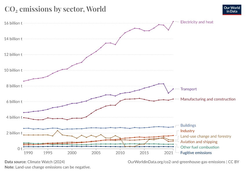
CO₂ emissions by sector
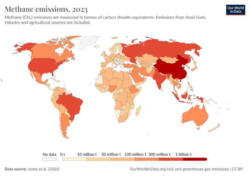
Methane: how much does the average person in South Korea emit? Where do emissions come from?
Methane (CH4) is a strong greenhouse gas, mainly produced through agricultural activities (e.g. livestock and rice production), in addition to leakages from oil and gas production (called ‘fugitive emissions’).
This first interactive chart here shows per capita emissions of methane each year. This is measured in ‘carbon dioxide equivalents’.
The other interactive chart shows where these emissions come from: the contribution of each sector.


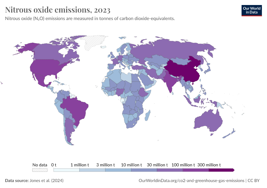
Nitrous oxide: how much does the average person in South Korea emit? Where do emissions come from?
Nitrous oxide (N2O) is a strong greenhouse gas that is mainly produced from agricultural activities (e.g. from the use of synthetic and organic fertilizers to grow crops).
This first interactive chart here shows per capita emissions of nitrous oxide each year. This is measured in ‘carbon dioxide equivalents’.
The other interactive chart shows where these emissions come from: the contribution of each sector.


Energy intensity: how much energy does South Korea use per unit of GDP?
Since energy is such a large contributor to CO2, reducing energy consumption can inevitably help to reduce emissions. However, some energy consumption is essential to human wellbeing and rising living standards.
Energy intensity can therefore be a useful metric to monitor. Energy intensity measures the amount of energy consumed per unit of gross domestic product. It effectively measures how efficiently a country uses energy to produce a given amount of economic output. A lower energy intensity means it needs less energy per unit of GDP.
This interactive chart shows energy intensity.

Carbon intensity: how much carbon does South Korea emit per unit of energy?
Energy intensity – shown in the chart above – is one important metric to monitor whether countries are making progress in reducing emissions. The other key part of this equation is carbon intensity: the amount of CO2 emitted per unit of energy.
We can reduce emissions by (1) using less energy; and/or (2) using lower-carbon energy.
This metric monitors the second option. As we transition our energy mix towards lower-carbon sources (such as renewables or nuclear energy), the amount of carbon we emit per unit of energy should fall.
This chart shows carbon intensity – measured in kilograms of CO2 emitted per kilogram of oil equivalent consumed.

Has South Korea’s economic growth decoupled from its CO₂ emissions?
To reduce emissions and achieve increasing prosperity at the same time, we have to decouple economic growth from CO2 emissions. Several countries have achieved this in recent years.
The chart here shows whether this country has achieved this by showing the change in GDP per capita, and annual per capita CO2 emissions over time.
We show both production-based and consumption-based emissions (for countries where this data is available). This allows us to see whether the import of production from other countries – or the export to other countries – has affected this change in emissions.

Cite this work
Our articles and data visualizations rely on work from many different people and organizations. When citing this profile page, please also cite the underlying data sources. This profile page can be cited as:
Hannah Ritchie and Pablo Rosado (2025) - “CO₂ and Greenhouse Gas Emissions” Published online at OurWorldinData.org. Retrieved from: 'https://ourworldindata.org/profile/co2/south-korea' [Online Resource]BibTeX citation
@article{owid-co2-south-korea,
    author = {Hannah Ritchie and Pablo Rosado},
    title = {CO₂ and Greenhouse Gas Emissions},
    journal = {Our World in Data},
    year = {2025},
    note = {https://ourworldindata.org/profile/co2/south-korea}
}
Reuse this work freely
All visualizations, data, and articles produced by Our World in Data are completely open access under the Creative Commons BY license. You have the permission to use, distribute, and reproduce these in any medium, provided the source and authors are credited.
The data produced by third parties and made available by Our World in Data is subject to the license terms from the original third-party authors. We will always indicate the original source of the data in our documentation, so you should always check the license of any such third-party data before use and redistribution.
All of our charts can be embedded in any site.