Exemplars in Global Health: Which countries are most successful in preventing maternal deaths?
830 women die from pregnancy-related causes on any given day. How can we use the Exemplar framework to learn how we can reduce these deaths?
On any average day 830 women die from pregnancy-related causes.1
If all countries had the maternal mortality rate of the places with the best health, 300,000 fewer women would die each year — as I previously showed. Most of these deaths are preventable, as the World Health Organization (WHO) highlights.
A world where very few women die from pregnancy is possible. But how do we get there?
An obvious answer is to make all countries rich: all rich countries have very low maternal mortality rates. We see this in the visualization, which plots the maternal mortality rate (on the vertical axis) against GDP per capita (on the horizontal axis).

But even if this correlation was causation, and it was the case that high incomes are the sole driver of low maternal mortality, this solution would come with two big problems: it is very difficult to make a poor country rich and economic growth is slow — it takes many decades for poor countries to become rich.
Let’s take the comparison of Rwanda and the UK as an example.
In 2019 — pre-pandemic, the average GDP per capita in Rwanda was $2043 while it was $39,113 in the UK.2 To increase incomes from the level of Rwanda’s ($2043) to its current level ($39,113) took the UK more than 350 years.3 This works out at an average growth rate of 0.8% per year.4
Even if we take Rwanda’s comparatively fast rate of economic growth — an average of around 4% per year from 2010 to 2019 — it would still take 76 years to reach the UK’s average income today.5
What else can we do than to wait for poor countries to grow rich before they can stop young mothers from dying?
While income matters, clearly there’s more to it — we see this from the very same chart: If income was the only aspect that mattered, all countries would lie on a single diagonal line in the scatterplot. Instead, there is a large spread in rates of maternal mortality at every level of income.
Look along the $10,000 income line, for example: in Ukraine, 17 of every 100,000 births resulted in the death of the mother in 2020. This was half as many as in Tunisia, and almost four times lower than in equally rich Ecuador.
As my colleague Max Roser explains in his companion article, we see these differences for countries of the same level of income across many aspects of living conditions.
Which countries have low levels of maternal mortality given their income level? From the scatterplot, we can identify the following:
- Low income: Nepal, Rwanda and Ethiopia.
- Middle income: Egypt, Ukraine, Moldova and Tajikistan.
- High income: Poland, Belarus and Greece.
One opportunity to reduce maternal deaths is therefore to learn from countries that have performed very well given their income or development circumstances. These countries are referred to as Exemplars.
By identifying them we can try to better understand why they perform so well, and if other countries can learn from them and then adopt a similar approach. This is the concept behind the newly-launched Exemplars in Global Health platform. This new research publication was prepared over the course of several years and we at Our World in Data have contributed to it since the early days. Now the platform has just launched at www.exemplars.health.
Which countries have achieved the fastest decline in maternal mortality?
If we want to identify countries we can learn from, we’re not only interested in countries that have low maternal mortality today but those that have achieved a fast reduction over time.
This slope chart shows the change in maternal mortality in each country from 1990 to 2015.

For example, Australia has a value of -25% because its maternal mortality rate fell by 25% — from 8 to 6 deaths per 100,000 — from 1990 to 2015. The Philippines also achieved a reduction of 25%, starting from 150, meaning a reduction of around 35 deaths per 100,000. Countries with a positive value saw a rise in mortality over this period.
The countries that achieved the largest decline are found at the bottom of the chart. Globally, the Maldives achieved the greatest reduction: the maternal mortality ratio declined by 90% from 677 to 68 deaths per 100,000 live births — a very impressive achievement.
The following six are Belarus, Kazakhstan, Bhutan, Cambodia, Cape Verde, and Turkey. They all reduced maternal mortality by over 80% throughout just one generation.
You can find the five countries which achieved the greatest reduction in each region in the accompanying footnote.6
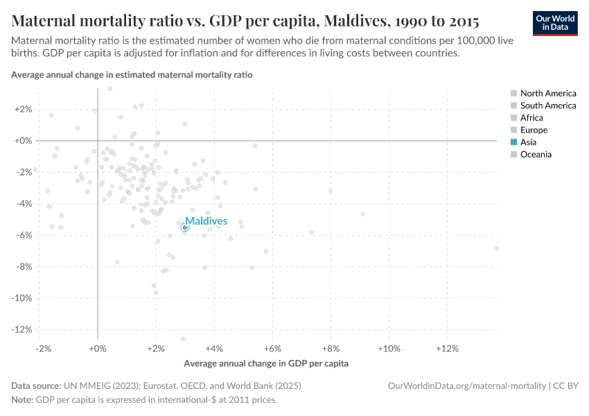
Which countries have delivered the most efficient decline in maternal mortality?
Many of the countries that achieved a large reduction in maternal mortality also achieved strong economic growth over this period. Maternal mortality fell as countries got richer.
This comparison is not helpful for poor countries that struggle to achieve: these countries need to understand effective interventions beyond economic growth. For them, it is helpful to learn from countries that have managed to convert even small increases in prosperity into much better health.7
In the visualization we can see the average annual change in maternal mortality (on the y-axis) in comparison with the annual change in GDP per capita (on the x-axis). Here, the countries that lie close to the 0% line on the x-axis but close to the bottom of the chart are the Exemplars. They achieved much better health with very little economic growth.
The Maldives — which is highlighted — is one of several Exemplars which achieved large reductions in maternal deaths. It not only achieved a large improvement in maternal deaths, but it did this during a time of only modest growth in incomes — it increased by just 3% per year on average.
Other Exemplars include others such as Belarus, Romania, Estonia and the Seychelles.
What can other countries learn from the Maldives? What did they do right?
The Maldives Health Strategy and research by the WHO gives insights into what to learn from their example. What they emphasize is that investments and policies geared towards maternal and child health have been a primary focus for the Maldives.8
More than 95% of births are now attended by skilled health staff. What has been particularly important is how rapidly the number of nurses and midwives has increased: The share of nurses and midwives among the population increased 12-fold since 1991; from less than one per 1,000 people in 1991 to more than 8 per 1,000 (this is more than four times the average in South Asia; and comparable to many countries across Europe).
The health ministry also introduced an in-depth review process that assessed the specific cause of all maternal deaths, helping health officials understand why women were dying and what could be done to prevent it.9
Also important have been interventions and policies geared towards nutrition: all pregnant women receive appropriate supplementation (such as iron and folic acid) at antenatal appointments.10 This has reduced nutritional deficiencies, which are a key contributor to conditions such as anemia — a complication particularly prevalent in pregnant women. The share of women of reproductive age with anemia fell from 69% to 43% from 1990 to 2016.
Belarus, Kazakhstan, Cambodia and Turkey also show that only relatively modest increases in income can be turned into large improvements in maternal health.
Accountability and success stories: how “exemplars” drive change
Is there any evidence that this approach of identifying “exemplars” can be effective in driving change in practice?
Zambia’s recent success suggests that it is possible. Following a rise in maternal mortality from 577 to 598 maternal deaths per 100,000 live births over the 1990s, Zambia achieved an impressive decline to 224 per 100,000 in 2015.
Alice Evans (2017) sought to investigate how this was made possible.11
She identified an exemplar-like mechanism as a crucial political tool to bring this change about: a comparison of Zambia to other countries revealed that the country was falling behind; its maternal mortality rates were higher than many of its neighbours.
Her research explains that Zambia had fallen behind due to increased political pressure on the government. The Zambian Ministry of Health responded by attempting to emulate the progress of neighboring countries — especially those that had seen the greatest improvements.
What has been pivotal in Zambia’s progress was the prioritization of maternal health through the introduction of dedicated national programs, including: a program to strengthen Emergency Obstetric and Neonatal Care; the introduction of in-depth reviews of the causes of maternal deaths in all districts; increased funding and specialized budgets for maternal healthcare and training of nurses and midwives; and the compulsory inclusion of maternal healthcare plans in every district.
It seems promising to try to replicate this mechanism across other countries. Using this approach we can identify Exemplars and then learn from them. In maternal mortality, there are many examples to build on; if we can adopt them at-scale there is the potential to save millions of mothers in the years to come.
Endnotes
The World Health Organization estimates that in 2015, there were 302,680 maternal deaths globally. Averaged over the year, this would be equal to around 830 maternal deaths per day [302,680 / 365 = 830].
This is measured in 2011 international dollars.
If we look at long-run data (adjusted for inflation and differences in living costs) on the UK’s GDP per capita, we see that average incomes were around $2000 — similar to Rwanda in 2019 — in 1666. This means it took more than 350 years to reach its level of income today.
It took the UK from 1666 to 2019 to increase average GDP per capita from $2135 to $39,113. This was 353 years. If we calculate the compound annual growth rate over this period as: [(39,113 / 2135) ^ (1/353) - 1] we get an average annual growth rate of 0.8%.
Here, I have taken the average of annual GDP per capita growth in Rwanda over the period from 2010 to 2019: this is approximately 4% per year. If we assume annual growth of 4% from its income in 2019 — $2043 — it would take around 76 years (until 2095) for GDP per capita to reach $39,113 — the UK figure for 2019.
Each country is colored by its geographical region. You can filter the countries shown by region by clicking on any region in the sidebar of the chart. The five countries that achieved the greatest reduction in each region are as follows [Because several countries have achieved the same level of reduction, some of the top-five rankings extend to six or seven if they place jointly]:
- Asia: Maldives (-90%); Bhutan (-84%); Cambodia (-84%); Turkey (-84%); Lebanon, Iran and Timor (joint at -80%).
- Africa: Cape Verde (-84%); Rwanda (-78%); Libya (-77%); Equatorial Guinea (-74%); Ethiopia (-72%).
- Europe: Belarus (-88%); Poland (-82%); Estonia (-79%); Romania (-75%); Czechia (-71%).
- North America: El Salvador (-66%); Mexico (-58%); Guatemala (-57%); Dominican Republic (-54%); Barbados and Honduras (joint at -53%)
- South America: Peru (-73%); Ecuador (-65%); Chile (-61%); Uruguay (-59%); Brazil (-58%).
- Oceania: Solomon Islands (-69%); Samoa (-67%); Vanuatu (-65%); Kiribati (-62%); Papua New Guinea (-54%).
In this comparison, we look at the relative change in maternal mortality versus the relative change in income — both given in percentage terms. We could, as an alternative, compare “efficiencies” by looking at the absolute cost of reduction, i.e., lives saved per dollar. Here we focus on the relative comparison under the assumption that improvements get increasingly and proportionately more costly as mortality rates decline. If we looked at this in absolute terms, we’d expect countries with the highest maternal mortality rate would be able to achieve much more “efficiency” (save more lives per dollar) than countries with better health.
National Reproductive Health Strategy 2014-2018, Health Protection Agency, Ministry of Health, Maldives.
Maternal and Perinatal Morbidity and Mortality Review Committee. Maternal deaths in the Maldives: 2009–2011. The Maldives Government; 2011.
World Health Organization, Regional Office for South-East Asia. (2005). Improving maternal, newborn, and child health in the South-East Asia Region. WHO Regional Office for South-East Asia.
Evans, A. (2017). Amplifying accountability by benchmarking results at district and national levels. Development Policy Review, 36(2), 221-240.
Cite this work
Our articles and data visualizations rely on work from many different people and organizations. When citing this article, please also cite the underlying data sources. This article can be cited as:
Hannah Ritchie (2020) - “Exemplars in Global Health: Which countries are most successful in preventing maternal deaths?” Published online at OurWorldinData.org. Retrieved from: 'https://archive.ourworldindata.org/20260717-090600/exemplars-maternal-mortality.html' [Online Resource] (archived on July 17, 2026).BibTeX citation
@article{owid-exemplars-maternal-mortality,
    author = {Hannah Ritchie},
    title = {Exemplars in Global Health: Which countries are most successful in preventing maternal deaths?},
    journal = {Our World in Data},
    year = {2020},
    note = {https://archive.ourworldindata.org/20260717-090600/exemplars-maternal-mortality.html}
}
Reuse this work freely
All visualizations, data, and articles produced by Our World in Data are completely open access under the Creative Commons BY license. You have the permission to use, distribute, and reproduce these in any medium, provided the source and authors are credited.
The data produced by third parties and made available by Our World in Data is subject to the license terms from the original third-party authors. We will always indicate the original source of the data in our documentation, so you should always check the license of any such third-party data before use and redistribution.
All of our charts can be embedded in any site.