Engel's Law: Richer people spend more money on food, but it makes up a smaller share of their income
How does spending on food change as incomes rise?
Richer people tend to spend more money on food.
We see this relationship when we look at data on food expenditure from across the world.
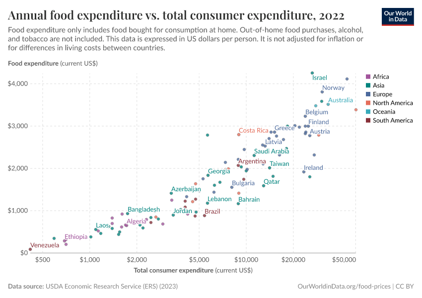
In the chart you see food expenditure plotted against total consumer expenditure per person. Total consumer expenditure is any personal expenditure on goods and services.
On the y-axis, we have the average amount of money spent on food per person, in countries across the world.1 This measures money spent on food consumed at home – from stores and supermarkets. The source does not include food eaten out-of-home, from restaurants and cafes (however, that would be useful data to have). Tobacco and alcoholic beverages are also excluded.
On the x-axis, we have a measure of prosperity, total expenditure. Expenditure tells us how much disposable income people have to spend on goods and services such as food, housing, education, health, and leisure activities. It’s important to ensure that we can afford all of the essentials that give us a high and comfortable standard of living.
Countries which are poor – and where therefore people’s expenditure is very low – can be found, richer countries are further towards the right. This is shown on a log axis by default, but you can change it to a linear scale on the interactive chart.
Both metrics are measured in US dollars per person per year.
What we see is a strong positive relationship: where expenditures are high people tend to spend more money on food
At expenditures below $5,000, the average person tends to spend less than $1,000 on food. At expenditures above $10,000, it's common for the average to be $2,000 or more per person per year.
For richer people, food makes up a smaller share of their expenditure
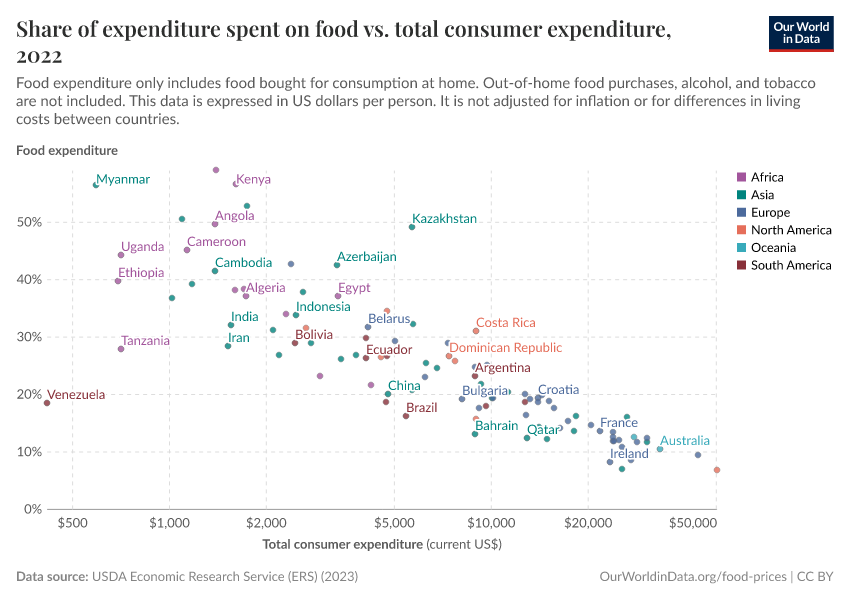
The amount of money spent on food might increase in absolute terms — as we saw in the previous chart — it falls as a share of people’s expenditure. This is what the following chart shows.
In the chart, we’ve plotted food spending against total expenditure again, but this time food spending is measured as a percentage of someone’s total expenditure.2
In countries with expenditures below $10,000, it’s common for people to spend a quarter or more on food.
As total spending rises, a smaller and smaller share goes toward food. At high expenditures, it’s common for people to spend 10% or less. This is despite the fact that they spend more on food in absolute terms.
Both of these points are positive signs for consumers. Spending more on food in dollar terms often means that people are eating more diverse diets. At low incomes, people tend to rely on cheaper staple crops such as cereals and tubers for most of their calories. As people get richer they can afford other foods such as fruits, vegetables, legumes, meats, and dairy products which have a wider range of micronutrients, protein, and fats.
Spending less of our money on food means we have more disposable income for other essentials such as education, healthcare, and housing.
Engel’s Law: how food spending changes with income
That gives us two important insights into food spending.
First, richer people tend to spend more money on food in absolute terms. Second, food tends to account for a smaller percentage of their total expenditure.
The chart illustrates this relationship: in absolute terms spending on food increases with income (shown in purple), in percentage terms it decreases (shown in green).
Combine them and we get a relationship called ‘Engel’s Law’: as household income (and expenditure) increases, the percentage that is spent on food decreases, but the absolute amount spent on food increases.
Research has shown that this relationship holds true within countries: studies looking at household expenditures in South Africa and China, for example, found the same pattern.3
Endnotes
This data comes from the United States Department of Agriculture (USDA) Economic Research Service, which estimates this for countries where available market data is sufficient.
Again, this data comes from the United States Department of Agriculture (USDA) Economic Research Service, which estimates this for countries where available market data is sufficient.
Mulamba, K. C. (2022). Relationship between households’ share of food expenditure and income across South African districts: a multilevel regression analysis. Humanities and Social Sciences Communications, 9(1), 1-11.
Chen, M. (2022). Engel’s law in China: Some new evidence. Review of Development Economics.
Cite this work
Our articles and data visualizations rely on work from many different people and organizations. When citing this article, please also cite the underlying data sources. This article can be cited as:
Hannah Ritchie (2023) - “Engel's Law: Richer people spend more money on food, but it makes up a smaller share of their income” Published online at OurWorldinData.org. Retrieved from: 'https://archive.ourworldindata.org/20260325-171315/engels-law-food-spending.html' [Online Resource] (archived on March 25, 2026).BibTeX citation
@article{owid-engels-law-food-spending,
    author = {Hannah Ritchie},
    title = {Engel's Law: Richer people spend more money on food, but it makes up a smaller share of their income},
    journal = {Our World in Data},
    year = {2023},
    note = {https://archive.ourworldindata.org/20260325-171315/engels-law-food-spending.html}
}
Reuse this work freely
All visualizations, data, and code produced by Our World in Data are completely open access under the Creative Commons BY license. You have the permission to use, distribute, and reproduce these in any medium, provided the source and authors are credited.
The data produced by third parties and made available by Our World in Data is subject to the license terms from the original third-party authors. We will always indicate the original source of the data in our documentation, so you should always check the license of any such third-party data before use and redistribution.
All of our charts can be embedded in any site.

