Gdoc/Admin

Light at Night

Light at night was once expensive everywhere. In some places people are still lacking light at night, while in other places light became extremely cheap.

Being able to switch on the light at night is something that most people today take for granted. But for those that live, or have lived where there is no artificial light, you can appreciate how important it is. After sunset, working, reading, and many other aspects of living become impossible.

Unfortunately, this is still the reality for many people today, and it was the default for everyone in the past.

By following the history of the light – the transitions from candles to lamps to lightbulbs – and the developments that make these accessible, we can learn a lot about technological innovation and economic changes over the centuries.

The price of light has fallen by more than 99.9% since 1700. And its efficiency has increased 1000-fold. This has made light at night available to more and more people.

On this page, you can find data, visualizations, and writing about changes in efficiency, price, and access to lighting.

Key insights on Light at Night

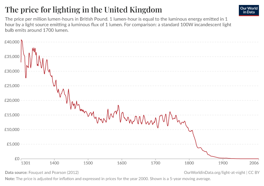
The price of lighting has fallen by more than 99.9% since 1300

Economic historians have reconstructed the price of light over the very long run for the United Kingdom. This data shows that the price of lighting has plummeted in recent centuries.

If we look at long-run datasets on the price of lighting in the UK, we see that prices fell by more than 99.9% from 1300 to the early 2000s.

In the 1300s, one million units of lighting — a lumen-hour — would have cost around £40,800 in 2000 prices. By 2006, this had fallen to £2.90. That is a 14,000-fold decline.

This reduction in prices has transformed the availability of light across the world.

What you should know about this data
  • This data is sourced from the study by Roger Fouquet and Peter Pearson.1
  • To calculate the price of lighting – today or historically – three different prices need to be known: (1) the prices of the relevant energy source, (2) the equipment to provide this light (e.g. a kerosene lamp), (3) how efficiently the available technology at the time can turn the energy into light. The latter is referred to as the ‘lighting technology efficiency’ in the literature and is measured in units of energy used for each lumen-hour of light generated.
  • The authors adjust these prices for inflation over time; the full series is measured in prices of the year 2000.
  • Prices are weighted from the combination of lighting sources at any given period of time. For example, prices of lighting from candles, whale oil, and gas will differ. The average price is, therefore, weighted by the share of each source in total lighting consumption.

The efficiency of lighting has increased 1000-fold since 1700

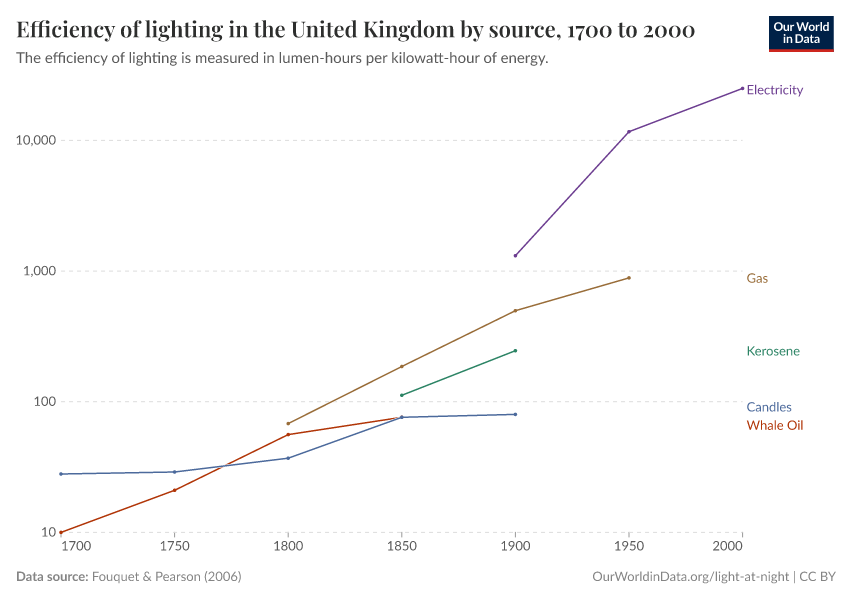
The efficiency of lighting – how much light you produce per unit of energy input – has increased by orders of magnitude over the last few centuries.

We see this in this chart which shows the change in the efficiency of lighting in the United Kingdom from 1700 to 2000.1

In 1700, the average efficiency of lighting was 30 lumen-hours per kilowatt-hour (kWh). By 2000, this had increased almost 1000-fold to 25,000 lumen-hours.

What you should know about this data
  • This data is sourced from the study by Roger Fouquet and Peter Pearson.2
  • The total efficiency of lighting is weighted for the different sources in the total lighting supply. For example, the efficiency of lighting from candles, whale oil, and gas will differ. The average efficiency is, therefore, weighted by the share of each source in total lighting consumption.

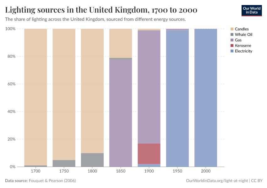
Many countries have moved from candles to gas, to kerosene, and then to electricity

An important driver of the improvements in lighting efficiency has been the transition from one energy source to another.

The chart shows the share of lighting in the United Kingdom that comes from different sources, from 1700 to 2000.

In the 1700s, almost all of the UK’s lighting came from candles. By the 1800s, this had diversified to include whale oil and gas too. The 1900s saw the entry of kerosene. And by the year 2000, all of the UK’s lighting came from electricity.

Lighting has gotten cheaper and more efficient by moving from one source to another

Lighting has become more efficient over time for two key reasons:

First, the efficiency of a given source – for example, candles, gas, or electricity increased over time.

But, more importantly, people have switched from less to more efficient sources.

We can see both of these effects in the chart, which looks at the efficiency of different lighting sources in the United Kingdom over time. These are measured as the amount of light (in lumen-hours) that is produced from one unit of energy (a kilowatt-hour).

We can see how the efficiency of each source increased. The efficiency of candles increased from 28 to 80 lumen-hours from 1700 to 1900. Gas increased from 68 to 880 lumen-hours between 1800 and 1950.

But even larger are the leaps in the transitions from one source to another. Moving from candles to gas increased efficiency from tens to hundreds of lumen-hours. And moving from gas to electricity increased this again from hundreds to thousands.

Global maps of lighting can tell us a lot about the distribution of prosperity in the world

For many people on lower incomes, lighting at night is a luxury. The poorest people can’t afford to use light at night, or only very little. This is visible from space, as this image shows.

By looking at satellite images, we can infer the changes in economic development. Light at night is brightest in areas that are densely populated, and those with higher levels of economic prosperity.

We can see this in the satellite image from NASA. The richest regions of the world – Europe and North America – are shown most prominently.  People in other areas of the world – parts of Africa most prominently – are living in energy poverty.

What you should know about this data
  • This satellite image is sourced from NASA.
  • Several other studies have shown that light density at night reflects standards of living well, both across geographic regions and across time. Some of these papers are:
  • Christopher Small & Christopher D. Elvidge (2013) – Night on Earth: Mapping decadal changes of anthropogenic night light in Asia. International Journal of Applied Earth Observation and Geoinformation. Volume 22, June 2013, Pages 40–52.
  • Henderson, Storeygard, and Weil (2011) – “Measuring Economic Growth from Outer Space,” American Economic Review, 102(2), 994-1028. This paper is online here.
  • Chen and Nordhaus (2011) – “Using Luminosity Data as a Proxy for Economic Statistics,” Proceedings of the National Academy of Sciences, 108(21), 8589—8594.
  • Tilottama Ghosh, Rebecca L. Powell, Christopher D. Elvidge, Kimberly E. Baugh, Paul C. Sutton and Sharolyn Anderson (2010) – Shedding Light on the Global Distribution of Economic Activity. The Open Geography Journal, 2010, 3, 147-160.

Observing light at night can tell us about changes in poverty levels

As people leave the deepest poverty behind, they gain access to the luxury of having light at night. We can often track country developments by looking at the brightness of artificial light.3

The two images below show two satellite images that researchers Maxim Pinkovskiy and Xavier Sala-i-Martin used to study how poverty levels changed.4

Poverty rates have plummeted across many countries in South Asia – such as India, Pakistan, and Bangladesh – over the last few decades. We see evidence of this from the satellite images: nighttime light is much brighter in 2010 than 16 years earlier.

Research & Writing

Interactive Charts on Light at Night

Endnotes

  1. Fouquet, R., & Pearson, P. J. (2006). Seven centuries of energy services: The price and use of light in the United Kingdom (1300-2000). The energy journal, 27(1).

  2. Fouquet, R., & Pearson, P. J. (2006). Seven centuries of energy services: The price and use of light in the United Kingdom (1300-2000). The Energy Journal, 27(1).

  3. Several papers have shown that light density at night reflects standards of living well, both across geographic regions and across time. Some of these papers are:

    Christopher Small & Christopher D. Elvidge (2013) – Night on Earth: Mapping decadal changes of anthropogenic night light in Asia. International Journal of Applied Earth Observation and Geoinformation. Volume 22, June 2013, Pages 40–52. Online here.

    Henderson, Storeygard, and Weil (2011) – “Measuring Economic Growth from Outer Space,” American Economic Review, 102(2), 994-1028. This paper is online here.

    Chen and Nordhaus (2011) – “Using Luminosity Data as a Proxy for Economic Statistics,” Proceedings of the National Academy of Sciences, 108(21), 8589—8594.

    Tilottama Ghosh, Rebecca L. Powell, Christopher D. Elvidge, Kimberly E. Baugh, Paul C. Sutton and Sharolyn Anderson (2010) – Shedding Light on the Global Distribution of Economic Activity. The Open Geography Journal, 2010, 3, 147-160 147.

  4. Maxim Pinkovskiy and Xavier Sala-i-Martin (2016) – Lights, Camera … Income! Illuminating the National Accounts-Household Surveys Debate. The Quarterly Journal of Economics (2016) 131 (2): 579-631. doi: 10.1093/qje/qjw003 Online at http://qje.oxfordjournals.org/content/131/2/579.full?etoc.

Cite this work

Our articles and data visualizations rely on work from many different people and organizations. When citing this topic page, please also cite the underlying data sources. This topic page can be cited as:

Max Roser and Hannah Ritchie (2023) - “Light at Night” Published online at OurWorldinData.org. Retrieved from: 'https://ourworldindata.org/light-at-night' [Online Resource]

BibTeX citation

@article{owid-light-at-night,
    author = {Max Roser and Hannah Ritchie},
    title = {Light at Night},
    journal = {Our World in Data},
    year = {2023},
    note = {https://ourworldindata.org/light-at-night}
}
Our World in Data logo

Reuse this work freely

All visualizations, data, and code produced by Our World in Data are completely open access under the Creative Commons BY license. You have the permission to use, distribute, and reproduce these in any medium, provided the source and authors are credited.

The data produced by third parties and made available by Our World in Data is subject to the license terms from the original third-party authors. We will always indicate the original source of the data in our documentation, so you should always check the license of any such third-party data before use and redistribution.

All of our charts can be embedded in any site.