How has income inequality within countries evolved over the past century?
While the steep rise of inequality in the United States is well-known, long-run data on the incomes of the richest shows countries have followed a variety of trajectories.
Thanks to a growing body of research on the incomes of the richest, we now have a much better understanding of the long-run evolution of income inequality.
This area of research has developed methods for estimating income inequality based on income tax records, or summary tables released by tax authorities. This is often available over much longer time horizons than household surveys, the most common data source for inequality researchers. For many countries, tax data can provide us with a view of the evolution of inequality over the past 100 years or more. It can also provide a more accurate view of the incomes of the richest, which are often poorly captured in survey data, as discussed further in a note at the end of this article.
Following the first uses of this approach around 20 years ago, the coverage of countries and periods has grown extensively.1 More recently, this effort has been coordinated by researchers at the World Inequality Database, who draw together the efforts of many inequality researchers according to a standardized methodology.
Below we show World Inequality Database estimates of the share of income received by the richest 1%. These data relate to income measured before taxes are paid and government benefits received.2
Inequality over the past century: dramatic declines, followed by substantial rises in some countries – but not in others
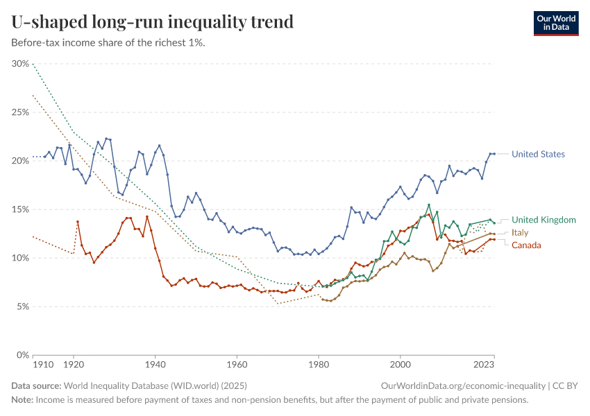
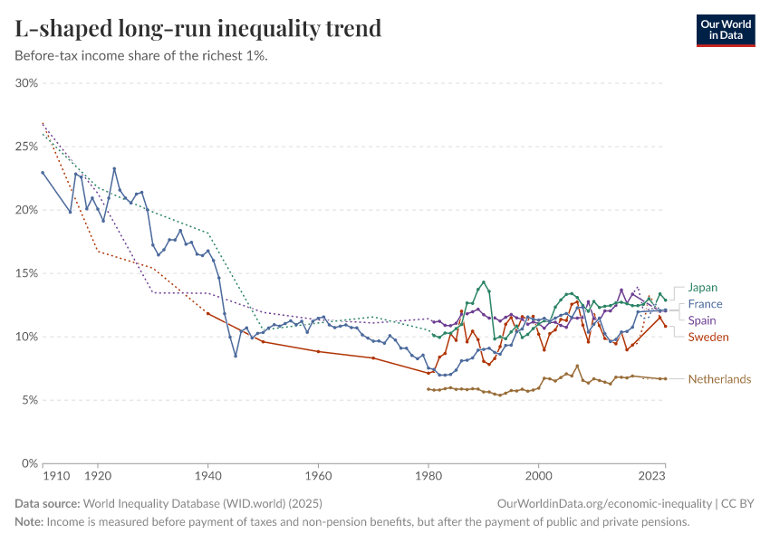
Over the early and mid-20th century, dramatic declines in income inequality were a common experience. In many countries, the share of income received by the richest 1% fell by half or more: from around one-fifth or even one-quarter of all income on the eve of World War I, to one-tenth or less by the 1970s.
From the 1980s, inequality began to rise again in many high-income countries, tracing a ‘U-shaped’ pattern over the past 100 years. The US is a clear example of this, as shown in the first chart. After a sustained rise over the last 40 years, before-tax inequality in the US is roughly at the same level today as it was a century ago. The US data is shown along with three other countries that saw substantial rises in inequality in recent decades: Canada, the United Kingdom, and Italy.
But this path has not been followed everywhere. Many countries that saw steep declines over the early and mid-20th century have maintained relatively stable levels of inequality since then. Examples of countries following this more ‘L-shaped’ trend – Japan, Sweden, Spain, France, the Netherlands – are shown in the second chart.
The differences in these trends tell us something important: high and rising inequality is not an inevitability; it’s something that individual countries can influence. A universal trend of increasing inequality would support the idea that inequality is completely determined by global economic forces like technological progress, globalization, or capitalism. The very different trends we see among countries exposed to these same forces suggest that national institutions, politics, and policy matter a lot.
Additional information: The problem of the ‘missing rich’ in household survey data
The incomes of the richest are often poorly captured by household surveys. This problem – what inequality researcher Nora Lustig (2019) calls the ‘missing rich’ problem – is due to a combination of factors.3
Endnotes
Anthony Atkinson, Thomas Piketty, and Emmanuel Saez (2011) provide a good overview of initial research efforts in this field. Atkinson, Anthony B., Thomas Piketty, and Emmanuel Saez. ‘Top Incomes in the Long Run of History’. Journal of Economic Literature 49, no. 1 (March 2011): 3–71. Available here.
The World Inequality Database describes these estimates as ‘Pre-tax, post-replacement’ income. ‘Post-replacement’ here means that the target concept of income is measured after the operation of the pension systems – both private and public. As such, this before-tax income concept already reflects transfers – social contributions and public pension benefits – that in some countries would normally be considered part of the redistribution achieved by governments. For further information, see the detailed documentation of the database’s methodology.
Lustig, Nora. ‘The “Missing Rich” in Household Surveys: Causes and Correction Approaches’. Commitment to Equity (CEQ) Working Paper Series. Tulane University, Department of Economics, November 2019. Available here.
Tax data may still underestimate the incomes of the extremely rich, to the extent that they are able to evade taxes. Evidence gathered by Alstadsæter, Johannesen and Zucman (2019) suggests tax evasion can be substantial.
Alstadsæter, Annette, Niels Johannesen, and Gabriel Zucman. ‘Tax Evasion and Inequality’. American Economic Review 109, no. 6 (June 2019): 2073–2103. Available here.
Nora Lustig (2019) provides a good overview of the problems involved in capturing top incomes in household surveys accurately, and how researchers and statistical offices attempt to correct this.
Lustig, Nora. ‘The “Missing Rich” in Household Surveys: Causes and Correction Approaches’. Commitment to Equity (CEQ) Working Paper Series. Tulane University, Department of Economics, November 2019. Available here.
See Carranza, Rafael, Marc Morgan, and Brian Nolan. (2021) ‘Top Income Adjustments and Inequality: An Investigation of the Eu-Silc†’. Review of Income and Wealth.
Cite this work
Our articles and data visualizations rely on work from many different people and organizations. When citing this article, please also cite the underlying data sources. This article can be cited as:
Joe Hasell (2023) - “How has income inequality within countries evolved over the past century?” Published online at OurWorldinData.org. Retrieved from: 'https://archive.ourworldindata.org/20260707-125341/how-has-income-inequality-within-countries-evolved-over-the-past-century.html' [Online Resource] (archived on July 7, 2026).BibTeX citation
@article{owid-how-has-income-inequality-within-countries-evolved-over-the-past-century,
    author = {Joe Hasell},
    title = {How has income inequality within countries evolved over the past century?},
    journal = {Our World in Data},
    year = {2023},
    note = {https://archive.ourworldindata.org/20260707-125341/how-has-income-inequality-within-countries-evolved-over-the-past-century.html}
}
Reuse this work freely
All visualizations, data, and articles produced by Our World in Data are completely open access under the Creative Commons BY license. You have the permission to use, distribute, and reproduce these in any medium, provided the source and authors are credited.
The data produced by third parties and made available by Our World in Data is subject to the license terms from the original third-party authors. We will always indicate the original source of the data in our documentation, so you should always check the license of any such third-party data before use and redistribution.
All of our charts can be embedded in any site.